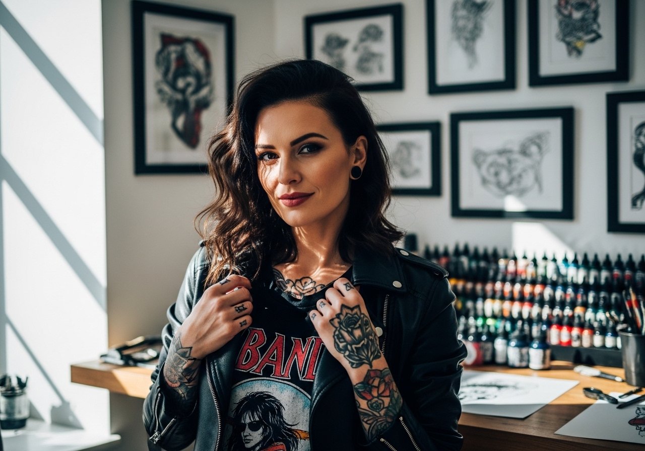
Bright color on the hand reads loud in photos and quiet in daily life. Hand tattoos age differently because of constant washing, friction, and sun exposure, so the trick is picking saturated color that sits at the right depth and a design with breathing room. Below are 27 colorful hand tattoo ideas with notes on what to ask for, how they heal, and how to show them off without wearing your whole jewelry box.
1. Saturated Botanical on the Back of Hand

This design uses bold color blocks around clear linework so the leaves read from a distance and do not blur into a mushy patch. I recommend asking your artist for slightly heavier linework where color meets skin so the saturation has a clear border. Pain is moderate because the back of the hand is thin. Expect touch-ups at year two to restore saturation if you work with your hands daily. For showing this off, pair the piece with a rolled+linen+shirt and a couple of thin stacking rings to frame the knuckle area.
2. Micro-Realism Floral on the Side of the Thumb
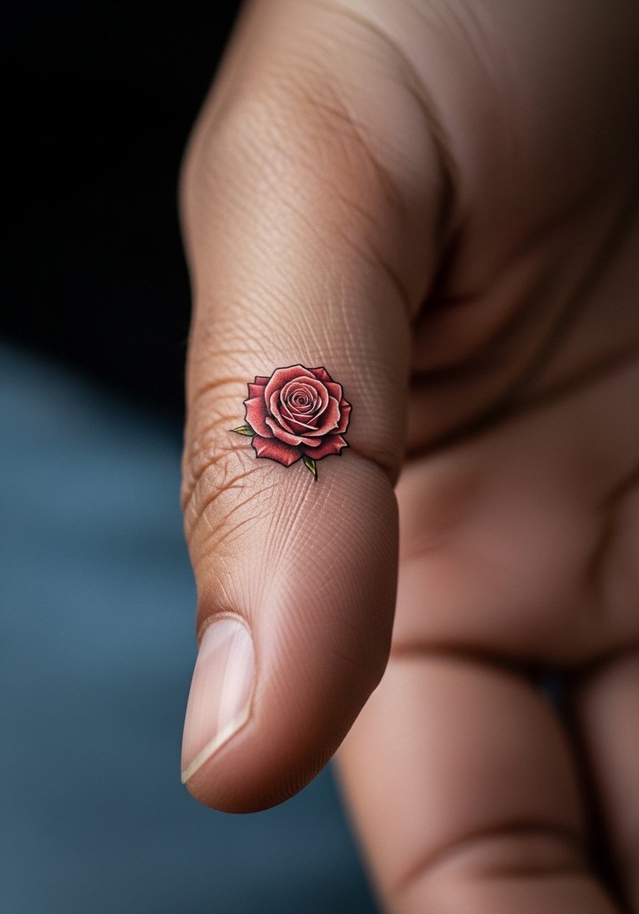
Most micro-realism pieces look fragile on the hand because the skin moves a lot. For a thumb placement, ask for slightly simplified petals and denser saturation in the shadows. Session time is short, about 30 to 60 minutes, but the spot is prone to wear from phone use and zippers. I usually tell people to expect a touch-up around year one. For the appointment wear a loose button-down shirt so you can push the sleeve up without tugging on the area.
3. Watercolor Splash Across the Dorsal Hand
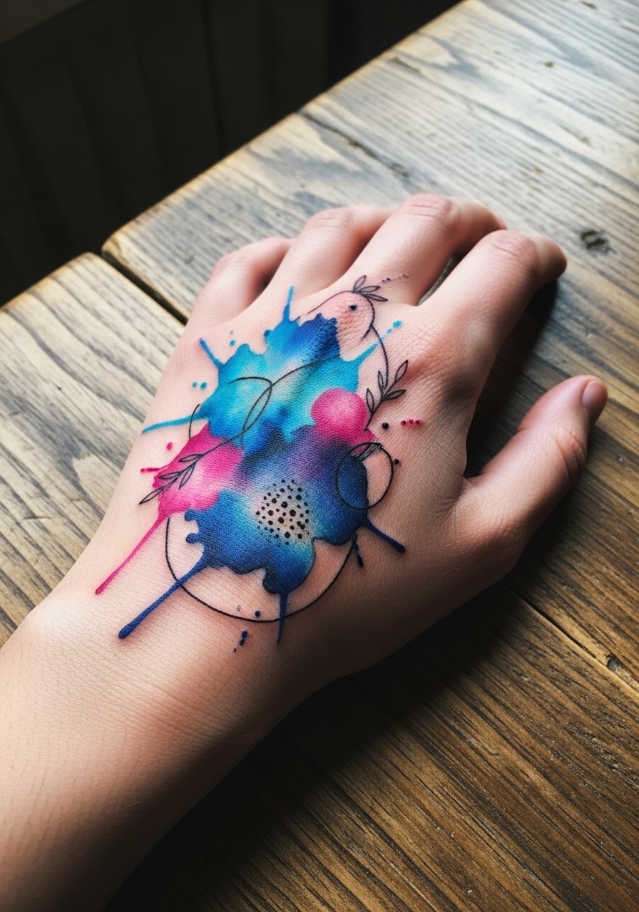
Watercolor on hands is gorgeous when fresh and controversial when healed. One camp says watercolor lacks the structure to hold on high-friction zones, and will wash out fast. The other camp argues that strategic color points and a light outline make it last. I side with the latter when the artist uses saturation anchors. Expect the washes to fade unevenly over 12 to 24 months and plan a touch-up to rebalance hues. To keep the color visible, show it off with short sleeves or a racerback+tank+top that keeps attention on your hands.
4. Neon Pop Knuckles with Tiny Symbols
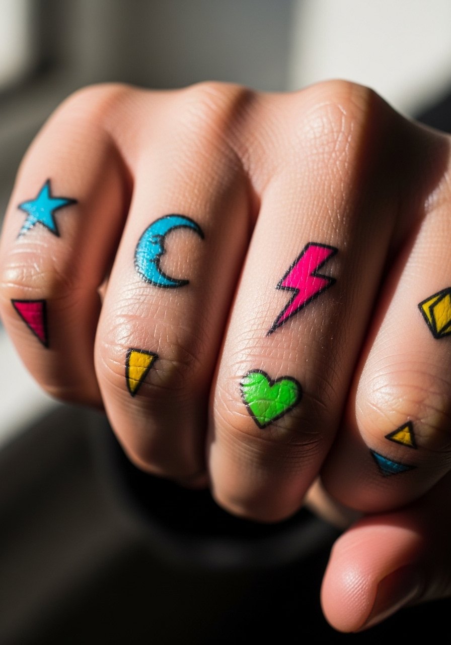
Knuckle tattoos demand simple, high-contrast designs because the skin there sees a lot of movement. For neon color, ask the artist to layer the pigment so saturation sits evenly without white highlights that vanish. Expect higher fade due to hand washing. The session is quick but intense, and touch-ups are common around year one. If you wear jewelry, keep rings minimal so the symbols remain the focal point. A set of thin stacking rings pairs well without crowding the knuckle art.
5. Geometric Color Block Across the Thumb Web
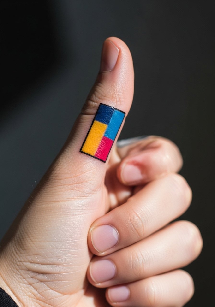
Geometric blocks read best when given negative space between shapes. The biggest mistake is cramming too many shapes into a small thumb web. Ask for simplified geometry and clear borders where color transitions. The thumb web is surprisingly resilient, but it still rubs against clothing. Expect a light touch-up at 18 months. For the session, wear a loose tank top so the artist can access the hand without sleeve interference.
6. Gradient Script Along the Side of the Hand
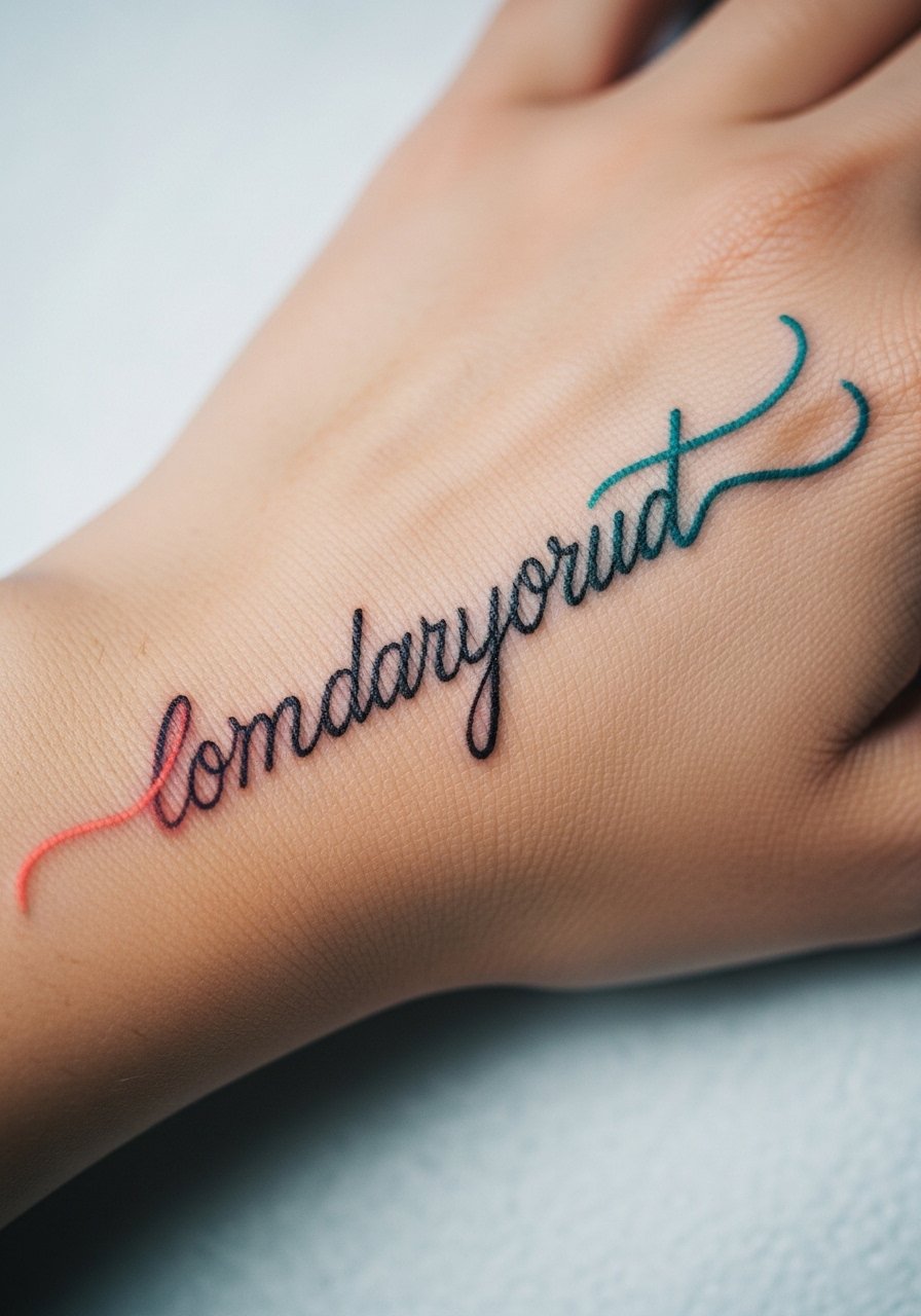
Script on the hand should be spaced so letters can breathe as the skin moves. I recommend a slightly bolder script with color that fades gently from letter to letter. The side of the hand sees less friction than knuckles, but the letters will soften over time. Have a touch-up plan at year two. For show-off styling, a thin chain bracelet worn low on the wrist highlights the written line without covering it.
Pre-Session Essentials
The thumb, knuckle, and back-of-hand pieces above heal differently from finger and wrist work, so a few small items smooth the session and the first week.
-
Stencil transfer paper kit. Lets you preview the actual placement on skin before committing, which is useful for thumb web and side-of-hand script pieces.
-
Topical numbing cream. Applied per instructions 30 to 45 minutes before can reduce sharpness for knuckle and thumb sessions without interfering with linework.
-
Thin protective film roll. Keeps hand tattoos cleaner during the first week when friction and washing are highest.
-
Fragrance-free gentle body wash. Cleans the area without stripping color from delicate gradients and micro-realism detail.
-
Aquaphor Healing Ointment. A thin layer protects tight linework on fingers and thumbs in the initial healing window.
7. Tiny Cartoon Character on the Side Finger

Tiny character pieces are playful, but they require simplified shapes to survive daily abrasion. Ask the artist to reduce facial detail and to use bold color blocks for defining elements. Fingertip and side-finger areas fade fastest, so expect touch-ups at year one. The session is short but precise. For showing off this kind of piece, stack a couple of dainty midi rings to draw the eye up the finger without overcrowding the tiny character.
8. Painted Daisy Cluster Near the Wrist

Clusters sit nicely near the wrist because you can hide them under sleeves if needed. The key is saturation over tiny detail. Most people request too many petals and then complain about blurring. Tell your artist you want bold centers and simplified petals. Expect the color to soften at six months and then stabilize, with a light touch-up at two years. For show-off outfits try a rolled sleeve linen shirt so the daisies peek out without competing with heavy bracelets.
9. Stained Glass Mosaic Across the Dorsum
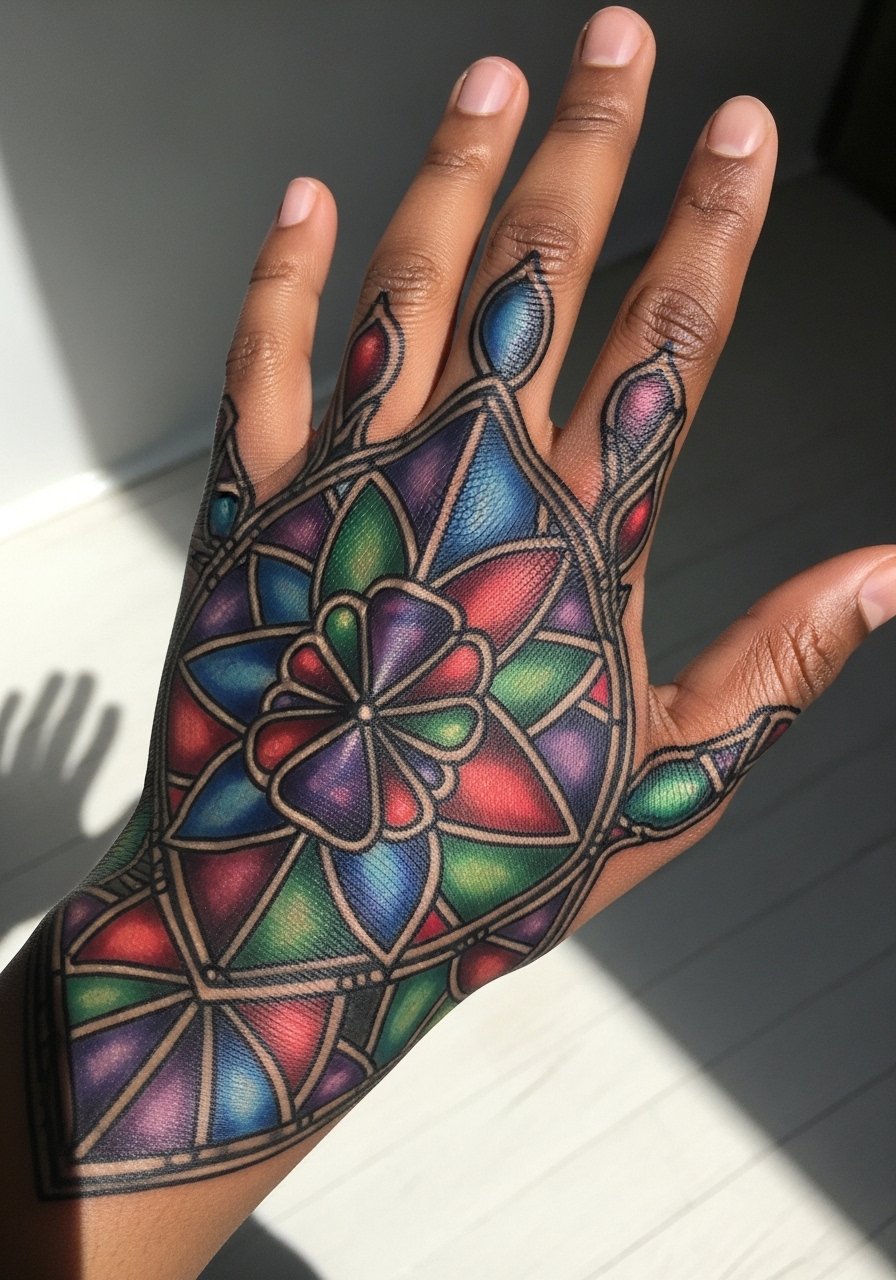
This style uses bold separators to keep color panels from merging as the skin ages. A common mistake is using too many small panels. Ask for slightly larger panes and strong black linework between colors to preserve clarity. The back of hand sees abrasion, so expect a touch-up at year two for saturation. For the appointment wear a loose short-sleeve shirt to allow easy access without tugging.
10. Miniature Portrait on the Side Palm
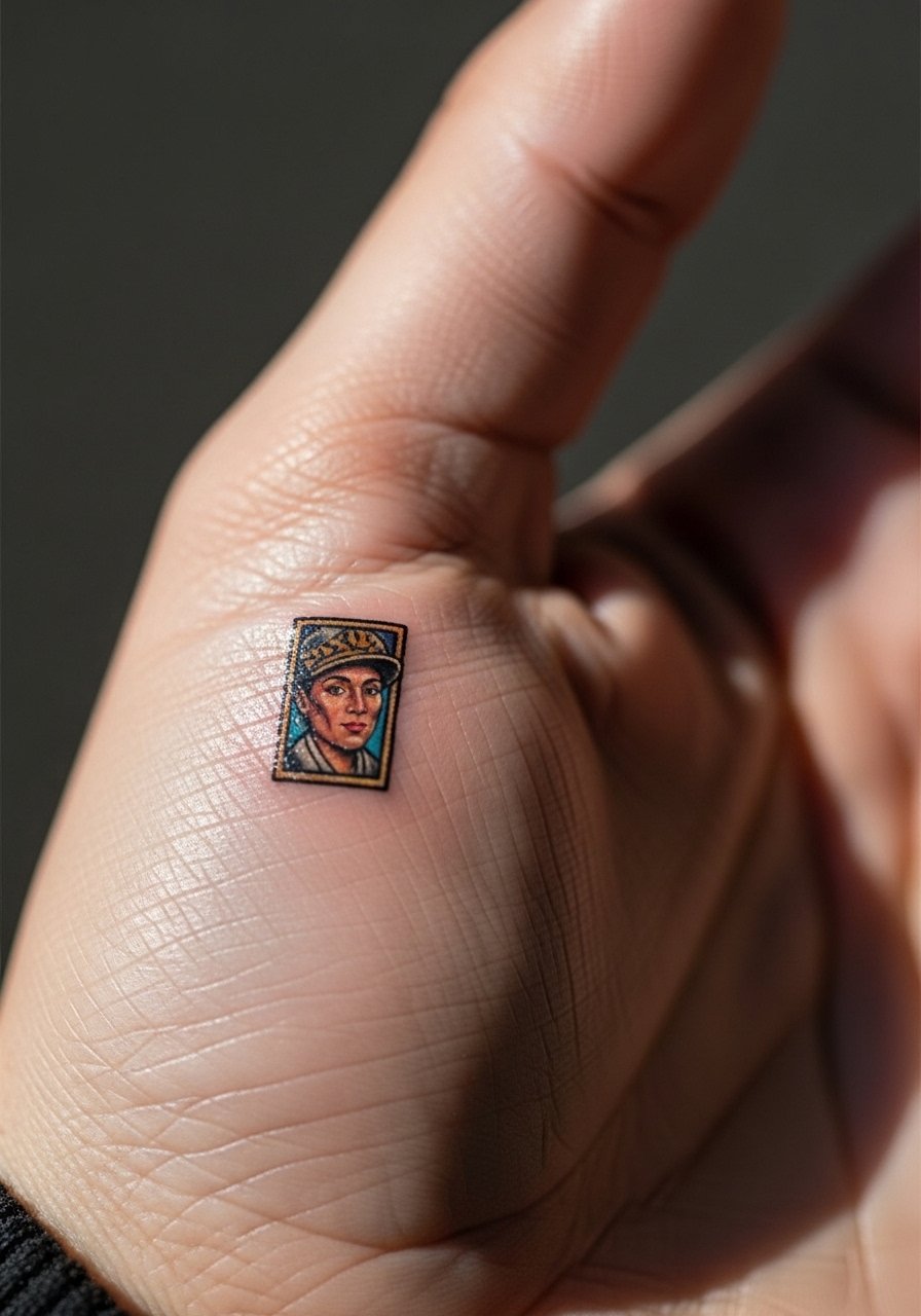
Palm and side-palm portraits are high-maintenance because the skin regenerates quickly and blurs detail. Many artists avoid palms for realistic portraits for that reason. If you still want a portrait, simplify facial features and use color blocks for hair and clothing. Sessions are short and painful. Expect significant fading and plan touch-ups within the first year. For the session, wear a zip-up hoodie you can remove without touching the fresh palm work.
11. Color Splash Mandala Between Fingers

Mandala detail in tight spaces often becomes a blur if the pattern is too dense. Ask for spacing in the design and for color anchors to prevent the central dots from merging. The webbing is vulnerable to movement related blowout, so the session is short and the pain mild to moderate. I recommend a touch-up around 12 to 18 months. To show it off, pick short-sleeve outfits and a thin leather bracelet that sits below the webbing area so the mandala remains visible.
12. Jellyfish Floating Up from Thumb Base
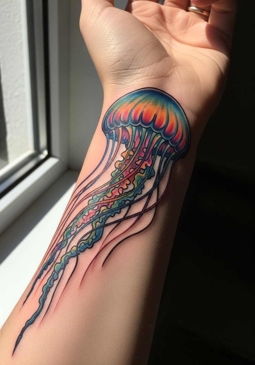
Organic vertical designs like a jellyfish work well because movement follows natural contours. Tell your artist you want tapered tentacles with stipple shading to avoid dense lines that could blow out. The thumb base heals better than fingertips, but the lower wrist end will see more sun exposure. Expect a color refresh at year two. For the session wear a loose tank top so the wrist area is easy to reach.
13. Traditional Rose with Saturated Fill on the Back of Hand

Traditional pieces age predictably because bold linework protects color. The biggest mistake is shrinking classic proportions to fit the hand. Ask for the rose to keep its classic scale and for the artist to anchor saturation at the edges. Pain is moderate. Expect less frequent touch-ups than fine line pieces, often around year three. For outfits, a short sleeve denim jacket frames the back-of-hand work without hiding it.
14. Pastel Cloud and Stars on Knuckle Pads

Knuckle pads see a lot of motion and washing, so pastel choices need more saturation than you think to last. A common error is asking for very light pastels that vanish after a few months. Ask the artist to layer pastel over a slightly deeper base. Expect touch-ups every 9 to 12 months. For showing off delicate knuckle art, try a minimalist watch with a thin band that keeps attention near the hand without covering the knuckles.
15. Colorful Linework Arrow Across the Outer Hand
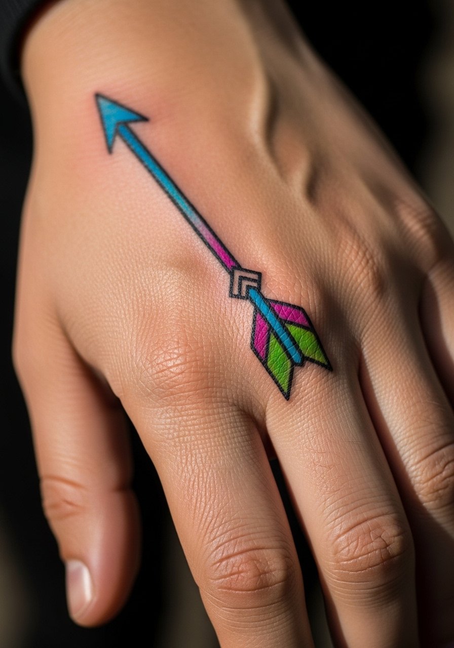
Linework that crosses tendons needs strategic spacing so the arrow does not blur where the skin flexes. Tell your artist to avoid overly thin single lines in flex zones. The pain is low to moderate and the session is quick. Expect the arrow to soften at year two. For low-effort styling, wear short-sleeve shirts or a crew neck tee so the piece remains visible during casual days.
16. Electric Swallow on the Thumb with Color Tail

Bird motifs on thumbs need a strong silhouette to survive friction. I suggest a bold outline and saturated tail color that can be refreshed without altering the bird. The thumb is a high-use area, so expect touch-ups at year one. For the day of the session, slip on an easy-to-remove button-up shirt so sleeves do not brush the fresh ink.
17. Candy Dot Work Across the Dorsal Fingers

Dot work reads clean when dots have space. A frequent mistake is packing dots too tightly which leads to an indistinct blur. Ask for slightly larger spacing and stronger color contrast between dots. The dorsal fingers fade faster than the hand back, so plan a touch-up within a year. This placement is nail-to-wrist visible, so keep nail polish neutral if you want the dots to pop.
18. Henna-Inspired Floral That Uses Color Accents

This pattern nods to traditional henna art but uses color points for longevity. For cultural respect, consider small variations rather than direct replication. Artists split on whether to treat these as decorative flash or as custom work, so ask how they approach cultural motifs. The back-of-hand placement makes it visible and easy to style. Pair this with an open-back midi dress for evenings when you want the pattern to complement a dressy look.
19. Bold Color Block Palm Accent
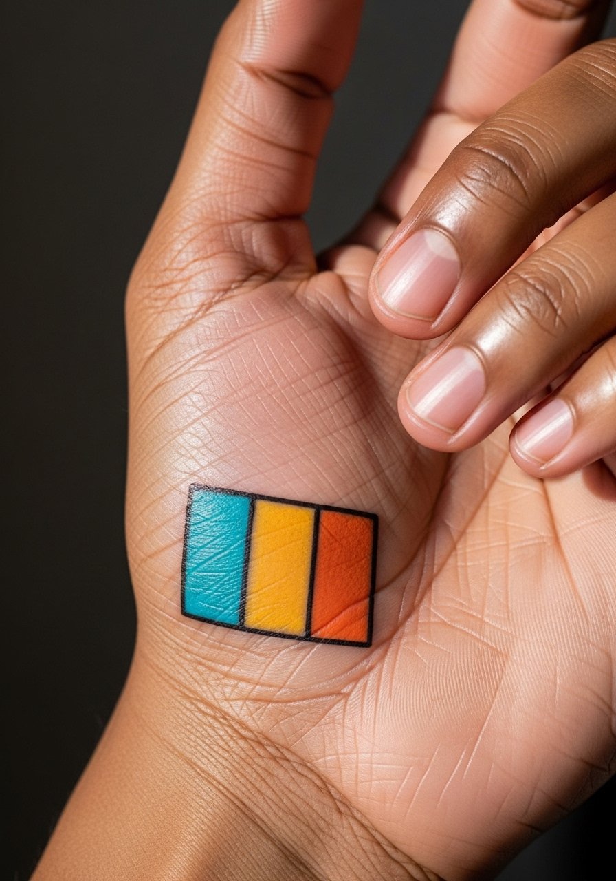
Palm work is high maintenance because the skin regenerates rapidly. Many artists avoid full palm pieces for true-to-detail color. If you want a color block, keep it small and expect repeated touch-ups. The feel of this session is intense and short. Plan for heavier maintenance and consider whether you want a high-visibility placement that will require longevity work.
20. Rainbow Negative Space Chevron on the Back of Hand

Negative space in colorful chevrons helps the skin read as part of the design. A common error is using too many tiny negative lines that blur. Ask for bold negative bands and solid color fills. Expect color softening at year two. For showing off, roll sleeves or wear a short sleeve blouse to keep the chevron visible without heavy jewelry.
21. Tiny Colorful Symbols Across Finger Sides
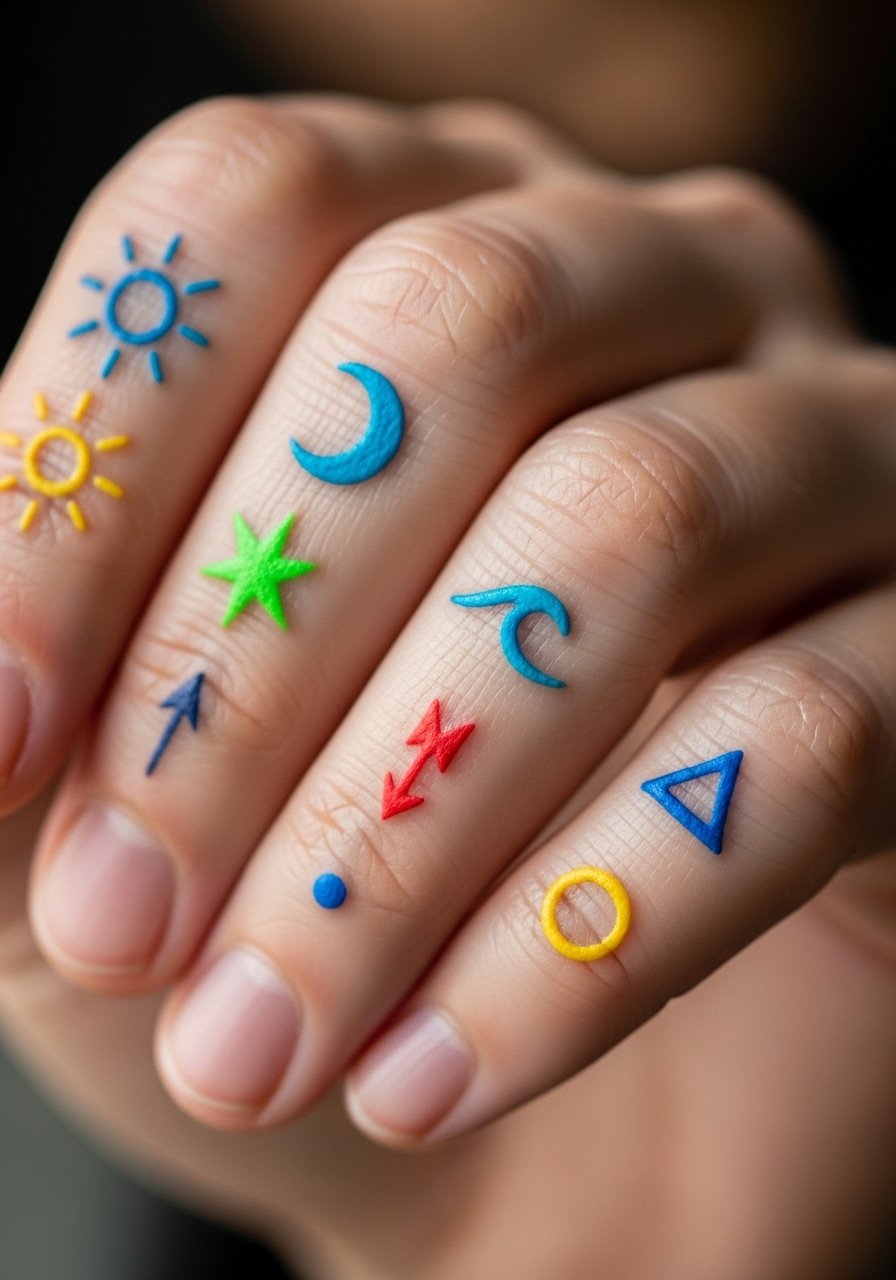
Symbols along the finger side are playful but fragile. The side of the finger has more constant rubbing against surfaces. Ask for simplified symbols and denser pigment. Expect touch-ups sooner than on the hand back, often at year one. For daily wear, avoid rings that sit directly over the symbols to reduce friction.
22. Saturated Butterfly on the Thumb Web

Butterflies need clear wing separation to avoid looking like a smudge later on. Ask for defined borders around the wings and a soft stipple shadow to lift the form. The thumb web heals reasonably well but sees zipper and phone friction. Plan a touch-up around year two. For accessorizing, a thin chain bracelet close to the wrist gives the hand a balanced look without covering the butterfly.
23. Hummingbird Mid-Hand Accent with Color Halo

Mid-hand placements read well with motion-oriented designs like a hummingbird. The halo helps the bird pop as it fades. Avoid ultra-fine wing lines that will vanish. Expect the halo to fade before the bird, and plan a touch-up for color balance after a year. For the session, wear a button-up shirt you can pull aside without brushing the area.
24. Pastel Geometric Band Around the Wrist Joint
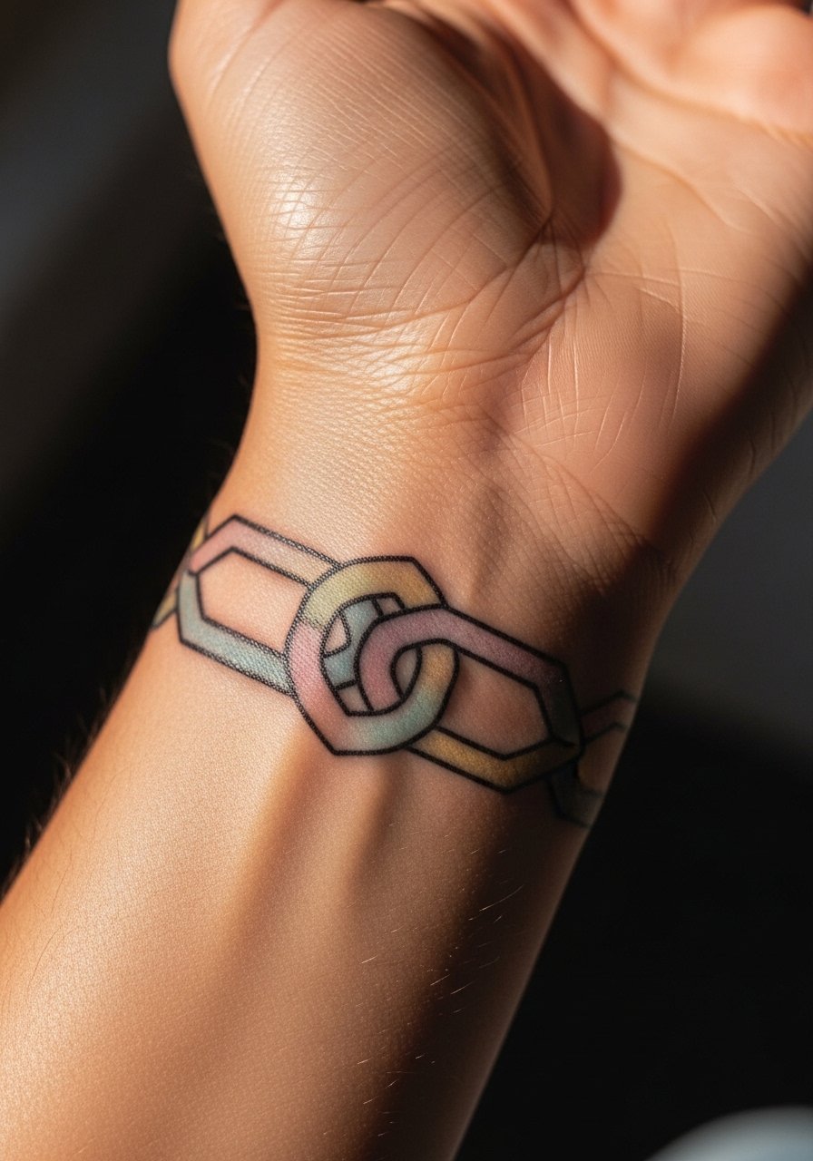
Wrist bands are visible and versatile, but joints move a lot so keep lines slightly thicker than you would on a forearm. The pastel palette needs denser underpainting to last. The band will soften with motion, so expect touch-ups at 12 to 18 months. For daytime styling, a minimalist leather watch can frame the band without sitting directly on the tattoo.
25. Neon Script Along Finger Side

Script in neon hues can read beautifully when the letters are spaced and bold. The side of the finger needs more pigment to hold neon. A common mistake is choosing tiny cursive that becomes unreadable. Expect frequent touch-ups. If you want this to last, choose one word and ask for solid letterweight. For showing off, a single thin band ring helps the neon script stand out without competing.
26. Colorful Wave Motif on the Lateral Hand
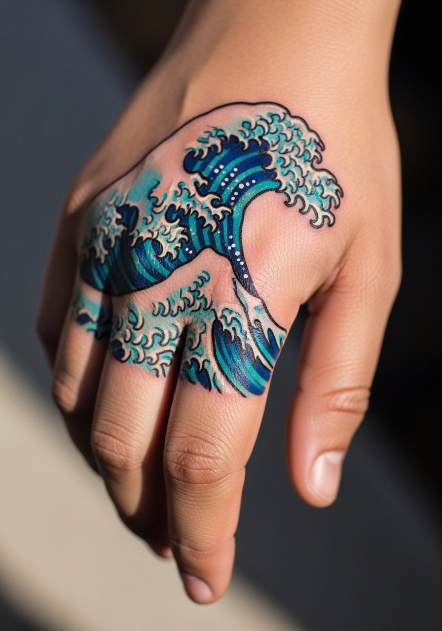
Lateral hand motifs follow the hand contour and work well with flowing designs. The lateral edge sees moderate abrasion from pockets and bags, so keep lines bold. Expect a touch-up at year two to refresh blues. The session is brief. For the appointment, wear a short sleeve tee to avoid sleeve interference.
27. Gradient Sunburst on the Back of Hand
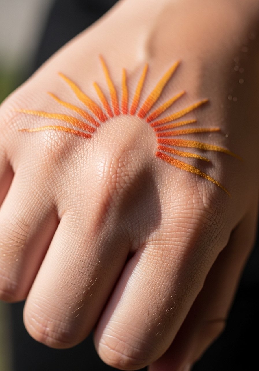
Sunburst designs are forgiving because the rays provide natural spacing. The trick is avoiding too many thin rays that will blur together. Ask for thicker rays near the center and softer feathering at the tips. Expect gradual fading in the outer rays and a touch-up at year two. For evenings out, wear a short sleeve blouse that keeps focus on the hand motif.
Frequently Asked Questions
Q: How long will colorful hand tattoos last before needing a touch-up?
A: It depends on placement and daily activity. Fingers and knuckles tend to need touch-ups around year one. Back-of-hand pieces usually hold up longer, often needing refresh at year two or three. Expect high-maintenance spots to require more frequent color boosts.
Q: Are pastel and watercolor styles a bad idea for hands?
A: They work if you accept higher maintenance. One camp argues pastel and watercolor fade too quickly on hands. The other camp says careful saturation and anchor outlines can make them last. If you like soft palettes, build in a touch-up budget and ask the artist to layer a stronger base.
Q: What should I wear to the appointment for a thumb or wrist tattoo?
A: Wear something that gives easy access without pulling across fresh ink. For wrist and thumb sessions I like a loose tank top or a button-up you can slide off gently. Comfort helps keep you still during detail work.
Q: Do colorful hand tattoos carry more risk of blowout?
A: Blowout risk is about skin type, needle depth, and placement. Hands see a lot of motion and thin skin so blowout and softening are more likely than on the forearm. Choose slightly bolder linework and allow spacing in color blocks to lower that risk.
Q: Can I get a portrait or micro-realism on the palm or finger?
A: You can, but understand the trade-off. Palm and finger skin regenerate quickly so detailed realism blurs sooner than on other areas. If you want a tiny portrait, simplify detail and accept that touch-ups will be frequent.
Q: How should I protect colorful hand tattoos daily to keep saturation longer?
A: Sun protection and minimizing friction are the main levers. Use sunscreen on exposed pieces after they heal and avoid rubbing the area against rough materials. During the work week, choose looser pockets and be mindful of rings that sit over fresh ink.