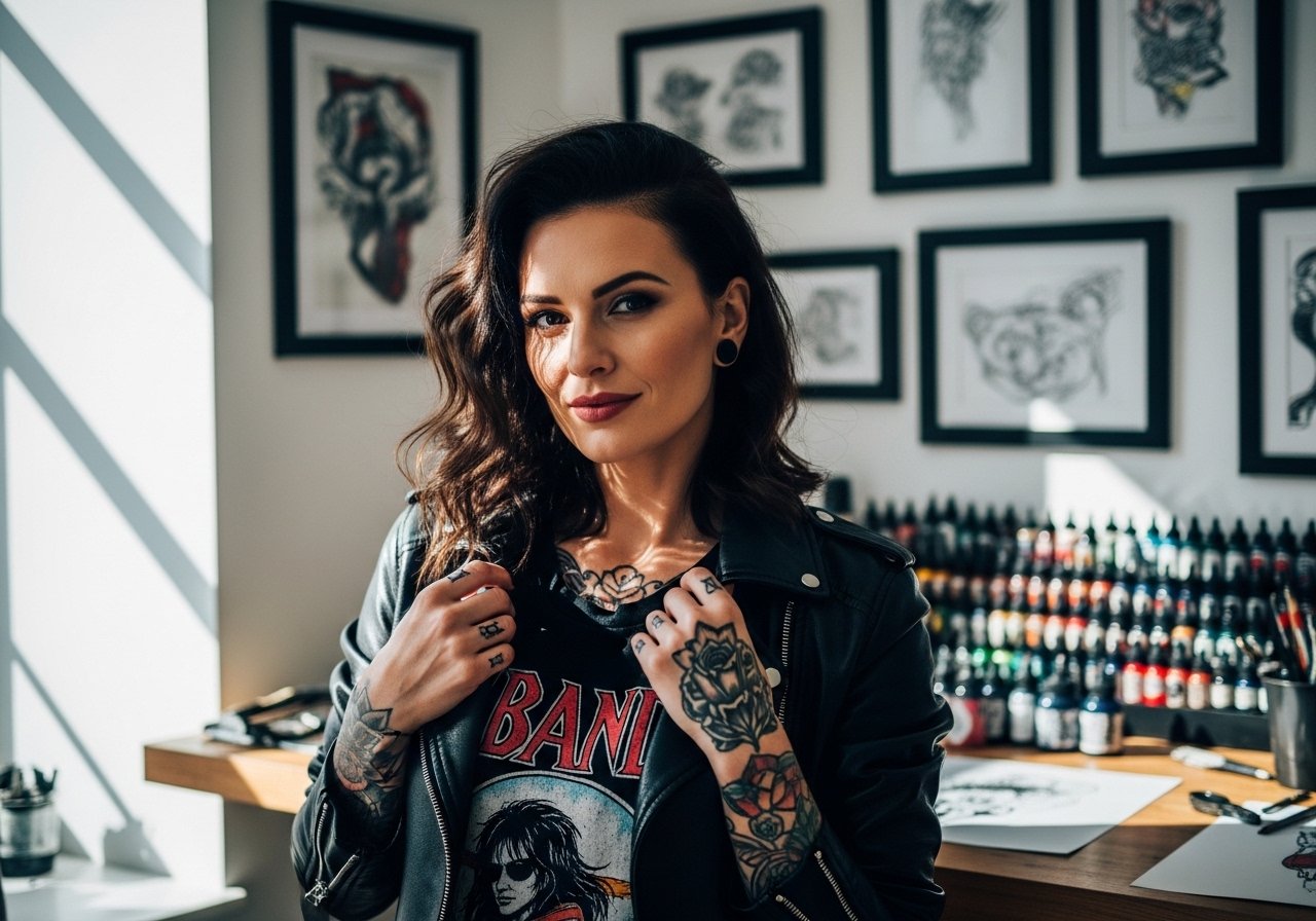
Fine line words behind the ear are everywhere on feeds right now, and the trend has exposed a gap between what looks gorgeous fresh and what still reads crisp after a year. Fading, unexpected blowout, and workplace visibility are the three issues I hear about most when people book this placement. Below are 21 word ideas sized and spaced for longevity, with what to ask your artist and how to show the tiny script off.
1. Breathe, thin cursive script

A single-word cursive feels effortless behind the ear and reads like a private reminder. I recommend this when you want something personal that peeks out with short hair or an updo. Tell your artist you want slightly open counters and a clean baseline so each letter has room to age. The common mistake is asking for ultra-fine hairline curves that merge after a year. Expect the first six months to show crisp strokes, then softening by year two with potential touch-up at year three. For showing it off, a thin chain pendant necklace sits just above the script without competing. Note on hiring and careers, visible ear-area ink still raises questions in some workplaces, so plan accordingly.
2. 1994, micro numerals

Dates behind the ear read like a bookmark. This placement suits someone who wants a tiny marker rather than a statement. Ask the artist for slightly bolder numeral stems than you think you need so the zero, one, and nine keep definition over time. A common error is having numerals drawn with identical thinness; small counters blur first. The session feels quick, often ten to twenty minutes, but the area is sensitive near bone and hairline so expect a sharper sting than on fleshier zones. Touch-ups are common by year three for micro numerals because the tiny counters lose crispness.
3. listen, lowercase minimalist script

Artists split on fine line behind the ear for a reason. One camp says the thin skin and frequent movement blur tiny scripts within two years. The other camp argues that with slightly deeper placement and deliberate spacing, fine line scripts can last as long as similar work on the forearm. If you pick this word, ask where your artist falls on that split and request spacing over dainty tightness. The worst version is a crowding of letters that look perfect fresh and then merge into an unreadable smudge. For the session, pull hair up with a silk scrunchie so the artist has clean access and you avoid hair tugging afterward.
4. R, single-letter monogram

A monogram letter plays like a personal stamp. This is a good choice if you want something classic but compact. Tell the artist you want the stem slightly thicker where necessary for longevity and a little negative space around the bowl so the letter keeps its shape. People often request extremely thin serifs that disappear into the skin with time. Expect a short session with localized soreness and pressure near the mastoid bone. If you wear statement earrings, choose sizes that frame rather than crowd the initial ring of ink.
5. stay, cursive with tiny dot work flourish

Adding a tiny stipple accent to a script word gives the piece texture without adding bulk. Recommend this to someone who wants a hint of ornament that still reads discreet. During consultation, ask for stipple shading that sits apart from the letters rather than overlapping thin strokes. A typical mistake is forcing stipple into the letterforms where it speeds blur. At six months the dot work often reads softer but still distinct. For outfits, small hoops or a delicate huggie earring frame the area and draw just enough attention.
6. XII.VII.MMX, Roman numerals

Roman numerals are compact and graphic, which helps them age better than tiny cursive. Ask for slightly increased spacing between characters so the vertical strokes do not visually merge later. A common mistake is lining up numerals too tight for a small canvas. Expect a short session and modest tenderness where the skin sits over bone. Over time the straight strokes maintain shape better than loops, but plan for a touch-up if you want the numerals to stay crisp after several years. For the appointment, wear hair up and a slip-on headband so the artist can work without you fussing with clips.
Pre-Session Essentials
The tiny word pieces above live in a high-friction, hairline zone, so a few small items smooth the session and the first week.
-
Stencil transfer paper kit. Lets you preview placement and scale on the neck so you can check how the word reads with your hairstyle.
-
Topical numbing cream. Applied per the product directions it reduces the sting near bone for nervous first-timers.
-
Thin protective film roll. Useful if your hair brushes the area or if you sleep on the side with the fresh ink.
-
Fragrance-free gentle body wash. Cleans the area without irritating the fine line ink that depends on open channels to heal clean.
-
Aquaphor healing ointment. A thin layer in the first days helps prevent scab cracking which can pull at delicate linework.
7. BRAVE, micro caps for bold read

All caps increases legibility at tiny scales. I point clients to this if they want a readable statement that still tucks behind the ear. During the consult, ask the artist to thicken vertical strokes slightly while keeping overall scale small. The common mistake is keeping strokes too thin which makes the letters disappear. At six months the caps usually remain legible, but expect softening at year two. For nights out, a cropped hairstyle or a pair of small hoop earrings helps the word be visible without asking you to change your look.
8. Morse code translation of a word
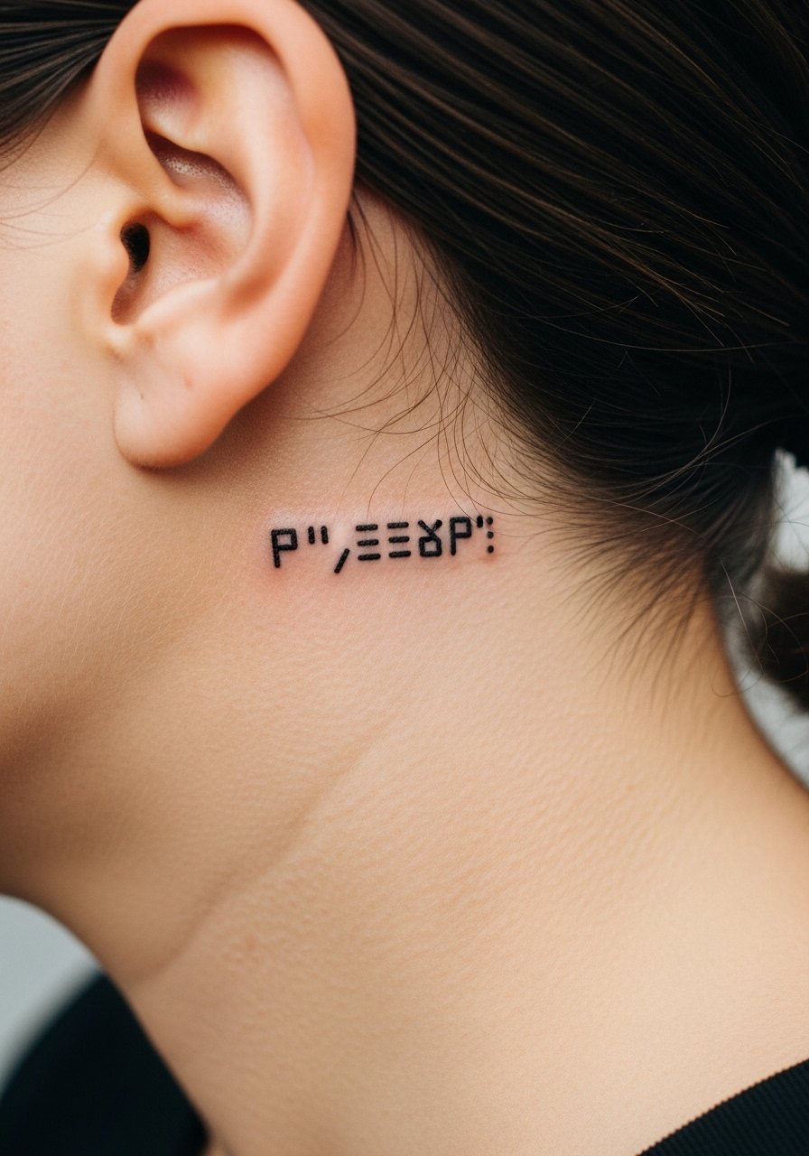
Morse code turns a private word into a quiet graphic. This works for people who want meaning without readable text. Tell the artist the exact dot-and-dash spacing you want, and confirm the scale so the dashes do not melt together. Mistakes happen when dots are too close and form a blurred line. The feel of the session is brief and steady. Over time the tiny dots can soften into a dotted blur if ink sits too shallow, so ask about touch-up timelines. If you plan to keep hair long, consider how the pattern will peek under strands during daily life.
9. Coordinates, exact format

Precision matters for coordinate tattoos. Always provide the exact characters you want the artist to reproduce. Ask for monospace type so decimals and commas align and the numbers age uniformly. A common slip is relying on memory so a digit changes during the stencil step. Tiny numerals tend to keep shape better than looping scripts, but expect slight softening at year two. For showing coordinates, a cropped ear cuff or simple stud earring frames the area without covering the numbers.
10. &, tiny ampersand glyph

An ampersand is a punctuation piece that reads like punctuation for your style. This is for someone who loves typography and wants a compact sign. Ask an artist to draft a few type options so you can pick a version with open counters. The mistake is picking an ampersand with too many tight loops. The session is usually quick and low on aftercare compared with larger work. Over years, single glyphs maintain their shape if given a little room. Consider small studs that let the symbol peek out.
11. rise, vertical micro script along hairline

Vertical script uses the hairline as a frame and feels discreet. This placement is great when you want a word that disappears with hair down. Tell the artist to keep the letters slightly taller than normal so ascenders and descenders do not collapse. A typical mistake is shrinking the letters to fit horizontal expectations. The session requires careful stretching of the skin near the neck, which can feel tight. After a year vertical scripts can soften along the long axis, so ask about spacing for longevity. Pair with a small chain ear cuff to highlight the vertical composition.
12. Zodiac glyph, tiny symbol

A zodiac glyph reads like a small emblem rather than text. This is smart when you want personal meaning without letters. Ask for bold pivots in the symbol to prevent thin strokes disappearing. The common error is copying a heavily stylized glyph that relies on tiny joins. Session time is short and the area heals quickly unless you sleep on it. Over time glyphs with straight bars hold up better than those made of hairline curves. For visibility, a cropped ear accessory works well.
13. kind, lowercase with thin underline

A tiny underline anchors the word and helps it read as a unit. I recommend this when the word itself is short and you want a visual base. Tell your artist to separate the underline slightly from the letter tails and to keep its thickness close to the letter strokes. The mistake is an underline that touches letters and accelerates merging. Expect the first month to have scabbing along the fine underline, then a smoothing as it heals. For styling, a slim hoop earring keeps attention on the area without competing.
14. bloom, word with tiny leaf accent

Pairing a word with a micro botanical flourish softens the text and gives it life. This is a good pick if you like tiny decorative elements that do not add visual weight. During consultation, ask that the leaf sits clear of letter strokes and that the veins are stippled rather than solid. The common mistake is overcrowding the letters with ornament. Sessions are slightly longer than a single word because of the detail, but still short. Over years the leaf will show softer than the text, which can be a subtle, pleasing contrast.
15. anchor, single-word with minimalist wave
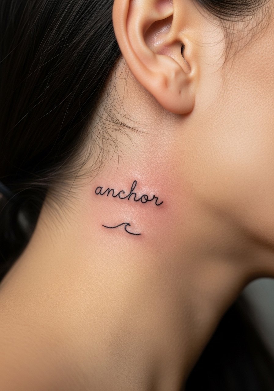
Symbol-plus-word combos let you tell a compact story. Ask your artist to separate the wave from the letters so each element breathes on its own. A typical mistake is making the wave too close which causes merging. Expect a modest session and a sensitive spot where the neck meets bone. For evenings out, short hair or an asymmetrical bob highlights the little composition. A simple stud earring complements without covering it.
16. no, tiny negative-space serif

A compact two-letter piece can be surprisingly striking. Negative-space serif approaches are modern but need design that anticipates how ink settles. Ask the artist to draft a reversed or open version to see what reads best at that scale. Mistakes include relying on packed serifs that fill in. The session is short but concentrated. Over time the negative space gets smaller, so a touch-up may be required to restore crisp edges. This choice reads bold without being loud.
17. wander, script with tiny star

For those who travel a lot, a tiny script with a star acts like a passport stamp. Tell the artist you want the star spaced away from the script and stippled rather than solid to prevent visual crowding. A mistake I see is asking for both overly delicate script and a dense solid star. The session feels quick and a bit tingly near the hairline. Over a few years the star's dots soften more than the letters. Style it with a textured hair clip when you want to show a hint of the piece.
18. hush, tiny lowercase with breath gap
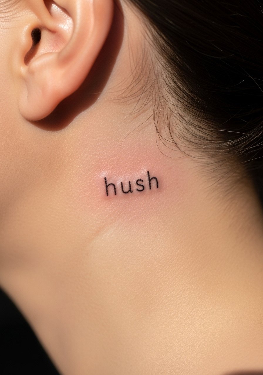
Placing tiny gaps between letters improves longevity for some scripts. Use this when you want the word to remain readable longer. During consult, ask for deliberate letter spacing rather than default kerning. The typical error is cramming letters to match a visual sample that was intended for a bigger canvas. The session is brief. Over time the gaps help prevent merging so this tactic reduces the need for early touch-ups.
19. Memento, small Latin-style script
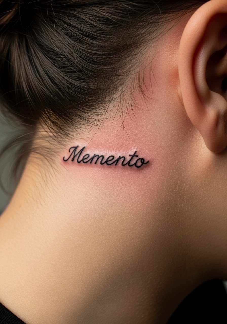
If you pick a phrase with cultural origins, approach with respect and opt for a slightly personalized rendering rather than a direct cultural motif. For "Memento" choose letterforms that feel intentional and ask the artist about spacing that will hold up. The mistake is borrowing dense calligraphy meant for larger areas. Expect a calm, deliberate session. Over years short Latin words tend to remain legible if given room and modest stroke weight. A tiny pendant or short hair will let the word peek when you want it to.
20. yes, micro lowercase with dot accent

A tiny affirmative can be quietly visible and uplifting. Ask the artist to draw the dot separate from the letters so it remains distinct as the ink ages. The common mistake is merging the dot into the tail of the s. This placement is low on session time but sharp on sensitivity. If you want it to last, err on the side of slightly thicker main strokes. A small stud brings attention without crowding.
21. remember, handwritten tiny script
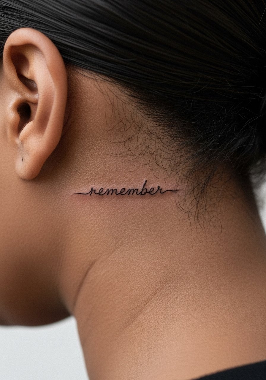
Handwritten script behind the ear feels intimate, like a private note. When you bring a handwriting sample, ask the artist to translate it into slightly more open letter shapes so the loops do not merge later. The most common mistake is asking for an exact micro copy of messy handwriting which becomes illegible when scaled down. Expect a short, focused session and localized soreness. For showing it off, wear your hair in a high bun or a minimal claw clip so the word peeks through.
Frequently Asked Questions
Q: Will a fine line word behind the ear blur faster than the same design on the forearm?
A: In my experience, yes it often softens faster because the skin near the hairline is thin and moves a lot. The difference depends on spacing and the artist's approach. Ask for slightly wider letter spacing and modest stroke weight to slow the blurring.
Q: How painful is getting a tiny word behind the ear and what should I wear to the appointment?
A: Expect sharper, short stings because the area sits close to bone. For the session, wear your hair up with a silk scrunchie and a loose top so you can move freely. A calm breath and knowing it is a quick piece helps.
Q: How often do these tiny words need touch-ups?
A: From what I see, small scripts may need a touch-up around year two to three, especially if you sleep on that side, have heavy sun exposure, or use strong exfoliants. Proper initial spacing reduces the need.
Q: Are there professional concerns with visible ear-area ink?
A: Yes, some industries still view visible tattoos conservatively. Behind-the-ear pieces can be hidden by hair, scarves, or small accessories, which is a common strategy for people balancing visibility with workplace expectations.
Q: How do I find an artist who respects fine line durability for this placement?
A: Use discovery paths like local studio directories, convention lists, and hashtag searches that include your city plus "fine line" or "micro script." Look for healed photos of behind-ear work rather than fresh shots to judge longevity. Ask in consultation about how they space tiny letters.
Q: Is aftercare different for behind-the-ear tattoos compared with other spots?
A: The steps are the same, but practicalities differ because hair can rub the area and sunscreen application may be awkward. Keep hair away during the first week and be mindful of pillow contact. For post-session protection, a lightweight headband can reduce friction while you heal.