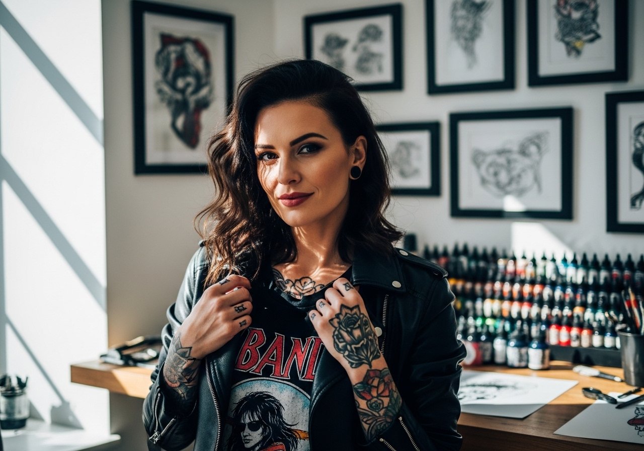
Fine line arm band tattoos look delicate at first glance and still read strong when planned for real life, not just for a feed. Trends push thinner and tighter bands, but longevity depends on spacing, placement, and how the skin moves. Read through these ideas with an eye for what holds up, what needs touch-ups at year two or three, and which pieces pair best with your wardrobe and session prep.
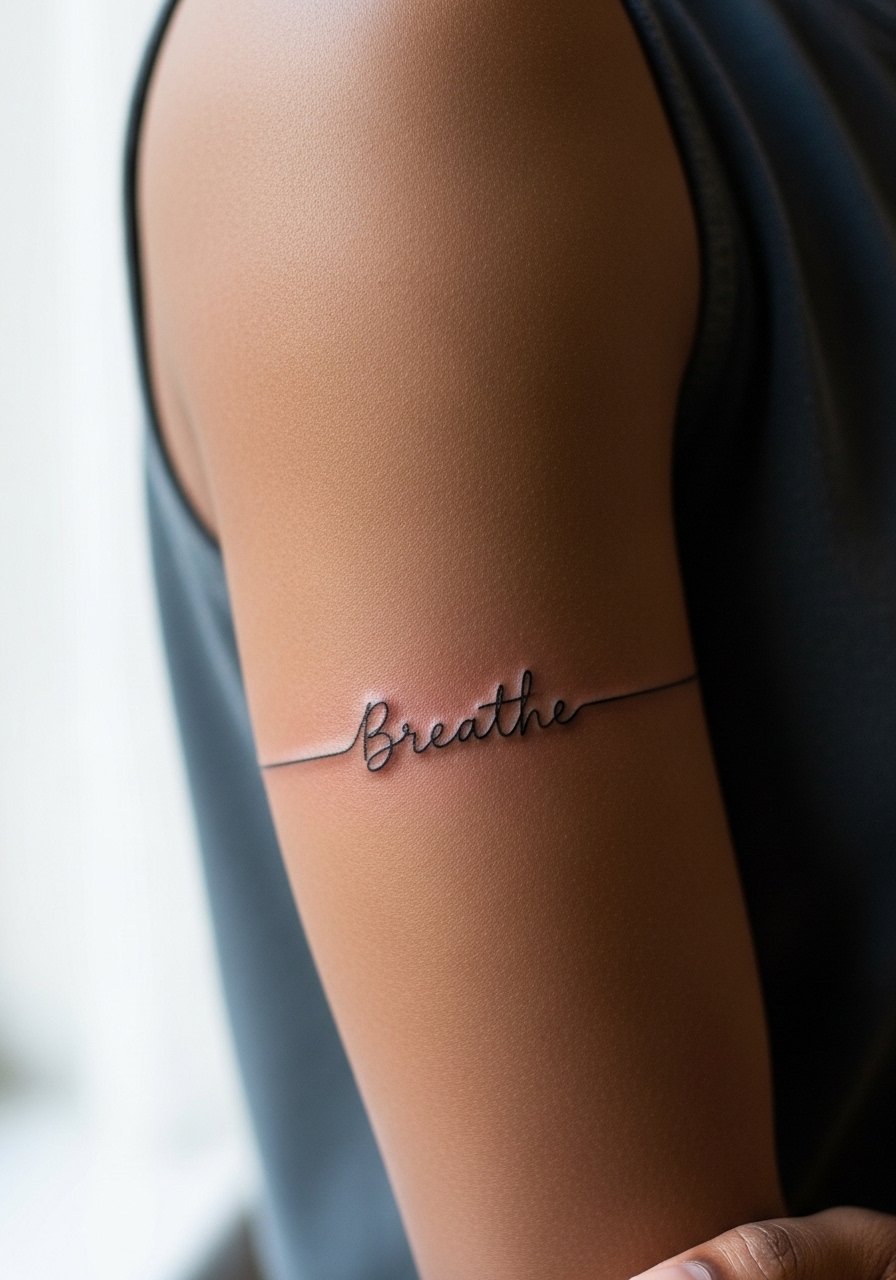
1. Minimal Single-Line Inner Forearm Band

I've seen single-line bands hold beautifully on inner forearms when artists keep line weight consistent and allow a tiny breathing room between repeated lines. Fair warning, the biggest mistake is asking for a line too thin to begin with; it looks great at first and then softens into a gray in three years. Tell your artist you want visible linework at 6 months and ask for slightly heavier line weight than a tattoo you only plan to photograph. Pain is low to moderate and a session runs short. For showing this off, wear a loose button-down shirt with sleeves rolled to the elbow so the band sits cleanly against neutral fabric.
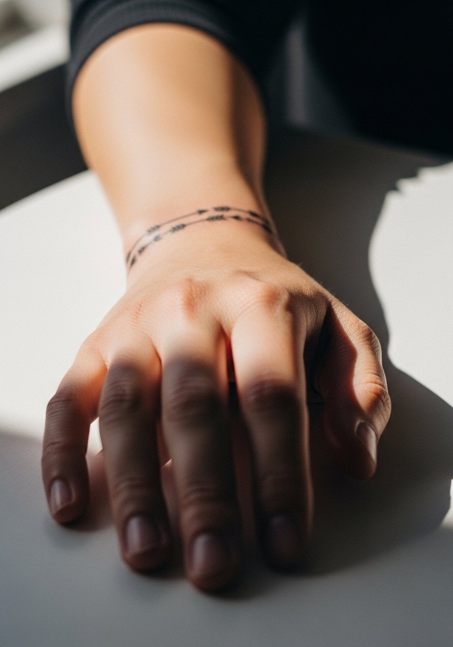
2. Double Parallel Wrist Band
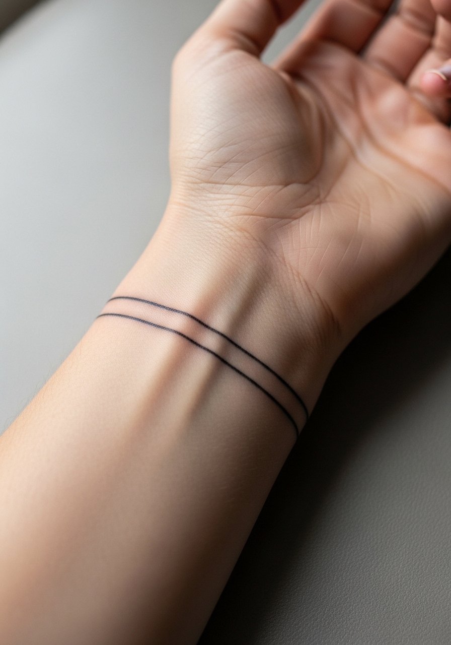
When you want a wrist band that reads deliberate, go for two parallel lines with a small gap instead of a tight cluster of micro-lines. The main risk here is friction and daily washing wearing the edges faster than on the forearm. Expect touch-ups earlier than on larger arm areas. Session time is brief and pain at the wrist is higher than the inner forearm. For session day, pull on a racerback tank so sleeves do not rub the fresh ink. A common consult note: ask the artist to test a short stencil wrap so the lines sit naturally with your wrist flex.
3. Continuous Geometric Upper Arm Band

Personal observation: geometric repetition looks most intentional on the upper arm where muscle movement is moderate. The common mistake is compressing too many shapes into a small circumference. That makes the design merge as it ages. In consultation, ask for wider negative space between elements and for stipple shading only in larger negative pockets. Pain is low and sessions take moderate time. Pair this with a loose linen shirt on warm days so the armband catches the eye when sleeves hit mid-bicep.
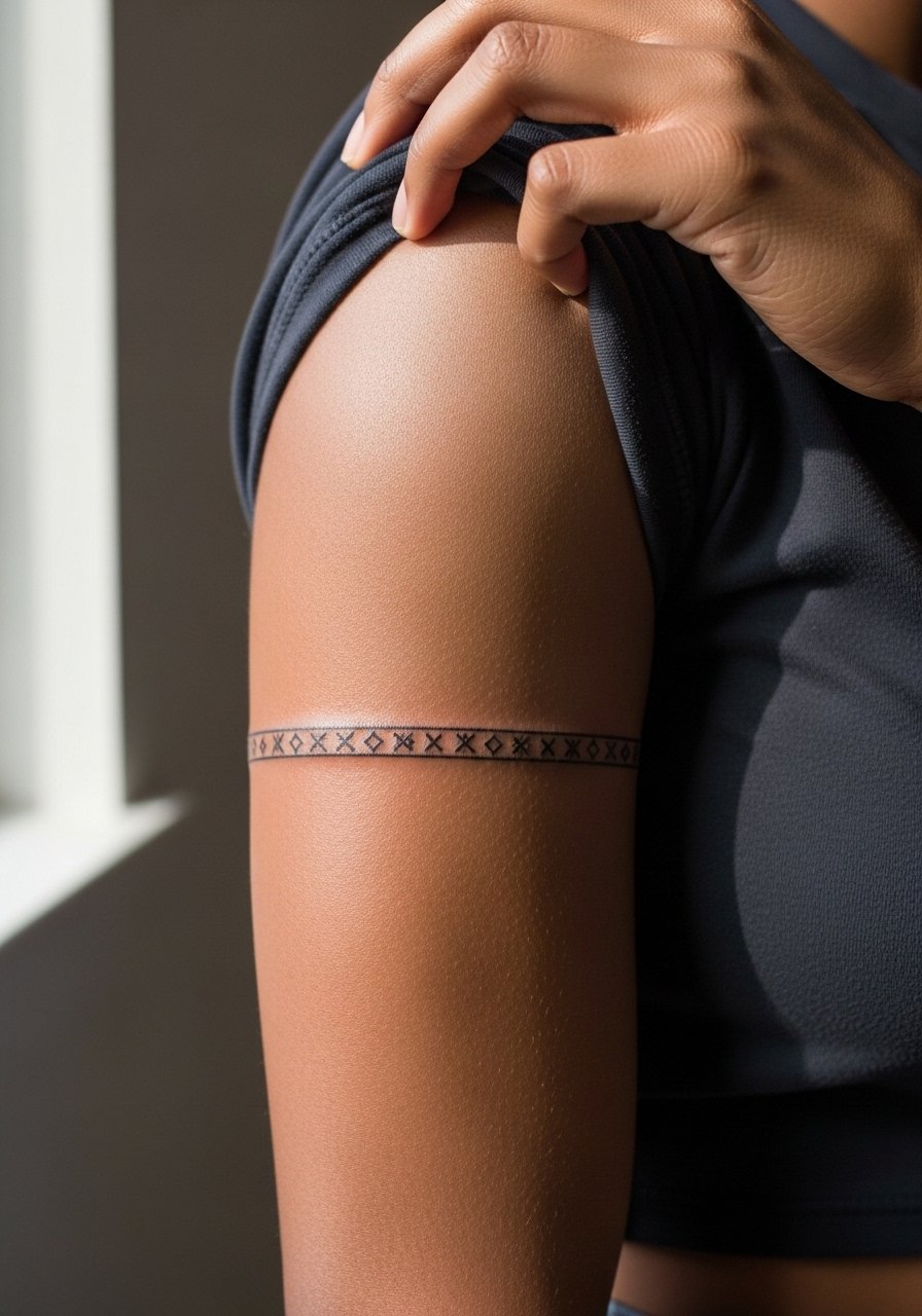
4. Braided Rope-Style Mid-Bicep Band
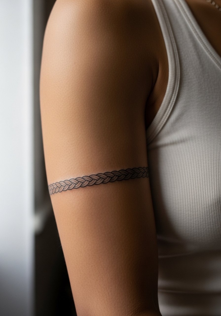
The visual impact of a braided band comes from the contrast between tight linework and open spaces. A real mistake is asking for too fine a braid pattern. On the bicep the skin tolerates tighter detail better than the wrist, but give the artist room to widen the strands slightly. Session feeling is a steady buzzing with low to moderate pain. Tell the artist you want the braid to read clean at year two and ask about spacing that anticipates slight softening. For evenings out, a rolled sleeve or a short sleeve linen shirt frames the pattern without covering it.
5. Negative Space Wave Band at the Elbow Crease

A negative space band that hugs the elbow crease needs smart placement because the crease is a high-movement zone. Pain spikes briefly when the needle crosses the joint. The aging issue is obvious: lines across creases can blur faster. Artists split on whether to place the band just above or below the crease. One camp says above the crease avoids most stretch. The other camp argues that slight overlap with the crease helps the band sit naturally when the arm bends. Ask which they prefer and why. For the session, wear a loose drawstring linen pant if the artist needs you to shift positions, but mostly make sure your sleeve can roll cleanly.
6. Micro Dot-Work Chain Around the Arm
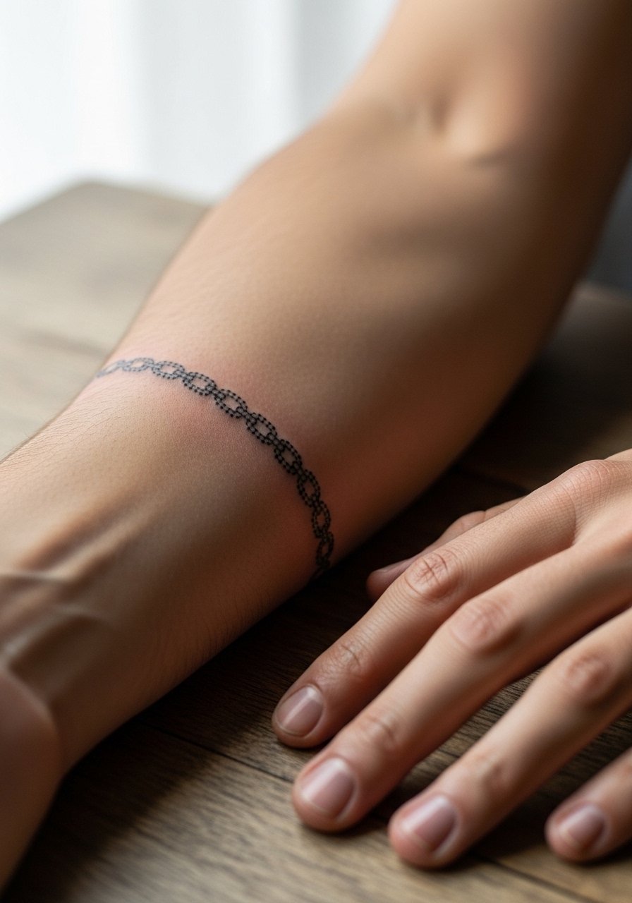
Dot work armbands age differently than continuous lines. The stipple shading that forms the chain effect can keep a sense of texture as it fades, but if dots are placed too close they can merge. The common mistake is asking for dot density that reads great at first but becomes a gray patch. In the consultation say you want visible individual dots at six months. Pain is low and sessions take longer than a single line. For showing it off, stacked bracelets work well. Try a stacked dainty bracelets set that frames but does not crowd the dot pattern.
Studio Day Picks
The pieces above include wrist, inner forearm, and elbow placements that ask for different prep and a little gear for the first week.
-
Stencil transfer paper kit. Lets you preview placement on the skin so small bands can be adjusted before the needle touches the skin.
-
Topical numbing cream. Use as instructed before a wrist or elbow session to ease the sharp crossings near bone.
-
Thin protective film roll. Keeps delicate wrist and finger bands dry and shielded from early friction.
-
Fragrance-free gentle body wash. Cleanses the healing area without stripping the fine line saturation those bands depend on.
-
Aquaphor healing ointment. Thin layers in the first days help lock in moisture for tight linework until the scabs fall.
7. Thin Script Band Along the Inner Arm
When a phrase wraps the arm, spacing is everything. The usual mistake is choosing a font that lacks readability at small scale. Ask for the exact lettering size and request a stencil preview that wraps your arm in a natural curve. Inner arm sessions are moderate on pain and healing depends on how much friction the band gets from clothing. Expect a touch-up window earlier than on the outer arm. For the session, wear a loose tank top you can pull aside without pressing on the fresh ink.
8. Floral Vine Thin Band That Intertwines

There is something about a delicate vine band that reads organic on the arm, but it can lose definition if the leaves are too small. The fix is to increase negative space and use stipple shading for depth rather than a dense cluster of tiny leaves. Forearm placements are forgiving and age well with minimal touch-up. In the consult ask the artist for a slightly wider stem and ask where highlights will be left as skin ages. For nights out, pair this with an open-back midi dress or a rolled sleeve so the vine shows in motion.
9. Constellation Fine Line Band Around the Wrist

Constellation bands read like micro-realism when the stars have small negative spaces around them. The common error is packing too many stars in too small a space. That makes the connectors blur after a couple of years. Wrist bands face friction from watches and frequent washing so expect earlier fading. In consultation, say you want each star to remain distinct at two years. For styling, a minimalist watch or a thin chain bracelet keeps attention on the pattern without rubbing it too much.
10. Celtic Fine Line Braided Band

Celtic knotwork is all about continuity. The rookie move is shrinking complex knots into a thin band. That softens into an indistinct pattern. Ask for simplified knots and for the artist to map how the design wraps so joins do not create visual tension. Forearm placements hold detail well. Pain is low and sessions can run longer because of the wrapping. Pair this with a rolled sleeve linen shirt for casual days when you want the knots visible.
11. Thin Barbed Wire Arm Band
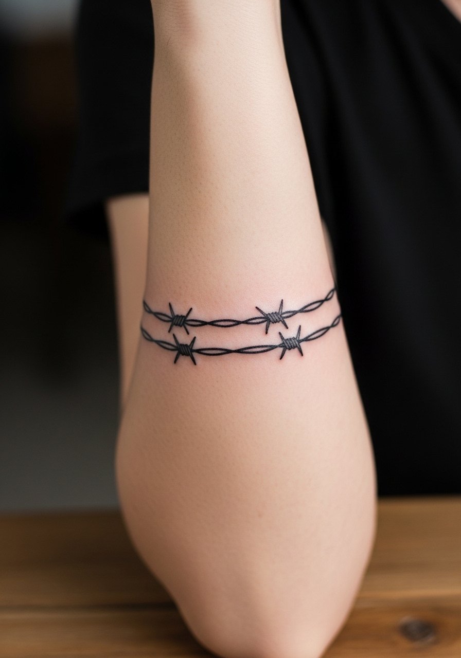
Barbed wire bands look bold but the tiny barbs can blur if placed too close together. The design reads stronger when spaced and when the barbs are slightly larger than micro. Forearm placement keeps the pattern readable longer than wrist placement. People often forget to consider how scarring or uneven healing could change the barb silhouette. Tell the artist to map the barbs against your natural muscle lines so they rest naturally. For session comfort, wear a loose button-down shirt you can pull aside.
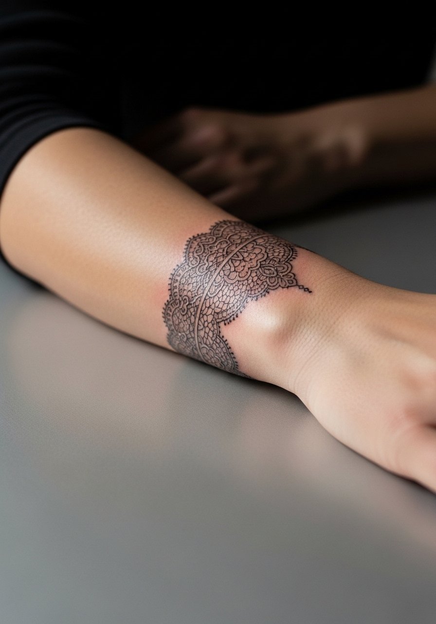
12. Thin Mandala Band with Negative Space

Mandala bands are gorgeous but dense mandalas tighten and merge as they age. The better route is repeating motifs with intentional negative space so the pattern keeps contrast. Upper arm placement allows for a bit more complexity than the wrist. The session can be longer because of the repetition and shading needs. In consultation, request the artist show how the pattern will look at six months and at year three. For evening wear, an open-shoulder blouse frames the band without covering it.
13. Morse Code Fine Line Band

Morse code bands let you encode a word discreetly, but spacing is critical so dots and dashes stay legible. The mistake is cramming long phrases into a narrow band. Ask for a short word or initials and request a test wrap of the stencil so the rhythm reads naturally when your arm is relaxed. Forearm placement keeps readability high. For showing it off, wear a short sleeve tee or roll sleeves to mid-forearm.
14. Botanical Thin Band with Tiny Blooms

Tiny blooms deliver a delicate repeat, but realistic petals become a blur if scaled too small. The better play is stylized petals with a hint of stipple shading to hold depth. Upper arm and outer forearm handle this design well. Session time is moderate and pain is low. Mention at the consult that you want each bloom readable at year two. For outfits, try a sleeveless linen dress that shows the blooms when you move.
15. Thin Bar Code or Linear Graphic Band

Linear graphic bands are modern and read sharply when the lines are spaced evenly. The common error is compressing the pattern so fine lines merge. Bicep placement tolerates finer detail than the wrist but still needs deliberate spacing. In consultation, ask for a reproducible stencil and preview at rest and when flexed. Sessions are moderate in length. Pair this with a tank top that leaves the bicep visible.
16. Connected Symbols Band That Tells a Story
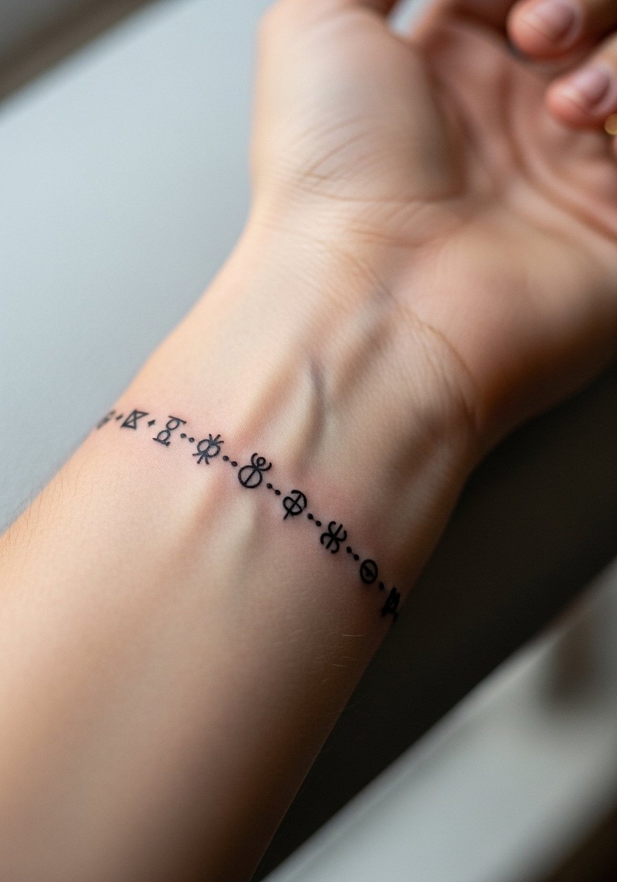
A story band needs visual pauses between symbols. The mistake people make is cramming too many elements without rhythm. Ask your artist to space symbols so each reads on its own at two years. Forearm spacing is forgiving. Session length depends on number of symbols. For session prep, wear a loose button-down shirt you can move without rubbing the site. For showing it off, layered thin rings and a simple watch keep focus on the symbols.
17. Thin Arrow Band with Negative Tail
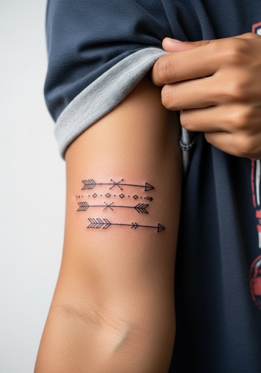
Arrows read kinetic and directional when the tails have negative space. The common mistake is repeating arrows too tightly, which blurs the movement. For longevity, increase spacing and consider whip shading on the feather for subtle texture. Forearm placement keeps the flow apparent. Sessions are short and discomfort is low. Style with a minimalist chain bracelet that runs parallel to the arrow flow.
18. Thin Lace Band That Wraps Lower Arm
Lace bands can look ornate, but small repeating scallops are the Achilles heel. Too fine and the scallops merge. Ask for simplified repeating motifs and for negative space to define scallops. Wrist-adjacent lace faces friction from bracelets and sleeves so plan for earlier touch-ups. Pain at the wrist is higher than mid-forearm. For nights out, a delicate cuff bracelet complements the lace without overcrowding.
19. Thin Chain-Link Band Around the Arm

Chain-link bands need consistent link size so the rhythm reads as intentional instead of patchy. Common mistakes are irregular links and tiny connector lines that disappear. Bicep placement reduces the chance of early merging. Sessions are moderate and pain is low. Ask the artist to preview the repeat pattern wrapped on your arm. Pair with a thin chain necklace that echoes the chain motif.
20. Thin Map Coordinates Band
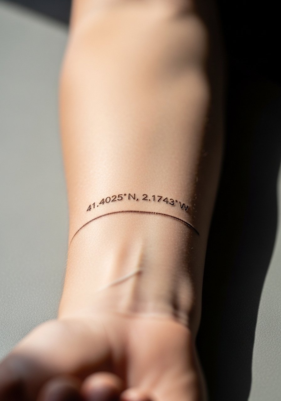
When numbers are the subject, exact spacing and font choice matter. The usual error is choosing a decorative font that becomes unreadable at scale. Ask for a clean monospaced or sans serif and request a wrapped stencil preview. Forearm placement keeps numbers legible longer. Session time is short and pain is minimal. Styling tip: a thin chain pendant necklace sits above the coordinates without distracting.
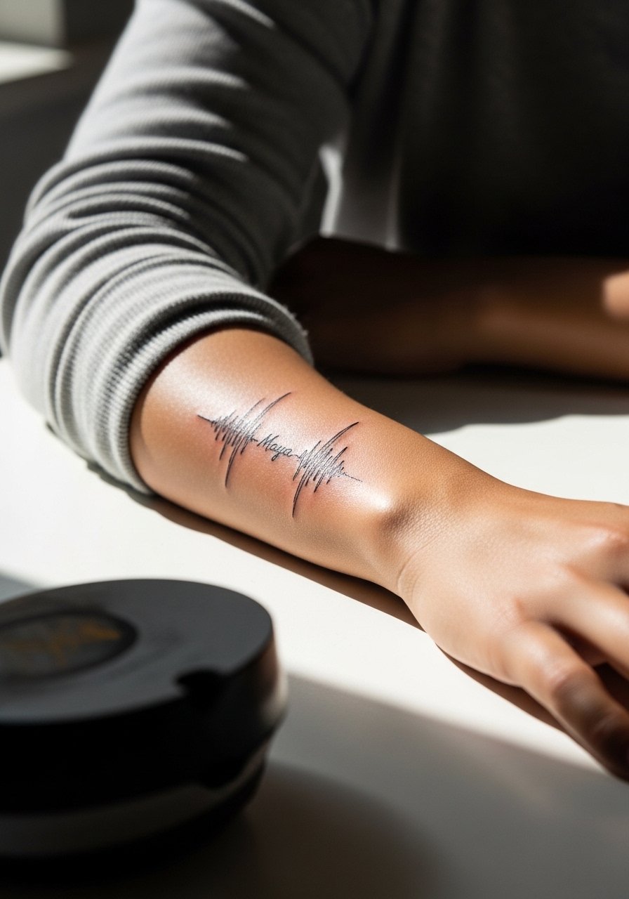
21. Thin Waveform Band That Echoes a Song

Waveform bands are personal and graphic. The big mistake is compressing a long waveform into a narrow band so the peaks and troughs lose shape. Pick a short phrase or chorus and have your artist scale the waveform so the peaks remain distinct at two years. Wrist location brings extra wear from watches and washing. For session day, wear a short sleeve tee you can move without rubbing.
22. Thin Chevron Pattern Band

Chevron repeats look modern but need consistent angle and spacing. Many people ask for too tight a repeat and the chevrons collapse visually as the ink softens. Forearm placement is forgiving but ask for slightly thicker outer lines so structure remains as the piece ages. Sessions are short. For styling, rolled sleeves and a casual watch band work well with the geometry.
23. Thin Soundwave Plus Name Band
Combining script and waveform demands coordination so the word does not break the waveform rhythm. The common mistake is inserting script without accounting for negative space, which makes both elements compete and fade into one another. Ask the artist to show the combined layout on a wrapped stencil and confirm legibility at two years. Forearm placement keeps it readable. For showing it off, a thin bracelet sits nicely beside the band.
24. Thin Tribal-Inspired Line Band
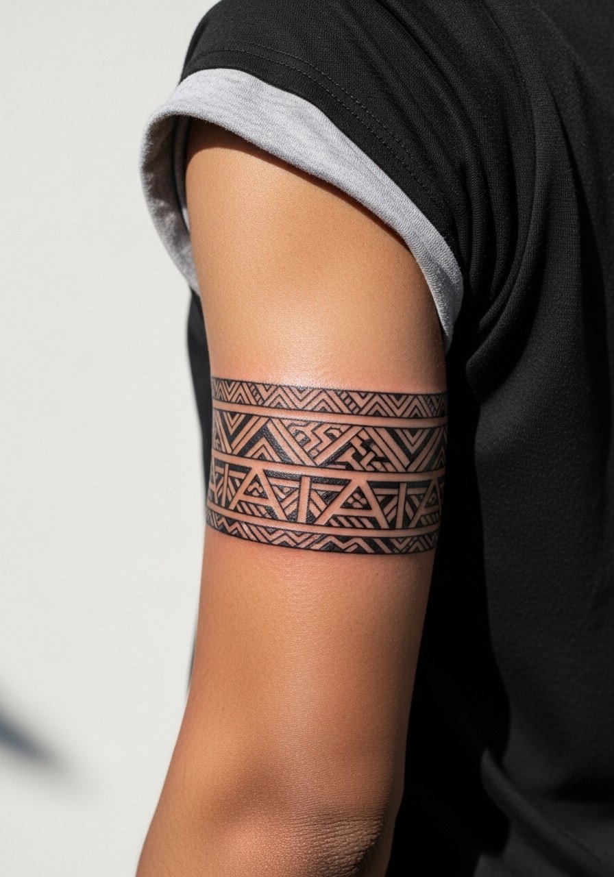
Tribal-inspired lines can be respectful when approached as a contemporary, simplified repeat. For cultural origin sensitivity, mention that motifs trace to a broader tradition and consider subtle variation rather than exact replicas. The typical error is copying intricate traditional work too small. Outer arm placement preserves structure. In consult, ask about cultural context and whether a simplified version is more appropriate. Pair with a simple linen tee so the pattern shows subtly in movement.
25. Thin Repeating Arrowheads Near the Wrist
Arrowhead repeats can make a subtle statement if the heads are slightly chunky rather than razor fine. Tiny heads lose shape. The wrist placement means you will likely need touch-ups sooner than on the forearm. Ask for preview stencils and slightly larger heads that keep a crisp silhouette after a few years. Session pain is higher around the wrist bones. For styling, try a minimalist bracelet set that complements the points.
26. Thin Interlocking Triangles Band

Interlocking triangles depend on exact angles. The common mistake is letting tiny misalignments sneak into the repeat, which becomes obvious when the band wraps. Forearm placement reduces distortion. In consultation, ask the artist to mark reference points on your arm to ensure consistent geometry. Sessions are moderate in length. For a casual look, wear a rolled sleeve cotton shirt so the triangles peek out.
27. Thin Honor Band with Small Symbols for Family
This is the wrap-up idea for a band that holds personal markers. The risk is overfilling the band with too many symbols which blurs identity and detail. Plan for a short list of symbols and insist each read as an individual mark at two years. Forearm spacing helps with legibility. During consultation, map each symbol and ask for a touch-up plan. For showing it, layer with a thin pendant necklace so the family markers sit within a subtle personal set.
Frequently Asked Questions
Q: Will fine line arm bands blur quickly compared with thicker bands?
A: From what I've seen, ultra-thin single lines blur faster than slightly bolder fine line bands because tiny channels of ink tend to spread. Placement and skin movement matter more than the aesthetic. Expect some softening by year three and plan for a light touch-up if you want crispness restored.
Q: Are wrist and hand bands worth it if I work with my hands?
A: Wrist and hand placements face more friction and sunlight so they do need earlier touch-ups. If your job involves heavy washing or manual labor, think through placement or choose a slightly bolder line weight. For session comfort, pick loose sleeves and avoid tight bracelets while healing.
Q: How do I bring up cultural sensitivity for a tribal or mandala band without offending an artist?
A: Say you want the design to honor the source and ask the artist for a simplified or adapted version. Mentioning that you want a contemporary interpretation opens a conversation rather than assuming permission. Use discovery paths like hashtag research and local directories to find artists who list cultural work in their portfolios.
Q: What should I wear to a session for an upper arm or forearm band?
A: A loose button-down or a tank top is easiest. You want clothing you can move without rubbing fresh ink and that gives the artist clean access while you stay comfortable during a one- to two-hour session.
Q: If I want a band that still looks defined in five years, what do I ask my artist?
A: Ask for slightly more breathing room between repeating elements, a modestly heavier line weight than the absolute thinnest option, and a plan for a touch-up around year two to preserve crisp edges. Also discuss sun protection for the area, since UV exposure accelerates fading.