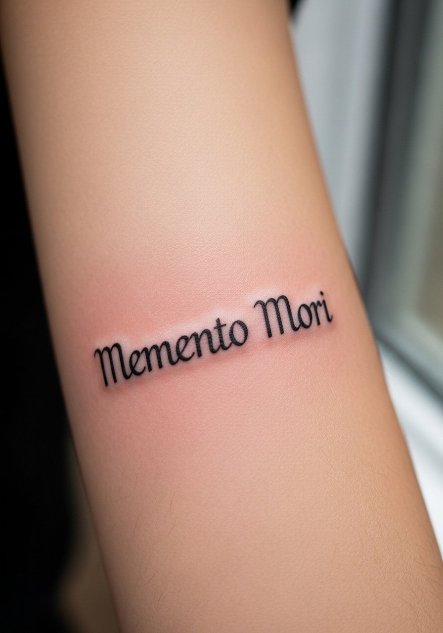
Fine line bible verse tattoos are trending for good reason, but the look that racks up likes on day one is not always the one that reads best at year five. Placement, line weight, and small wardrobe choices matter more than the font you pin. Below are 21 subtle verse ideas with real consult notes, how they age, and low-key styling tips so the script still sings after a few seasons.
1. Philippians 4:13 on the Inner Forearm, Fine Line Script
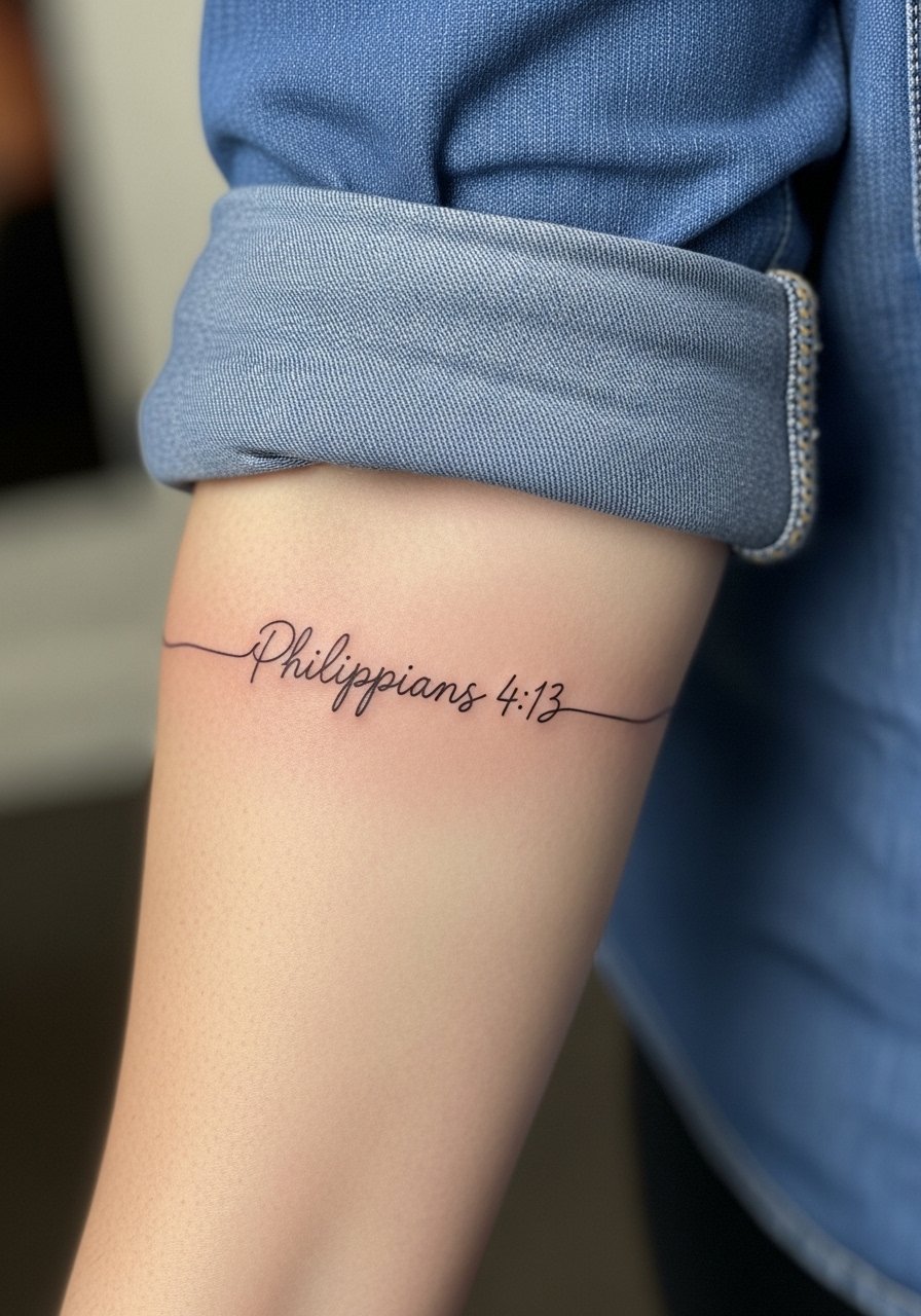
I recommend this for people who want a readable line that still feels delicate. Tell your artist you want slightly heavier linework than the thinnest fine-line fonts and two millimeters of letter spacing. A common mistake is asking for ultra-tiny lettering, which blurs on forearms after sun exposure. Expect the midline to look crisp at six months, slightly softened at two years, and require a light touch-up by year three if you spend time outdoors. For showing it off, roll a rolled cuff chambray shirt and add a thin leather cord bracelet on the opposite wrist.
2. John 3:16 Mini Script on the Wrist, Minimalist Outline
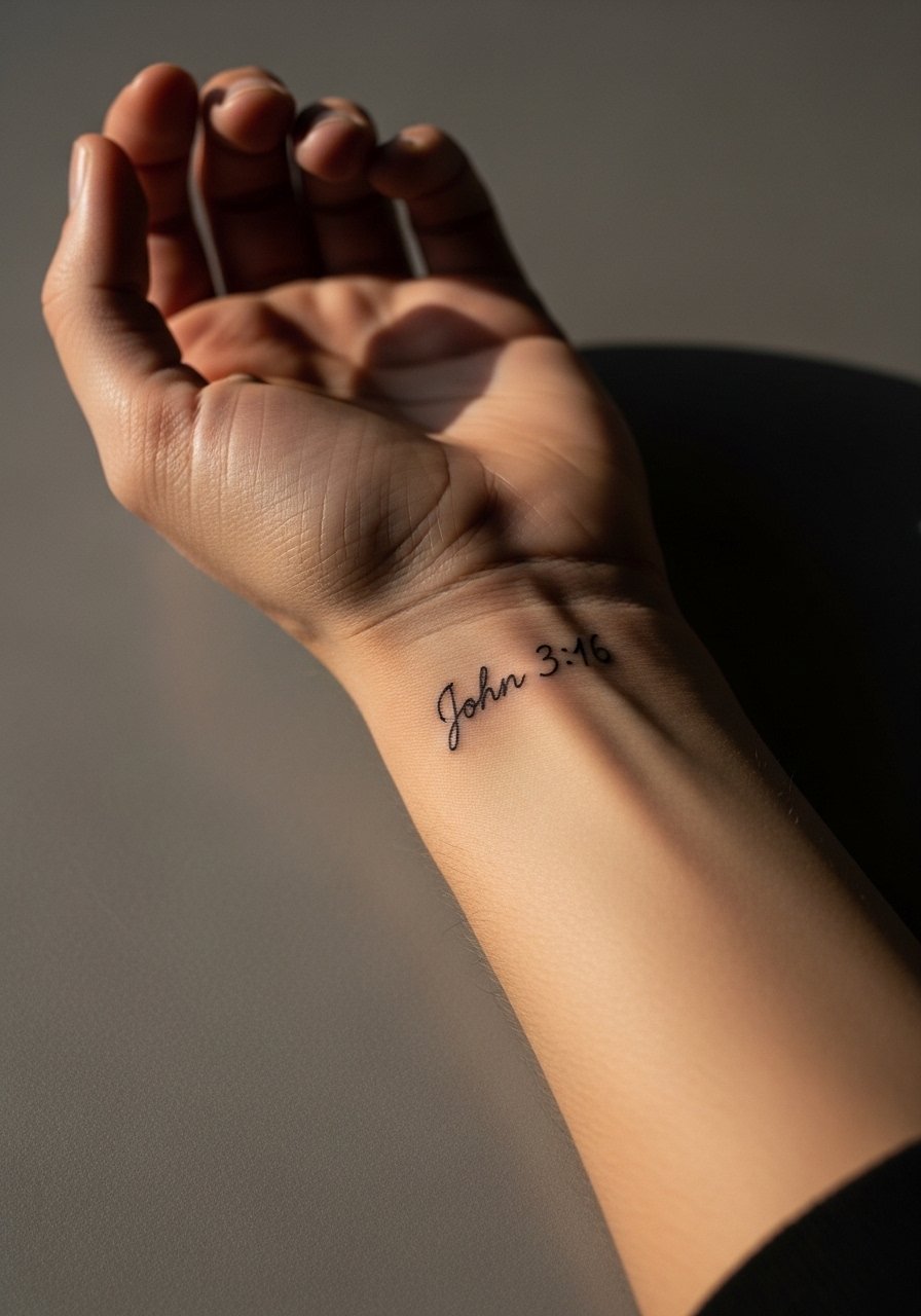
The wrist is classic for short verses, and the trade-off is longevity. If you want clarity past year two, ask for slightly bolder strokes applied at a shallow depth, not the wafer-thin micro script. Small wrist scripts often fade faster on darker skin tones, so get a mockup placed on your skin tone. Pain is low to moderate and sessions take under an hour. Avoid stacking bracelets at first while it settles. A single thin silver chain bracelet on the opposite wrist frames the script without crowding it.
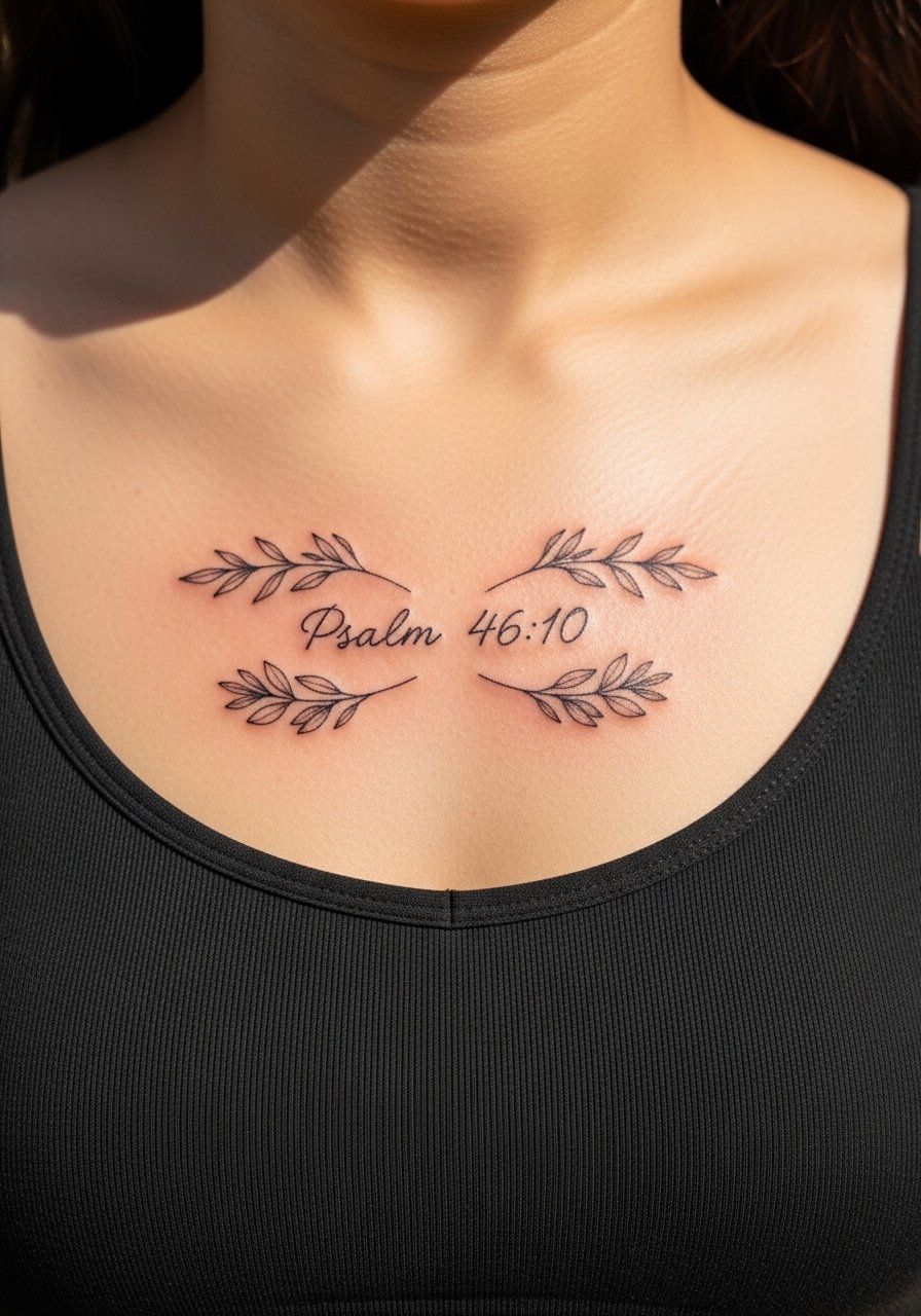
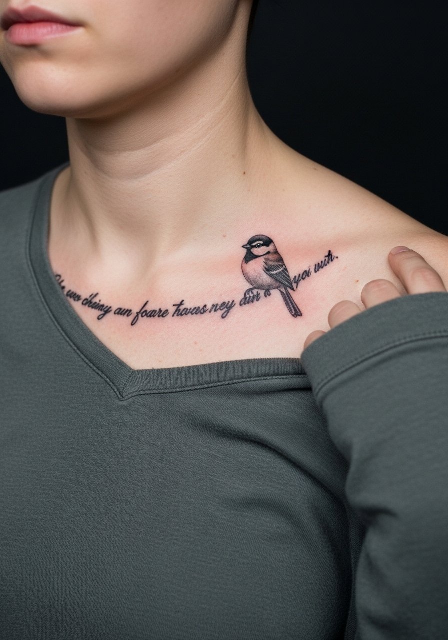
3. Proverbs 3:5-6 with a Dove on the Collarbone, Fine Line Illustrative
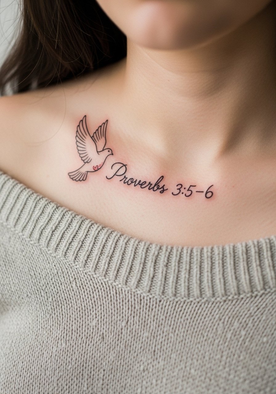
Collarbones show text with elegant spacing. Ask for a dove sized to sit just above or beside the line, not overlapping the letters. The collarbone can be bony and the artist may need to adjust needle approach, so expect a two-session consult for layout. A common aging mistake is cramming long verses across the curve, which causes letter distortion when the skin moves. For appointments wear a strapless bralette or an off shoulder knit top so the artist can shift fabric without exposing more than the collarbone area. Layer a layered pearl necklace below the line to complete the vibe.
4. Isaiah 41:10 Banner on the Ribcage, Blackwork Script
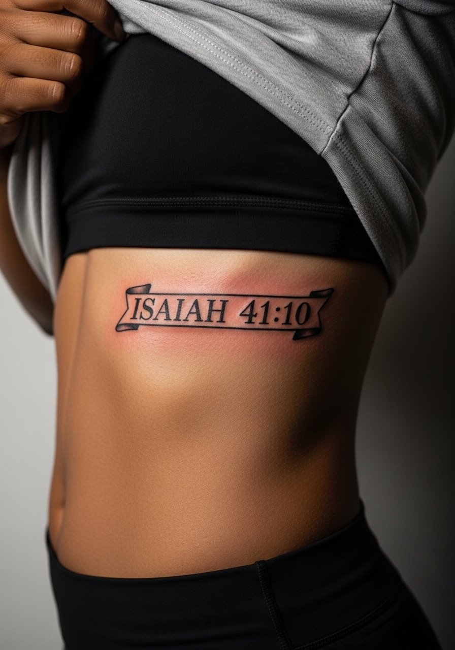
Fair warning, ribcage sessions rank high on most pain scales, but they also make for very private statements. Artists split on fine line here. One camp says ribs stretch and cause lines to blur within two years. The other camp says spacing and needle depth fix that. Ask the artist where they stand and for a stencil you can see on your skin before needle touches down. Expect two to three sessions for a neat banner and a possible touch-up at year two. For session wear pull on a cropped top you can lift slightly so the artist has clean access without exposing more than the working area.
5. Jeremiah 29:11 Outer Forearm, Watercolor Wash Over Script
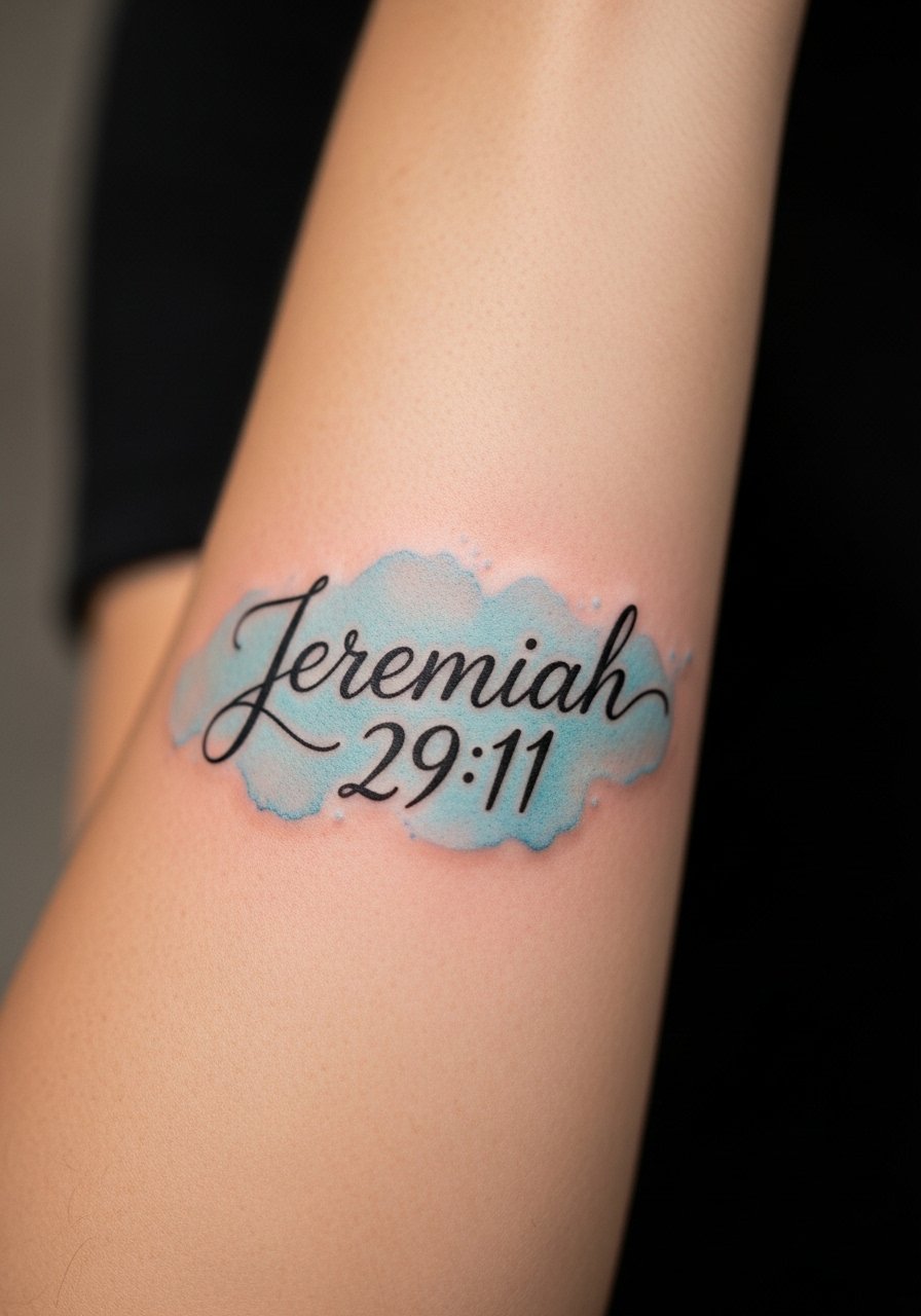
Watercolor over script looks modern, but washes often fade faster than black text. The trick is to ask for the wash to sit behind and not blend into the letters. That keeps the verse readable as the color softens. Outer forearm has less friction than the inner side, so color survives better there. For session day wear a loose fit button down shirt you can slide a sleeve up without tight seams. Touch-ups for the watercolor element are common at year two, while the black script may last longer.
6. Psalm 23:1 with Shepherd Icon and Floral Frame on the Shoulder, Neo-Traditional
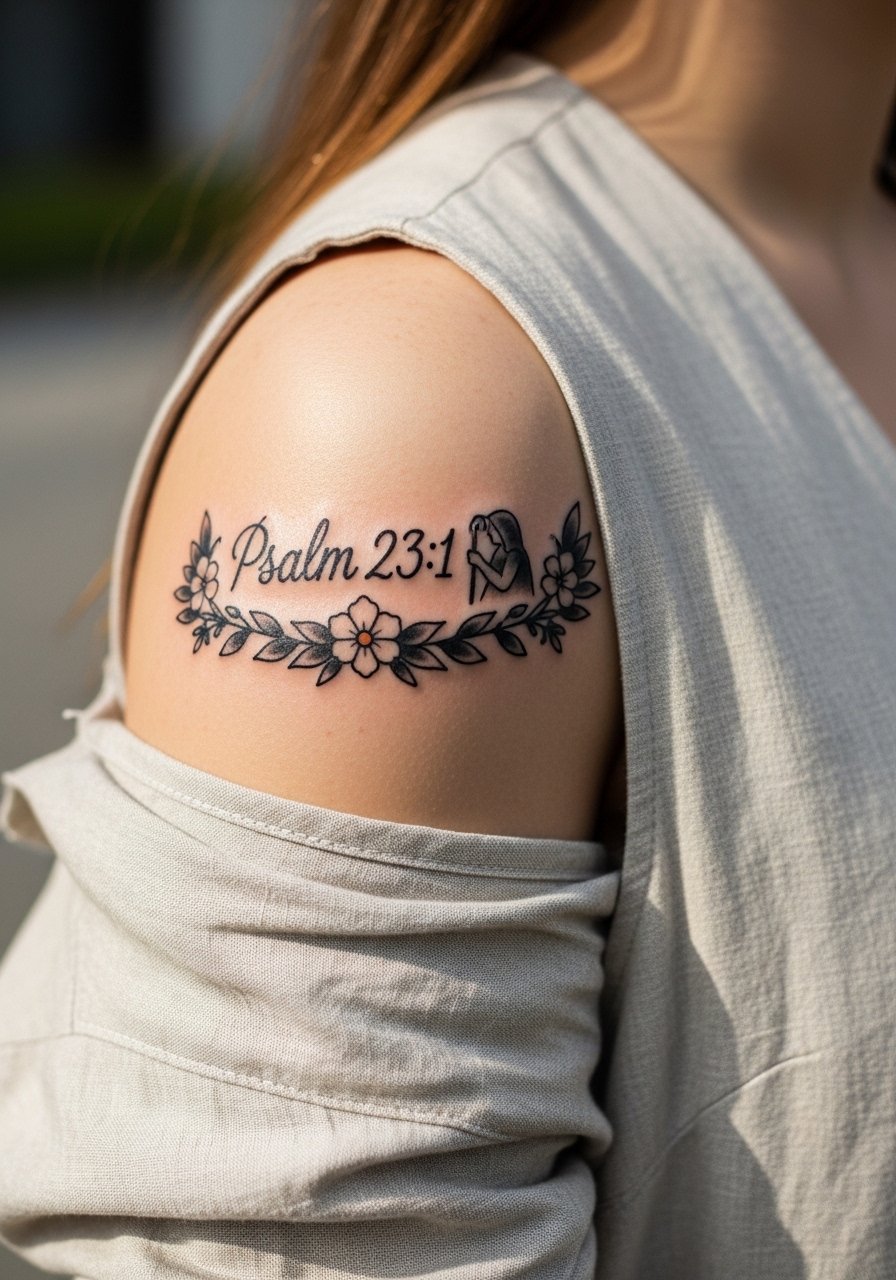
Shoulder pieces tolerate heavier saturation, so they are forgiving if you want color accents around your verse. Tell the artist you want the script to sit inside the frame, not over petals. A common error is compressing the letters to fit the art, which compromises legibility. Pain is moderate with short breaks. For showing off, a sleeveless linen tunic keeps the shoulder visible while feeling effortless. Expect color touch-ups at year three if you swim or sunbathe often.
Studio Day Picks
Those first six ideas range from exposed wrists to private ribs, so a few small items make the appointment and first week easier.
- Stencil transfer paper kit. Lets you preview the line placement on skin and avoid layout surprises for script-heavy forearm and collarbone pieces.
- Topical numbing cream. Helpful for ribcage or shoulder sessions when the pain could force frequent breaks that blur fine lines.
- Thin protective film roll. Keeps wrist and ankle pieces clean during the first week of frequent washing and movement.
- Fragrance-free gentle body wash. Mild cleansing preserves delicate linework without irritating fresh skin.
- Aquaphor healing ointment. Thin application for the initial days locks in moisture for fine script without clogging.
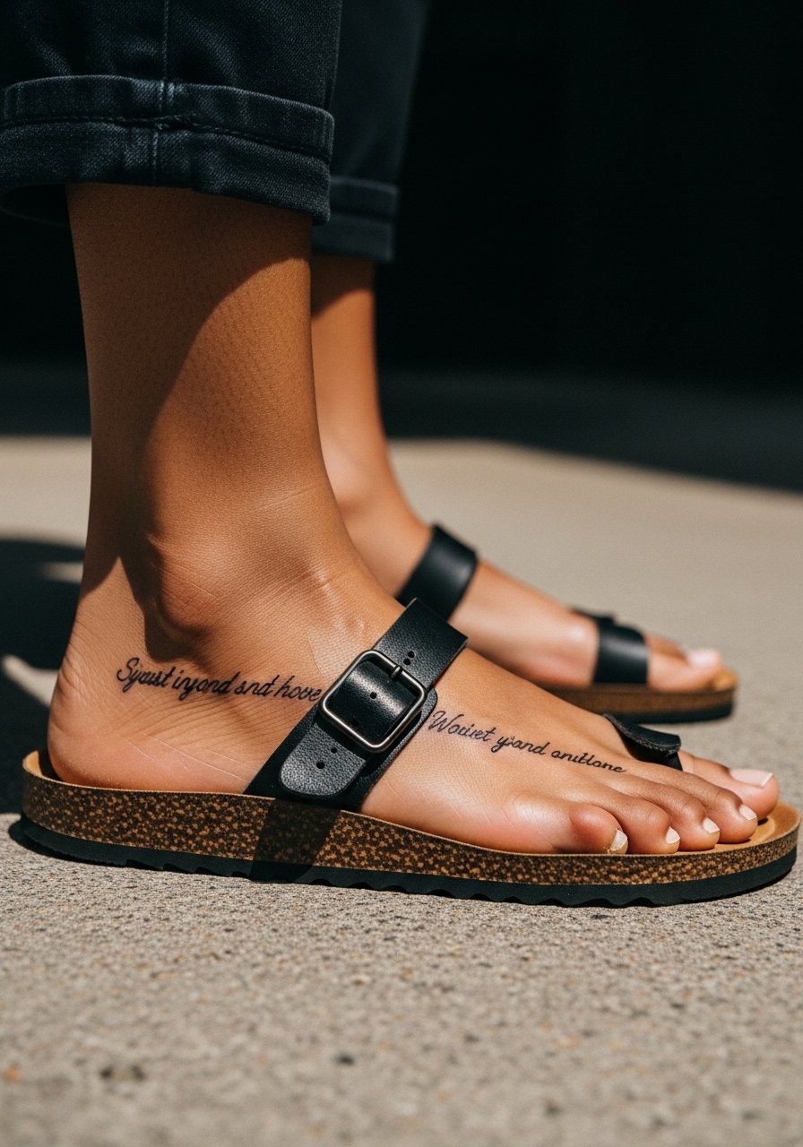
7. Ephesians 2:8 in an Arc Around the Ankle, Ornamental Script
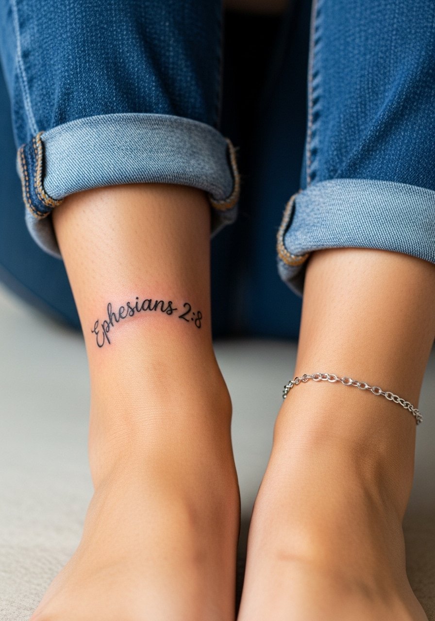
Curved arcs around the ankle sit nicely in sandals and with cuffed pants. The mistake is wrapping too tightly so the letters squeeze when you walk. Ask for a gentle curve with even letter height and a gap at the bone so the script breathes. Ankle sessions are brief but the area sees a lot of friction, so expect a protective wrap the first few days. Pair with cuffed straight leg jeans and a dainty ankle chain for casual reveal.
8. Isaiah 40:31 with Eagle Wings on the Upper Arm, Micro-Realism
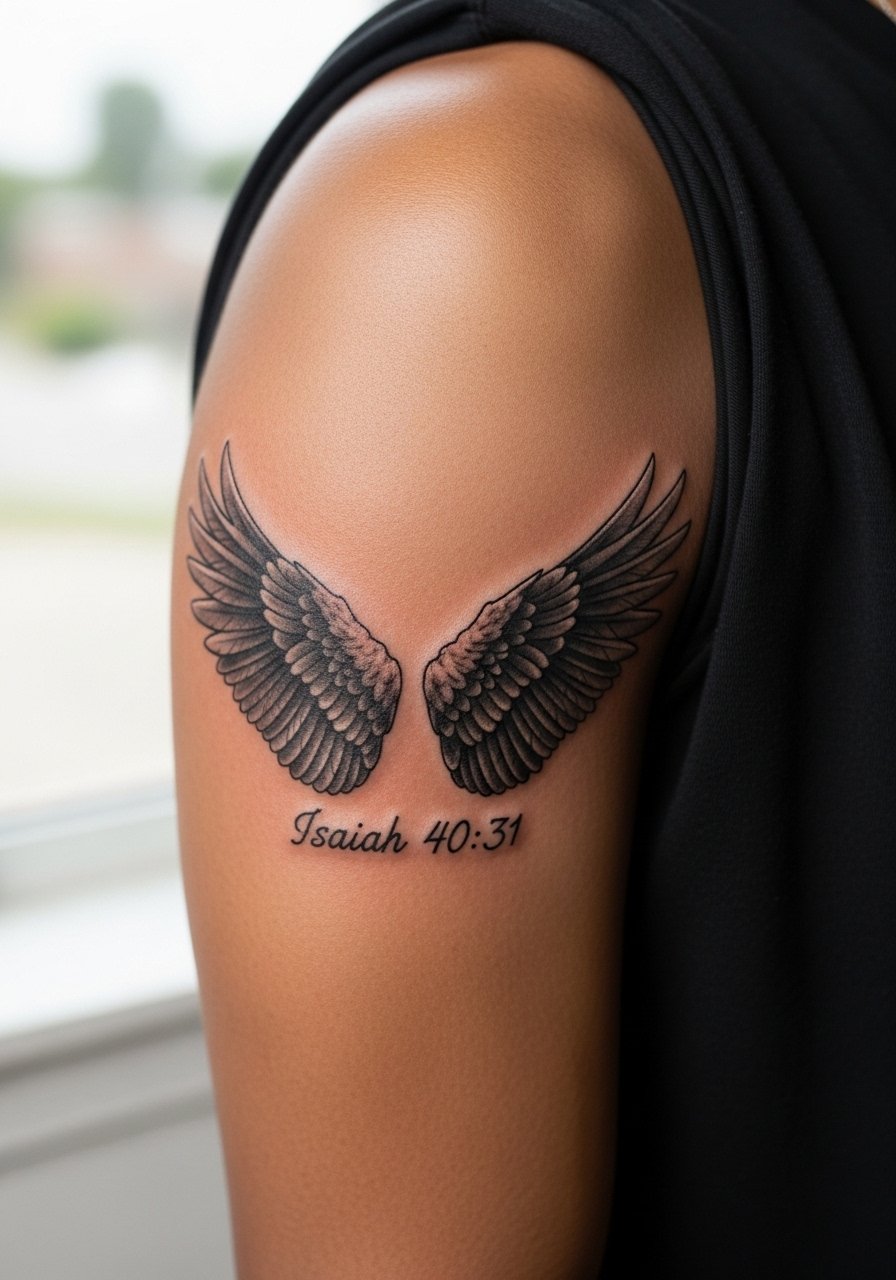
Micro-realism demands saturation and contrast to stay readable over time. For this combo, have the artist place the verse in negative space between the wings so the text does not compete with feather detail. Upper arm skin holds pigment well, which helps micro shading endure. A common mistake is over-detailing the feathers right up against tiny letters. Sessions run longer and may need a second pass for depth. Ask for a healed mockup photo when possible so you see the balance between image and script.
9. Tiny Script Behind the Ear, Single-Line Word
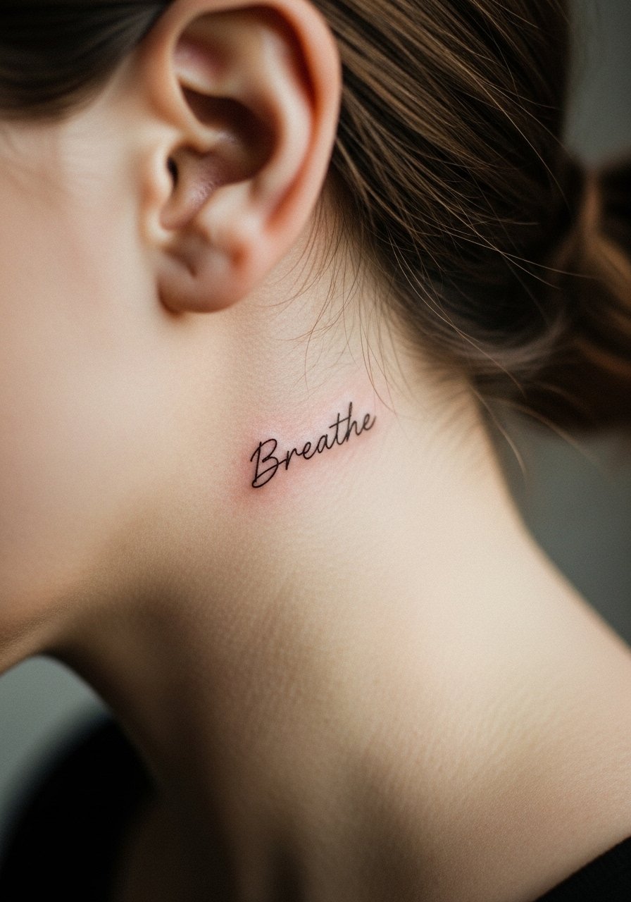
Behind-the-ear placements are discreet and personal, but they require precision. Because the area sits right at the hairline, ask for text no smaller than 1 inch and a font with open counters so letters do not close up as it heals. Session time is short, pain is moderate. For professional settings keep in mind visibility can increase with short hair or updos. Discovery pathways like #BibleVerseTattoo on Instagram are good for layout ideas, and r/tattoos threads help find local artists who do small script well.
10. Inner Bicep Single-Line Scripture, Micro Script That Ages
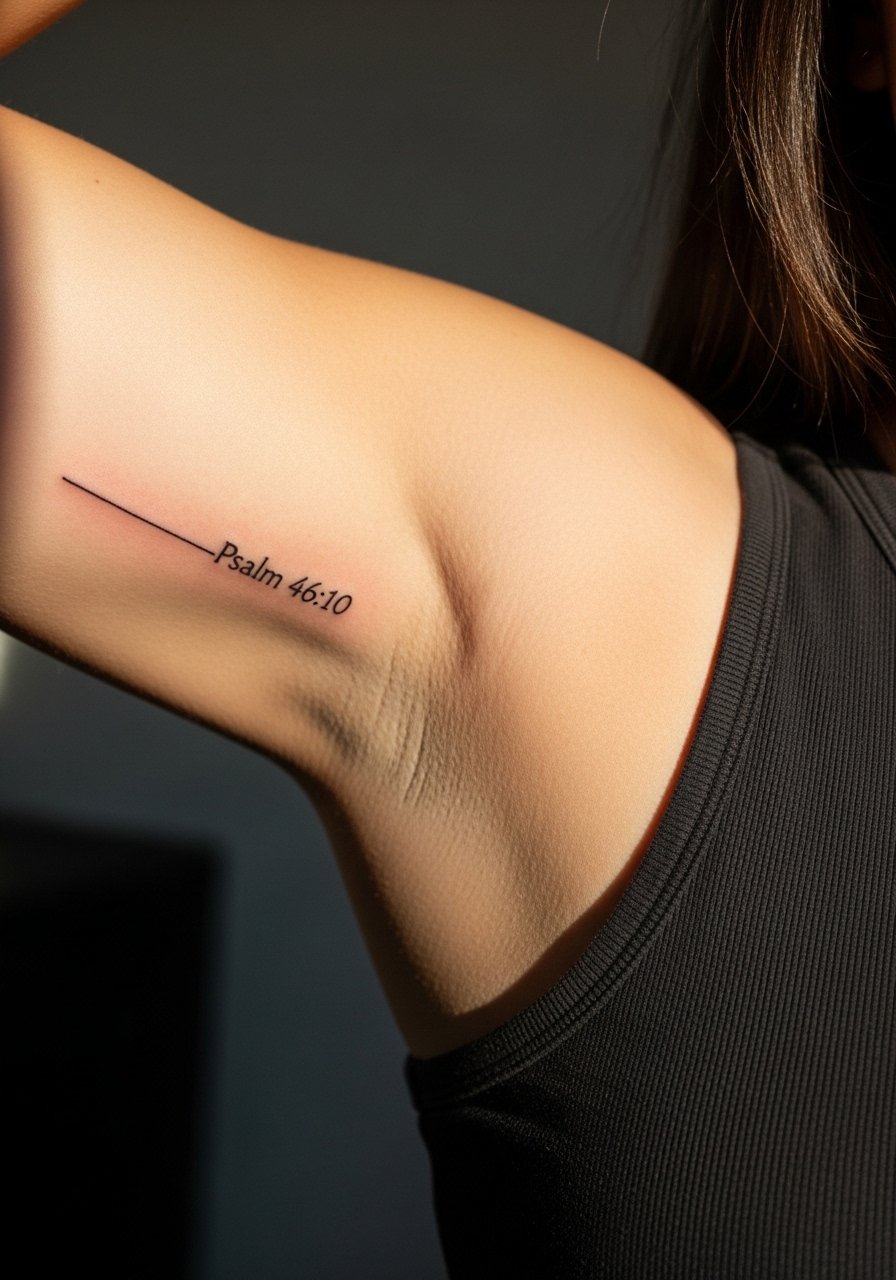
Inner biceps are softer and experience less sun, so fine lines last surprisingly well there. The downside is movement from lifting the arm which can stretch letters over time. Tell your artist you want slightly wider letter spacing and avoid condensed fonts. Pain is higher when the arm is pressed out. Most inner bicep scripts look sharp at six months and hold to year three with a small touch-up. For sessions wear a loose tank top you can lift without stretching the area.
11. Small Script Along the Side of the Hand, Caution Required
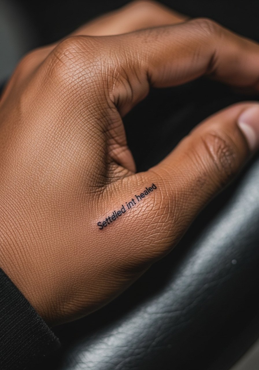
Side-of-hand and finger scripts are tempting for constant visibility, but they blur faster than forearm pieces. The skin here regenerates differently and sees daily abrasion. If you choose this placement, go slightly bolder with the letters and accept the likelihood of a touch-up within one to two years. Many people test a small flash piece first. Mention career considerations to your artist since some workplaces still react to visible hand ink.
12. Sternum Line Breaks, Fine Line Botanical Frame
Sternum text works well split across the midline when the letters align with the rib contours. Because this zone moves with breathing, request extra spacing and avoid stacked lines that compress when you inhale. Session pain is higher and artists often advise shorter stretches. The botanical frame can protect the eyes from focusing only on letters as the script ages. Wear a fitted sports bra to your appointment so the artist can check symmetry without full exposure. Expect a light touch-up after the first year.
13. Finger Verse, Micro Script with Longevity Trade-Off

Finger verses are peak-minimalist but probably the fastest to soften. If you want one, pick a single short word or date and ask for bolded single-stroke letters rather than hairline script. The common mistake is requesting long phrases on fingers. Touch-ups are common as oils and washing wear the pigment. Session time is short but healing needs care. If you work with your hands a lot, discuss alternative placements that give similar visibility without the abrasion.
14. Scripture Wrapped as a Spine Accent, Small Script Vertical
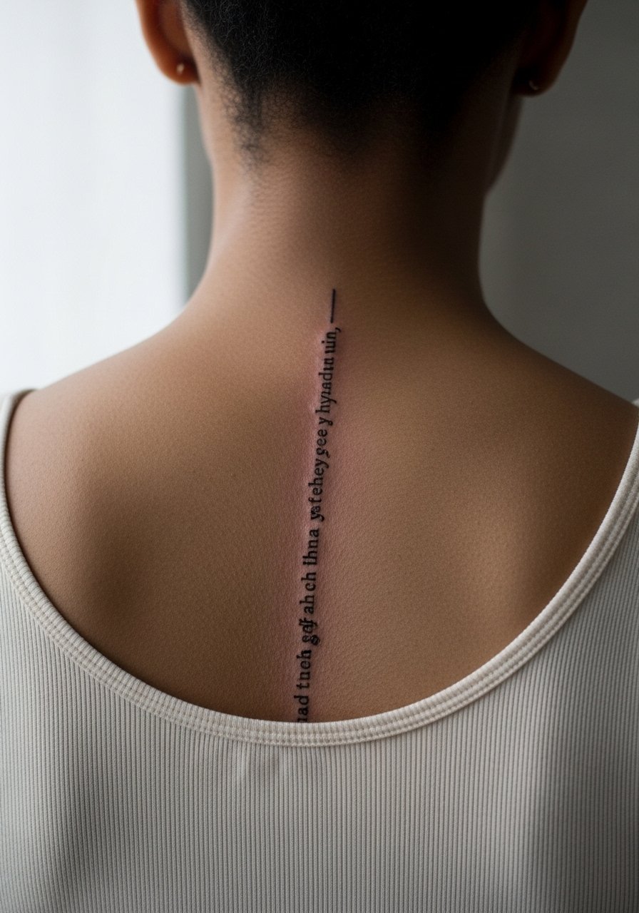
Spine scripts offer a striking silhouette with modest text. The key is letter height and vertical spacing. Avoid compressed type that becomes unreadable as the skin settles. Pain on the spine is variable and often higher near vertebrae. Artists may recommend two shorter sessions so you can manage discomfort. For clothing, open-back tops reveal the line without competing detail. Expect a touch-up around year two if you often sleep on your back.
15. Memorial Verse with Dates on the Outer Forearm, Clean Serif

Memorial lines benefit from clear, legible type. Serif fonts can give a classic feel and hold contrast well. Bring exact dates printed out for the artist to avoid spelling errors. The biggest mistake is trusting a memory for exact punctuation or Roman numerals. Outer forearm positions age well and suit people wanting visibility with moderate friction. Sessions are straightforward and most memorial scripts will need only routine ultraviolet protection to keep contrast.
16. Short Verse in Latin or Greek Script, Cultural Sensitivity Note
Foreign-language verses can carry layered meaning. Before inking a phrase in Latin or Greek double-check translation and context. Some phrase origins trace to historical or liturgical uses that deserve sensitivity. Ask your artist for a fresh stencil and have someone fluent confirm spelling. Fine line blackletter can look elegant but needs room between letters. Inner-forearm placements usually age neatly. Be deliberate about origin and translation to avoid cultural missteps.
17. Cross and Scripture Combo on the Rib Arc, Bold Script Option
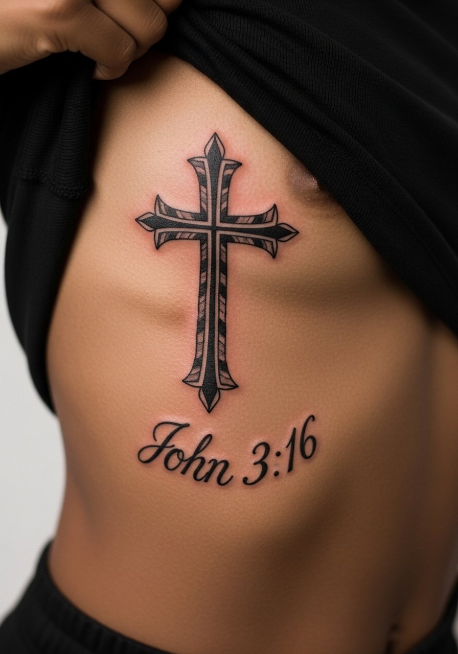
Combining a symbol with text gives visual anchors that hold up as the script blurs. For ribs, consider bolder letterforms so the cross remains the focal point long-term. Artists disagree on fine-line ribs versus bold script. Name both camps when you consult. If you prefer subtler lettering, budget for a touch-up at year two. For sessions wear a loose tank you can lift without exposing more than the working area.
18. Micro-Realism Bird with a Short Verse on the Collar Edge
A small bird can frame a short verse without overpowering the script. Ask the artist to keep the text in a negative space so shadows from feathers do not obscure letters. Collar edge placements are visible and age like collarbones in terms of sun exposure. Sessions are moderate in length due to shading. For showing off the tattoo choose wide-neck shirts that reveal only the upper chest strip so the piece feels deliberate.
19. Ankle Coordinate-Style Verse with Tiny Numbers, Hidden Meaning
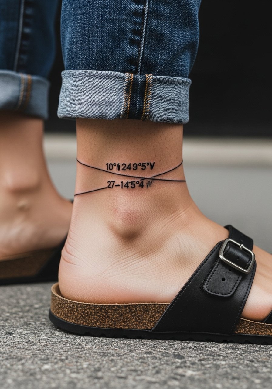
Coordinates or short numeric references work as discreet verse stand-ins. Keep numbers bold enough to avoid dot loss over time. Ankle skin takes friction from shoes and socks, so avoid ultra-thin strokes. This placement pairs well with strappy sandals and cuffed pants. For appointments wear flats you can slip on after the session and avoid anything that rubs the area for a few days.
20. Verse Behind the Collarbone with Subtle Whip Shading, Career-Friendly
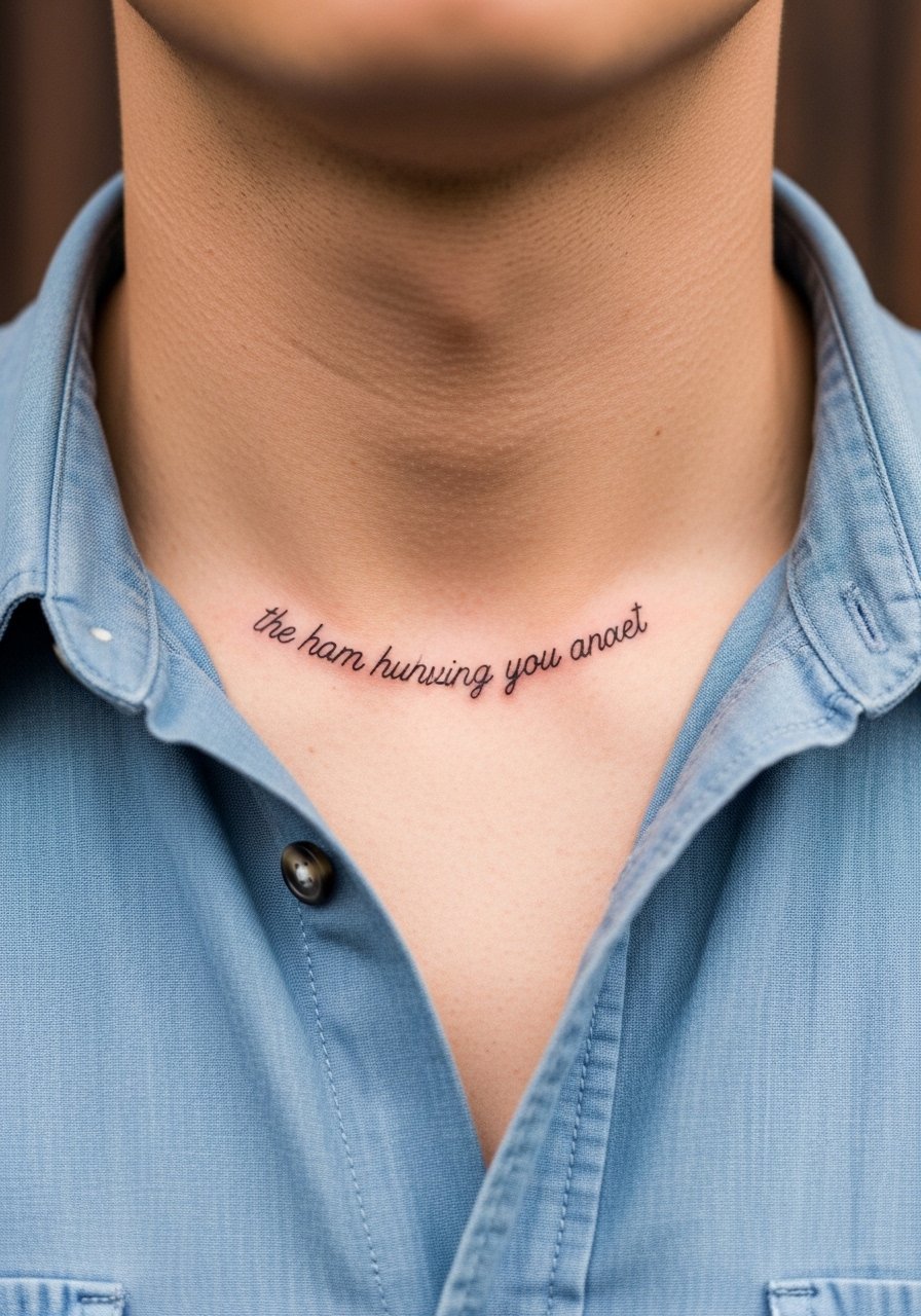
Tucking a verse just below the collarbone keeps it elegant and career-friendly. Whip shading behind letters gives dimension without competing with the text. A common mistake is heavy shading that looks like bruising during healing. Ask for soft feathering and check healed photos of the artist's past work. During the session wear a button-front shirt you can open a few inches for access. Expect the text to remain legible at three years with minimal upkeep.
21. Foot Arch Script, Low-Profile and Seasonally Hidden
Foot arches are private and look great when hidden by shoes through most of the year. The skin here is thin and movement-heavy, so bold script is safer than micro lines. Expect multiple short sessions and a careful healing period because shoes can rub the area. A good consultation covers footwear during the first week and custom aftercare timing. If you want occasional reveal, plan wardrobe around low sandals or cropped pants.
Frequently Asked Questions
Q: Will fine line bible verse tattoos blur faster than bold script, and what should I choose for longevity?
A: Fine line tends to soften earlier than bolder strokes. If longevity is priority pick a slightly heavier line weight and avoid very small lettering in high-friction spots like fingers. For private placements like the inner bicep or spine, fine line can last well. Ask the artist for a healed portfolio and expect a touch-up timeline around year two to three for most fine-line pieces.
Q: How do I prevent misspellings or wrong verse formatting before the needle?
A: Bring the exact verse printed or typed in the font you want and request a transferred stencil on your skin before the session starts. Double-check punctuation, capitalization, and any numerals on the stencil. A second person reading the stencil out loud catches mistakes that a single pair of eyes might miss.
Q: Do certain garments help show off collarbone and shoulder verses without overexposing?
A: Yes. Off-shoulder or wide-neck pieces reveal collarbone lines without full exposure. For example, an off shoulder knit top sits just low enough to frame a short verse while keeping the rest covered.
Q: If I want a tiny finger or hand verse, what should I expect for maintenance?
A: Expect higher maintenance. Hands and fingers endure frequent washing and sun so pigment fades faster. Plan for touch-ups at one to two years and consider making the letters slightly bolder up front.
Q: Are there religious or cultural concerns I should check with before inking a translation or foreign phrase?
A: Yes. Confirm translations with a fluent speaker and consider the phrase origin. Some liturgical or historical phrases have specific contexts. A quick search in community forums and a conversation with your artist can prevent unintended use.
Q: How do artists typically handle the fine line versus bold line controversy on ribs?
A: Artists split into two camps. One says ribs stretch and fine lines blur quickly. The other argues proper needle depth and spacing let fine lines settle well. Bring up the debate in your consult, ask for healed photos, and choose the approach the artist has the strongest portfolio for.