
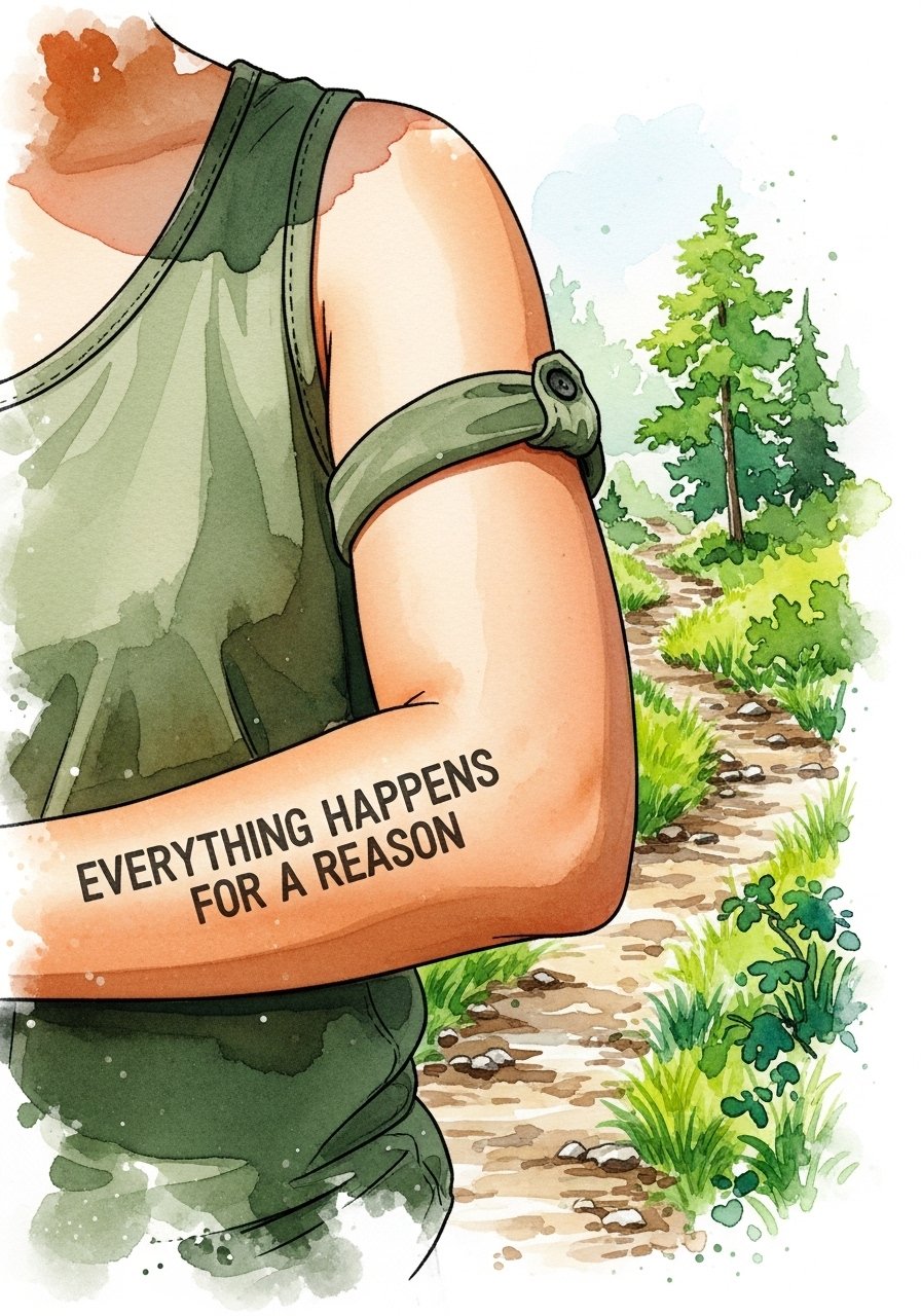
Fine line script and symbolic pieces are everywhere online right now, but what holds up past the first year is rarely the trendier render. I keep seeing people pick ultra-fine lettering for high-friction spots and then wonder why the script blurs. These 17 designs focus on approaches that balance the look you want with predictable aging, session realities, and wardrobe choices that actually show the work off. The first one dives into the classic compass-script pairing.
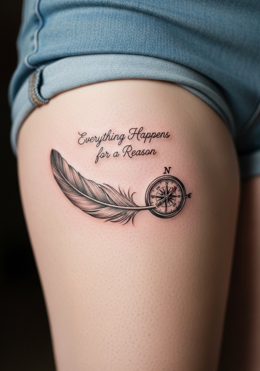
1. Fine Line Compass Rose on Inner Forearm
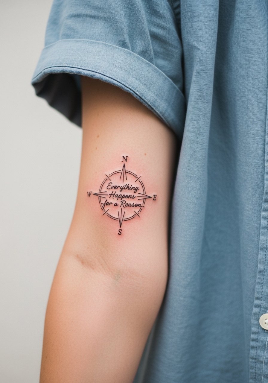
I recommend this when you want a clear phrase that sits naturally with a symbol and ages more predictably than ultra-thin script alone. Tell your artist you want slightly heavier hairlines for the compass points and a 0.8 to 1.2 mm stroke for the text so the letters do not sink into a blur after a year. The main mistake is asking for the thinnest possible lettering at the edge of legibility. Expect 1 to 2 sessions and a touch-up window around year two for a forearm placement. Pain is mild to moderate. Pair the healed piece with a rolled cream linen shirt when you want to show it off, which helps the linework read sharp against neutral tones. linen button down shirt
2. Watercolor Path Through Forest, Forearm or Calf
Watercolor gives an ethereal take on fate but it is the style most prone to early fading on curved placements. If you want color that lasts, ask the artist for color saturation at medium depth and a black script overlay in a slightly bolder hand. A common fail is letting washes sit too shallow, which turns them into pastel smudges by year two. On the calf the piece can be larger and more forgiving than on the forearm. Session feel is longer because of packing color, and you will likely need two sessions. Show it off with high waist denim shorts or a flowy midi skirt for evenings when the color reads best.
3. Minimalist Dotted Trail to Quote Banner, Ankle or Collarbone
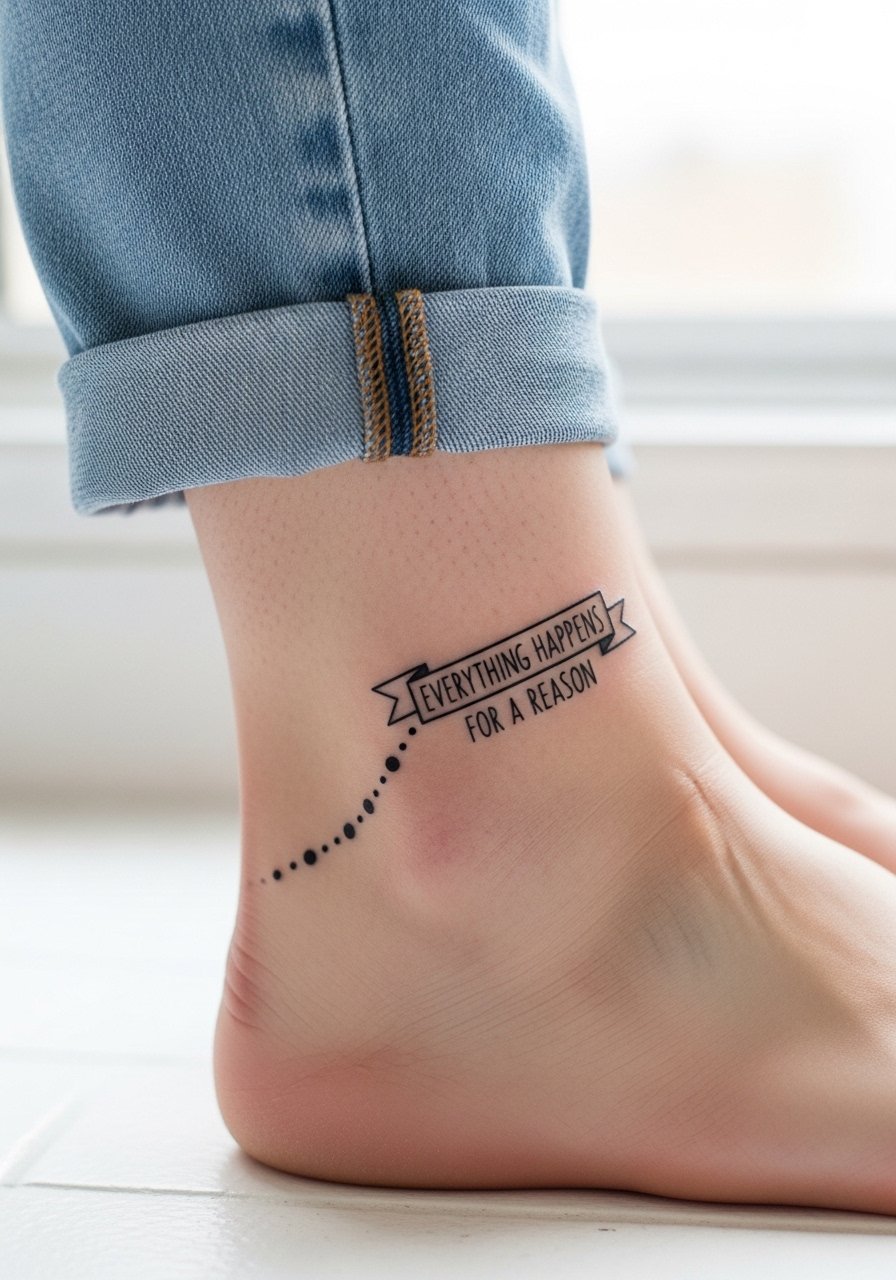
This version keeps the phrase compact and modern. The dotted trail gives motion without heavy linework, which is helpful on high-movement spots like the ankle. The typical mistake is making the dots too close together. Leave breathing room so the dots do not merge over time. For an ankle piece, pain is low to moderate and one session usually does it. For showing the ankle, strappy sandals and cropped straight-leg jeans frame the trail well. Wear something easy to roll up for the session so the artist can work without tight fabric pulling on the area. strappy flat sandals
4. Neo-Traditional Hourglass with Spilling Script, Shoulder or Thigh
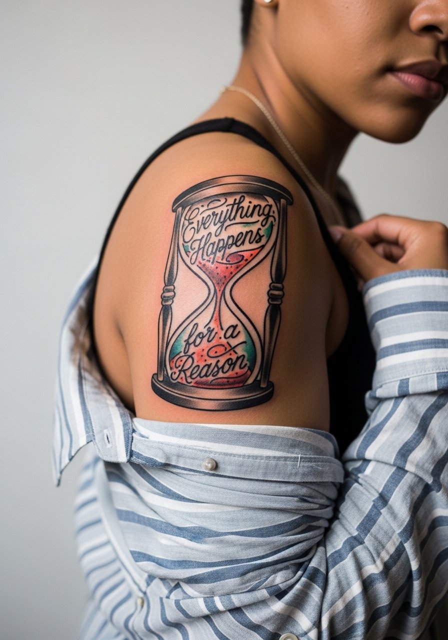
Bold outlines and saturated fills make hourglasses read well across time. If you want the text to feel integrated, ask the artist to let the script spill around the glass instead of sitting on top. The shoulder is more forgiving than the thigh for consistent saturation. A common error is shrinking the hourglass too small and then trying to cram ornate detail inside. Expect 2 to 3 sessions depending on size. Pain is moderate on the shoulder and higher on the thigh. Pair the shoulder piece with a loose button-down shirt you can pull aside during the session and wear afterwards.
5. Blackwork Mandala Encircling Phrase, Upper Arm or Back
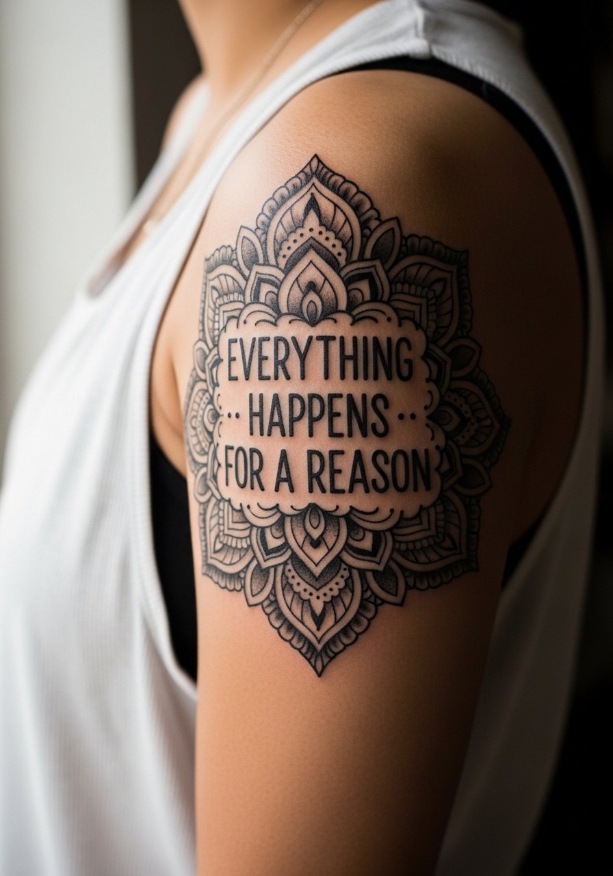
Blackwork holds up especially well when the design uses negative space to define elements. Ask the artist for slightly wider spacing in dense areas so dot work and stipple shading do not merge as they age. The mistake people make is compressing too many concentric rings into a small surface. For upper arm work you can expect two sessions and very low risk of blowout if the needle spacing is respected. Show this with a sleeveless black tank for contrast. Session wear that gives clear access to the shoulder keeps the artist from working around fabric.
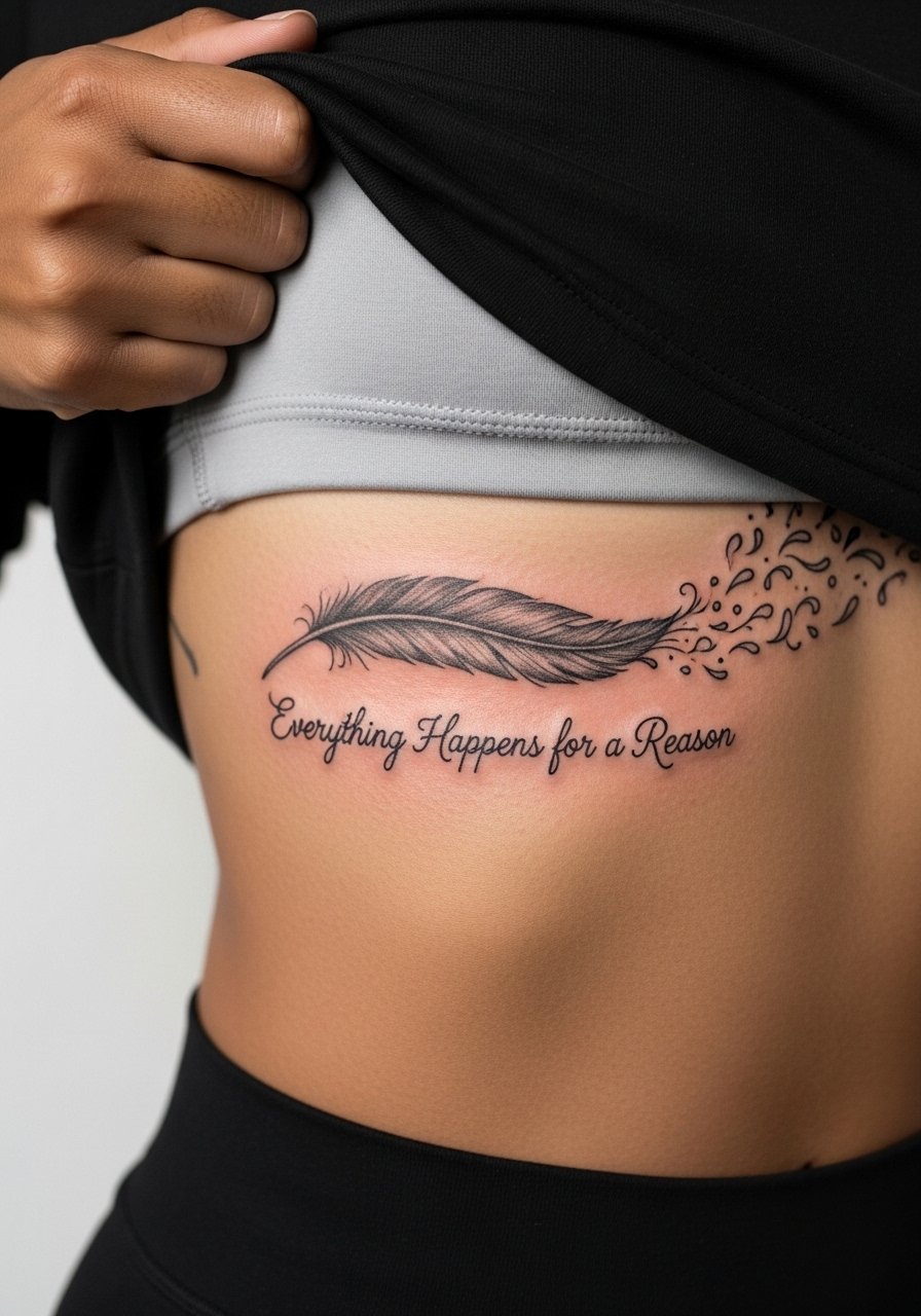
6. Micro-Realism Feather Unraveling into Text, Inner Bicep or Ribcage
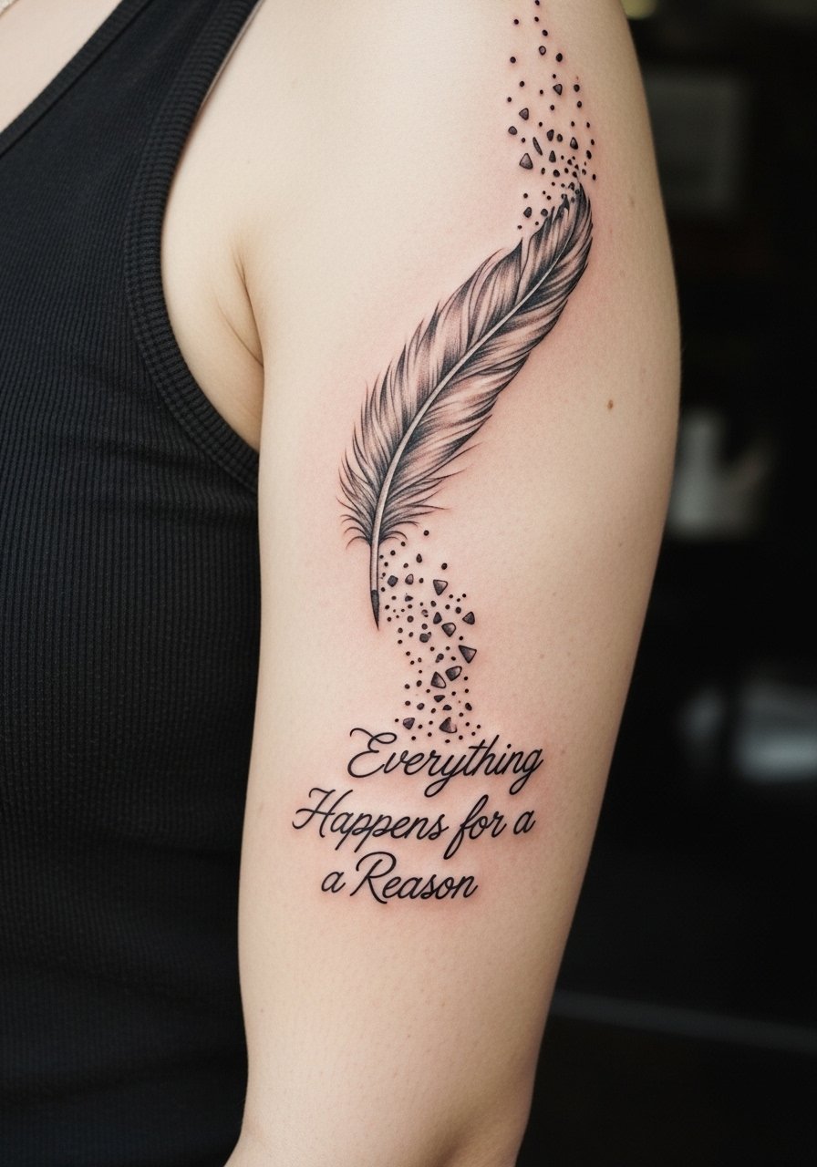
Fair warning, the inner bicep is a sensitive spot and sessions feel tender. Micro-realism demands tight shading and crisp transitions. The common error is asking for hyper-detail at too-small a scale. On ribs this look reads differently because breathing can shift stencil placement. If you choose the ribcage version, plan for a longer, more painful session and expect touch-up at 12 to 18 months. Ask for healed examples on similar skin tones during consults, especially if you have darker skin and want contrast. For session wear, bring a tank so the artist can expose only the upper arm cleanly.
Pre-Session Essentials
The wrist and inner-arm pieces above heal differently from larger colored work, so a few small items smooth the session and the first week.
-
Stencil transfer paper kit. Lets you preview placement on skin for script and compass pieces so you do not commit to a layout that sits off the forearm curve.
-
Topical numbing cream. Applied as directed before longer thigh or rib sessions, it can reduce pain for stubborn areas without changing linework when used properly.
-
Thin protective film roll. Keeps fine line wrist work from rubbing against clothing during the first days when friction is most damaging.
-
Fragrance-free gentle body wash. Cleanses healing areas without irritation, which matters for pale script and watercolor edges in the early week.
-
Aquaphor healing ointment. A thin layer in the first 48 hours helps control scabbing on small blackwork and fine-line pieces.
7. Ornamental Vine Wrapping the Spine with Script
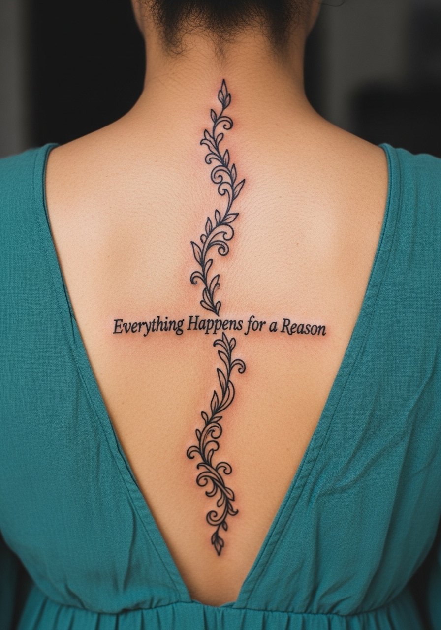
Spine pieces need composition that honors curvature. Ask the artist to draft the vine to follow the spinal line rather than forcing a straight layout. The mistake is treating the spine like flat canvas and centering elements that then skew when the body moves. Expect two sessions for a six-inch ornamental vine and plan for touch-up if you have significant weight fluctuation. This placement pairs well with open-back dresses and halter tops when you want it visible. For session wear, a button-down you can remove without twisting keeps the chest comfortable.
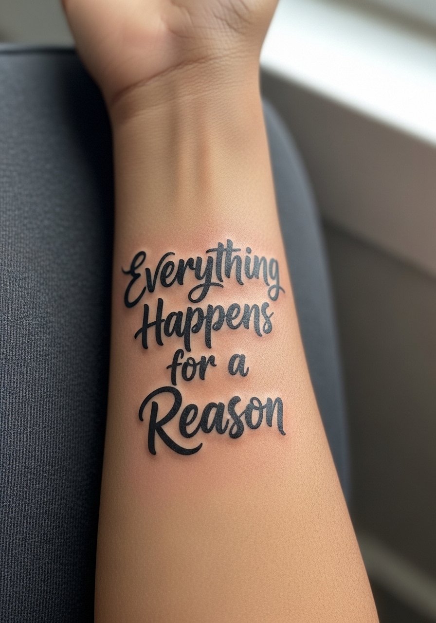
8. Script with Stoic Infinity Loop on the Wrist
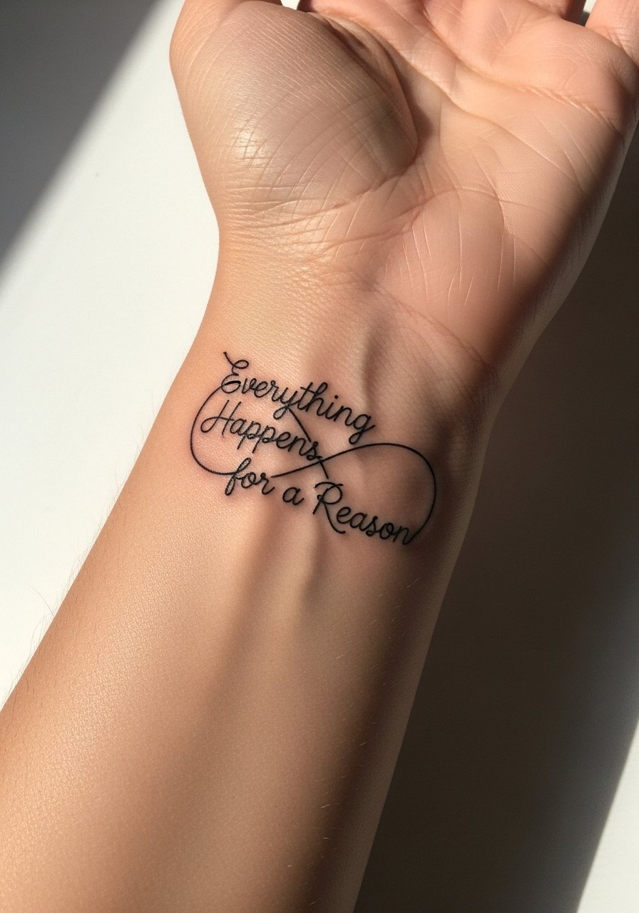
Wrist script reads intimate but is vulnerable to blur when the letters are too thin. Artists are split on fine line on wrists. One camp argues that ultra-fine lines fade fast and merge into a soft blur on high-motion spots. The other camp says that with deliberate needle depth and slightly increased spacing, fine line can remain legible for years. When you consult, ask the artist which approach they use and request healed photos. Pair the healed wrist with a thin chain bracelet to frame the text without crowding it. thin gold chain bracelet
9. Traditional Anchor with Banner Text, Forearm Outer
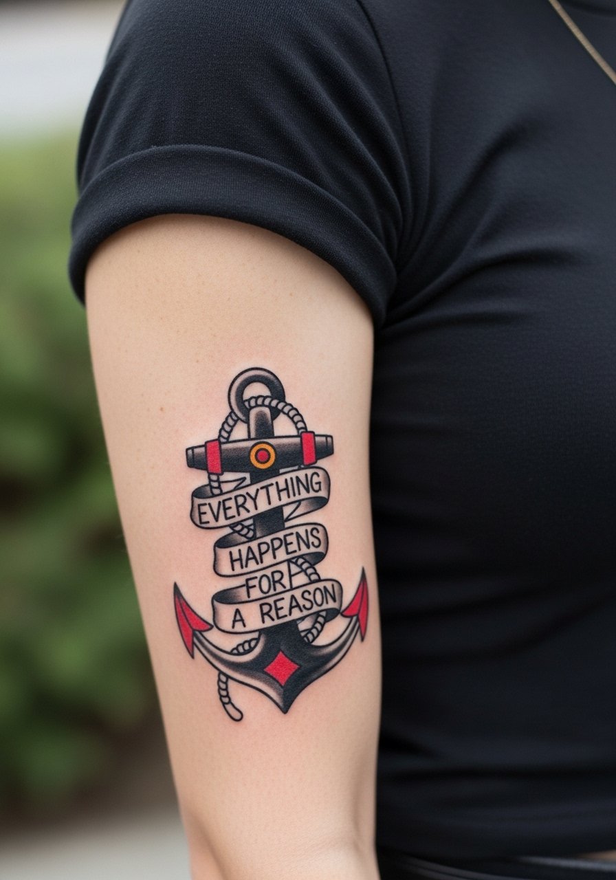
Traditional work is forgiving because strong linework ages into legible shapes. For this piece tell the artist you want classic saturation in the reds and a banner text weight that balances with the anchor. A common mistake is shrinking the anchor too much and losing the graphic punch. Forearm outer placement is a low-blowout zone and often finishes in a single session. Style it with a fitted crew neck tee and a leather arm cuff on the opposite wrist to create contrast. fitted crew neck tee leather arm cuff
10. Ignorant-Style Jagged Path to Phrase, Calf or Shoulder Blade
Ignorant style thrives on raw edges and heavy outline work. It works best at a larger scale so the jagged strokes do not look cramped. The shoulder blade is better for detail than a small calf piece when you want deliberate texture. A common error is compressing jagged elements into a small space and ending up with a block of black. Sessions are moderate and may require shading passes. For session wear, bring a loose tank or button-down you can shift so the artist has access.
11. Fine Line Phoenix Rising from Quote, Collarbone or Upper Thigh
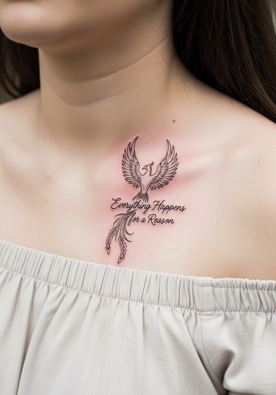
A phoenix reads as resilience when the lines are given room to breathe. Collarbone placement requires attention to how the piece sits across the bone and the clamp of fabric when you wear certain tops. The typical mistake is compressing feathers into too-narrow a band. If you want longevity, ask for slightly stronger primary strokes and gray wash rather than tiny stipples across the feathers. Pain on the collarbone is higher than on the thigh. Show this with an off shoulder blouse when you want it visible and bring a strapless or wide-neck top for the appointment so the artist has clear access.
12. Micro-Realism Single Feather Unraveling into Script, Ribcage Variant
Ribcage micro-realism looks beautiful but is vulnerable to breathing motion and higher pain. Artists debate whether fine-line micro-detail on ribs will hold without touch-ups. One side says the skin there stretches and blurs lines quickly. The other side says correct depth and spacing prevent that. Ask for a mock-up on the body and plan for a touch-up at 12 months. Session time will be longer and more intermittent to manage discomfort. Wear a cropped top or loose joggers for the appointment to keep the area accessible and comfortable.
13. Compass Path with Birthdate Timeline, Inner Forearm or Wrist
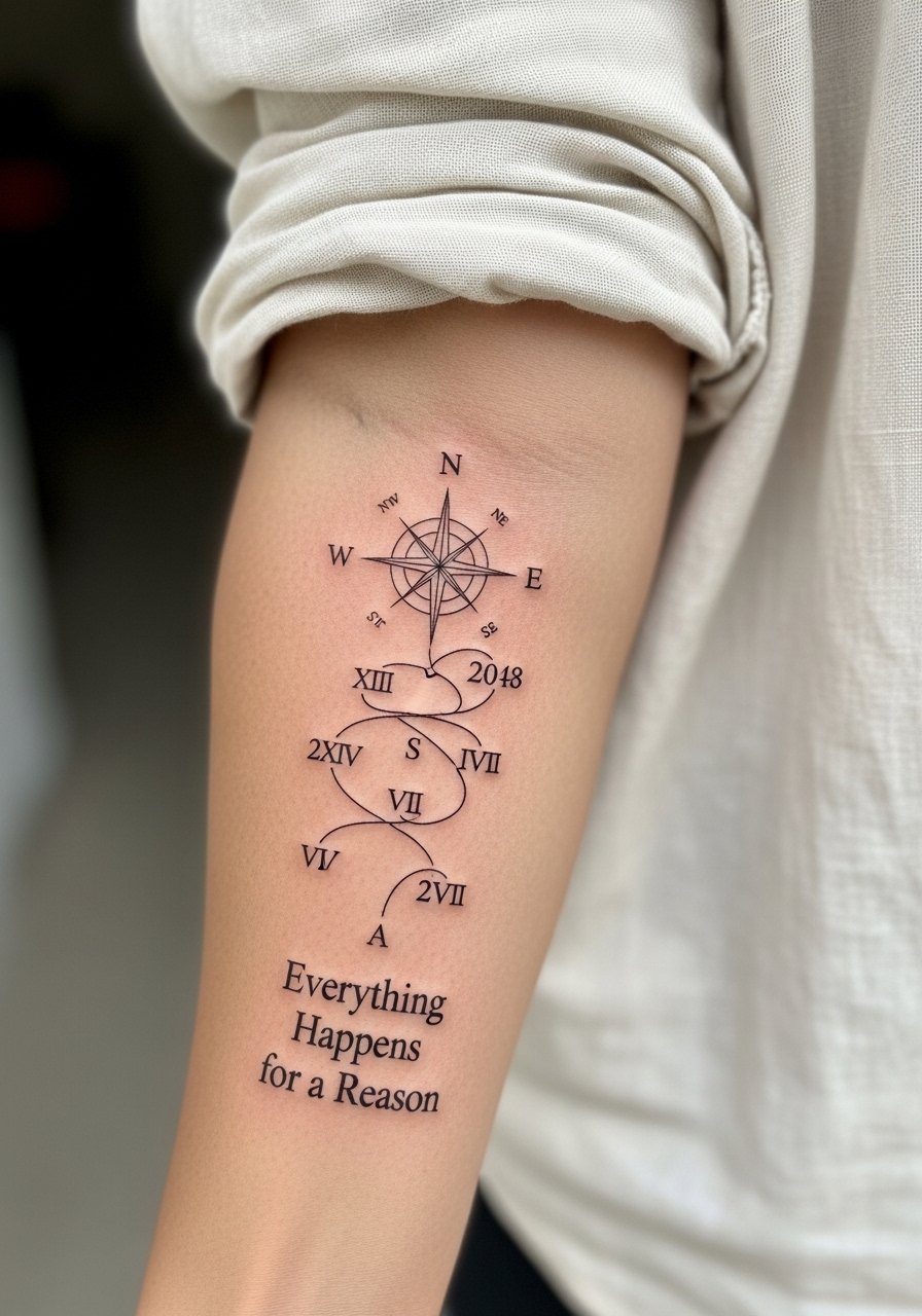
This is one of the under-covered ideas that blends fate with chronology. Ask your artist to place dates along the compass path rather than clustered inside a banner so the sequence reads like a timeline. The main mistake is overloading the path with too many tiny numerals. For readability, keep numerals spaced and use Roman numerals only if the artist can show healed examples. Inner forearm scale is forgiving but plan for touch-up around year two. Pair with rolled linen shirts to let the details breathe. linen button down shirt
14. Ornamental Vine Adapted to Spine Curvature, Thigh Variant
Adapting an ornamental vine to natural curves avoids the “stuck-on” look when the body moves. I suggest asking for a living sketch that your artist draws while you stand naturally so the vine wraps the contour rather than fighting it. A common error is using a straight reference on a curved surface. For thigh work, session comfort is better and details hold well. If visibility matters, pair with high-waisted shorts when you want to show it off. For the appointment, loose joggers are handy so you can roll or shift fabric without pressure.
15. Dark Skin Adaptation: Thicker Lines and Higher Contrast Script
If you have darker skin, discuss visibility with your artist and ask for stronger line weight and higher contrast fills rather than ultra-fine hairlines. The overlooked mistake is replicating a thin script reference that was shot on light skin and expecting the same visibility. Request healed examples on similar tones and expect touch-up timetables that consider pigment visibility rather than fading alone. Forearm placements are forgiving for thicker script. This approach trades some delicacy for longevity and legibility, which many prefer when photos and everyday lighting are considered.
16. Stoic Infinity Loop with Minimal Script, Neck or Wrist
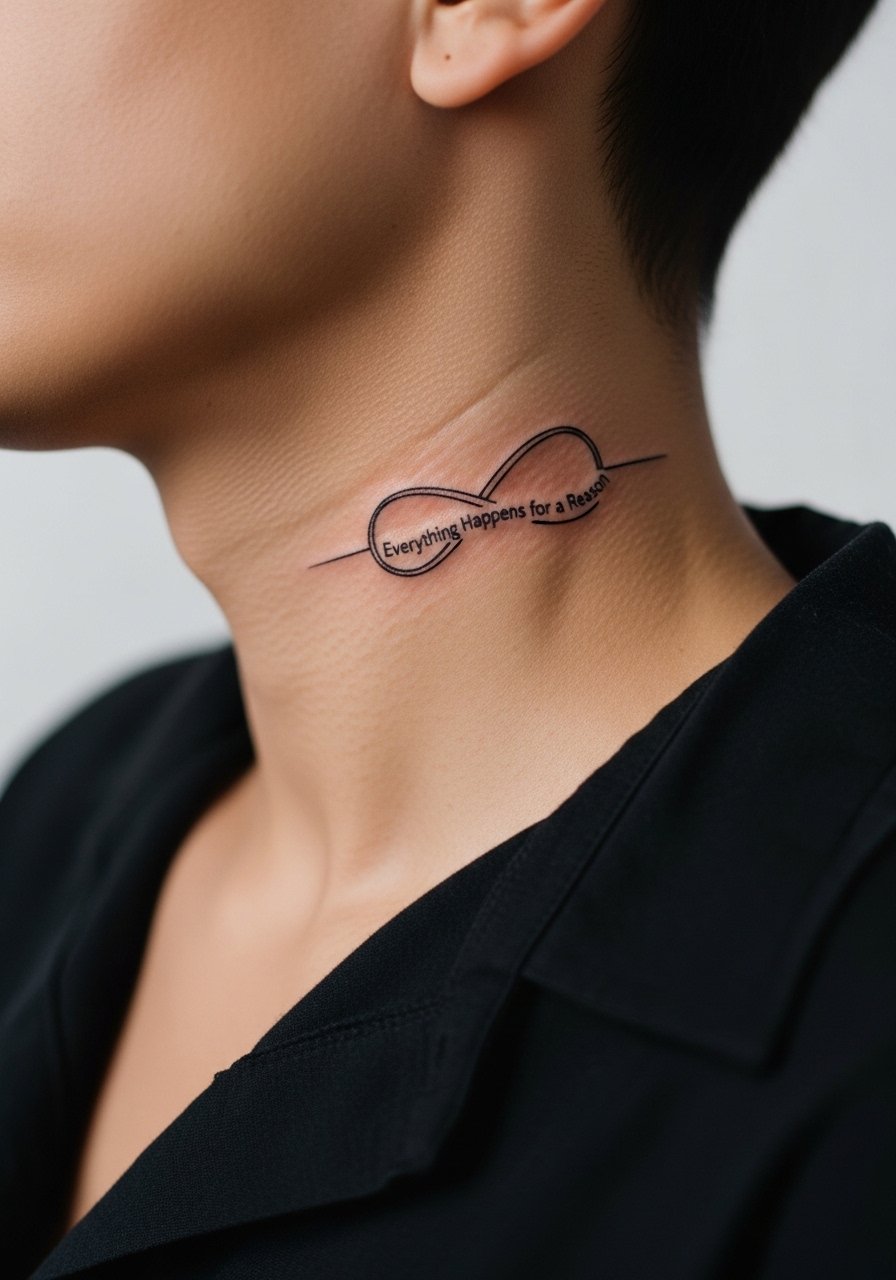
Neck placements look sharp but are not trivial. The neck has a different healing environment and visibility that affects careers and daily life. If you choose the neck, ask the artist about stencil adhesion on curved skin and plan for a conversation about long-term visibility. Many artists will recommend a slightly bolder primary stroke for neck text to avoid early softening. For wrist variants, the same loop benefits from slightly increased spacing to prevent merge. Session wear should be a wide-neck shirt you can shift.
17. Micro-Realism Feather as Memorial Mark with Compass Integration, Upper Thigh
This hybrid combines memorial symbolism with navigational reference. It works well on the upper thigh because the area allows scale without compressing detail. Tell the artist which elements should stay crisp over time and which can soften into texture. The common mistake is trying to fit too many micro elements into a narrow vertical. Expect one to two sessions depending on shading. For the appointment, wear high-waisted shorts so the artist can expose only the area needed without tugging or pressure.
Frequently Asked Questions
Q: Will fine line script blur faster on wrists and hands than on the forearm?
A: Yes, fine line on wrists and hands faces more friction and frequent washing, so it tends to soften earlier than forearm pieces. One camp of artists says fine line is an acceptable aesthetic trade if you like the way it ages. The other camp says choose bolder strokes for high-friction zones. Ask your artist for healed photos of similar placements to see which approach they favor.
Q: Should I expect watercolor tattoos to need a touch-up sooner than blackwork?
A: Watercolor relies on softer saturation and can fade faster, especially on curved or mobile skin. Expect color refreshes sooner than dense blackwork. If longevity matters, ask the artist to strengthen edge contrast with a black script overlay or to place watercolor on areas with lower sun exposure.
Q: What should I wear to a shoulder or upper-arm session so the artist has access?
A: Wear a loose button-down shirt or a sleeveless tank you can move without twisting. That lets the artist reach the area cleanly and keeps you comfortable for longer sessions.
Q: How does darker skin change the approach to fine script or micro-realism?
A: Darker skin often benefits from slightly heavier line weight and stronger contrast. Artists will adjust spacing and saturation to preserve readability. Ask to see healed work on similar tones before booking and plan touch-ups based on visibility rather than assumed fading.
Q: Saniderm or dry healing, which is better for mantra pieces on wrists and forearms?
A: Artists split into two camps on this. One group prefers Saniderm for a scab-free early week and controlled environment. The other group favors dry healing to avoid trapping moisture and to encourage natural scabbing. Your choice depends on your skin type and the studio's protocol. Bring up both options in your consultation so the artist can recommend based on the piece and your history.
Q: How often do I need a touch-up for fine line script near joints like the wrist or collarbone?
A: Plan for a realistic touch-up window around 12 to 36 months for high-movement areas. The exact timing depends on your lifestyle, sun exposure, and how shallow the original depth was. Touch-ups are normal and part of maintaining crisp script over the years.