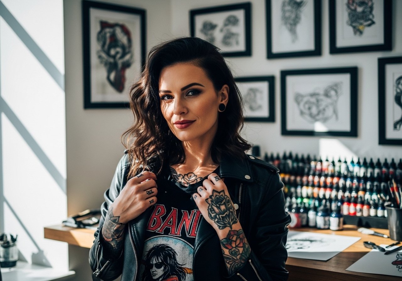
Fine line family scripts are everywhere on feeds, and the collarbone is the spot people pick when they want something that sits pretty under a top and shows up when they want it to. That trend looks gorgeous fresh, but it also exposes three common surprises: the bone hurts more than you expect, skinny lines can blur faster on some skin tones, and bra straps will be a nuisance during healing. Start here for 21 collarbone ideas that balance look, longevity, and real session logistics.
1. Fine Line "Mom" Script on the Inner Collarbone
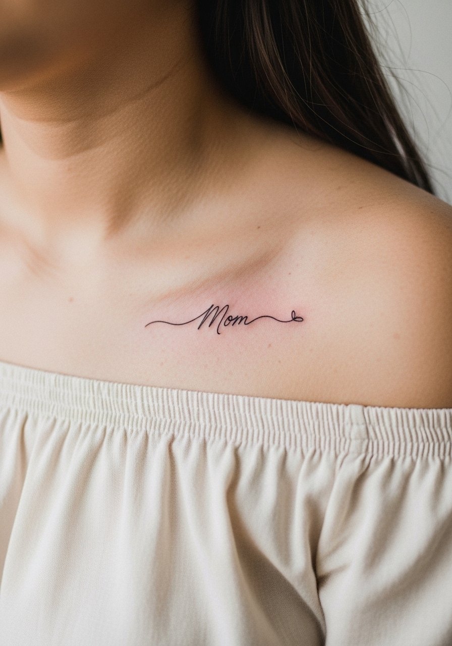
This is the obvious starter for mom dad tattoo design on collarbone seekers who want something discrete and readable. Bring a reference that shows the exact script size and curve you want so the artist can align the text with the bone rhythm. Expect sharper pain over the bone and plan for a shorter session, roughly 30 to 60 minutes, depending on scale. A common mistake is asking for a hairline weight that reads great fresh but washes out in a year. Request slightly stronger single-needle weight and schedule a touch-up window at six to twelve months. For showing it off, pair with an off shoulder blouse in cream or linen to frame the script gently.
2. Minimalist Heartbeat Line with Mom/Dad Initials
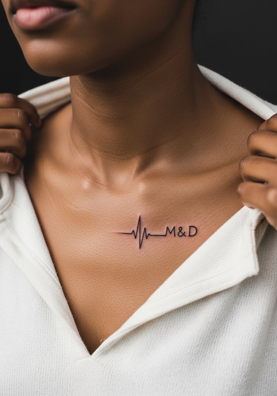
The heartbeat motif adds symbolic motion without spelling everything out. Ask your artist to scale the peaks so the waveform stays open and does not compress into a solid bar after healing. Pain is moderate where the needle crosses the ridge of bone. This style is ideal for first-timers because it stays compact and can be done in one session. Blowout risk is higher if the waveform runs too close to bone or is stamped too densely. To style it, a halter top or a bandeau lets the tiny peaks sit center stage while keeping the look elegant.
3. Neo-Traditional Floral Wreath Framing "Mom Dad" Text
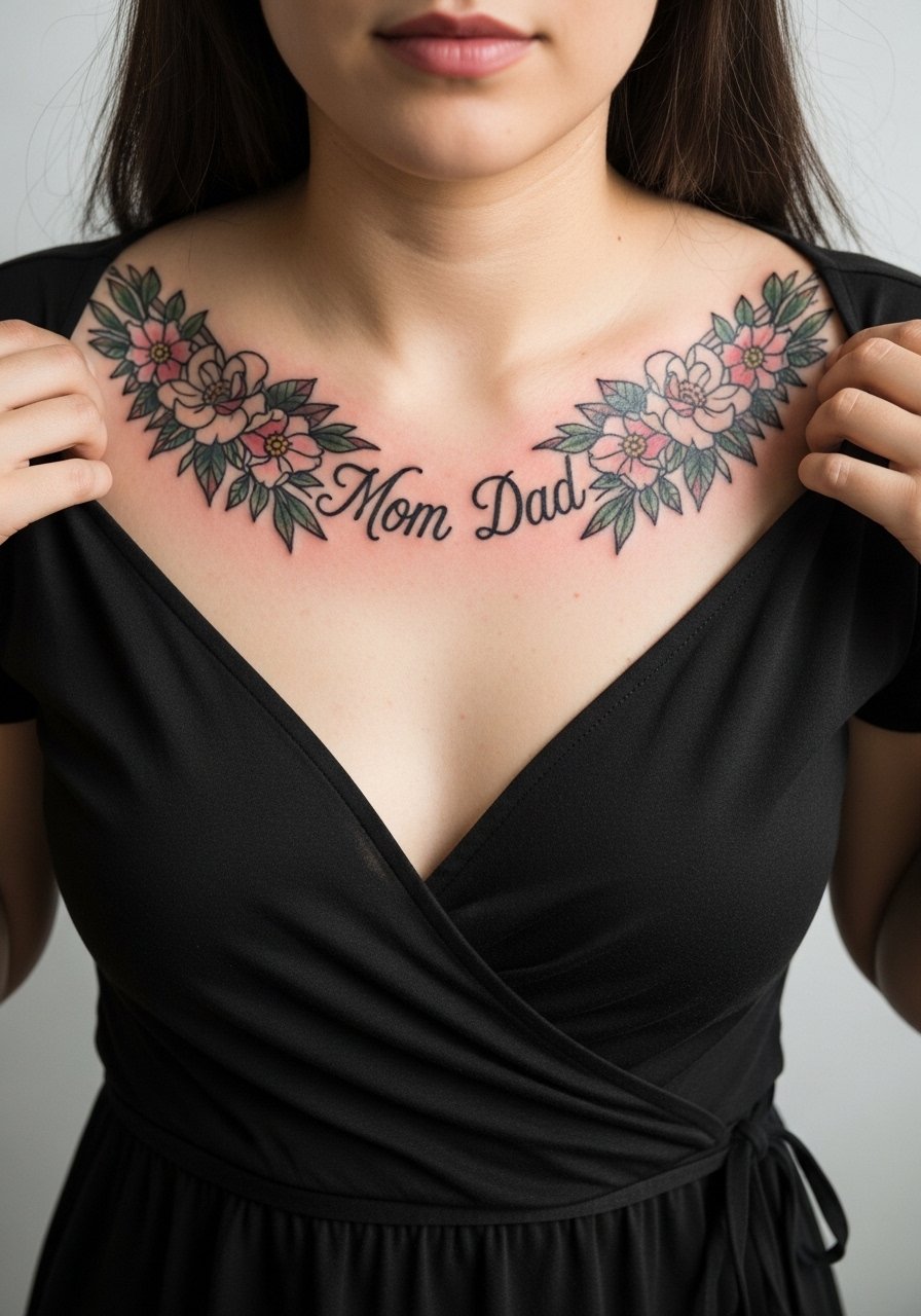
This option turns a parent dedication into a decorative piece that spans both collarbones. Tell the artist you want open negative space between blooms so the design breathes and ages without merging. Expect two sessions if you want color accents and saturated petals. The main mistake is compressing too many tiny details into a small span, which can age into blotch. If you like showing it off with an evening look, a v neck wrap dress in olive or wine tones complements the neo-traditional palette and keeps the wreath visible without competing with pattern.
4. Blackwork Geometric Arrows Pointing to Names
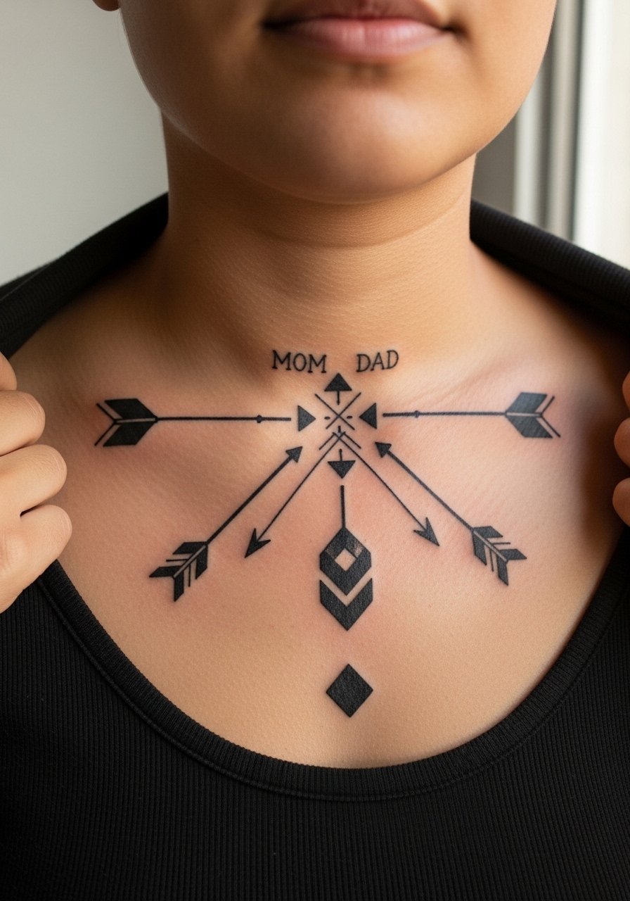
If you want a modern edge, blocky blackwork arrows guide the eye along bone structure and keep contrast high on medium and dark skin tones. Ask for bold fills rather than hairline outlines for longevity. The session feel is briefer for each solid element, but saturation takes time and may require a second pass for even black. One common error is making the geometry too intricate for the collarbone curve, which leads to warping as the body moves. For everyday wear, a solid black tank top shows off the negative space while keeping the tattoo the focal point.
5. Micro-Realism Parent Portrait Outlines
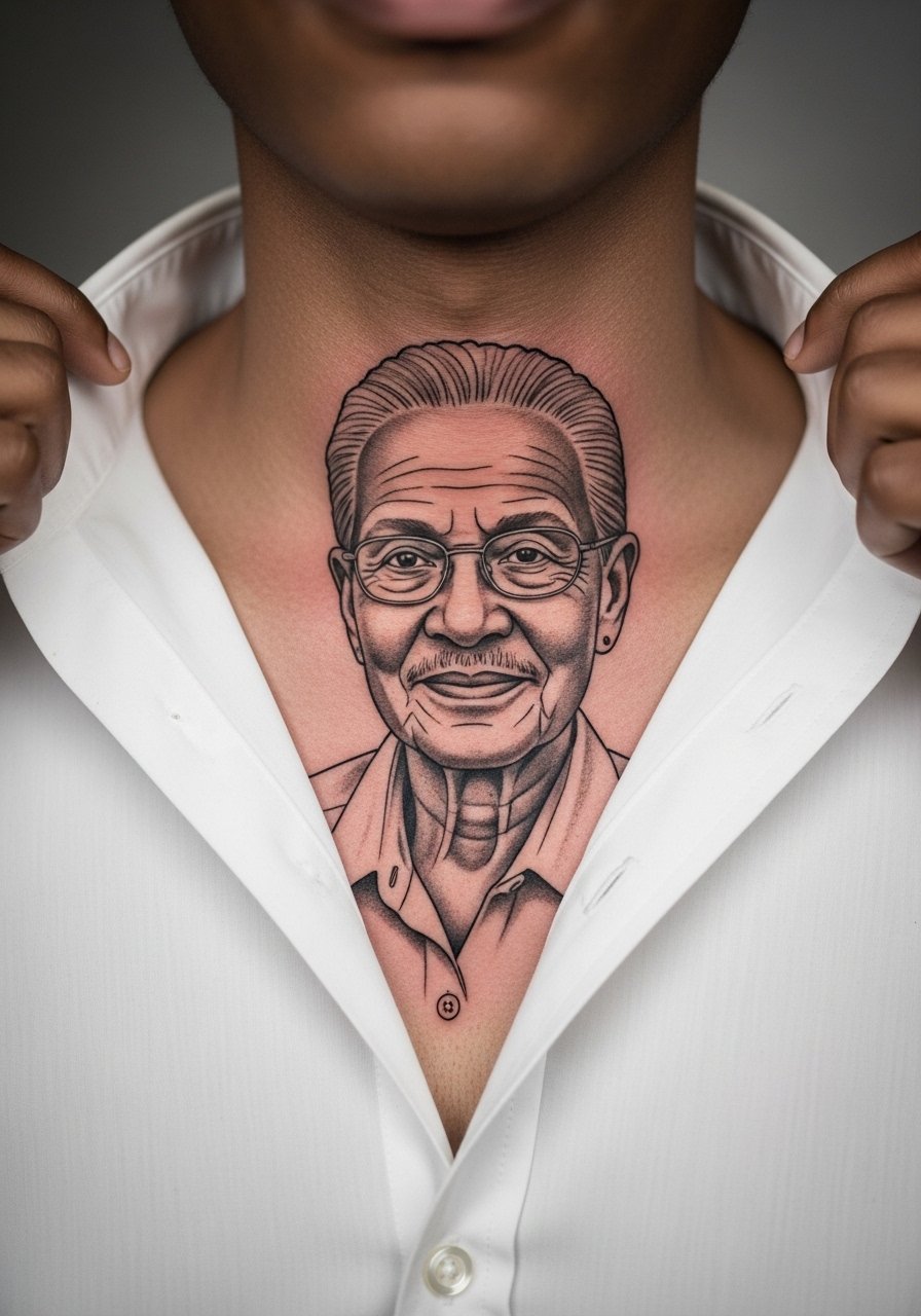
Micro-realism on the collarbone is intimate and demanding. Tell your artist you want outline-driven portraits rather than dense photorealism so the small scale will age better. Expect two short sessions and an artist who routinely works at tiny scale. The biggest mistake is shrinking a full-face portrait too small, which loses defining features and becomes indistinct. Hand placement near the bone increases sensitivity, so numbing is reasonable if you need it. For a clean display, an oversized white button-up worn half-unbuttoned centers attention on the tiny portrait without distraction.
6. Watercolor "Mom + Dad" Script with Heart Drip
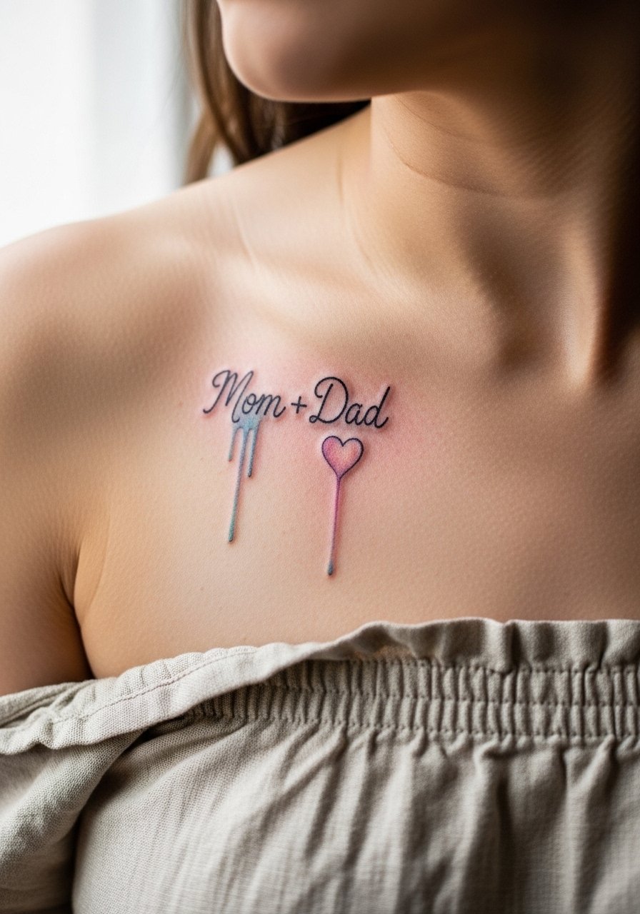
Watercolor effects give a soft, painterly vibe that contrasts with the bone's hard edges. Ask for color placement that avoids heavy saturation directly over the ridge to reduce early fading. Watercolor pieces often look ethereal fresh but lose punch faster than saturated blackwork. The controversy here is real. One camp says watercolor can heal beautifully with light washes and frequent sun protection. The other camp warns that pastel washes on the collarbone fade into indistinct smudges without heavy outline support. If you go this route, consider pairing with a strapless linen top that sits just under the drip so the color reads in photos without rubbing against fabric during healing.
Pre-Session Essentials
The collarbone designs above ask for access and sun control more than a leg piece does, so a small kit of specific items smooths the appointment and first week.
-
Lush Hush Balm. A non-greasy balm many artists recommend for bony areas because it soothes without laying down an occlusive film that traps sweat.
-
Indie Ink Shield spray. Breathable protection that some forum users prefer over heavy film during warm-weather sessions and short healing windows.
-
Tattoo Goo aftercare cream. Lighter than some balms, useful if your collarbone sits high and gets sun exposure during summer months.
-
After Inked lotion. A thinner lotion option for later-stage healing when the scabs have fallen and you still need moisture without grease.
-
Aquaphor healing ointment. A thin layer on day one helps protect fine line work from friction with clothing that might otherwise scab unevenly.
7. Ornamental Mandala Halves Split Left "Mom" Right "Dad"
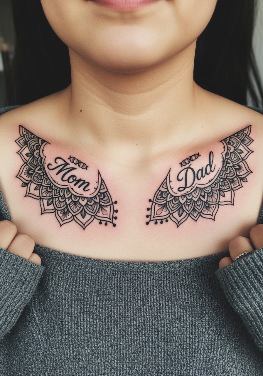
A bilateral mandala balances both sides of the collarbone and reads well when you want symmetry. Tell the artist you want bold outer rings and open interior lattice so the pattern does not blob as it ages. This is best for people who want a visible statement that still reads as decorative rather than literal. Expect two sessions to perfect symmetry and saturation. A tricky mistake is matching two slightly different stencil placements that look misaligned when you stand straight. For low-key display, roll a boatneck sweater down slightly or pick a summer romper with a wide opening to keep both halves visible.
8. Traditional Anchor with Mom/Dad Ribbon Banner
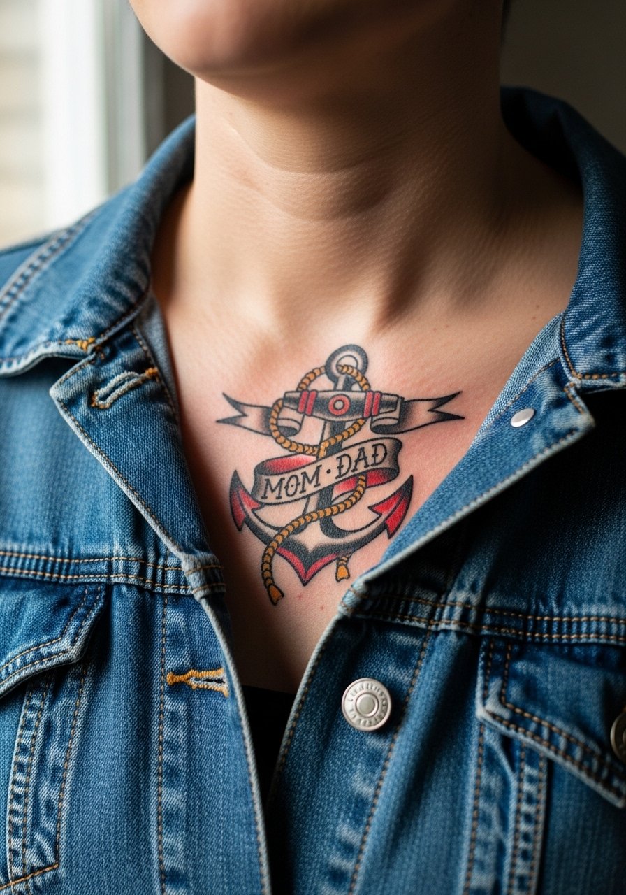
Traditional sailor imagery adapts well to the collarbone because the bold lines survive years of wear. Ask for thick outlines and saturated fills in the banner text to avoid early blurring. Sessions are moderate in time and typically finish in one to two sittings. The common error is shrinking a banner so small that the letters merge into a dark strip. For a relaxed, vintage feel, an off-shoulder denim jacket or a vintage band tee worn off one shoulder frames the anchor perfectly without covering the ribbon.
9. Ignorant Style Block Letters "MOM DAD" Stacked
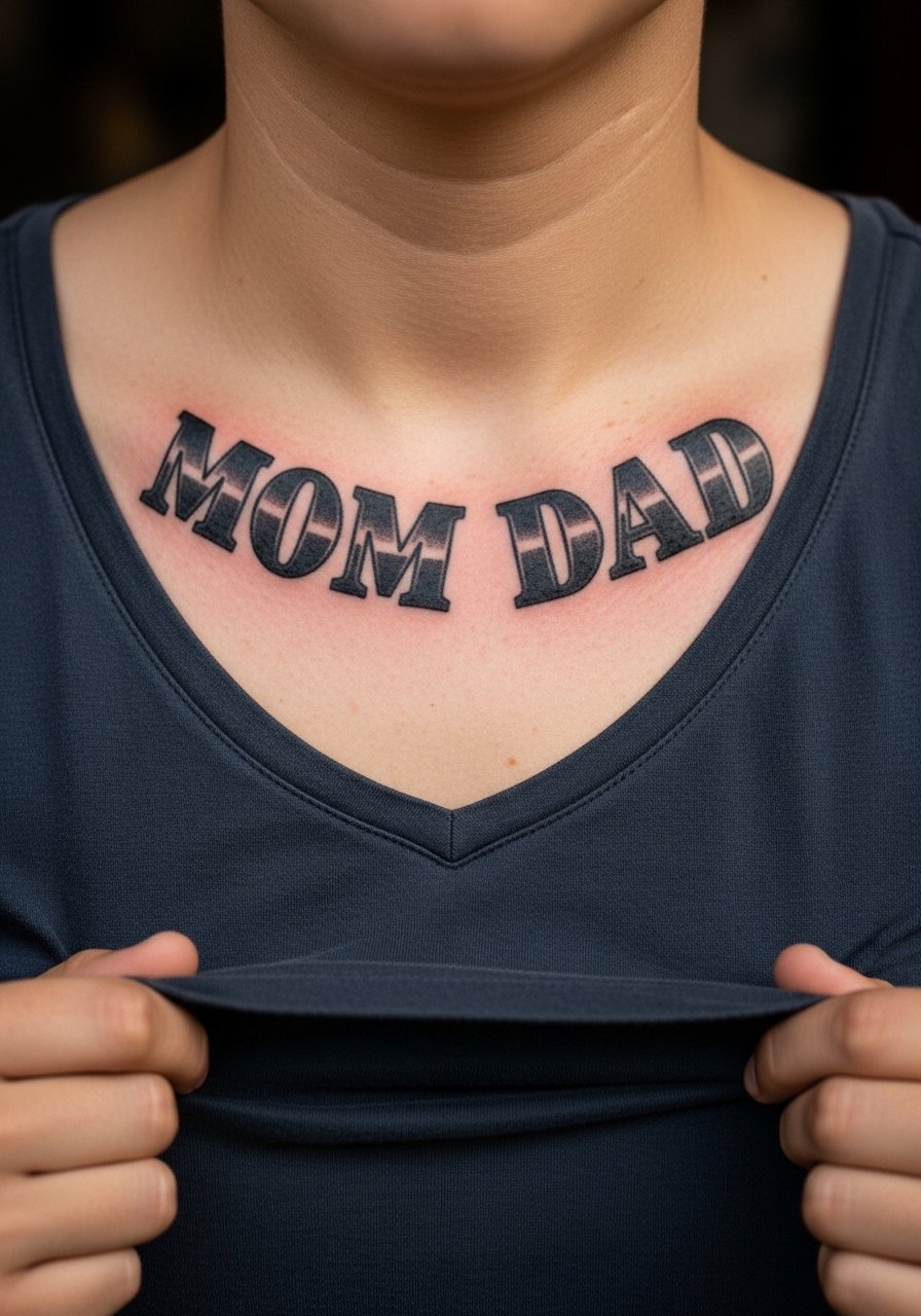
Ignorant style gives raw, unapologetic letters that read from across a room. This style benefits from one solid session and bold fills that keep edges crisp. Because the central dip moves with breathing and posture, ask the artist to test the stencil while you shift to standing and sitting so the stack remains readable. A mistake is using a font with thin counters that will close up into a single black mass after healing. For casual wear, a loose V-neck tank keeps the letters visible without cutting into the skin during the first week.
10. Fine Line Infinity Loop Weaving "Mom" and "Dad"
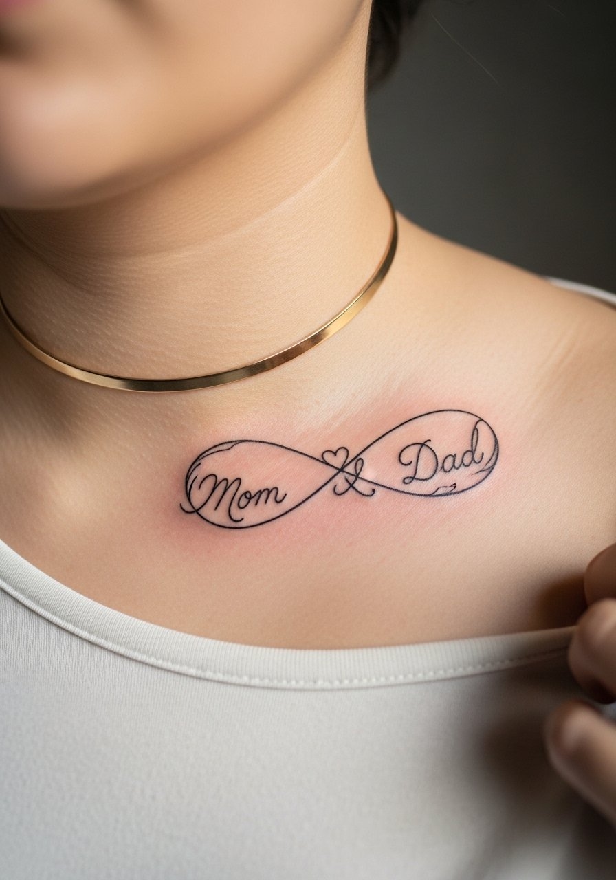
An infinity loop is compact storytelling that hugs the bone. Tell your artist you want spacing between the letters and the loop crossings so the script does not merge into a knot. Expect lower pain than deep rib work but higher sensitivity than flat muscle because the needle rides the ridge. A usual error is compressing names into tiny cursive that loses legibility at distance. Pairing this with a thin gold choker necklace highlights the curve without crowding the ink.
11. Black and Gray Rose Stems Connecting Parent Initials
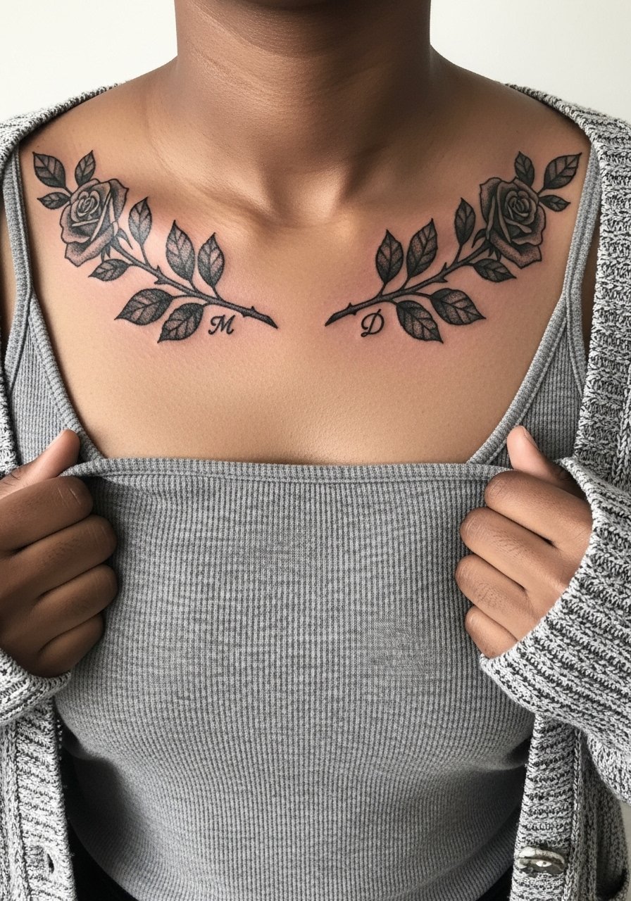
Rose stems provide a graceful flow across the bone line and the stipple shading lends texture without heavy color. Ask the artist to keep stem lines thicker near the bone so they stay visible as the skin moves. Two sessions may be needed if you want deeper gray gradients. The misstep is placing tiny initials inside dense shading, which hides them once healed. For a put-together look, a lightweight open front cardigan worn over a neutral tank lets the rose stems peek through without competing with prints.
12. Minimalist Morse Code for "Mom Dad"
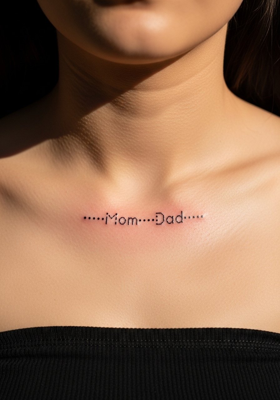
Morse code is the quiet option for privacy-minded people who want a message that only the few will read. The advantage is mechanical clarity and tiny scale. Be specific in the stencil review so the dot spacing remains consistent, and ask for slightly larger dot sizes than you think you need to prevent early merging. Touch-ups are inexpensive if dots soften. Style this with a bandeau neutral top so the code is discreetly revealed at gatherings without being the center of attention.
13. Neo-Traditional Bird Silhouettes Carrying Script
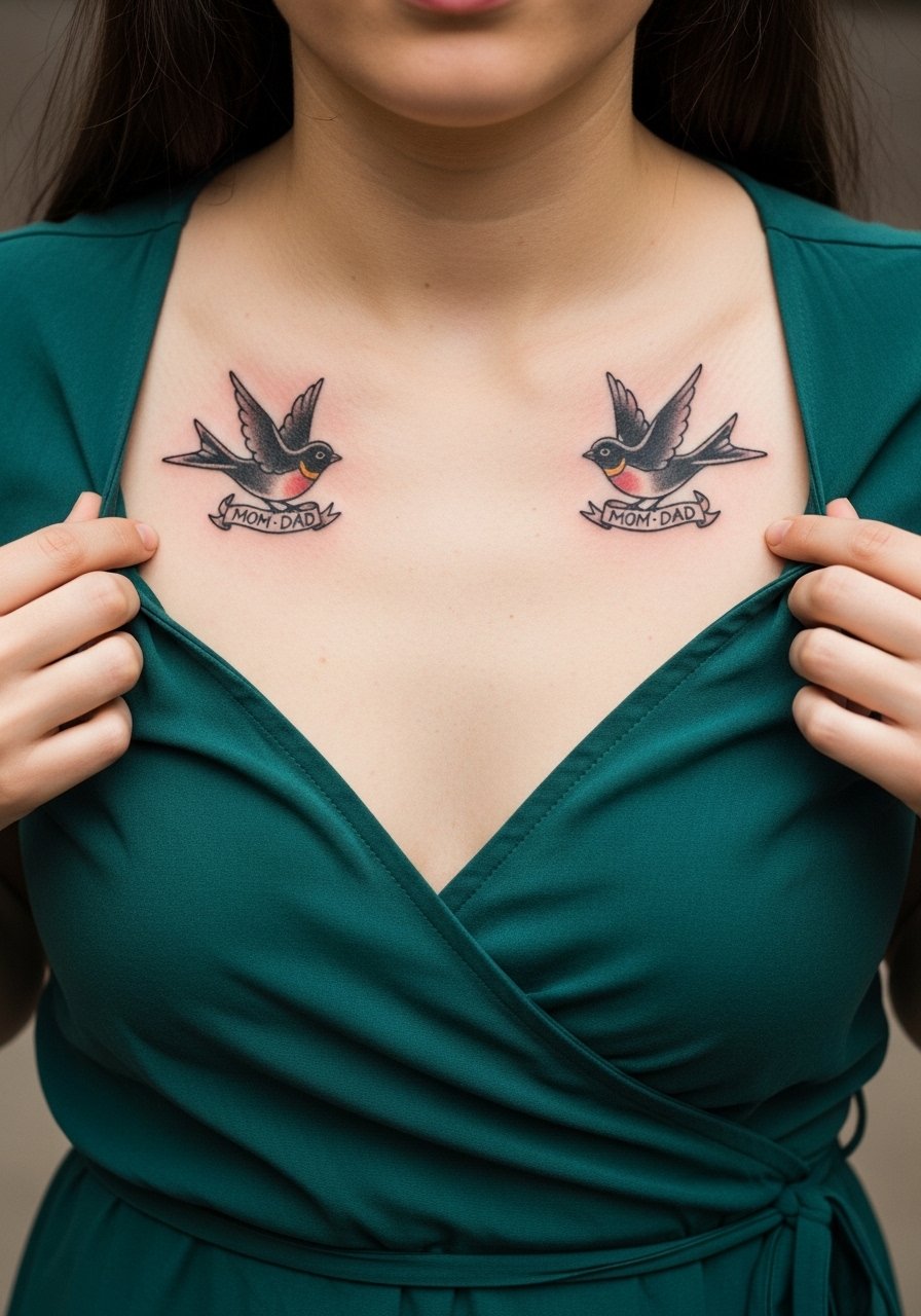
Birds introduce motion and a narrative of flight and care. For longevity, ask for simple silhouettes with minimal tiny feathers that would blur. Usually done in two sessions, the main error is over-detailing wings at small scale. If you want both names readable, put them on the banners with bold letters rather than micro cursive. Wrap dresses and small hoop earrings create a romantic look and a v neck wrap dress keeps the birds visible without obstruction.
14. UV-Reactive Night Glow Parent Names
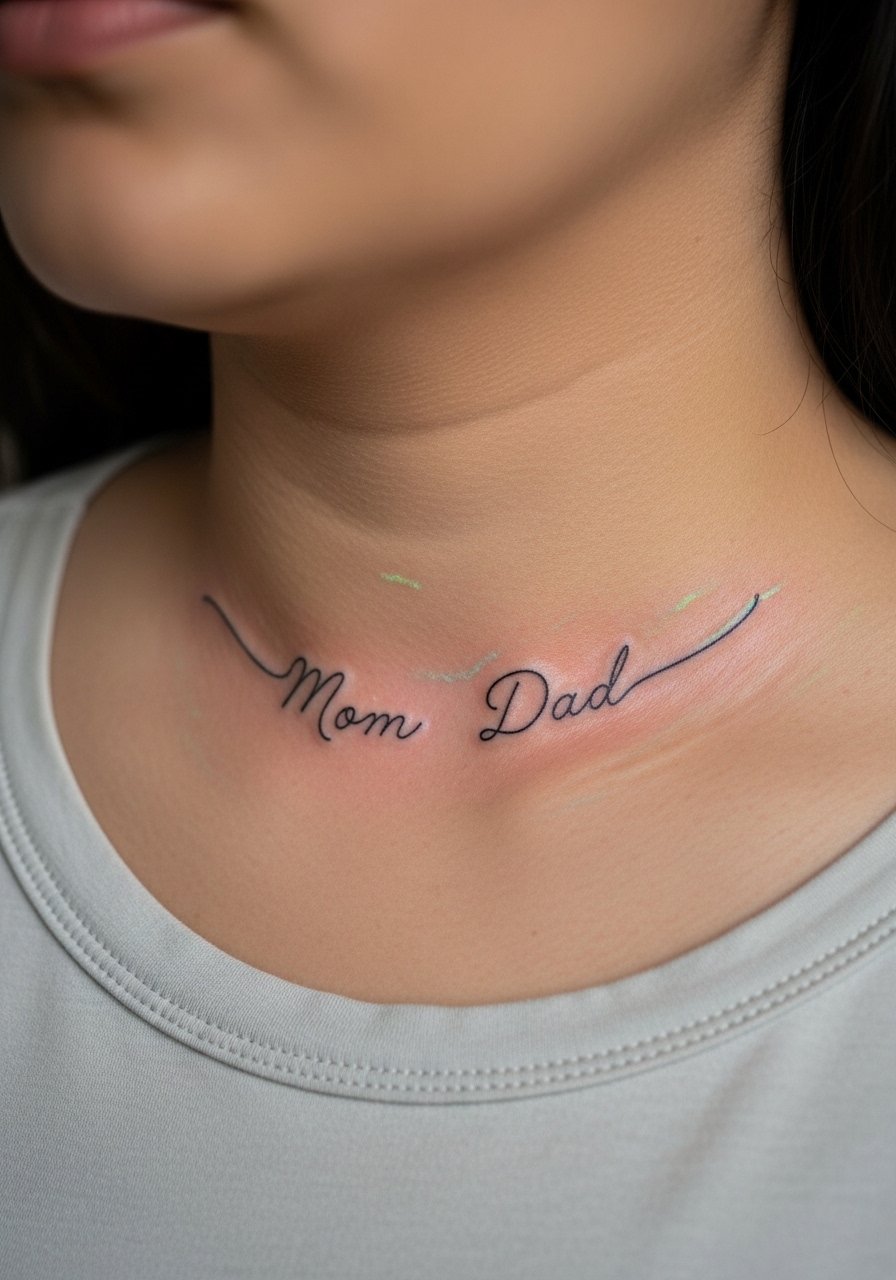
UV ink is niche and playful, especially for people who want a secret glow in dim light. Not every studio uses UV, so ask where they source their pigments and whether they patch-test for reactions. One camp of artists treats UV pieces as safe and stylish under black light. The other warns the pigment can fade differently and be harder to touch up. If you try it, expect to schedule a touch-up earlier than for standard black ink. This is a good fit for people who enjoy nightlife silhouettes and who understand the niche maintenance.
15. Asymmetrical One-Sided Mom or Dad Story
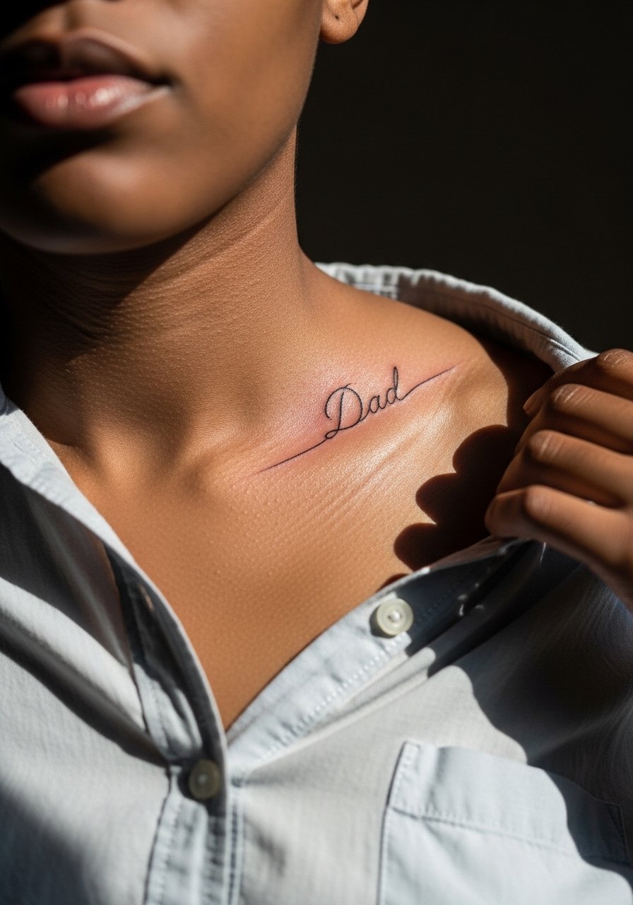
Putting a name on only one collarbone tells a specific story and reduces the total session time. This choice is great if you want a personal narrative that does not demand symmetry. Tell the artist the exact placement in relation to the clavicle notch so it reads intentional, not accidental. Watch for dressing-related friction from bra straps during the first week. For the appointment, a loose button-down shirt you can pull to the side saves a lot of awkward undressing.
16. Birthdate-Synced Heartbeat Line
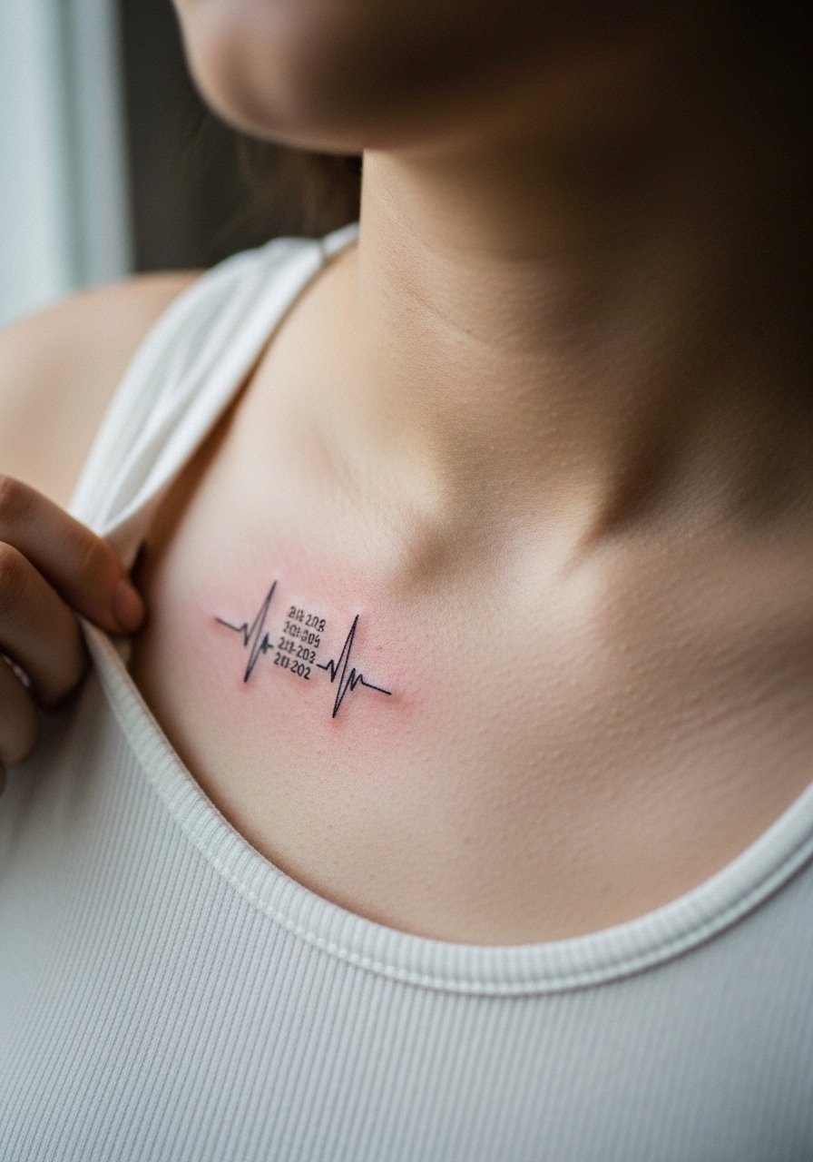
Syncing a waveform to a birthdate adds a precise, sentimental layer. It requires clear communication with your artist so the waveform actually corresponds to the numbers you want preserved. Small scale means slight changes can obscure the encoded data over time, so request readable peaks and spacing. This is a low-pain, high-concept option and it photographs well with minimal accessories. A tank top that exposes the upper chest keeps the waveform centered and easy to capture in photos.
17. Single-Needle Weight Script with Extra Spacing
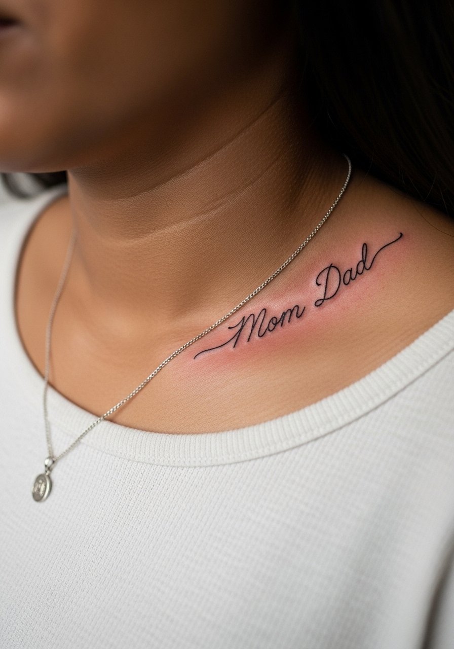
This is a longevity-minded take on fine line script. Ask explicitly for more letter spacing and a marginally heavier single-needle so letters hold their shape as the skin shifts. Expect a briefer session but insist on a stencil check at three different postures. A typical error is requesting hairline spacing that collapses into unreadable cursive after a year. For a clean presentation, a thin chain pendant necklace sits above the script without crowding the collarbone.
18. Split Symmetry, Names Each on Separate Collarbone
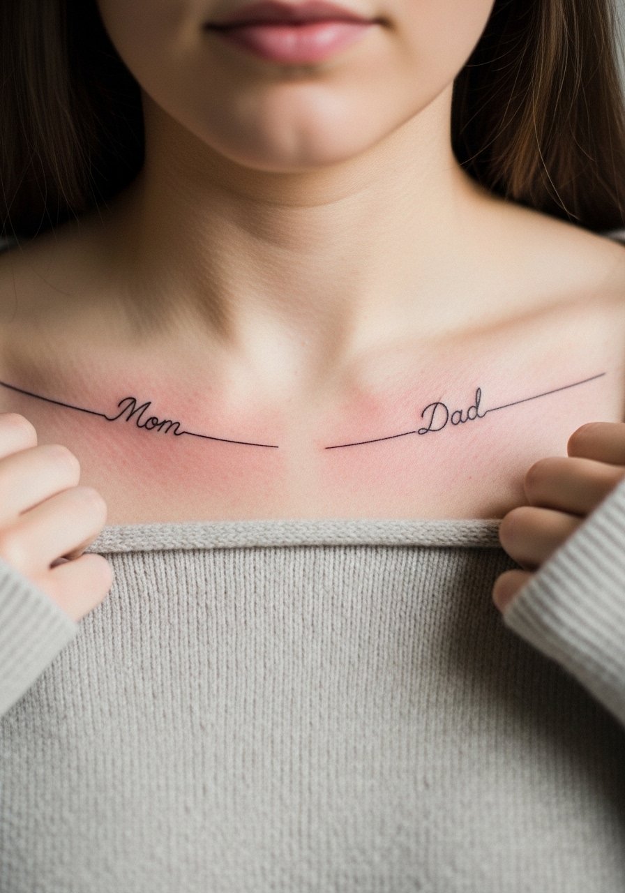
Putting one name on each collarbone gives you a balanced look and splits pain into two lighter sessions if you prefer. Ask for mirrored letter spacing and matching baseline so both names read as intentional halves. The main practical issue is making sure both stencils are applied while you are standing so breathing does not make one sit higher. This layout photographs beautifully with a boatneck or open summer rompers that keep both sides visible and equal.
19. Tiny Geometric Frame with "Mom Dad" Inside
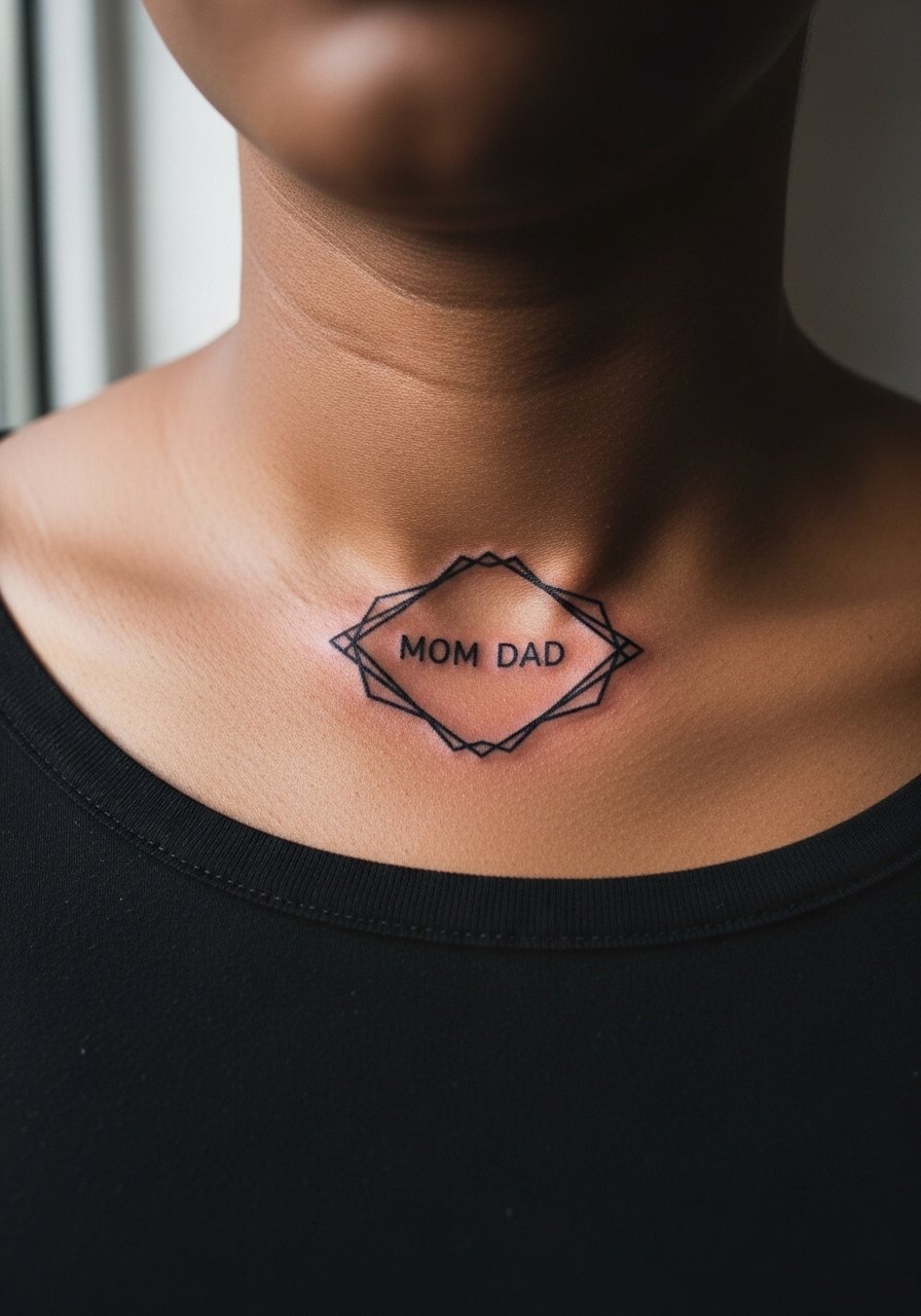
Encasing names inside a tiny geometric frame keeps the focus tight and intentional. For readability, make the frame slightly larger than you instinctively want so letters have breathing room. This approach is forgiving because the frame preserves edges even if the interior softens a little. Expect a shorter appointment and a straightforward touch-up schedule. Pairing it with a simple thin stackable rings and a neutral top keeps the accessory conversation in balance.
20. Stipple-Shaded Mini Silhouette Portrait
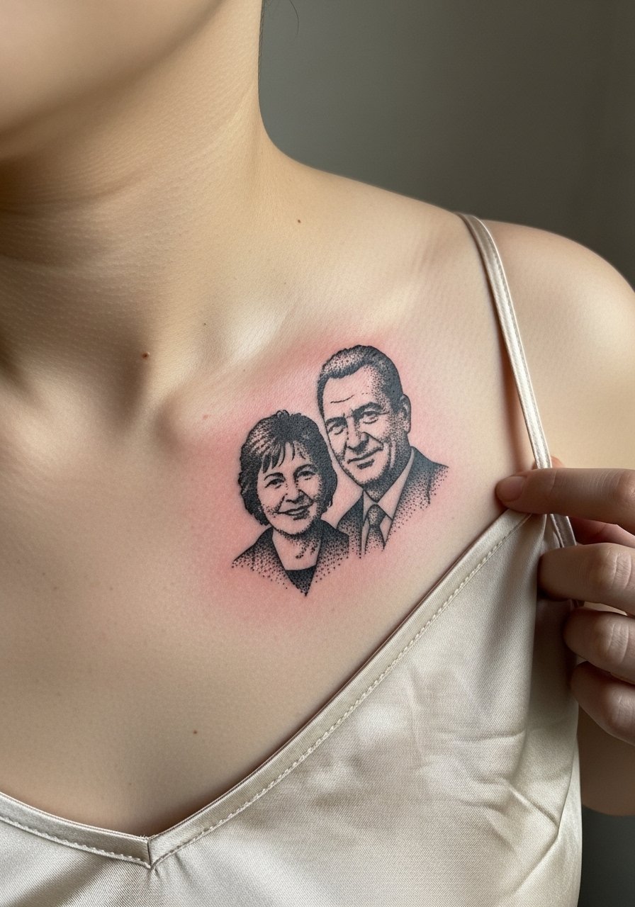
Stipple shading gives a delicate texture that scales down well for tiny silhouettes. Ask for a high-contrast silhouette rather than micro-photorealism so identifying features remain recognizable. Two sessions might be needed for densities and touch-ups. A common error is asking for too many midtones that merge on small skin surfaces. For evenings out a silk camisole half-unbuttoned keeps the silhouette visible and elegant.
21. Script Inside a Flowing Ribbon Following the Bone Curve
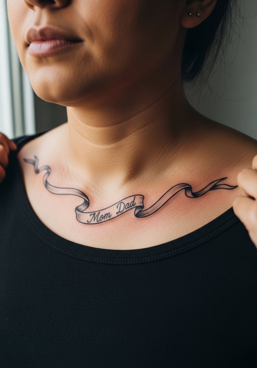
A ribbon that tracks the clavicle makes the design feel like it was made to sit on that spot. The trick is asking the artist to trace the stencil while you move your shoulders so the ribbon does not compress into a fold when you sit or reach. Expect one session for the linework and a short color pass if you want subtle shading under the ribbon. Avoid tiny script inside thin ribbon bands. For a polished outfit, choose an open front cardigan over a neutral tank to let the ribbon breathe without rubbing.
Frequently Asked Questions
Q: Will fine line script on the collarbone fade faster than bold blackwork?
A: Fine line tends to soften sooner than saturated blackwork because the single channels of ink sit shallower and have less visual mass. Expect to plan for a touch-up in the six to twelve month range if you rely on very thin strokes. If you want longevity without losing the clean look, ask for slightly heavier single-needle weight and keep sun exposure to a minimum.
Q: How much does collarbone placement hurt and are numbing creams okay?
A: Collarbone sessions are often described as sharper over the ridge because the needle rides close to bone. Pain varies by person and by how long the session lasts. Numbing cream is accepted by many first-timers and can make the session manageable, though some traditionalists argue it changes how you perceive the experience. Talk to your artist about a patch test and timing if you know you need it.
Q: Do dark and medium skin tones need different design choices for readability?
A: Higher contrast and bolder line weights read better across a range of skin tones, especially on the collarbone where sun exposure can accelerate fading. Blackwork, solid fills, and open negative space help designs remain legible. If you have a darker tone, ask for stronger outlines or slightly larger lettering so the piece photographs and heals with clarity.
Q: What should I wear to my collarbone appointment to make access and comfort easier?
A: Pick clothing you can pull to the side without taking off everything. A loose button-down, a wide-neck shirt, or a tank top works best so the artist can reach the area cleanly. Bring a thin necklace you can remove and a loose bra to avoid straps rubbing during the first week. A loose button-down shirt is a reliable go-to for both access and modesty.
Q: Are there healing debates I should know about for collarbone tattoos?
A: Yes. Two prominent debates are Saniderm versus dry healing and fine line durability on bony spots. One camp supports protective film for fewer infections and cleaner early stages. The other believes dry healing and minimal occlusion help line definition long term. Both approaches have advocates and trade-offs. Pick a method after talking with your artist and considering your sweat level, clothing friction, and access to follow-up care.