
The neo-traditional hand tattoo trend is louder than ever. What looks like an easy flash piece often demands color saturation, bold linework, and careful placement to survive daily friction, sun, and frequent washing. If you want a hand piece that still reads clear at year three and beyond, pick the right motifs, ask the artist for longevity tweaks, and plan for touch-ups. Below are 27 hand-focused neo-traditional ideas, how they age, what to tell your artist, and real styling tips for the session and everyday wear.
1. Side-of-Hand Victorian Rose with Velvet Tones
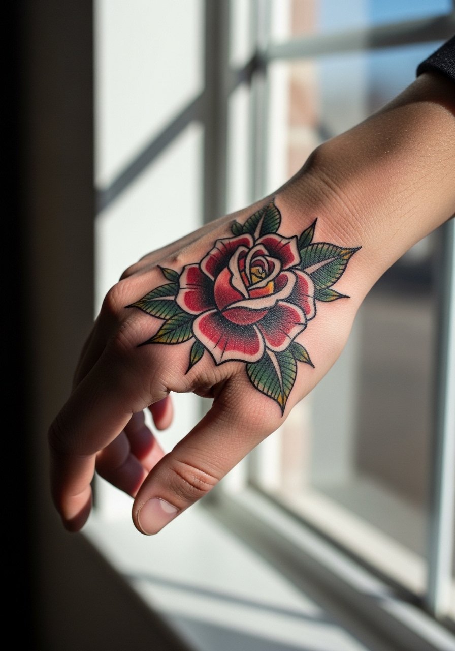
I recommend this when you want a floral that reads strong from a distance and still photographs well up close. Ask your artist for bold outside outlines and solid color blocks rather than hairline shading. The common mistake is a tiny pastel rose with feathered shading. It looks delicate fresh and then softens into a muddy patch after a year. For longevity, prefer jewel tones and skip hair-thin petal veins. Pain on the side of the hand is moderate. Session time is usually one short appointment. For showing it off, roll up a linen button-down sleeve so the side of the hand is visible without wrist clutter.
2. Wrist-Medallion Portrait Cameo, Neo-Traditional Edge
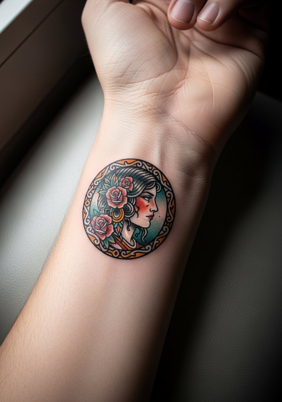
This compact portrait reads like a keepsake when contained in a circular medallion. Tell your artist you want simplified features and strong linework rather than micro-realism. Artists debate portrait detail on wrists because fine faces can lose definition faster than on an arm. One camp avoids faces on wrists altogether. The other uses bolder outlines and limited color fields to make portraits hold. Expect more touch-ups than a plain rose. Session feel is quick but precise. Wear a loose short-sleeve tee for the appointment so the wrist is fully accessible.
3. Back-of-Hand Jewel-Toned Butterfly with Stipple Shading
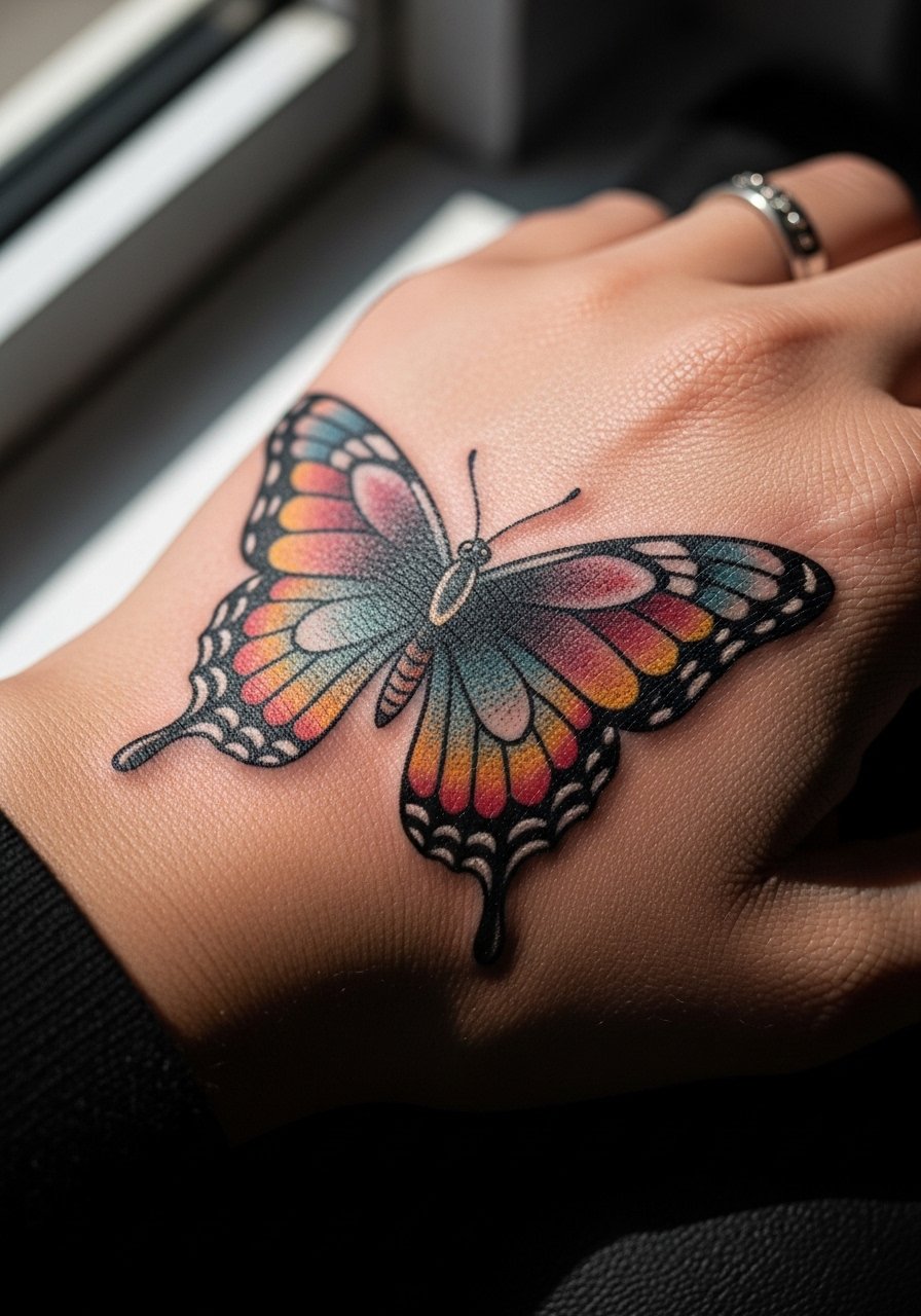
Butterflies shine in neo-trad when artists use rich saturation and stipple shading for depth. Ask for stronger contrast between wing edges and inner color so the pattern reads after fade. A common error is delicate watercolor fills that vanish within months on hands. This version uses dense saturation and midweight linework to resist blowout and abrasion. Expect 1–2 touch-ups in the first three years. For daily style, pair it with a thin gold chain bracelet stack on the opposite wrist so the butterfly stays the visual focal point.
4. Finger-to-Knuckle Serpent Wrapped in Roses
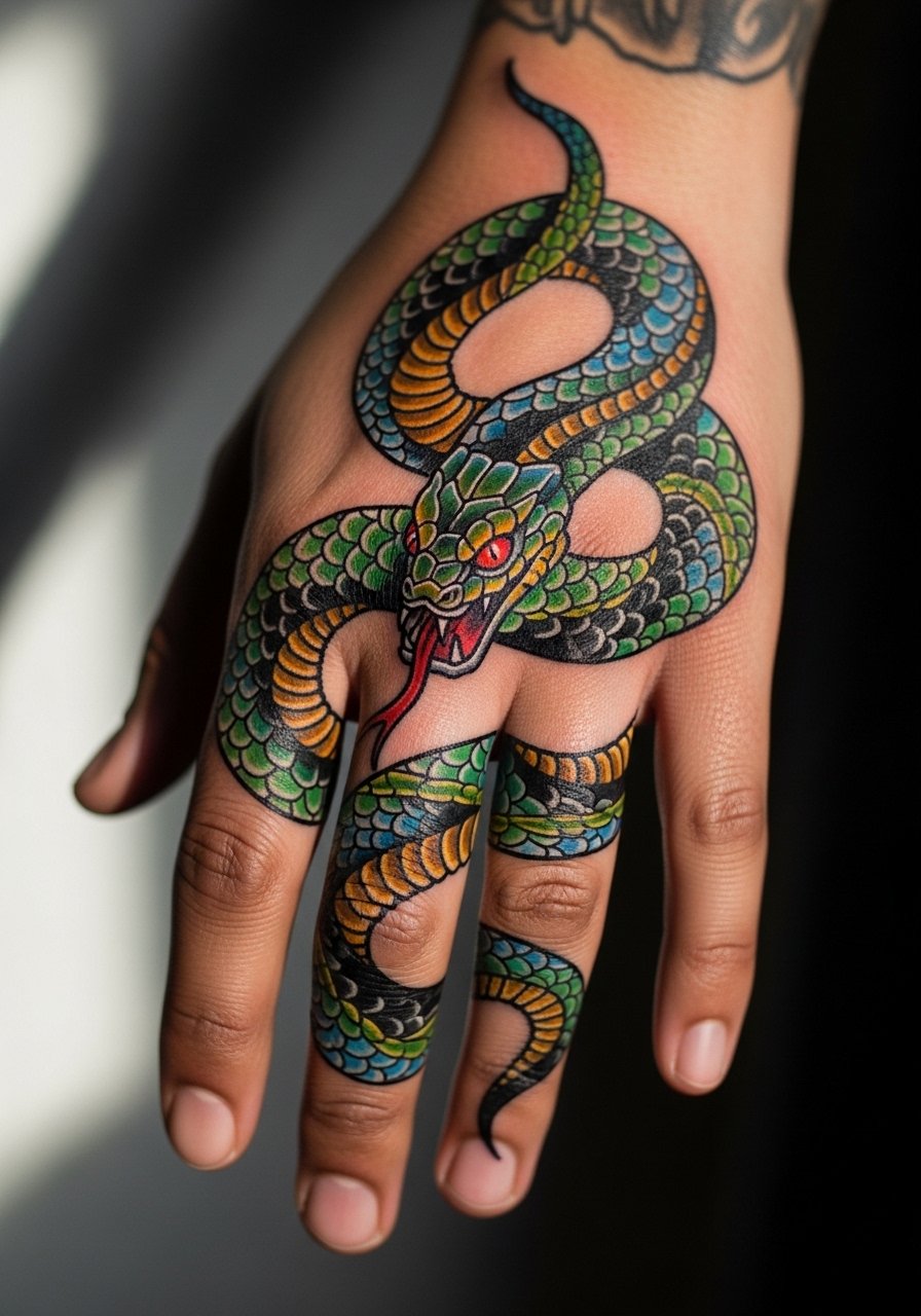
This wrap is dramatic because it uses negative space along the finger joints. Tell your artist to avoid ultra-thin lines over knuckles. The mistake people make is asking for tiny scales and hairline details that blur where the skin flexes. This design benefits from bolder scales and solid color blocks where movement is highest. Knuckles and fingers are high-wear zones. Expect more frequent touch-ups and the possibility of partial fading where rubbing is constant. Session discomfort is higher on knuckles. During the appointment wear a racerback tank so you can stay comfortable without sleeves restricting arm rests.
5. Half-Hand Peony Panel with Art Nouveau Filigree
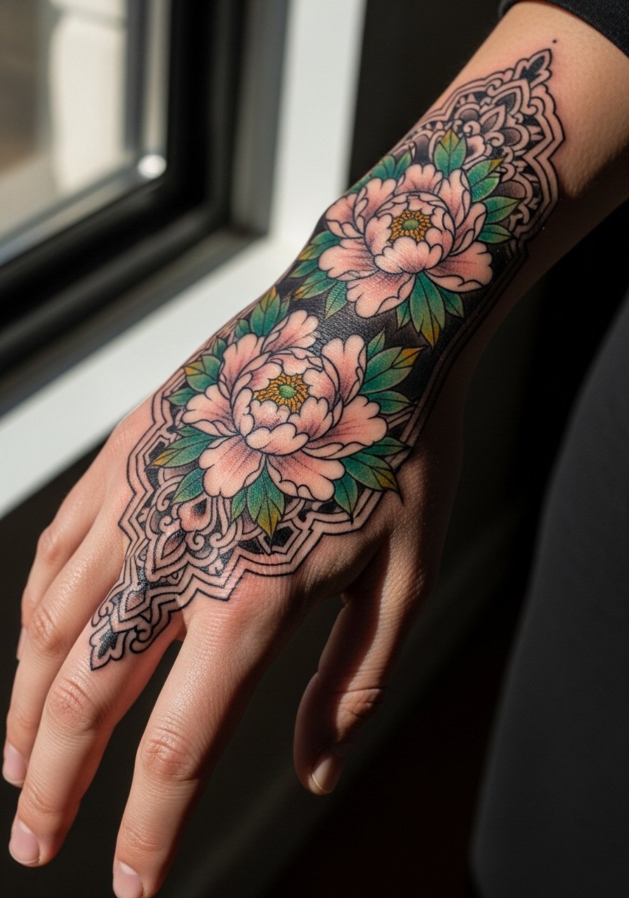
A peony panel fills the hand without needing tiny fineline textures. Ask for layered color patches with clear edge definition and ornamental filigree as negative space. The aging pitfall is overworked gradients that merge into one tone. This approach uses discrete color zones and strong outlines so the floral silhouette stays readable. Plan for a multi-session build when saturation and layering are required. This placement can show up in photos and looks intentional with rolled sleeves and a minimalist watch on the opposite arm during events.
6. Ornamental Script Banner with Neo-Traditional Frame
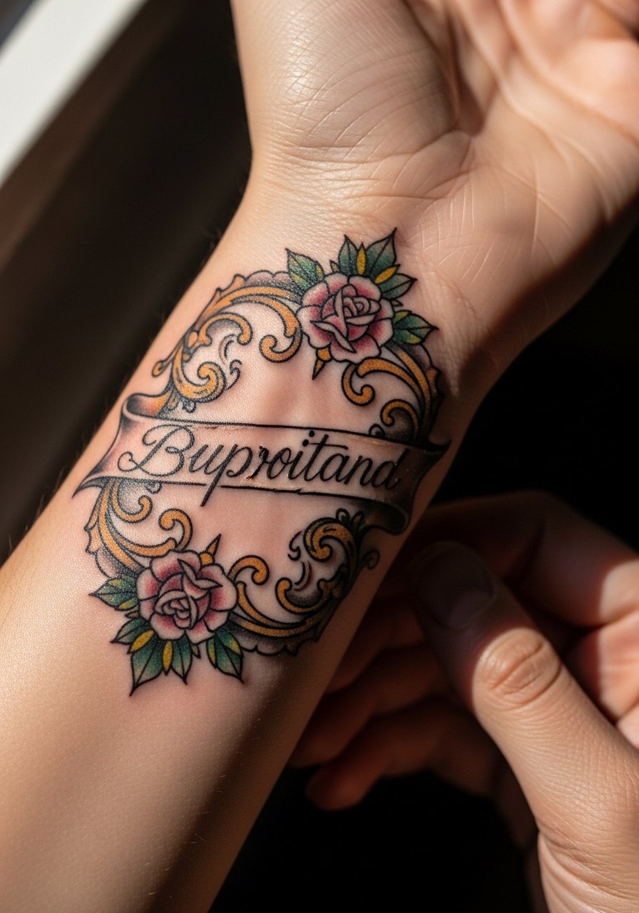
Script on the wrist needs letter spacing that can handle expansion and abrasion. The common misstep is hairline cursive that dissolves into a blur at year two. Ask for slightly heavier letterforms and an ornamental frame to protect the script visually. Artists differ on whether to recommend Saniderm for wrists because of frequent hand washing. If your job requires heavy hand use, discuss shorter protective film wear time. For the session, avoid tight bracelets and wear a loose button-down shirt you can pull aside.
Before You Book
The wrist, knuckle, and back-of-hand pieces above face more friction than forearm tattoos, so a few targeted items help before and after the session.
-
Indie tattoo balm. A small, fragrance-free balm helps maintain saturation during the initial healing window without overly occluding the skin.
-
Fragrance-free gentle body wash. Cleans the hand after work or cooking without stripping pigment during the first two weeks.
-
Thin protective film roll. Useful for adapting Saniderm-style coverage to fingers and wrists where movement is constant.
-
Stitching transfer stencil paper kit. Lets you preview placement and scale on your hand before committing to linework.
-
Aquaphor healing ointment. Thin layers in the first few days reduce scabbing and keep fine lines from drying out.
7. Knuckle Mini Symbols with Bold Outlines
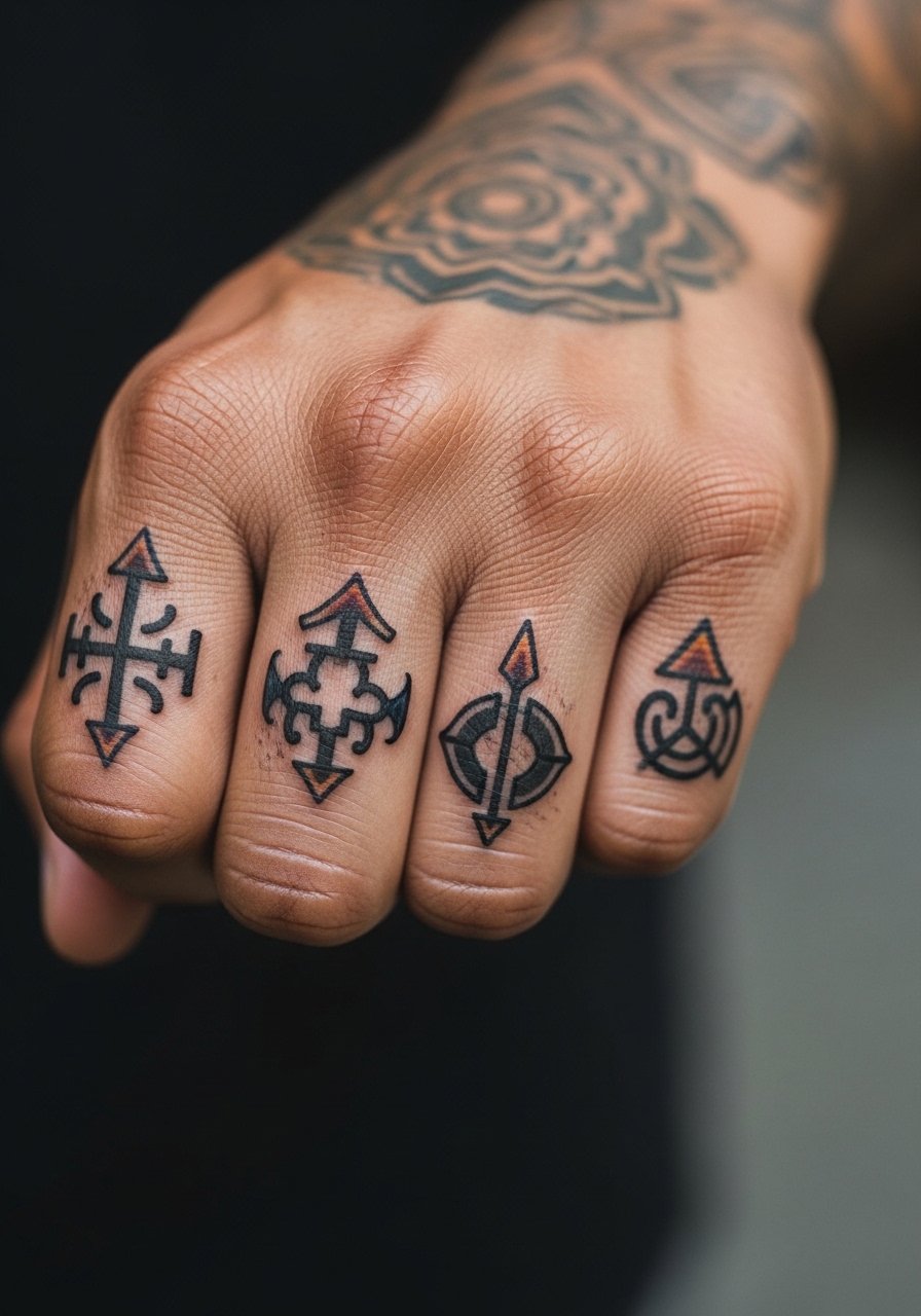
Knuckle tattoos force design economy. Pick symbols that rely on shape rather than interior detail. Tell your artist you want thick outlines and simplified fill areas. Small, intricate motifs age poorly on knuckles because the skin is thin and rubbing is constant. If you want letters, space them wider than you think. Pain is sharp on the knuckles. For finishing looks, keep rings minimal and wear a thin gold cuff bracelet on the opposite wrist to balance the hand without crowding the knuckle art.
8. Micro-Panel Tarot Card on the Back of Hand
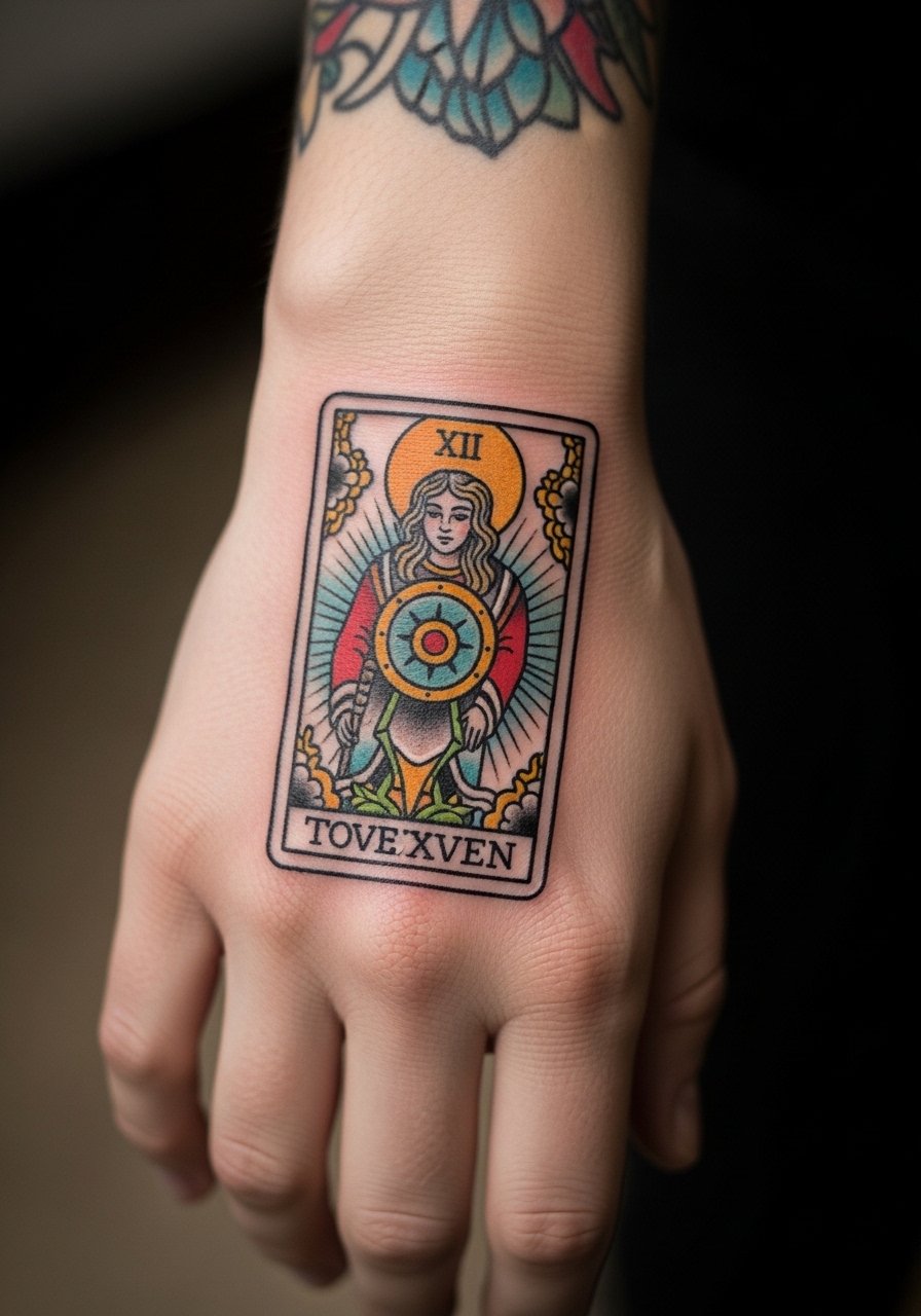
A tarot mini-panel works well as a contained narrative element. Ask for simplified iconography and a bold border. The problem is over-detailed imagery in a tiny space. That leads to muddiness after a year. Ask the artist to prioritize silhouette and high-contrast color. Expect this to need a small touch-up in the first 12–18 months. Session time is compact but requires precision. For outfits, the panel pairs with neutral sleeves and a racerback tank when you want it visible.
9. Jewelry-Inspired Chain and Locket Design Along Thumb Web
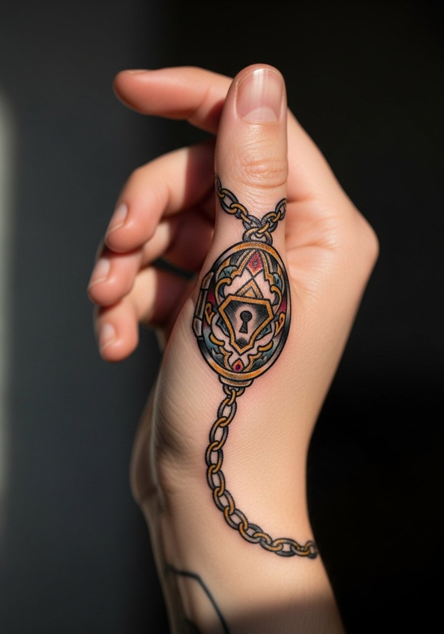
Jewelry tattoos mimic real accessories and photograph well. Request a heavier outline on the chain links and a simple locket face so the piece keeps shape when it fades. The common error is ultra-thin chain links that blur and lose definition. Placement near the thumb sees lots of rubbing from pockets and phone handling. Consider a slightly darker contrast palette and plan for touch-ups. Wear minimal rings on that hand after healing. For the session, choose a loose tank top to keep your arm comfortable.
10. Neo-Traditional Moth Aligned with Veins and Tendons
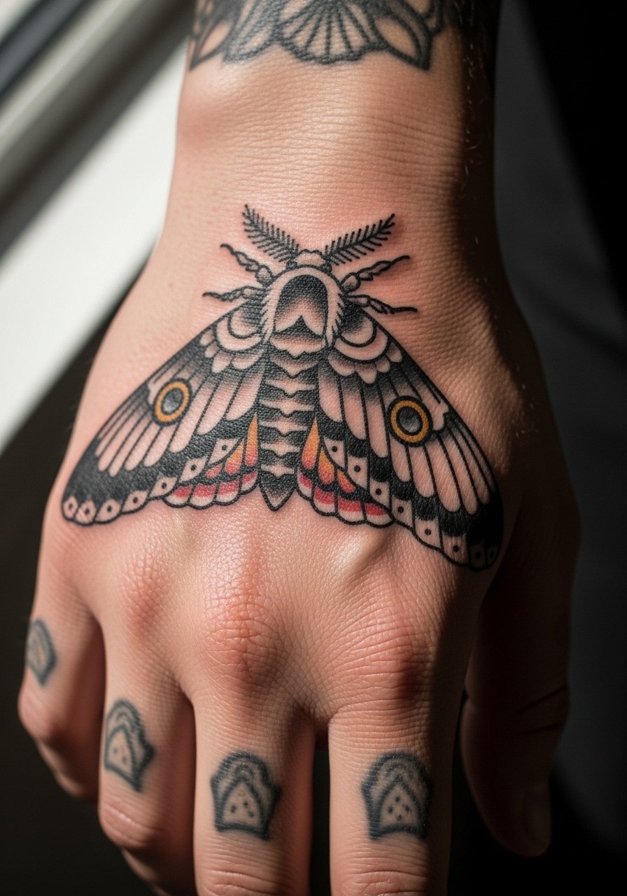
A moth design that cooperates with hand anatomy looks integrated rather than pasted on. Tell your artist to align wings with natural lines and pick saturated pigments for the body. Avoid mottled gradients across flex points. The mistake is fine-scale stippling in high-movement zones. That fades unevenly and can look patchy. Touch-ups are common where the wings cross knuckle creases. The session can sting where tendons are thin. For showing off, neutral jewel tones and a minimalist watch opposite the hand accentuate the moth.
11. Ornamental Crescent Moon with Face, Side Hand Placement
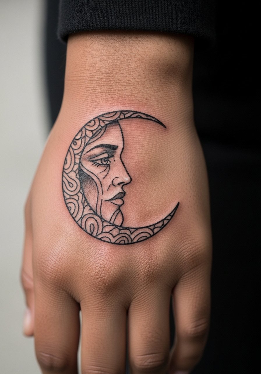
Lunar motifs translate well into neo-traditional framing and ornamental flourishes. Ask for clean negative-space around the moon so the face detail remains readable. The error is packing too much facial shading into a small crescent. That blurs quickly. A bold outline and selective color blocks hold better. Side-of-hand placement sees moderate wear. Plan to touch up the lighter tones first. For appointment comfort, wear a rolled sleeve linen button-down you can slide up easily.
12. Pocket Compass with Jewel Accent on Wrist Edge
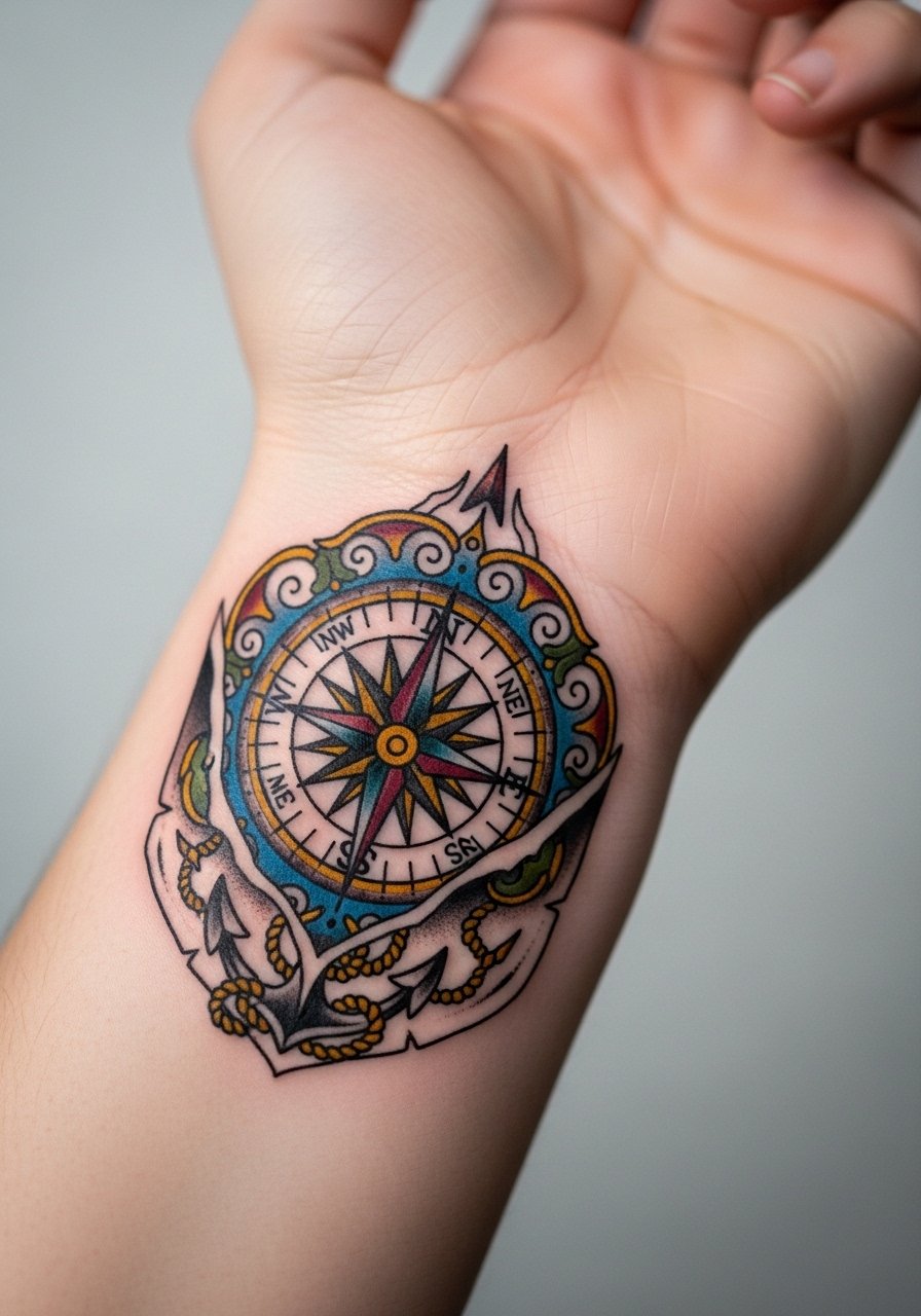
A compact compass is ideal for the wrist edge where it will peek from sleeves. Ask for a dense central pupil and jewel-tone accents that keep color depth when fading begins. The aging issue is pale jewel fills that wash out on exposed wrists. Choose saturated pigments and limit tiny crosshatching that doesn't hold under friction. Session time is short but requires careful lining. Pair this with a minimalist watch on the other wrist so the compass feels intentional.
13. Stacked Miniatures: Skull, Rose, and Dagger Cluster
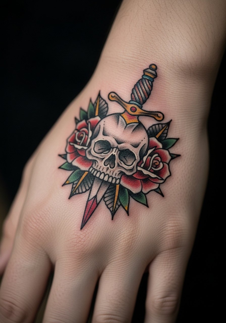
Clusters are a way to pack multiple motifs into the hand space without tiny micro-detail. Guide your artist to use distinct separation between elements so each reads on its own. The common mistake is making them too close, which merges into a blob when healed. Space and bold borders prevent that. Expect touch-ups in the high-contact zones. The session feels like a focused short appointment. For streetwear pairing, a short-sleeve tee solid color keeps attention on the cluster.
14. Art Deco Fan with Geometric Fill on Back of Hand
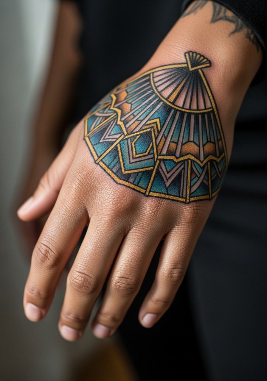
Art Deco geometry looks crisp in neo-trad when artists use clear negative space between motifs. Ask for slightly thicker linework in dense areas. The aging error is too-fine geometry that bleeds into gray fields. This design benefits from space and solid fills. Durability is good if the artist keeps the guard lines strong. For the session, avoid tight jewelry. For show-off styling, neutral jewel-tone tops pair well.
15. Peacock Feather Accent Drifting Toward Knuckles
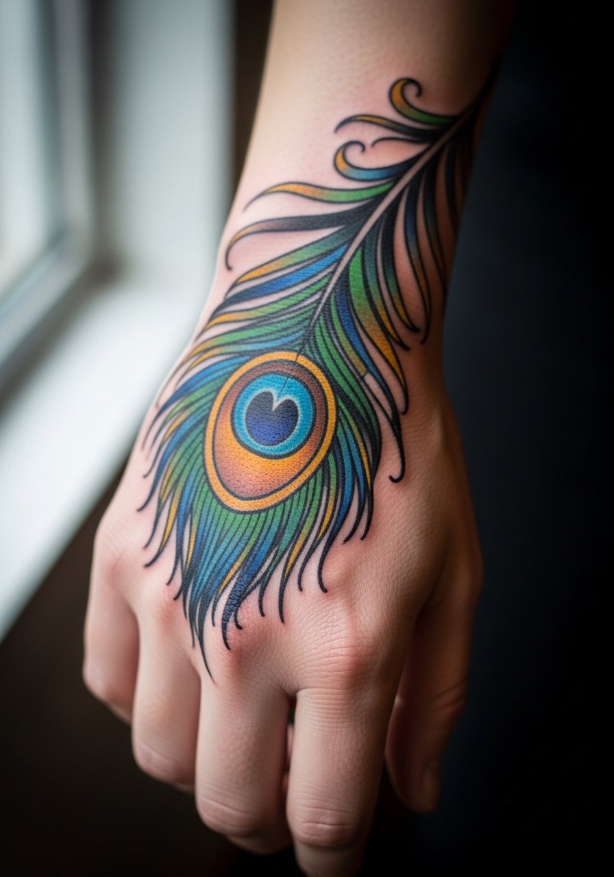
Feather work must account for movement across knuckles. Ask for defined rachis and selective color blocking. A mistake people make is ultra-fine barbs that blur in the first year. Bold barbs and a strong spine keep the feather readable. Touch-ups will likely be needed on the tips that meet fingers. For outfits, rolled sleeves expose the feather best. Wear a thin gold chain bracelet stack on the other wrist to balance visual weight.
16. Ornamental Eye in a Frame with Jewel Highlights
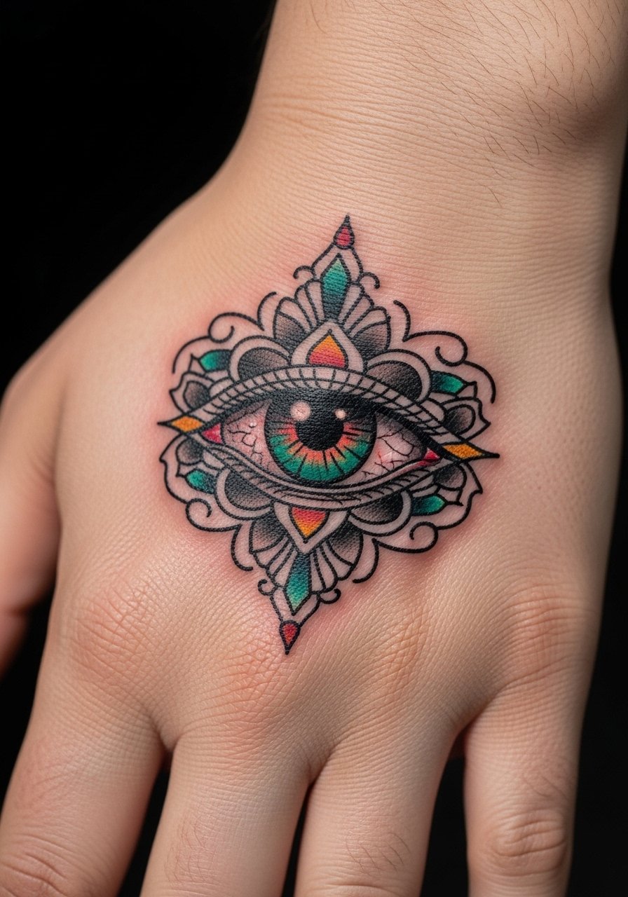
Eyes are powerful focal points in neo-trad. Request simplified iris detail and heavier eyelid lines. Tiny pupil textures get lost on hands. The common version that ages poorly uses micro-dot pupils and soft shading that softens into a patch. A clean outline and selective color accents improve longevity. Expect a touch-up in 12–24 months. Session feel is focused and a little tender. For the session, bring a loose button-down shirt to stay comfortable.
17. Nautical Anchor with Floral Frame on the Thumb Base
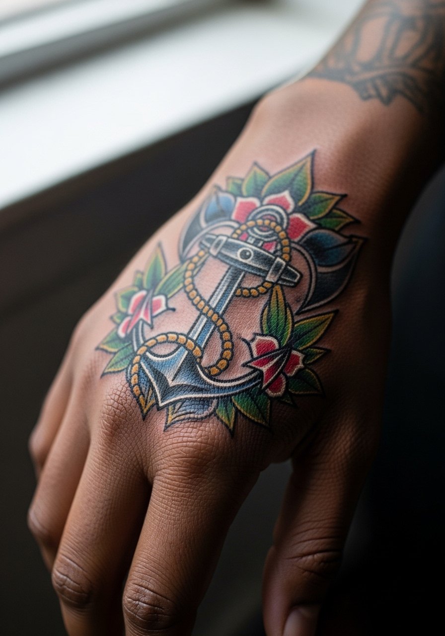
Anchors are classic and translate well into neo-traditional ornamentation. Ask for bold anchor lines and simplified flower petals. The mistake is busy filigree hugging the anchor too tightly. Give the anchor room to read. Thumbs see frequent contact with devices and pockets. Expect touch-ups along the edges. Appointment wear: avoid tight gloves and opt for a loose tank top so your arm sits comfortably.
18. Miniature Cameo Locket with Portrait Silhouette
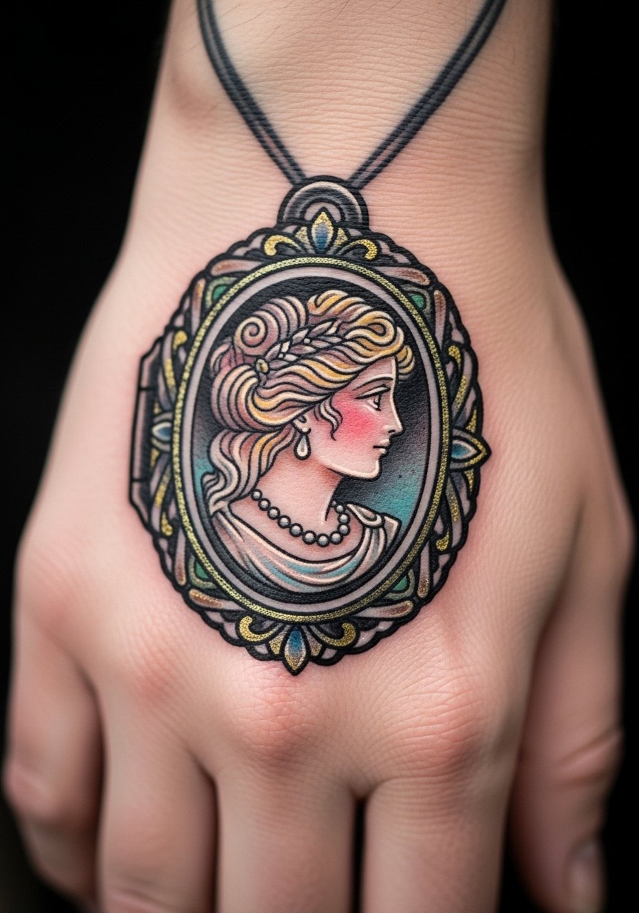
A cameo is a subtle statement piece. Tell your artist to simplify facial features into a silhouette and use a decorative frame to keep the shape legible. Overly detailed faces inside a cameo are a common regret. Keep contrast high. This idea is lower-risk for blowout because of compact form, but it still needs maintenance. For showing it off, a dainty pendant on the opposite side of the body or clean nails helps images read.
19. Neo-Traditional Phoenix Rising Along the Thumb Edge
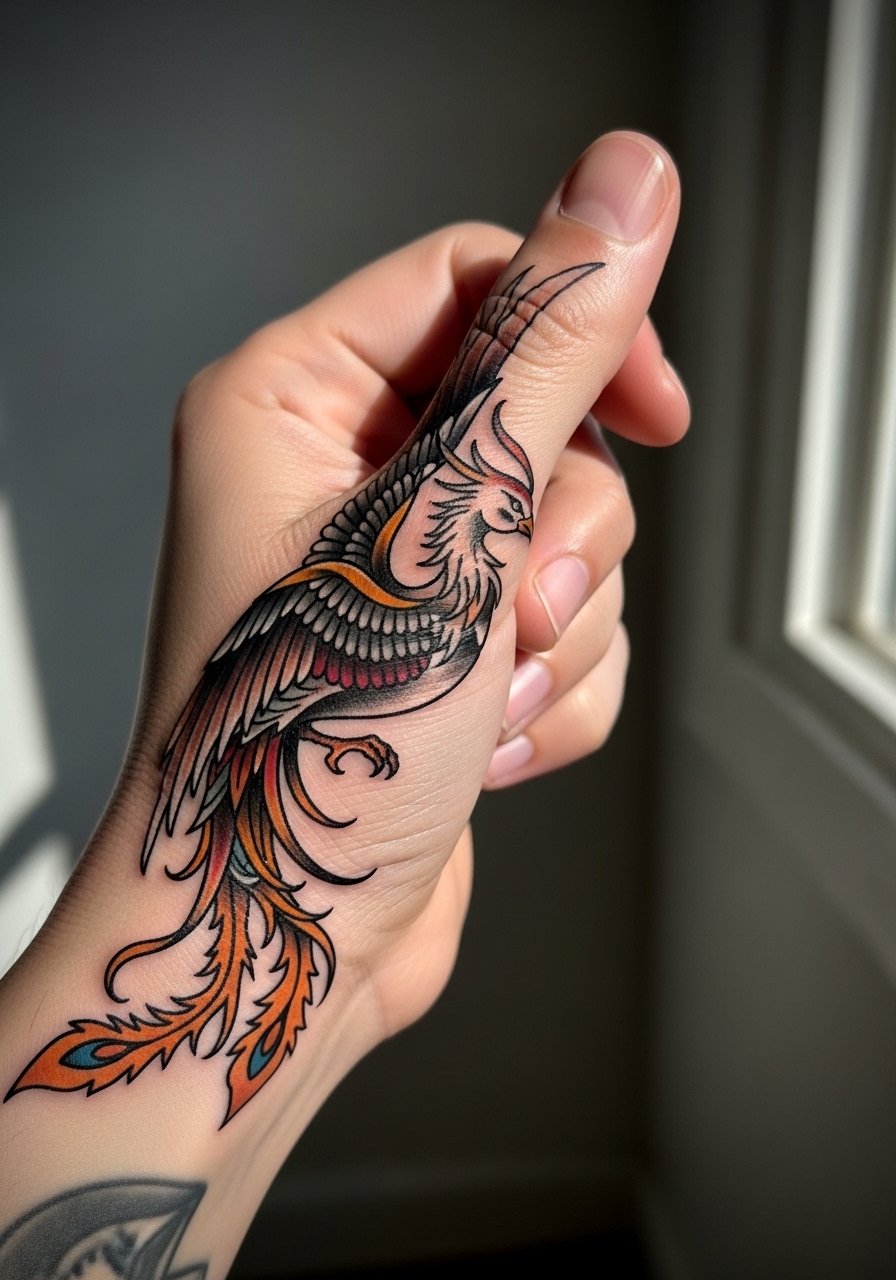
A vertical phoenix uses the hand's natural line to great effect. Ask the artist to use distinct color zones and avoid micro-feathers across joints. The common mistake is excessive feather detail that blurs where the hand bends. This approach uses bold shapes and saturated fills so the silhouette stays strong. Plan for a layering session if you want deep saturation. Wear a minimalist watch on the opposite arm to balance the dramatic phoenix.
20. Symmetrical Twin Roses Across Each Side of the Hand
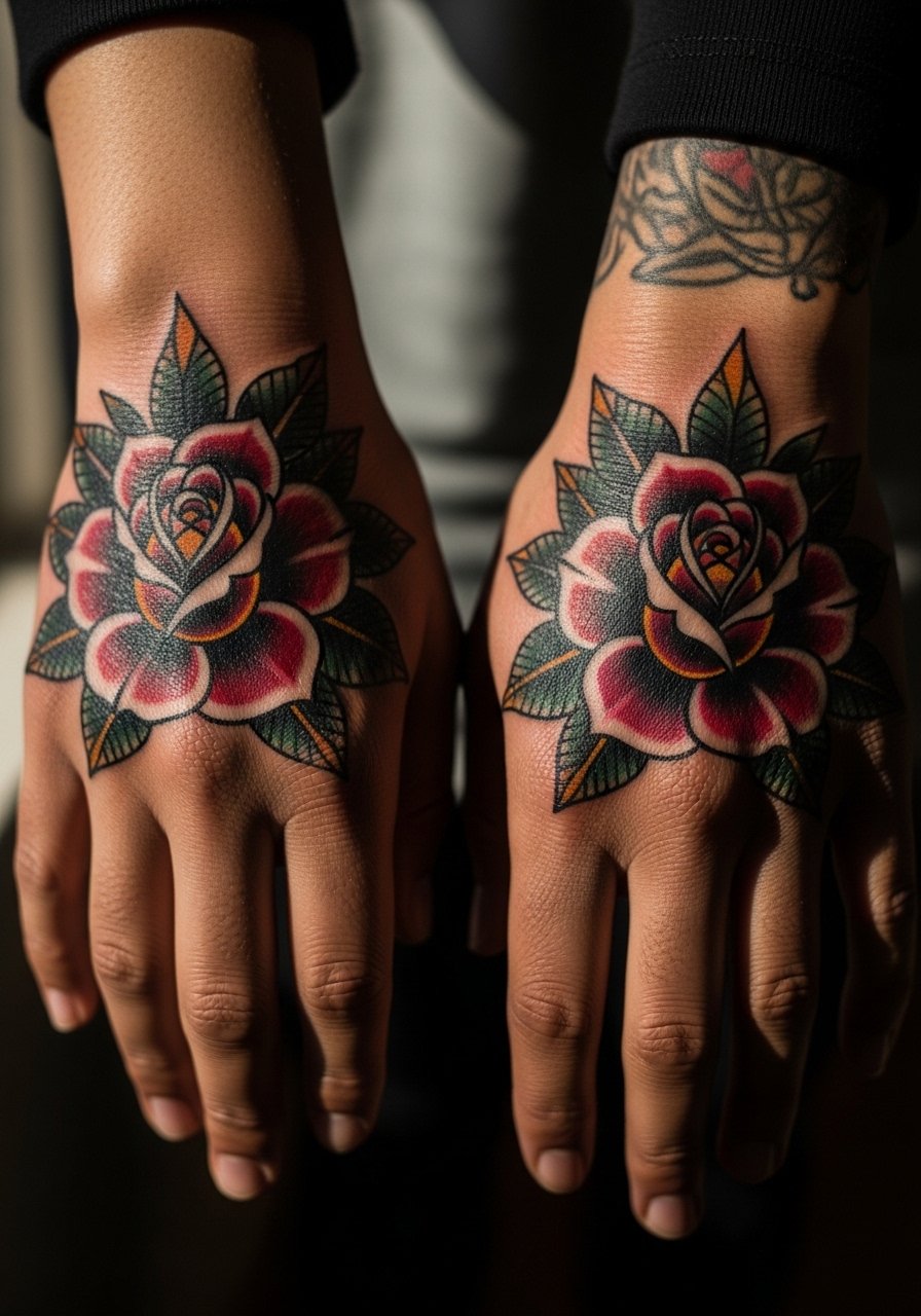
Matching hands create a mirrored effect that photographs well. Tell artists to design for asymmetry so each piece reads with the hand's natural posture. The error is identical mirrored stencils that do not account for handedness. Strong outlines and limited internal detail avoid early blur. These often require touch-ups sooner than forearm pieces. For day-to-day style, keep rings minimal and consider a thin gold cuff bracelet on the non-tattooed wrist for balance.
21. Decorative Ring Band Tattoo That Wraps the Finger
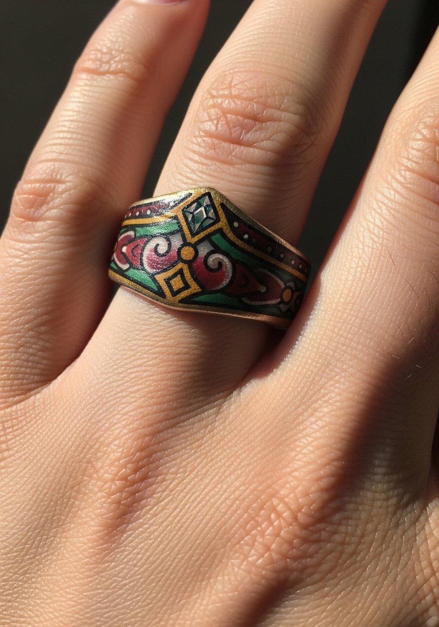
Finger band tattoos work if you accept higher maintenance. Ask for thicker motifs and avoid micro-texture. The common mistake is expecting a fine ring line to stay crisp. Finger skin sheds and stretches. Expect yearly touch-ups and occasional re-inking of thin segments. For the session, remove jewelry and wear a neutral oversized sweater so sleeves do not rub the fresh ink while traveling home.
22. Serpent and Dagger Mini Composition Over the Knuckle Line
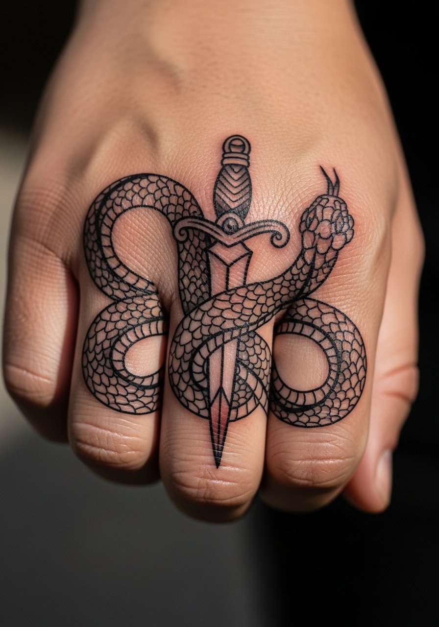
Dagger motifs give motion to the hand. Ask for bold dagger shafts and simplified serpent patterns. The pitfall is trying for micro-scale texture over the knuckles. Keep shapes bold to resist blowout. Knuckles are a high-friction area and may require touch-ups more often than flat hand fields. Pain is higher on knuckles. For showing it off, minimal rings on that hand keep attention on the design.
23. Hummingbird in Flight with Floral Trail Toward Wrist
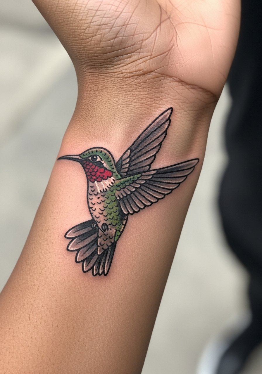
A hummingbird reads as motion when the wings align with the hand's lines. Ask your artist to prioritize wing silhouette and avoid micro-feather shading across flex zones. Tiny dots and soft blends lose clarity. This version uses solid wings and jewel-tone fills. Durability on the back of hand is moderate. For sessions, wear a loose button-down shirt for comfort.
24. Ornamental Sunburst with Central Gem on the Back of Hand
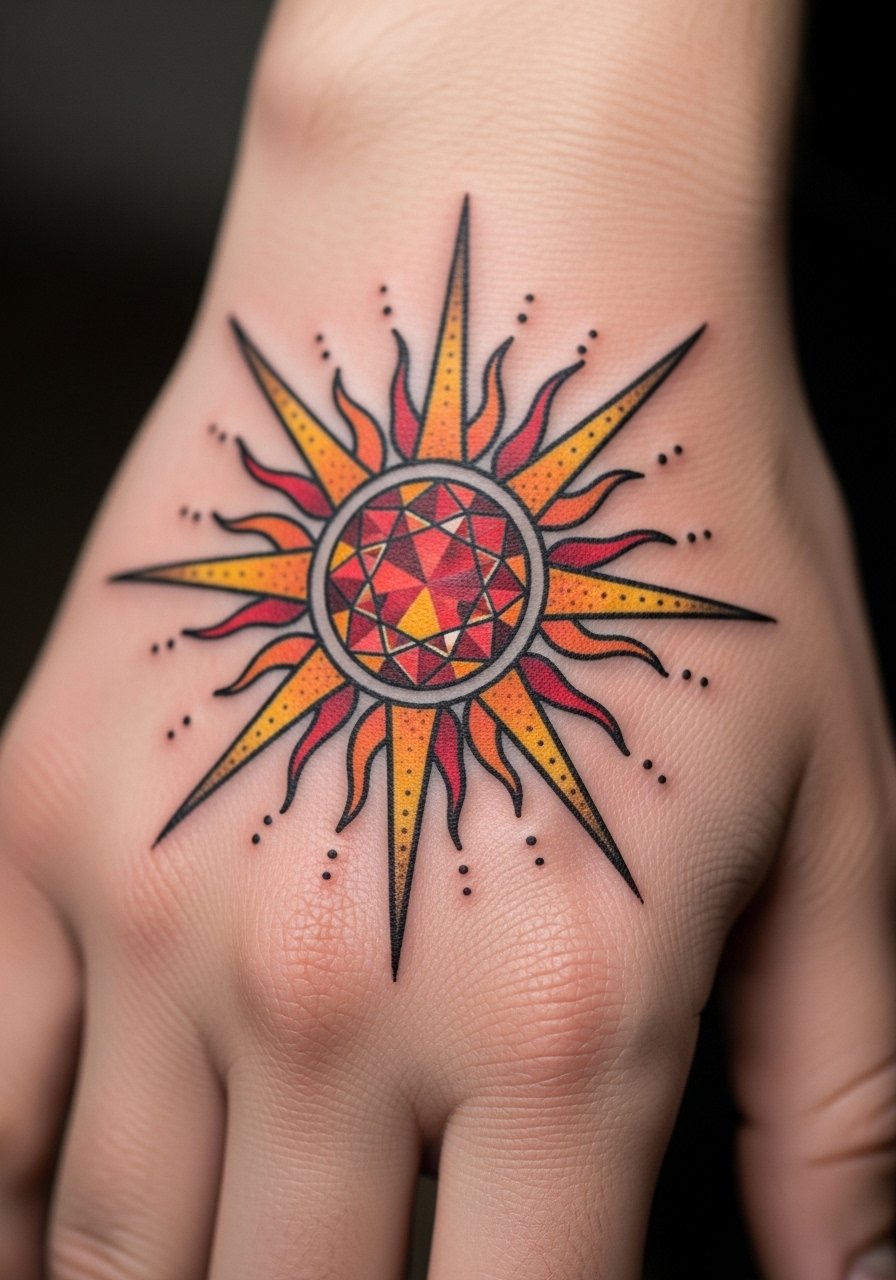
Sunbursts work as a central anchor for smaller accents. Ask for clear spacing between rays and high contrast around the gem. Overcrowding is the usual mistake and leads to indistinct shapes after fading. Solid outlines and defined negative space keep the sunburst readable. Expect minor touch-ups where rays meet skin folds. For daily wear, neutral sleeves let the motif stand out.
25. Peacock Eye Mandala That Tucks Near the Wrist Crease
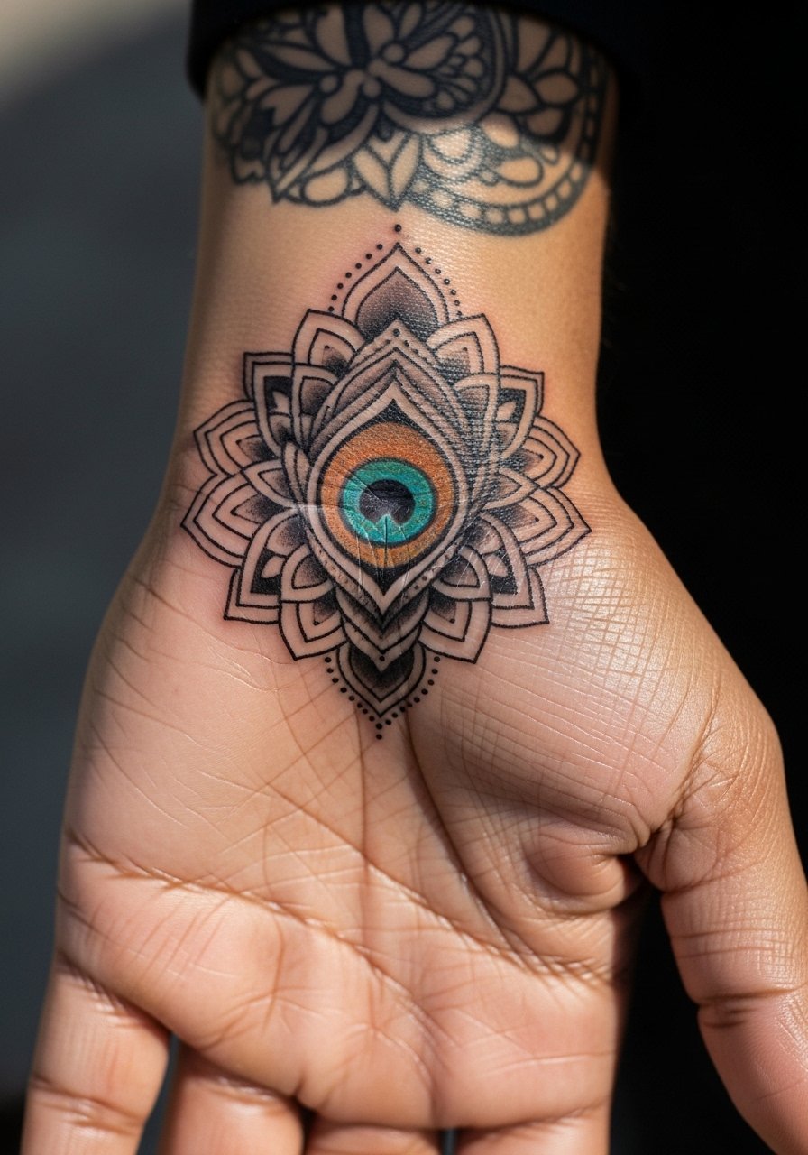
Mandala elements need breathing room on the hand. Ask for larger petal shapes and fewer concentric rings. Micro-lace mandalas often merge into gray areas. This variation uses geometric spacing and solid pigment capsules to retain pattern. The wrist crease is a tricky spot for consistency and may need a touch-up at year two. During the appointment wear a short-sleeve tee solid color so your artist can work without tight cuffs.
26. Crescent Moon and Stars Trail Over the Fingers
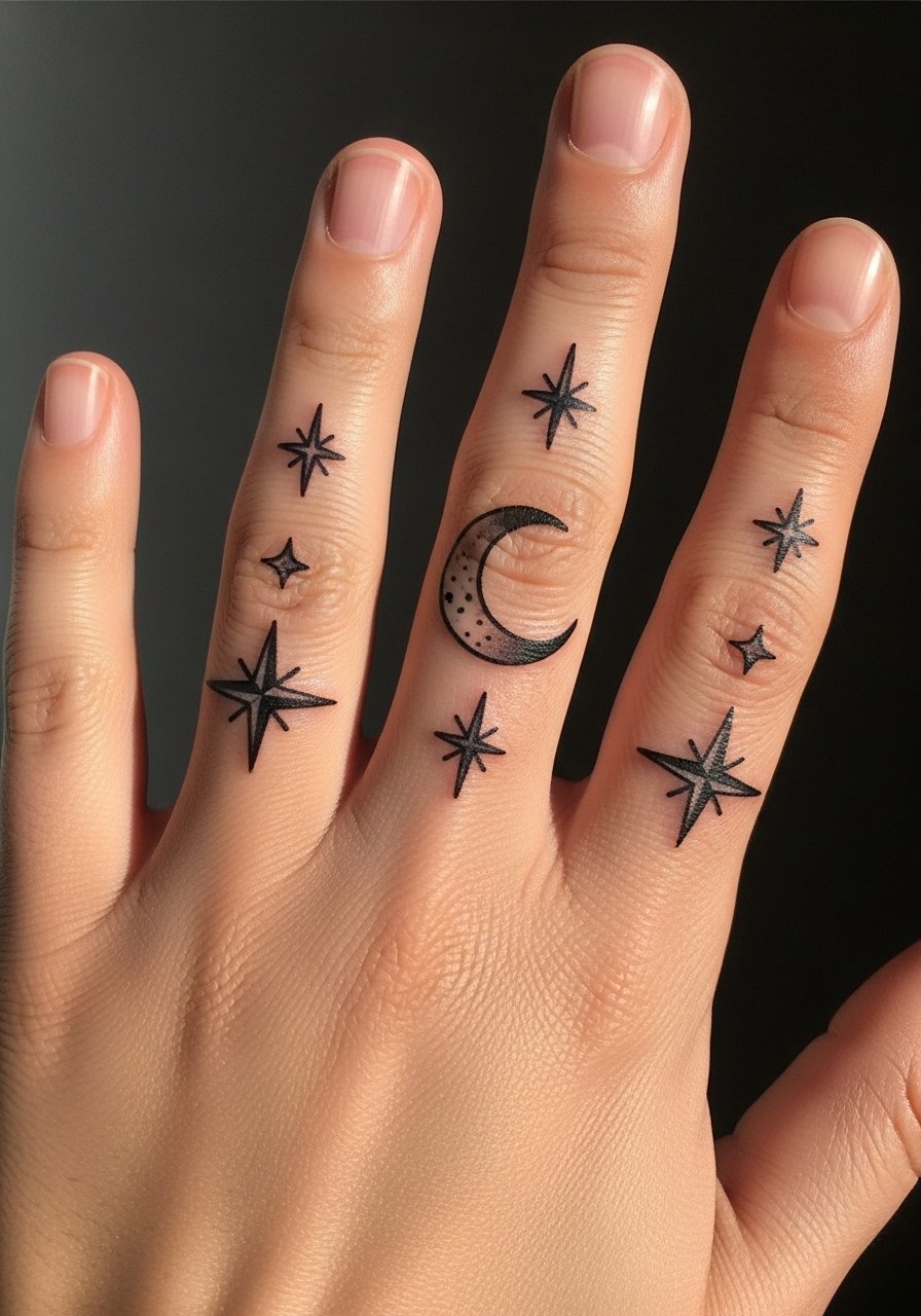
Small celestial elements are playful but fragile. Tell your artist you prefer slightly larger stars and a thicker crescent outline. Tiny dots fade or get absorbed into the skin texture. Fingers and proximal joints are high-wear and need touch-ups. The session is quick but precise. For showing off, manicured nails and a thin gold chain bracelet stack on the opposite wrist photograph well.
27. Stylized Anatomical Heart with Banner and Date
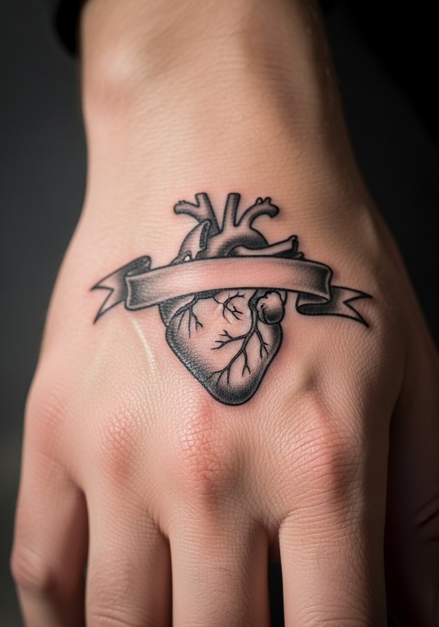
An anatomical heart in neo-trad uses bold chambers and a limited palette to remain readable. If you want text or a date in the banner, tell the artist the exact wording and font weight you expect. The worst outcome is tiny script that bleeds. Use heavier banner strokes and clear letterforms. Expect touch-ups on the banner lines first. For the session, avoid rings and wear a loose tank top for comfort.
Frequently Asked Questions
Q: How fast do neo-traditional hand tattoos fade compared with forearm pieces?
A: From what I've seen, hand tattoos fade faster because the skin there gets more washing, sun exposure, and friction. Expect a noticeable softening in 12 to 24 months for detailed work. Choosing bold outlines, saturated fills, and planning for touch-ups will extend how long the design reads clearly.
Q: Should I worry about professional settings if I get a back-of-hand neo-traditional piece?
A: It depends on your industry and client interactions. Some workplaces are relaxed and others still hold visible tattoos against you. If you need discretion, consider side-of-hand placement or wrist-adjacent spots that can be covered by sleeves. Ask your prospective employer about dress code policies if you are unsure.
Q: Do certain neo-traditional colors show better on deeper skin tones?
A: Jewel tones like emerald, deep burgundy, and opaque gold tend to retain presence across darker skin tones. Pastels and pale flesh tones can disappear more quickly. Tell your artist your skin undertone and request healed photos on similar tones when possible.
Q: What's the realistic touch-up timeline for detailed neo-traditional on knuckles or fingers?
A: Plan for touch-ups every 12 to 24 months on fingers and knuckles. Those areas get the most mechanical wear. A clean initial build with bold outlines reduces frequency, but expect maintenance as part of the cost and planning.
Q: Should I ask my artist for Saniderm for a hand tattoo?
A: Artists split on this. One group prefers short Saniderm wears for hygiene, while another favors open-air healing for hands because of repeated moisture and movement. Ask your artist how they tailor film wear time for hand placements and follow their protocol for the best result.