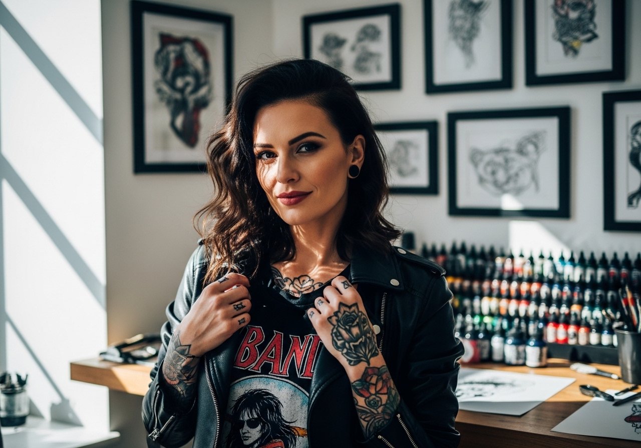
Fine line trends look gorgeous on saved boards, but what holds up ten years later is often less obvious. Fade, placement, and the invisible daily friction from shirts or typing decide whether a script still reads at year five. If you want the phrase "Everything happens for a reason" in black and grey, think about size, spacing, and where your skin moves most. The sections below give concrete options, what to ask your artist, and how each placement ages.
1. Fine Line Script on Inner Forearm
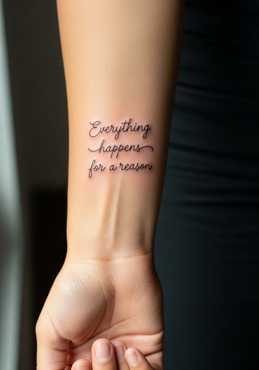
I recommend this for people who want readable text and an easy show-off placement. Fair warning, the inner forearm gets constant sun exposure, so ask for slightly heavier line weight and modest spacing between letters to help longevity. Expect a low to moderate pain level and a single-session appointment under an hour in most cases. A common mistake is requesting ultra-thin lettering that looks crisp fresh but softens into blur by year three. For the session, wear a loose button-down shirt you can roll or pull aside so the artist has full access without stretching the skin.
2. Wrapped Script Around Wrist
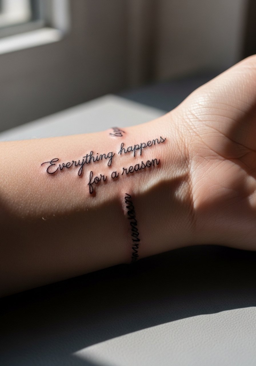
Wrist wraps read intimate and look continuous with bracelets. The wrist is prone to friction from watches and jewelry, so plan for touch-ups earlier than an arm piece. Tell your artist you want letter spacing that breathes, not cramped cursive, and that you prefer the text to sit slightly higher on the forearm side of the wrist to avoid bracelet rubbing. Session time is short, but pain spikes near bone. Pair this with a thin chain bracelet when showing it off, and avoid heavy cuffs for the first month.
3. Minimal Circle Emblem with Script Band on Finger
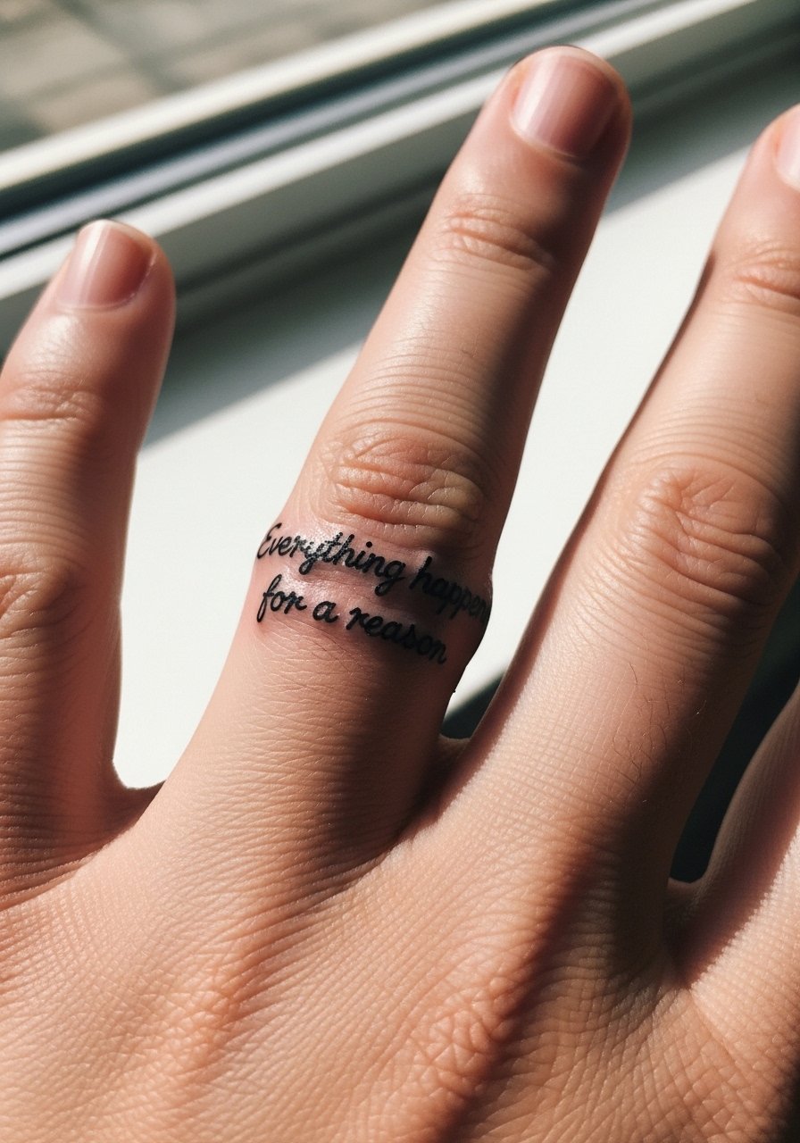
Finger bands are a compact way to wear the phrase, but they are high-maintenance. Fingers experience constant washing and friction, which makes ink move and fade faster. Expect touch-ups within a year for most people. A common mistake is asking for too much detail in the letters. For this placement, keep letters bold enough to read up close and avoid fine flourishes that merge. The session is quick and sharp on pain. Consider swapping rings with a minimalist silicone ring during healing to prevent metal abrasion.
4. Script Curving Over the Collarbone

Collarbone script sits beautifully with open necklines and layers well under jewelry. The skin there is thin and sits over bone, so expect higher discomfort and slightly slower session pacing. Tell your artist you want modest letter size and spacing to avoid ink migration into the clavicle shadow. At six months the letters will settle flatter, and by two to three years small touch-ups are common for very thin scripts. Pair with a thin chain pendant necklace that sits just above the text to frame it without crowding.
5. Sternum Script Anchored by Botanical Motifs
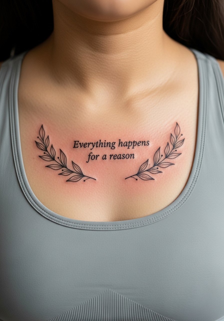
Sternum placements make the phrase feel centered and private yet revealable. Sessions can be longer and more intense on pain because of the proximity to bone. The biggest mistake is asking for tiny script packed into the sternum crease. Leave breathing room and let botanical elements sit slightly below or beside the letters to protect readability. Expect a touch-up window at year three depending on your wardrobe choice. For the appointment, wear a fitted sports bra or bandeau so the artist has clear access without full exposure.
6. Ribcage Statement with Script and Shaded Clock
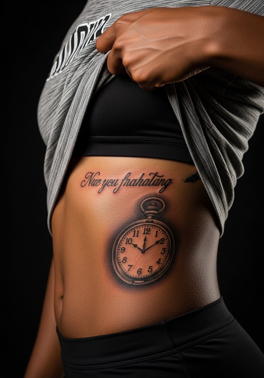
Ribcage pieces are dramatic and sit close to the idea of timing and fate when paired with clocks. Pain is higher on ribs and sessions can stretch longer. There is an active controversy about fine line on ribs. One camp says the skin there moves and blurs lines quickly. The other camp says with correct needle depth and spacing, fine line holds up. Ask your artist where they land before booking and consider slightly larger lettering or heavier linework to hedge against migration. Dress in loose, high-waisted bottoms for the session.
Studio Day Picks
The collarbone, sternum, and ribcage pieces above all demand different prep than wrist or finger work. These items smooth the session and the healing window.
-
Stencil transfer paper kit. Useful for previewing line placement on curved areas like the ribcage and collarbone so you can confirm spacing before the needle touches skin.
-
Topical numbing cream. Applied as directed before sternum or rib sessions can take the edge off higher pain spots without blurring the stencil if you follow your artist's guidance.
-
Thin protective film roll. Keeps chest and collarbone tattoos cleaner during the first week when clothing might rub against the area.
-
Fragrance-free gentle body wash. Mild cleansing for larger sessions that avoids stripping the delicate healed linework in the days after.
-
Aquaphor healing ointment. Thin layers in the first days help lock in moisture over fine script without clogging the channels that need to scab then heal.
7. Upper Arm Banner with Script and Bold Shading
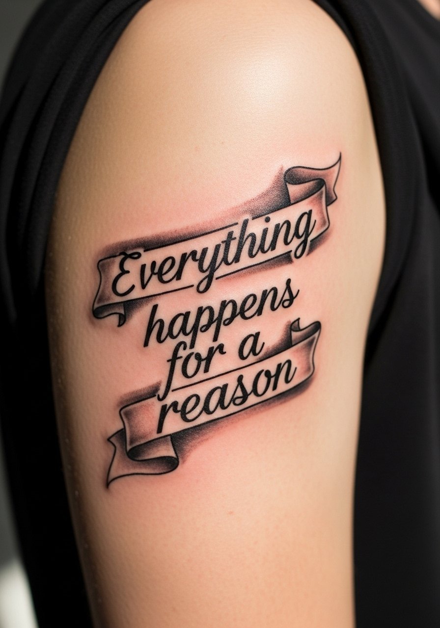
Upper arm banners combine readability with longer life because the skin there rarely stretches drastically. Sessions are moderate and often finish in a single visit. Ask your artist for partial saturation under the letters to keep the phrase legible as the skin ages. A common error is crowding heavy shading too close to thin script, which can visually darken the letters over time. This placement pairs well with rolled sleeves and a short-sleeve linen shirt to show the piece without squeezing it.
8. Full Inner Bicep Script with Dot Work Frame
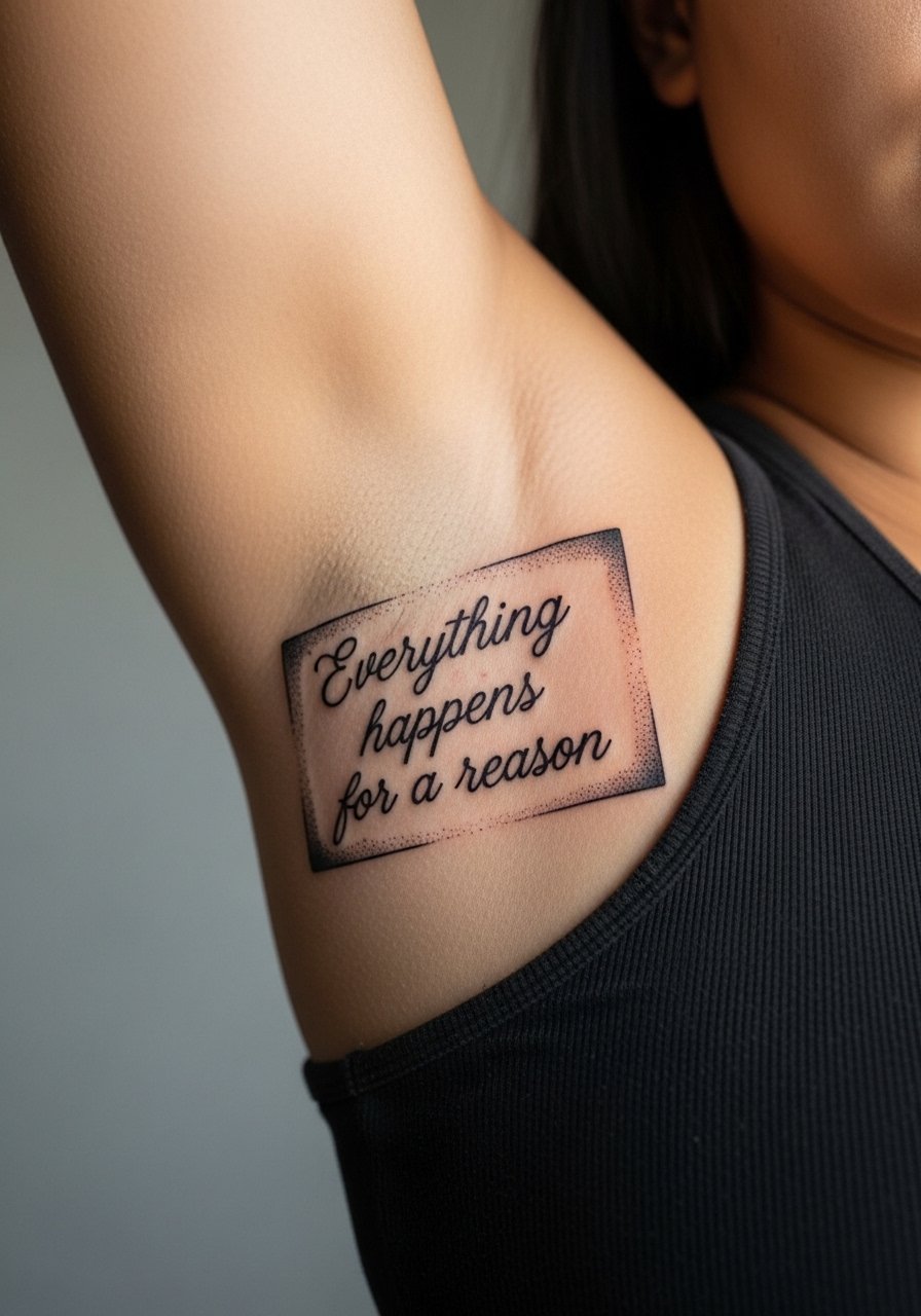
Inner bicep work looks private and reads well when you move the arm. Pain is variable and often higher in the fold near the armpit. Make sure your artist spaces the letters so the script does not collapse when the arm is relaxed. Stipple shading holds well here and avoids heavy saturation that could create a soft edge over script. For the session wear a racerback tank you can easily pull down or shift without exposing more than necessary.
9. Back of Shoulder Miniature Banner

This reads as a subtle reveal with movement. Pain is low to moderate and sessions are short. The main mistake is sizing it too small so the letters smudge into an unreadable line after a couple years. Tell your artist you want thicker lowercase strokes and leave extra space between words. It shows well with sleeveless or off-the-shoulder tops. For the appointment wear a loose tank top to give the artist clear access.
10. Spine Script with Vertical Layout

Spine text makes a strong visual line and pairs with dresses that show the back. Pain is higher along the vertebrae and sessions may be split. One mistake is compressing letters to fit a narrow column. Ask for slightly more generous kerning so the text reads from a distance. Expect touch-ups in areas where the skin flexes most. Pair with open-back clothing for evenings, and for the studio wear a loose button-down you can remove without wiggling over the head.
11. Ankle Script with Tiny Floral Accent
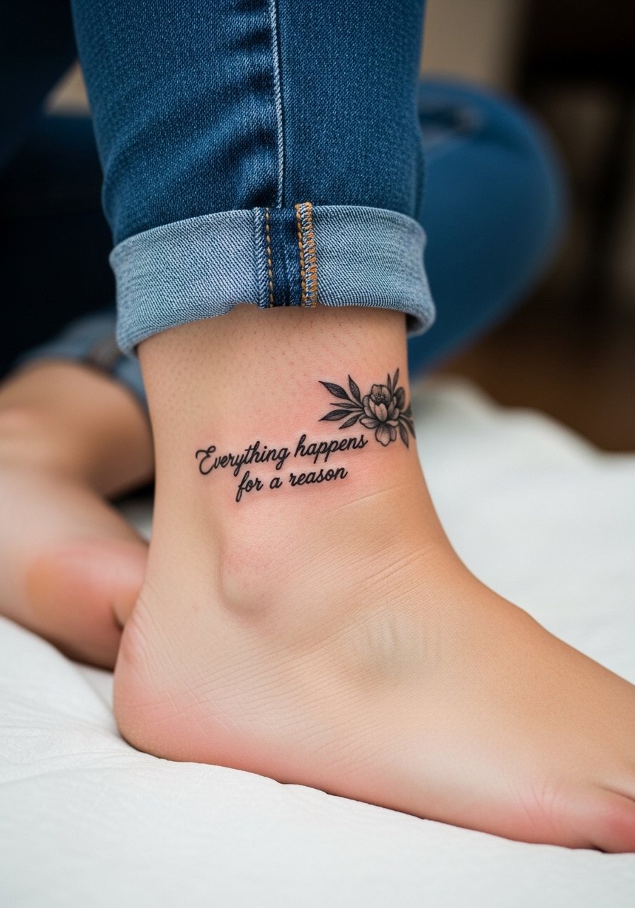
Ankle pieces are subtle but endure heavy friction from socks and shoes. That friction accelerates fading and edge softening. Ask your artist to place the text slightly higher than you think to avoid shoe rub. Sessions are short but pain increases near bony areas. For showing it off, sandals or cropped trousers work well. For the session, wear pants you can roll up easily like loose drawstring linen pants.
12. Calf Script Inside with Gentle Whip Shading

Inner calf placements age well because they avoid constant sun and abrasion. Sessions can be comfortable and fit into a single visit. The error to avoid is heavy, dark background shading that competes with the script. Ask for light whip shading to give depth without overpowering the letters. Pair with mid-length skirts or shorts to show the piece. For the appointment, a pair of loose athletic shorts makes access easy.
13. Side-Rib Script Hidden with Botanical Veil
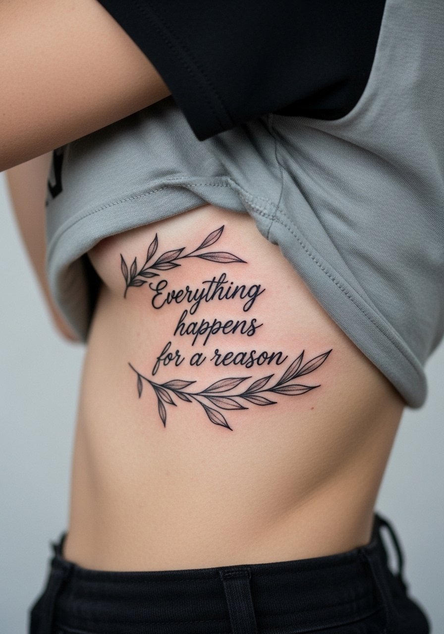
Side-rib script reads as a private note that peeks out. This area has high pain and a longer session window. The controversy about fine line on ribs comes up here again. Some artists avoid very thin scripts on the rib for fear of blur. Others will do it if given larger letter size and spacing. If you want fine lettering, ask about their healed examples on ribs. Expect a likely touch-up at year two or three depending on activity and clothing. For the session wear high-waisted bottoms so you can lift a shirt rather than disrobe.
14. Lower Back Horizontal Script with Ornamental Dots
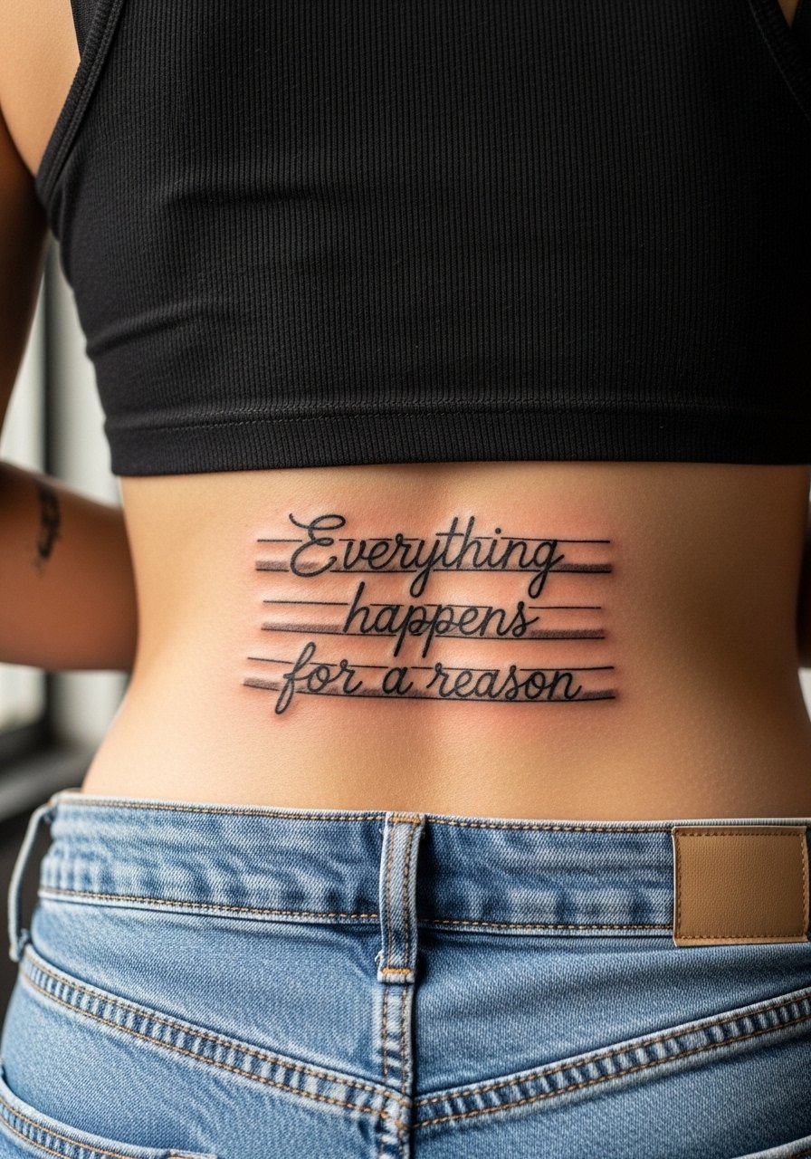
Lower back script can be a discreet statement that pairs with summer styles. The skin here is forgiving but can shift with weight changes, so choose a size that allows for some skin movement. A common mistake is too-small lettering which becomes illegible after stretching. Sessions are moderate in time. Show this off with low-rise or back-cut garments. For the appointment bring bottoms you can lower slightly without exposing more than the tattooed strip.
15. Inner Thigh Script Hidden by Clothing
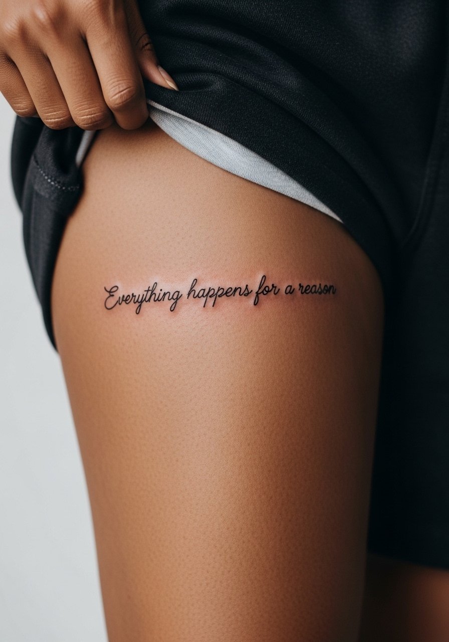
Inner thigh placements are intimate and can be highly sensitive during the session. Because clothing naturally covers them, they are private and less exposed to sun, which helps longevity. The mistake people make is asking for extreme thinness in such a high-friction zone from underwear seams. Ask your artist to avoid tiny serifs and plan placement away from elastic lines. For the session wear shorts you can shift rather than underwear you must remove.
16. Chest-Center Script with Radiating Linework

Center-chest script reads boldly under crewnecks or wide-neck shirts. The skin here lies over the sternum in places so expect variable pain and careful stencil placement. Avoid squeezing too much text into a small horizontal band. Tell your artist you want a balance between legibility and decorative lines. For showing off pair with a low neckline and a thin chain pendant necklace that sits above the phrase.
17. Script Winding Around a Clock on the Forearm
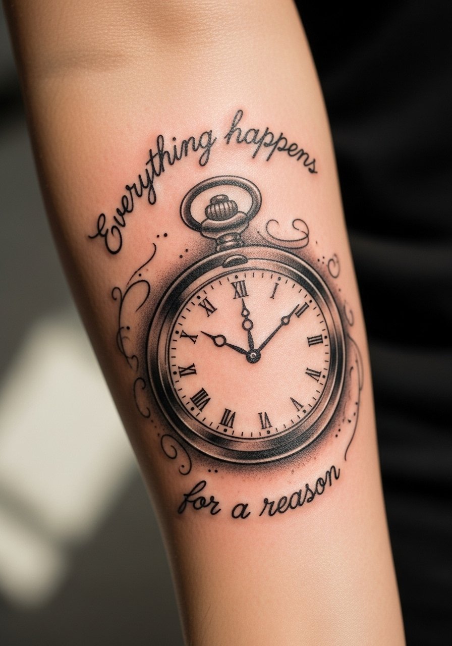
Combining a timepiece with the phrase gives symbolic weight. Forearm placements fare well with thicker strokes and moderate saturation to resist UV fade. The mistake is packing tiny script into curved watch edges. Ask for slightly larger letters and for the artist to preview the wrap on your arm with a transfer before starting. Sessions are moderate and comfortable for most. Pair with rolled sleeves or a racerback tank to display the composition.
18. Behind-the-Ear Mini Script Hidden by Hairline
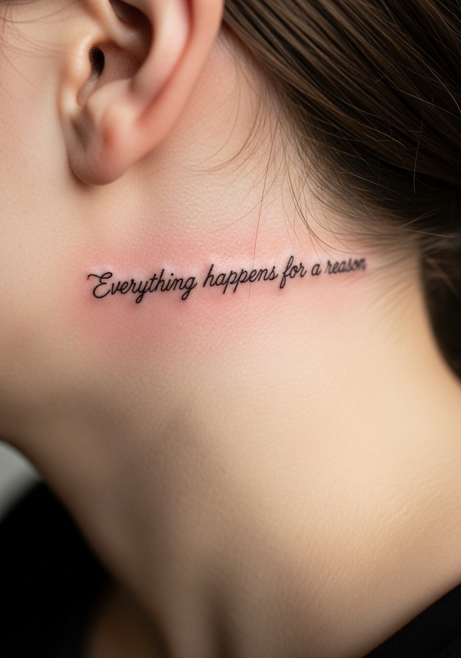
Behind-the-ear text is subtle and often visible only with hair up. The area is sensitive and requires a precise, experienced hand. Keep the letters tiny but bold enough to avoid loss of definition. Sessions are short and sharp. Note that some workplaces still have conservative views on visible ink, so consider placement and hair styling. For the session have hair up and wear a shirt with a collar you can pull aside.
19. Script Along the Foot Arch

Foot placements are high-maintenance because shoes and socks create constant wear. Expect faster fading and likely touch-ups. The key mistake is selecting tiny, intricate letterforms that cannot survive shoe friction. Ask for thicker strokes and placement away from seams. Sessions can be uncomfortable because the foot is sensitive. For showing it off choose sandals and for the session wear loose footwear you can remove easily.
20. Sleeve Accent Script Hidden in Negative Space
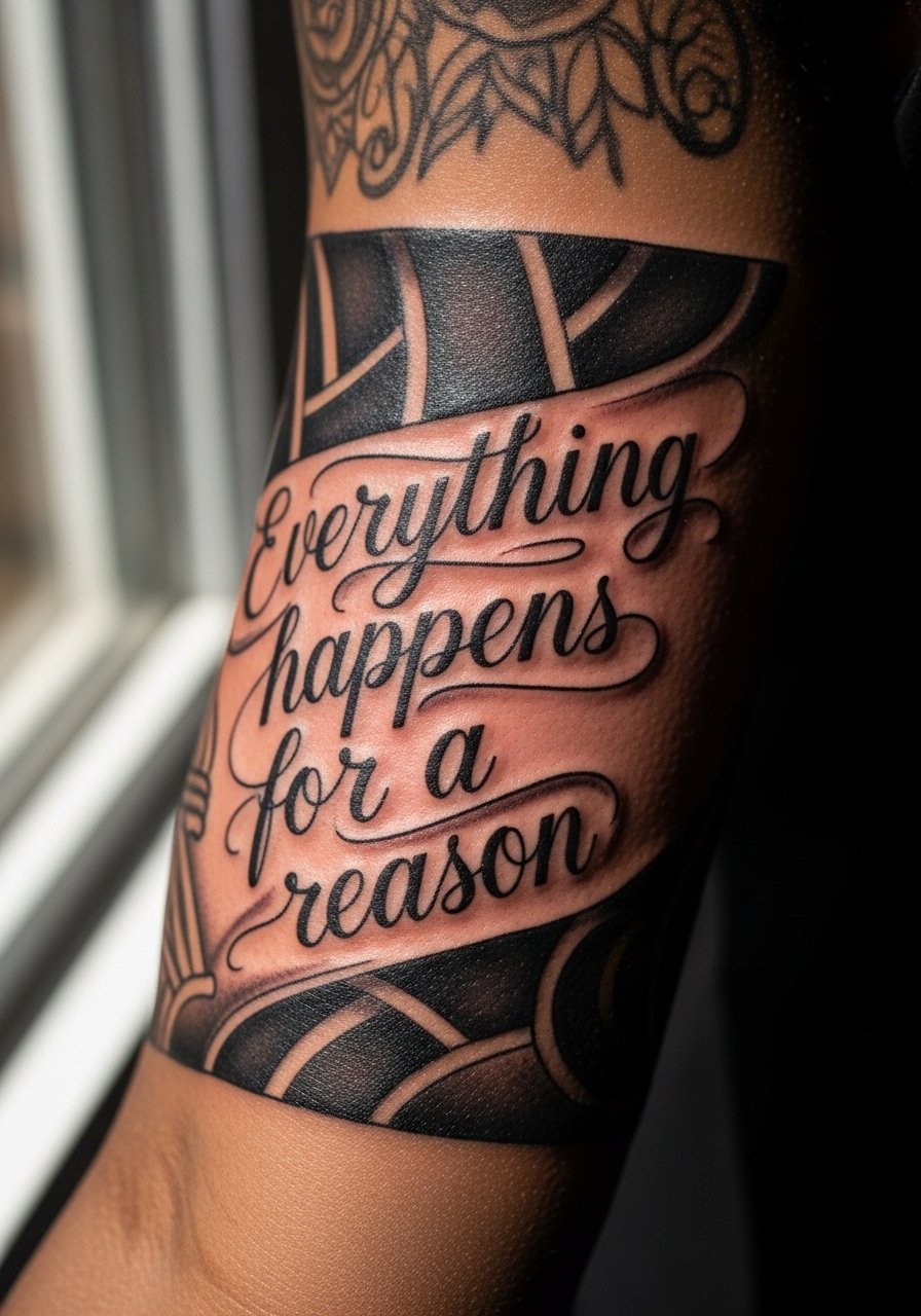
Embedding the phrase into a sleeve gives you context and protection because surrounding shading shields the letters. The risk is losing legibility if the script sits on busy background. Tell your artist you want a reserved area of clean skin around the letters for contrast. Sessions will be longer as part of a sleeve, and touch-up schedules vary by saturation. Wear a loose button-down shirt to the studio so the artist can access the arm without stretching.
21. Minimalist Single-Line Script Across the Knuckles
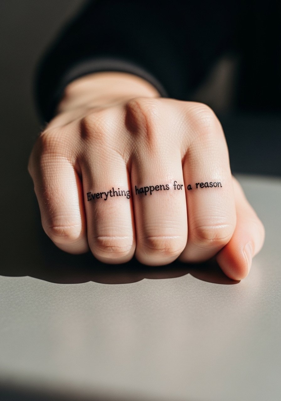
Knuckle text is bold as a statement but faces intense wear from washing and manual tasks. The main mistake is asking for elaborate cursive there. Keep letters blocky and spaced. Expect the highest maintenance of any hand placement and plan on touch-ups within a year. Also consider career implications in some fields before committing. Sessions are short and painful. During healing, avoid heavy manual labor and jewelry on those fingers.
Frequently Asked Questions
Q: Will fine line script fade faster than bolder lettering on the forearm or wrist?
A: From what I've seen, fine line fades sooner on high-friction or high-sun areas like wrists. On the forearm it can last longer if you ask for slightly heavier line weight and get regular sunscreen on the healed piece. If you want extremely thin lettering, expect a touch-up at two to three years depending on exposure and lifestyle.
Q: Is ribcage script worth the pain if I want the phrase to be private?
A: Many people choose ribs specifically for privacy and impact, but be honest about pain and healing. Ribs are a higher pain zone and have more movement, which can affect fine line. If privacy matters more than low maintenance, the ribs are worth it, but discuss slightly larger letters or heavier strokes with your artist.
Q: How should I dress to a session for a sternum or collarbone script?
A: Wear a fitted sports bra or a wide-neck shirt you can pull aside, so the artist has clean, minimal access without full exposure. A fitted sports bra is an easy option for sternum appointments and keeps things discreet.
Q: Are finger and knuckle scripts a poor choice for longevity?
A: They are the highest maintenance options because of constant washing and friction. If longevity is a priority, choose a nearby but less-exposed placement like the inner forearm or side of the hand. If you still want finger or knuckle work, expect routine touch-ups and protective steps during healing.
Q: How do I find an artist who has good healed examples of text work on my chosen placement?
A: Use local shop directories, hashtag searches for your city plus "script" or "fine line," and look for healed photos rather than fresh shots. Ask artists for healed portfolios and how often they recommend touch-ups on that placement. Trust your artist only after you see consistent healed results in the exact placement you want.