Bold black arm bands age differently than you expect. The thick, saturated bands that look brutal fresh often keep reading strong for years, while tiny decorative bands that please on day one can blur into an indistinct gray ribbon by year three. Pick the right line weight and spacing for your skin and placement, and you get a band that reads like armor. The first six ideas below help you narrow the look and the questions to ask at your consult.
1. Classic Thick Solid Bicep Band

There is a reason solid bands are a perennial choice. They read strong at a distance and age into a single bold stripe that still looks intentional years later. For the consult tell your artist you want even saturation and a firm edge so the band does not feather at the margins. Common mistakes include going too thin or stacking multiple narrow solid bands too close together, which invites blowout. Session feel is short but intense on the bicep. Wear a loose tank top to the appointment so the artist can work without tugging at fabric.
2. Negative Space Chevron Band

This design uses black saturation to carve chevrons out of the skin tone. It works best when the negative space is at least as wide as the black bars so the shapes keep separating as the years pass. Tell the artist you want bold fills with clean negative shapes rather than micro gaps that will blur. The common aging mistake is tiny gaps that collapse into muddiness. Pair this with rolled sleeves and a loose button-down shirt to show the repeating pattern without distraction. Expect a touch-up between year two and four depending on sun exposure.
3. Dotwork Stipple Armband
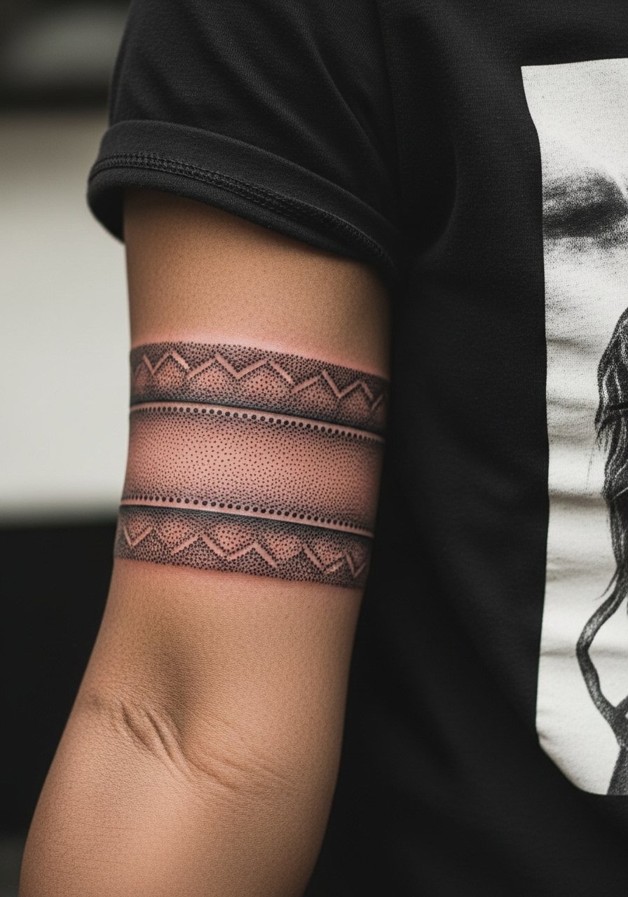
Stipple shading creates a soft gradient without solid fills. It is a slower needle technique so sessions take longer. Ask your artist for a denser dot pattern near the band edge and lighter dots moving inward so the fade reads intentional when healed. The main mistake is making the dots too dense across the whole band, which can look like a gray block later. Inner-forearm placement raises blowout risk if the client moves or squirms during the session. For showing it off, stack a couple of thin delicate bracelets so the texture of the stipple sits between metal and skin.
4. Celtic Knot Interlace Band
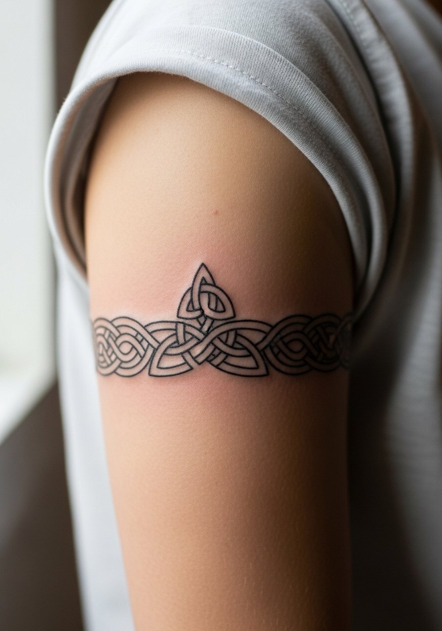
Intricate knotwork reads like craftsmanship when the lines are spaced and scaled correctly. For this one bring multiple reference images and ask for simplified knot patterns rather than micro-detail. The common mistake is trying to compress a full knot motif into a narrow band, which causes the loops to fuse over time. This style benefits from a slightly thicker line weight so the interlaced areas keep definition. It pairs well with rolled shirt sleeves or a short-sleeve linen shirt that frames the arm. If cultural origin matters to you, note that some details have specific meanings so choose variations rather than direct replicas.
5. Barbed Wire or Thorn Band
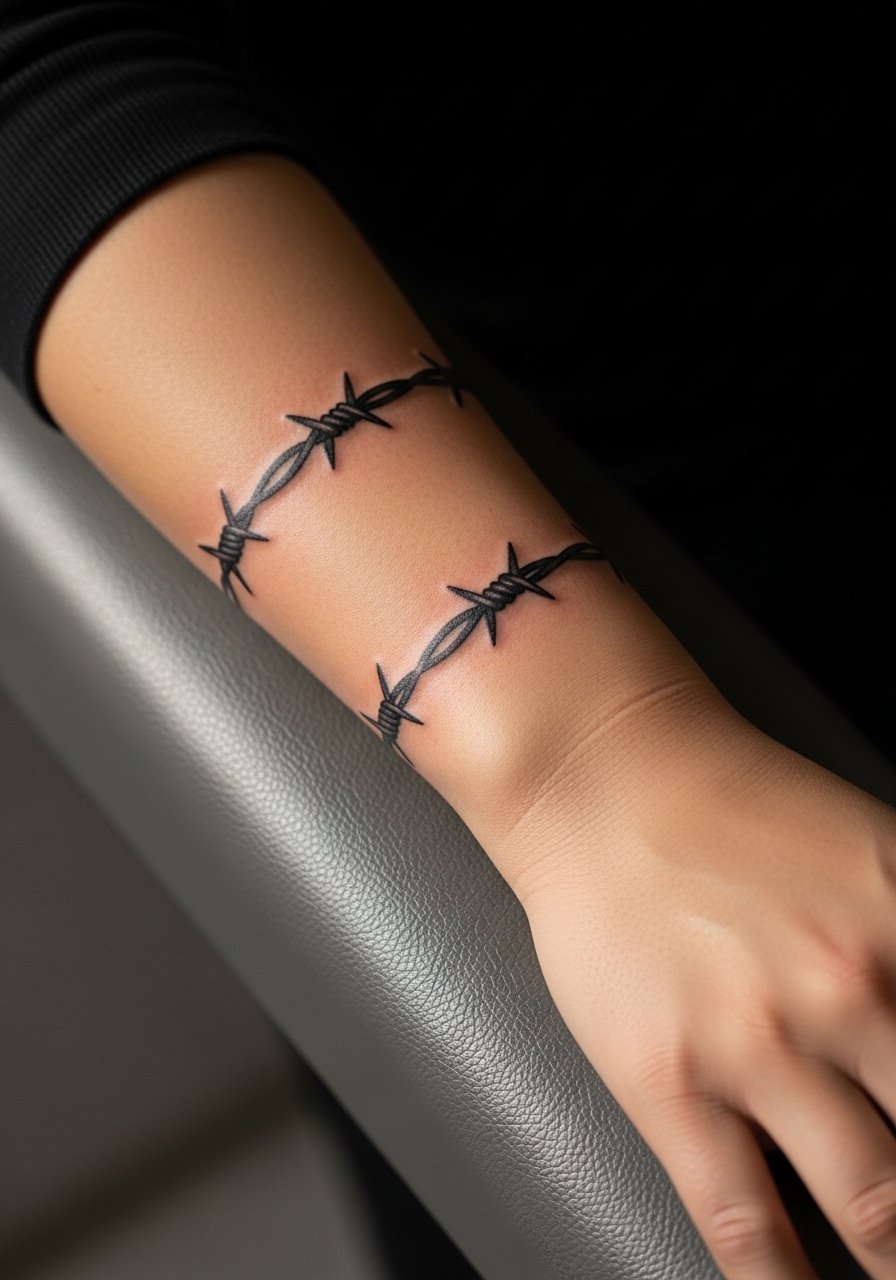
Barbed wire and thorn motifs read confrontational and raw. They work best when the barbs are bold and not overly fussy. Tell the artist you want clear negative space around each barb so the points do not blur into a muddied line later. The frequent error is too many tiny hooks packed into a narrow band. Expect a sharper sensation on the forearm during the session, and wear a loose short-sleeve tee to the appointment so the area is easy to access. This design is simple to maintain with minimal touch-ups if the linework is bold from the start.
6. Geometric Chevron and Wave Hybrid
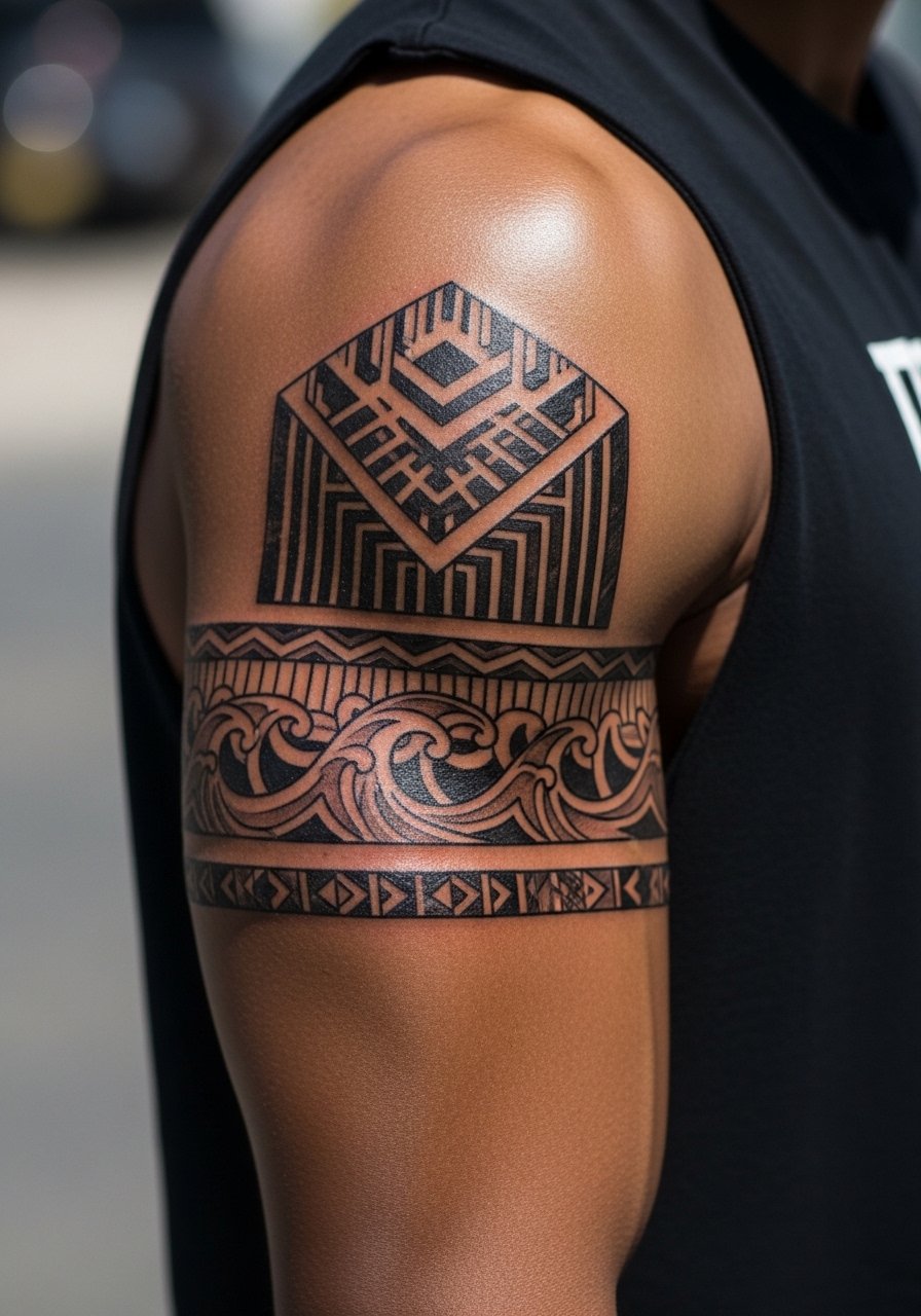
Mixing straight geometric bars with flowing wave shapes gives a modern contrast that reads strong across the arm. Ask your artist to keep straight elements slightly thicker than the waves so the straight lines retain edge as skin stretches. A common oversight is matching all line weights, which makes the waves and chevrons flatten into a single texture later. This piece looks great with a rolled cuff and a heavy knit for colder months. For show-off style try a sleeveless sweater that keeps attention on the upper arm design.
Studio Day Picks
Those first six band styles lean on different access and healing needs, and a few small items make studio day and the first week easier.
-
Stencil transfer paper kit. Lets you preview placement and check how the repeating pattern sits on the curve of the arm before ink ever touches skin.
-
Topical numbing cream. Applied per directions eases sensitivity on the forearm and bicep without affecting the artist's linework.
-
Thin protective film roll. Keeps fresh forearm bands clean during the first few showers and while clothing rubs the area.
-
Fragrance-free gentle body wash. Cleanses healing bands without stripping pigmentation or irritating tender skin.
-
Aquaphor healing ointment. Thin application for the initial days helps saturated blackwork retain moisture and reduces crusting over fine edges.
7. Broken Line Band with Gaps

Deliberate breaks in a band create rhythm and let skin act as part of the design. Use this when you want an armband that breathes rather than a solid stripe. Tell the artist you want the negative gaps wider than the lines themselves so the breaks survive natural blur. The inner bicep is sensitive and flexes when you move, so expect more discomfort during the session. Wear a loose tank top that lets you lift the arm without pulling at the area. Touch-ups are common at year two if gaps start to soften from friction.
8. Ornamental Lace Band
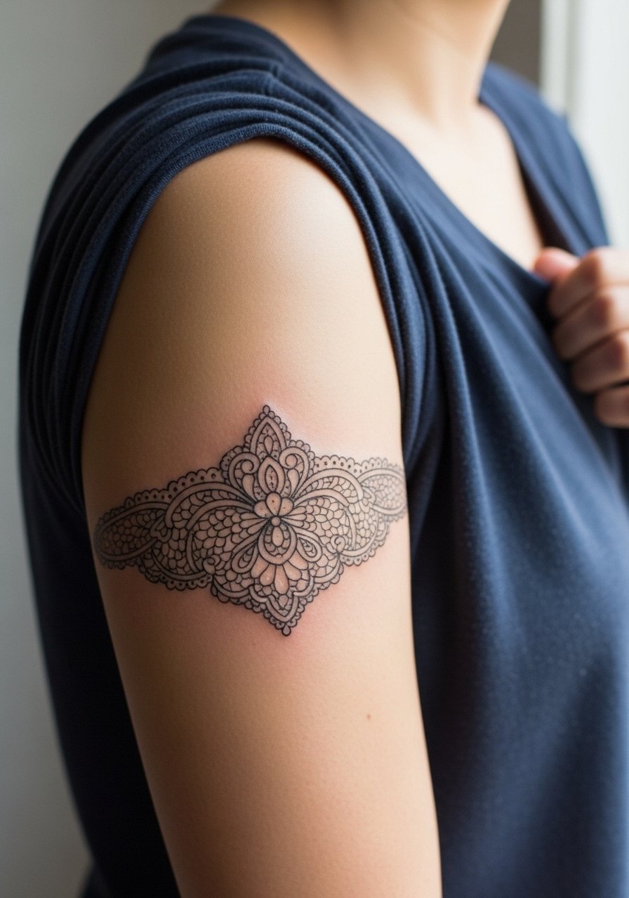
Lace-like bands use thin linework and negative space for an elegant effect. They look best when scaled generously rather than compressed. The controversy here is clear. One camp says delicate lace work on arms preserves its detail if the lines are spaced and the artist uses precise depth. The other camp warns that fine lines in ornamental work blur within a few years and recommend thicker outlines. Ask the artist which side of the debate they fall on and request examples of healed lace pieces in similar placements. For sessions, wear a wide-neck top so the shoulder stays covered except where needed.
9. Repeating Triangle Stack
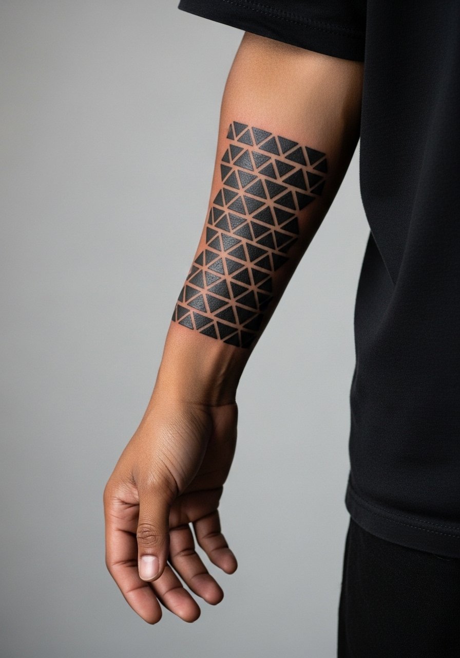
A stack of triangles creates a rhythmic, modern armband that reads architectural. It ages well if triangles keep consistent spacing and a predictable orientation. The usual mistake is inconsistent sizing that makes the pattern look lopsided after healing. During the consult specify exact repeat count and ask for a stencil proof to see how the triangles sit across muscle curves. This design pairs cleanly with a minimalist watch or a single cuff bracelet, like a minimalist watch strap, which keeps focus on the geometric repetition.
10. Scripted Phrase Band
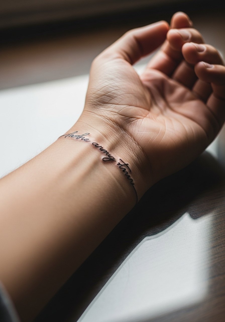
A script band wraps words around the arm and reads intimate. Choose fonts with clear counters and ask the artist to space letters slightly wider than print references. The big mistake is selecting tiny script that blurs into a single stroke. Script also changes with arm movement so preview how lines connect across the seam. For the session wear a short-sleeve tee so your wrist and forearm are accessible. Plan for a touch-up at year three if you want crisp lettering long term.
11. Celtic-Inspired Knotwork with Negative Rings
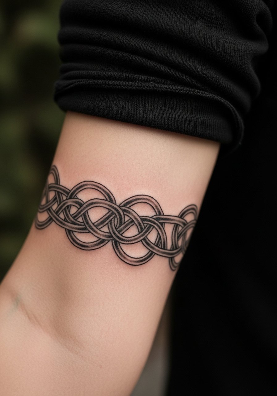
This variation lets knotwork breathe by repeating negative rings that interrupt the weave. It is a good pick when you like tradition but want modern spacing. Tell the artist to enlarge the knot intersections slightly so the woven effect does not fill in. A common mistake is compressing too many overlaps into too narrow a band. Pair this with rolled sleeves or a casual linen shirt to complement the rhythm without stealing focus.
12. Thin Parallel Line Stack
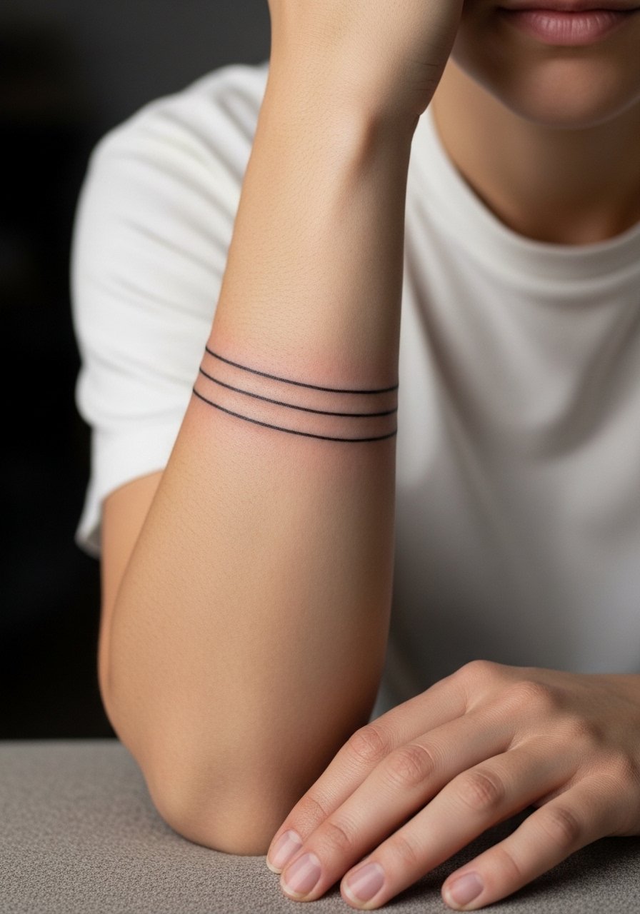
Three thin parallel bands are a minimal route to a bold look when the spacing is deliberate. The mistake most people make is pushing the lines too close, which causes merging. Ask for a stencil with exact millimeter spacing and insist on slightly bolder needle groupings than the faint reference you brought. These heal fastest of the band types but need precise execution. Style them with a slim metal cuff that sits between the lines without crowding.
13. Floral Vine Band
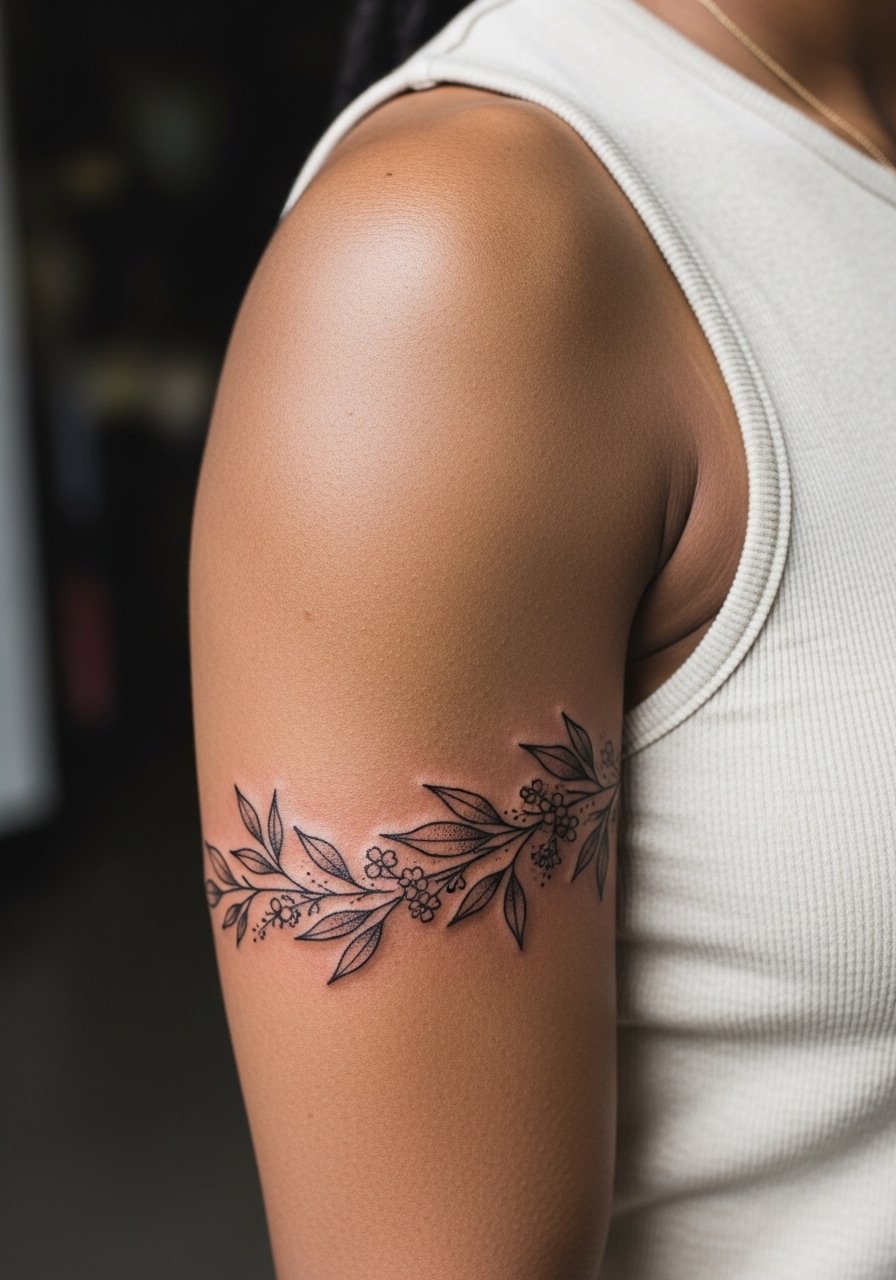
A botanical band softens the arm while still reading as an intentional band. For longevity request slightly larger leaf shapes and moderate stipple shading rather than micro veins. The typical error is over-detailing small leaves which bleed together with time. This style works visually with sleeveless tops and dresses. For show-off pairing try an open-back midi dress that frames the bicep and keeps the vine visible.
14. Aztec/Geometric Indigenous-Inspired Band
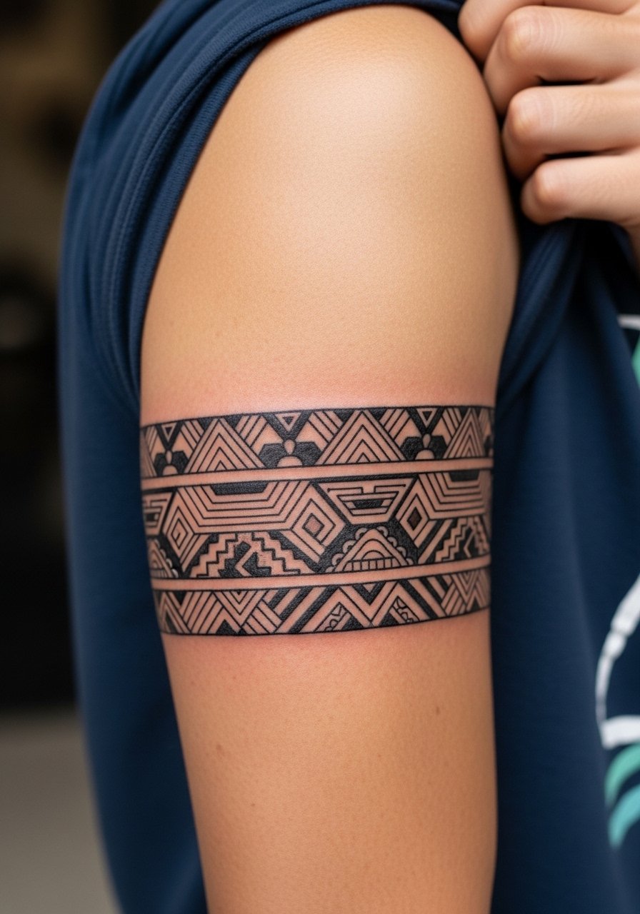
Geometric bands that draw on indigenous motifs have a powerful visual language. If you choose a pattern with cultural origin, note that some designs carry meaning and you might opt for a variation that nods to the aesthetic rather than copying sacred imagery. Ask your artist about respectful adaptations and the sources they used. These bands age well when lines are bold and patterns are spaced. Pair with a short-sleeve cotton shirt that keeps the upper arm visible.
15. Barcode or Linear Code Band

A barcode band reads modern and minimal but demands extreme straightness and consistent line weight. The biggest mistake is allowing slight angle variations across the seam, which becomes obvious once healed. Ask for the stencil to wrap the arm and for the artist to double-check symmetry before starting. This style pairs well with stacked rings and a minimal leather bracelet to offset the mechanical look.
16. Polynesian-Inspired Bold Band
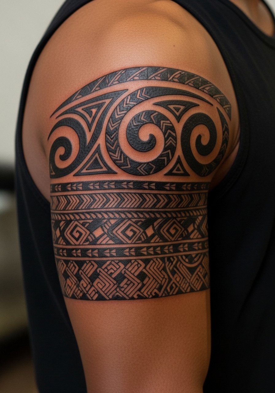
Polynesian-style bands use repeating motifs and heavy blackwork. These patterns are culturally significant for many communities, so consider choosing elements with awareness and ask for a custom piece rather than a direct copy. When done boldly they age incredibly well because the thick fills resist blur. The session can be long due to saturation work, so plan appropriately. For clothing, try a sleeveless surf-style top that shows the upper arm with an intentional aesthetic.
17. Maze or Labyrinth Band

A labyrinth band reads like an abstract puzzle. The trick is keeping corridors wide enough to survive slight pigment spread. Tell your artist to simplify corners and prioritize negative corridors over tiny dead ends. Overly complex mazes compress and merge into a gray mass after a few years. This design pairs with casual watches or a simple cuff. Wear a rolled sleeve linen shirt to show the pattern without competing prints.
18. Interlocking Gear or Industrial Band

Interlocking mechanical motifs give a band an engineered silhouette. Keep the gears large enough so teeth keep definition as the skin moves. Common requests compress too many small gears into a narrow band, which causes loss of detail. For session comfort wear a short-sleeve tee that can be shifted to allow unobstructed access. This style ages well with proper spacing and solid fills.
19. Micro-Realism Scene That Wraps
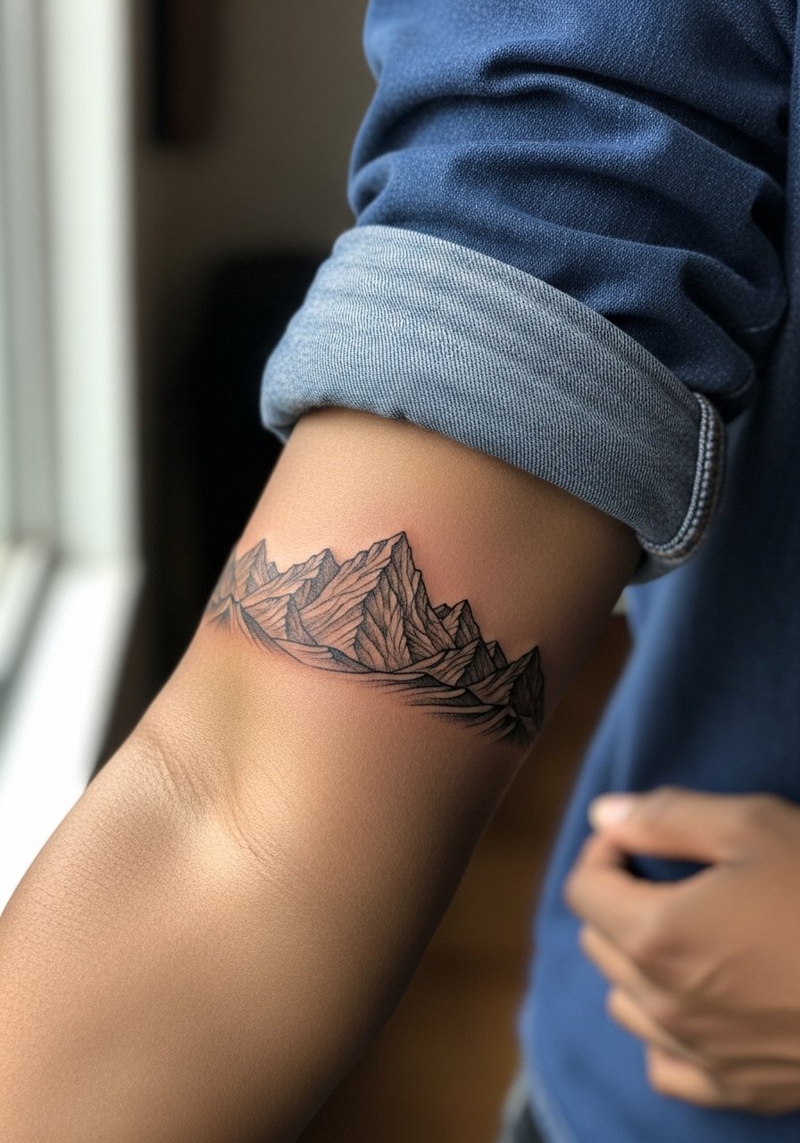
Wrapping a micro-realism scene into a band yields a narrative strip rather than a pattern. Because the details are tiny, ask the artist to pick one focal element repeated or scaled instead of a continuous string of micro elements. The age risk is detail loss; the fix is to enlarge major elements so they remain readable. For showing it off, wear a rolled sleeve denim shirt that frames the forearm scene and keeps the composition visible.
20. Solid Band with Negative Symbol Cutout
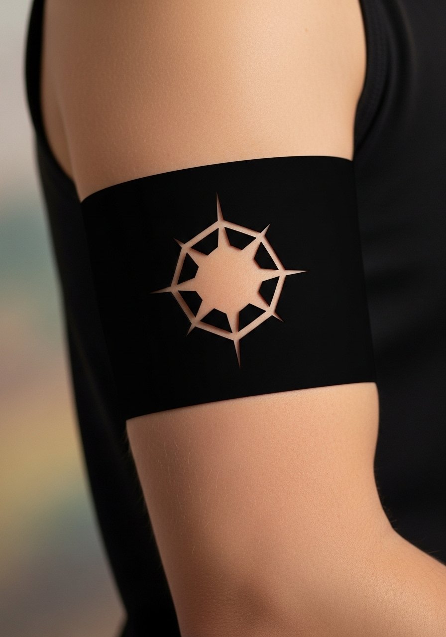
A solid band with a negative symbol gives you the drama of heavy blackwork plus a private emblem. The key is making the cutout large enough to remain distinct within a saturated field. Many people choose tiny cutouts that dissolve into a blur. Ask for the negative shape to be at least one third the band height. This style is bold in sleeveless looks and pairs with a sleeveless knit top for nights out.
21. Maze of Arrows Band

Arrows create directional motion around the arm. Keep arrow shafts and points consistent so the motion reads cleanly when healed. Overly thin arrow shafts are the main mistake because they lose snap. Request slightly thicker shafts and clear negative separation near points. This design looks great with stacked minimalist rings or a thin chain bracelet that runs parallel to the arrow flow.
22. Wave Pattern Band
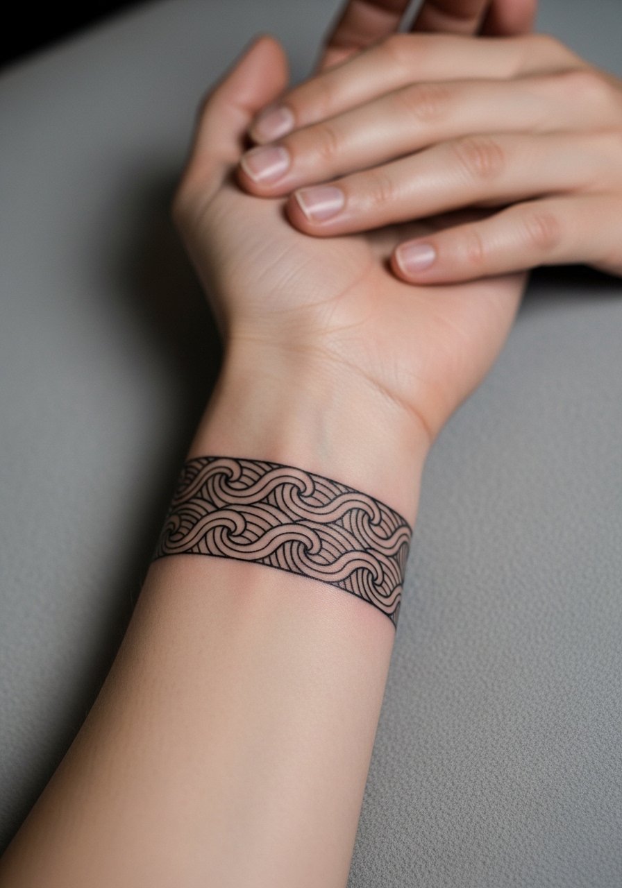
Wave bands have organic movement and sit naturally on curved muscle. Make sure the wave peaks are not too tightly packed or they will blur into a single scallop. Ask for stronger peaks and deeper troughs so the shape survives. This placement pairs naturally with rolled cuffs and a minimalist watch that lets the wave pattern read uninterrupted.
23. Ornamented Filigree Band

Filigree bands are decorative without being delicate. The secret is scale. Ask for simplified curls larger than your reference so they do not collapse. The common error is micro curls that blend. For show-off looks, an open or wide-neck top like a wide-neck blouse keeps the filigree visible and tasteful.
24. Barcode of Coordinates Band
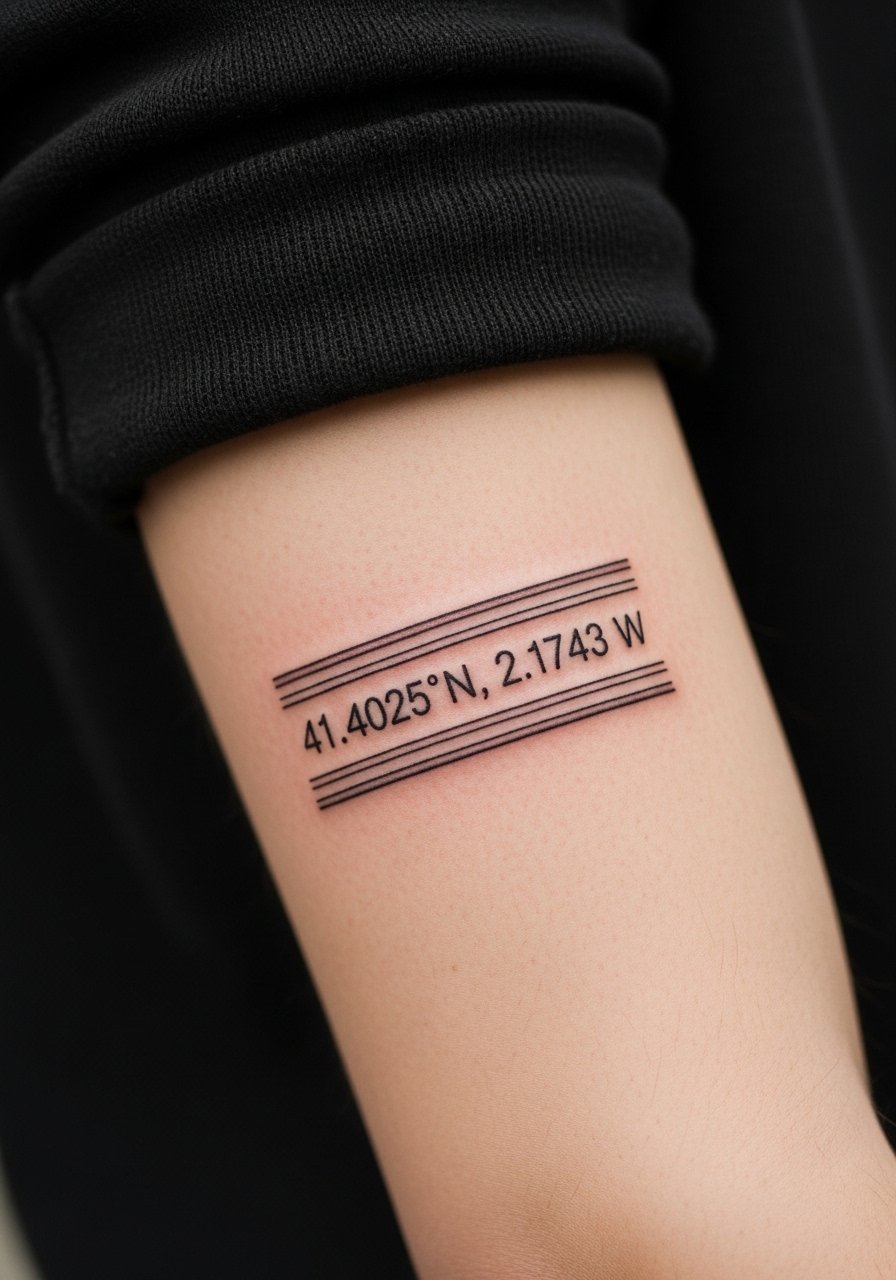
Coordinates wrapped as a band can be graphic and meaningful. Make sure the numeric text uses a simple, open font and is scaled large enough to stay legible. Tiny numerals blur quickly, so ask for slightly bolder type. This design pairs with a minimal pendant necklace that balances the arm without drawing attention away.
25. Split Band with Color Accent
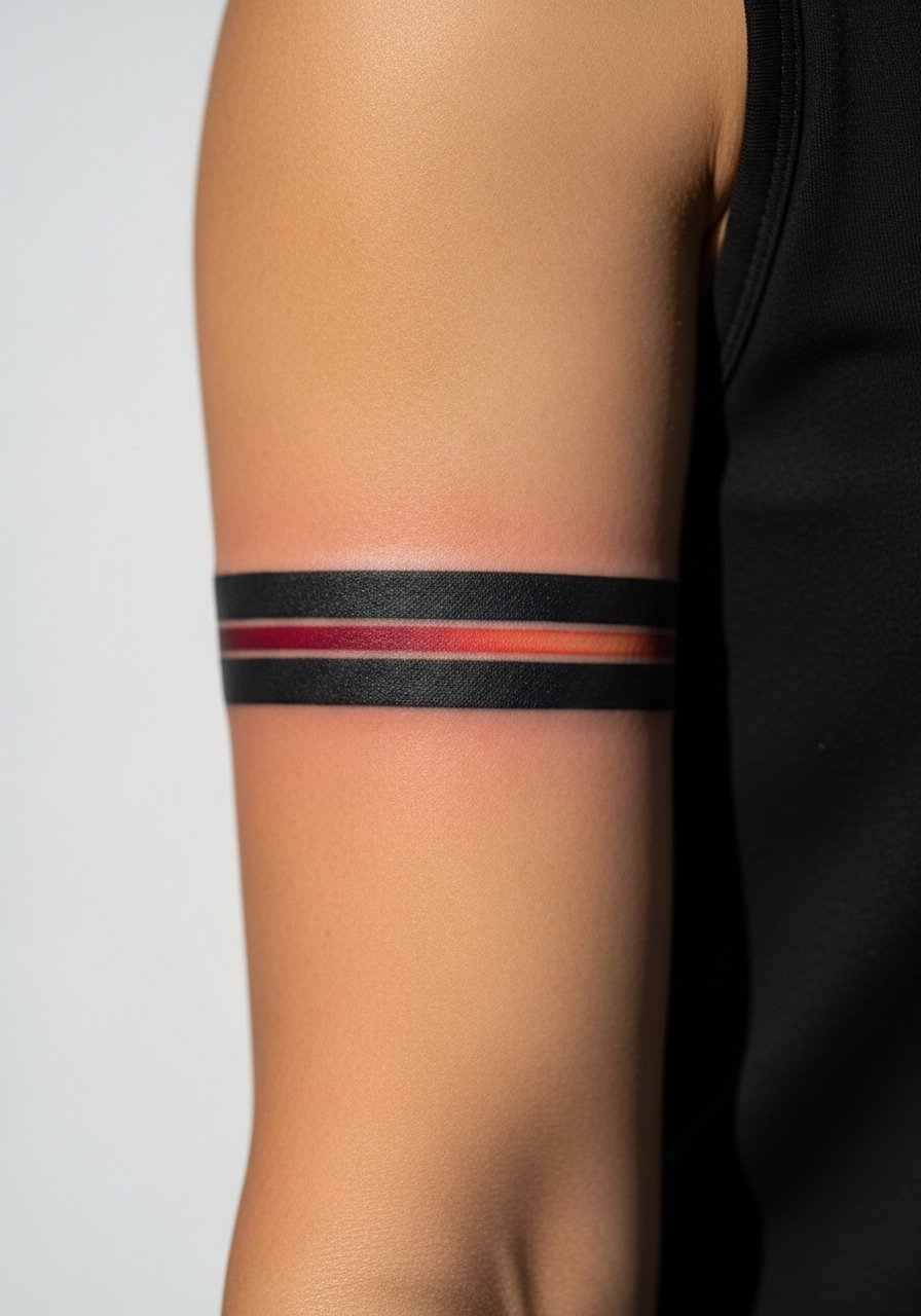
A thin color stripe inside a black band gives a pop while keeping the overall silhouette bold. Ask for the color channel to be placed in a recess so it is slightly protected from friction and UV. The mistake is using very thin color stripes that fade faster if they are surface-level. This design looks great with short sleeves and a lightweight cardigan that can be pushed up to reveal the color.
26. Script with Decorative Flourish Band
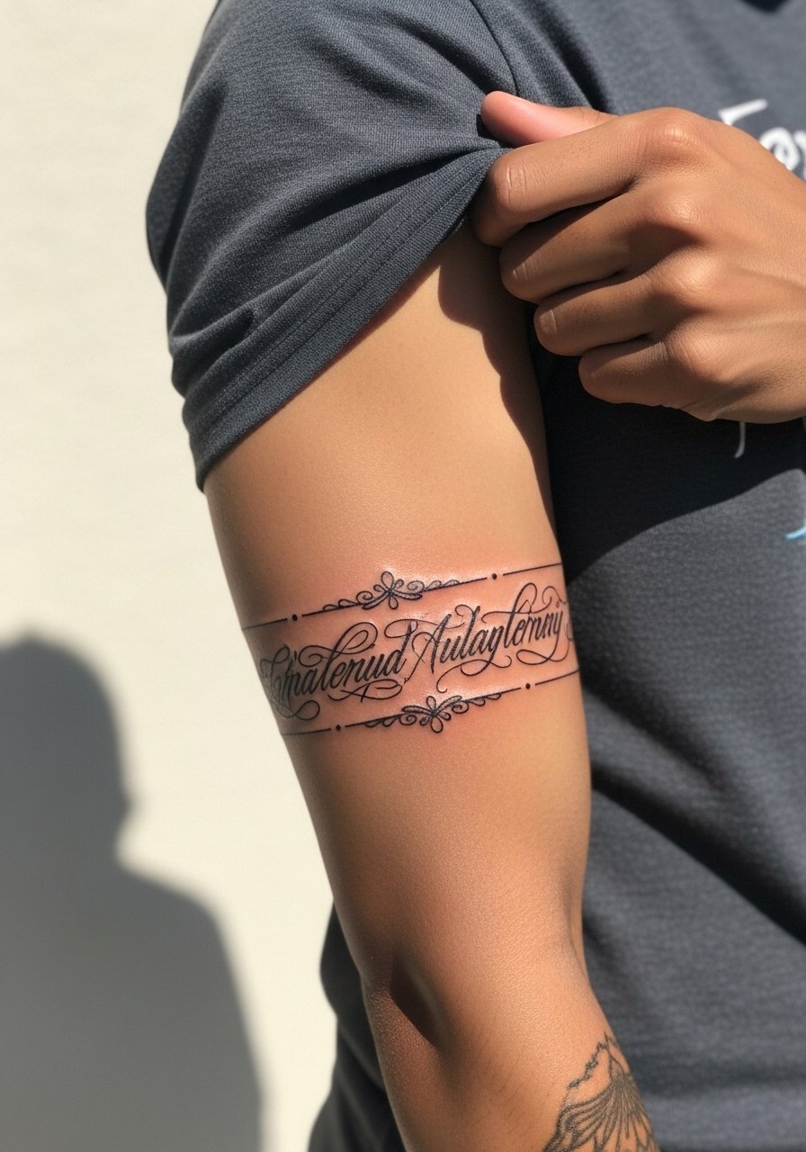
A scripted band gains personality through the flourishes between words. Keep flourishes bold enough to survive a few years and space letters for breathing room. The common mistake is ornate curls that read like a single stroke after healing. Ask for a slightly thicker script and a stencil wrap to preview the seam. For accessories, a thin chain pendant necklace sits above without competing.
27. Morse Code Dot-Dash Band

Morse code bands are subtle and personal, spelling a word or date in dots and dashes. Make the dots and dashes large enough to resist merging and ask for consistent spacing between units. The main error is compressing Morse into a tiny space where decoding becomes impossible after healing. This style is discreet with rolled sleeves and stacks nicely with a slim bracelet that runs parallel without overlapping.
Frequently Asked Questions
Q: Will thin decorative armbands blur faster than bold solid bands, and which should I pick if I want low maintenance?
A: Thin decorative bands do tend to soften faster than bold filled bands because they rely on fine linework and small negative spaces. If you want low maintenance choose slightly bolder lines and wider spacing so the design resists blowout and sun fade. For a midline option consider a patterned band with thicker anchors and detailed interiors kept at a larger scale.
Q: How do I talk to my artist about placement and seam alignment for a wraparound band?
A: Ask to see a full stencil wrapped around your arm and request small adjustments while the stencil is on. Point out where you want the seam to sit when your arm is relaxed and when flexed. That way the pattern aligns in everyday positions rather than only in the photo pose.
Q: Are culturally inspired bands appropriate if I do not belong to that culture?
A: Some patterns are rooted in specific traditions and meaning. Many people opt for respectful adaptations rather than direct replicas. Ask your artist about sources and consider a custom piece that nods to the aesthetic without copying sacred symbols.
Q: How does inner bicep placement change pain and healing compared with outer arm bands?
A: The inner bicep is more sensitive and moves a lot, so sessions there can hurt more and healing can take longer. Expect to follow access and movement advice from your artist and plan for a slightly longer touch-up timeline if the design relies on fine detail.
Q: If I like fine line armbands but worry about longevity, what practical choices help the design last?
A: Increase overall line weight slightly, widen negative spaces, and position the band where friction is minimal. Also check healed portfolios from the artist for similar placements. Those steps make the difference between a piece that needs touch-ups at year two and one that holds crispness longer.