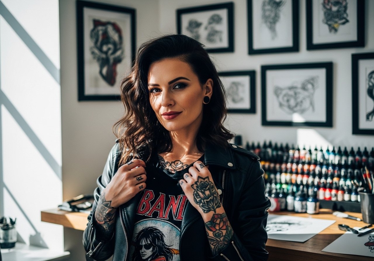
Bold hand tattoos age differently than you expect, and the pieces that still look deliberate after a few years are rarely the ones that got the most likes on day one. Heavy linework and smart spacing hold up through hand washing, typing, and daily wear. Read through these designs, the real mistakes I see, and what to tell your artist so your hand ink keeps reading sharp long after the first photo.
1. Knuckle Script Letters
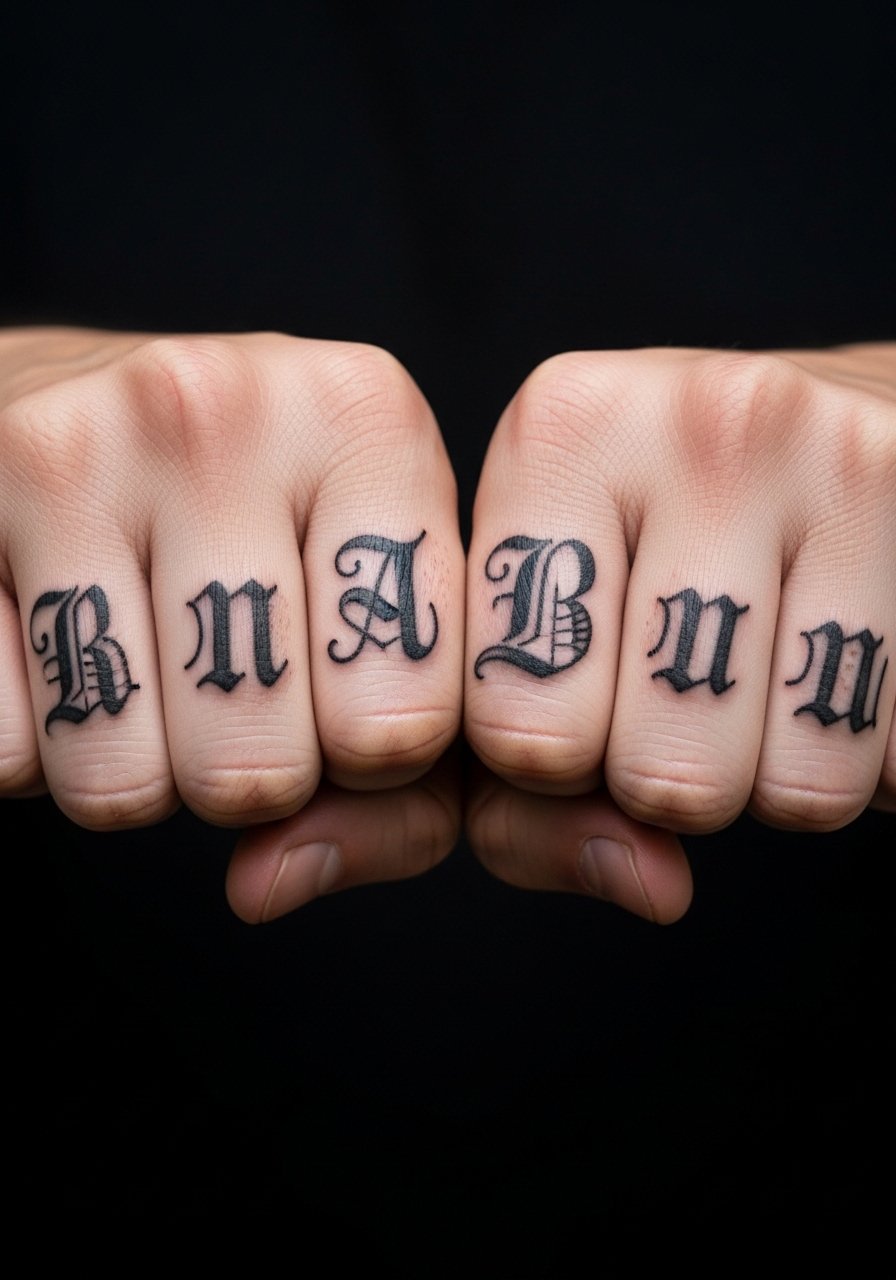
Most people want words that read from a fist or open hand. I've seen 0.25-0.5 inch letter heights hold up best, because tiny script melts into blur after repeated washing. When you sit with your artist, ask for bold single-pass outlines rather than hairline script, and show the exact font weight you want. Pain is sharp on knuckles, expect short sessions under an hour. A common mistake is stacking flourishes to fit more letters, which crowds the knuckle spaces. For showing this off, keep sleeves minimal. Try a vintage henley shirt with short sleeves so your fists gesture without hiding the ink.
2. Snake Silhouette Wrap
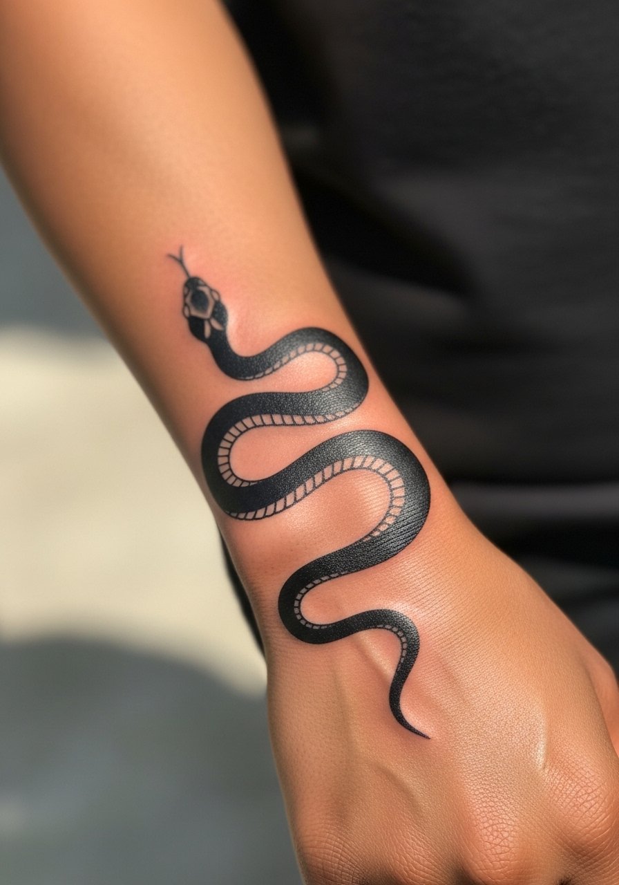
I've seen snake wraps that flow with the hand contours age elegantly because the design uses negative space to breathe. When consulting, say you want the head to sit near the thumb web and the tail to taper toward the wrist, so the movement reads as your hand moves. Pain on the side of the hand is moderate. The trap is trying to fit too much scale into a skinny silhouette, which can blur where the skin folds. Pair this with a thin signet ring or a flowy linen button up rolled at the cuff for natural motion when you gesture.
3. Evil Eye Talisman on the Palm

Fair warning, palm tattoos are a commitment because palm skin sheds differently and fades faster than the back of the hand. Pick a bold, single-motif talisman about 1-2 inches wide and accept that touch-ups are typical at the one-year mark. Tell your artist you want dense black saturation and simplified interior lines, not intricate filigree. Sessions feel rough because the palm is sensitive, and aftercare needs attention to friction from grips. If you plan to hide it at interviews, remember palms can be shown or hidden at will by opening your hand.
4. Sacred Geometry Mandala on Palm Center

Most mandalas that fail on palms were drawn too dense. The aging reality is that tight, close-spaced geometry on palm skin fills in. Ask for wider spacing between concentric elements and solid anchor lines that keep the pattern readable. Expect a long, focused session because every radial line needs consistent depth. A common mistake is asking for tiny detail at first session. For session wear, keep hands free and relaxed. Pairing is subtle, so short-sleeve polos or minimalist rings work when you want to flash the design.
5. Botanical Vine Crawl Across Fingers

When vines meet finger joints they bend with movement, which is part of the charm and the challenge. I recommend slightly thicker stems where the vine crosses knuckles so the motif reads after a year. Tell your artist which fingers to avoid if you want to wear rings later. Pain on finger tops is sharp, keep sessions short. A mistake I see is asking for extremely fine leaf detail across joints. For showing it off, wear a thin signet ring on a non-tattooed finger and roll sleeves up in a flowy linen button up for natural movement.
6. Celestial Knuckle Stars
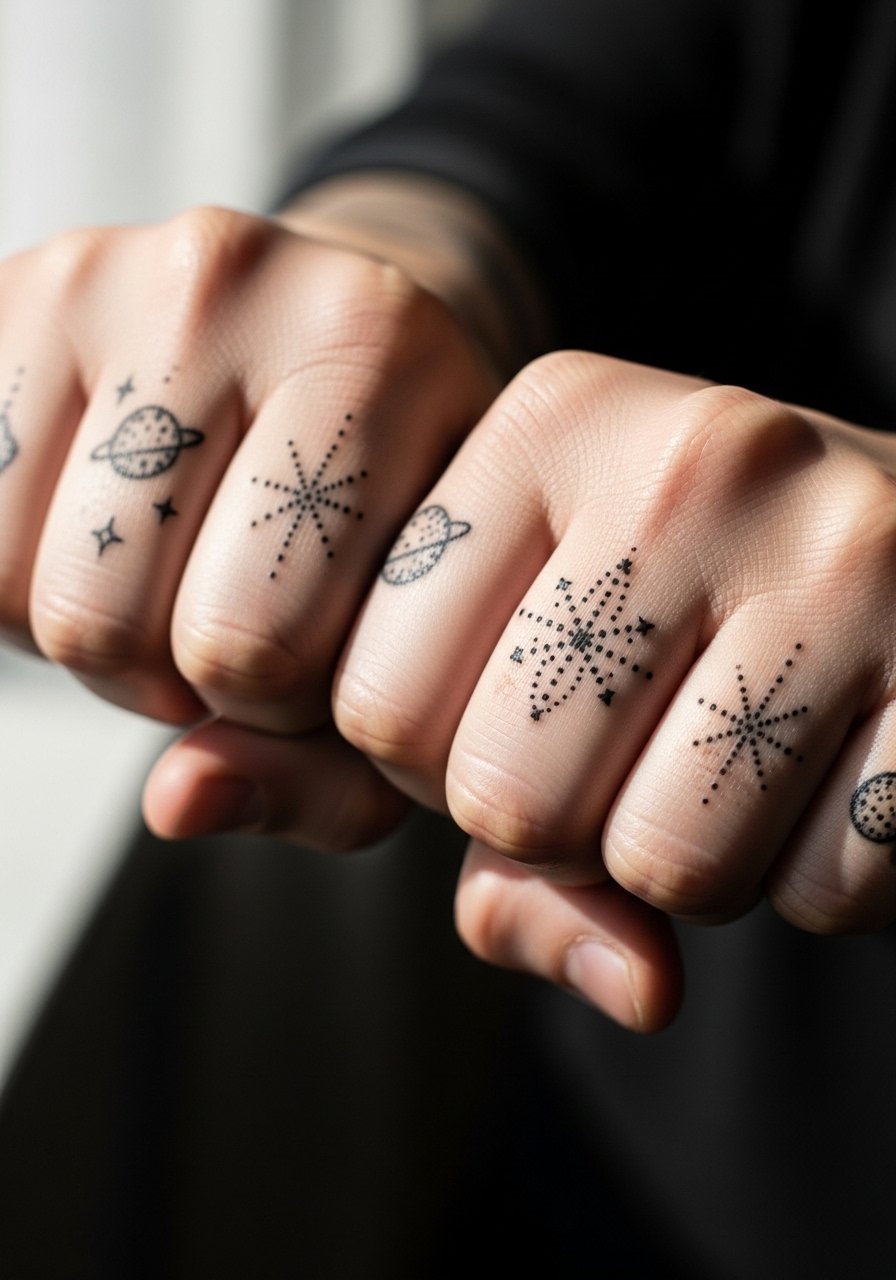
Knuckle stars are quick sessions and easy to read from a distance when you use compact 0.5-inch motifs. A visual impact lead works here, these small celestial glyphs catch attention during gestures. The typical error is over-detailing each star with micro shading. Keep dots and simple rays so the pieces don’t settle into a grey smudge. Pain is knuckle-level sharp but fast to heal. Style them with vintage tees or a chunky chain necklace to balance the upper-body look.
Before You Book
The wrist and finger pieces above heal differently from larger back-of-hand work, so a few small prep items smooth the session and the first week.
-
Zodiac mini temporary tattoo pack. Lets you test knuckle and finger placements before committing, handy for deciding exact letter spacing or star placement.
-
Hand-poked temporary sheet set. Mimics the raw hand-poke look and shows how dot work will age on your skin for a few days.
-
Stencil transfer paper kit. Useful for previewing linework layout on knuckles and palms and avoiding placement regrets.
-
Thin protective film roll. Keeps finger and palm tattoos clean during early healing when friction and washing are constant concerns.
-
Aquaphor healing ointment. A thin layer protects fresh hand lines during the first few days, especially helpful if you have a job that requires frequent handwashing.
7. Traditional Rose Fist
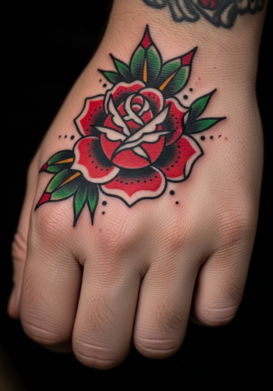
I've seen classic roses hold up because they use solid black outlines and heavy saturation. Visual impact is immediate, and color ages into a warm read if the outline stays crisp. When you book, ask for a slightly larger petal separation than your reference so the bloom does not fill in. Pain on the back of the hand is moderate and sessions usually take 1-2 hours. A common mistake is expecting tiny petals to remain distinct. Pair this with a wide leather cuff bracelet or rolled denim sleeves to frame the artwork.
8. Blackwork Skull Web Across Knuckles

The back-of-hand blackwork piece reads as instant edge because of deep saturation and graphic negative shapes. A mistake I often see is over-detailing the facial area, which loses form when skin shifts. Tell your artist you want bold anchors with simplified internal shading. Expect heavier sessions and likely two appointments for saturation. Blowout risk increases on thin skin, so avoid overly thin outlines. For showing this off, short sleeves and a silver bangle stack or leather cuff complement the heavy lines.
9. Word Finger Banner

When you spell words across fingers, spacing is everything. The consultation lead matters, bring exact text and font weight. A common error is requesting ornate script too small, which blurs at the joints. Keep letters bold and simple, around 0.25-0.5 inch tall. Sessions are quick but precise. Expect touch-ups in the first year, especially if you wear rings that rub the outer fingers. Style with a fitted tank and minimal rings so the banner reads during gestures.
10. Palm Mandala Burst

Aging reality for palm mandalas is harsh; tight density fades first. When you request one, ask for a simplified center and stronger outer anchor lines to preserve the burst over time. The session is intense because palm skin is sensitive and heals unpredictably. If career visibility matters, remember palms can be revealed selectively. After the session, avoid heavy grip work the first week. When you want to show it, a relaxed-fit polo keeps focus on the hand without overexposing.
11. Knuckle Dice Roll

The dice motif works because of clear geometric edges. Visual impact lead applies here, a compact cube reads well if the pips are bold. Avoid tiny numerical dots or ornate corner shading. Consult on orientation so the numbers align when your hand is relaxed. Knuckle pain is sharp, but the session is short. Pair with casual henleys or a vintage henley shirt to keep the upper-body look cohesive during gestures.
12. Finger Skeleton Hand

Most micro-realism on fingers softens over time because skin movement alters fine shading. For this, tell your artist to lean into simplified bone shapes with strong outer edges and selective stipple shading. Pain is high on fingers, so plan multiple short sessions. A common mistake is requesting photoreal detail that loses contrast after a year. Session wear should be minimal, a loose sleeve you can roll up. For showing off, stack a thin chain pendant necklace so upper-body accessories balance the finer finger work.
13. Back-of-Hand Tiger Claw
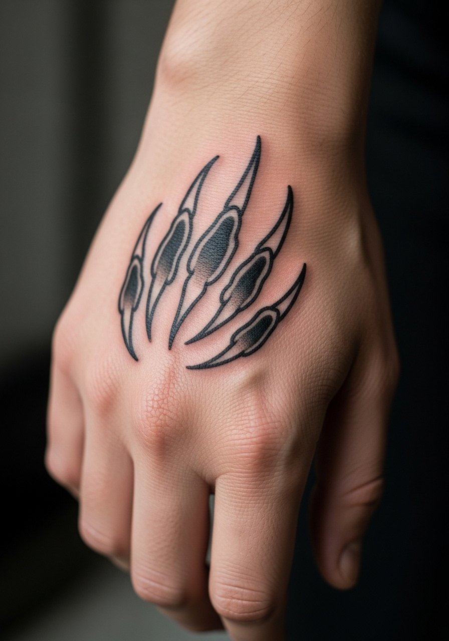
There's something about bold black outlines with shaded fills that read from across a room. When you want animal symbolism, ask for dynamic claw placement that follows the hand's diagonals so it looks animated in motion. Expect 2-3 sessions for saturation and shading. Mistakes I see include pushing too much tiny texture into thin skin areas, which flattens over time. Style this with rolled denim sleeves and a wide leather cuff bracelet to frame the artwork.
14. Negative-Space Geometric Lines
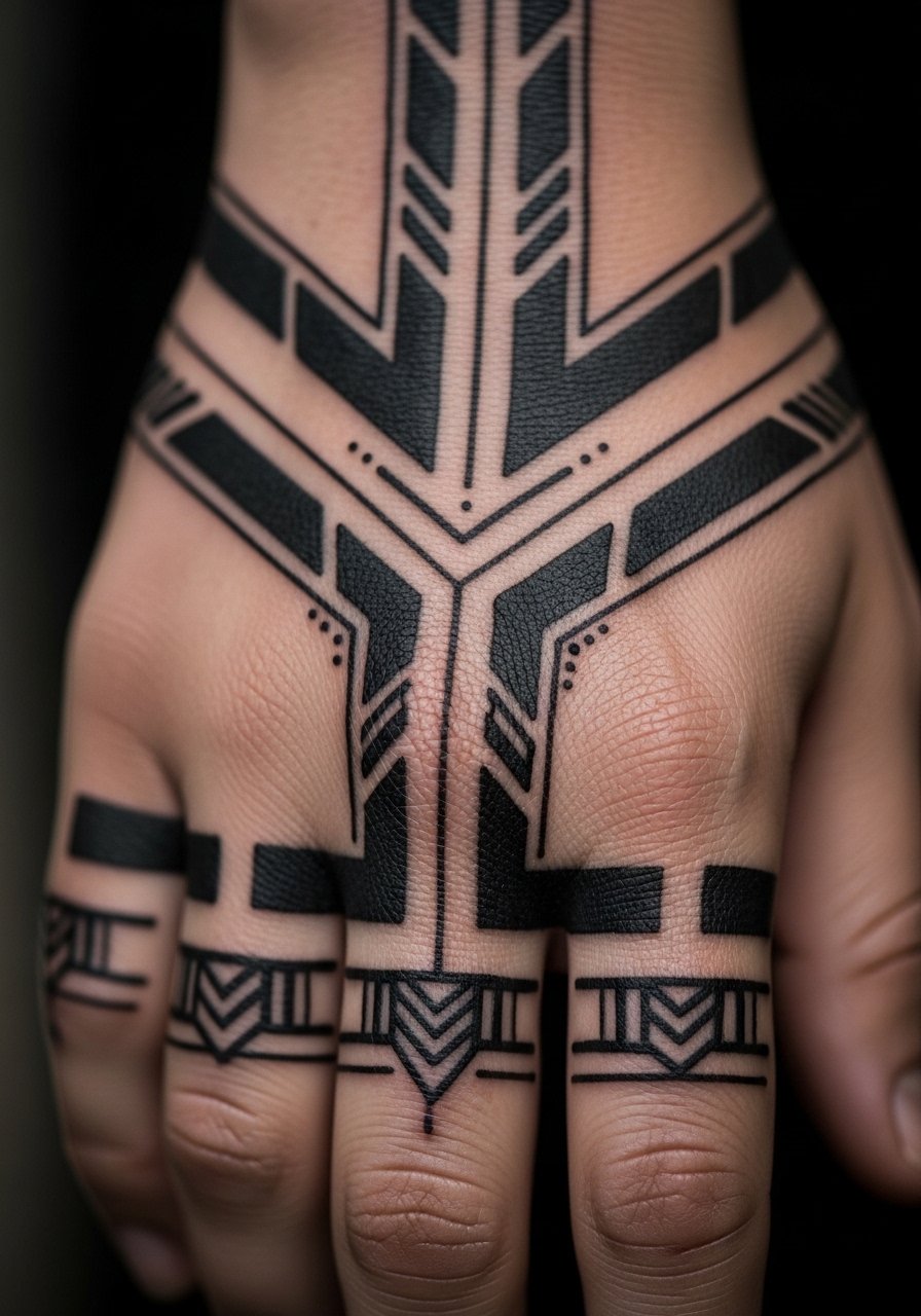
The biggest mistake with geometric work on hands is going too small. For longevity, leave breathing room between parallel bands and create negative-space anchors. Consult on the exact spacing you want reproduced. The piece feels tight during application but the look ages well if the geometry uses thicker linework. Pain is moderate. For showing the shape, wear short sleeves and a minimalist leather watch opposite the design.
15. Tiny Glyphs Along Thumb Web

Personal observation: the thumb web is a discreet spot that still shows in gestures. Small talismans here often need bolder marks because skin moves a lot. Tell your artist you want compact anchors and avoid intricate shading. Sessions are brief and pain is sharp. A common real mistake is underestimating how the glyph will rotate when you flex. For the session, wear a loose short-sleeve shirt so your arm is accessible.
16. Metallic-Style Gold Line Accents
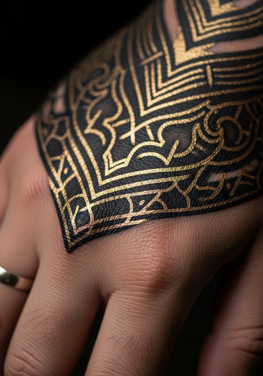
This is one of the under-covered twists I keep seeing. Metallic-style inks or white-gold highlights need extra thought because they fade faster, so artists often layer them over strong black anchors. When you ask for metallic touches, specify you want the gold reserved for highlights only, and accept that touch-ups will be needed. Pain and session time match other back-of-hand pieces. A mistake is expecting the metallic to last as long as black. For showing it off, neutral fabrics let the glint read, try a relaxed fit polo for subtle flashes.
17. Chain-Link and Signet Ring Illusion
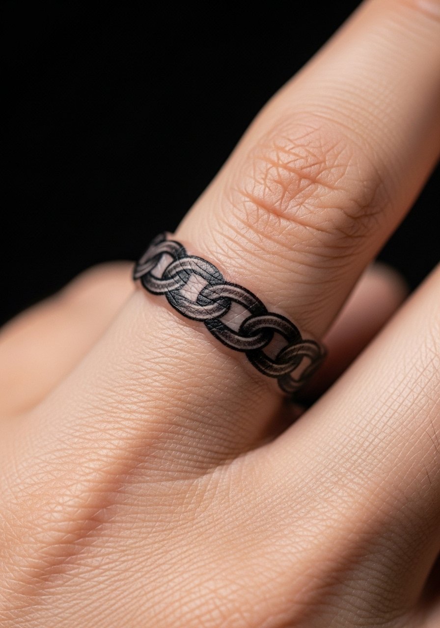
When clients want ring-mimic tattoos, placement precision during consultation is everything. Ask for band alignment that complements your actual ring finger if you wear jewelry, or avoid that finger entirely. The session is straightforward but expect slight touch-ups where fingers rub. Common mistakes are choosing too thin a link pattern, which disappears under joint movement. Pair this with minimal real rings or a thin signet ring on a different finger for a layered look.
18. Constellation Map Across Hand
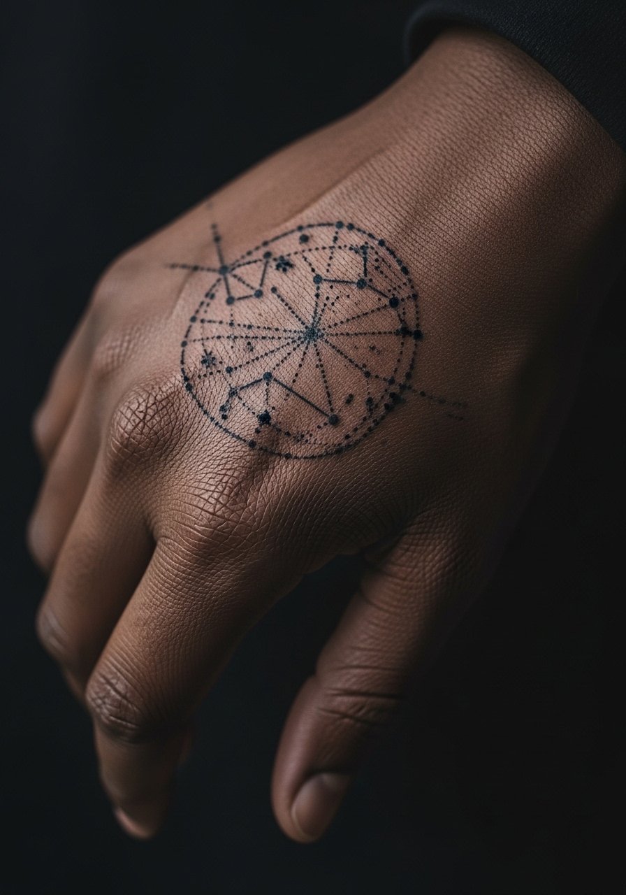
Aging lead: dot work on hands tends to soften because small dots spread. To prevent a blur, ask for slightly larger dot sizes and bold connecting anchors. The visual is delicate but durable if planned that way. Sessions are focused and often divided to allow precise placement. A mistake is using ultra-fine dots meant for forearm skin. Show it with cropped hoodies or a thin chain bracelet opposite the wrist for balance.
19. Minimalist Arrow Across Finger Side

Consultation lead matters here, arrows on the finger side must align with your natural finger length. The pain is high in that narrow strip and sessions should be kept short. A common error is making the arrow too thin; thicker shafts survive better. If you plan to wear a thin ring, avoid that finger to prevent friction. For session wear, pick a loose sleeve that you can roll up easily.
20. Floral Shield on Metacarpal Ridge
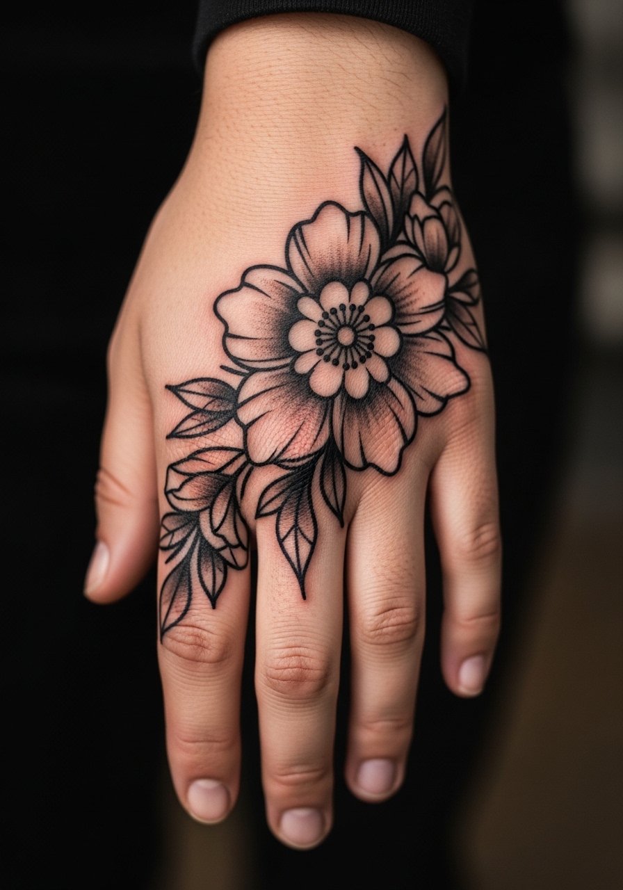
Visual impact lead: the metacarpal ridge is a broad canvas that reads well when shapes are bold. Tell your artist you want petals that follow the hand diagonals so the bloom moves with gestures. Expect moderate pain and a 1-2 hour session. Common mistakes include tiny internal details that wash out. Style with short sleeves and a silver bangle stack for framing.
21. Micro-Realism Eye on Thumb Base
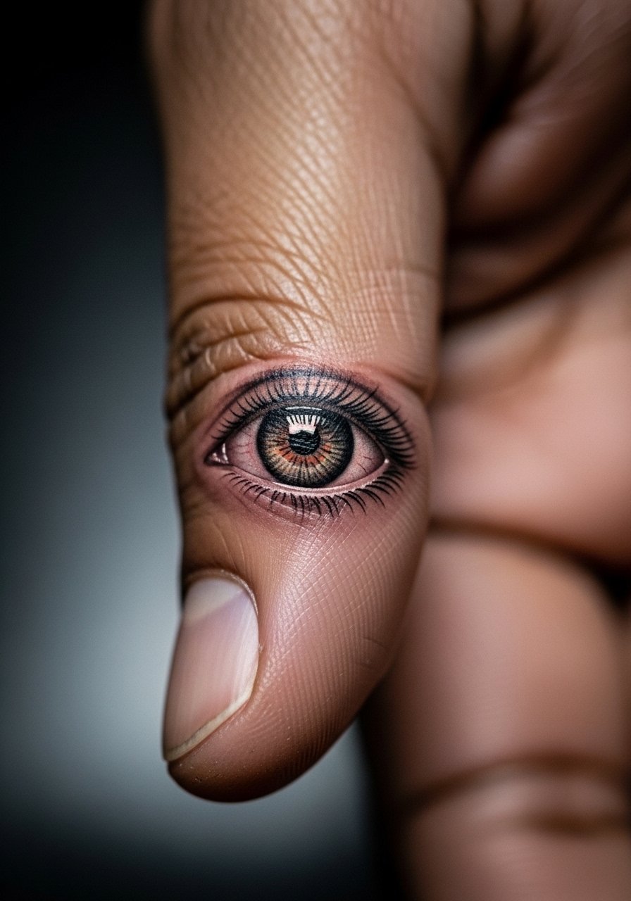
Aging/healing lead applies here, micro-realism on the thumb base needs higher contrast initially to keep the pupil and iris readable as the skin softens. Tell your artist you want crisp pupil work and simplified lashes rather than delicate filigree. Sessions are precise and may take multiple short passes. A mistake is requesting photoreal smallness that loses depth. Keep apparel simple during sessions, a loose button-down shirt works well.
22. Celtic Knot Wrist-to-Hand Flow
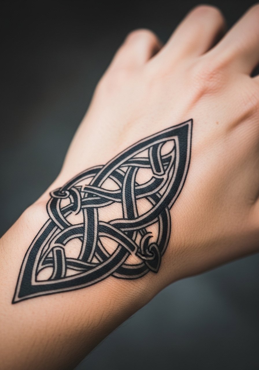
Consultation lead: knots need consistent line weight to keep the weave readable as it ages. Ask for thicker bands and space between overlaps. Sessions require careful mapping. A common mistake is picking ultra-fine bands that merge. For showing it off, roll sleeves and wear a minimalist leather watch opposite the knot to balance the wrist.
23. Gothic Lettering on Side of Hand
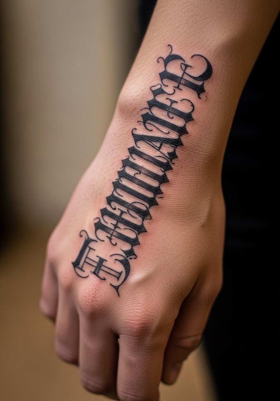
Mistake lead: gothic script looks dramatic when letters are scaled appropriately, but too-small blackletter squashes into unreadability. Request larger counters and simplified serifs. Pain on the hand edge is moderate. Sessions are quick but precise. For pairing, try a relaxed fit polo and minimal rings so the script remains the focal point.
24. Ivy Creeper for Cottagecore Fingers
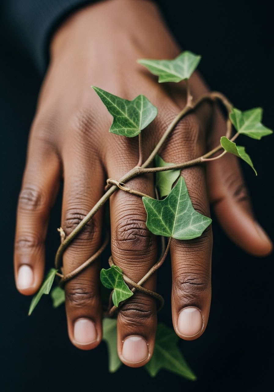
I've seen the ivy trend pop up for a seasonal cottagecore look. To keep it readable, ask for slightly bolder stems at joints and spaced leaves so the pattern settles without filling in. Pain is localized and sessions can be split by finger. A common mistake is requesting micro leaves that flatten. For show-off pairing, thin rings and rolled-up linen sleeves in earth tones help the vine breathe. Consider a flowy linen button up for photos.
25. Palm-Only Hidden Symbol
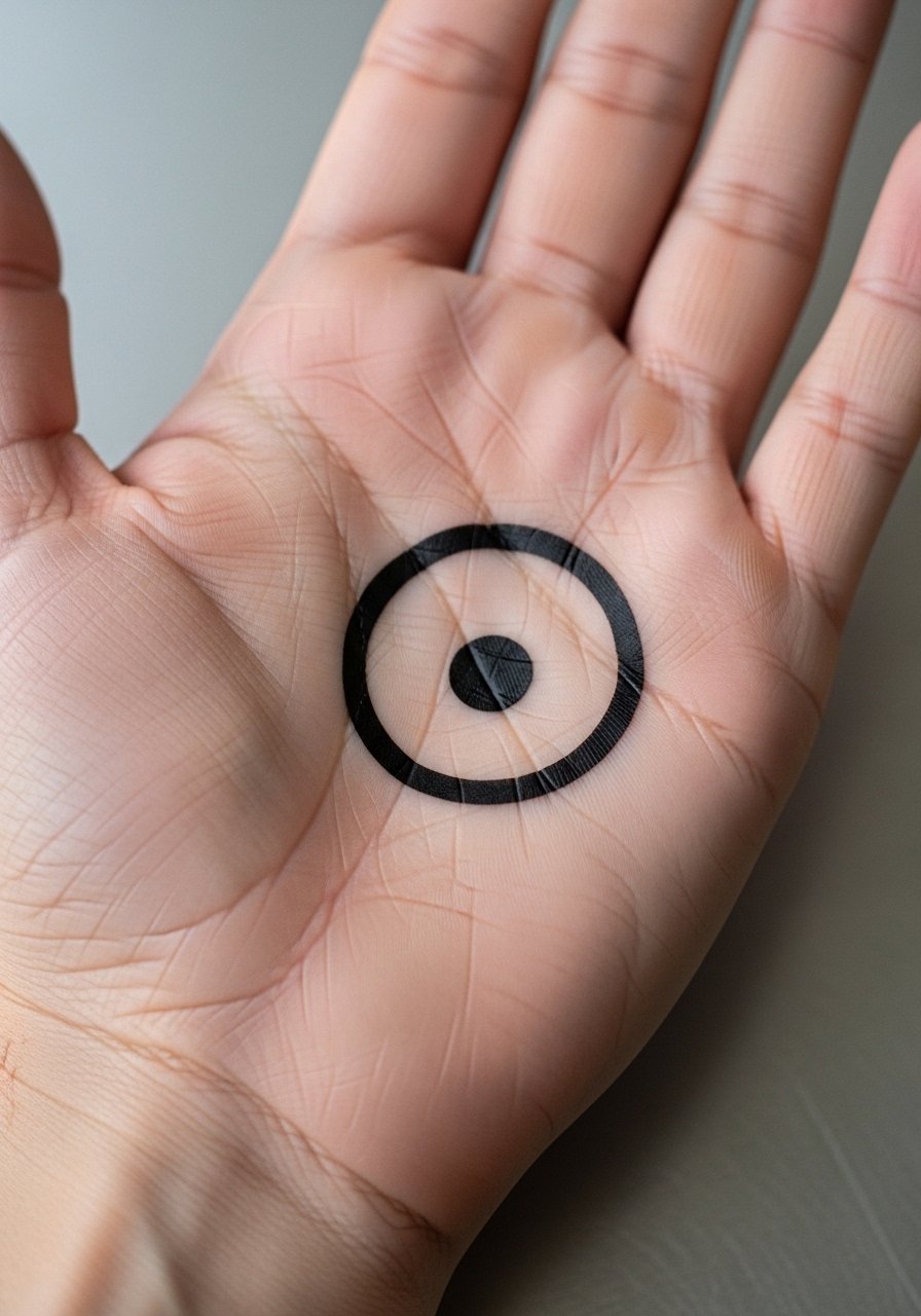
This is a clever visibility strategy. Palm-only placements can be flashed or hidden depending on the situation. Choose a single bold symbol about an inch wide and expect more frequent touch-ups than back-of-hand pieces. Session pain is high and after the process you will notice how much daily life uses the palm. A mistake is attempting complex detail that the palm cannot keep. This option is good for people who want a visible ritual piece without permanent exposure in every handshake.
26. Hand-Poked Dot Work Panel

One of the under-covered approaches is testing the hand-poked aesthetic with temporary sheets before committing. The hand-poked method needs careful spacing so stipple shading stays defined. Tell your artist you want visible dot rhythm and leave breathing room in darker areas. Sessions are slower and more meditative. A mistake is packing dots too close. For session comfort, wear a loose short-sleeved top and consider a relaxed fit polo that you can roll up.
27. Palm-Bordered Mandala with Wrist Extension

Decision-pressure lead: combining a palm mandala with a small wrist extension gives you symmetry that reads both open and closed. Ask for bold border rings and simplified inner detail. Expect longer session time and a clear touch-up plan. The controversy about Saniderm versus dry healing comes up here because palm work sits in a moisture-heavy area. One camp prefers protective film for the first 48 hours to manage moisture, the other prefers dry healing to avoid maceration. Ask your artist which method they prefer and why before you book.
Frequently Asked Questions
Q: How quickly do hand tattoos typically need touch-ups?
A: From what I’ve seen, hands usually need touch-ups sooner than arms or legs because of constant washing and friction. Plan on checking the piece around six to twelve months for knuckles and palms, and every one to two years for back-of-hand blackwork. Touch-up frequency depends on ink saturation and daily wear.
Q: Should I pick bold lines or fine line for finger and knuckle work?
A: Artists split on this, but the practical reality is fine line tends to blur faster on hands. Bold lines and stronger anchors usually keep a clean read longer. If you love fine detail, accept that touch-ups may be regular and size things up to give room for natural spreading.
Q: Can I test a hand design before committing?
A: Yes, temporary packs and hand-poked temporary sheets let you trial placement and movement without the commitment. Trying a design for a week shows how it interacts with your rings, phone use, and gestures, which helps avoid placement regrets.
Q: Do palm tattoos affect professional opportunities differently than back-of-hand tattoos?
A: Palm tattoos are more controllable because you can hide them by closing your hand, but some employers still react to visible hand ink. Back-of-hand pieces are visible during most interactions, so think about how frequently you’ll need to conceal or reveal the work and ask about policies before booking.
Q: What's the best way to find an artist who knows hand work?
A: Use discovery pathways like searching #BoldHandTattoo and #HandBlackwork on Instagram, checking Tattoodo style filters, and reading recent TikTok healing videos under #HandTattooMen. Local clinic apps and Reddit threads can also point to artists who have documented hand portfolios. Look for healed photos, not only fresh shots.