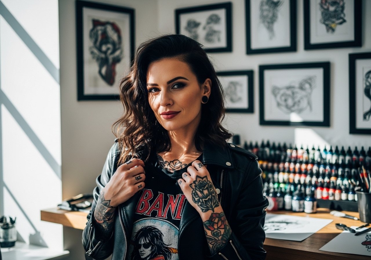
Fine line tattoos are everywhere online, but the colorful pieces that still read strong after years are usually the ones planned with space, saturation, and placement in mind. Some trends look gorgeous fresh and then smear, and others age into a new kind of depth. Below are 17 arm ideas that balance immediate impact with how they heal and hold over time, plus what to ask your artist at consult.
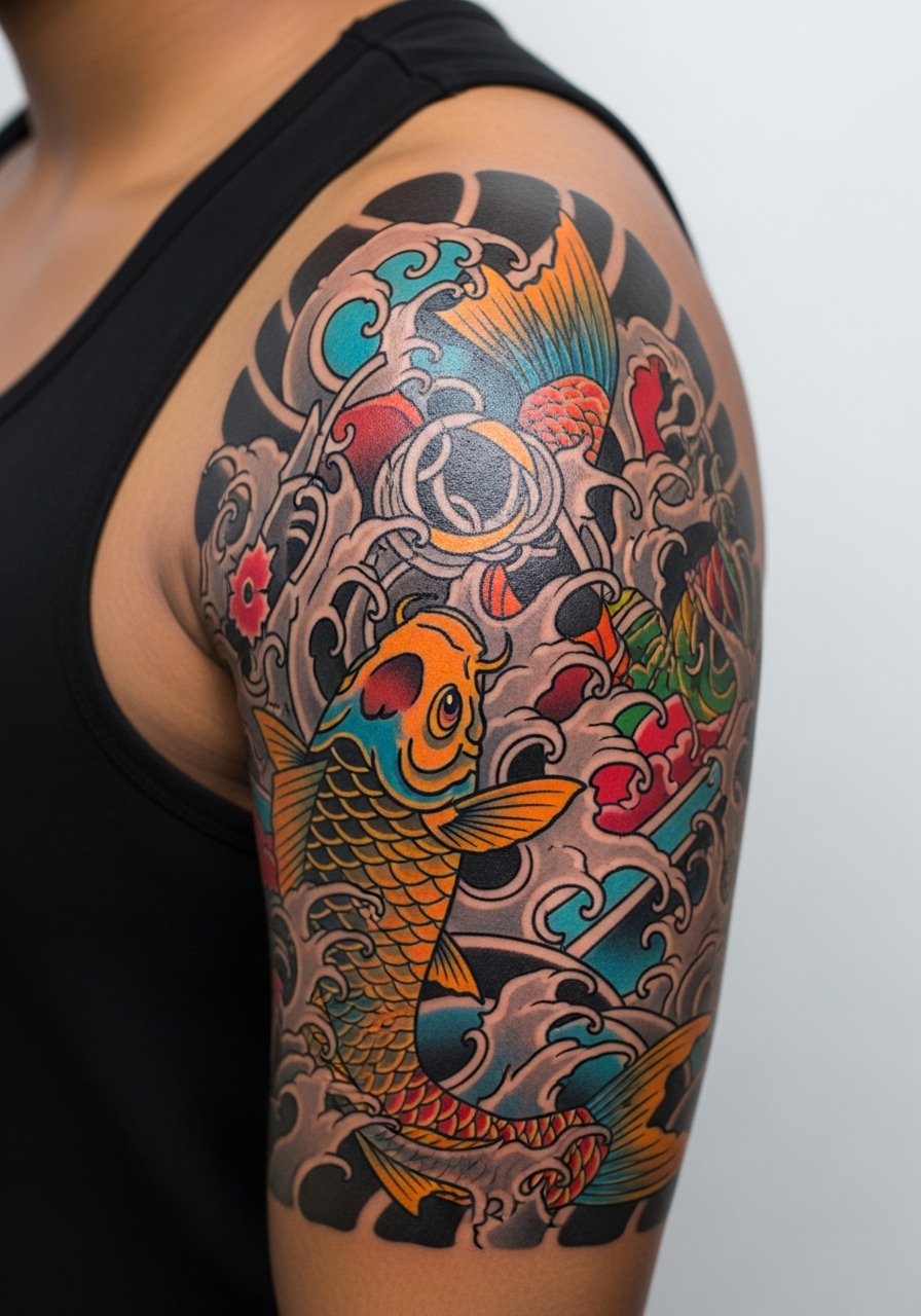
1. Watercolor Koi on Upper Arm
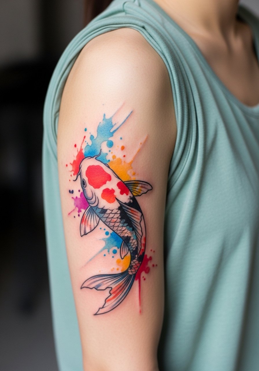
This placement gives room for color gradients and movement while keeping the piece protected by sleeves most days. I recommend asking for slightly heavier saturation along the fins and a thin outline to prevent the watercolor from bleeding into a fuzzy shape after a few years. The session feels like a long bicep pop, moderate pain, and one to two longer sittings depending on size. A common mistake is demanding pure wash without any anchor lines because that version tends to lose definition at year three. Expect touch-up at year three to five if you want the brightest contrast to last. For showing it off, wear a loose tank top that frames the shoulder and keeps the upper arm visible.
2. Neo-Traditional Koi and Lotus Sleeve Patch
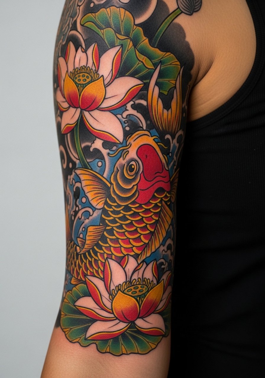
This hybrid keeps the boldness of traditional work while using modern color palettes. Tell your artist you want punchy saturation in the midtones and gradual shading rather than a single flat fill. The biggest mistake is asking for too many tiny details in a small arm patch because those details can merge into blotches over time. Pain is friendly on the outer arm and sessions are broken into two to three moderate-length sittings. For aging, outlines usually hold a decade or more while color loses peak saturation sooner. Pair this with rolled-up sleeves or a short-sleeve button shirt to keep the composition visible without crowding the image.
3. Geometric Mandala on Inner Forearm
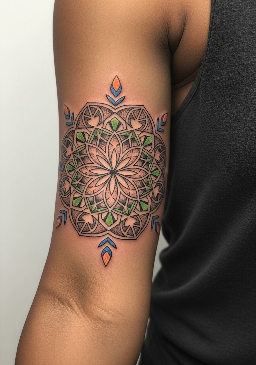
Fine geometry on the inner forearm looks sharp at first, but dense lines too close together are the thing that ages poorly. When you consult, ask for increased spacing between repeating elements and for stipple shading instead of heavy solid fills in tight areas. The inner forearm can feel sensitive but manageable, and the session is usually one medium-length sitting. A common mistake is shrinking the mandala to fit a small wrist band size because small geometry collapses into visual noise by year two. For showing this piece off, roll sleeves or cuff a light linen shirt so the forearm sits framed against neutral fabric.
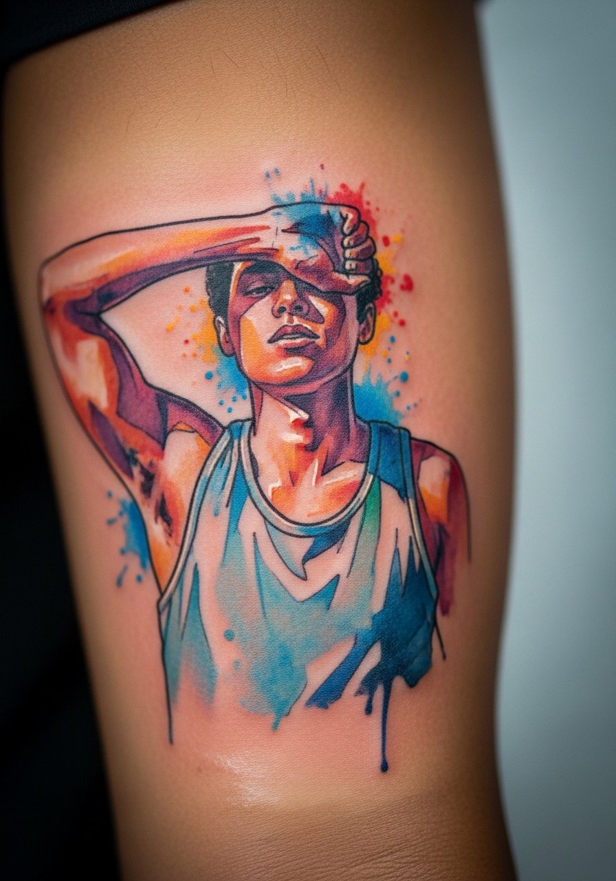
4. Micro-Realism Portrait on Upper Bicep
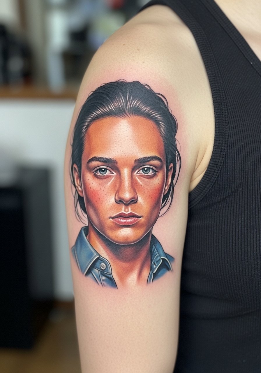
Portraits with color demand careful reference and honest sizing. When you sit down with your artist, bring the exact photo and agree on how much of the face will be implied versus rendered in detail. The biggest mistake is compressing a large photographic face into a small bicep spot because the facial details blur relatively quickly. Expect a two to three hour focused session and plan for a touch-up around year two if it sits in a high-sun area. Tell the artist to prioritize saturation in midtones because pure highlights fade fastest. For session comfort, wear a loose tank top that you can shift without pressing against the fresh ink.
5. Bold Traditional Rose with Colorful Leaves on Forearm
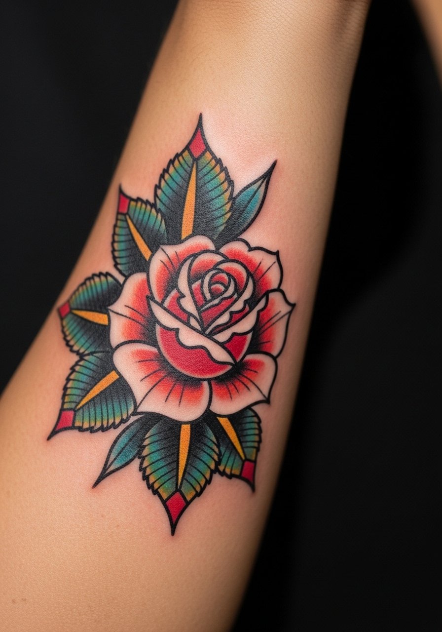
Traditional pieces age predictably because the linework is an anchor. Ask for slightly thicker outlines than you might want fresh because that line weight keeps the rose readable as colors soften. The mistake I see is asking for ultra-thin outlines with saturated fills and then wondering why the image looks muddy later. Pain is low to moderate on the forearm and a single session often does the job. Expect touch-up at year five for color refresh. Pair this with a crew-neck tee and rolled sleeves when you want the forearm to read clearly in day-to-day looks.
6. Color Splash Sleeve Accent with Negative Space
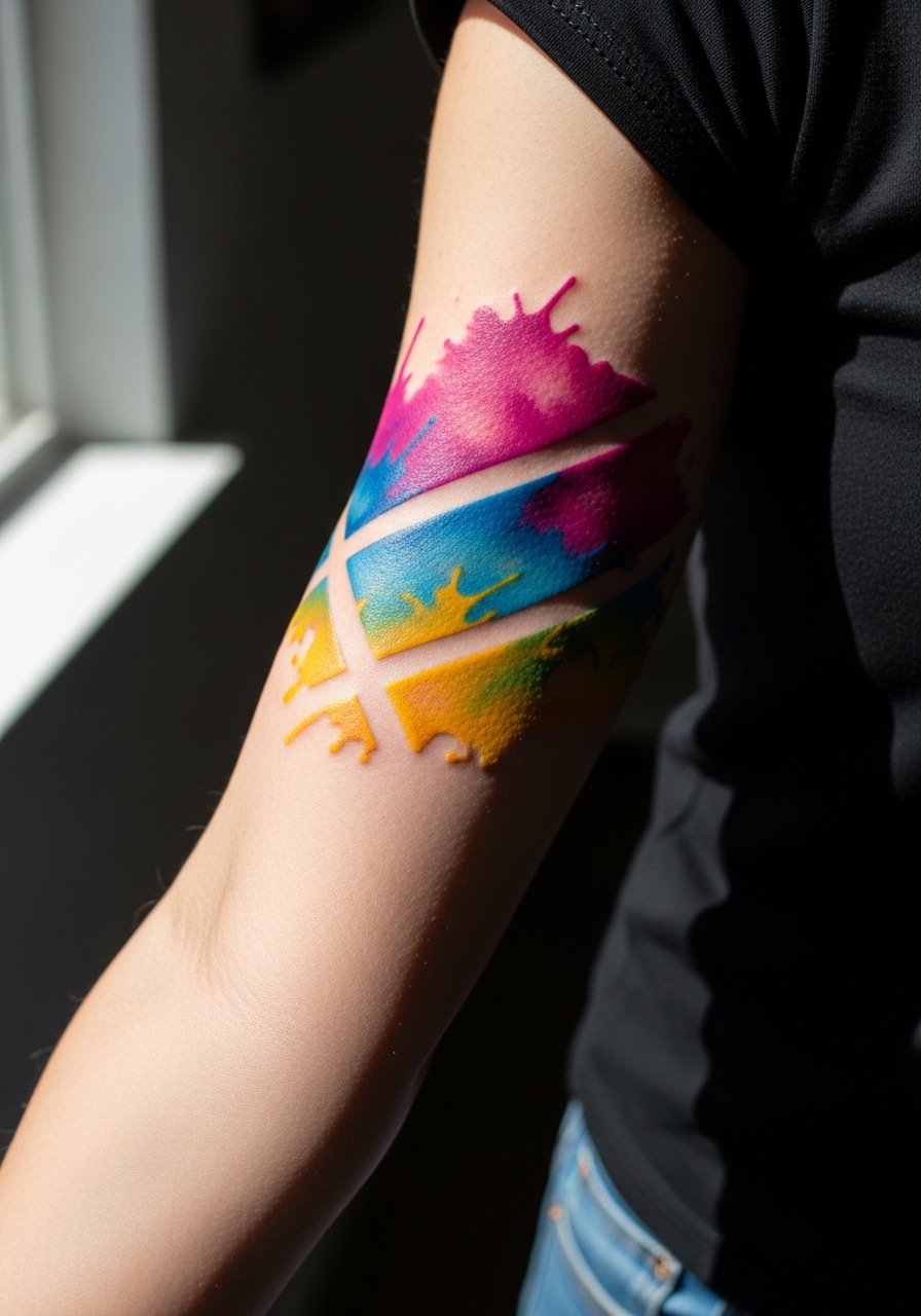
This version uses negative space to protect the piece from going muddy. In consult, specify where you want the negative gaps rather than leaving it to chance. The session feels like alternating bursts of needle work across the arm and can be longer than a standard single-piece appointment. A common mistake is covering the whole forearm in wash without any structural anchors because that leads to a washed-out patch in a few years. Expect touch-ups for the brightest pigments at year three. For showing off the splash without distraction, wear a short-sleeve tee.
Studio Day Picks
Those first six designs include both exposed forearm work and larger upper-arm patches, and a few of them ask for different prep and small supplies that make the session and first week smoother.
- Stencil transfer paper kit. Lets you check placement and scale directly on skin before needles start, which matters for the mandala and portrait pieces above.
- Cooling aloe gel. Applied after a longer session soothes inflammation in saturated color zones without leaving a greasy film.
- Thin protective film roll. Great for wrist and forearm pieces that rub against sleeves during the first few days.
- Fragrance-free gentle body wash. Cleans the area without stripping color or irritating tender linework from the first week of healing.
- Aquaphor healing ointment. A thin layer in the initial days locks in moisture for delicate linework and helps minimize scab cracking on forearm pieces.
7. Collage Sleeve of Travel Icons and Coordinates

This is the custom patchwork sleeve that reads personal without being a single image. For consult, map out the icons and coordinate placements on a printed arm template so the flow reads from elbow to shoulder. People often pack too many tiny elements close together and then the icons lose definition when the arm moves and skin settles. Sessions are modular, broken into multiple shorter sittings to keep color saturation consistent. If you want the script clear, ask for slightly larger lettering because small script tends to blur by year three. Wear a button-down shirt with sleeves you can roll to style the collage.
8. Fine Line Script Wrap Around Wrist
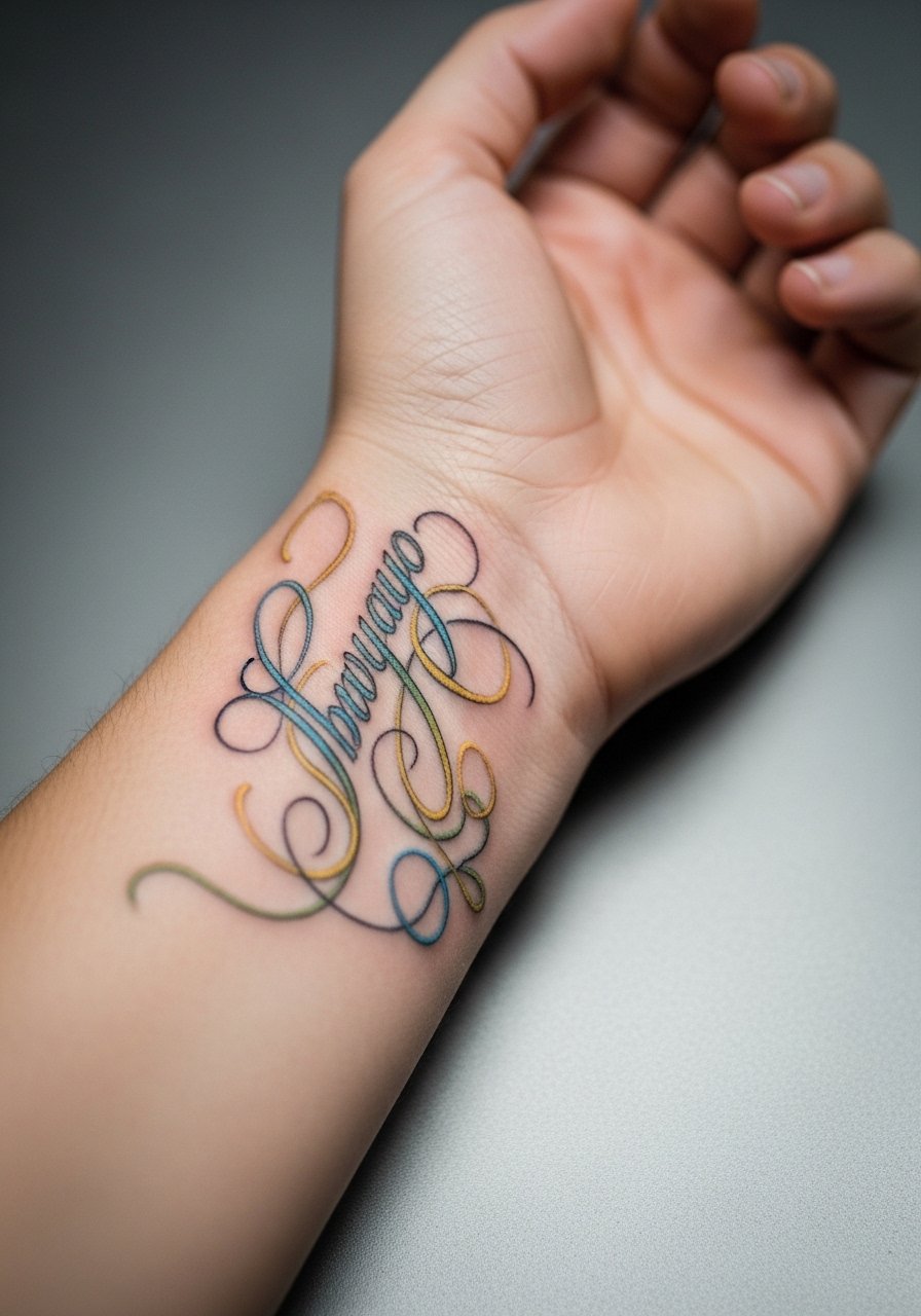
A wrist wrap reads intimate and delicate but is one of the quickest to age because of constant movement and washing. The controversy about fine line holds here too. One camp says fine line on the wrist blurs in two years because of motion and thin skin. The other camp argues that with correct needle depth and spacing it can hold well for five years. Ask where the artist lands before booking. For longevity, get the script slightly bolder than the tiniest option and plan a touch-up in year two or three. Sessions are quick and low to moderate pain. Show it off with a thin chain bracelet that complements the script without rubbing it.
9. Graphic Band Around the Tricep
The tricep gives a flat canvas for bands that circle the arm. When you ask for wraparound geometry, confirm the seam spot where the pattern meets so you do not get a misaligned repeat. A typical mistake is squeezing complex repeats into a narrow cuff because the repeat becomes unrecognizable as the skin moves. Pain is low on the tricep and a single session can cover this if sized right. Expect the black anchors to hold longer than the color fills. For session ease, wear a sleeveless shirt that you can shift without excess friction.
10. Neo-Japanese Upper Arm with Color Gradients
Large upper-arm canvases allow for traditional motifs refreshed with modern palettes. Tell the artist you want clear planes of color with transition zones rather than blended mush so the waves keep their shape over time. The common error is cramming too many tiny highlights into the waves because those highlights flatten after a few years. Sessions are medium to long and may be spread across sittings. If you plan to expand into a sleeve, leave breathing room for future connectors. Wear a loose tank top for access during the session.
11. Stipple Shaded Botanical on Inner Bicep
Inner bicep work feels sensitive and the skin there can be delicate. Ask the artist about needle depth because heavy saturation in the inner bicep can increase blowout risk. The mistake is treating the inner bicep like outer arm skin. Expect higher pain and a bit more swelling for a few days. Stipple shading often ages nicely because it avoids heavy solid fills that can shift. Plan for a touch-up at year two if the dots soften. For the session, wear a tank top so you can raise the arm without tugging fabric across the area.
12. Bold Color Block Shoulder Cap
Shoulder caps are great for strong color statements that peek out from shirts. The trick is to anchor the color blocks with dark edges where needed so the edge does not feather into the shoulder crease. Missteps include asking for a tiny shoulder cap that looks like a sticker because it lacks scale. Sessions are moderate and you can usually finish in one or two appointments. Colors here stay relatively stable because the shoulder sees less daily abrasion. Wear a loose button-down shirt you can pull aside for the appointment.
13. Watercolor Portrait Fragment on Inner Forearm
Watercolor portraits are beautiful but they ask for compromise in edge control. When you ask for this style, tell your artist which parts of the face or figure must remain crisp and which can fade into wash. The common error is asking for an entirely wash-based portrait with no contour anchor because it becomes a color blur quickly. The inner forearm is more exposed to sunlight, so plan for earlier color fade. Sessions can be medium length and a touch-up at year two helps keep the portrait legible. For showing it off, keep sleeves short and choose a short-sleeve tee.
14. Colorful Script Banner Across the Bicep
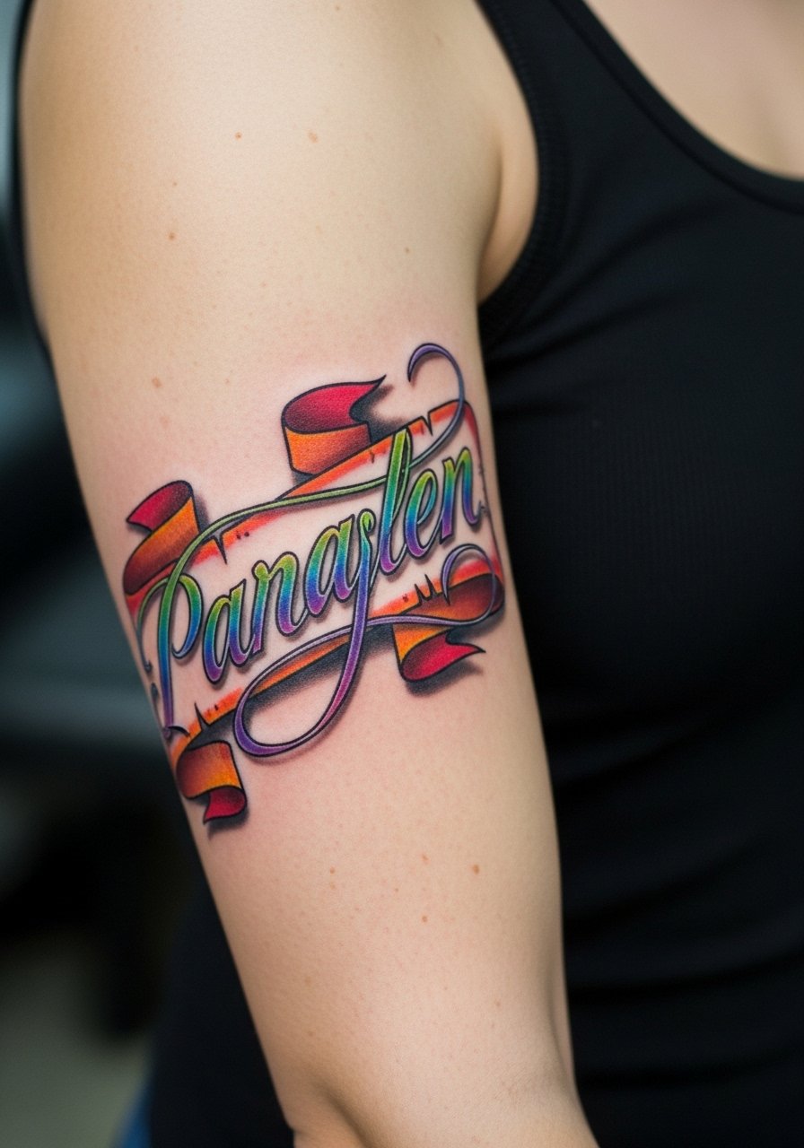
Script pieces look great across the bicep when scaled so the letters breathe. Tell your artist the exact phrase and font weight because tiny cursive compresses into illegibility. A frequent mistake is choosing ultra-delicate script for a frequently tanned or sun-exposed area. Sessions are short and usually straightforward. Expect the colored fills behind script to need a touch-up before the black outline. Wear a tank top for the session so the bicep sits accessible.
15. Neo-Tribal Armband with Color Accents
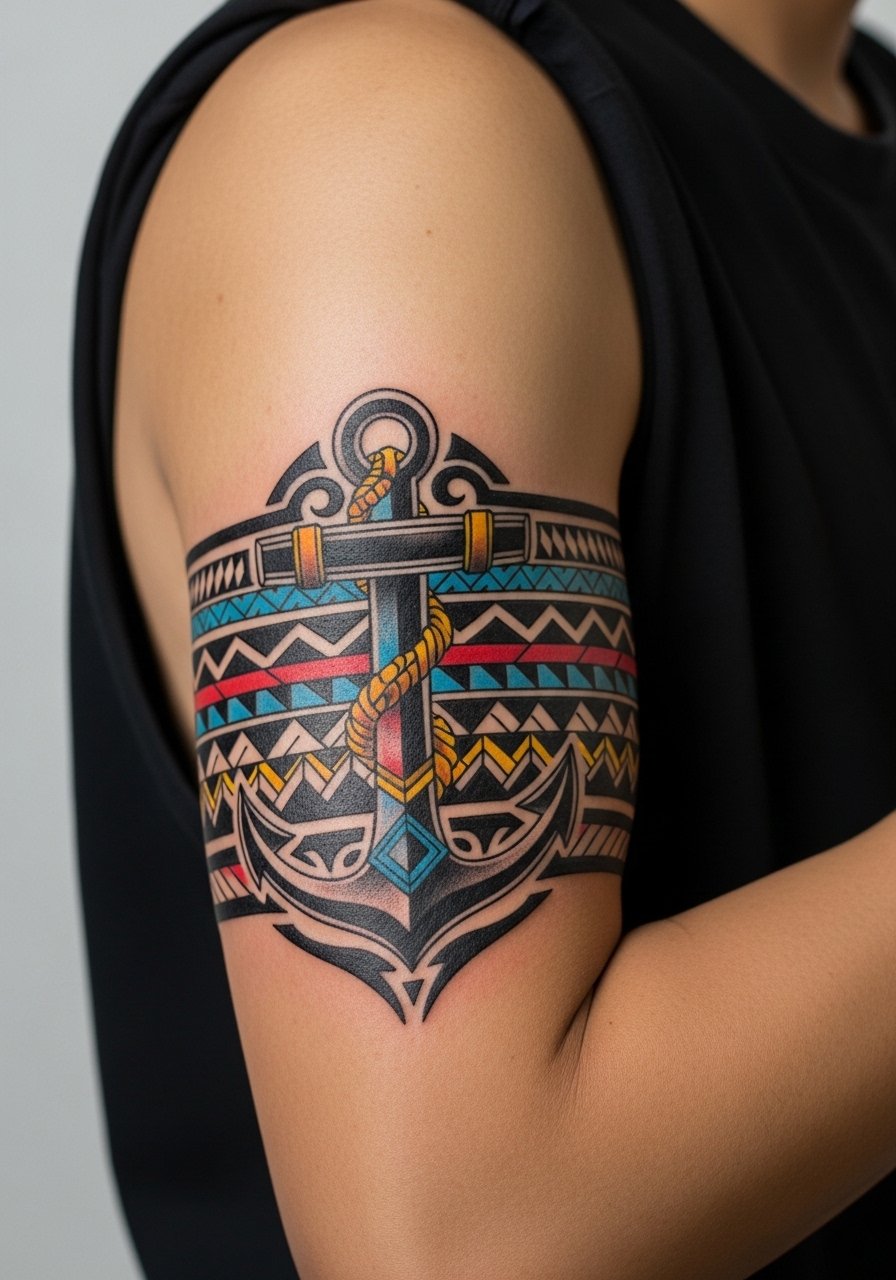
Tribal patterns live and die by clean linework and pacing. Ask for slightly thicker black anchors and modest color accents rather than full color fills in tight repeats. The common error is requesting an ultra-dense repeat that looks crisp fresh but melts into a single band after movement and time. Sessions are short to medium and pain is mild. For display, cuff a sleeve or wear a sleeveless tee that shows the band cleanly without distraction.
16. Elbow Halo with Radiant Color Rings
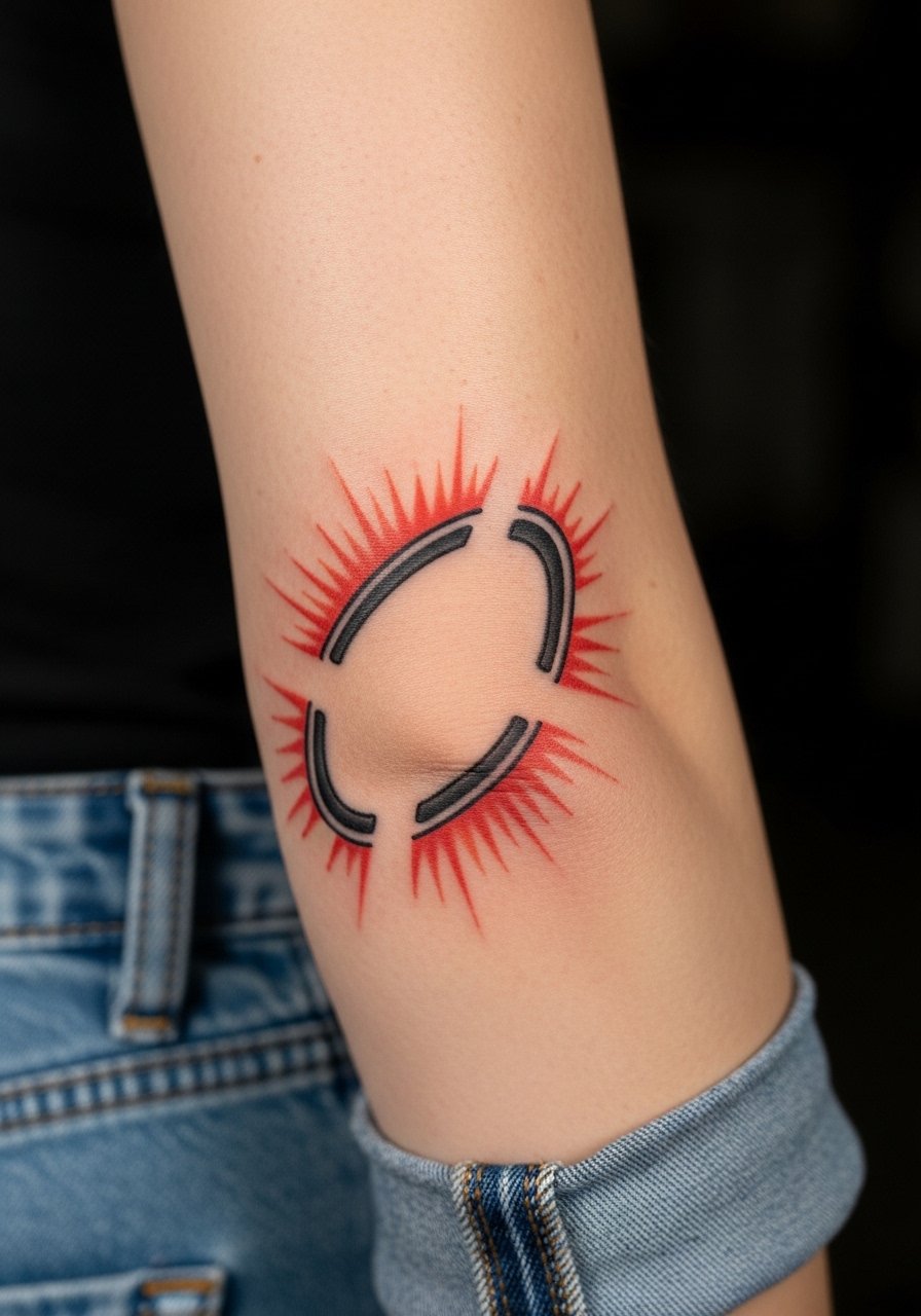
Elbow pieces are notoriously tricky because the joint folds repeatedly. The key is to allow negative space at fold lines and to use broader color strokes rather than tight detail. The mistake is trying to cram detail exactly over the joint because that part loses definition quickly. Pain is higher at the elbow and expect a longer healing window due to scabbing and motion. A small touch-up at year one is common. For session comfort, wear jeans or a sleeve you can roll without pressing on the elbow during aftercare.
17. Hand and Knuckle Accent Dots with Color
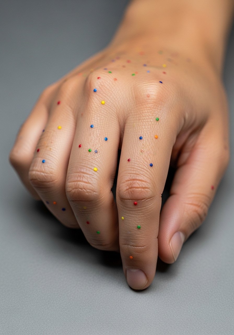
Hand and knuckle work is visible and controversial for obvious reasons. Professionally, the risk is twofold. One camp warns heavily about career implications and recommends against hand ink for people in conservative workplaces. The other camp points to growing acceptance in creative fields and says careful placement and small scale mitigate the issue. Think about long-term visibility before committing. From a technical side, hand skin moves and sheds fast which leads to earlier fading. Expect touch-ups every one to two years to keep color dots solid. These sessions are short but stinging. For minimal friction after the appointment, rest the hand on a soft surface and avoid tight rings for a week.
Frequently Asked Questions
Q: Will a colorful sleeve need touch-ups more often than blackwork?
A: Colorful sleeves usually need periodic refreshes sooner than solid blackwork because pigments that create bright midtones and pastels lose peak pop faster. From what I have seen, blacks anchor the composition and can read well for longer, while the brighter hues often look best with a touch-up every three to five years depending on sun exposure and skin type.
Q: Can watercolor techniques be combined with bold outlines to improve longevity?
A: Yes. Combining delicate washes with strategic outlining gives the wash breathing room and a clearer edge that holds up better. Mention to your artist which parts you want anchored in linework during the consult so they can plan the balance.
Q: How do I prepare clothing for a long upper-arm session?
A: Wear something you can shift without applying pressure to the fresh tattoo, like a loose tank top or a button shirt you can pull aside. Avoid tight seams that sit over the healing area for the first few days.
Q: Are bright pigments safe for darker skin tones?
A: Bright pigments can work on all skin tones, but some shades register differently. From conversations with artists and seeing healed work, warm and saturated pigments often show more reliably on darker skin than pale pastels. Ask to see healed examples on a similar skin tone before you book.
Q: Do small wrist scripts ruin well with regular hand washing?
A: The wrist gets a lot of motion and contact which accelerates fade. If you want a tiny script, accept an earlier touch-up timeline and consider slightly larger lettering for durability.