
Fine line compass tattoos look incredible fresh, but how they hold up depends on placement, spacing, and the needle work under the skin. Trends push ultra-delicate compasses on the spine and lower back, and the reality is some of those need touch-ups sooner than people expect. Read on for 27 compass designs placed on the back with notes on aging, consultation tips, and what to wear to show them off.
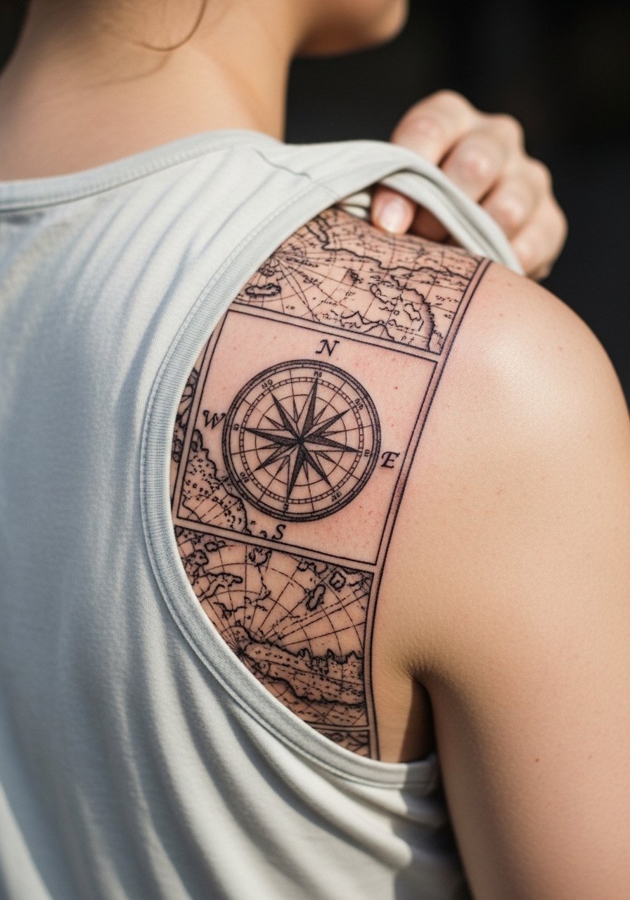
1. Classic Nautical Compass Centered on Upper Back

Start with a plain nautical compass when you want a timeless anchor for future back work. I tell clients this is the easiest way to scale into a full-back piece because bold outlines hold up well on the upper back and rarely need early touch-ups. During consultation, ask for slightly heavier outer ring linework and clean cardinal points so the compass keeps definition as it heals. The session feels moderate on pain and usually finishes in one long visit or two shorter sessions. For showing it off, an open-back midi dress frames the piece without covering the shoulders.
2. Micro-Realism Compass over the Spine
I recommend micro-realism for the central spine when you want intricate shading and subtle depth. Fair warning, the spine area can show blur if too many tiny details are packed into a small space. Tell your artist to prioritize clean linework and deeper spacing between shaded elements to avoid future blowout. Sessions are often longer because of the focus on tiny graduations in shading. Expect touch-up conversations early on. For appointments, wear a low-back tank top so the artist has full access without you being uncomfortable.
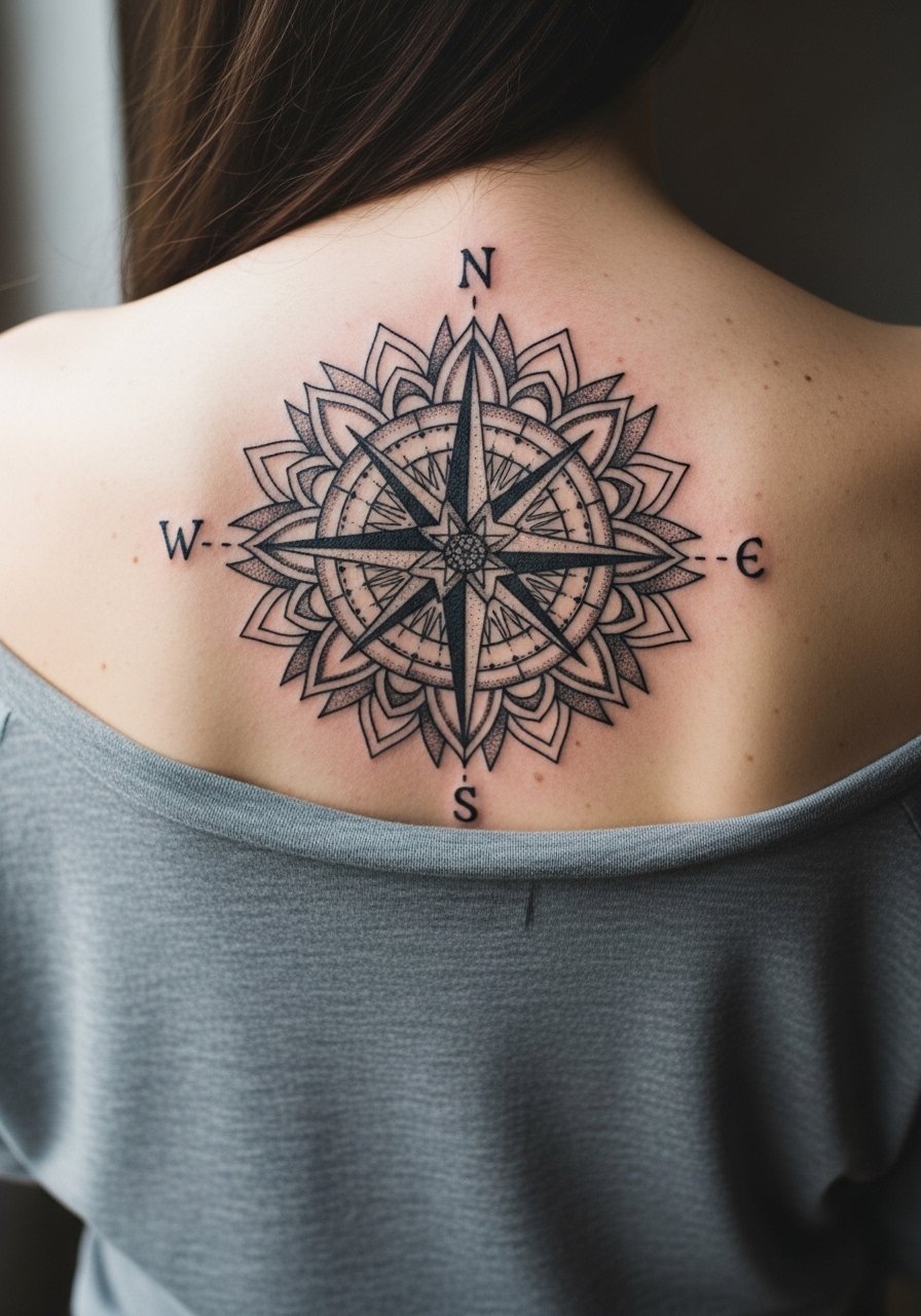
3. Geometric Compass with Mandala Ring on Mid-Back
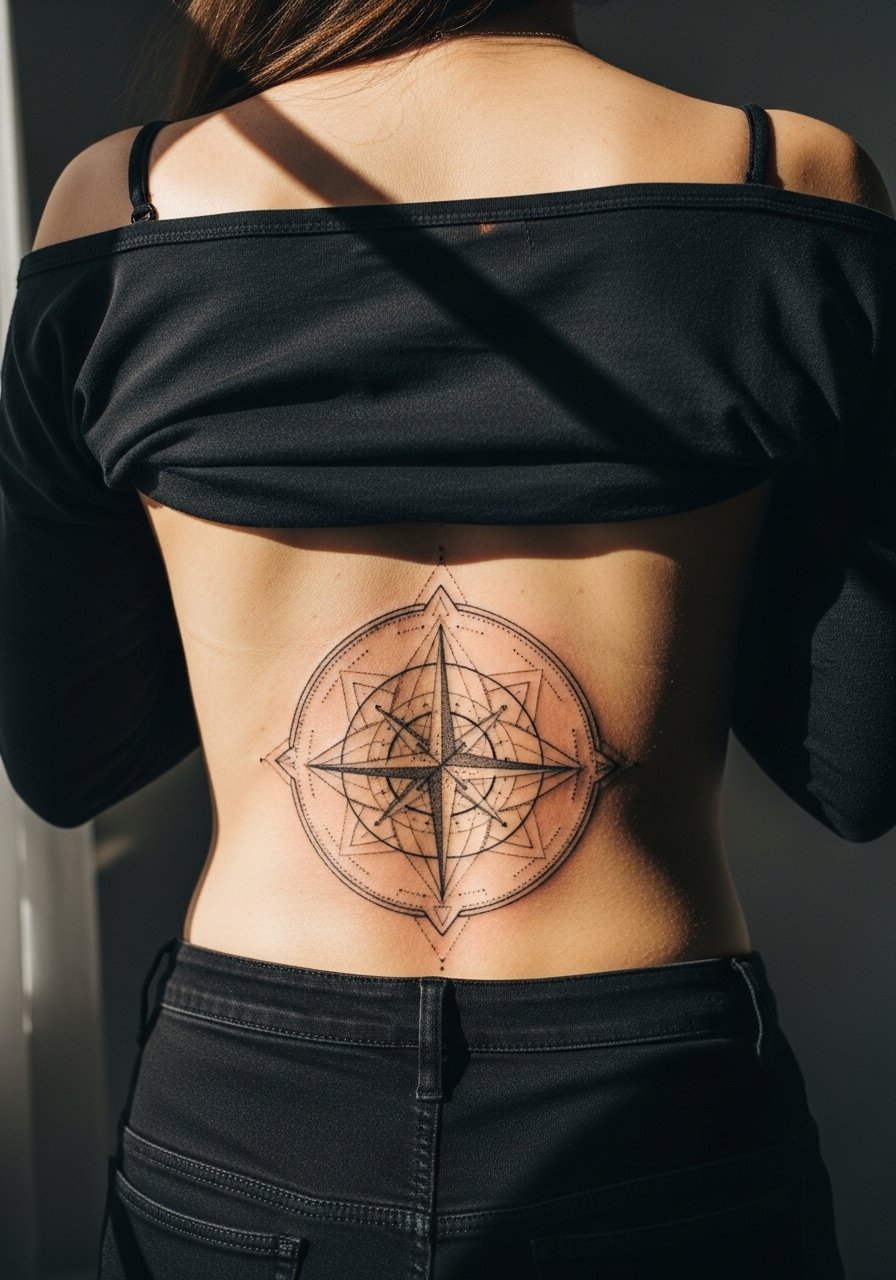
There is a debate about geometric detail on the back. One camp says dense mandalas can age into blur if done too small. The other camp argues that with correct needle depth and ample negative space, geometric rings remain crisp. I tell clients to choose slightly larger spacing between lines and to ask for stipple shading rather than heavy saturation in tight rings. The mid-back offers space so scale up the mandala. For evenings, a backless blouse highlights the radial symmetry without crowding the shoulders.
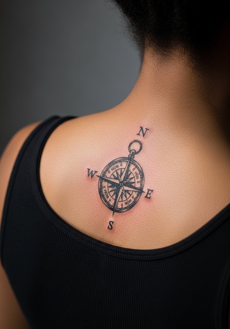
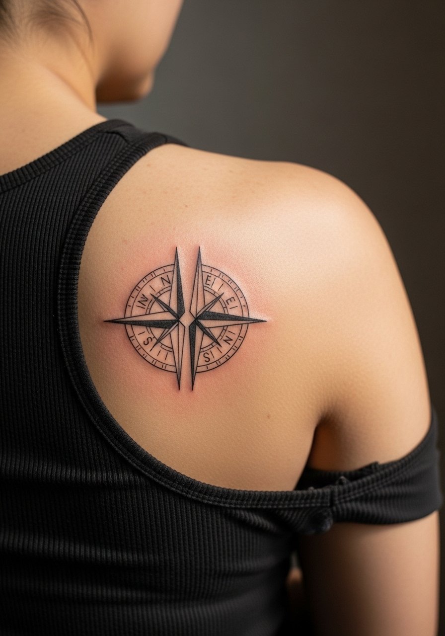
4. Minimalist Compass at the Nape
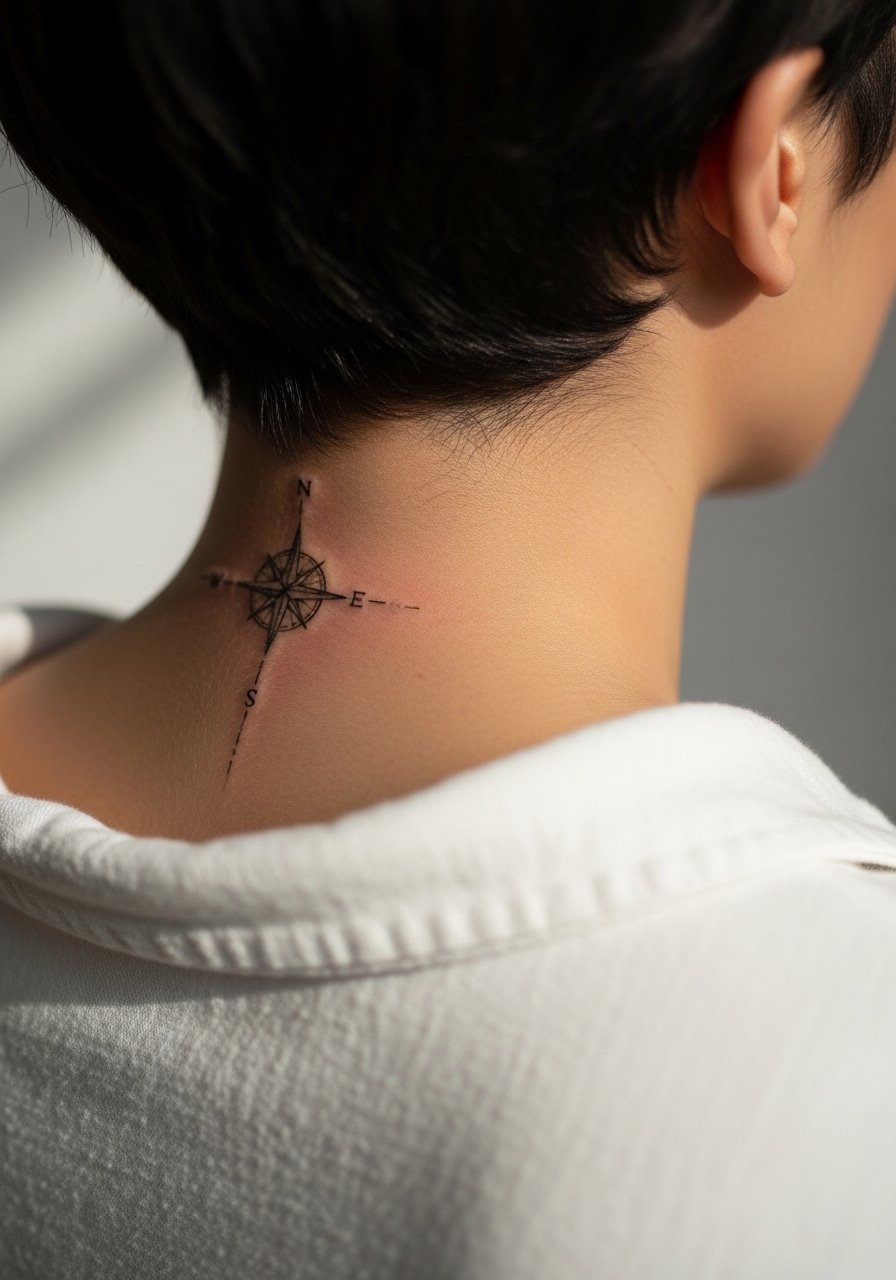
Minimal compasses at the nape read delicate and discreet when sized and spaced correctly. The biggest mistake is making the compass too small which leads to merged lines after a year or two. Ask your artist to keep cardinal points open with slight breathing room and to avoid dense tonal fills. Sessions are quick and feel like a low to moderate sting depending on individual sensitivity. For showing it off, a racerback tank or a hair-up style keeps the nape visible without full exposure.
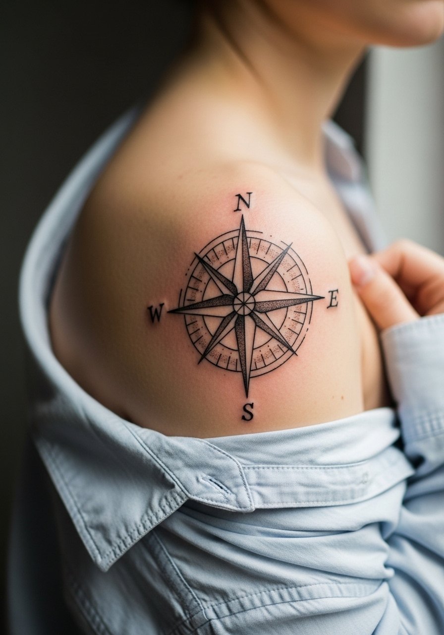
5. Ornamental Compass with Filigree on Shoulder Blade
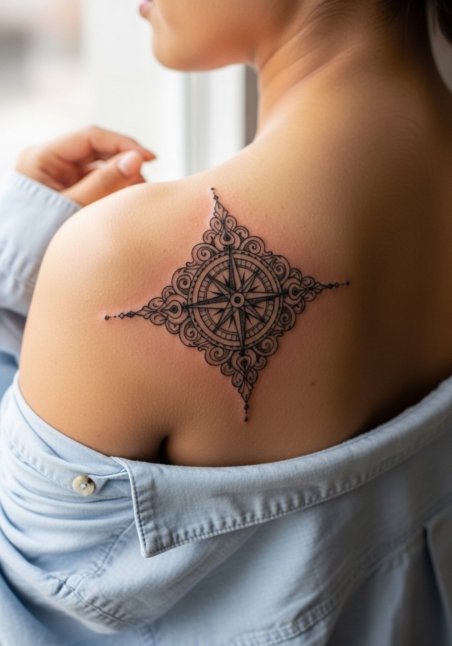
An ornamental compass on the shoulder blade reads decorative and pairs well with future sleeve work. I often recommend stipple or whip shading for the filigree to maintain texture without heavy saturation that can muddle. Watch for the mistake of overly thin filigree; it looks fragile after the first year. Sessions run moderate and require the client to sit semi-reclined. For the session, wear a loose button-down shirt you can pull aside so the artist works comfortably.
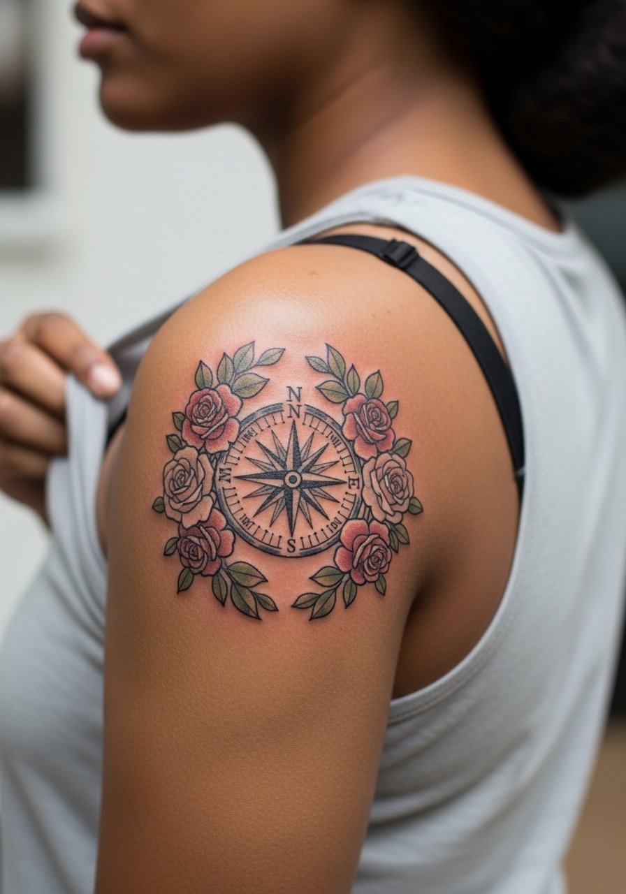
6. Rose-Encircled Compass Across the Upper Back
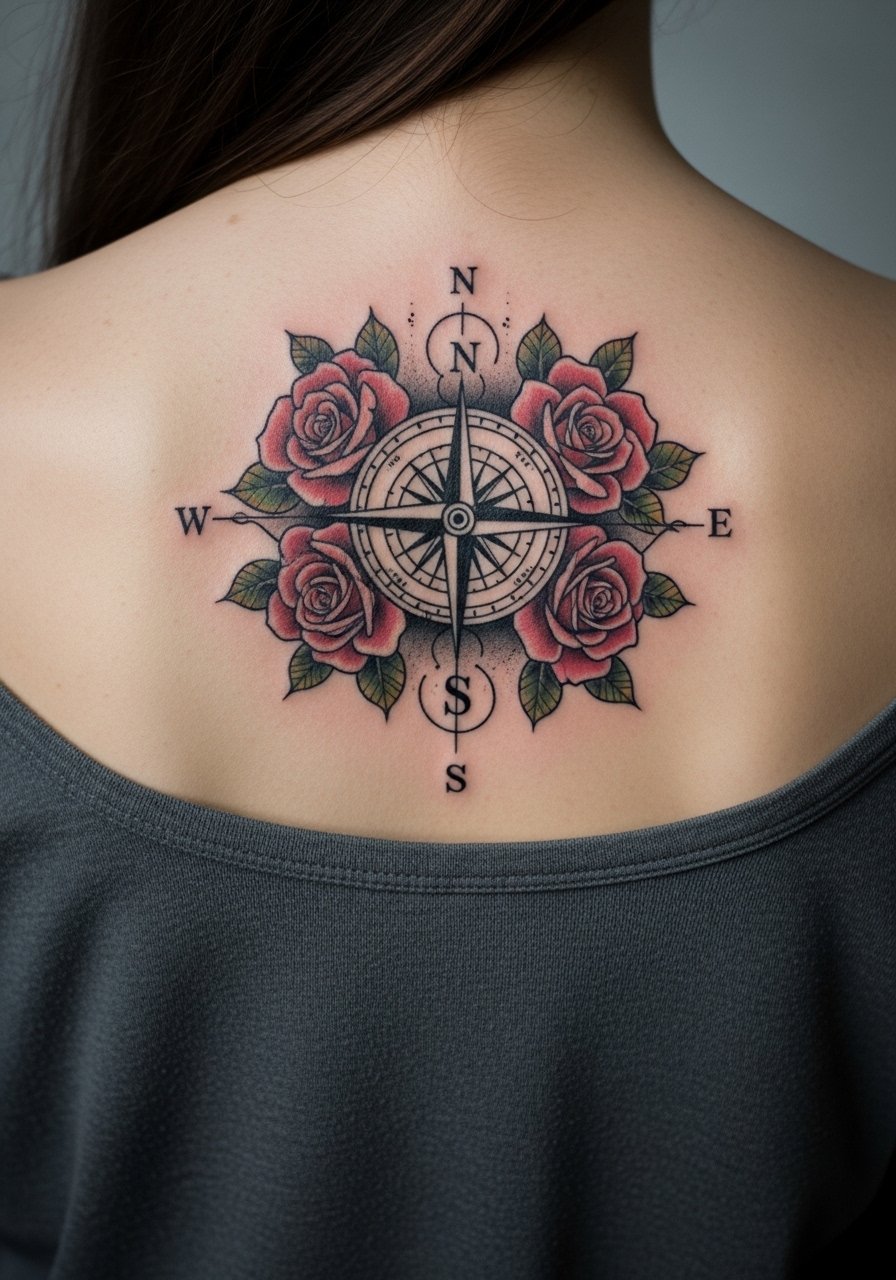
This combines a compass with floral framing to soften the geometric core. A common error is heavy color saturation inside the petals next to fine line compass points, which can make the compass look washed out over time. Ask for defined compass outlines and restrained color fill in petals. The session may split into outline and color days. If you plan to show it off, try an open-back midi dress that displays the floral ring without distracting from the central compass.
Studio Day Picks
The upper back and shoulder blade designs above need clothing choices that give the artist clear access and let the healed work show without rubbing from straps.
- Stencil transfer paper kit. Lets you preview placement on the skin so the compass sits exactly where you want it, especially for centered upper back pieces.
- Topical numbing cream. Applied before the session can ease the sting on shoulder blade work without obscuring linework.
- Thin protective film roll. Useful for lower back pieces that rub against waistbands during the first week.
- Fragrance-free body wash. Gentle cleansing keeps delicate linework around floral elements clean while healing.
- Aquaphor healing ointment. Thin layers in the first days help maintain moisture without clogging tiny needle channels in fine compass points.
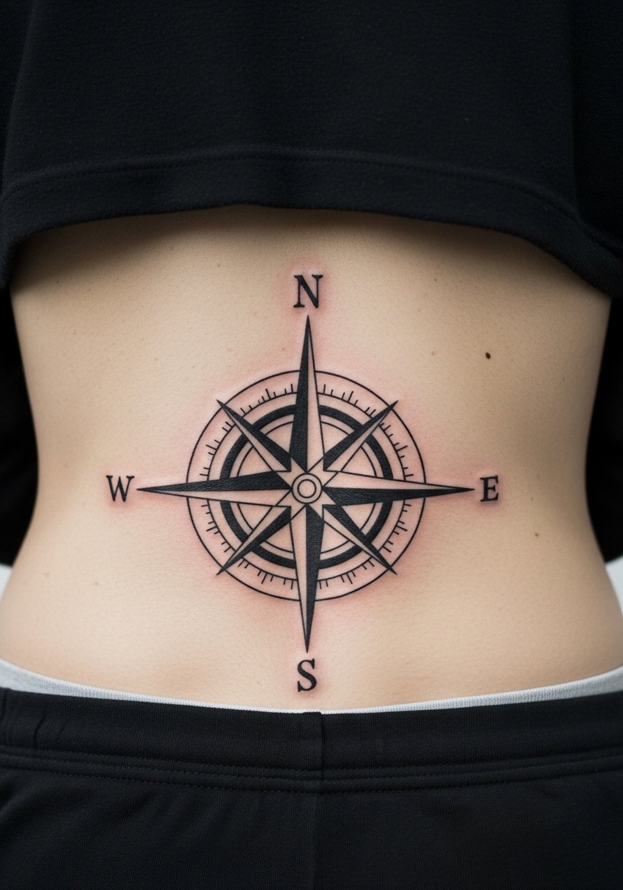
7. Celestial Compass with Star Map on Lower Back
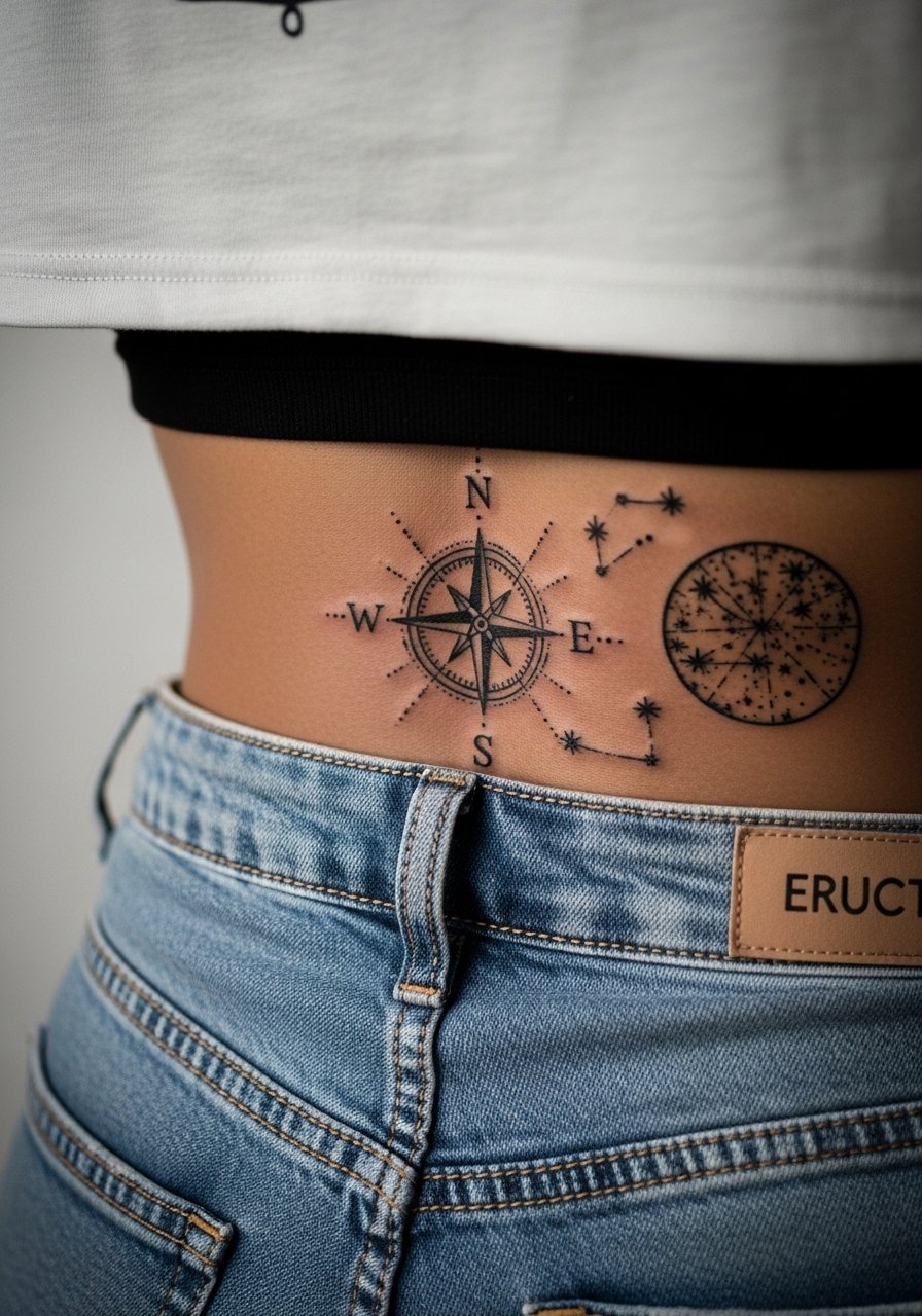
A celestial compass across the lower back pairs compass geometry with dot work stars for a night-sky feel. The lower back moves with sitting and bending, so advise the artist to allow extra negative space around fine dots to prevent crowding as the skin shifts. The session can feel more tender near the spine and lower ribs. For showing it off, a cropped tee and high-waisted jeans frames the lower back without full exposure and mimics common styling for casual wear.
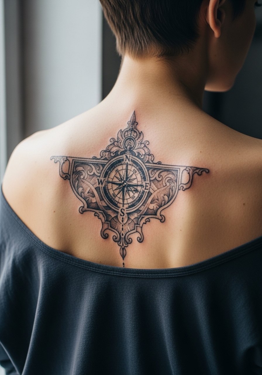
8. Compass Rose Embedded in a Decorative Spine Column
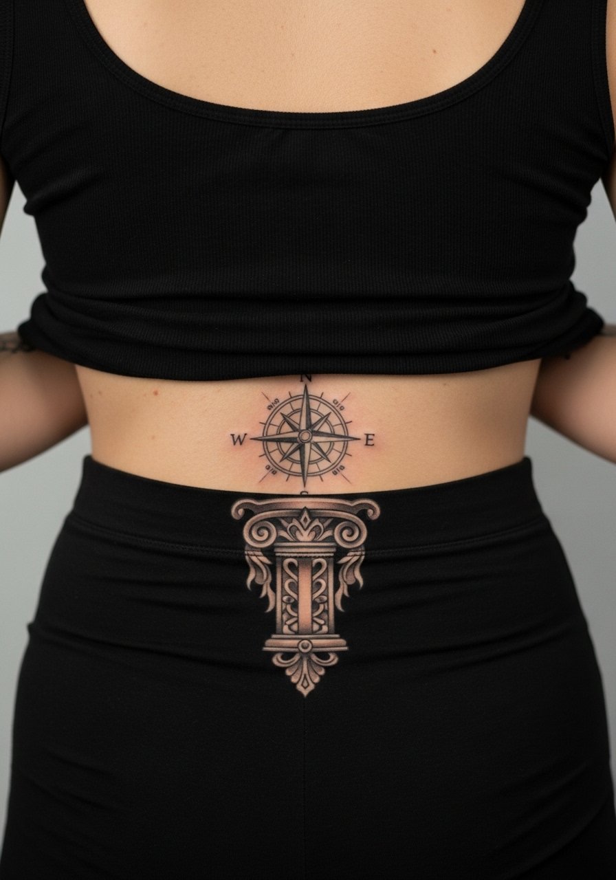
Embed a compass rose into a vertical spine motif when you want a centered focal point that reads both geometric and architectural. The key consultation note is to ensure vertical symmetry and consistent lineweight down the column. If the artist tightens the inner lines too much, the motif risks merging over time. Sessions are focused and may require breaks. For visibility, a low-back tank keeps the spine area accessible and stylish.
9. Watercolor Compass Across the Upper Back
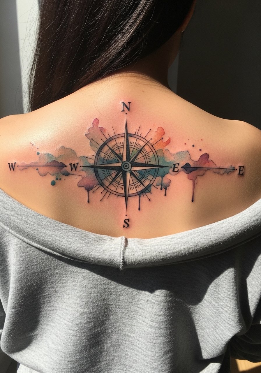
Watercolor techniques bring color motion into the compass but they age differently from solid blackwork. One camp cautions that diluted pigment fades faster on high-movement back zones. Another camp says with careful layering and saturation, watercolor lasts if placed strategically. My advice is to keep the compass linework as a bold anchor while using watercolor washes outside those lines. Session length increases with color layering and touch-ups may be needed earlier than with blackwork. For dinners and events, a backless blouse shows off the color without straps rubbing.
10. Celtic Knot Compass Over the Upper Spine

A Celtic knot compass reads symbolic and pairs knotwork with cardinal markers. The common mistake is compressing knot lines too tightly, which leads to blurring where strands cross. Tell your artist to scale the knot slightly larger and to favor clean negative spaces to preserve the weave. The area takes moderate pain and usually one session for outlines, another for shading. For a casual reveal, a wide-neck shirt pulled to the side frames the upper spine without exposing more than needed.
11. Antique Map Compass Panel in Upper Back Corner
This panel style feels like a pulled page from an old map and works well when you want asymmetry. A real mistake is asking for excessive micro-shading in a small panel, which can age into a muddy patch. I recommend broader line separation and gentle stipple to simulate age without overwhelming the compass points. Sessions can be split into outline and shading days. For casual wear, a loose tank top gives access while keeping you comfortable.
12. Blackwork Solid Compass Filling the Mid-Back
Solid blackwork compasses age predictably because saturation holds better than fine line in high-friction zones. A downside is heavier tattoos can feel more intense in session. Tell your artist you'll accept slightly heavier shading instead of tiny details. Expect longer single-session time and a lower touch-up frequency. If you want to alternate looks, pair this with a backless evening dress to make the graphic black stand out.
13. Compass with Latin Motto on Lower Mid-Back
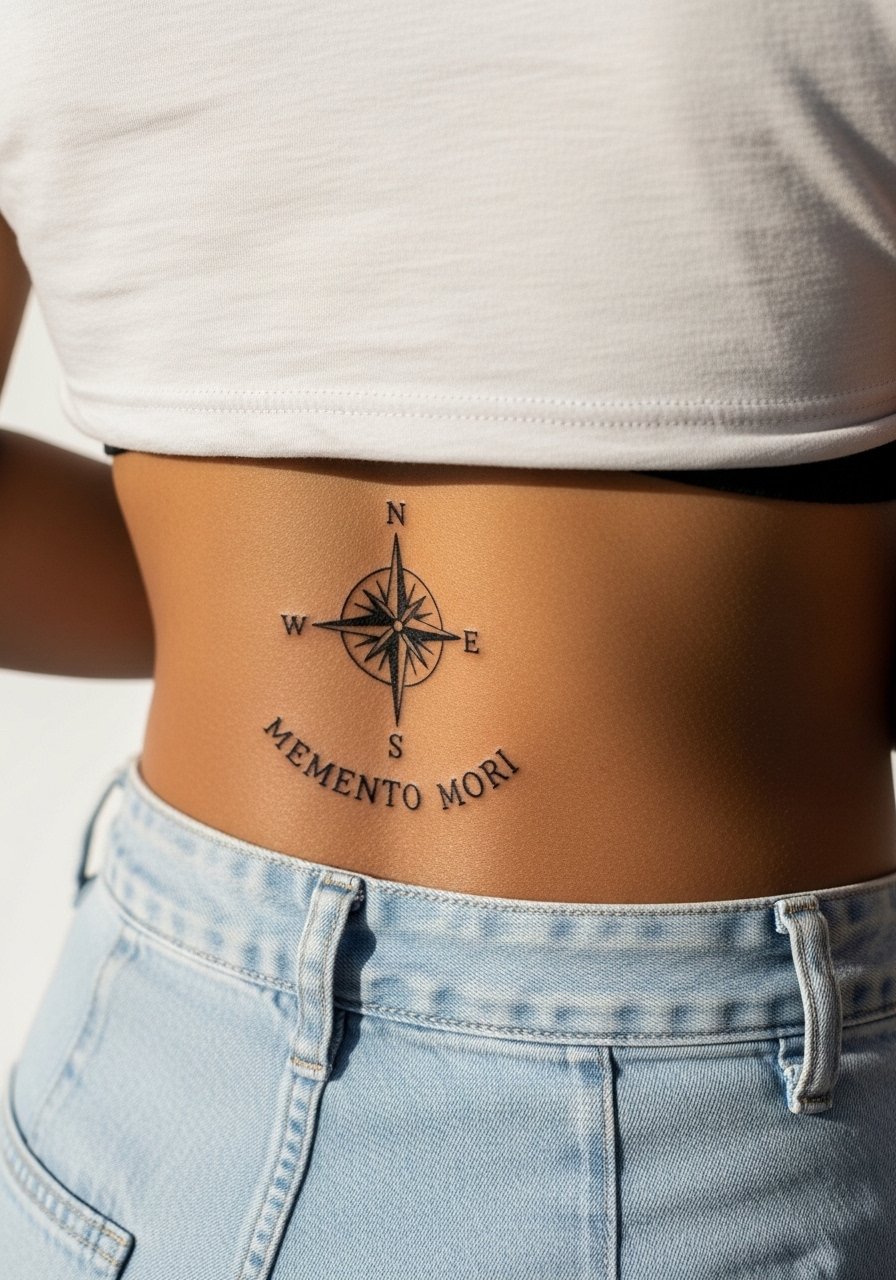
When including text beneath a compass, exact lettering matters. For script on the lower mid-back, request a slightly larger, airy font so letters do not tighten together as the skin moves. The image prompt rule means specifying exact text. Sessions combine linework for the compass and careful lettering. Avoid tiny script where daily friction from waistbands can blur letters. Wear high-waisted pants and a cropped tee for a clean reveal that keeps the text visible.
14. Anatomical Compass Over the Scapula
This design blends anatomical cues with compass points for a slightly anterior feel. The scapula moves a lot under muscles, so deep shading can shift over time if placed too close to the edge. Tell your artist to anchor the compass with clear outer lines and to avoid overly dense inner shading. Sessions typically feel like a mid-range sting because of bone proximity. For sessions, a loose button-down shirt works well.
15. Minimal Dot-Work Compass Centered Low on the Back
Dot-work compasses use negative space to great effect and are forgiving when scaled appropriately. The common error is packing dots too tightly which can read as solid after a year. Ask for a slightly larger dot spacing and to layer dots in gradients rather than flat fills. Sessions are steady and often relaxed. For showing it off, a cropped tee and high-waisted bottoms keep the lower back visible without full exposure.
16. Rose Compass Over the Left Shoulder Blade
Pairing roses with a compass softens the directional theme and creates a classic silhouette. Over the shoulder blade, straps and bra lines can rub during healing so tell your artist you prefer moderate saturation in the petals. The mistake is heavy color near thin line compass points. Session time varies with color work. Wear a tank top that you can pull aside for the session.
17. Compass with Constellation Overlay on Upper Back
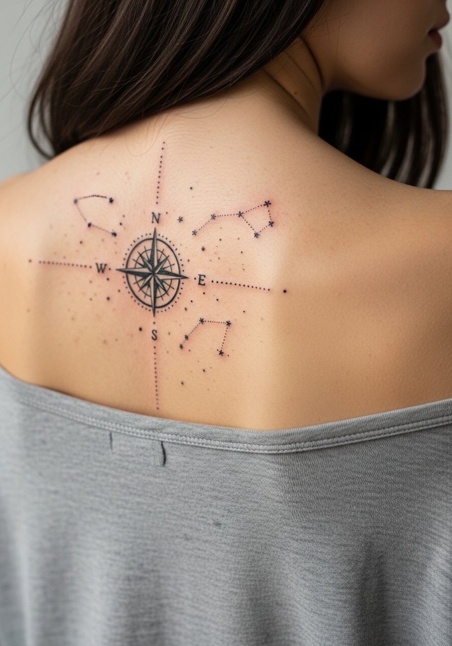
A constellation overlay adds personal coordinates without overwhelming the compass. The subtlety risk is making star dots too small. Recommend slightly larger star points and ask for a small degree of spacing so stars hold. Sessions are gentle and quick. For a polished night-out look, a backless blouse frames the constellation without straps cutting across the design.
18. Compass with Map Coordinates Along the Spine
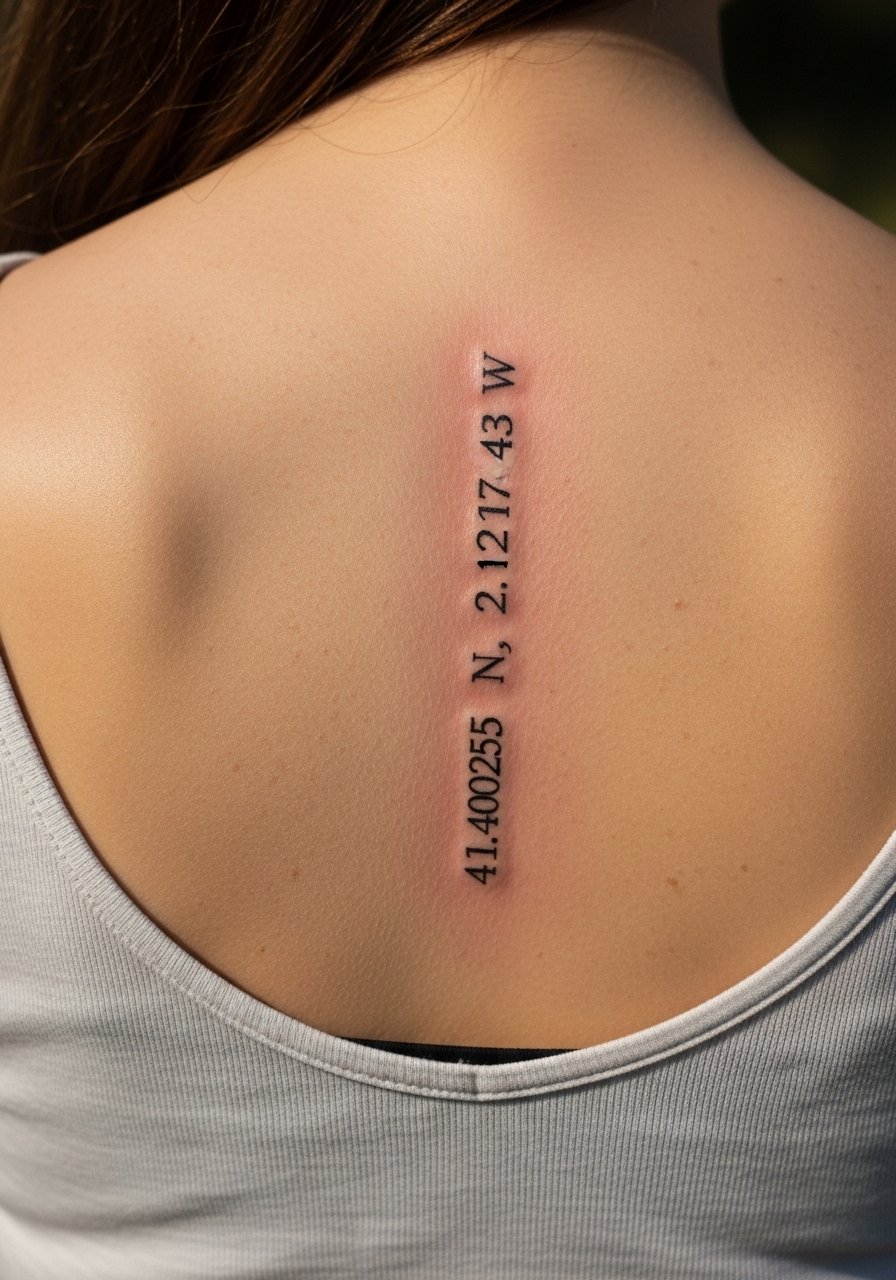
Textual coordinates add travel memory to the compass motif. Exactness is crucial so include the precise coordinates in your reference. A standard mistake is using tiny type which blurs after movement and time. Ask for slightly larger characters and test the font on skin with a stencil before inking. Sessions may be split between compass work and lettering. For revealing, a low-back tank keeps the vertical layout visible.
19. Compass with Nautical Rope Frame on Upper Back
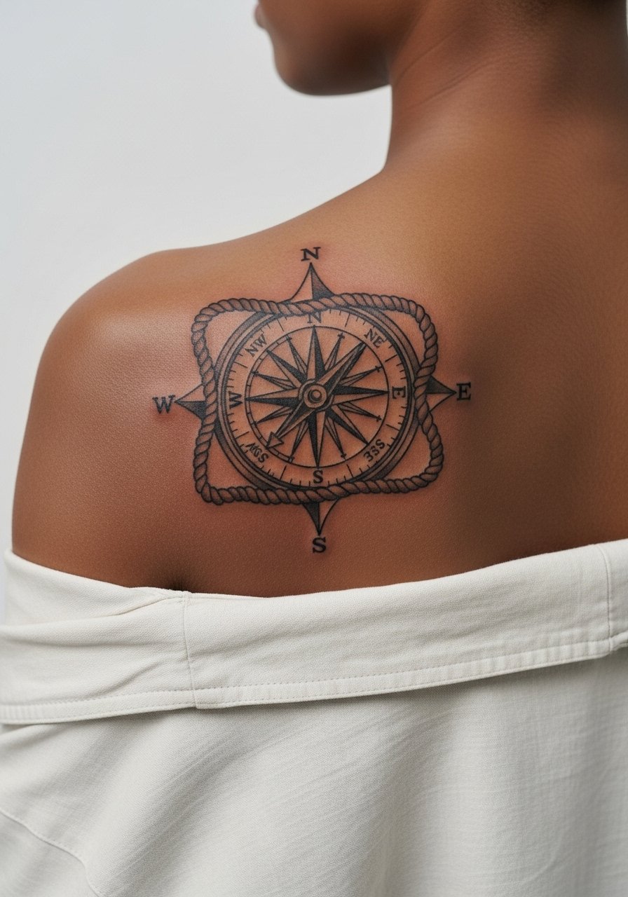
A rope frame adds texture and nods to maritime history. Rope details are forgiving if linework is bold and the twists are given space. The error is over-detailing the rope too tightly which becomes a blur. Ask for a bolder rope outline and lighter interior shading to preserve contrast. Sessions feel moderate. For a weekend look, an open-back midi dress pairs well with the nautical theme.
20. Mandala Compass Spanning the Upper Back Shoulders
Mandala compasses across shoulders require symmetry checks in consultation. The common mistake is starting the mandala too small which causes the inner rings to look crowded as it heals. I advise scaling each ring bigger and using stipple shading in the denser areas. Sessions are longer because of the symmetry work. A backless evening dress shows the full spread elegantly.
21. Compass with Arrow Accents on the Mid-Back
Small arrows add direction and motion to a central compass without overcrowding it. The mistake is pointing arrows too close to the compass edge which makes the overall piece read cramped. Ask for a small buffer zone and slightly heavier arrowheads. Sessions are straightforward and often short. For casual visibility, try a racerback tank that reveals the mid-back cleanly.
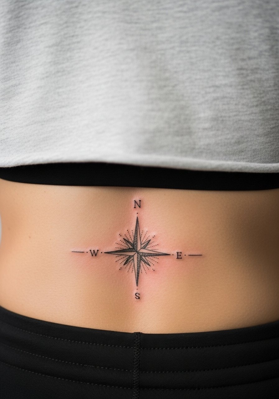
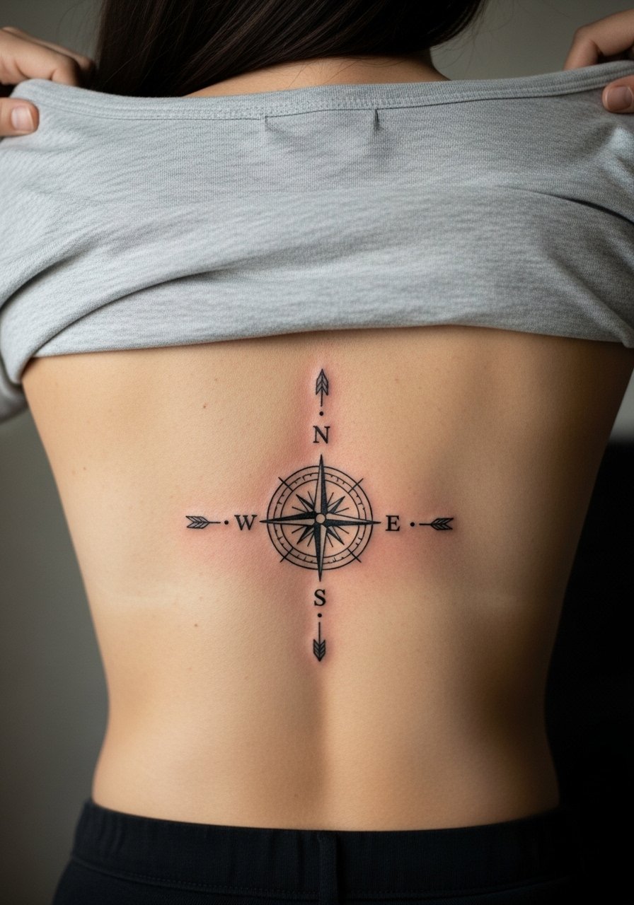
22. Single-Needle Fine Line Compass at the Small of the Back

Fine single-needle work at the small of the back looks fragile but can be beautiful when scaled appropriately. There is controversy among artists about single-needle on lower back. One camp warns the area shifts and fine lines blur quickly. The other camp says precise depth and spacing can keep single-needle work intact. I recommend larger spacing and a slightly bolder central ring. Sessions are quick but expect a possible touch-up window earlier than for bolder work. For wearing, a cropped tee and high-waisted bottoms shows the design without excessive exposure.
23. Compass with Botanical Wreath on the Lower Back
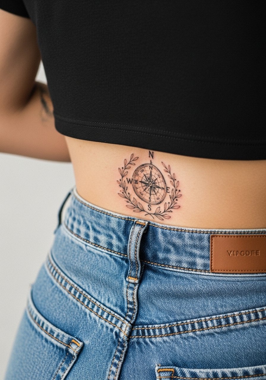
A botanical wreath softens directional imagery and creates movement. Lower back placement must consider waistline friction so request lighter saturation near edges to prevent color migration. A common mistake is over-detailing small leaves. I advise a slightly simplified wreath and gentle stipple for texture. Sessions may split outlines and color. For show-off styling, high-waisted jeans and a cropped tee keeps the wreath visible.
24. Split Compass Design Across the Shoulder Blades
Splitting a compass across shoulder blades creates dramatic symmetry but requires precise alignment. The big mistake is trusting a stencil without standing and moving to check alignment over the shoulder curvature. During consultation, stand, bend, and have the artist adjust placement as you move. Sessions are split to ensure mirroring. For visibility, a tank top that can be shifted works best.
25. Compass with Small Animal Motif on the Lower Right Back
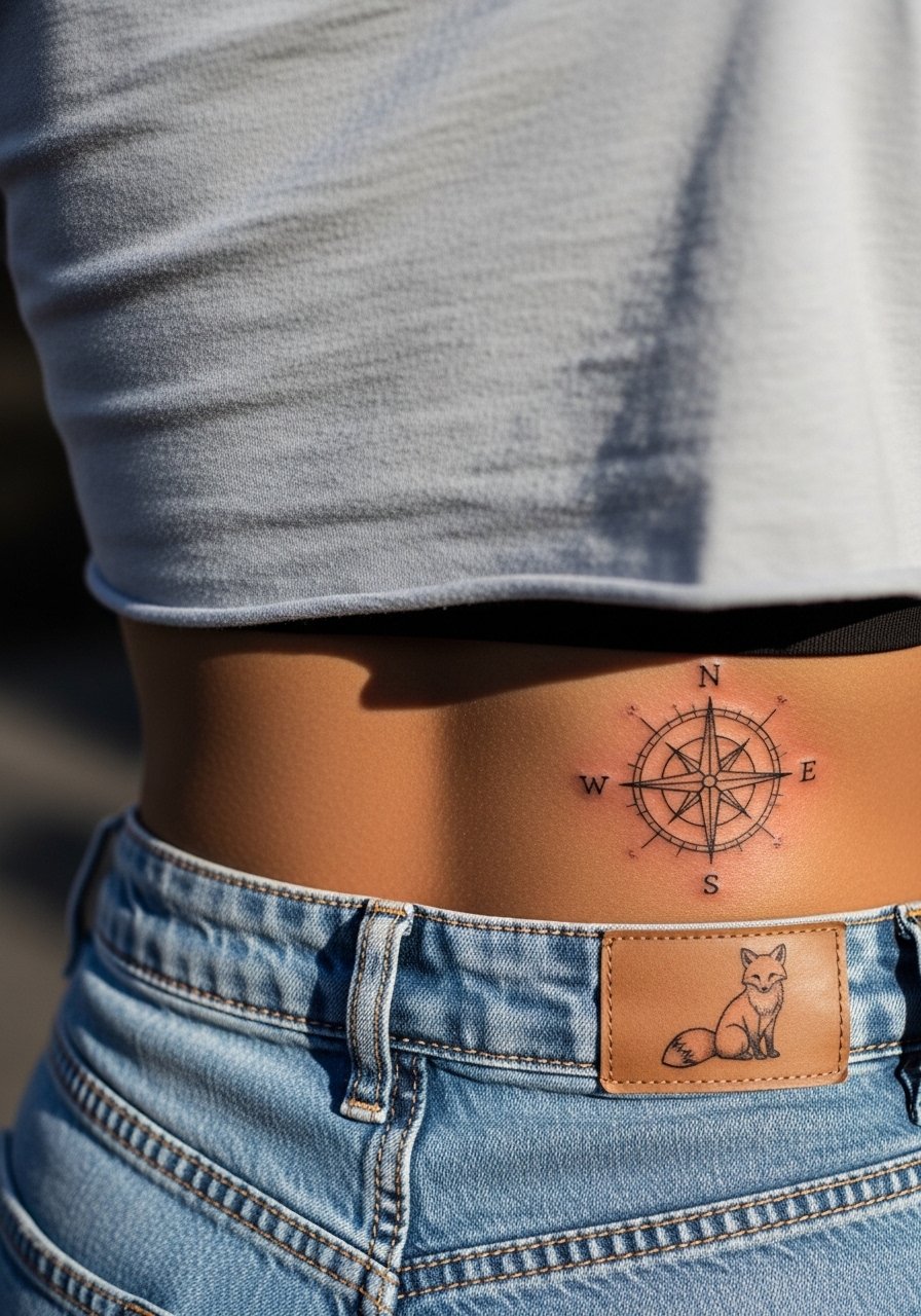
Personal motifs like animals give a compass a narrative. For lower right back motifs, be mindful of scale so the fox or animal does not compete with the compass. The common error is making the motif too detailed in a small area. Ask for simplified silhouette work and a clear margin from the compass. Sessions are quick. For warm-weather styling, high-waisted shorts and a cropped tee display the piece cleanly.
26. Compass Integrated into a Larger Backpiece Frame
Use the compass as the anchor in a larger backpiece when you plan future expansion. The consultation must cover future seam lines and how the compass will interact with added elements. A mistake is not thinking about negative space for future additions which leads to overcrowding later. Sessions for a larger frame are staged over multiple visits. For appointments, consider a loose button-down shirt that you can move aside.
27. Elegant Compass Tattoo Design on Lower Back with Lace Motif
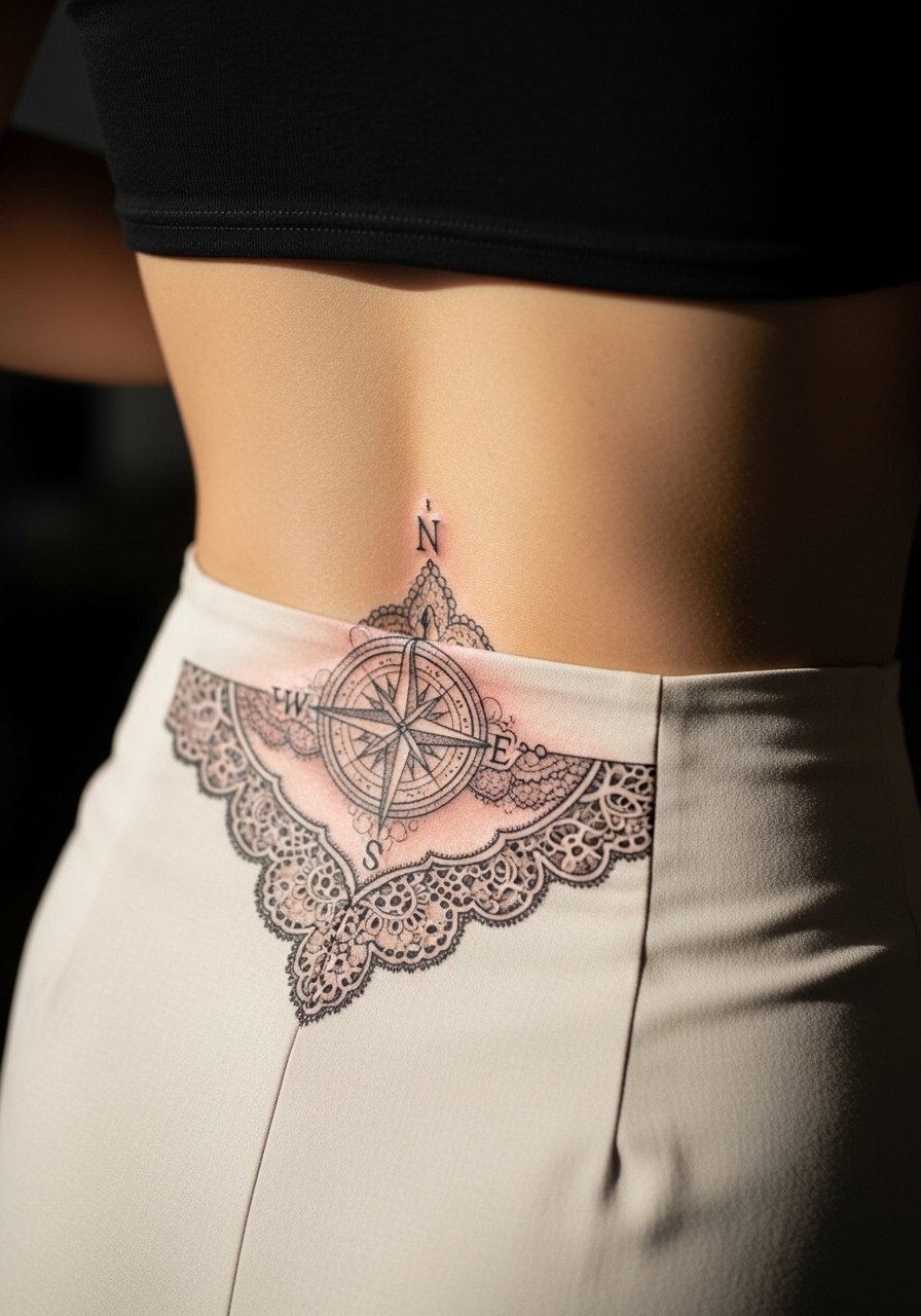
Lace motifs paired with a compass create an elegant contrast that reads like fabric on skin. For lower back lace, the risk is over-detailing which leads to loss of definition. Ask for a simplified lace repeat pattern and balanced negative space so the compass remains central. Sessions can be long because of delicate lines and shading. For special occasions wear a high-waisted skirt and cropped top that displays the lace framing without rubbing.
Frequently Asked Questions
Q: Will fine line compass work blur faster on the lower back than on the upper back?
A: It depends on how the tattoo is executed and how much friction the area faces. The lower back moves with sitting and waistbands and that increases the chance of lines merging. Ask for slightly larger spacing and bolder outer rings if you want fine line work to last longer.
Q: How do I describe the exact look I want for a mandala compass so the artist understands scale?
A: Bring reference photos with clear close-ups and request the artist place a stencil in multiple standing and bent positions. Say you want "ample negative space between rings" and ask for stipple shading rather than heavy fills to preserve crispness.
Q: If I want a watercolor compass over the upper back, what should I ask about longevity?
A: Ask your artist about pigment saturation and layering strategy. A common approach is to anchor the watercolor with defined black linework so the color can fade gracefully while the compass retains its form. Plan for potential touch-ups.
Q: Are there styling choices that make back compasses more visible without exposing too much skin?
A: Yes. Open-back tops, wide-neck shirts pulled aside, and low-back tanks show the tattoo area cleanly. Try an open-back midi dress or a low-back tank depending on the location of your compass.
Q: Should I expect more pain for compass work centered on the spine versus off to a shoulder blade?
A: Spine-centered designs tend to feel sharper because of bone proximity, while shoulder blade work hits musculature and often feels less intense. Pain varies greatly by person but planning for short breaks and splitting sessions can help.
Q: How often do compass tattoos on the back need touch-ups?
A: Touch-up frequency depends on lineweight, placement, and sun exposure. Bold blackwork may go many years without attention, while very fine or watercolor elements may need touch-ups within a few years. Discuss realistic timelines with your artist during consultation.