Fine line tattoos dominate Pinterest and saveable boards right now, but the ones that age gracefully on inner arms are rarely the prettiest fresh photos. I have seen thin script blur faster than expected, people wince at inner bicep pain, and guest-spot cancellations leave plans up in the air. Read on for designs that balance how they look, how they heal, and what to wear the day you sit down.
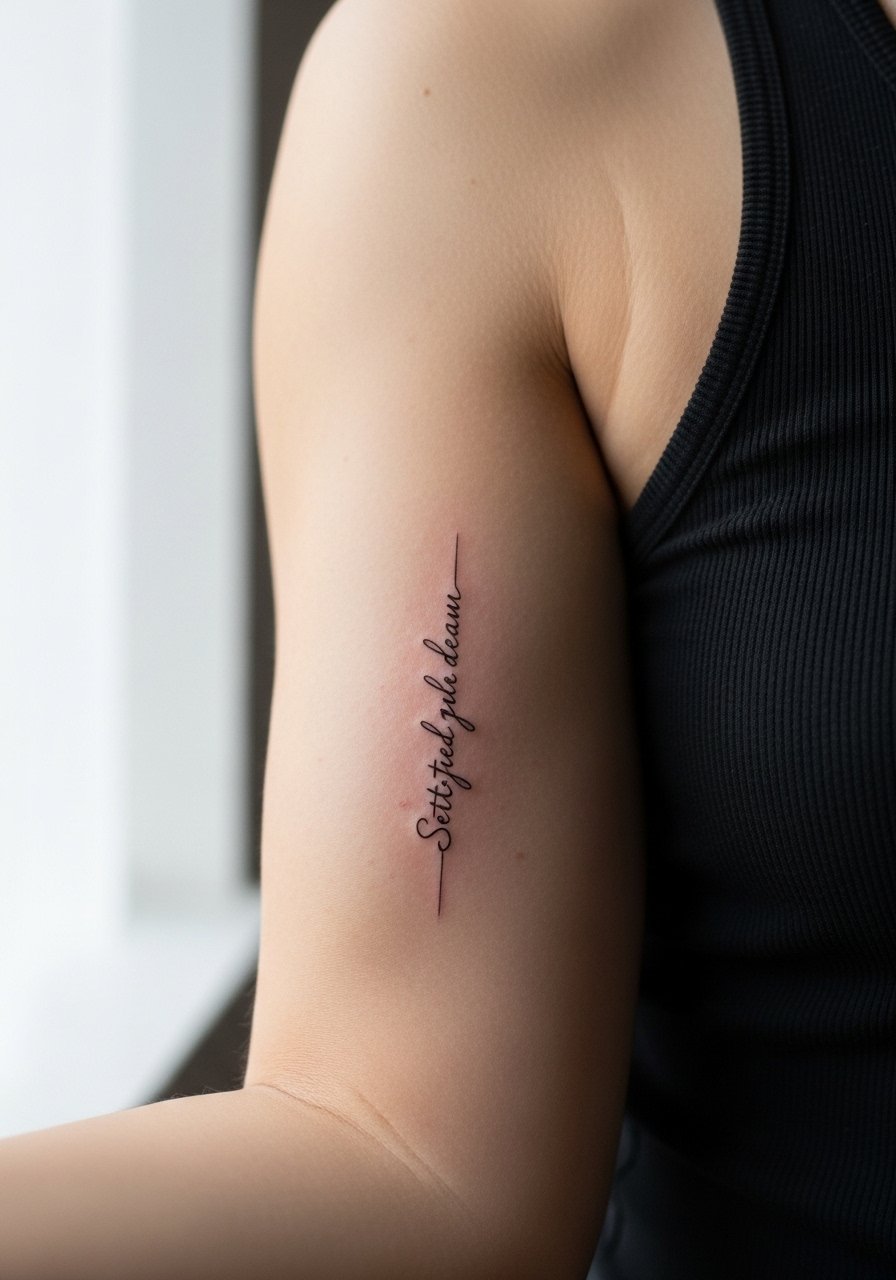
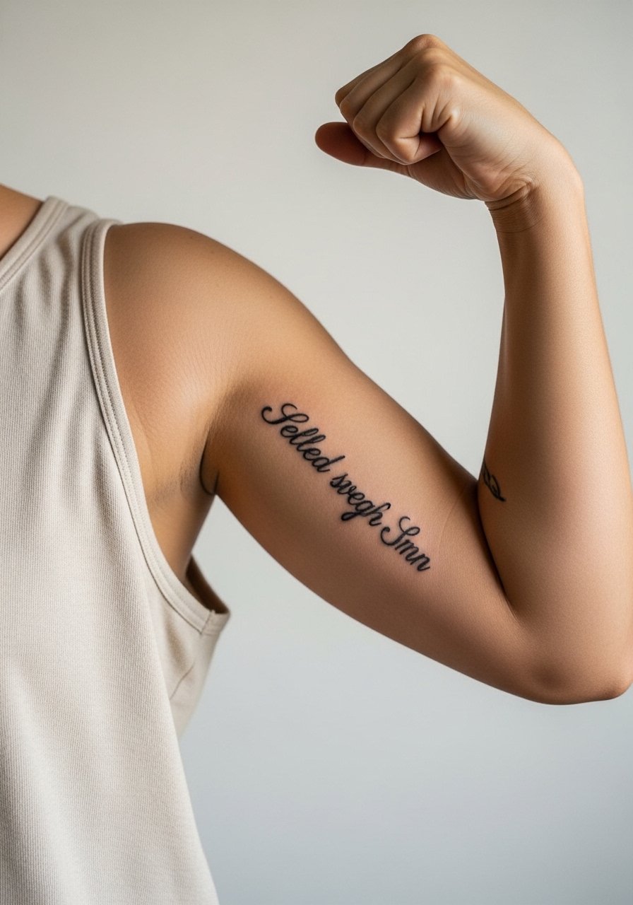
1. Vertical Fine-Line Script That Follows the Bicep Curve
I've seen this style work best when the script follows the natural flex of the bicep. Ask your artist to draft the quote curved to the muscle, not straight across, and to use a single-needle approach for a crisp result. Fair warning about fine line fading. One camp says fine line is a perfect, subtle look and worth the touch-ups. The other camp argues bold outlines last longer and photograph better on darker skin. Say which camp you prefer in consultation so you get the right depth. Session feel is usually moderate pain around a four to six out of ten on the inner bicep, and plan short sessions under three hours to reduce swelling. For showing it off, pair with a rolled sleeve tee women that frames the script without covering the chain area. Image shows arm raised slightly, tank top access.
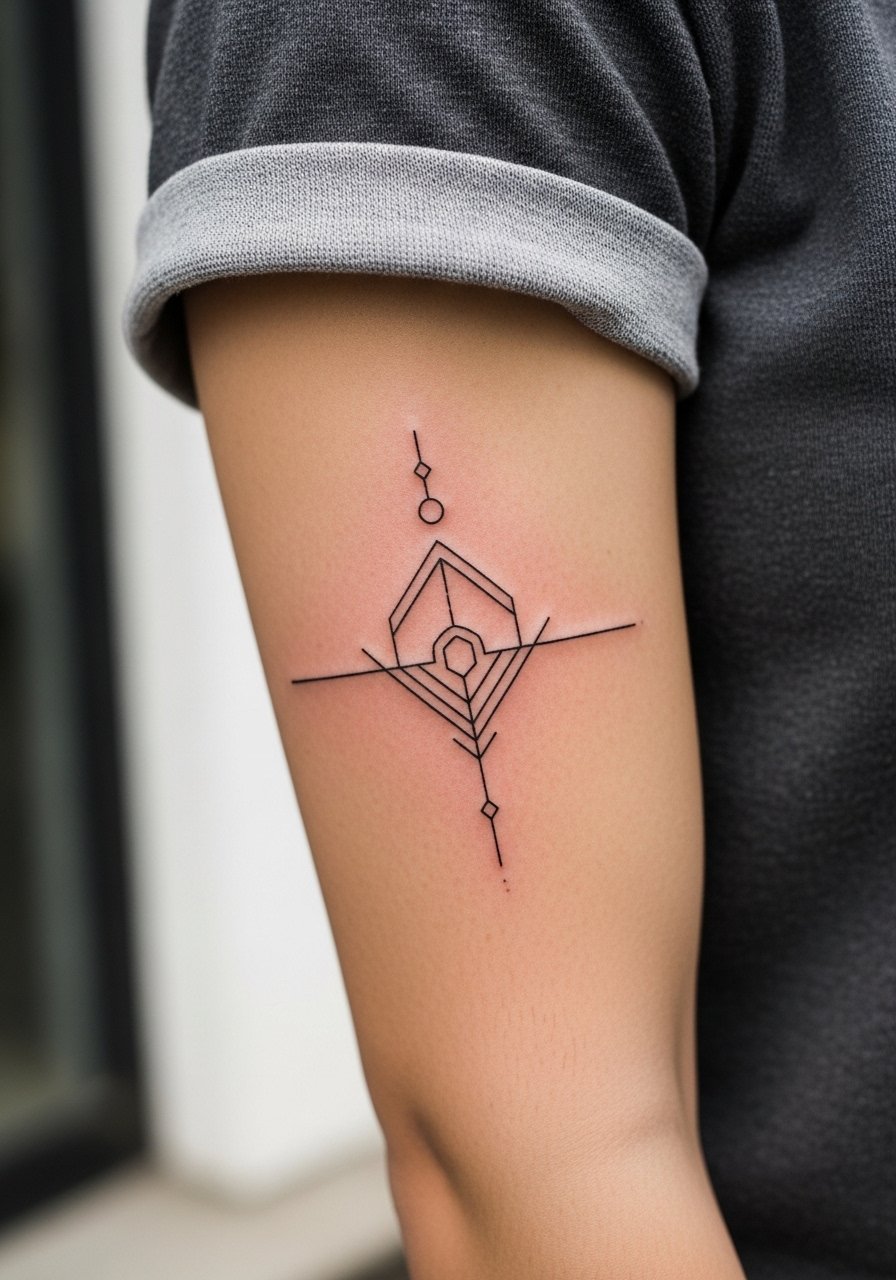
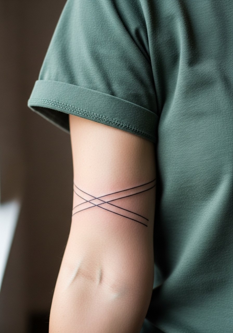
2. Minimalist Geometric Stack on the Inner Forearm
The minimalist geometry version that holds up is not a cluster of tiny, ultra-tight lines. The biggest mistake is going too small. Give each shape breathing room and ask for slightly heavier lineweight than your reference if you want it to stay crisp beyond six months. This placement is one of the easiest to heal and rates lower on pain. Bring reference photos that show the spacing you want and discuss blowout risk with your artist. Plan a single session under three hours for a 2.5 inch stack. For outfits, these designs pair neatly with an oxford button down shirt with cuffs rolled twice, which frames the forearm without hiding the work. Image shows forearm exposure with short sleeve rolled.
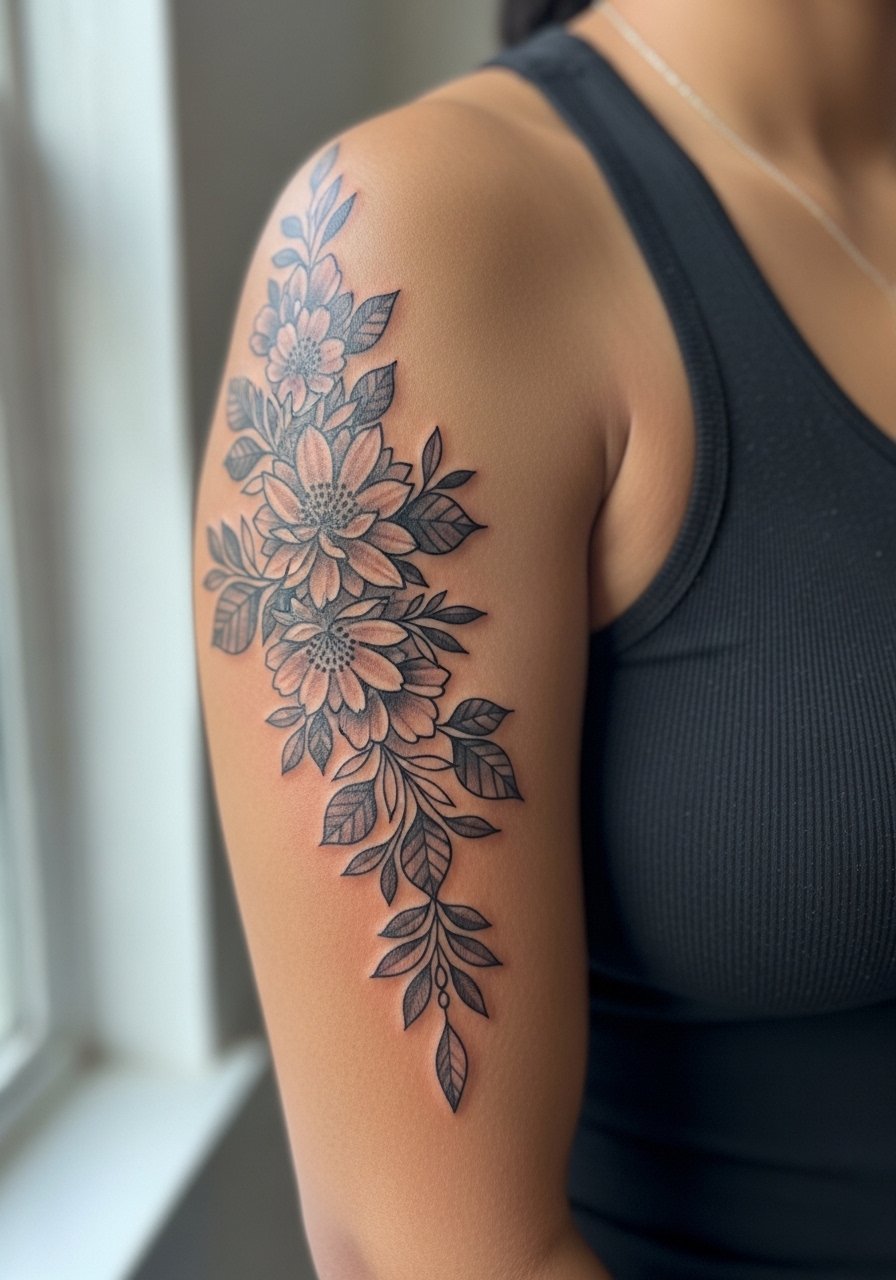
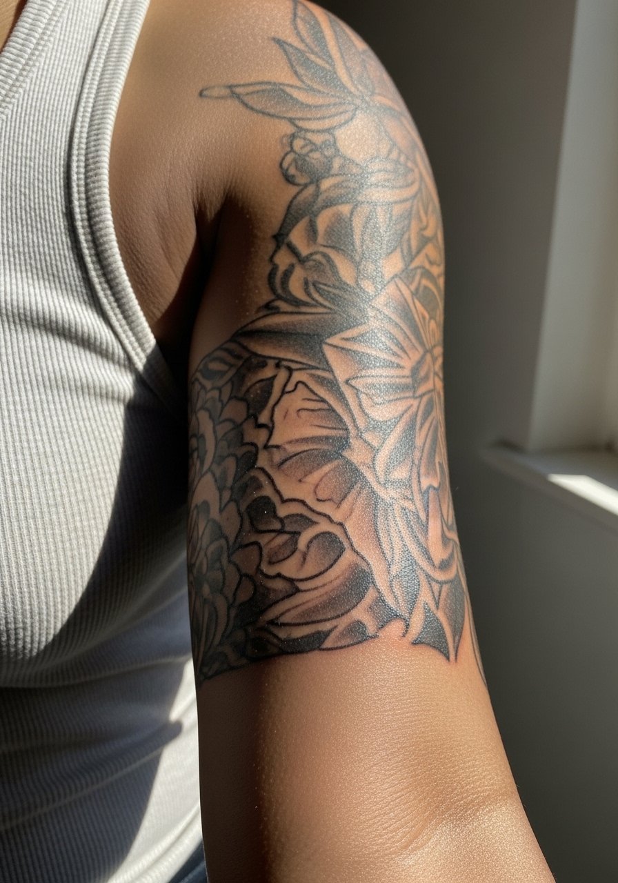
3. Black-and-Gray Floral Column on the Inner Bicep
Most black-and-gray florals on the inner bicep age well when the artist builds soft gradients and avoids overly dense detail near the armpit. The common version that ages poorly packs tiny petals and heavy stipple into a small space. Ask for 4 to 6 inch vertical flow, smooth saturation, and staged shading so the petals keep definition at year two. Sessions run longer, expect two to three visits for a complex column and moderate pain due to thin skin. For showing off, this reads beautifully with a sleeveless sheath dress or a solid tank layered under an open knit cardigan. On darker skin tones, request higher contrast in the blackwork so the composition reads in photos. Image framed with arm raised in a tank for access.
4. Cursive Roman Numerals Along the Inner Arm Curve
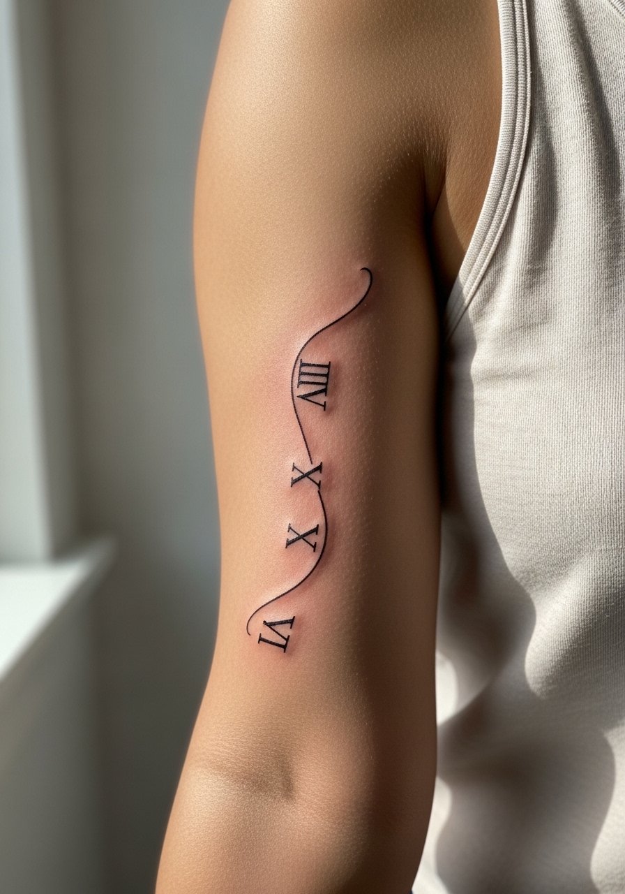
Roman numerals that follow the inner arm curve are a strong choice when you want discreet symbolism visible only when you flex. The design mistake I see most often is using a script font that is too ornate, which blurs into illegibility. Tell your artist you want a serif-based cursive with open counters so each numeral sits apart. This is usually a one-session job and the pain is manageable. Expect a touch-up if the numerals are very thin. For session wear, choose a loose tank or button-up you can slide aside to keep pressure off the area. Image shows the numeral curve hugging the bicep contour.
5. Fine-Line Butterfly Outlines on the Inner Forearm
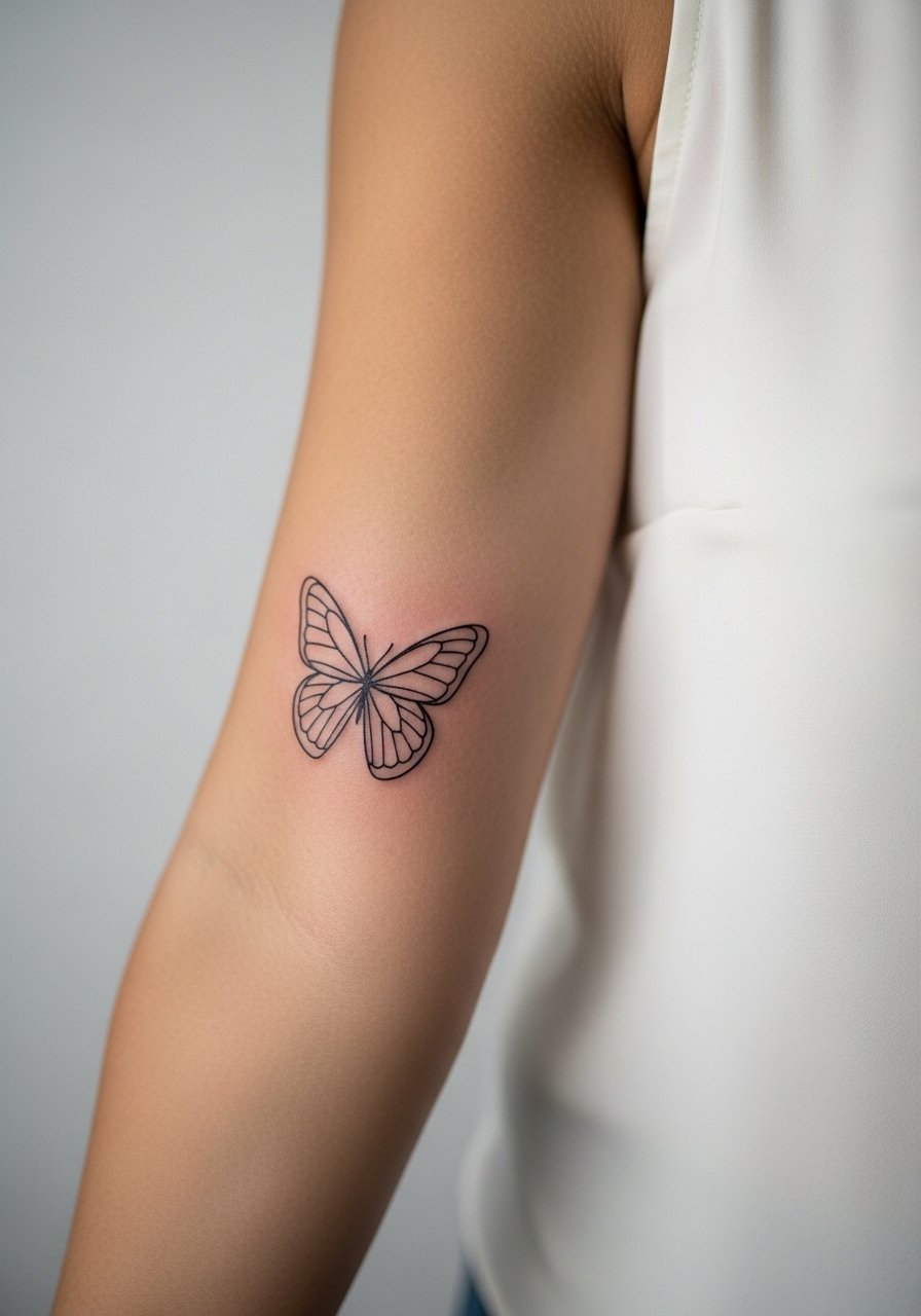
If you want a whimsical feel without heavy commitment, a single-needle butterfly outline at about three inches wide on the inner forearm is an easy win. Watch out for overly fussy wing details that tend to blur. The session is quick and low on pain. For women who like dressing around the piece, pair it with a chiffon blouse women half-tucked and dainty hoop earrings. During the appointment, show the artist photos that display the exact curve and wing spacing you like, and ask about touch-up timing for the single-needle work. Image shows forearm in a sleeveless blouse.
6. Ornamental Celestial Stack on the Inner Bicep
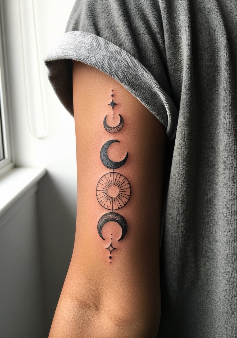
Ornamental celestial motifs stack very naturally on the inner bicep because the vertical space complements moons and stars. The core mistake is crowding tiny dots into a dense pattern. Ask for breathing room and stipple shading only where it enhances negative space. Pain on the inner bicep is real for some, so consider a topical numbing discussion if you are nervous. This piece usually needs two shorter sessions. For a polished outfit pairing, try a neutral linen button up shirt unbuttoned at the cuff so the celestial stack peeks out. Image framed with arm raised slightly for access.
Studio Day Picks
Those inner bicep scripts, forearm geometrics, and floral columns above ask for slightly different prep. A few compact items smooth the session and the first week of healing.
-
Indie thin ointment. Users praise faster absorption without greasiness, which helps fine-line pieces on the inner forearm avoid clogged channels during the first few days.
-
Australian aftercare spray. A no-touch spray can be handy for inner bicep stacks that flex a lot and where hands-on balming is awkward.
-
Small-batch tattoo foam cleanser. Foaming cleansers are kinder to thin forearm skin and reduce the drying that can flatten single-needle work.
-
Rice-based healing balm. Less occlusive than heavier balms, this type helps in humid climates where inner arm areas trap moisture.
-
Aquaphor healing ointment. A thin layer in the first 48 hours protects fresh linework and eases friction zones on the inner bicep while you swap to a lighter balm.
7. Single-Needle Symbol Row on the Inner Forearm
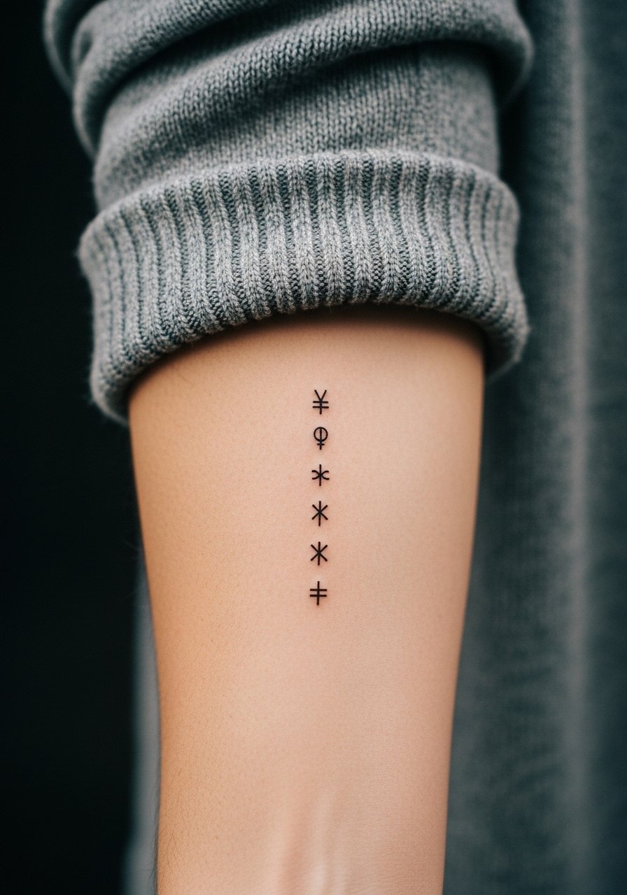
Single-needle tiny symbols under two inches work well if you are after subtlety. The usual problems are scaling the glyphs too small or expecting the same longevity as bold work. Talk to your artist about slightly increasing lineweight and planning a one-year touch-up for razor-thin motifs. This spot heals fast and the pain is minimal. For a casual reveal, a tailored tailored crewneck sweater pushed to the elbow frames the symbols without covering them. During consultation, ask to see healed photos on skin tones similar to yours so you can set realistic contrast expectations. Image crops the forearm area.
8. Illustrative Blackwork Geometrics That Respect Arm Movement
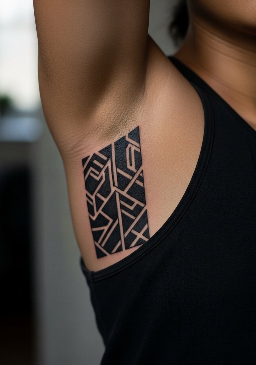
Blackwork geometrics that look great at year five are drawn with spacing for muscle movement and with bold saturation that resists blurring. The biggest mistake is cramming complex interlocking shapes into a spot that flexes widely. This design often requires two to four sessions for saturation and healing checks. The inner arm's blowout risk is higher if lines are pushed too deep. For placement, a vertical five-inch panel aligns with the arm and reads clean from distance. Image shows the inner arm geometric panel against a neutral backdrop.
9. Foreign-Language Fine-Line Quote Along the Bicep Curve
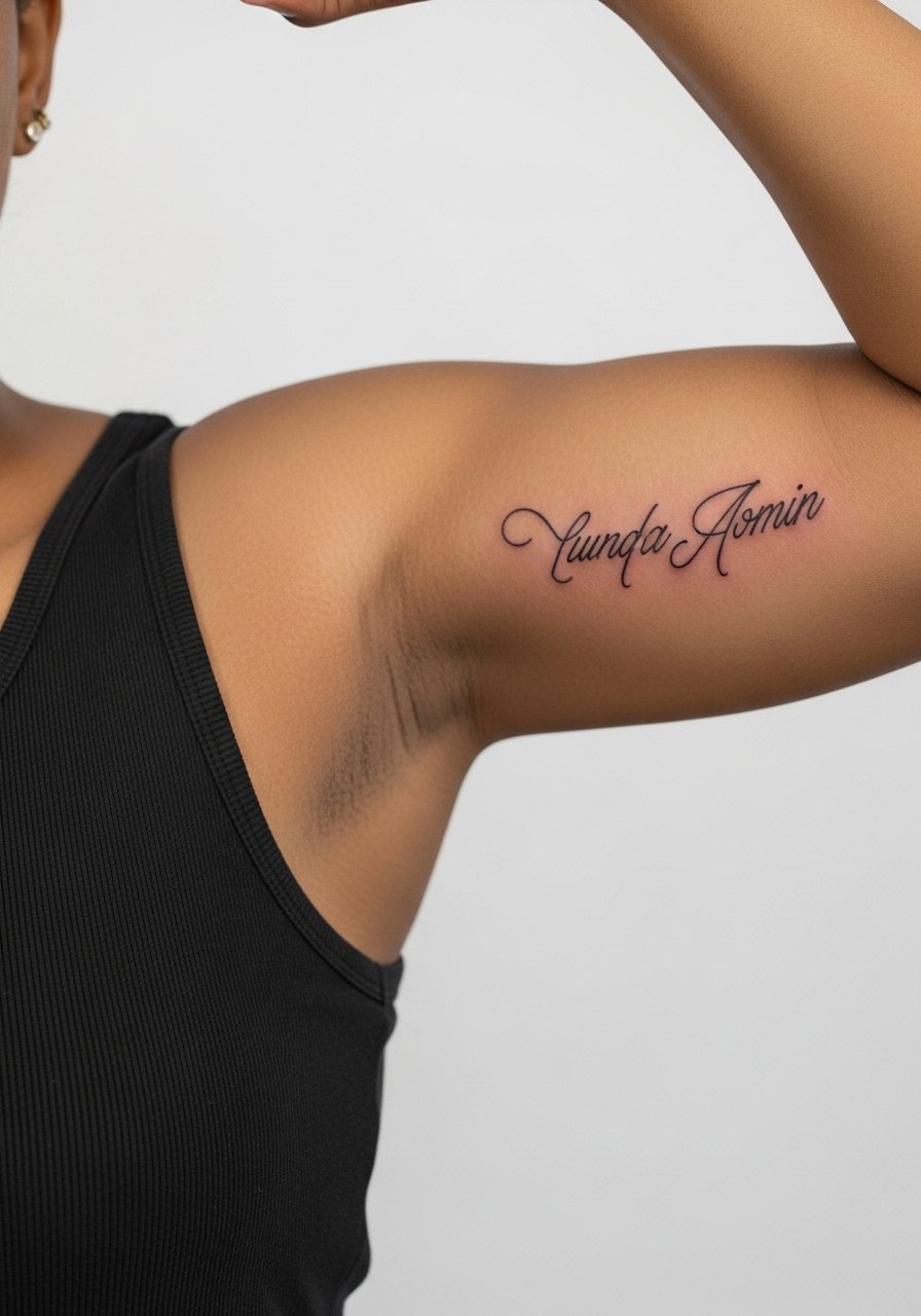
Foreign-language lines, when done in fine script, have a sculptural quality that moves with the arm. The wrong choice is a font that lacks open counters, which can make words merge on darker tones. Artists split on whether fine line holds on the inner bicep. One camp says the skin stretches and soft lines blur in two years. The other camp contends that with correct needle depth and spacing fine line settles as intended. Ask which approach your artist uses and request examples on similar skin tones. Expect one session, a light touch-up at year one for many clients, and moderate discomfort around a five on average. Image shows curved script on the inner bicep in a tank.
10. Serif Initials on the Inner Forearm for Memorials
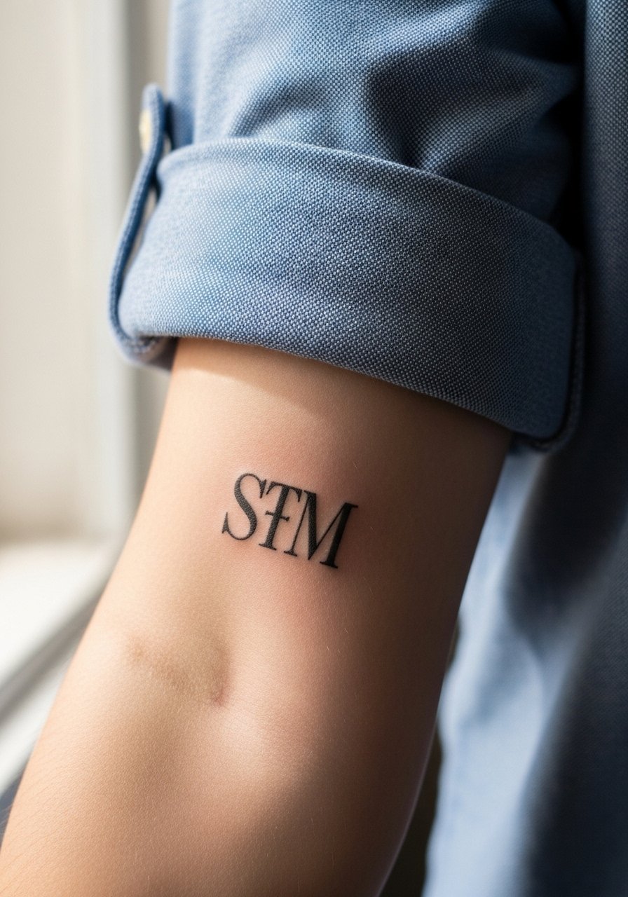
Serif initials placed along the inner forearm are simple and readable when spaced correctly. The common error is tight kerning and tiny letterforms that become hard to distinguish in photos. Ask for two to three inch spacing and request that the artist test the serif weight on skin. This is usually a short, single-session tattoo with low pain. For a clean daytime look, wear an oxford button down shirt with the sleeves rolled twice so the initials are visible without being loud. Image frames the forearm resting on a neutral surface.
11. Watercolor Wraps That Move With the Inner Arm
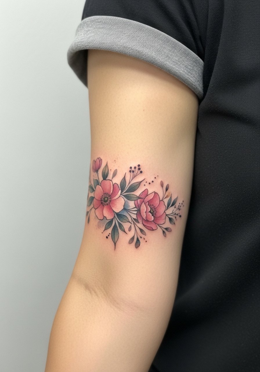
Watercolor-style florals that wrap the inner forearm give a soft painterly effect, but they demand spacing and color choices that tolerate friction. Compared to black and gray, watercolor can lose vibrancy faster on areas that rub against clothing. If you want color, ask for strategic saturation along edges where color meets black outlines so the piece keeps structure while still feeling soft. These wraps often need two to three sessions and careful sun protection. For photos, neutral sleeves or rolled cuffs help the colors stand out. Image shows a soft color wrap around the forearm.
12. Motivational Sans-Serif Phrase on the Inner Bicep
A clean sans-serif motivational phrase placed vertically on the inner bicep reads as a private prompt without being showy. The trap is picking tiny letterforms that fade into gray on darker tones. Ask for open letter spacing and a slightly bolder weight. This is often a one-session design and is visible when you lift your arm. For session day wear, bring a loose tank top cotton so the artist can access the whole bicep area comfortably. Expect a light touch-up within 12 months if you favor super-thin weights. Image crops the inner upper arm with arm raised.

13. Vertical Script That Flexes With the Muscle
This is one of the unique choices few galleries show. A vertical script designed to change shape slightly when the bicep flexes looks dynamic in motion. The consultation should include flex and relaxed photos so the artist can plan letter spacing. The main risk is over-detail that collapses when the muscle moves. Expect a one to two session timeline and moderate inner bicep discomfort. For session wear, a loose tank top cotton gives clean access and avoids sleeve friction on fresh ink. Image shows script lining the bicep with the arm flexed.
14. Inner Forearm Wrap That Aligns With Vein Lines
This under-covered idea works when the design follows natural vein patterns for organic flow. The mistake is forcing symmetry where the arm has asymmetry. During consultation, point out your most visible veins and request the stencil sit along them for a natural curve. This approach reduces the illusion of distortion if your body shape changes. Healing is straightforward for most, and pain is low. Image shows a wrap aligning with forearm vasculature, framed tightly.
15. Black-and-Gray on Oiled Skin for Healed Vividness
Some artists photo new tattoos on oiled skin to preview healed vibrancy. If you like this look, ask to see similar healed photos from past clients instead of just the fresh, oiled shot. Black-and-gray saturation done with smooth gradients reads well on inner arms, especially when the artist avoids micro-detail in high-flex zones. Sessions run longer for saturation and layered shading. This is the time to discuss touch-up timelines so you know whether a second pass is budgeted. Image shows a healed black-and-gray panel with subtle contrast.
16. Planning Guest Spot Matching for Inner Arm Work
If you are traveling for a guest spot, the biggest risk is last-minute cancellations and deposit issues. One practical step is to book local options as backup and confirm refund policies in writing. Use discovery pathways like searching hashtags and platforms for style-specific portfolios and then confirm a date through a booking app. For the design itself, bring a flexible reference that the visiting artist can adapt to your arm shape. Image shows a travel-ready inner arm stencil on the skin.

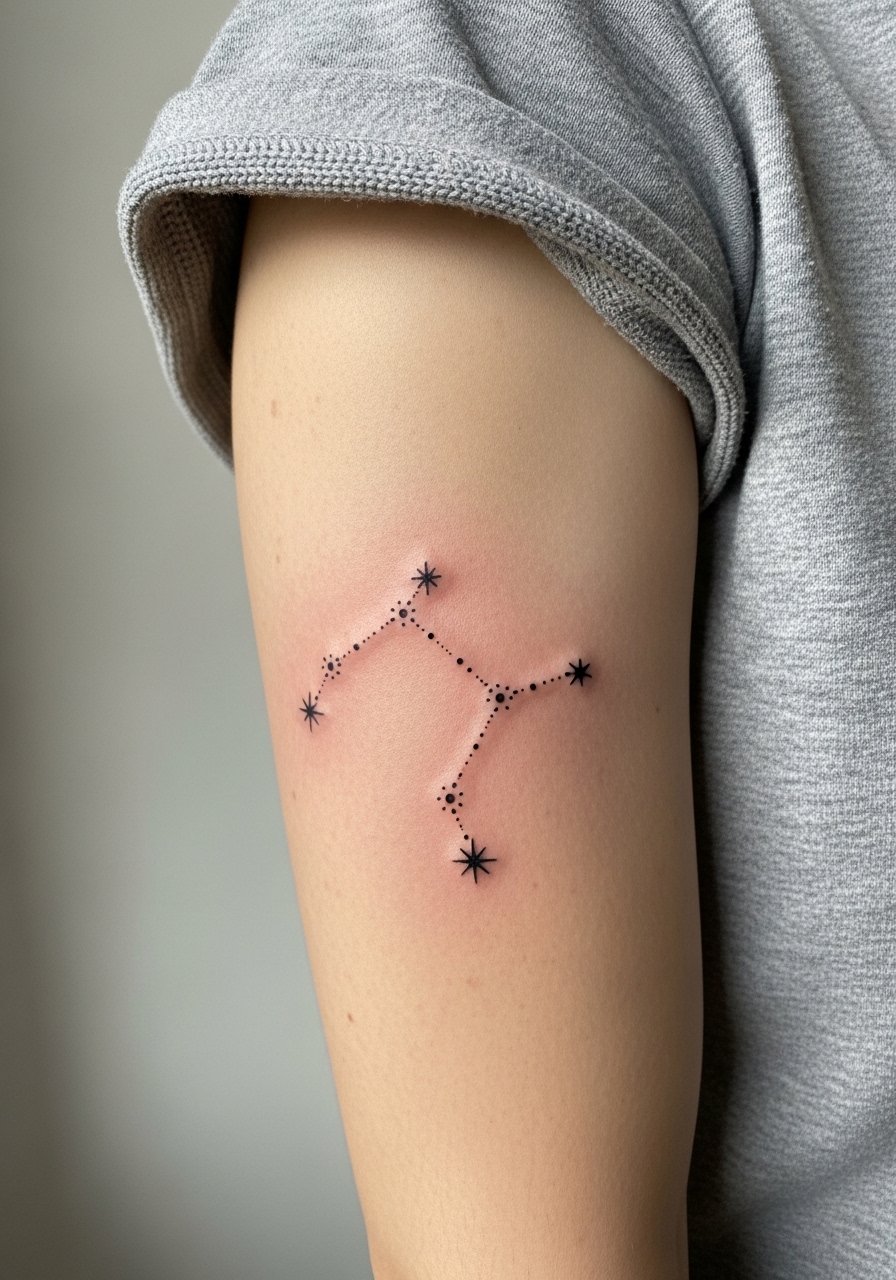
17. Minimal Constellation Cluster Along the Inner Arm
Tiny constellation clusters along the inner arm read as subtle geometry when spaced carefully. The common mistake is placing the dots too close together or using faint dots that vanish in photos on darker skin. Ask for slightly larger star points and a touch of boldness to help with contrast. This heals fast and is low pain. For showing it off, a simple dainty hoop earrings look puts attention near the arm and face without overwhelming the cluster. Image frames the inner arm with a neutral background.
Frequently Asked Questions
Q: Will fine-line script on the inner bicep fade faster than a bold script?
A: Fine-line script tends to soften sooner than bold script, especially on thin, frequently moving skin like the inner bicep. One approach is to choose a slightly heavier single-needle weight or plan a touch-up around year one. Sit down with your artist and have them show healed examples on similar placements.
Q: Are watercolor wraps on the inner forearm a bad idea if I want long-term color?
A: Watercolor can look beautiful but it can lose vibrancy faster on areas that rub against sleeves. If color longevity is a priority, ask for strategic black outlines or stronger saturation at edges so the piece keeps structure as it ages.
Q: How painful is inner bicep work compared with the inner forearm and what should I wear for the session?
A: The inner bicep typically rates higher on a pain scale than the inner forearm. For the session, choose a loose tank top cotton so the artist can access the area without tight fabric rubbing against fresh ink.
Q: Should I avoid single-needle tiny symbols if I have darker skin?
A: You can still get single-needle symbols, but request higher contrast with slightly bolder lineweight or consider blackwork alternatives. Ask the artist for healed photos on similar skin tones and plan for a potential touch-up if contrast shifts in photos.
Q: What do I say to an artist about the flexing script idea so it looks right when I move?
A: Ask them to take photos of your arm flexed and relaxed, and to design the stencil using both. Request that they test the stencil on your skin and show you the difference before any needle touches skin. That preview saves hours and a possible touch-up later.