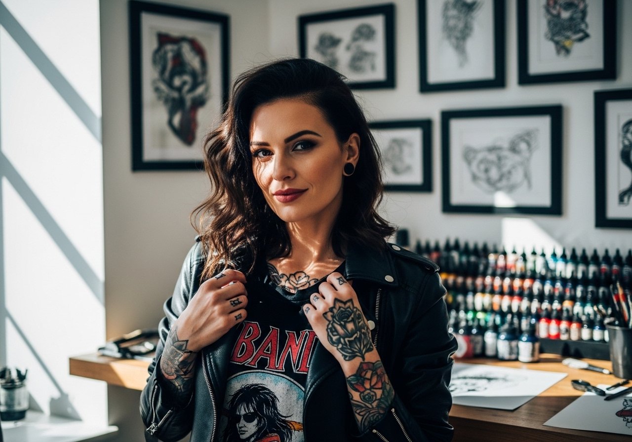
Fine line tattoos look effortless on social feeds but they ask for careful choices that most people skip. I see clients pick tiny script because it photographs delicate, then book touch-ups two years later when letters blur. The secret with word-based fine line work is not just the font. It is placement, spacing, and what you wear every day that adds friction. Read the first idea and you will have the practical detail to ask for at your next consultation.
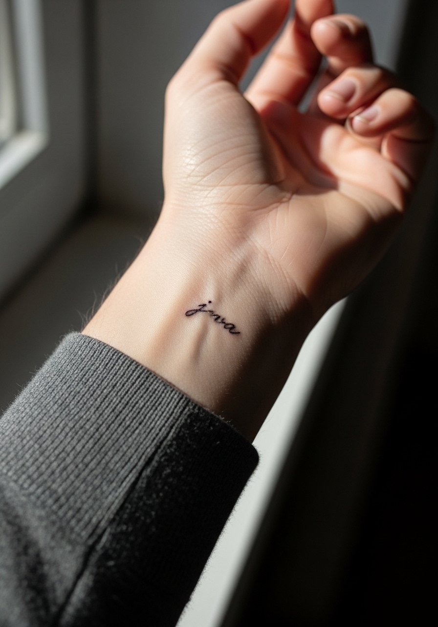
1. Lowercase Script on Inner Wrist
I've seen this exact placement last well when the letters are kept narrow and given a touch of breathing room. Ask your artist for single-needle lowercase with slight kerning between letters so the ink has room as skin moves. Fair warning, the wrist takes daily friction from watches and sleeves so expect a touch-up around year two to three. The session feels quick but sensitive because the area is thin and close to bone. Avoid asking for ultra-tiny text that reads like a dot at six months. Pair this with a minimalist gold watch when you want to show it off without crowding the linework.
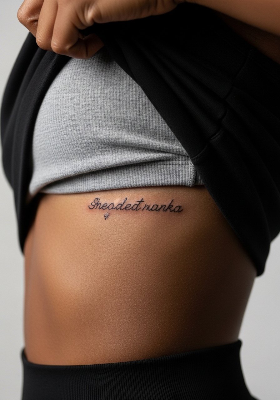
2. One-Word Serif on Side Ribcage
Fair warning, rib pieces carry more long-term risk than forearm work. One camp of artists says the ribcage stretches and blurs fine line quickly. The other camp argues that with slightly heavier line weight and spaced letters it can hold for years. Tell your artist you want the letters spaced a touch wider with modest depth so nothing sits too shallow. The session is longer and awkward because you need to hold breaths for the stencil. Expect a firmer touch-up timeline than the wrist, often around year two. For the appointment, wear a cropped athletic top you can lift slightly so only the rib area shows.
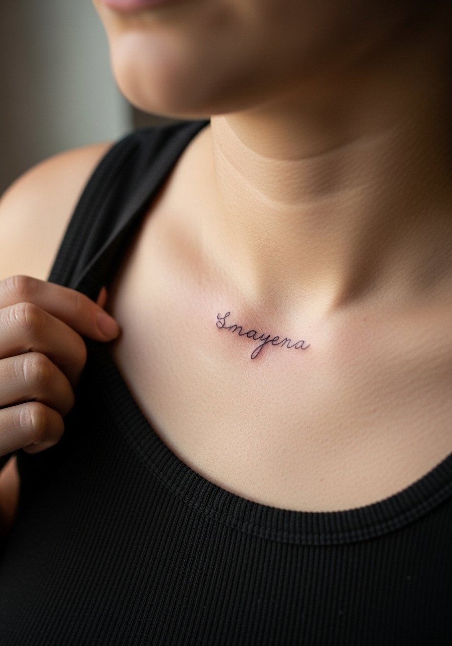
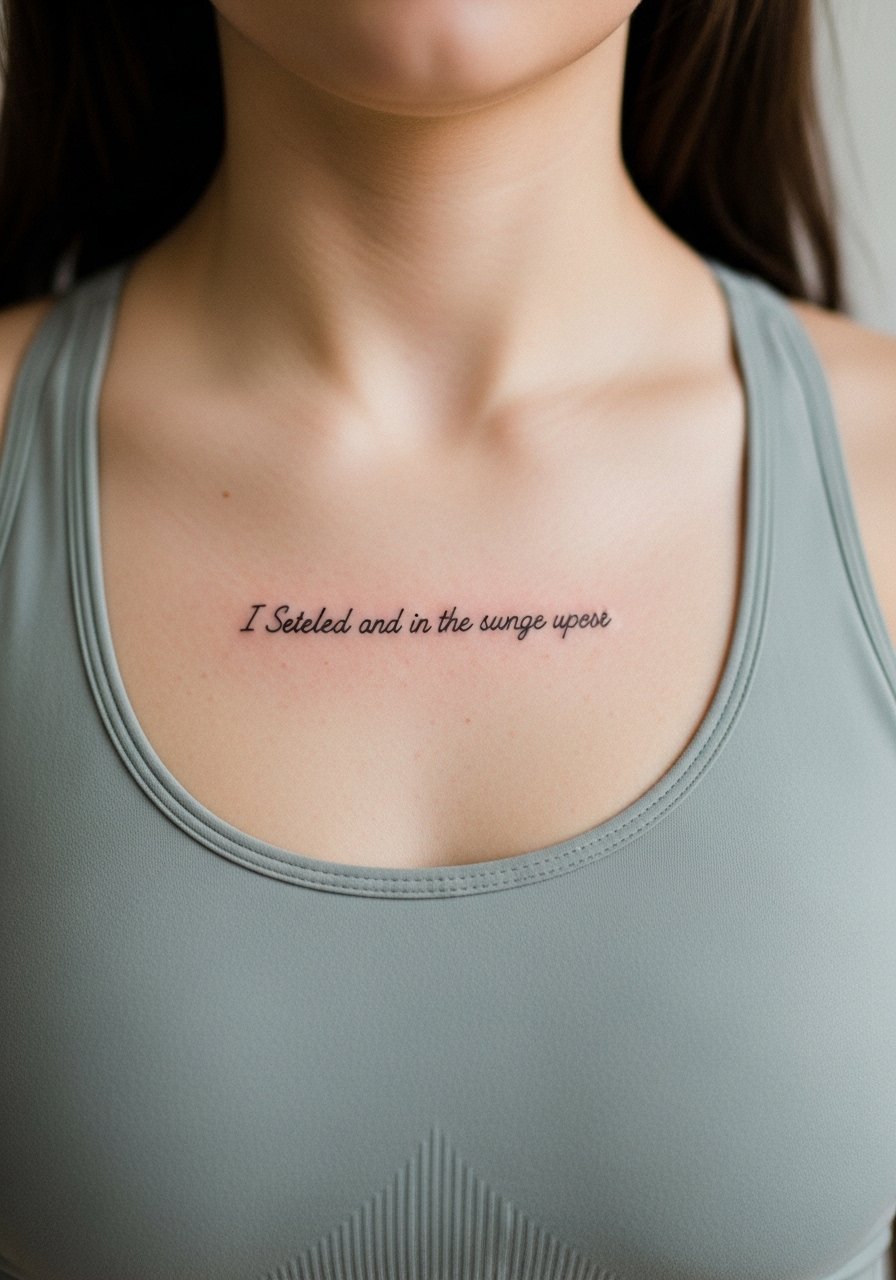
3. Lowercase Script Along the Collarbone
This placement reads like jewelry when the letters follow the bone. I recommend a slightly italicized lowercase so the flow matches collarbone curves. During consultation, ask for a stencil preview that sits naturally when you move your shoulder. The pain is moderate and sessions are short. Aging looks good here if you keep letters medium size and avoid dense flourishes that can merge in a few years. A common mistake is insisting on very thin strokes across a long phrase. If you want something discreet for evenings, a thin chain pendant necklace sits above the script without competing for attention.
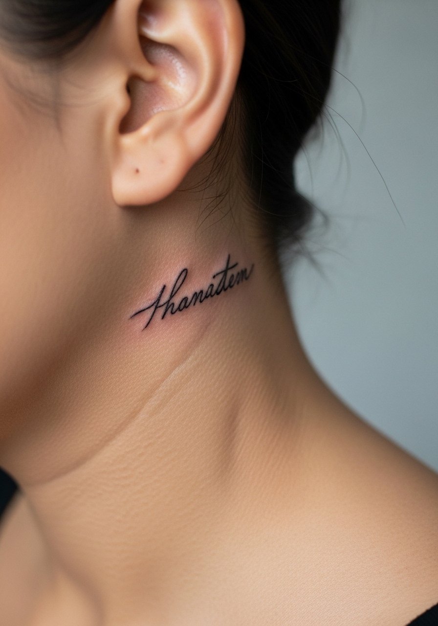
4. Micro Script Behind the Ear, Below the Hairline
This is a secretive spot that reads personal and intimate. When you get words here, specify the exact text to the artist and request the stencil be placed below the hairline on the neck so the tattoo sits on skin behind the ear rather than on the ear itself. The area is sensitive and the session is quick. The biggest mistake is going too ornate with letter tails that snag in hair. For showing it off, tuck hair behind one ear and wear a simple wide-neck top for evenings so the placement is visible without full exposure. Note that healing needs care near hairlines to avoid follicle irritation.
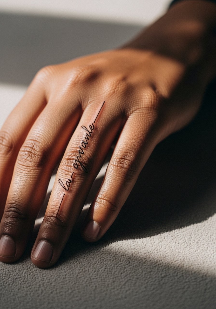
5. Single-Word Script Down the Side of a Finger
Finger text looks striking but it is one of the fastest to soften. The skin here moves, washes often, and rubs against surfaces. Tell your artist you want a slightly bolder single-needle stroke than you think you need so the letterforms survive daily use. Expect touch-ups sooner than other placements, sometimes within the first year. A real mistake is requesting tiny cursive that loses legibility. The session is fast but stings more than the wrist. Keep in mind that work on hands and fingers can impact some professional environments so weigh placement against career needs.
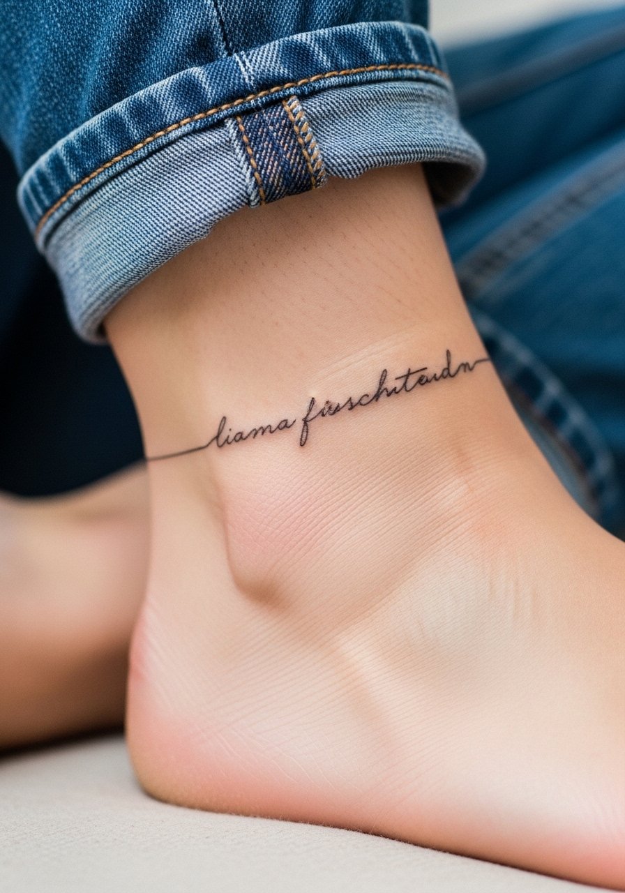
6. Script Wrapped Around the Ankle
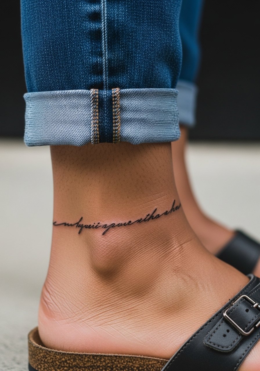
Ankle script is great for phrases that feel private but still peek from rolled pants. For longevity, avoid very small loops where letters touch after a year. Ask for the script to sit slightly above the bone so shoes and socks create less friction. Sessions are brief but the ankle swells easily so plan for light mobility after the appointment. A common mistake is placing text on the very front of the ankle where shoes scuff. Show-off pairing works well with sandals and cropped trousers. Try a pair of neutral sandals for summer looks that frame the text without covering it.
Pre-Session Essentials
The wrist and ankle pieces above face different friction and swelling than chest work, so a few specific items smooth the studio day and the first week.
-
Stencil transfer paper kit. Lets you preview the exact placement on skin before the needle hits, which matters for curved areas like the collarbone and ankle.
-
Topical numbing cream. Applied per instructions 30 to 45 minutes before can ease the sharp sting on fingers and ribs without altering linework.
-
Thin protective film roll. Helps seal finger and wrist tattoos against constant washing and typing during the first few days.
-
Fragrance-free gentle body wash. Cleans sensitive spots without irritating the fresh lines that fine work depends on.
-
Aquaphor healing ointment. A thin layer in the first 48 hours helps retain moisture on small script work without clogging.
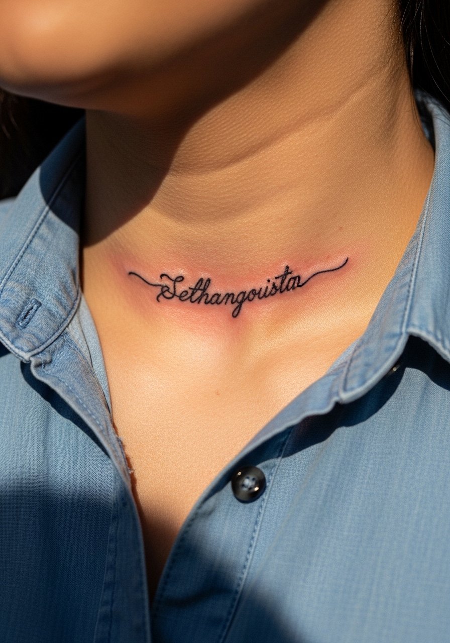
7. Tiny Cursive Across the Collarbone Curve
Visual impact is subtle here but convincing when spacing is right. I recommend keeping each word short and using lowercase cursive with modest spacing. The area is forgiving because the collarbone sits flat, yet harsh tugs from bags can stress fresh lines. Tell your artist to preview the stencil while you move your shoulder so the phrase follows the natural line. Sessions are short and pain moderate. A typical mistake is cramming a long phrase into a small curve. For session wear, bring a button-up shirt you can pull aside so the artist has clean access without full exposure.
8. Minimalist Quote on the Sternum
Sternum script is intimate and dramatic when centered. Artists are split on technique for this zone. One camp warns that fine line here can blur due to skin movement and sweat. The other camp says small adjustments to needle depth and letter spacing make it stable. When you book, ask how their healed images look on sternums specifically. Sessions can be intense and involve longer breaks. A common error is demanding ultra-tiny lettering across the sternum. For the appointment, wear a fitted sports bra so the artist can work around the fabric line. An Elastic sports bra keeps coverage modest while the area heals.
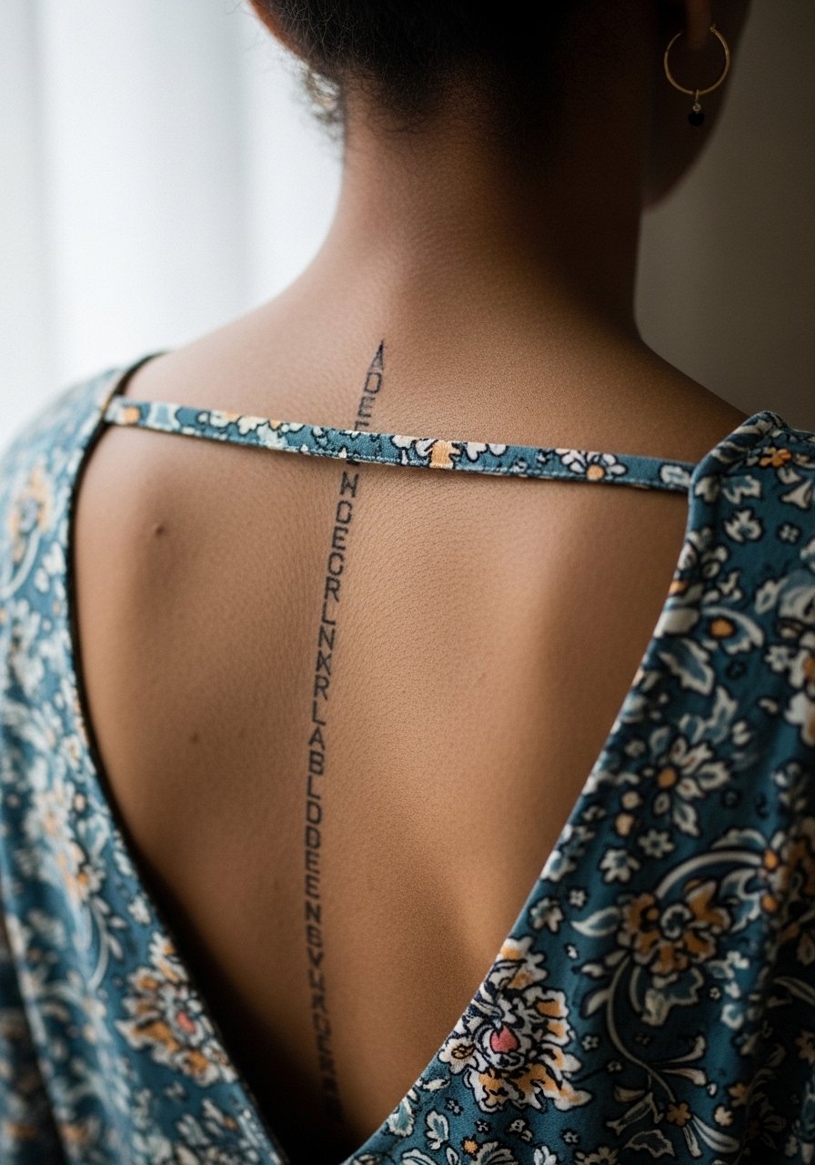
9. Stacked Words Along the Spine
Stacked words down the spine read architectural when letterforms are consistent. Ask for slightly wider spacing between stacked lines to prevent crowding as skin shifts. The session is longer and you will need short breaks. The spine can be sensitive near vertebrae so pain varies by person. A common mistake is stacking too many words in a short area. If you want to show it off, open-back dresses or halter tops work well. Carry a lightweight open-back dress for nights out if you want the vertical line to be visible without strain.
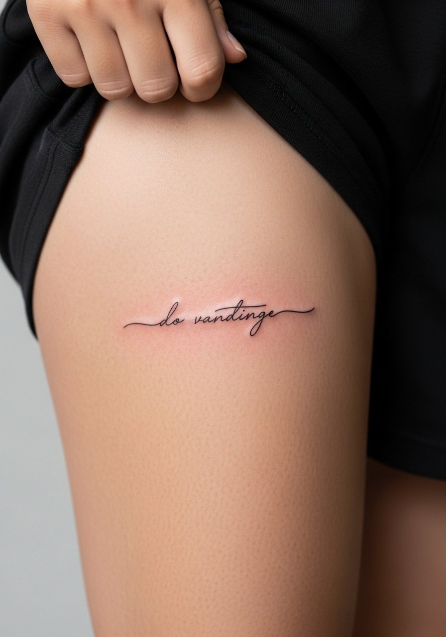
10. One-Word Script on the Side of the Thigh
Thigh text lets you go longer and still keep the letters readable. The skin is generous so linework can breathe. Sessions are comfortable and healing tends to be slower but steadier than hands. A mistake I see is placing text too close to existing stretch marks or seams where clothing will rub. During your consultation, request the stencil be aligned with how your leg sits while walking. For session comfort, wear loose drawstring linen pants so the artist can roll the leg up easily without pressure.
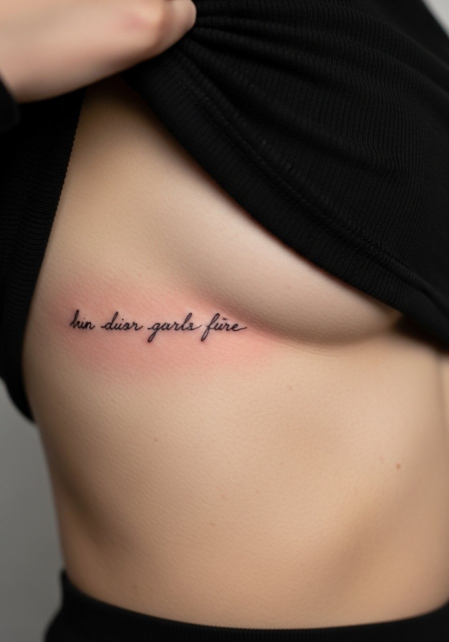
11. Tiny Script Along the Upper Rib Edge
This placement is discreet and reads like a private note when clothing reveals it. The ribs challenge fine line durability because skin expands and compresses with breathing. Tell the artist you prefer slightly bolder strokes and spacing to compensate. Sessions are sensitive and may require more breaks. A frequent error is asking for ornate ligatures that blur into one shape. If your wardrobe includes cropped tops, pick pieces that lift slightly rather than tug. For career-minded folks, remember this area is hidden most of the time so it stays private.
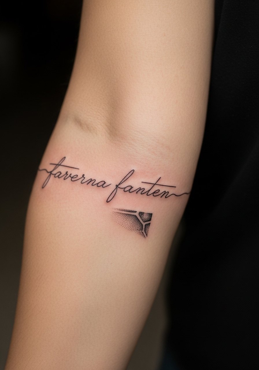
12. Scripting with a Small Graphic on the Forearm
Pairing a short word with a tiny drawing gives the piece context and helps the word age better by redirecting attention. I recommend a small symbol placed either before or after the word so the composition breathes. Tell your artist you want the symbol in stipple shading to avoid dense fill that competes with the script. Forearm placements heal well and photograph reliably. A common mistake is placing the graphic too close to letters. For showing it off, roll sleeves and choose fabrics in neutral tones. A rolled-up linen shirt frames the forearm without stealing focus.
13. Micro Script on the Side of the Neck
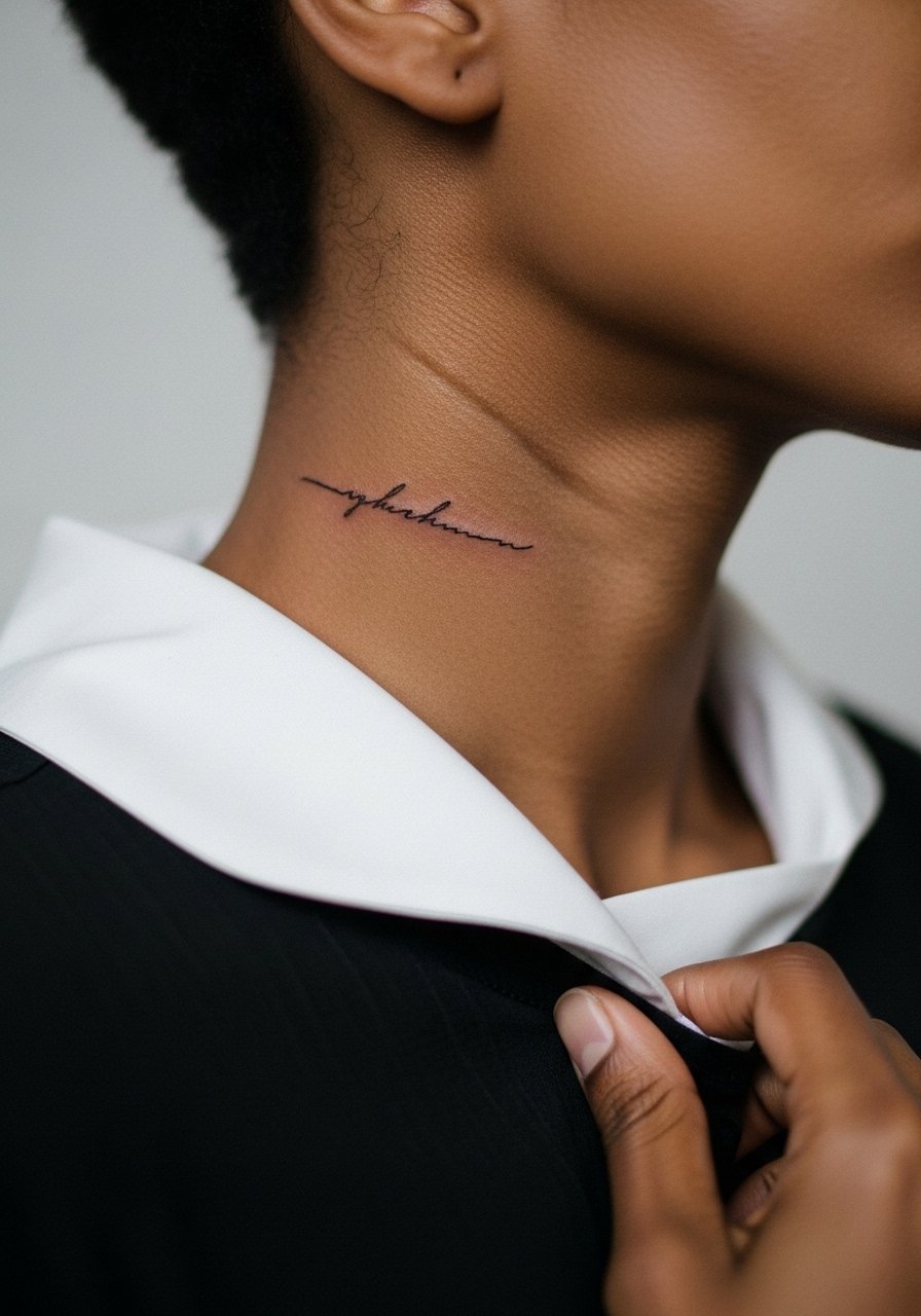
Neck script is visible and bold even when the letters are tiny. Some employers still judge visible neck work so think about career timing. The skin here is thinner and touch-ups may be needed sooner. Ask for a test stencil and avoid overly decorative fonts. The session is short but may sting more than the upper arm. A real mistake is getting a full sentence in a highly visible spot. For subtle presentation, choose a wide-neck sweater that can hide the tattoo during professional settings.
14. Script Arcing Over the Nape
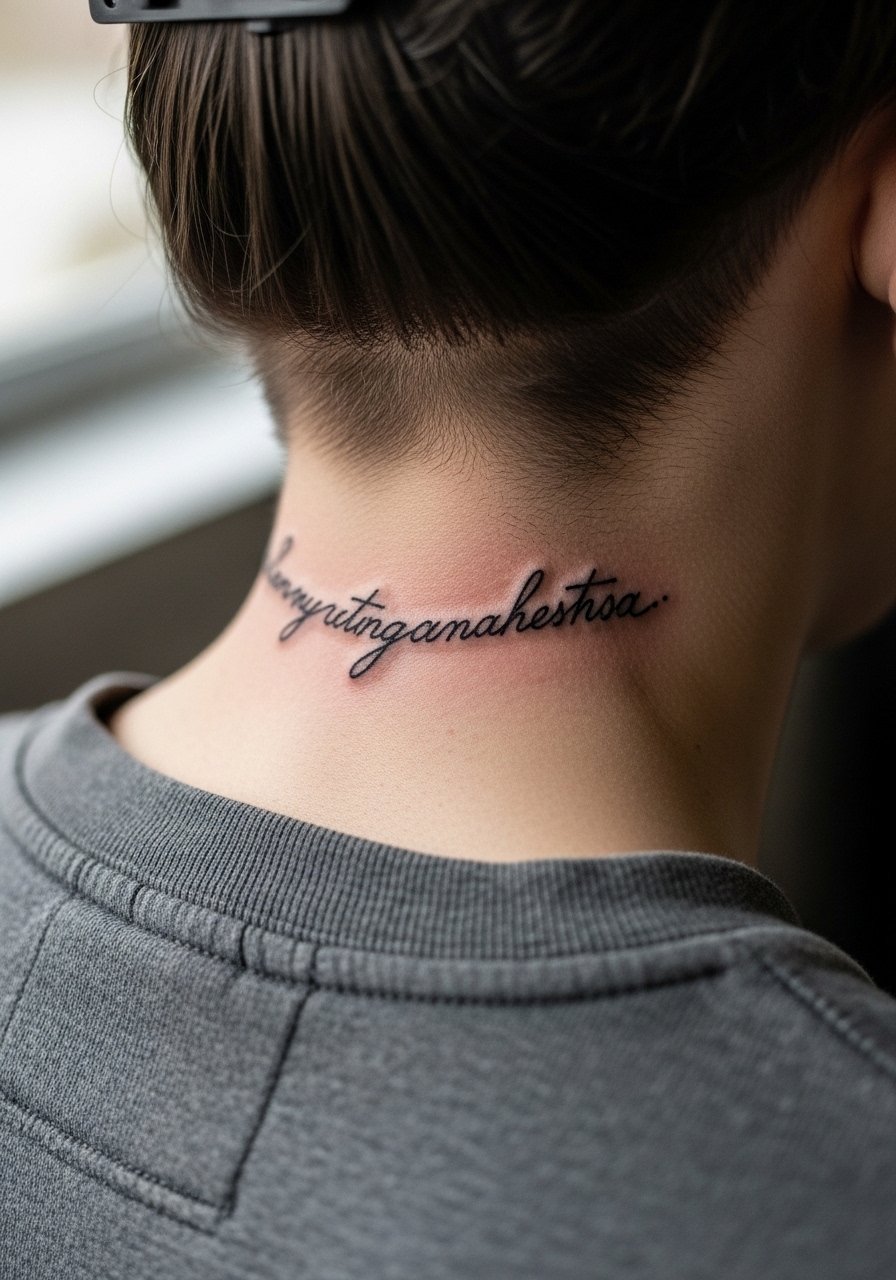
A short phrase arcing across the nape works as a revealed or hidden statement depending on your hair. Request a curved stencil that follows the spine at the base of the skull so the letters sit naturally. The area is sensitive and healing requires caution around hair products. Avoid ornate serifs that catch in hair. The session is moderate in length. To show it off occasionally, wear a crewneck shirt with a low back or pull hair up in a clip.
15. Minimalist Script with Dot Work on the Wrist
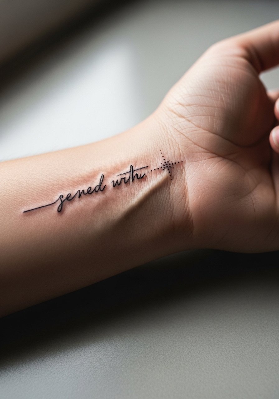
Combining a short word with subtle dot work frames the text and helps aging by adding texture. Ask for stipple dots rather than dense shading so the skin keeps definition longer. The wrist is vulnerable to friction from watches and bracelets so expect touch-ups sooner than forearm pieces. Sessions are quick and the pain moderate. A common mistake is overdosing the area with heavy dots that sit like a shadow right away. Stack dainty bracelets sparingly so the metal does not rub the fresh ink during healing.
16. Script Around the Ankle Bone
Placing text just above the ankle bone creates a delicate ring of words that peeks from shoes. Keep letters slightly larger than you think and avoid extremely tight cursive loops. The area swells with walking so plan lighter activity for 24 to 48 hours. A common mistake is selecting thin floss-like strokes that get washed out by constant movement. For summers, pair it with cropped trousers or a pair of neutral sandals so the script is visible without rubbing against footwear.
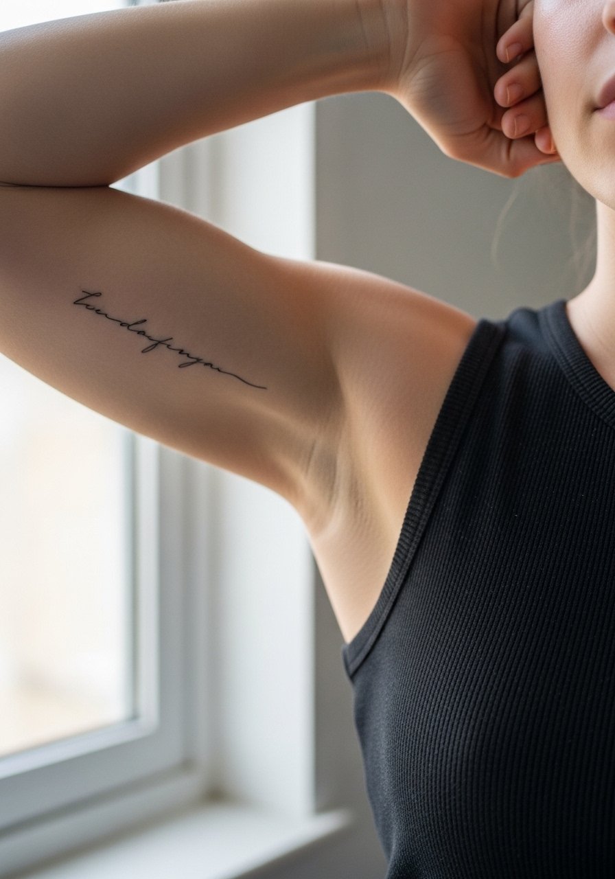
17. Tiny Script on the Inner Bicep
The inner upper arm is a forgiving canvas for short phrases that you want mostly private. Ask for the stencil to sit so the phrase reads when your arm is relaxed. The area is tender but sessions are generally comfortable and easy to pause. A common error is squeezing too many words into the inner bicep where the skin can accordion during movement. For the session, wear a loose tank top so the artist can access the area with the arm raised. A loose tank top keeps coverage comfortable both during the appointment and in the first week of healing.
Frequently Asked Questions
Q: Will fine line text on my fingers blur faster than the same text on my forearm?
A: Yes, fingers wear more from washing and contact so they usually soften sooner. Forearm script sits on flesh that moves less and is easier to protect. If finger placement matters to you, ask your artist to increase stroke weight slightly and plan on earlier touch-ups.
Q: How should I ask my artist for spacing that holds up on the ribcage?
A: Ask for wider letter spacing and slightly deeper, consistent needle depth so the ink does not sit too shallow. Mention you want to see healed photos from that artist on rib placements, not just fresh work. That gives you a realistic sense of how their technique performs there.
Q: Can small script be combined with tiny graphics without risking blur?
A: Yes, when the graphic is placed with breathing room from the text and uses stipple or thin linework. Tell your artist you want separation between the word and the motif and prefer dot shading over dense fill so the pair ages more predictably.
Q: What should I wear to a sternum or rib session to stay modest but accessible?
A: Wear a fitted sports bra or a cropped athletic top that you can shift slightly so only the tattoo area is exposed. That keeps the rest of you covered and gives the artist clean access without full exposure.
Q: If I want to hide neck or collarbone text for interviews, what clothing works best?
A: Wide-neck shirts, high collars, or lightweight scarves can conceal the area when needed. A button-up shirt worn normally hides most collarbone work while still allowing quick access if you need to show healed photos to a stylist.