
Fine line geometry looks incredible fresh, but how it wears is what matters. Too-tight mandalas and ultra-fine triangles can blur under daily wear if you skip spacing and depth planning. I prefer designs that plan for movement across the forearm and room for touch-ups. Below are 21 clean geometric forearm ideas for men, each with what to ask your artist and how it will age.
1. Minimal Geometric Band on Inner Forearm
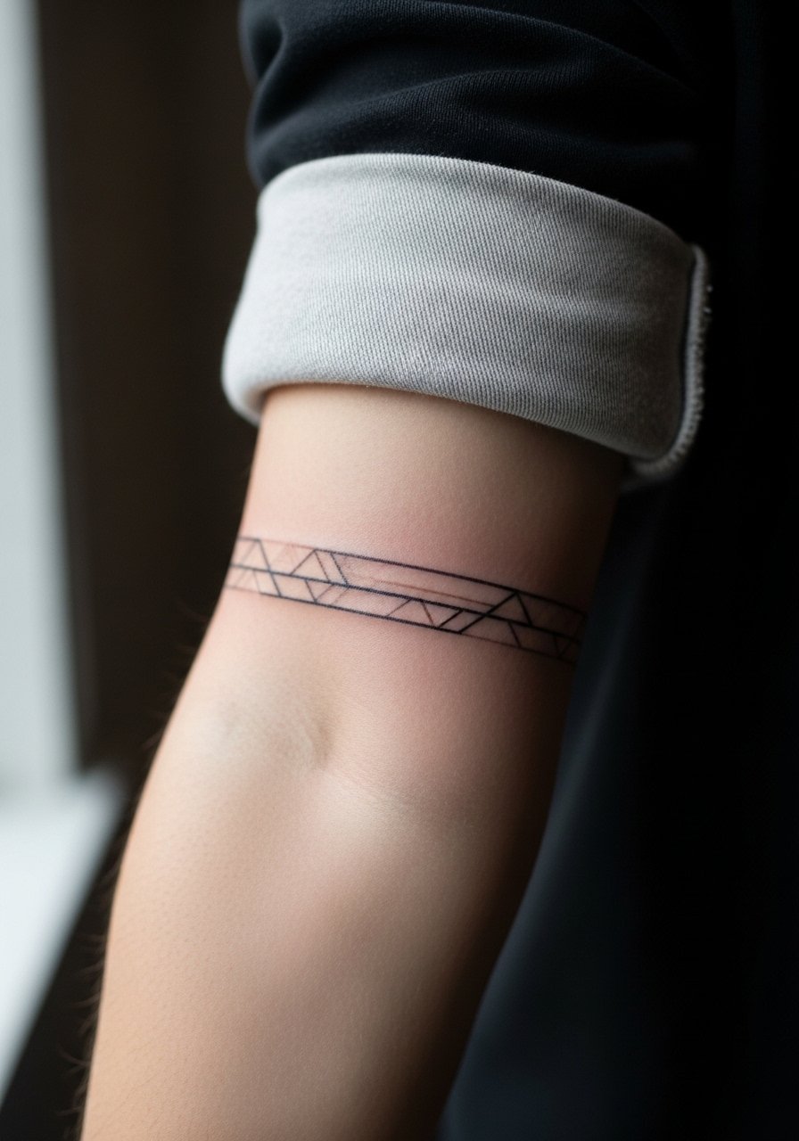
I recommend this when you want something low-key that still reads architectural. Ask your artist for slightly heavier outer lines and lighter interior lines so the band keeps its shape at two years. Common mistake is making the inner details too tight, which leads to merging as the skin ages. Expect a one to two hour session and moderate pain on the inner forearm. For showing it off, rolled-up sleeves or a loose button-down shirt frame the band without covering it. Touch-up is usually minor at year three if spacing is respected.
2. Constellation Trail Along the Radius
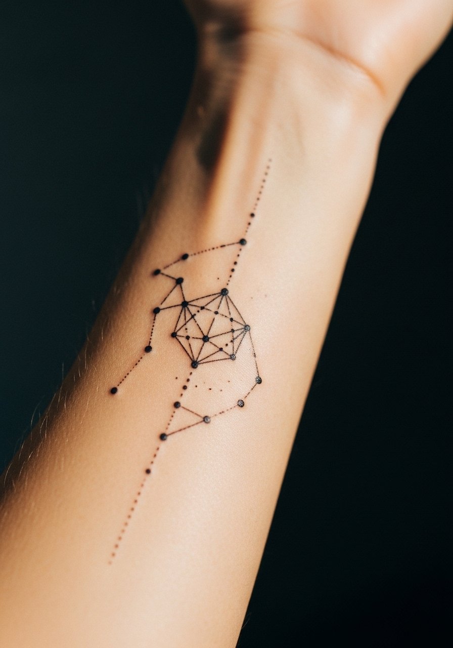
I've seen this used as a subtle wrap that reads like jewelry from a distance. Tell your artist you want micro spacing between nodes and a mix of stipple shading for depth. The risk here is blowout on very fine dots if the needle goes too deep. Pain is low to moderate and sessions can be split into two short passes. For outings, pair the trail with a minimalist watch to keep the wrist area clean and complementary. Expect the dots to soften at 2 years and plan a small touch-up if you want crispness to remain.
3. Mandala Quarter on Outer Forearm
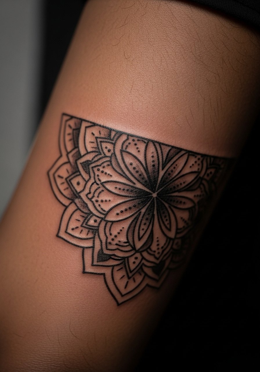
Fair warning: dense mandala elements age poorly if packed too small. One camp argues mandalas need tight repetition to look cohesive. The other camp says larger petals and deliberate negative space preserve detail. I side with spacing that favors the second camp. Ask for a scaled-down center and more open outer rings so the pattern breathes. This placement is visible and tolerable for pain. Expect two to three hours and possible touch-up at year three for inner filigree.
4. Interlocking Triangles Sleeve Accent
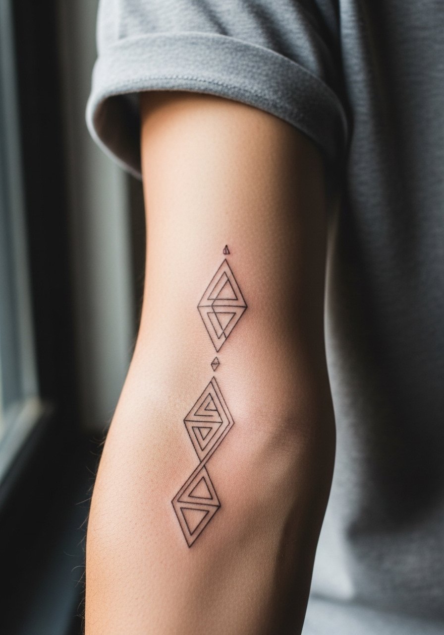
There is real visual impact when triangles follow muscle lines. When you sit with your artist, map the design along the radius so it moves with the arm contour. Common mistake is ignoring how a rigid grid looks when the forearm flexes; that makes the pattern look skewed in motion. Session time runs around two to three hours depending on coverage. For showing it off, a short sleeve linen tee keeps attention on the pattern without competing. Touch-ups are predictable if spacing is consistent.
5. Negative Space Chevron Stack on Outer Forearm
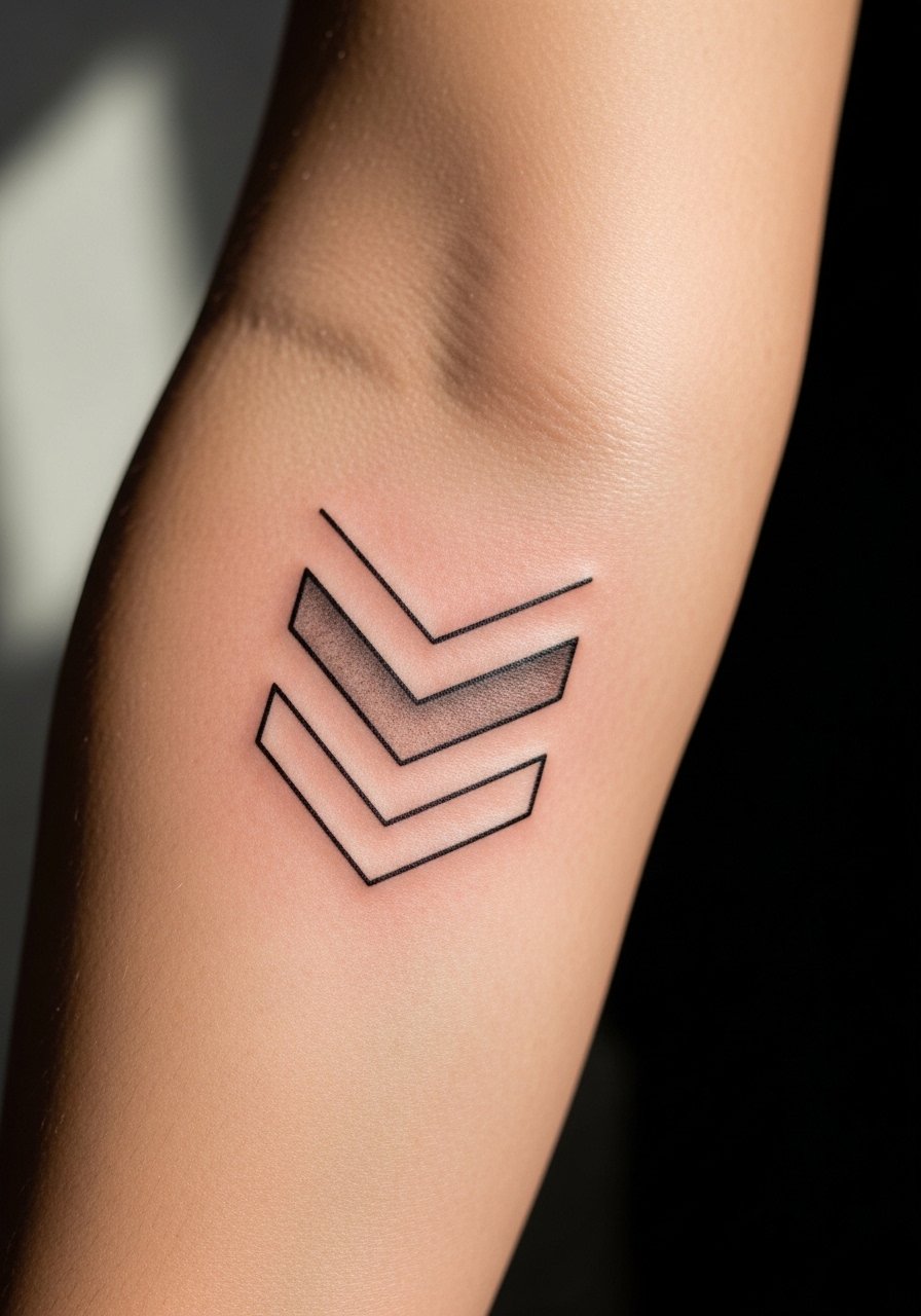
The visual trick here is using untouched skin as part of the geometry. Tell the artist to treat the negative shapes like lines that must be preserved by avoiding over-saturation nearby. A frequent error is filling too close to the negative zone, which reduces contrast over time. Pain is moderate and sessions are often quick. Pair the chevrons with a thin leather cuff bracelet when you want the forearm to read like an intentional accessory. Expect crispness to soften at year two without heavy touch-ups.
6. Stipple Shaded Hex Grid Near Wrist

When you book this, ask for stipple shading rather than solid fill inside the hexes to maintain texture as the ink settles. One mistake I see is heavy saturation in small cells, which leads to muddy blocks after healing. This area faces friction from sleeves and watches, so plan for possible minor fading. For session comfort, wear a loose cuffed shirt you can roll up without rubbing the fresh ink. Expect a touch-up at year two if you want to retain crisp stippling.
Studio Day Picks
The inner and outer forearm pieces above face different friction and sun exposure, so a short kit for sessions and the first week helps protect fine line work.
-
Stencil transfer paper kit. Lets you preview placement and scale on the forearm before the first pass, which is essential for bands and mandalas.
-
Thin protective film roll. Helps shield wrist and lower forearm work from shirt friction during the first 48 hours.
-
Fragrance-free gentle body wash. A mild wash prevents irritation around fine line areas while cleansing the healing skin.
-
Topical numbing cream. Useful for dense grid sessions near the wrist where sensitivity spikes and multiple passes might be needed.
-
Aquaphor healing ointment. A thin application in the first days keeps the skin supple around intricate linework without clogging the surface.
7. Asymmetric Polygon Cluster on Inner Forearm

Personal observation: asymmetric clusters read modern without trying too hard. During consultation, show the artist where you want visual weight so the cluster doesn't drift toward the wrist. A common error is making all polygons the same size, which flattens the composition. Pain is similar to other inner forearm pieces and sessions are often one to two hours. For a smart show-off pairing, a racerback tank or rolled sleeve works well. Plan a minor touch-up at three to five years depending on sun exposure.
8. Micro-Realism Geometry Overlaid on Bones
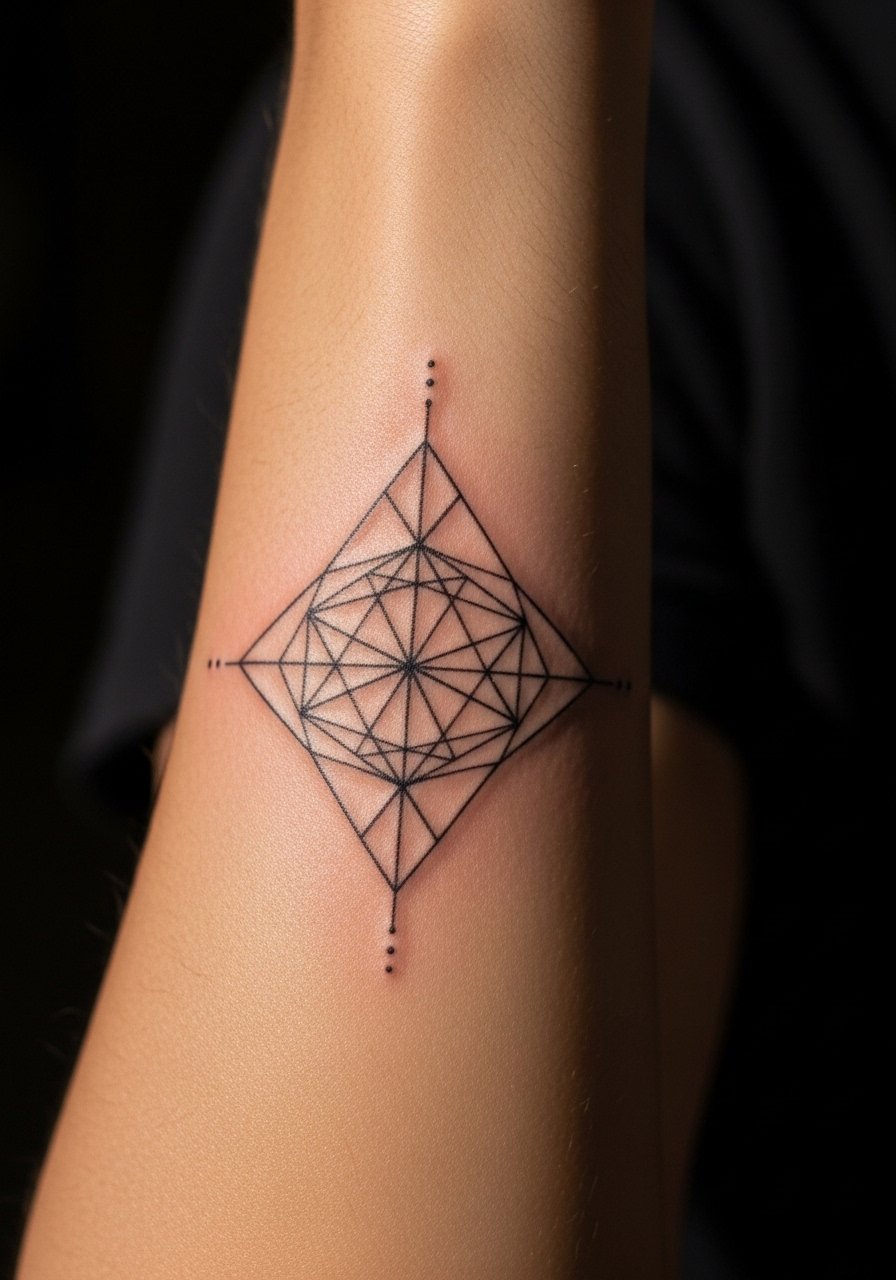
When you want the design to interact with anatomy, ask your artist to place lines to run parallel to the ulna or radius. Visual impact comes from alignment, not extra detail. The risk is placing tight detail directly over bony ridges, which can be more painful and show faster fading. Session feeling is sharper near bone. If you have a career concern, note that more visible placements attract attention. Expect a touch-up timeline similar to other fine line pieces.
9. Optical Illusion Band That Wraps the Forearm

There are two camps about optical illusion bands. One camp loves the perfectly repeating tessellation and thinks it reads cleaner. The other camp warns that repeating tiny elements blur into a grey band over time. I suggest a hybrid approach with slightly larger repeat units and open negative space. Tell the artist to plan the wrap with movement in mind. Sessions can be longer if the band covers a large circumference. For daily wear, a minimal bracelet keeps the arm balanced without covering the illusion.
10. Dot Work Mandala Slice Near Wrist

Most dot work looks great at first and then softens in the first two years if dots are too close. Ask for a varied dot density with larger gaps toward the edge. The wrist end will take more friction, so expect the outer rows to need a touch-up first. Session time depends on stippling density and can run long because stipple shading is meticulous. For show-off styling, a thin chain pendant or bracelets will frame the wrist without crowding the mandala edge.
11. Bold Blackwork Triangle Panel
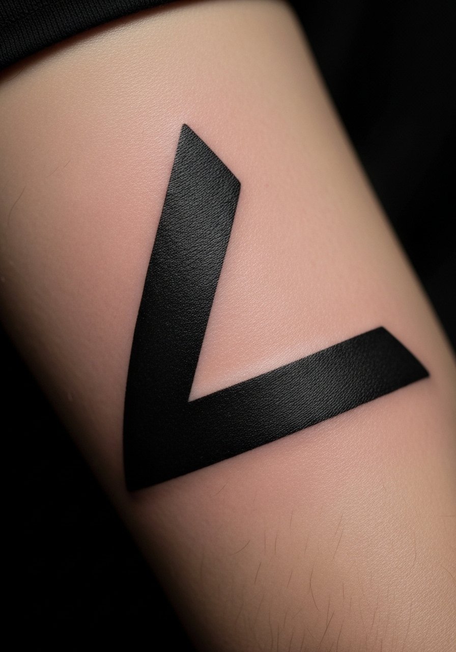
Visual impact lead: bold blackwork holds up well because saturation ages into clear shapes rather than soft lines. If you want longevity, ask for solid fill with clean edges rather than micro-shading inside triangles. The downside is heavy black in small areas can feel overbearing, so scale the panels to the forearm width. Expect more needle passes and a longer session, and anticipate lower touch-up frequency compared with fine line. For pairing, short sleeves or a casual short sleeve tee keep the panel visible and intentional.
12. Geometry Meets Script: Coordinates with Lines
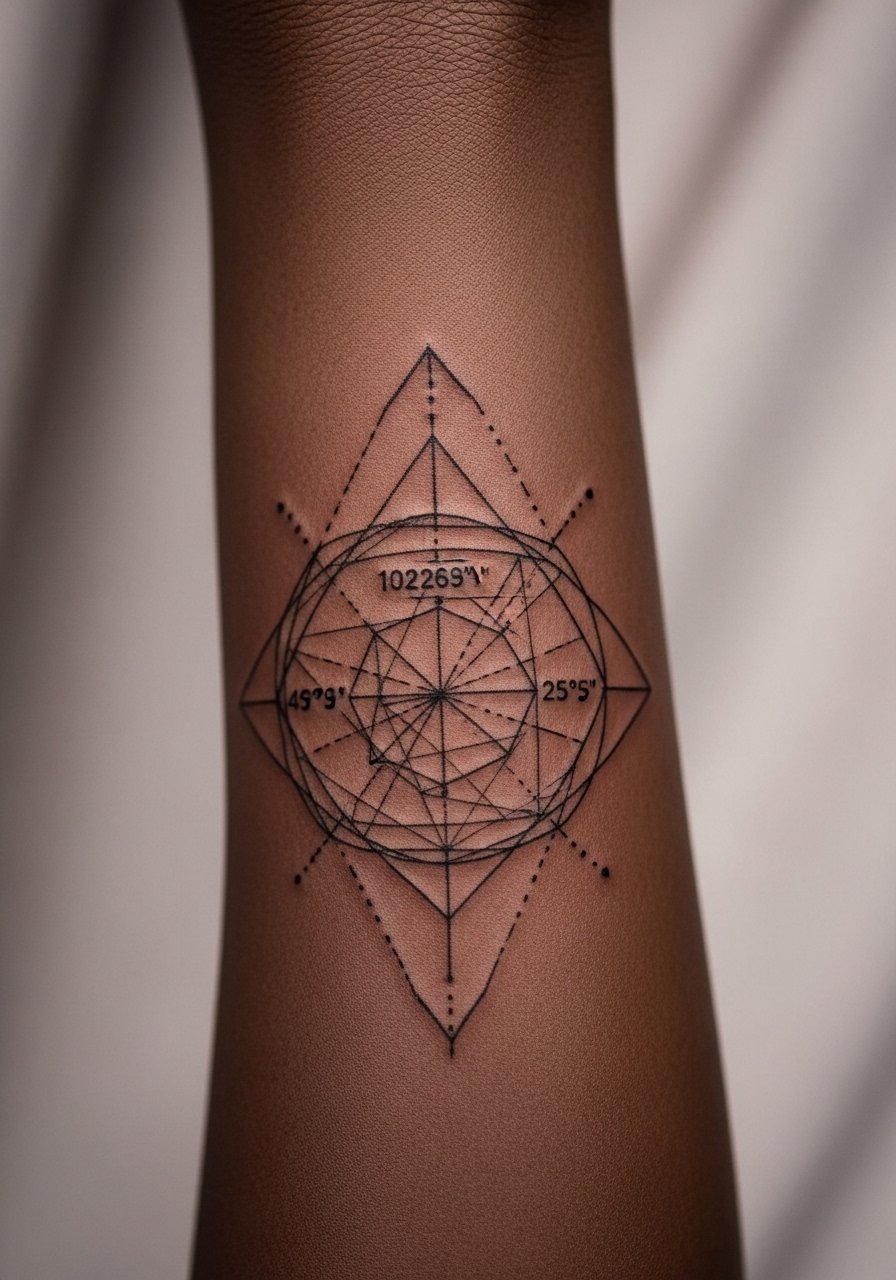
Consultation lead: bring exact wording for any visible text because image generators and printers need it. If you include coordinates, specify the font size and spacing to avoid tiny letters that blur. A common mistake is cramming script into a dense geometric field. Keep the script separate from busy geometry for legibility. Session time is short for coordinates but increases if you want integrated linework. This is a personal piece, so consider placement relative to career visibility.
13. Forearm Compass with Geometric Rays

Mistake lead: the biggest error with compass-based geometry is treating the compass as a sticker rather than a lived piece. Tell your artist to orient the compass so the top aligns with your wrist or elbow depending on how you want it to read. Expect moderate pain and a session around two hours. For showing it off, pair with a minimalist watch strap that complements the compass without covering the central point. Touch-up needs are minimal if negative space is respected.
14. Muscle-Flow Polygon That Accents the Forearm Vein Line

Visual impact lead: when geometry follows muscle flow it looks custom and intentional. Tell the artist you want the design to accent veins and tendons rather than cross them awkwardly. A mistake I often see is forcing a symmetric grid over an asymmetric arm. Expect higher sensitivity where the ink crosses thinner skin. This approach is subtle long-term and usually needs only light adjustments after the initial healing window.
15. Thin Line Concentric Circles Stack
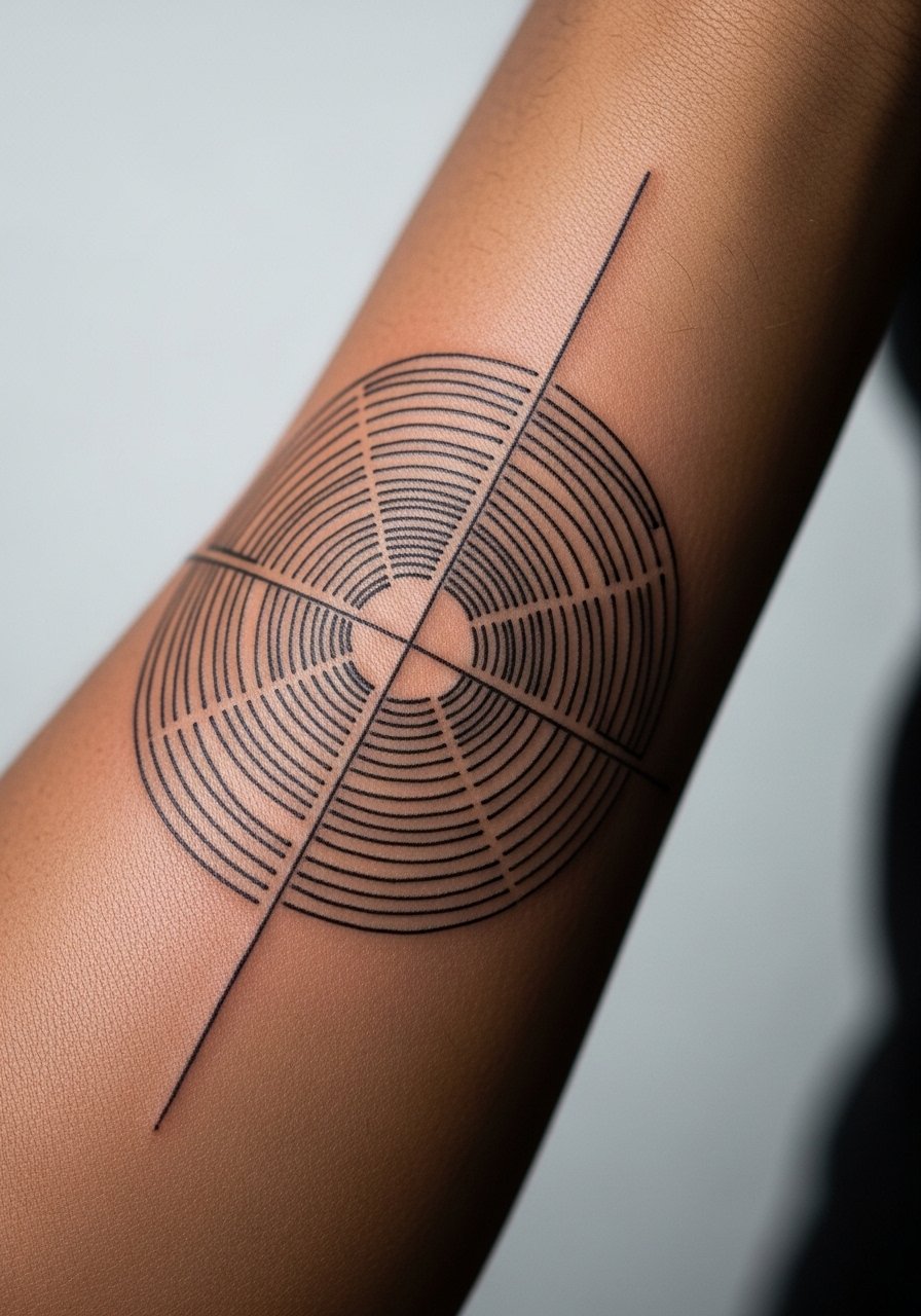
The aging reality lead: concentric thin lines can merge if circles are too tight. One camp believes micro-spacing is enough. The other camp suggests scaling circles larger with more negative space. I recommend deliberate spacing for longevity. Sessions are moderate in length and pain level is average. For casual showing, wear a short sleeve linen shirt to keep the stack visible without distraction. Touch-ups may be needed at year three for inner rings.
16. Fragmented Polygon with Scar-Friendly Placement

Consultation lead: if you have scars, bring clear photos so the artist can design around texture and thickness. A fresh angle is using negative fragments to incorporate scar edges instead of fighting them. Mistakes include trying to tattoo over raised keloid-prone tissue. Sessions can be more complex and the artist may test a small patch first. This design ages predictably because it uses bolder shapes that mask minor pigment shifts.
17. Layered Lines with UV Accent

Controversy lead: UV accents split people into practical and playful camps. One camp loves the hidden pop for nightlife. The other camp worries about long-term visibility and pigment stability. If you choose a UV accent, keep it as a small highlight rather than the main structure. Ask your artist about their experience with UV inks. Session time increases slightly and touch-ups for UV pigment are more likely. This is a fresh angle I have seen less often in forearm geometry.
18. Arrowed Geometry Pointing Toward Wrist

Mistake lead: arrows get lost if they are too thin or placed in a busy field. Tell your artist you want directional clarity so the arrows read as movement rather than random marks. Pain at the wrist end is higher, so be ready for a sharper sensation there. For styling, a simple leather strap watch keeps the wrist area framed without obscuring the arrow tips. Expect minor softening at two to three years.
19. Fragmented Dot Grid That Ages Into Texture
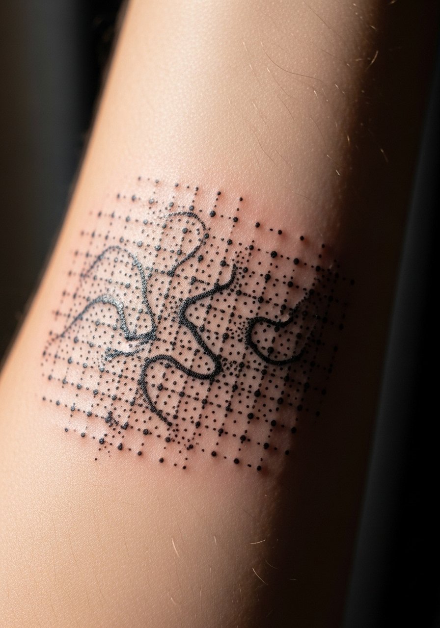
Aging lead: rather than fighting dot softening, this design leans into it and uses a fragmented grid so the loss of contrast becomes texture, not loss. Tell your artist you want the densest area to sit away from high-friction zones. A common mistake is placing the densest dots near sleeve edges. Sessions can be long because stippling is time-intensive. This is one of the unique angles that competitors often miss since it plans for the aging process from the start.
20. Forearm Wrap with Negative Space Arcs

Consultation lead: for full wraps, artists need clear stencils to ensure the pattern reads continuous when the arm rests. Mistakes come from misaligned repeats that break the wrap visually. Expect multiple fitting moments in the session. For casual outfits, a casual short sleeve tee works well to show the wrap without covering it. Touch-ups are usually localized rather than full wrap reworks.
21. Fine Line Geometric Portrait Accent on the Forearm

Consultation lead: mixing micro-portrait with geometry asks for precise scale planning. The common mistake is making the portrait too detailed for the small area, which blurs over time. Tell the artist to simplify facial detail and let the geometry carry the composition. Pain and session length depend on portrait realism. This hybrid is a modern take that still reads clean if planned for movement and touch-ups.
Frequently Asked Questions
Q: Will fine line geometric work on the forearm blur faster than bold blackwork?
A: From what I've seen, fine line tends to soften sooner because there is less saturation to anchor the shape. Bold blackwork generally ages into solid forms while very thin lines can merge. The outcome depends on spacing, depth, and sun exposure. If longevity is a priority, ask for slightly increased line weight and plan for a touch-up around year two or three.
Q: How do I decide inner forearm versus outer forearm for a mandala or band?
A: Consider visibility and movement. Inner forearm sees less sun but more contact with shirts, which affects friction. Outer forearm shows more in casual settings and takes more direct sunlight. Tell your artist which side you prefer for visibility and ask them to scale the pattern to the chosen plane so the design reads well in motion.
Q: Are wrist-adjacent geometric pieces risky because of constant hand use?
A: Yes, wrist-adjacent work faces more washing, typing, and watch friction, so fine details can fade faster. If you want crisp detail near the wrist, plan for slightly larger spacing, and accept that touch-ups are more likely. Protective film in the first days helps but does not prevent long-term softening.
Q: Should I plan my wardrobe around a visible forearm piece, and what should I wear to the session?
A: For showing off, light neutral rolled sleeves or short sleeve linen shirts complement geometric forearm work. For the session, wear a button-down or loose short sleeve so the artist can access the area without pressure. A recommended option is a loose button-down shirt that lets you pull the sleeve up comfortably.
Q: Can I mix dot work and solid black in the same forearm piece without it looking uneven over time?
A: You can, but plan it intentionally. Use solid black for anchors and stipple or dot work for texture. The key is to separate them with negative space or transitional elements so the dot work softens without making the solid areas look disconnected. Ask your artist to mock up the healed look so you can see the balance before inking.