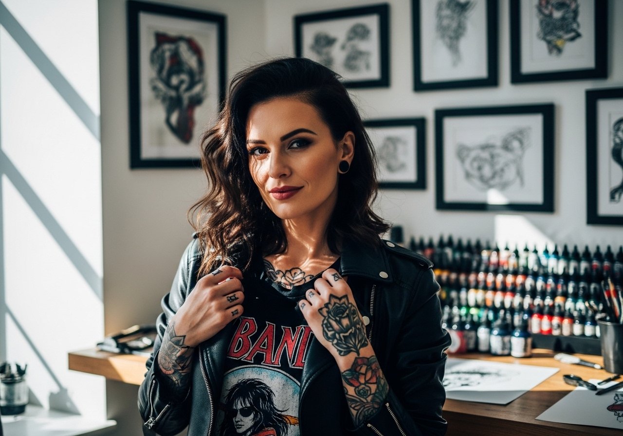
Fine line koi on fingers look effortless in photos, but the reality is a tight dance between needle depth, spacing, and daily friction. Tiny scales and soft linework can blur faster than you expect unless the design, placement, and aftercare are planned from the start. Below are 21 finger-friendly koi ideas that read clean when fresh and still look intentional after healing and a few touch-ups.
1. Micro Koi Along the Finger Side
A thin-profile koi that hugs the finger side stays sheltered from direct abrasion from palms and keys. Tell your artist you want a single continuous line for the fish contour and slightly thicker linework where the tail meets the body so contrast survives over time. Common mistake is packing tiny scales into the whole body, which causes the detail to merge in a year. Expect a short session under an hour and a likely touch-up around year two, depending on how much you wash your hands. For showing it off, try a delicate stacking ring on the adjacent finger to frame the piece.

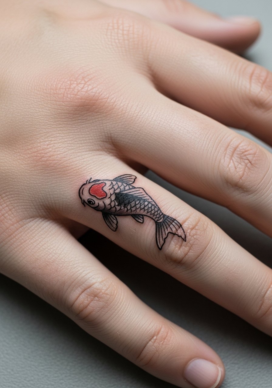
2. Tiny Colored Koi on the Top Knuckle
Fair warning, the knuckle gets more wear than the finger side so saturation needs care. I recommend a compact design with a bold color splash over the dorsal area to read longer. During consultation, ask for slightly heavier black outlines paired with a single saturated color patch rather than full color fill. The mistake is asking for gradient shading across the knuckle in a tiny piece. Session feels brisk but tender when the needle crosses the joint. For evenings out, a thin leather bracelet keeps attention on the hand without covering the knuckle art.
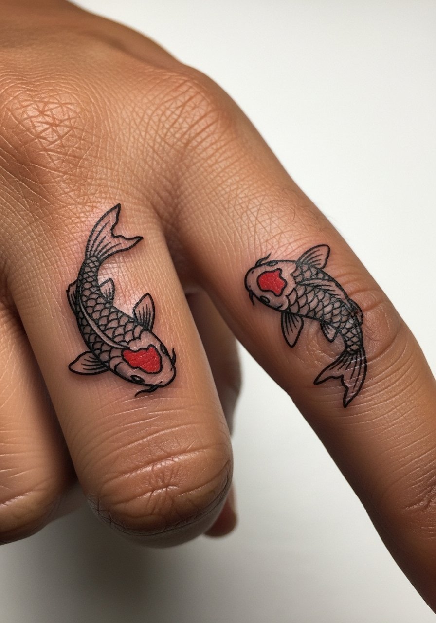
3. Side-By-Side Mini Koi That Wrap Slightly
There is a nice visual in placing two tiny koi along opposite sides of one finger so they appear to swim around a single axis. In consultation, specify mirrored anatomy so tails do not collide when the finger flexes. Aging-wise, two small pieces that share a narrow border risk line merging if placed too close. Ask your artist to leave a hairline gap between bodies to prevent blowout. The session will be detail-focused and may take longer than a single finger piece. Pair this with a minimalist ring set when you want to highlight symmetry.
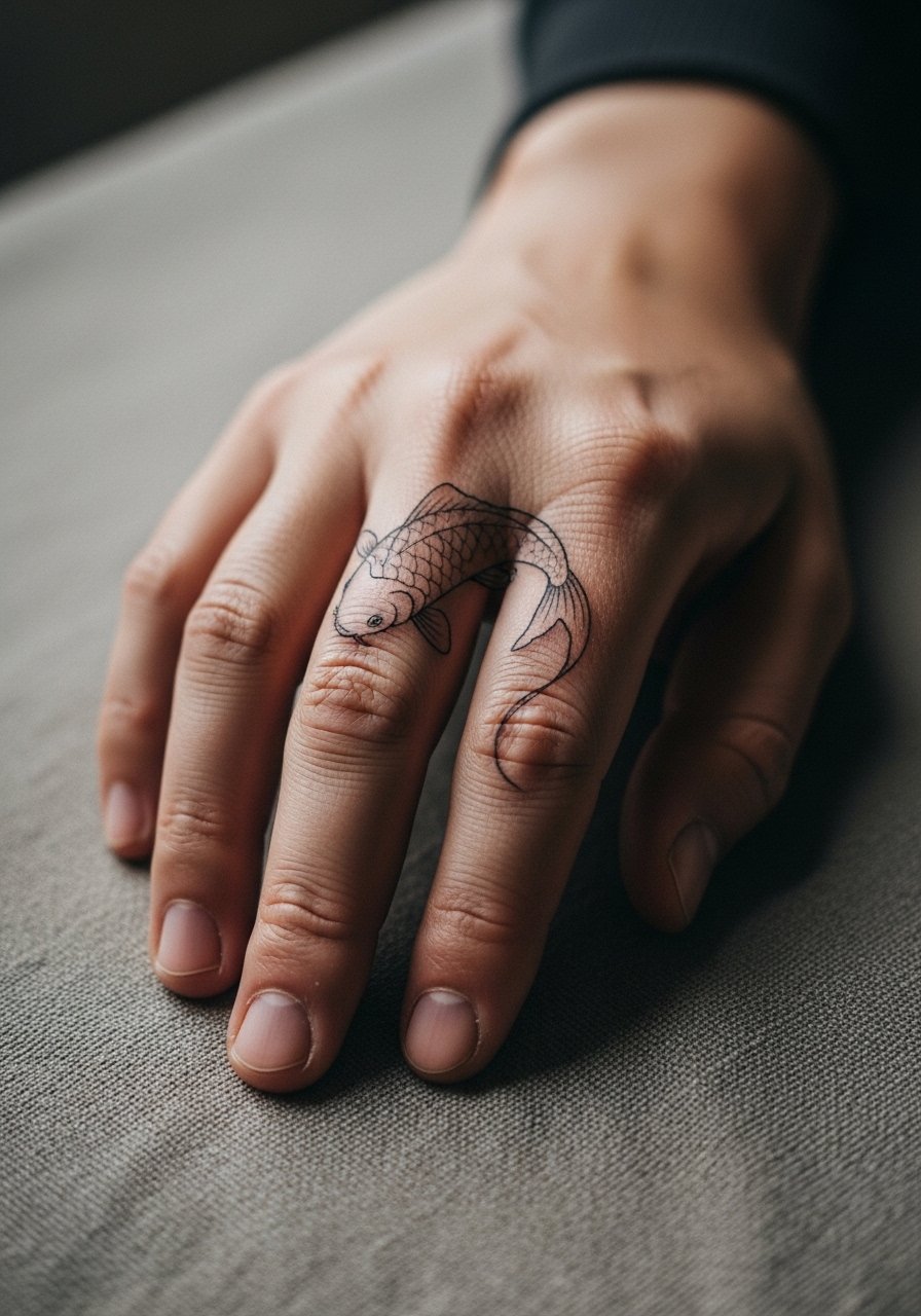
4. Crescent Koi That Curves Toward the Nail
A crescent-shaped koi that follows the proximal phalanx lines feels deliberate and holds composition when photographed. Tell the artist to orient the fish so the head points toward the nail or toward the palm. Common mistake is putting the head at the wrong angle, which reads awkward with jewelry. This placement can feel sharp when the needle hits near the joint. Expect touch-ups earlier if your job means heavy manual work. For session comfort, wear a loose short-sleeve shirt so the artist can position the hand without fabric tugging.

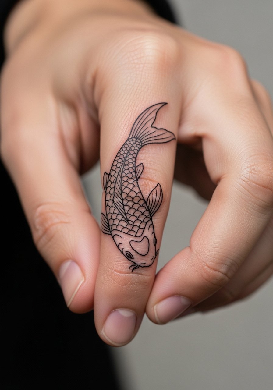
5. Minimal Outline Koi With Dot-Work Scales
Dot work gives scale texture without dense lines that can blur on finger skin. Ask for stipple shading concentrated toward the belly and tail so the head maintains clean linework. The aging reality is stipple preserves better than tight hatch shading here. A mistake people make is expecting full tonal gradients in a micro spot. Session time is moderate because of dot work pacing. For show-off styling, layer a thin chain bracelet low on the wrist so the finger work reads as a subtle extension.

6. Single Line Koi That Reads Like Script
There is a clean look when a koi is suggested with a single confident line and a few interior accents. When you ask for this, mention continuous flow and steady line weight so the fish does not appear tentative after healing. The common error is asking for hairline strokes that disappear into the skin texture. This option is lower contrast when healed but ages gracefully if kept simple. The session is quick and often under forty-five minutes. For a polished presentation, wear a racerback tank so your hands are free during the appointment and the artist can position the limb easily.

Studio Day Picks
The finger placements above face frequent friction from washing and typing, so a small kit that protects linework and eases the session helps the first week.
-
Stencil transfer paper kit. Lets you test mirror placement on the finger before the needle touches skin, which matters when the design wraps a joint.
-
Topical numbing cream. Applied as instructed it reduces sharpness over knuckles and short sessions without changing how the artist lays linework.
-
Thin protective film roll. Keeps fresh finger tattoos cleaner through handwashing and lowers scab irritation from frequent contact.
-
Fragrance-free gentle body wash. Cleans the area without stripping moisture which helps fine line retention in the first two weeks.
-
Aquaphor healing ointment. A thin application over the first few days supports skin hydration for tiny linework while avoiding clogged needle channels.

7. Tiny Blackwork Koi With Bold Halo
Blackwork scaled down is a good choice if you want contrast that survives. Start the consult by asking for a slightly wider outline and a negative-space halo rather than interior black fill. The mistake is crowding the interior with black dots which age into an unrecognizable blob on fingers. Expect the session to be a bit stingy around the nail bed. For outfits, a thin cuff bracelet helps the hand read as styled rather than tattooed when you want to show the piece.
8. Minimal Koi With Subtle Scale Stipple
A minimalist koi with stipple texture reads delicate and intentional. Tell your artist you want the stipple density light near the head and heavier toward the tail so the focal point stays crisp. The common mistake is packing stipple too densely for the small canvas, which accelerates fading. The session is slow because stippling is methodical. Expect touch-ups at year two or three if you are often outdoors. Sensitive placement note, fingers can be tricky for certain job roles so think about visibility before committing.

9. Tiny Koi That Curves at the Knuckle Crease
Designing the koi to curve with the natural crease helps the piece maintain shape when the finger flexes. In the consult, ask the artist to place the head over the wider phalanx and the tail toward the crease. A common mistake is centering the design on the joint which leads to distortion when the finger bends. The session will be more sensitive over the crease. For session wear, choose a loose button-down shirt you can pull aside so the artist can rotate the wrist without fabric bunching.
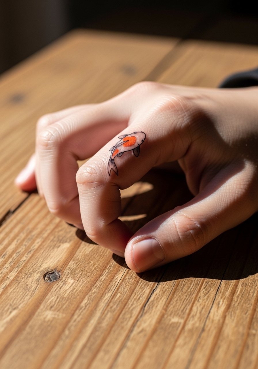
10. Micro Koi with Tiny Wave Accent
Adding a tiny wave or water accent around the koi keeps the narrative readable when details fade. Tell your artist to keep water marks open and airy rather than dense dark shading. The mistake is small heavy shading that fills the negative space and steals contrast from the fish. Expect a short session and touch-ups based on how often you rub your hands. For showing the piece, stack it with a thin silver ring to keep attention on the shape rather than isolated detail.

11. Koi Running Toward the Nail Bed
Orienting the koi so it swims toward the nail creates movement and photographs well. During the consult, specify that the head align with the nail flank to avoid awkward cropping when you wear rings. The error is placing the head too close to the cuticle, which risks losing line clarity from natural nail maintenance. The session may feel sharp near the nail bed. For daily wear post-heal, a thin ring guard can be used if you want protection for the adjacent jewelry.
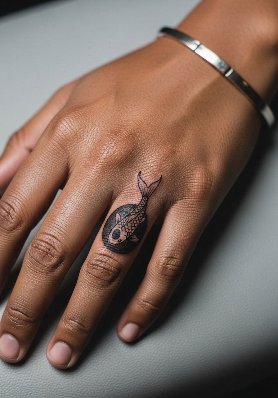
12. Negative-Space Koi for High-Contrast Look
Using negative space as the koi silhouette keeps the surrounding black simple and readable. Tell the artist you want open skin areas to form the fish rather than detailed interior work. The common mistake is overcomplicating the surround, which reduces clarity on a tiny finger. This approach ages well because the contrast dependency is straightforward. Session time varies with the background fill. For career considerations, negative space can be less visually aggressive while still bold.

13. Micro Irezumi-Inspired Koi Accent
A tiny nod to Japanese style works if you keep the iconography simplified for the finger. Ask for stylized fins and a single scale row rather than the full traditional pattern. Artists split on how much traditional detail translates to micro sizes. One camp says simplified motifs keep the feel, the other camp warns that micro Irezumi loses cultural context when shrunk. Name your intention in the consult and ask the artist for respectful simplification. For sessions, wear a loose drawstring linen pant so you can stay comfortable while the artist works on small motions.

14. Tiny Two-Tone Koi With Accent Scale
A two-tone approach uses one color for the main body and a contrasting tiny patch for the scale pattern. Specify limited palette in the consult so color placement reads as intention rather than noise. Wrong move is asking for more than two colors in a micro spot. Expect slightly longer session times because color packing takes care. For after the session, avoid abrasive rings for the first two weeks to protect the color.
15. Tiny Koi with Tail That Wraps the Finger Edge
When the tail wraps the outer edge it creates motion without crowding the knuckle. Tell your artist you want the wrap subtle and limited to the lateral nail edge. A common mistake is overwrapping which ages into a smudged silhouette. The session can be fiddly because the hand must be positioned precisely. For showing off, pair with a minimalist ring set that sits just below the tattoo to frame the tail.

16. Linear Koi That Follows the Finger Crest
A clean linear koi placed along the finger crest reads like a small bracelet. In a consult, request the main axis match the finger natural ridge so the piece does not twist with motion. The mistake is ignoring skin grain which creates uneven line weight after healing. Expect a low to moderate pain level. Touch-ups are common at the two-year mark when repeated contact softens edges. For practical session prep, bring a thin chain pendant necklace if you want something easy to remove while the artist works.

17. Micro Koi With Tiny Floral Accent
Pairing a koi with a single tiny floral accent adds context and helps the eye focus. Ask for the flower to be an anchor, not an additional texture field. A common error is clustering more floral detail than the finger can handle. The added motif often ages better because it gives a stable focal point. The session takes extra time for the flower detail. For showing it off, wear a thin chain bracelet or a small watch to balance visual weight on the hand.

18. Minimal Koi With Geometric Accent Line
Combining a minimalist koi with one geometric accent line gives a modern edge. During the consult, make the geometry secondary and light so it does not compete with the koi silhouette. A mistake is adding dense geometry which ages into visual noise. Expect a precise, short session. For an appointment, choose a loose short-sleeve shirt to keep the artist from working against clothing.

19. Micro Koi With Tiny Metallic Ink Accent
Some people ask for a tiny metallic ink accent for a subtle shimmer effect. Not all shops use metallic inks, and there are two camps. One group accepts metallic accents and has compatible inks and testing routines. The other group avoids them due to pigment stability and allergy concerns. Ask your artist where they land and what patch testing they do. If approved, keep the metallic minimal and expect slower fading than standard pigments in some cases. For styling, a slender thin silver ring pairs naturally with metallic touches.

20. Tiny Koi With Scripted Wave Line
A small scripted line that suggests water creates context and movement without dense imagery. Request open calligraphic strokes and avoid heavy shading near the lettered wave. The mistake is crowding script near tiny scales which blurs into slashes over time. Sessions feel quick but require steady hands from the artist. For after the appointment, keep rings off the finger for a few days to reduce scab rubbing.

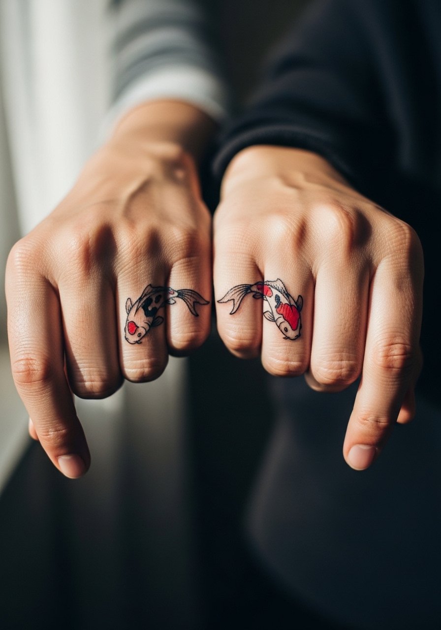
21. Linked Koi That Spans Two Adjacent Fingers
A linked design that connects across two fingers works well when the negative space between fingers is part of the composition. During consultation, discuss spacing for daily gestures like typing so the link does not distort. The common mistake is forcing a continuous line across a joint without accounting for skin movement. This design can require a slightly longer session and a planned touch-up window at year one. For wear after healing, consider a delicate stacking ring on the inner finger to accent the gap gracefully.
Frequently Asked Questions
Q: How long do micro koi finger tattoos usually stay crisp before a touch-up?
A: It depends on placement and daily wear. Fingers see more friction and sun exposure than other sites so many micro pieces need a touch-up between year one and year three. If your job is hands-on, expect the earlier side of that window. Ask your artist about planned touch-ups during the consult.
Q: Are finger koi more prone to blowout than the forearm versions?
A: Yes, fingers have thin skin and movement that raises blowout risk. A safe approach is slightly thicker outlines, fewer tiny interior details, and spacing from joints. Talk to artists who show healed finger portfolios and ask how they avoid blowouts.
Q: Can colored koi on fingers keep their vibrancy?
A: Color can hold if packed conservatively and limited to one or two areas. Intense fills in micro spots fade faster when rubbed. If you want color, plan for periodic color refreshes and protect the area from UV during the first year. For showing off color after healing, consider pairing with a thin chain bracelet to frame the hand.
Q: Will a design that wraps a knuckle distort when I bend my finger?
A: Some distortion is natural with any design crossing a joint. Good artists use the crease as a compositional element so the piece reads well both relaxed and bent. Discuss how the image should look in both positions during your consultation.
Q: Is it risky to get micro cultural-style koi inspired by traditional motifs?
A: There are two viewpoints. One says simplifying a traditional motif can honor the aesthetic without copying sacred compositions. The other argues some traditional elements lose meaning at micro sizes. Be transparent with your artist about why you want the motif and ask for a respectful, simplified approach if you are unsure.