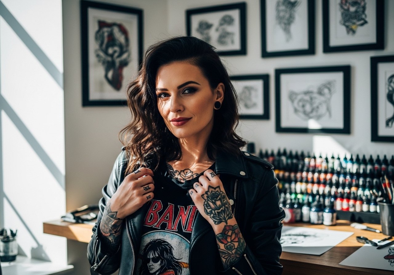
Fine line hand work looks delicate on a phone screen and different in the chair. The skin on fingers and the back of the hand moves, rubs, and sees sun in a way forearms do not. That reality changes the design choice more than most people expect. Start with pieces built to breathe and to be refreshed, and the ideas below show how matching hands can look right now and in five years.
1. Matching Minimalist Finger Initials
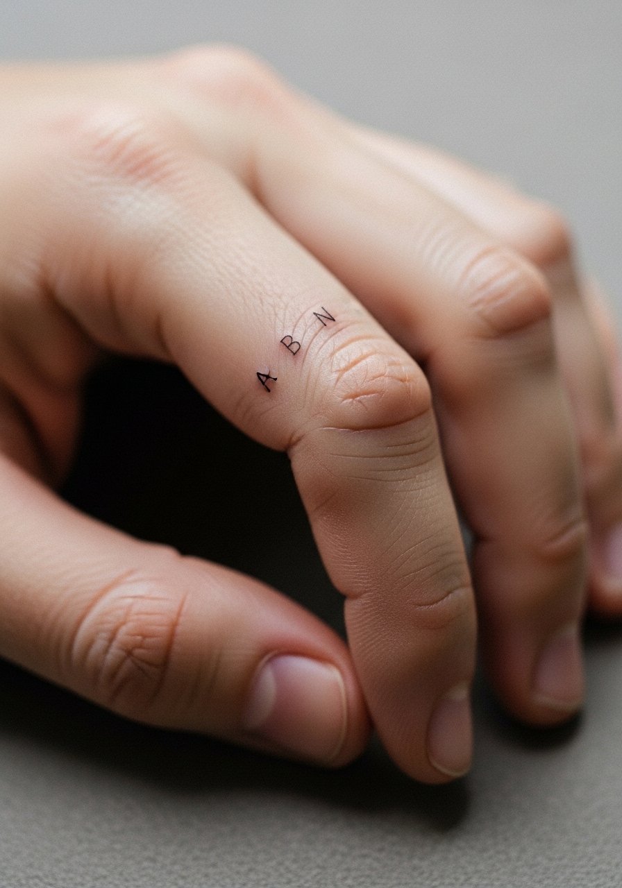
Start with initials when you want a discreet twin signal that slips into everyday life. I recommend keeping letters slightly taller than most script flash so the ink has room before lines merge. Tell your artist you want single-needle linework with a hair more spacing than usual. A common mistake is asking for letters that are too ornate. That detail looks great day one and loses clarity quickly on fingers. Expect a touch-up window around year one to two. For showing it off, stack a dainty chain bracelet on the same hand to frame the initials without crowding them.
2. Tiny Matching Heart on the Side of the Finger
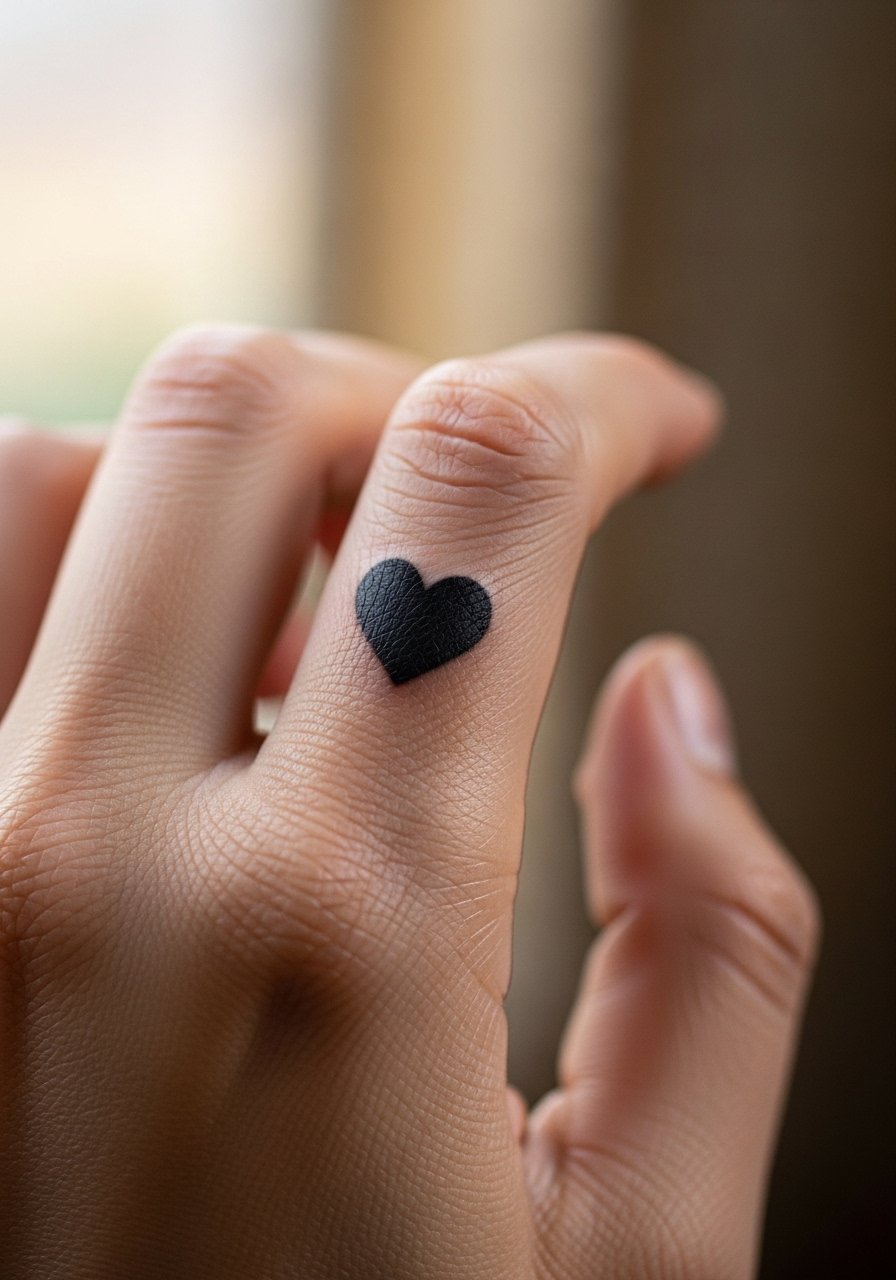
There is a real appeal to the side-of-finger heart because it reads as intimate when hands meet. I advise a compact filled shape rather than thin outline. Solid saturation holds up better against hand friction. During consultation, ask for slightly bolder packing so the heart keeps shape after the first year. The session pain is brief but sharp. Commonly people request the heart too small and then need an early touch-up. For a subtle show-off, pair it with a thin rose gold midi ring that sits just above the tattoo and draws attention without rubbing the ink.
3. Mirrored Micro Constellations Across Knuckles
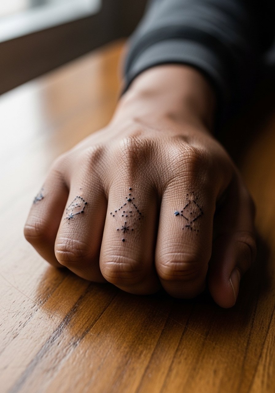
Constellations feel custom without huge commitment and they scale well to knuckles. The trick is leaving breathing room between stars so the dot work does not merge into a line over time. When you book, bring a clear reference of spacing rather than a dense cluster. The knuckle skin is thin and will sting more than the wrist. Blowout risk is higher when lines are placed over the joint. Expect these to soften by year two and plan a light touch-up around that time. For wearing, short-sleeve shirts keep the hands in view and a soft linen button-down rolled at the cuff frames the knuckles nicely.
4. Matching Tiny Script on the Side of the Palm
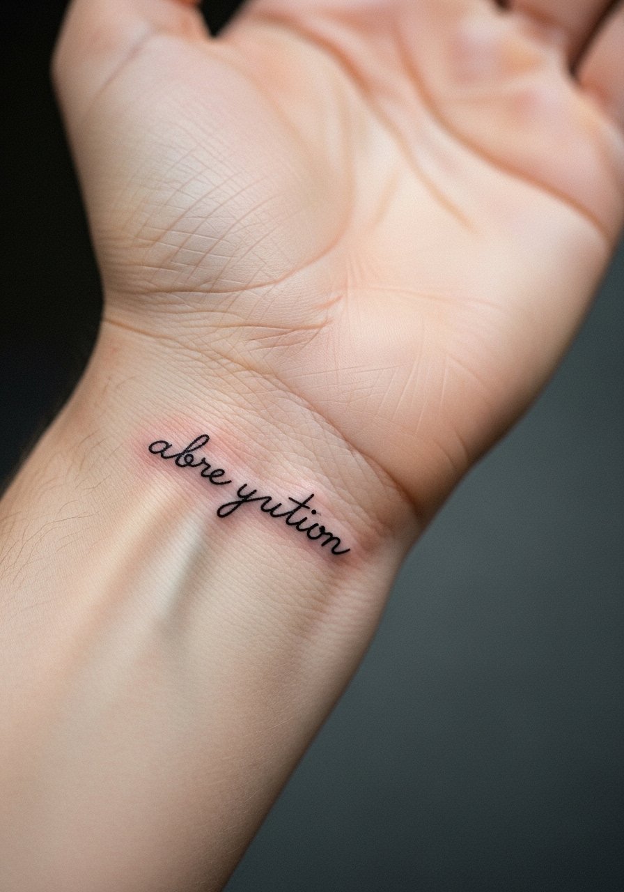
Script on the palm edge reads private unless you lift your hand. For longevity pick a clean, low-contrast script with letters that do not interlock. Tell your artist you want slightly more space between letters than a normal script layout. The palm skin is one of the fastest to lose definition because of washing and friction. One camp of artists avoids palm script since it fades fast. The other camp says with tight saturation and planned touch-ups it can work. Ask where your artist stands. Session discomfort is moderate and healing needs careful dry times. Wear a loose cotton glove to protect the area lightly in the first few days if you expect heavy hand work.
5. Matching Outline of a Tiny Crescent Moon on the Thumb Side
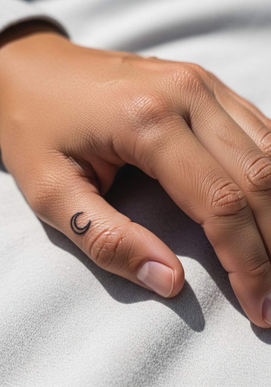
The thumb-side crescent is visible when holding a cup and discreet when hands are relaxed. For the best lifespan choose a single clean line with moderate line weight. The biggest mistake is asking for an ultra-fine outline there. The thumb sees a lot of flex and the ink can blur if under-tattooed. Talk to your artist about slightly deeper placement without heavy saturation so the line settles rather than blows out. Pain is noticeable but brief. This placement pairs well with a minimalist leather band watch that frames the hand without rubbing the crescent directly.
6. Matching Tiny Floral Dot Work on the Back of the Hand
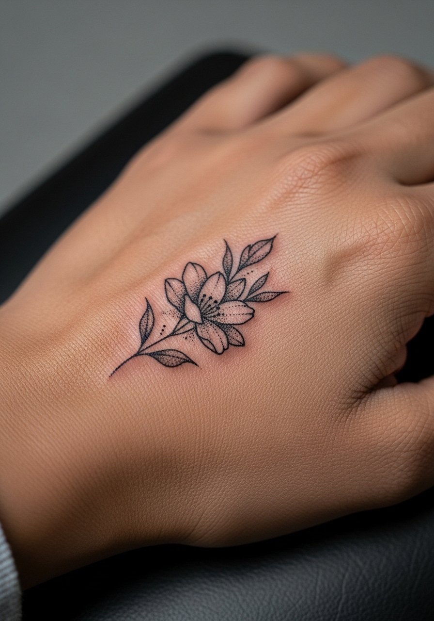
If you want a visible shared piece, small stipple florals on the back of the hand read soft and deliberate. Request dot work or stipple shading rather than dense gray wash. That technique gives texture without heavy saturation that can look patchy after sun exposure. A common error is packing too much detail into a tiny canvas. Tell your artist to design for scale with larger dots and more negative space. Hands get more sun and will need protective sunscreen in time. Expect touch-ups sooner than for forearm pieces. For dressing, a lightweight cotton ring scarf can add style while keeping the floral visible on cool days.
Pre-Session Essentials
The finger and back-of-hand pieces above need different prep from forearm work, and a few deliberate items smooth the session and the first week.
-
Stencil transfer paper kit. Lets you preview line placement on small areas like fingers so both people agree on scale before the needle.
-
Topical numbing cream. Applied per the product instructions eases the sharper sting on knuckles and thumbs without changing how the artist lays the linework.
-
Thin protective film roll. Works well for fingers and the back of the hand where washing and typing cause friction in the first days.
-
Fragrance-free body wash. Cleans the area during showers without stripping the delicate needle channels that fine line work depends on.
-
Aquaphor healing ointment. A thin layer in the first few days keeps tiny linework hydrated without clogging pores.
7. Matching Tiny Anchor at the Base of the Thumb
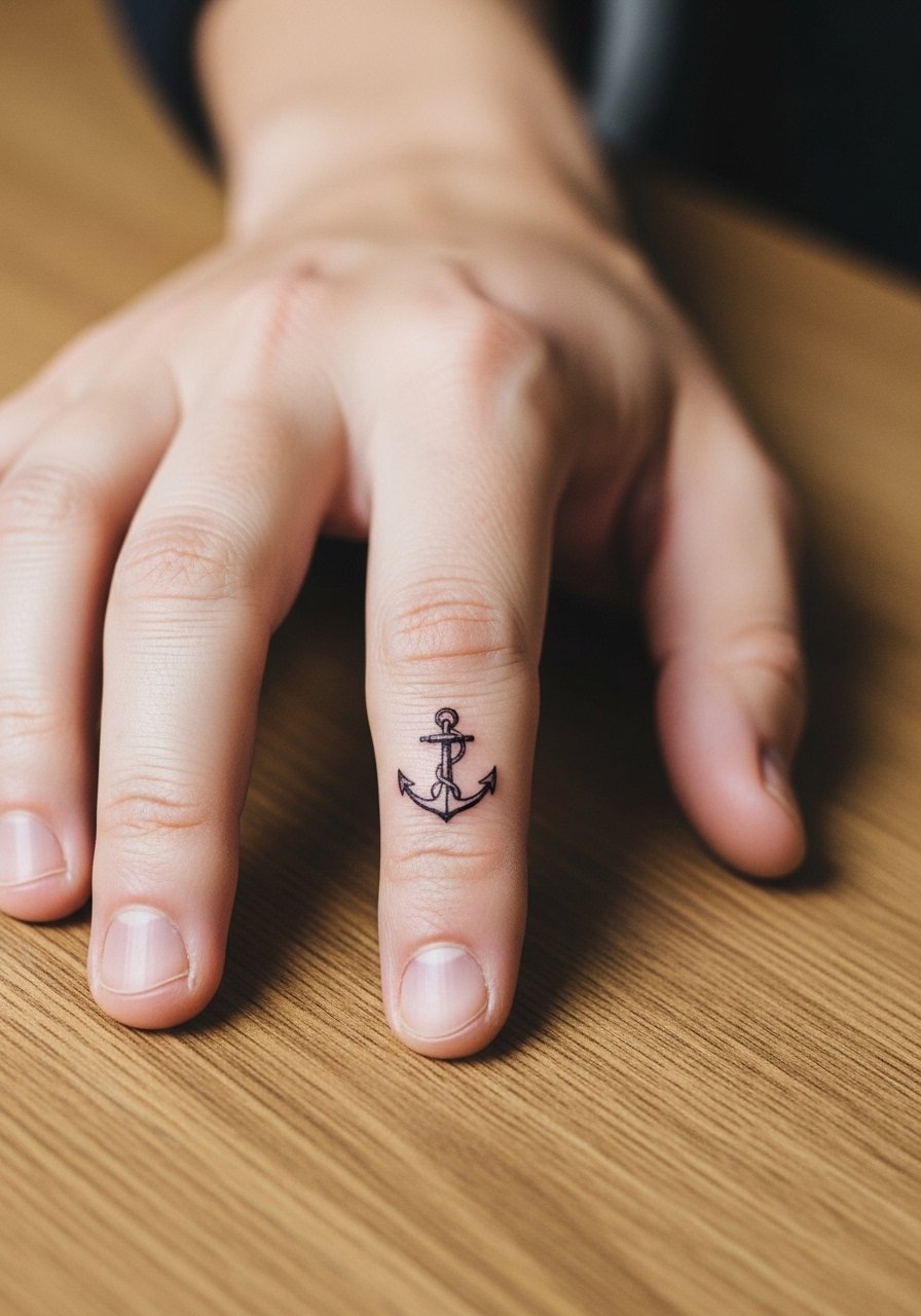
An anchor on the thumb base has old-school symbolism but in micro form it reads modern. I recommend a slightly compact silhouette that keeps the shank and flukes clear. Ask your artist to avoid tiny cross hatching inside the anchor. The base of the thumb moves a lot so small cross-hatch ages into blotches. Pain is brief and more focused than on the wrist. Expect touch-ups by year two as the edges soften. For the session wear a short sleeve top so the artist can access the hand cleanly without full arm exposure.
8. Matching Tiny Geometric Line Motifs on the Side of the Hand
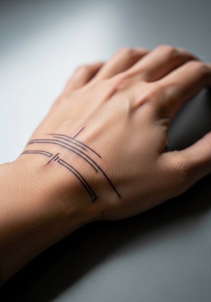
Geometric motifs translate well across two hands because they read clean at a distance and detailed up close. The key is giving each line enough separation. The biggest mistake is stacking too many thin lines in a small space. Tell your artist you want modest spacing and a slightly heavier line weight than the sketch. Hands are unforgiving with fine geometry. Expect the piece to blur earlier than on flat forearm skin and plan a touch-up at year one if you want crisp repetition. Pair this look with a minimal cuff bracelet to echo the parallel lines without overcrowding.
9. Matching Tiny Paw Print on the Top of the Hand
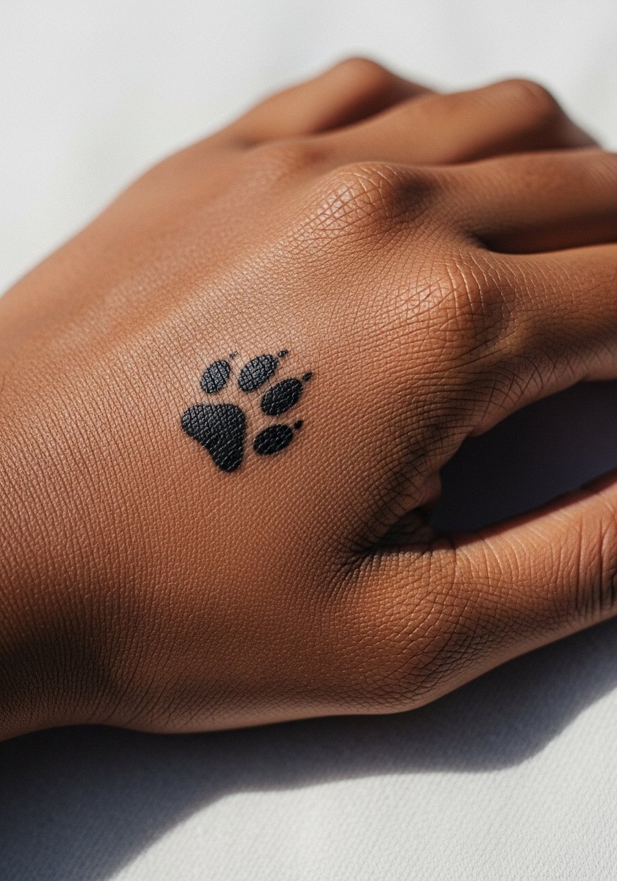
Paw prints are a friendly matching option that read clearly when kept slightly larger than you might expect. Ask for a filled silhouette with simple pads rather than dotted shading. The top of the hand sustains wear and sun, so solid packing helps the shape remain legible. A mistake is shrinking the print to novelty size. That makes it disappear quickly under daily friction. Pain is moderate and healing can scab more on the raised areas. For showing it off, short sleeves and a linen summer shirt keep the hands visible without extra sun exposure.
10. Matching Micro Arrow Along the Outer Edge of the Hand
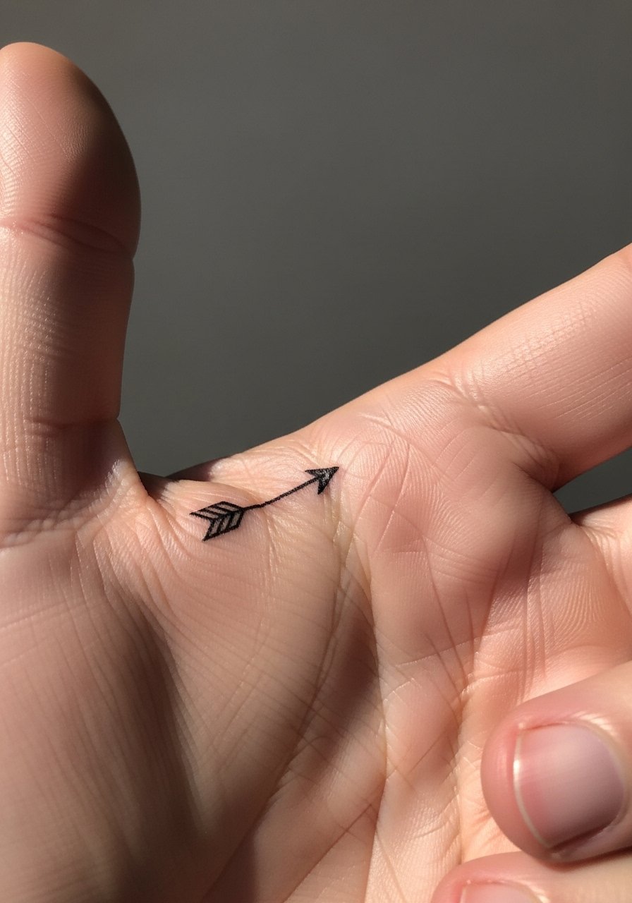
An arrow placed along the hand edge has directional energy without taking much space. Recommend a clean stem and a modest head that does not rely on tiny feather details. The outer edge sees stretching when you grip objects, which can make fine feather lines merge. Tell your artist to favor a slightly bolder head and a straight clear shaft. Sessions are quick and the discomfort is lower than at the knuckle. Expect softening by year two and budget a touch-up if you want the arrow to remain sharp. Try a thin leather wrap bracelet on the same hand for a subtle pairing.
11. Matching Tiny Birth Coordinates on the Side of the Finger
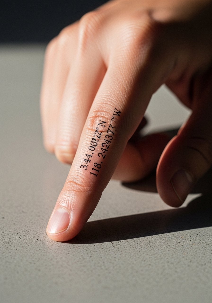
Coordinates feel private and specific. For fingers use condensed numerals and allow a little extra spacing between groups so the numbers do not blur together. A common mistake is requesting long strings of numbers in tiny type. That makes them unreadable after the first year. Discuss numeric spacing with your artist and request a simple serif that holds up better than script. Pain is quick and focused. Plan for a touch-up in one to two years. For a refined look, wear a fine signet ring on the same hand that complements the numeric detail.
12. Matching Tiny Leaf Outline on the Webbing Between Thumb and Index
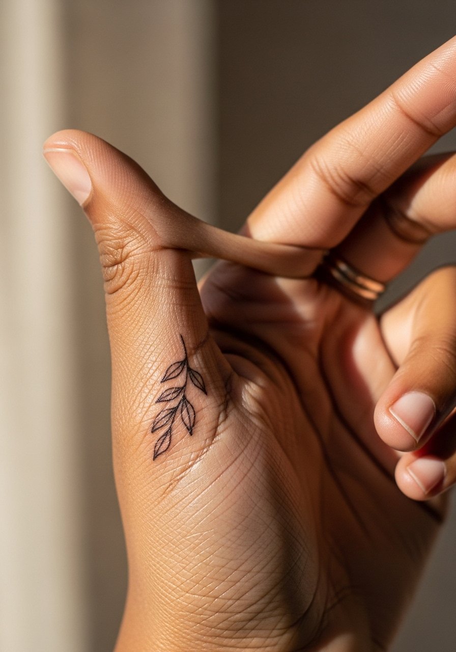
Webbing tattoos sit in a high-movement area so choose simple shapes. A single-leaf outline with slight spacing inside the vein line keeps the design readable. The controversy here is clear. One group of artists says webbing is a no-go because the constant flex will destroy fine line. The other group says with careful depth and planned touch-ups it is possible. Ask your artist how they handle webbing and what touch-up schedule they recommend. The session can be ticklish and the healing needs gentle protection. Keep hand creams off the area in the first week and consider a temporary soft finger sleeve if you expect heavy use.
13. Matching Tiny Music Note on the Side of the Hand
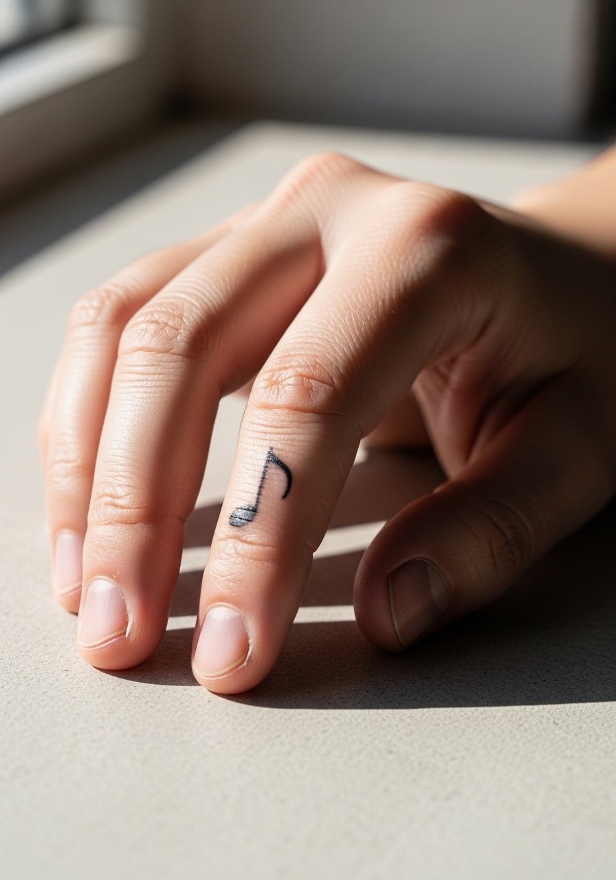
A music note is a playful shared piece for partners who sync playlists. Pick a bold filled note rather than a fragile stem and flag. Thin stems can migrate on the hand surface. Tell your artist you want clean packing in the note head to preserve visual weight. The pain is brief and the session short. Over time the flags can soften so factor a touch-up into year two or three if you want the symbol to stay crisp. For evenings out, a delicate metal knuckle ring sits near the note without rubbing the area.
14. Matching Tiny Arrowhead on the Outer Finger Near the Nail
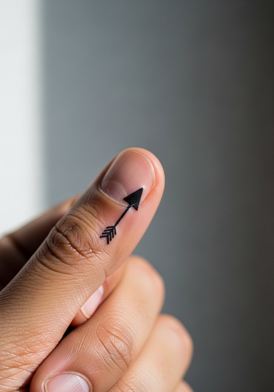
Placing a solid arrowhead near the nail is a compact option that reads bold despite tiny scale. Solid shapes age better than intricate filigree in that spot. The common error is requesting an outline only. Outlines can vanish against constant hand use. Ask for solid packing in the head and a tapered shaft if you want motion implied. The session is quick and mildly painful at the fingertip. Expect touch-ups as early as year one. Match with a clear resin nail ring or simple manicure to keep attention near the nail without harming the tattoo.
15. Matching Tiny Keyhole on the Side of the Palm
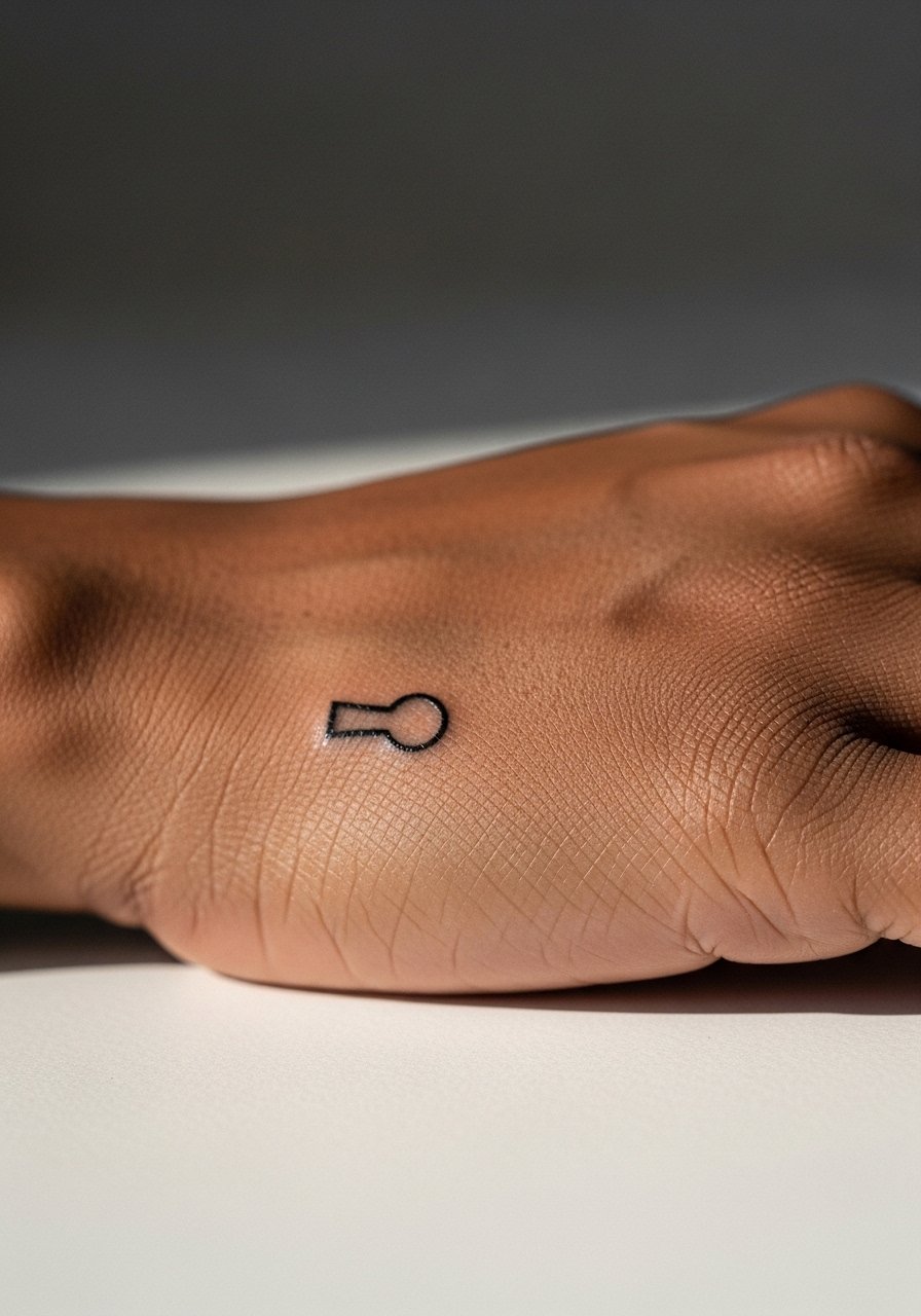
A keyhole is symbolic and fits small hand anatomy. Keep the silhouette simple and slightly taller than wide so it keeps proportion when the skin moves. People often ask for ornate Victorian keyholes that do not translate to the palm. That detail blurs fast. Tell your artist you want a modern simplified shape with clear negative space. The palm area experiences heavy washing and will require touch-ups sooner than dorsal hand work. The session discomfort is moderate. For protection during the first week, a soft cotton hand wrap can help reduce friction when you sleep.
16. Matching Tiny Anchor Outline on the Ring Finger

Ring-finger anchors function like minimalist commitment marks with a nautical nod. Choose a slightly bolder outline than you think you need so the anchor keeps definition. The usual mistake is requesting needle-thin outlines that become ghost marks. Discuss outline thickness and negative space with your artist. The finger will need a touch-up in the first two years if you want the shape to remain defined. Slip on simple bands that do not directly rub the ink. A thin silicone ring is wearable and gentle while the ink settles.
17. Matching Tiny Wave Line Along the Side of the Hand
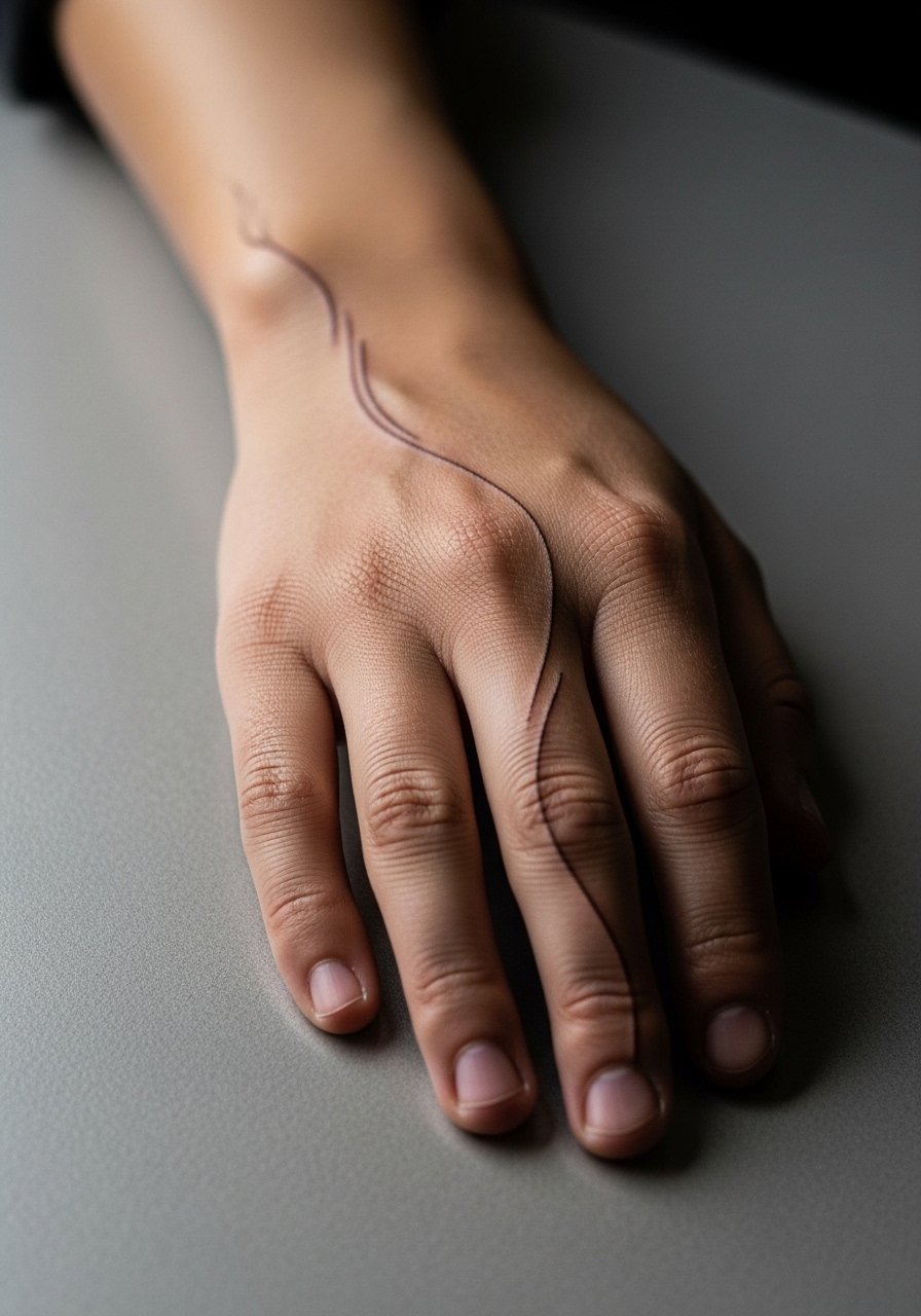
A single wave line carries meaning with minimal ink. The line should breathe and avoid very tight curves that can merge. Ask for a slightly thicker single pass so the wave remains legible after a year of sun and hand use. The skin here flexes when you grip and that can make acute peaks soften. Expect a touch-up window at year two. For casual days, rolled sleeves and a soft cotton bracelet let the wave peek out without constant sun exposure.
18. Matching Tiny Sun Glyph Near the Base of the Index Finger
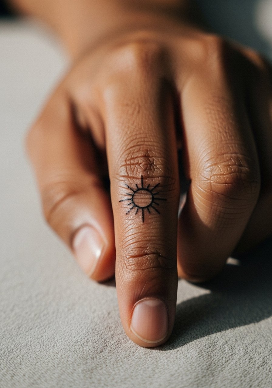
Sun glyphs can be graphic yet small. Request simplified rays and a solid center to prevent spidery lines that vanish. The mistake is asking for too many thin rays. Those thin rays are the first to lose edge under hand wear. Sessions are brief and a little sharp. Over time the rays merge so expect a touch-up if you want crisp radiance. Pair with a subtle brass band ring to echo the circular motif.
19. Matching Tiny Mountain Silhouette on the Back of the Hand
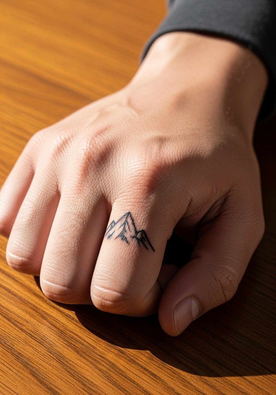
Micro mountain silhouettes read bold because of their contrast. Keep peaks few and avoid inner texture. The common error is asking for topographic detail in micro scale. That detail collapses with sun and friction. Ask for a flat silhouette with one or two peaks and clear negative space below. Healing is straightforward but sun protection matters. Plan for a small touch-up at year two to keep peak edges sharp. For outdoorsy matches, a thin braided leather bracelet ties into the theme without rubbing the tattooed zone.
20. Matching Tiny Lock and Key Across Two Hands
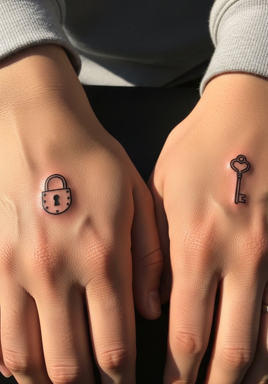
Lock-and-key pairs read like a private code between two people and work well when each piece is slightly larger than you expect. Avoid excessive fine detail on the key teeth. A solid silhouette keeps the shapes readable. One camp favors heavy packing for longevity. Another camp recommends minimal saturation with planned touch-ups. Ask the artist which approach fits their technique. The hands will see different wear patterns so anticipate touch-ups at different times. For pairing, a thin matching chain bracelet on both wrists creates visual continuity.
21. Matching Tiny Paper Plane Near the Wrist
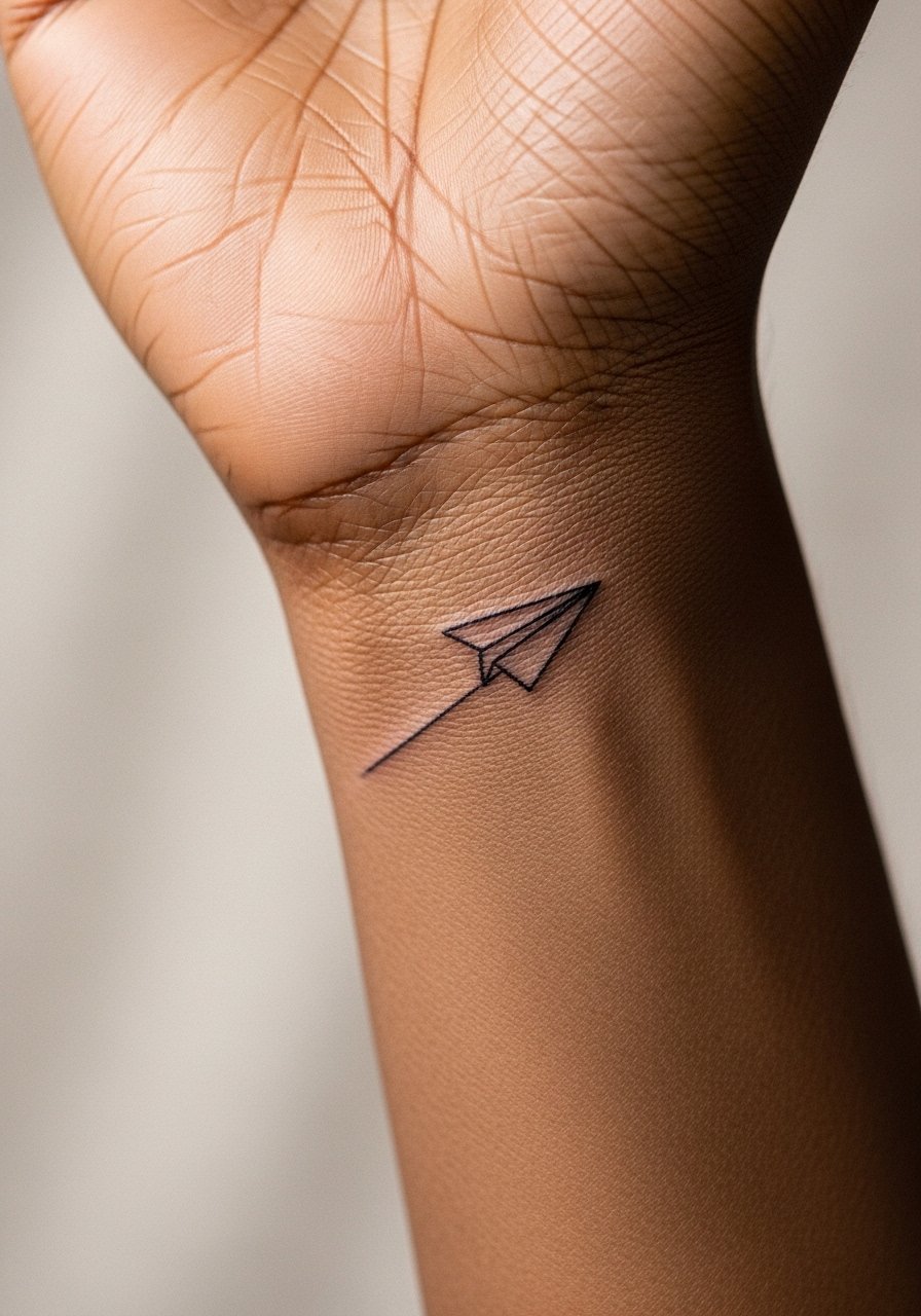
A paper plane near the wrist has motion built into a tiny silhouette and reads playful without being juvenile. Keep folds simplified and avoid tiny hatch marks that will blur. Tell your artist you want a single clean pass with a slightly bolder outer line than shown in your reference. Wrists are exposed to sun and jewelry, so plan for periodic touch-ups if you want the crisp fold lines maintained. The session is quick and mild. For evenings out, pair with a slim mesh bracelet that frames the wrist without rubbing the ink.
Frequently Asked Questions
Q: Will finger and hand tattoos require touch-ups more often than forearm pieces?
A: Yes, in my experience hand and finger tattoos need attention earlier because of constant friction and sun exposure. Expect a touch-up in the first one to three years depending on scale and needle saturation. Planning a light touch-up is a practical part of choosing small matching hand pieces.
Q: Are there styles I should avoid for matching hands if I want them to last?
A: Avoid ultra-fine single-needle detail and very dense micro-realism on fingers and knuckles. Solid simple shapes, stipple shading, and slightly bolder single lines age more predictably. If longevity is the priority, choose designs with negative space and plan an early touch-up.
Q: How should I prepare for a hand tattoo session?
A: Hydrate and avoid heavy exfoliation the day before. Wear clothes that give the artist clear access to the wrist and keep hands clean. Bring an item like a loose button-down shirt so you can move a sleeve aside without full arm exposure. A calm schedule that avoids heavy hand use for 48 hours helps the first phase of healing.
Q: Do matching hand tattoos affect job prospects or professional situations?
A: Some workplaces remain conservative about visible hand tattoos while others are indifferent. If career flexibility is important, discuss discreet placements and smaller designs that can be covered with a bandage or subtle jewelry until you know the workplace culture.
Q: Is the hand a good place for color matching between two people?
A: Color on hands is trickier because saturation fades faster with sun and friction. If you want color, stick to simple blocks and expect faster touch-ups. Many people opt for black-only matching pieces on hands for easier long-term maintenance.
Q: How do matching tattoos on hands compare emotionally to matching ones on less visible spots?
A: Hands are public and tactile so matching pieces there become part of shared gestures. That visibility is the point for many people, but it also means the design will be a frequent reminder. If that suits both of you, choose a motif that can age with touch-ups and that feels meaningful when seen daily.