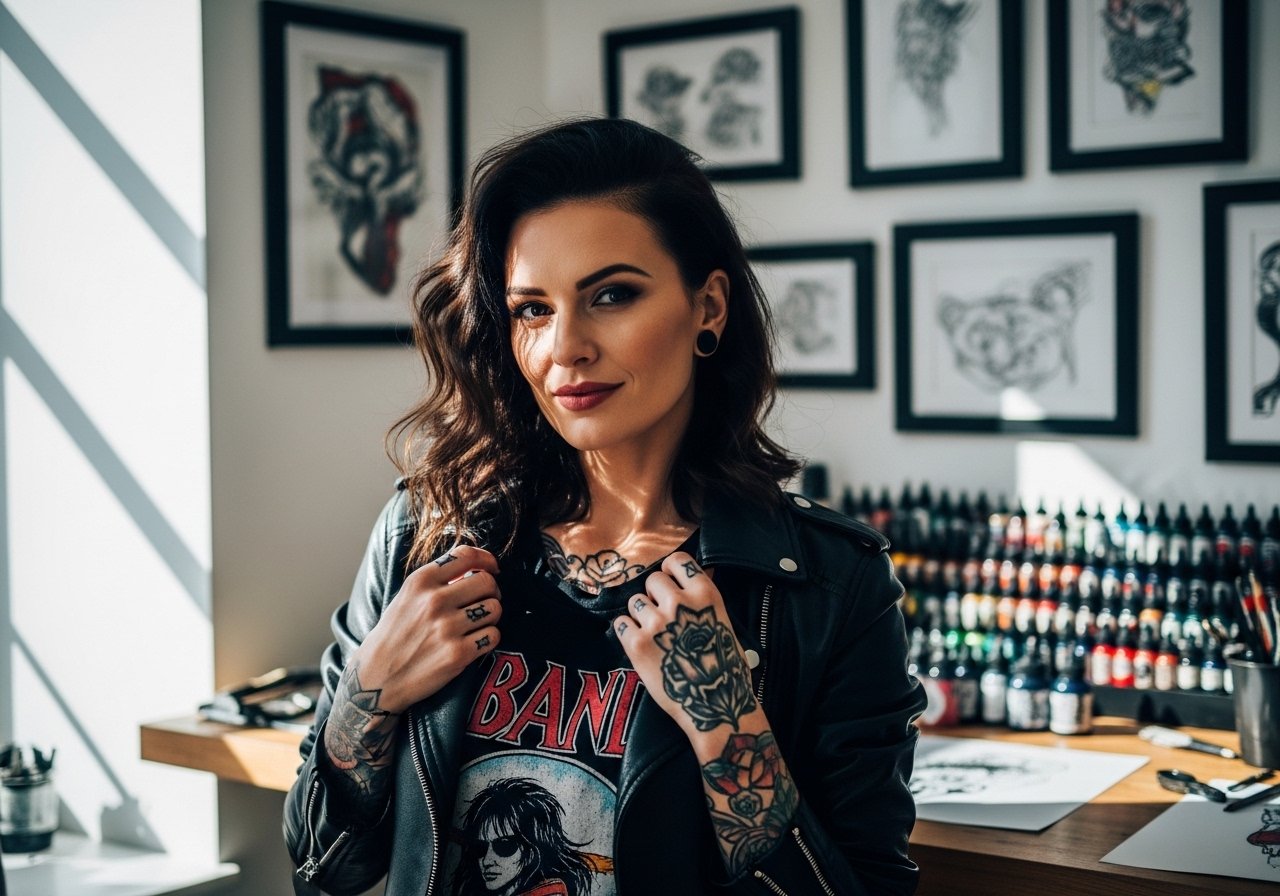
Fine line and bold work are both popular ways to honor parents, but what holds up on the skin is often different from what looks best in a saved photo. I see people pick ultra-fine script for a name and then come back for touch-ups sooner than they expected. This list balances ideas that read well fresh with versions that still look intentional five years later, starting with a collarbone geometric that frames a simple mom-dad script.
1. Fine Line Script on Inner Forearm
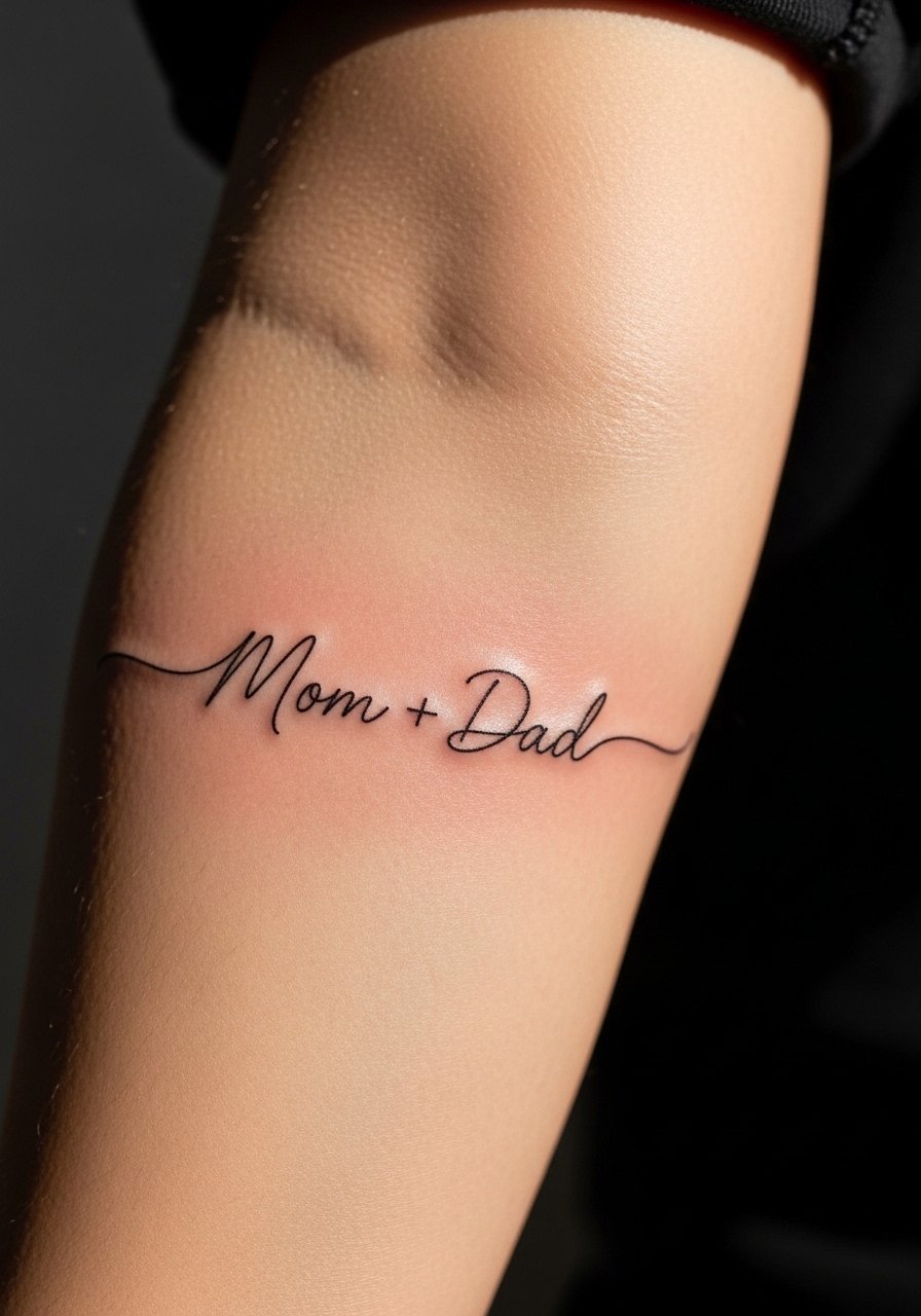
I've seen this placement hold personality better than the same script on smaller areas. The inner forearm gives room for slightly heavier linework so the letters do not merge as they age. Tell your artist to scale the script up a touch from what looks perfect on a phone screen and to use single-needle linework with modest spacing between strokes. A common mistake is asking for ultra-tiny cursive that looks delicate fresh but softens into blur by year three. Expect a light touch-up around year two or three if you spend a lot of time in sun. For the session, wear a loose button-down shirt so the artist can roll the sleeve without tugging.
2. Small Portrait Medallion on Upper Arm
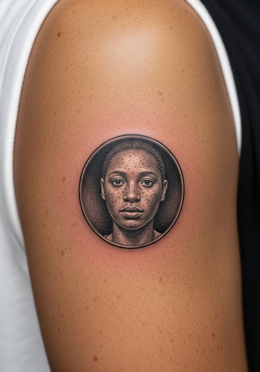
Fair warning: upper-arm portraits demand contrast more than tiny detail. The session feels like a steady, medium-length build of shading and tiny stipple work that can sit around two hours for a small medallion. Ask your artist for higher contrast in the reference so facial features remain readable at distance. The common error is compressing too much detail into a dime-sized circle. That version looks great in a photo but loses recognition as it heals. Plan a touch-up at the year-two mark for micro-realism work. Pair this with short sleeves when you want it visible, and for the appointment wear a loose tank top so the shoulder is easy to access.
3. Matching Coordinates Behind the Ear, Subtle Placement
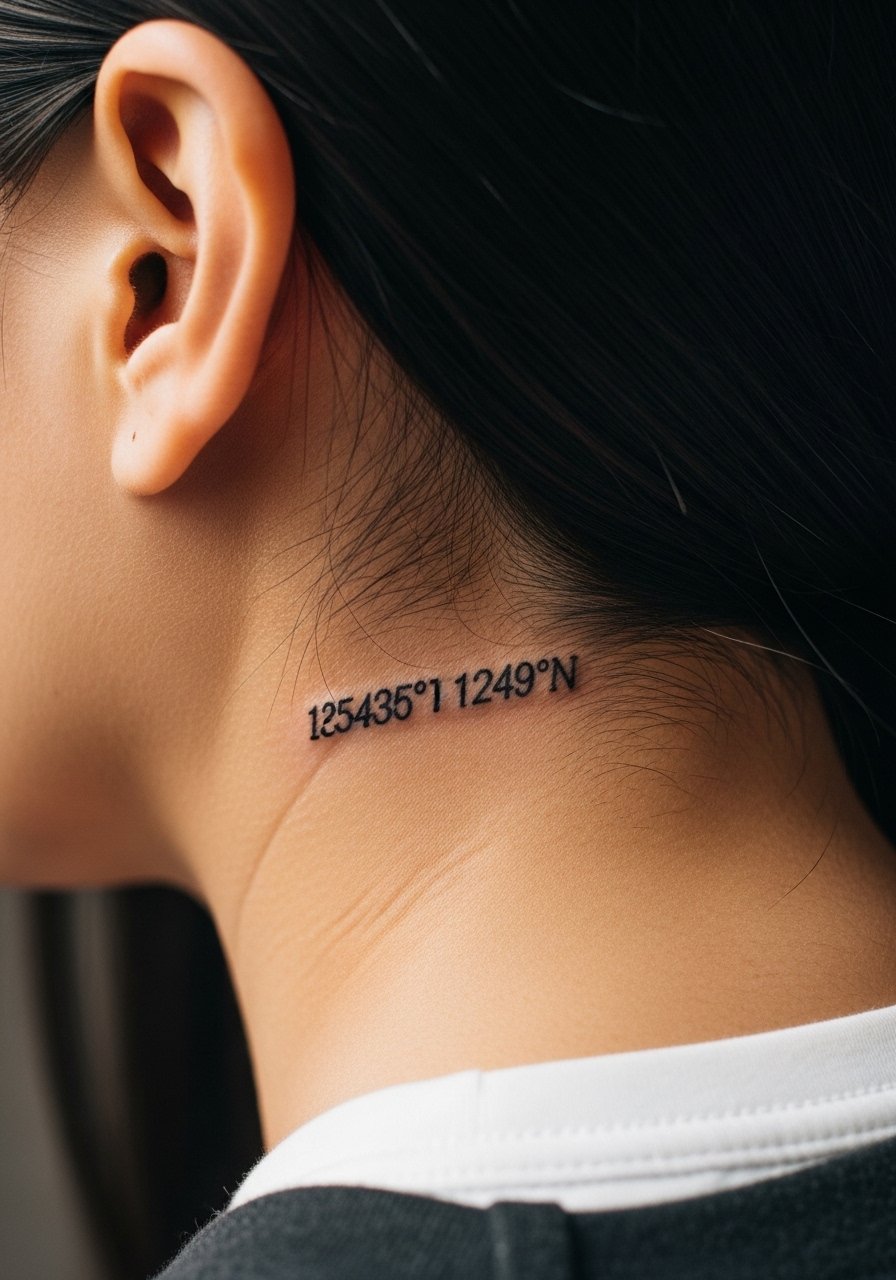
Most people choose coordinates for the day a parent was born or a meaningful place. The behind-the-ear zone requires tiny, clean type and an honest talk about longevity. In that spot the skin is thin and mobility is high, so the letters can blur if the type is too fine. Ask for slightly bolder monospaced numbers so the digits remain legible. The session is quick and sensitive but short. If you want it to remain crisp, plan for a touch-up in two to three years. This placement shows best with the hair tucked behind one ear for casual reveal, and it is simple to hide if needed for work.
4. Interlocking Hearts on the Sternum, Minimal Design
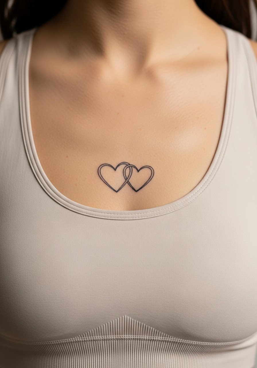
A sternum piece reads intimate and personal. Pain varies, and most people tell me sternum work is more intense than outer-arm sessions but tolerable in short bursts. The version that holds best uses slightly thicker fine lines with a small gap between the hearts so the shapes do not fuse as the skin stretches. The mistake is requesting pin-thin connector lines that look delicate fresh and then blur. For the appointment, wear a fitted sports bra so the artist can access the area without you feeling exposed. Consider how often you want to show it, because the placement is easy to frame with tops and harder to conceal with typical shirts.
5. Blackwork Family Crest on Upper Back
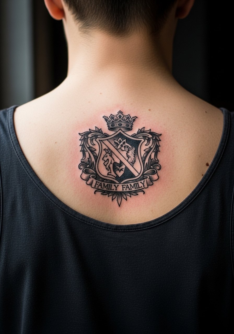
There's something about bold black saturations on the upper back that ages predictably. The session can be longer because of saturation work, so expect multiple passes for even depth. Tell the artist you want clean edges and negative-space elements so the crest stays readable as saturation settles. A common misstep is packing too many micro-details into a central crest. Those fine ornaments tend to muddy over time. For showing off, open-back shirts and layered necklaces frame the piece well. During the session wear a loose button-down you can slide off without raising full-shoulder pressure.
6. Tiny Script Rings on Finger Sides
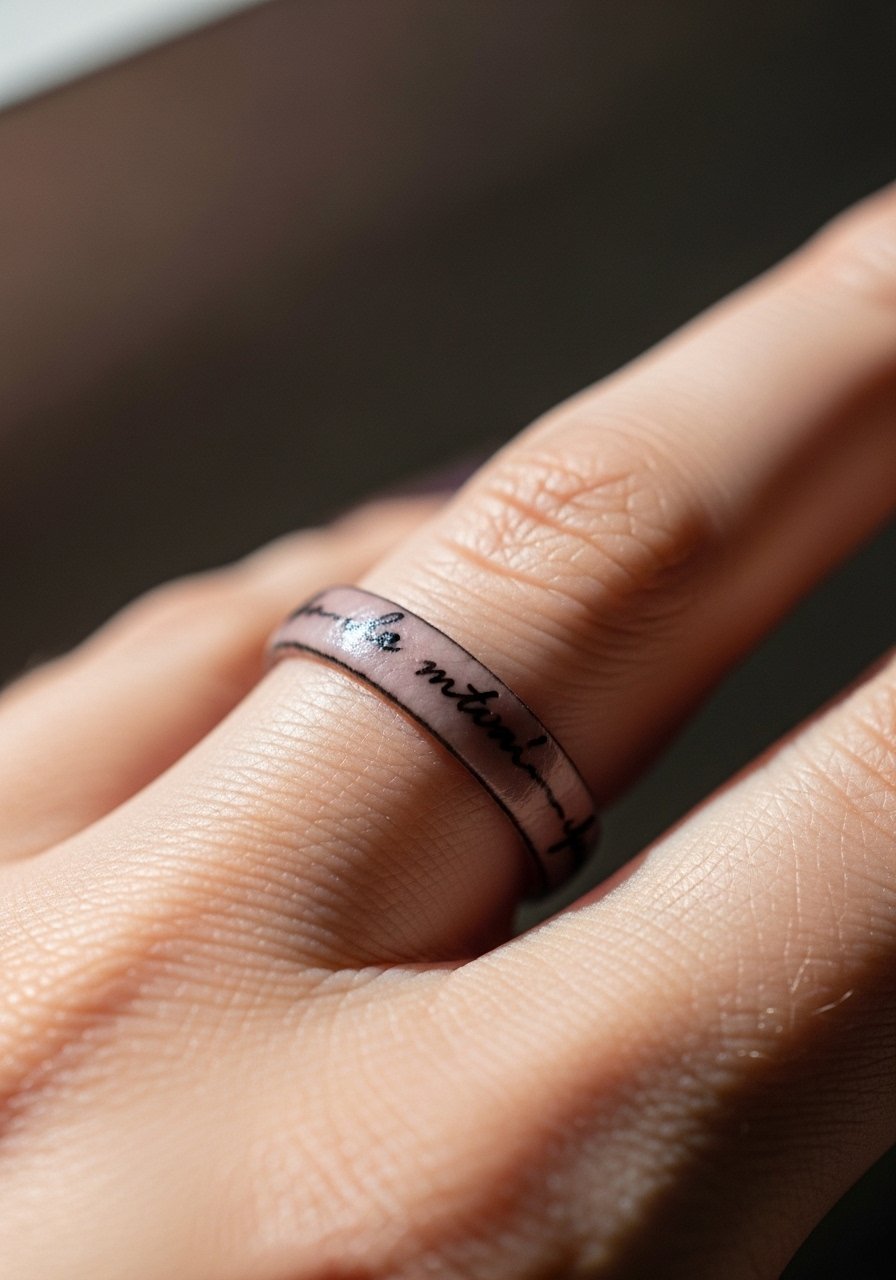
When people choose fingers for names they want visibility, but fingers are high-friction and heal differently than other spots. Expect touch-ups more often, sometimes within a year. Ask for slightly bolder linework and for the artist to consider a tiny break in script so the ink has room. A real mistake is insisting on single-needle thin cursive on the pad side. That version rarely lasts. For session comfort wear a short-sleeve top and keep hands unadorned. Finger pieces pair well with thin stacking rings that do not rub directly over the ink when new.
Studio Day Picks
The wrist, finger, and sternum pieces above each bring unique prep needs, so a few targeted items smooth out the session and the first week.
-
Stencil transfer paper kit. Allows a quick trial of placement on skin, which is helpful for forearm script and small portrait medallions.
-
Topical numbing cream. Applied per directions before a sensitive sternum or rib session it can make short stints feel much more manageable.
-
Thin protective film roll. Keeps finger and wrist pieces cleaner during the busiest week when friction and washing are highest.
-
Fragrance-free gentle body wash. Soft cleansing helps preserve fine line work on exposed forearms and avoids irritation near fresh edges.
-
Aquaphor healing ointment. A thin layer for the first days locks in moisture without suffocating the delicate needle channels on small script and portrait work.
7. Watercolor Blooms Framing a Name on the Ribcage
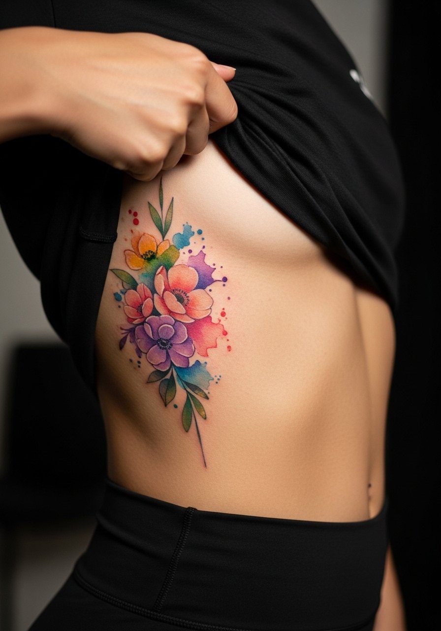
Artists split on watercolor on ribs. One camp says the thin layers of color wash out faster because of movement and stretch. The other camp believes careful saturation and spacing can make watercolor last longer there. When I counsel clients I ask which they prefer more, freshness or longevity. For a ribcage bloom that lasts, ask for deliberate spacing between color washes, and for slightly heavier outlines in key areas. The session feels more intense because ribs are a sensitive zone, so plan breaks. For the appointment choose a top you can lift easily, like a cropped tee.
8. Minimalist Line Portrait on the Calf, Modern Pairing
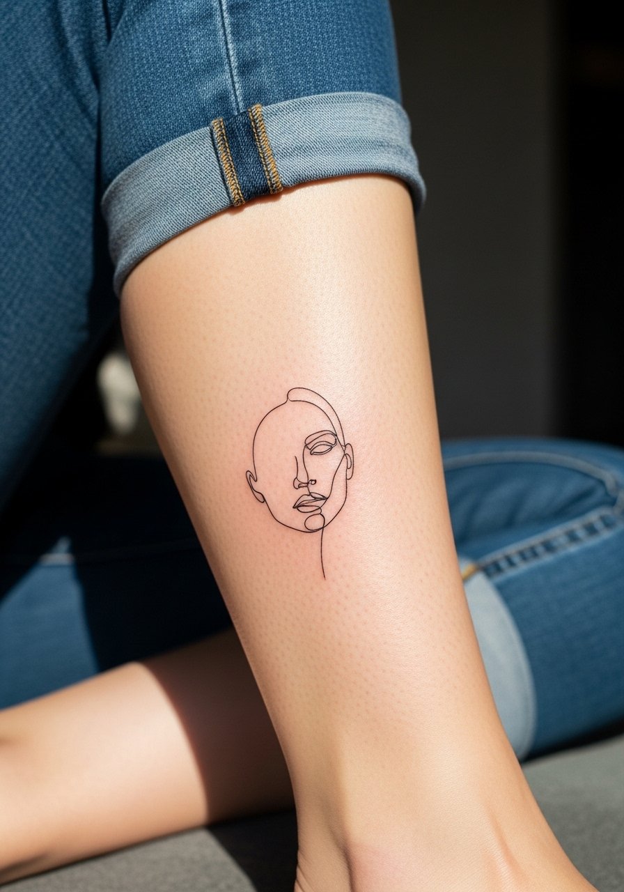
This placement reads well from a distance and gives the portrait space to breathe. The calf tolerates longer sessions with moderate discomfort and usually heals with stable linework. Ask your artist to avoid ultra-small facial details and instead emphasize silhouette and a few expressive strokes. A common mistake is packing portrait detail into a small calf piece, which loses clarity. For showing off, pair the tattoo with jeans rolled at the hem or mid-calf boots that let the line portrait peek without being overwhelmed.
9. Tiny Matching Anklet Chains for Both Parents
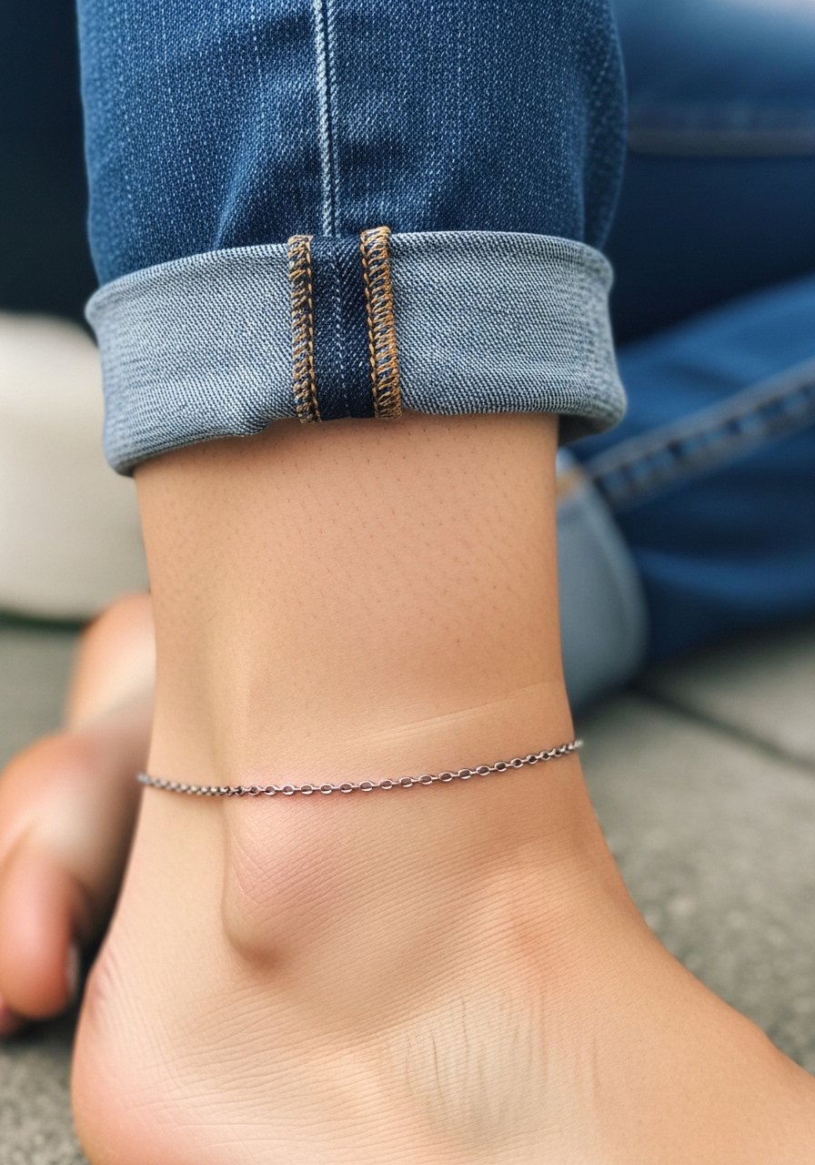
I've seen these anklet pieces become daily reminders because they are easy to glance at. Ankles experience friction from socks and shoes, so the trick is slightly bolder links rather than pencil-thin chains. Tell your artist you want a narrow but steady link width so the pattern keeps its rhythm as it heals. The session is short but the area can be tender where bone is close to the skin. For the appointment wear pants you can roll up and afterwards consider sandals for a week. Pair the tattoo with simple ankle bracelets when you want to accentuate the design, and try a minimalist ankle bracelet for evenings out.
10. Scripted Names Curving Along the Collarbone
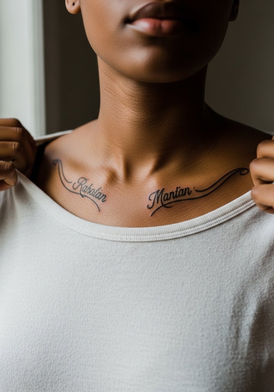
Fair warning: collarbone work sits across thin skin and bony landmarks, which makes line consistency hard without a steady hand. The session feels scratchy in spots where the bone is near the surface. Ask for slightly adjusted line weight that keeps letters readable without being too heavy. The common error is asking for hairline script that fragments over the collarbone. That version looks lovely fresh but often loses continuity. For showing off, wide-neck shirts and necklaces that sit above the script complement the curve. For the appointment, a wide-neck top is ideal.
11. Small Botanical Cluster on the Outer Thigh
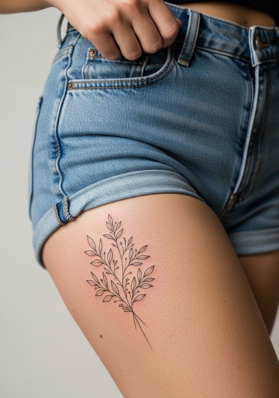
Thigh pieces heal with less friction than lower leg spots and can hold finer stipple shading. The session is usually comfortable and can be spread across two shorter passes if desired. Request slightly open spacing in the leaves and a mix of stipple and whip shading to avoid dense patches that can soften. A mistake is packing dense color into a tiny thigh spot, which looks solid initially but can age into a flattened blotch. For the appointment pick loose bottoms like high-waisted shorts and consider a loose drawstring linen pant to roll up without pressure.
12. Matching Small Anchors on the Wrist and Ankle, Symmetry Idea
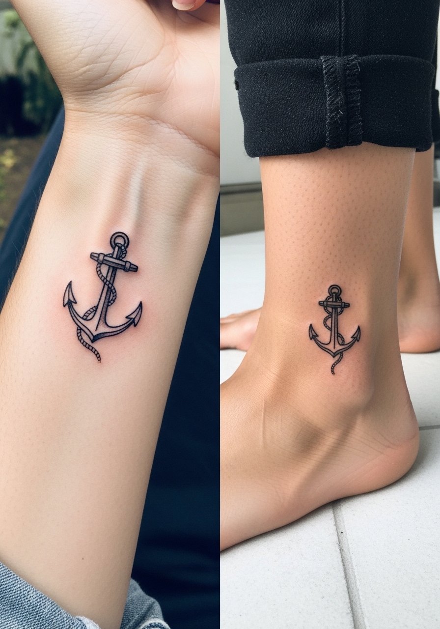
Visual balance is why people choose matching tiny symbols for mom and dad. Wrist anchors are exposed and age under sun and daily washing, while ankle anchors face friction from shoes. When doing both, ask the artist to use a slightly heavier line for the wrist anchor and a touch more saturation for the ankle. The common mistake is identical scale for both placements. Scale matters because the canvas changes. The wrist piece may need a touch-up sooner. For showing off, stacked bracelets and rolled pants work well. Wear a thin chain bracelet on the wrist side to complement the anchor without obscuring it.
13. Geometric Arrow Pair Pointing Inward on the Chest
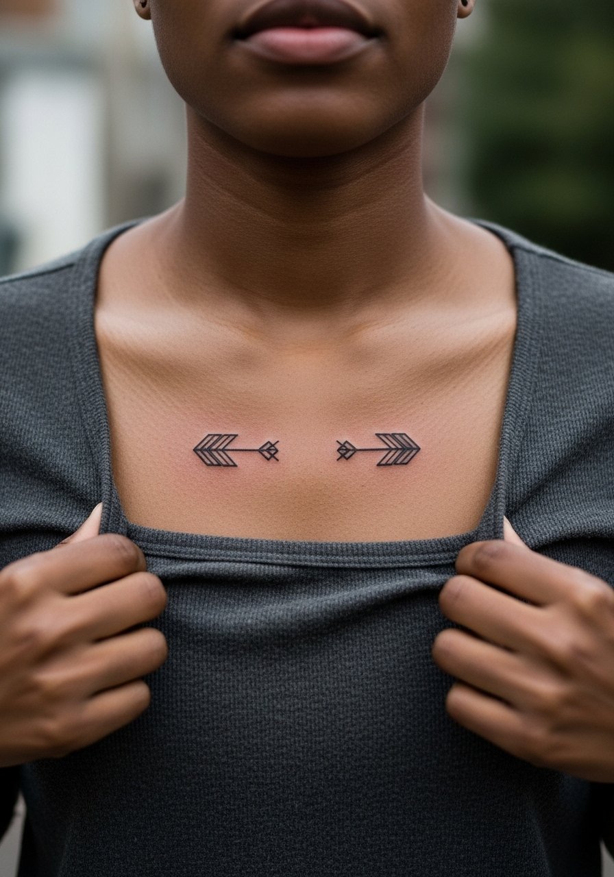
The visual impact of mirrored arrows works because geometry reads consistently over time when spacing is respected. The session can be short but requires steady linework to avoid wobble. Tell the artist you want crisp negative space between the arrows so the forms do not merge as the skin moves. A mistake is asking for ultra-tight geometry too close to the sternum where the bone and motion can distort lines. For the session wear an easy-to-shift top and plan short breaks if the area gets sore. Open shirts and layered chains frame this placement well.
14. Tiny Handwritten Notes on the Side of the Rib Cage
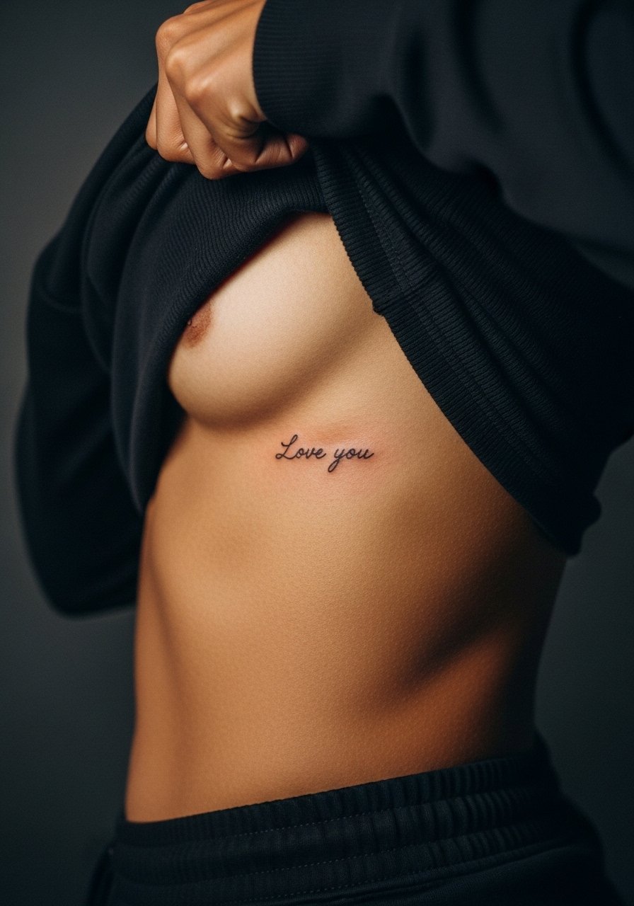
Consultation tip: bring a clear photo of the handwriting you want preserved. Handwritten script carries emotional weight, and artists need to translate pen pressure into consistent linework. Ribs are sensitive and move when breathing, so expect breaks. The common mistake is asking for an exact pen trace with hairline detail. That rarely survives motion and stretch. A slightly bolder translation keeps personality and improves longevity. For the appointment choose a cropped top you can lift easily. If the handwriting has cultural or sentimental meaning, be mindful of context when replicating family members' scripts.
15. Minimal Portrait Silhouette Behind the Shoulder Blade
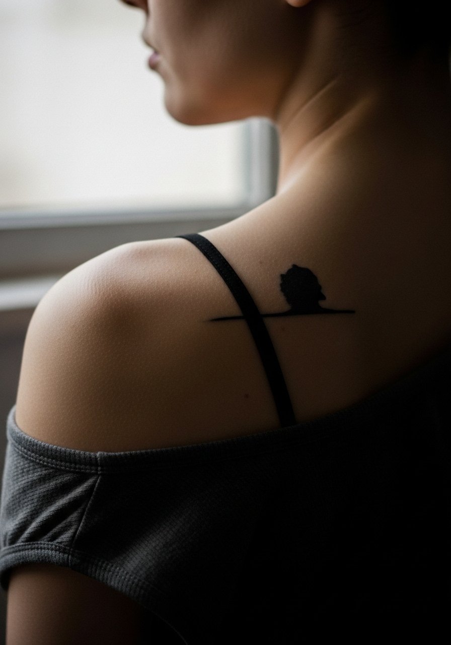
This placement sits between privacy and reveal. The session is moderate in discomfort and often feels like focused linework across a broad surface. I recommend a silhouette or negative-space portrait for this area because it avoids tiny facial features that blur over time. People often ask for full micro-detail and then find it reads like a muddled image after a few years. For showing off, racerback tanks and open-back dresses let the piece breathe. During the appointment wear a button-down you can slide aside without raising tension on the shoulder.
16. Tiny Roman Numeral Bands Around a Finger
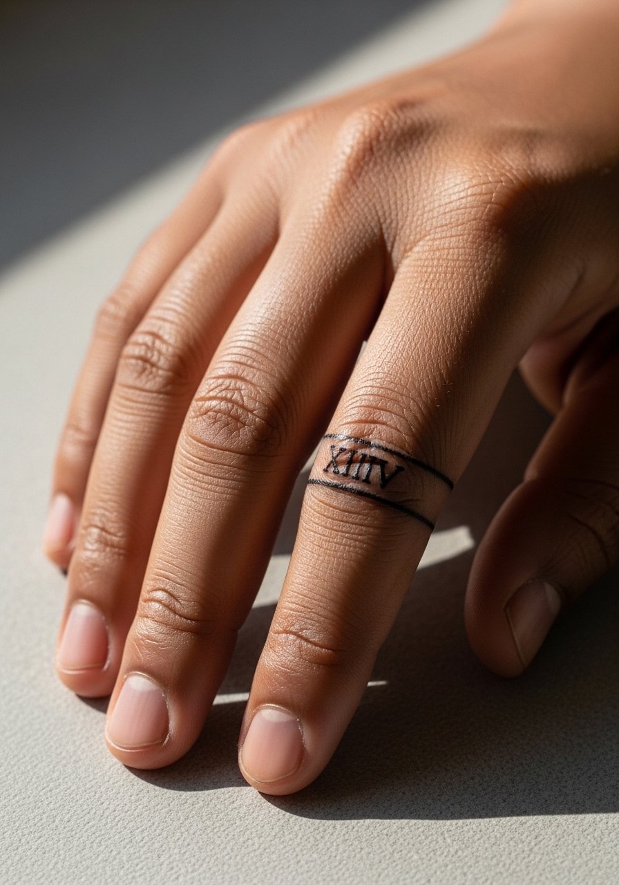
I've noticed numeral bands are a quiet way to mark a date while staying understated. Fingers often need heavier ink for longevity, so request a slightly thicker stroke and clear spacing between numerals. The common error is choosing too-small numerals that blur into a line. Expect a touch-up within one to two years. This placement is visible daily so consider how rings might rub the area. For the appointment keep your hands free of jewelry and try a simple ring style afterwards that sits slightly above the new ink. A thin band ring complements the numerals without rubbing the fresh skin.
17. Blackwork Family Tree on the Side Rib, Bold Heirloom
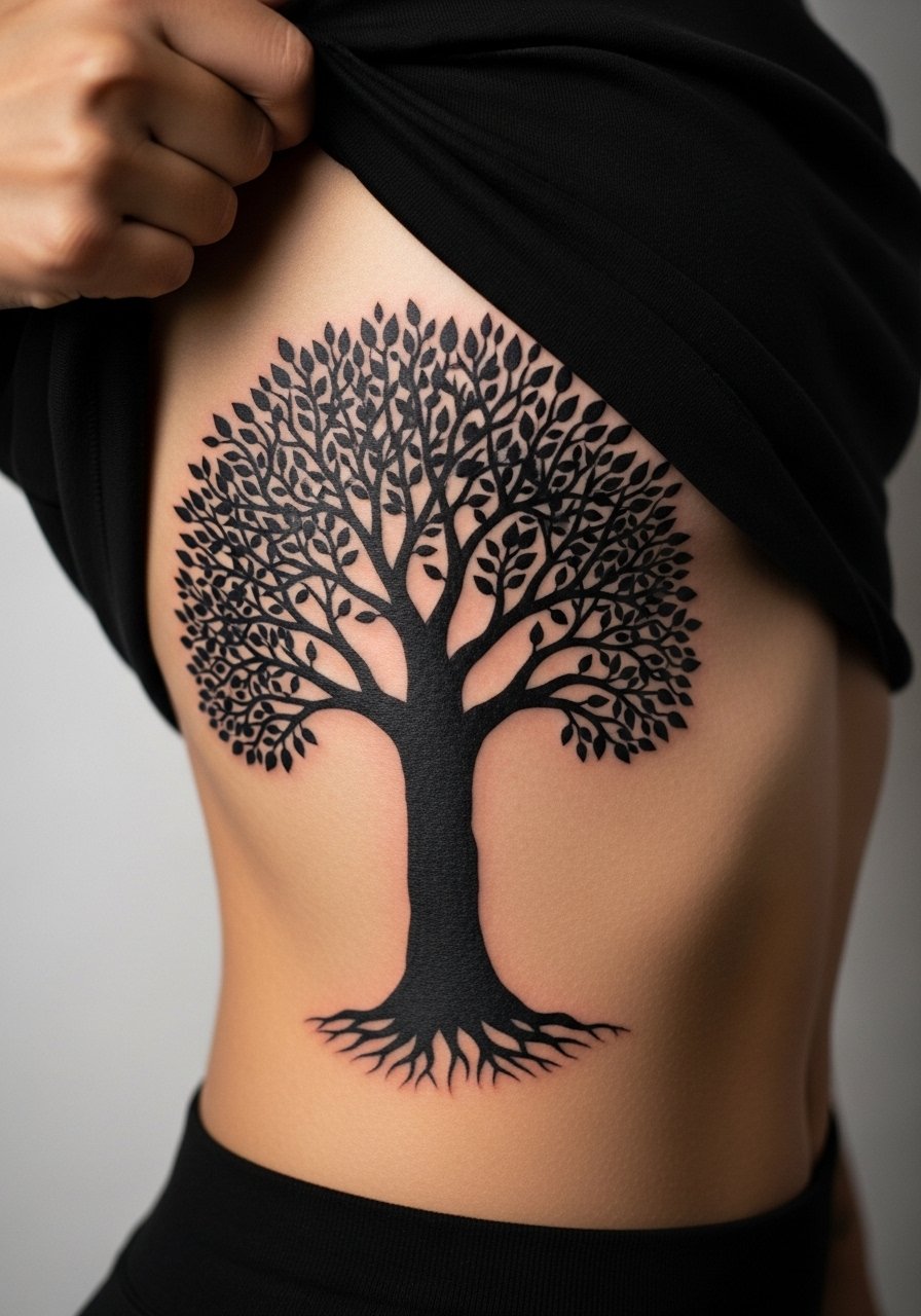
Fine line family trees on ribs split artists into two camps. One side argues that detailed branches become indistinct as the skin stretches and moves. The other side says deliberate negative space and controlled saturation keep the design readable. I advise a blackwork approach that uses solid silhouettes and negative space to represent branches rather than tiny filigree. The session will be longer because of saturation, and you should expect at least one follow-up pass. For the appointment choose a cropped top you can lift without feeling exposed. If the design references cultural motifs, consider slight adaptation out of respect for origins.
Frequently Asked Questions
Q: Will fine line script on the forearm need touch-ups more often than bold blackwork?
A: Yes, fine line tends to soften faster, especially on areas with frequent sun exposure. For forearm script I recommend slightly heavier line weight at the start and planning for a touch-up around year two to three if you spend lots of time outdoors.
Q: Are hand and finger tattoos appropriate if I work in conservative jobs?
A: Hand and finger tattoos are visible and still affect perceptions in some workplaces. If you are unsure, consider placements that are easy to cover during interviews, or choose tiny, discreet spots at first so you can assess reactions over time.
Q: How should I prepare clothing-wise for a sternum or ribcage session?
A: Wear a fitted sports bra or a cropped top you can lift easily without tugging. That simple choice keeps you covered and gives the artist clean access to the tattoo zone.
Q: Do watercolor-style parent tattoos require different upkeep than blackwork?
A: Watercolor often needs more sun protection and occasional refreshes because the soft washes can fade faster. Expect periodic color touch-ups and diligent sunscreen use on exposed watercolor pieces.
Q: What's the realistic timeline for touch-ups on finger versus upper back tattoos?
A: Fingers commonly need touch-ups within one to three years due to constant use and washing. Upper back saturation often holds longer and may only need touch-ups at a slower cadence, possibly three to five years, depending on exposure and care.
Q: Can I combine a cultural motif in a family crest without it being insensitive?
A: Yes, if you approach it thoughtfully. Consider modifying direct sacred symbols into respectful adaptations and discuss cultural origins with your artist. Many clients opt for inspired patterns rather than exact replicas to honor without appropriating.