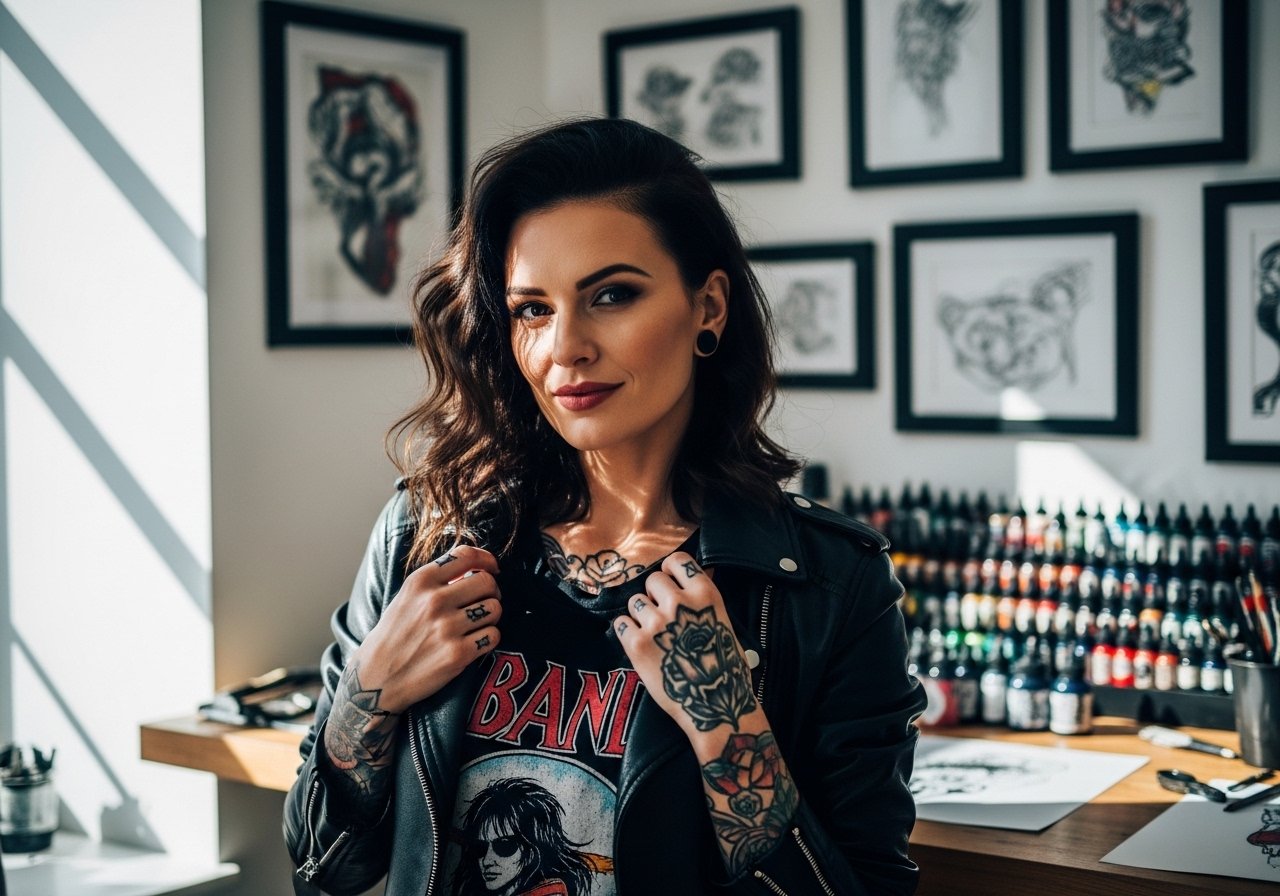
Fine line tattoos are everywhere on saved boards right now, and the hard truth is they look gorgeous fresh and often need a realistic plan to stay crisp. Small script, tiny verse arcs, and soft dove outlines can all read as private faith signals, but placement, line weight, and aftercare decide whether they still read clean at year three. Below are 27 subtle bible verse tattoo ideas and practical notes that help them age well.
1. Fine line "Be still" (Psalm 46:10) on the inner wrist
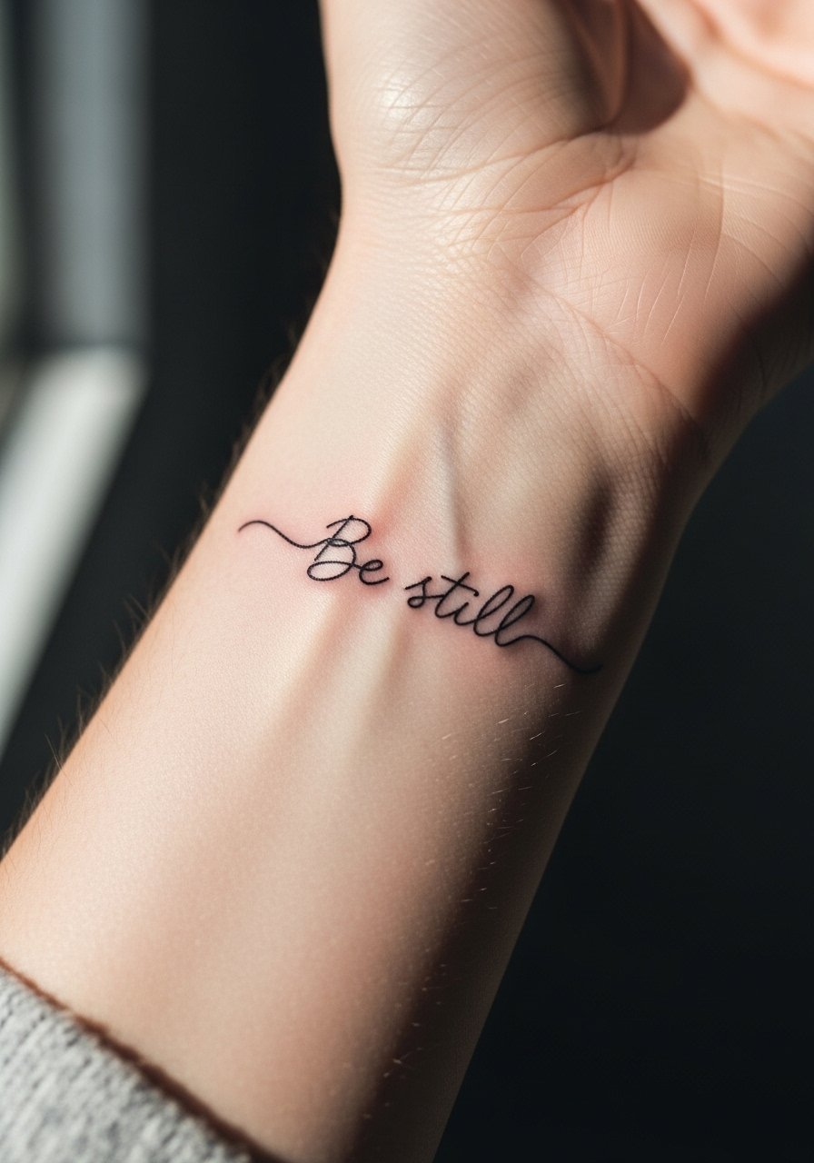
I've seen this exact small phrase inked on wrists that are handled like jewelry. Pick a slightly thicker single-needle line than the absolute thinnest so the letters hold without blurring into each other. Tell your artist you want readable spacing between letters and ask for a mockup in the same placement so you can check curvature on your wrist. Fair warning: fine line on wrists splits artists into two camps. One camp says the thinness fades fast and needs touch-ups at year two. The other camp insists a measured depth and spacing will settle nicely. Expect a touch-up discussion at booking. For showing it off, pair with a thin silver chain bracelet and a linen button up shirt with the cuff rolled once so the script reads naturally.
2. Watercolor dove plus "I can do all things" (Philippians 4:13) on the forearm

Watercolor accents can soften a verse without overpowering the script. Ask for the text in black micro-script and the dove in translucent washes so the words remain the focal point. A common mistake is heavy saturation in the color fields that eclipse the script within a year. For longevity, request separated edges between ink colors and black linework. Session feel is moderate, one to two hours depending on size. For casual show-off wear, roll sleeves up and try a rolled sleeve cotton shirt so the piece sits in frame.
3. Minimalist "For I know the plans" (Jeremiah 29:11) in cursive on the inner bicep

The inner bicep is private and flat enough for script to sit without much distortion. Bring three font references and ask the artist to stencil the curve on your arm so you can test how it reads when you bend. Mistake to avoid is compressing long phrases into one tiny line. This area heals with extra friction from arm movement, so expect mild scabbing and a touch-up discussion at the one-year mark. For the appointment wear, throw on a loose tank top so the artist has clear access.
4. Blackwork Luke 6:31 with a thin cross outline along the collarbone

Collarbone placements read like jewelry and can look striking without large scale. Ask for the cross to use negative space rather than heavy fill so the design keeps its subtlety. The collarbone can be tetchy for pain, and the linework needs enough saturation to avoid early fading where the skin flexes. Common error is making the script too small for the collarbone's natural curve. To frame it when you want it visible, wear an off shoulder blouse and layer a delicate necklace layer above the ink.
5. Vertical "Be still" (Psalm 46:10) on the ribcage
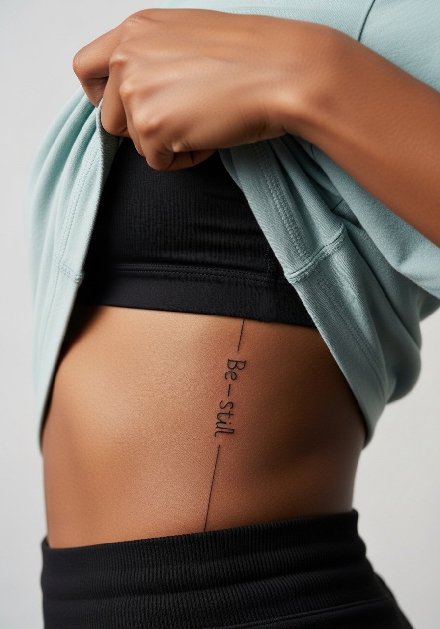
Fair warning: the ribcage is a high-pain placement and the skin flexes with breathing. Artists are split on fine line here. One group says ribs warp thin lines into blur within two years. The other group says precise depth and slightly wider spacing keeps the script legible. When you consult, ask your artist where they land on that debate and whether they recommend spacing changes. If you want a private piece that only shows in swimwear or crop tops, this placement is worth it. For session comfort, wear a loose tank top you can lift so the artist only exposes the worked area.
6. Ornamental arc with Ephesians 2:8 wrapping the ankle

An ankle wrap works like a small bracelet. The curved layout follows the bone and reads well with a gentle arc. Tell your artist you want the text to sit on the outer ankle curve rather than the inner, which experiences more rubbing from shoes. People often request ultra-thin script here and then complain about early fading. Plan for a single tidy session and a touch-up if you wear low-cut shoes daily. Pair with cuffed jeans and a thin anklet chain when you want to show it.
Studio Day Picks
The wrist, forearm, ribcage, collarbone, and ankle pieces above all need slightly different prep and small supplies to smooth the session and the first week.
-
Tea tree tattoo salve. Gentle, less greasy salves can help fine line areas avoid clogged pores during the first days, which matters for delicate script on wrists and ankles.
-
CeraVe healing ointment. A lightweight, fragrance-free option for short-term moisture that feels less heavy on shallow linework.
-
Australian Gold aftercare spray. Sprays reduce scab picking and are handy for hard-to-reach places like ribs and back.
-
Indie Japanese ink balm. Breathable balms work well in humid climates and keep watercolor edges from smudging into other pigments.
-
Saniderm protective film. Many artists and clients use protective film for the first few days to reduce friction on ankle and wrist pieces, though some prefer dry healing. Name both camps when you book so your artist can match the method to your skin type.
7. Micro-realism John 1:16 on the inner forearm
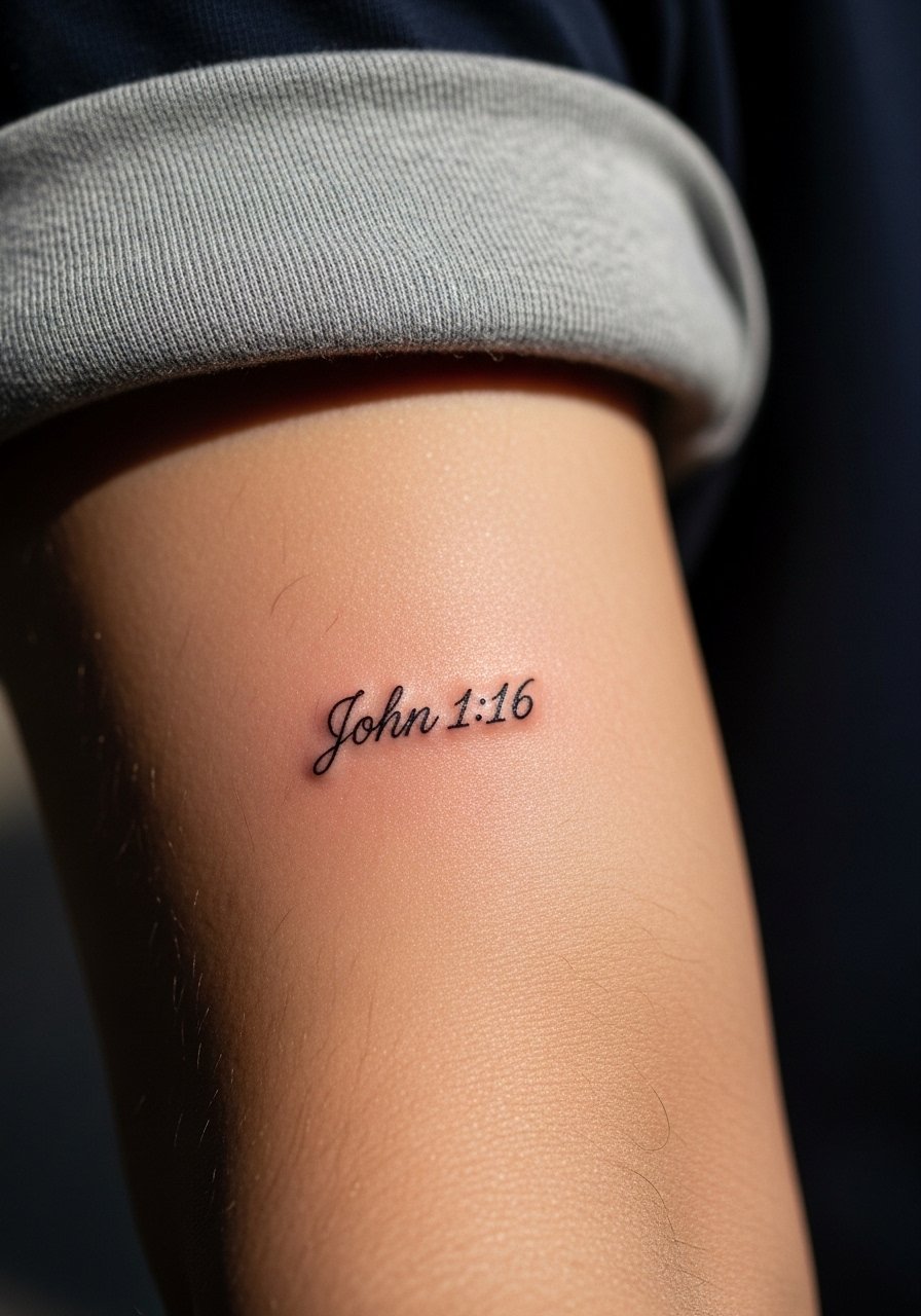
Micro-realism gives a crisp, compact script that reads like a private note. The trick is to keep the phrase short and the negative space consistent. Tell your artist you want clear counters in each letter so they do not fill in as the piece heals. Expect slightly longer session time for precise needles and more focus on saturation. Common mistake is demanding micro size for a long line. For a clean look in photos, try a single thin watch on the opposite wrist so the arm composition stays balanced.
8. Neo-traditional Genesis 2:7 with soft dust motif on the shoulder blade
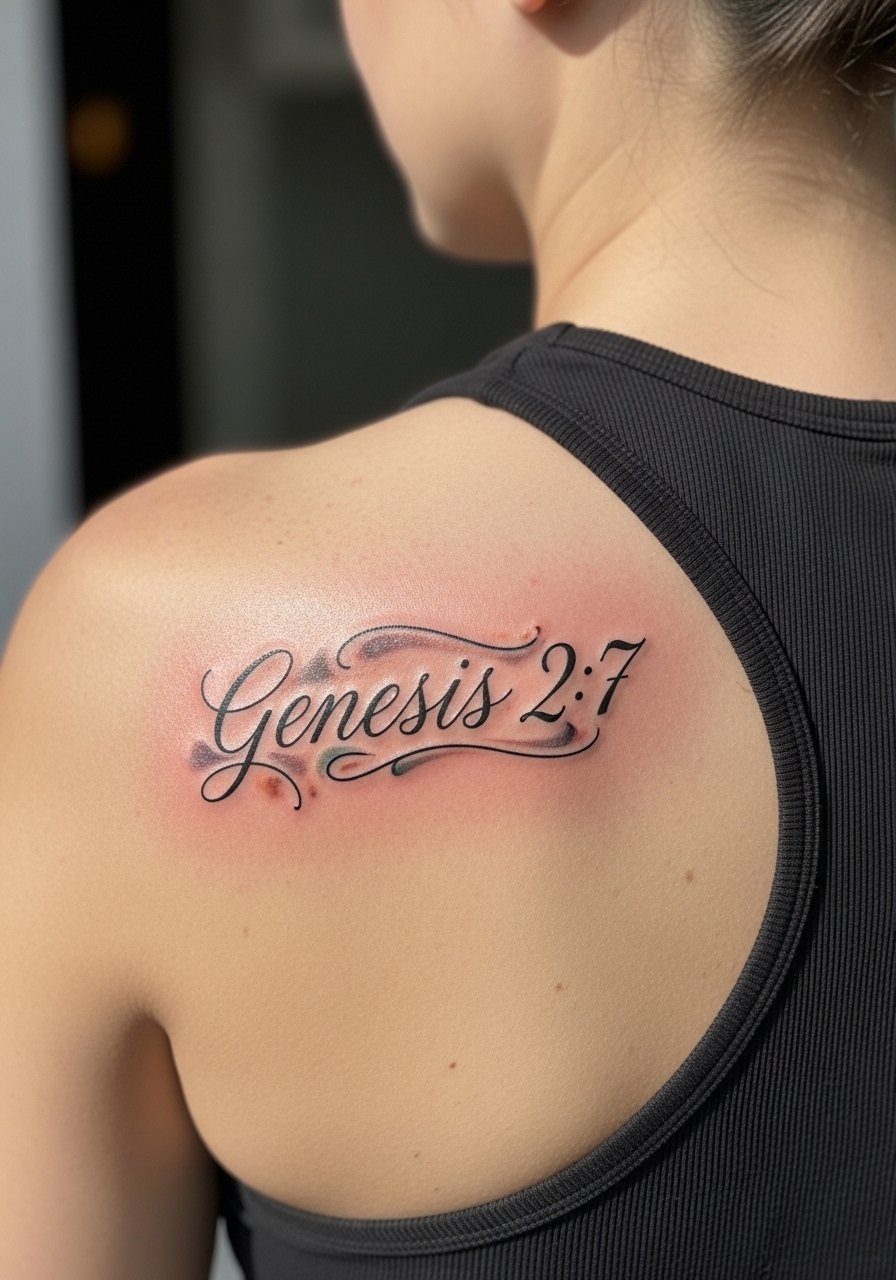
The shoulder blade offers a broad canvas without the stretch issues of ribs. Neo-traditional text paired with texture can read like custom jewelry. Ask for slightly bolder outlines around the script so the letters survive color fade. Session feel is manageable because you can relax on your stomach. To show it off in summer, pair the piece with a racerback tank top.
9. Scripture hidden inside a dove outline on the inner thigh

Inner thigh placements are intimate and heal with less sun exposure, but there is friction from clothing. Many people like the idea of a verse tucked into a dove silhouette for privacy. Tell your artist you want the script only visible when the dove is viewed up close. A common mistake is making the letters too tiny to read after healing. For the session, wear loose shorts you can shift so the artist sees only the worked area. If you plan to reveal it, high-leg shorts work well.
10. Minimal black-gray "Saved by grace" script on the outer calf

Calf placements take friction well and show clearly in summer. This location suits slightly bolder fine script for athletes or people who jog. Ask for a moderate line weight and ask the artist how the script will look when viewed from walking distance. Many request ultra-fine lines that blur under sweaty conditions. For sessions, wear shorts or capris for easy access and try a pair of athletic shorts men or capri leggings you can roll.
11. Leviticus 19:28 as a wristband reference line
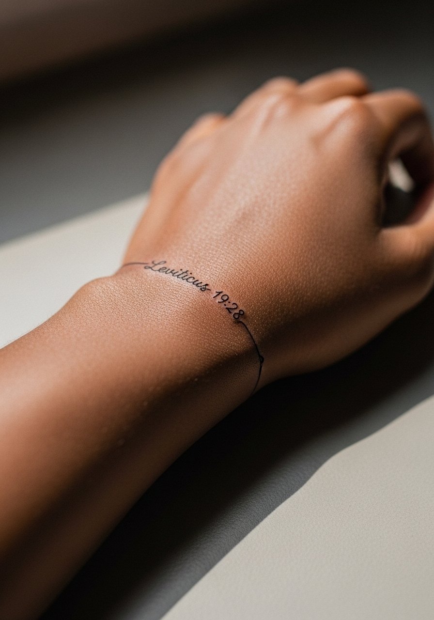
A wristband-style reference is subtle and almost graphic in effect. Keep the band narrow and consistent so it reads as a band rather than a phrase that breaks mid-wrist. The irony here works best if the script is compact and clearly legible. The most common mistake is making the band wider than the wrist can accommodate, which forces awkward kerning. Expect touch-ups at year one for this exposure-heavy location.
12. Watercolor flowers framing "Be still" on the upper arm
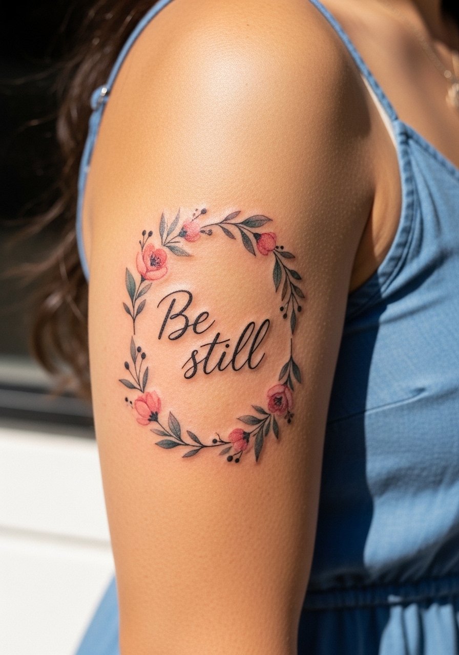
Floral frames can help a short verse read like an ornament rather than a line of text. For durability, keep the script in black and the flowers as soft washes. The typical error is letting the watercolor bleed into the letters. Ask for separation and subtle outlines where the script meets color. This placement pairs naturally with sleeveless silhouettes and a sleeveless sundress when you want it visible.
13. Bold ignorant-style cross with Jeremiah 29:11 on the back rib
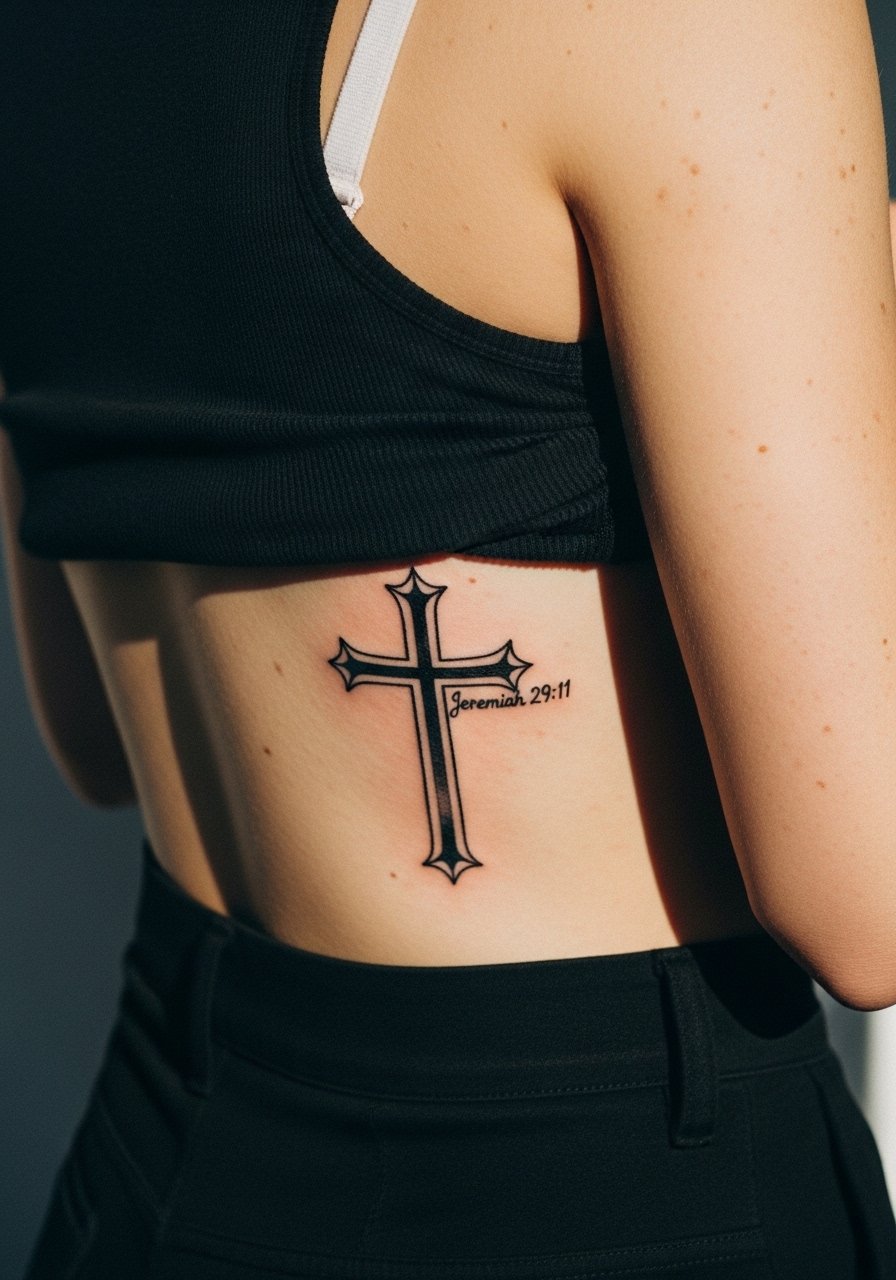
Ignorant style takes thick, graphic lines and softens them for subtlety. On the back rib, the bold outline reads from a distance while keeping the verse discreet. Because ribs flex, choose slightly larger letterforms than you might think necessary. Some artists caution against ultra-thin script on ribs for this reason. Expect a two-session approach if you want heavy blackwork with a clean edge.
14. A small arc of scripture that follows the collarbone curve
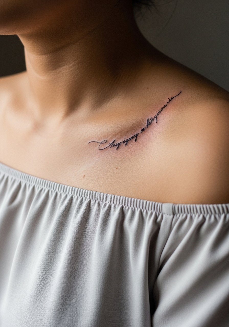
Contours matter. An arc that mimics the collarbone flow avoids visual distortion and keeps the verse readable while moving with the body. Tell your artist to print the stencil and check it while you stand so the arc sits correctly with shoulder posture. Avoid compressing long lines into a short arc. When you want to show it, an off shoulder blouse frames the script naturally.
15. Negative-space cross integrated into a finger band scripture
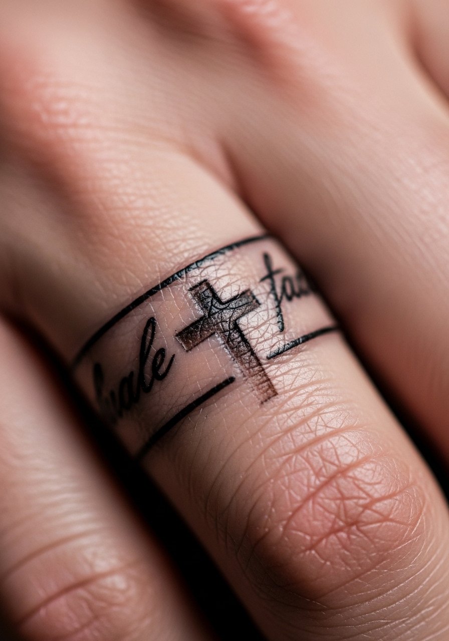
Finger bands read like jewelry but age differently because of constant washing and friction. Negative space crosses inside a band keep the design subtle. The common mistake is going too small for the line density a finger needs. Ask for slightly heavier outlines and expect more frequent touch-ups, especially on fingers used for typing or manual work. Think of this as a ring that will likely need attention.
16. Try-before-you-ink: henna verse test on the forearm
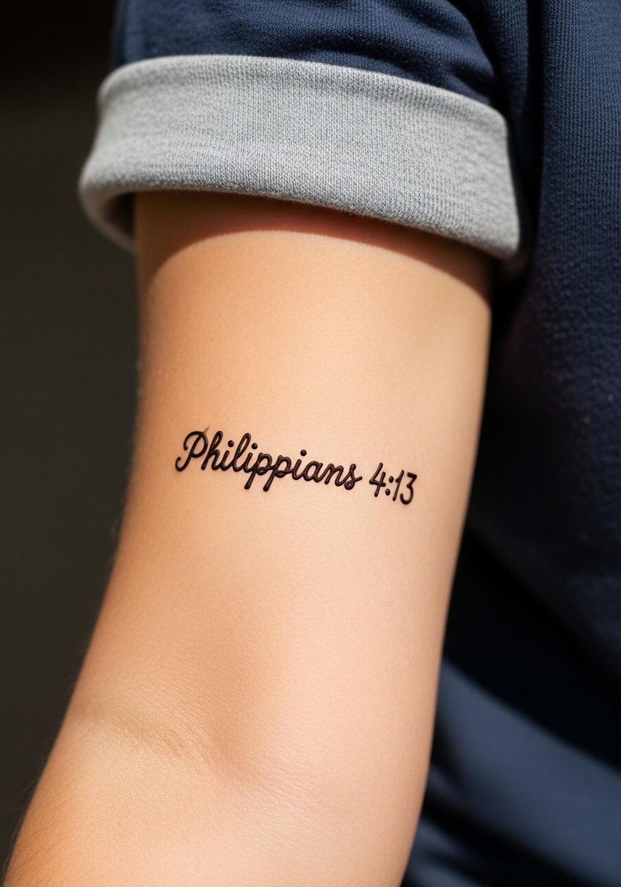
Doing a temporary henna or jagua test is a low-risk way to live with a placement and phrasing before committing. It answers the "does this read too long" question without permanent consequences. Apply the henna in the exact placement and wear it for a week of daily photos so you can judge visibility and how it sits with clothing. This approach cuts regret and helps decide whether to scale up or down when you move to permanent ink.
17. Thickened script for dark skin on the forearm or wrist

For darker skin tones, fine single-needle lines sometimes wash out in photos though they read well in person. The practical fix is to ask for slightly thicker script with more saturation so the letters hold in both real life and images. A mockup with temporary marker can help preview contrast. The real-world trade-off is a bolder look, but one that lasts longer without frequent touch-ups.
18. Vertical verse along the spine hidden under hair
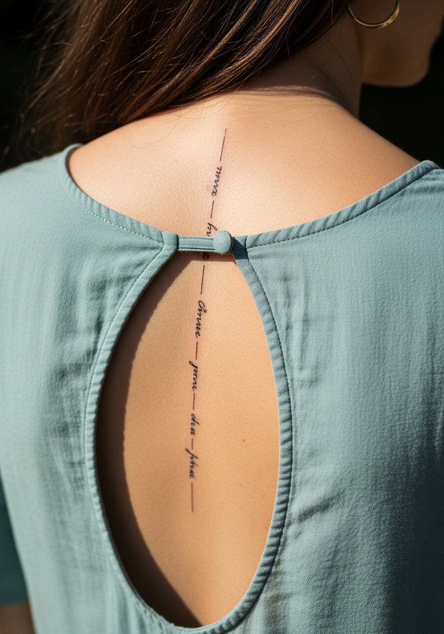
A spine placement hidden by hair is the ultimate private placement that shows only when you want. Because the skin along the spine moves less, vertical script can remain legible for years if spacing is generous. Tell your artist you want each letter a touch larger than a wrist script to offset movement. For showing it off at events, an open back midi dress lets the line breathe.
19. Micro-script ring on the side of the finger
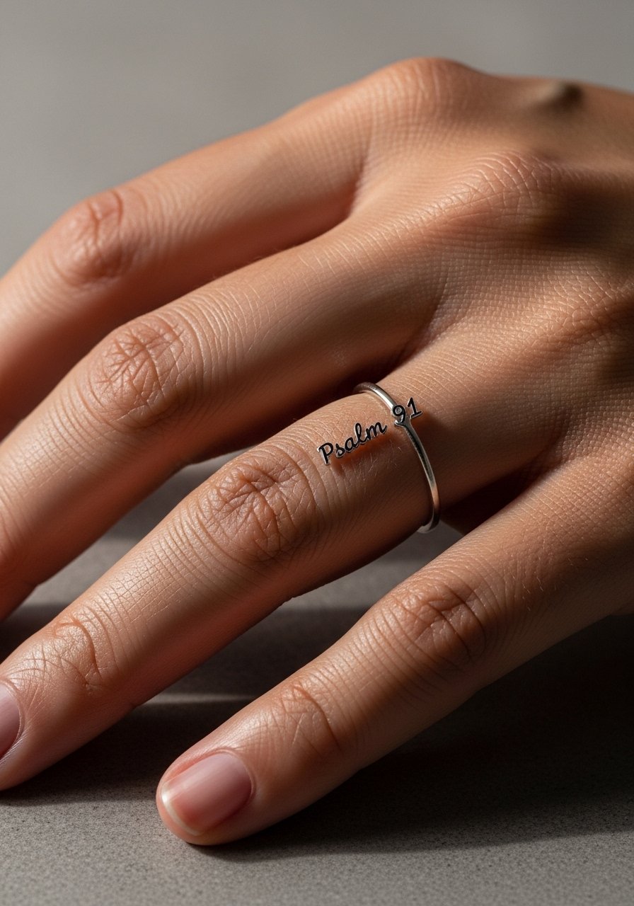
A micro ring is intimate and essentially decorative. Keep the phrase as brief as possible and accept that finger ink requires maintenance. Ask your artist about placement on the lateral side of the finger, which often holds better than the pad. Expect a touch-up timeline sooner than wrist or forearm work.
20. Short memorial verse framed with small blooms on the upper arm
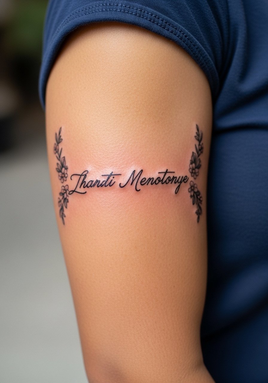
Memorial verses with subtle floral frames read like wearable keepsakes. The upper arm gives enough room to balance lettering and ornamentation so the script does not shrink into the florals. A common mistake is over-detailing the blooms when the canvas is small. Ask the artist for simplified petals and leave the script in black for longevity.
21. Tiny coordinate or single-word scripture on the inner wrist

Short single-word choices or coordinates make private statements that are easy to conceal. On the inner wrist, pick a line weight that survives constant handwashing and sunlight. A test with pen ink helps you check readability before booking. Pair it when visible with a minimalist cuff bracelet to keep attention tasteful.
22. Ankle-side vertical verse with stacked anklet styling
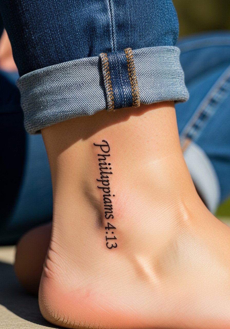
An ankle-side verse reads like a private charm. Because the area sees shoe friction, place the lettering slightly higher on the outer ankle bone. Pair with stacked anklets when you want to show it. A common session mistake is allowing the artist to place the lowest letter where shoes rub, which causes early wear.
23. Short bold script on the upper arm designed for future cover-up
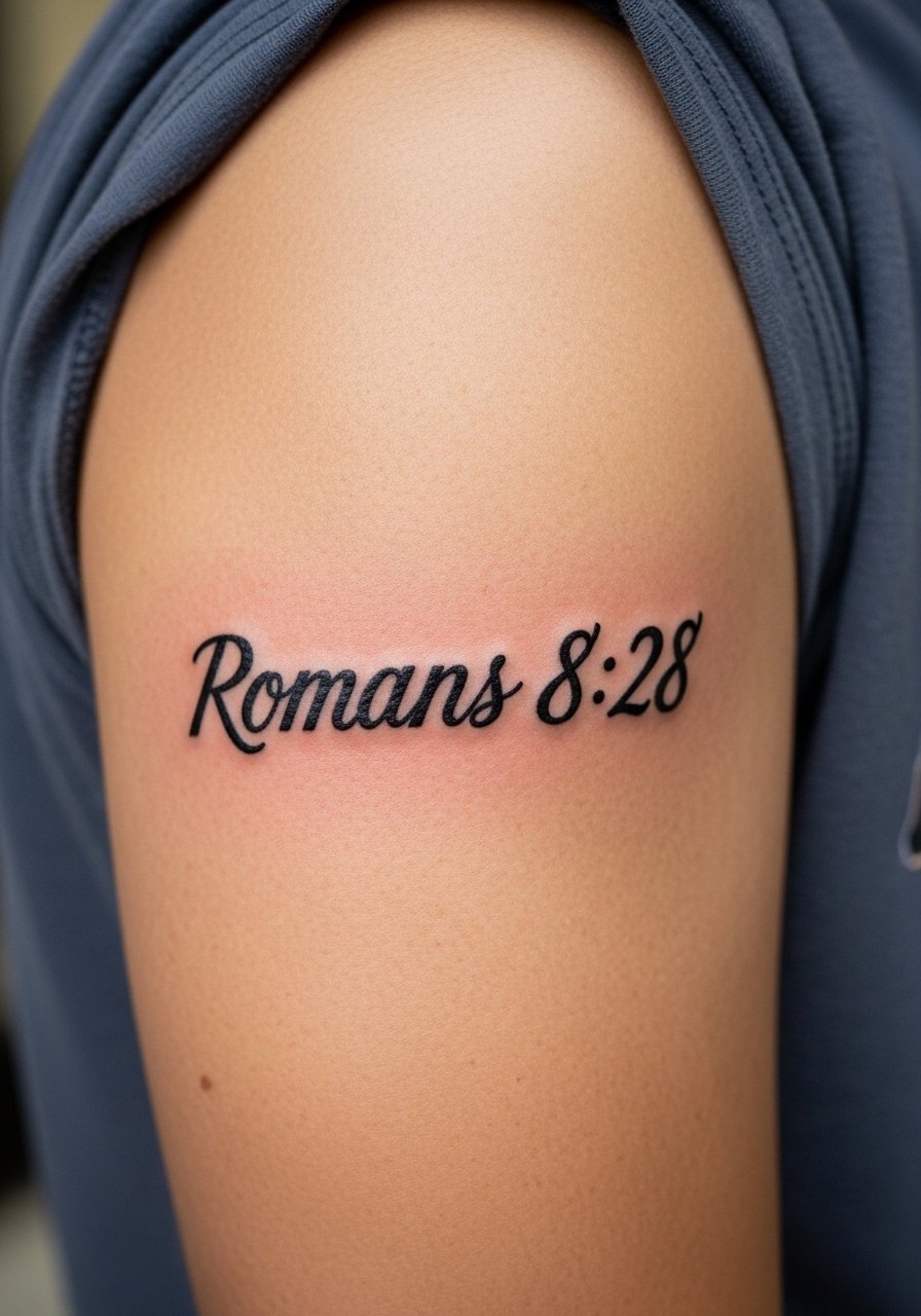
If you suspect you might change style in the future, planning a short bold script with coverage-friendly spacing makes later cover-ups or expansions easier. Tell your artist you want clean, saturated fills and clear margins around the letters. The session is straightforward and typically heals predictably.
24. Tiny script tucked behind the ear, below the hairline
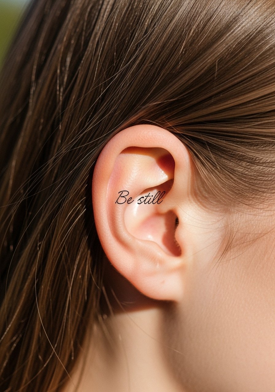
Behind-the-ear pieces are whisper-quiet and practical for someone who wants an almost-hidden verse. The prompt for this placement must emphasize the skin below the hairline so the artist frames the stencil correctly. Pain is mild, but the area can be fussy with hair oils, so plan a clean parting for healing. If your job requires discretion, this is a logical spot.
25. Sternum script under a sports bra line
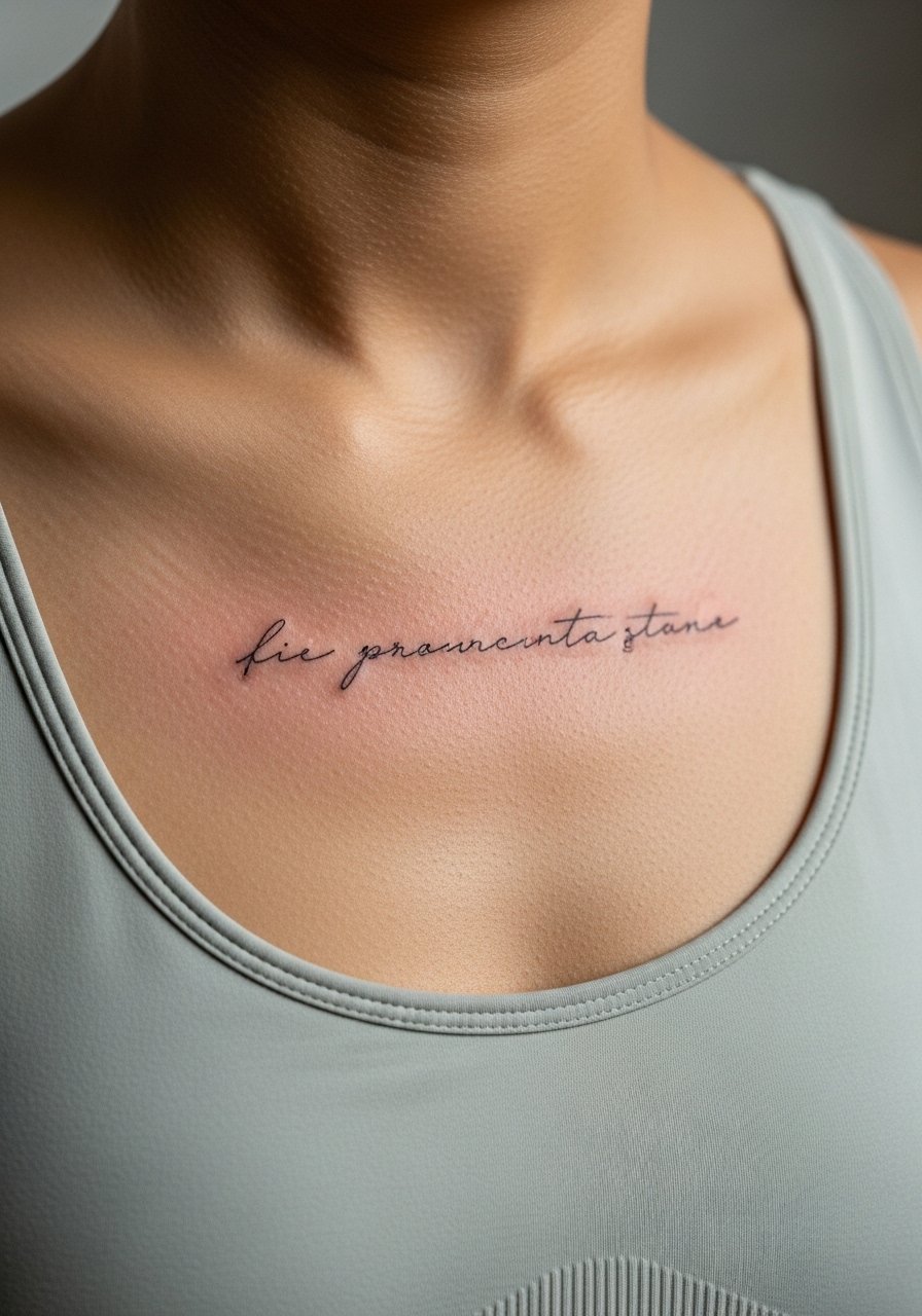
Sternum script reads intimate and dramatic when done right. Always wear a fitted sports bra for the session so the artist can work within the fabric line. The skin here heals with scabbing for some clients, so expect a slightly tender week. Keep the phrase short and centered so it aligns with the garment line.
26. Lower-back single-line verse with minimal floral touches
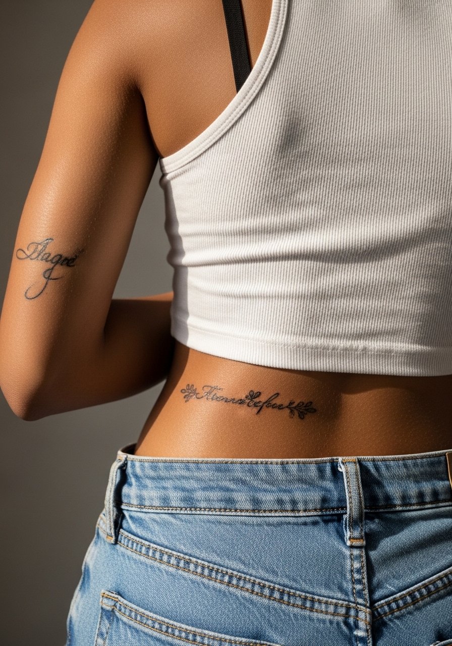
Lower-back pieces can stay private and are easy to heal because they see less sun. The common mistake is trying to cram a long verse into the narrow strip above the waistband. Plan a concise line and check the stencil while standing. For sessions, wear high-waisted bottoms you can shift slightly to expose just the tattoo zone.
27. Thumb-to-index small script band that reads when hands touch
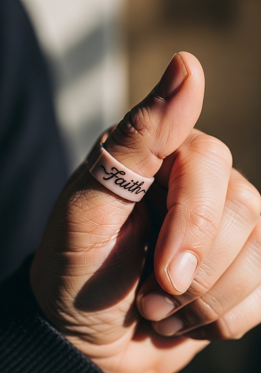
This placement is tactile and almost ritualistic. The downside is heavy use and frequent touch-ups. If you want something that reads only when you bring your hands together, keep it to a single word or tiny verse citation. Ask about a slightly bolder line to survive constant movement and handwashing.
Frequently Asked Questions
Q: Will a fine line wrist verse need a touch-up sooner than a forearm one?
A: It often depends on daily exposure and your skin type. Wrists take more sun and friction from watches and bracelets so expect a touch-up conversation at the one to two year mark for very thin single-needle work, while forearms tend to hold longer with similar line weights.
Q: How should I test a verse layout before committing to a rib or collarbone placement?
A: Try temporary ink or henna in the exact spot and wear it for a week with the outfits you would normally use. Stand and move during the mockup so you can see how breathing or shoulder posture affects the curve. This preview saves mistakes like cramped lettering or awkward arcs.
Q: For dark skin tones, what wording or line weight works best for photo visibility?
A: Slightly thicker black script with consistent saturation reads better in photos while still being subtle in person. Ask for a test stencil inked with a non-permanent marker so you can photograph the placement before booking.
Q: Artists disagree on Saniderm versus dry healing. What should I decide for a fine line wrist piece?
A: Both camps have legit points. Some people prefer Saniderm for short-term friction protection on wrists and ankles. Others go dry because they worry about adhesive irritation. Bring the topic up in consultation and follow your artist's recommendation based on your skin type and activity level.
Q: Where can I find artists who specialize in script and subtle verse work?
A: Search hashtags like #FineLineBibleVerse and #ScriptTattoo on social platforms, filter local results with apps such as Tattoodo and Booksy, and cross-check Reddit threads for city-specific recommendations. Guest spots and convention lists often surface the right specialist if local shops are fully booked.