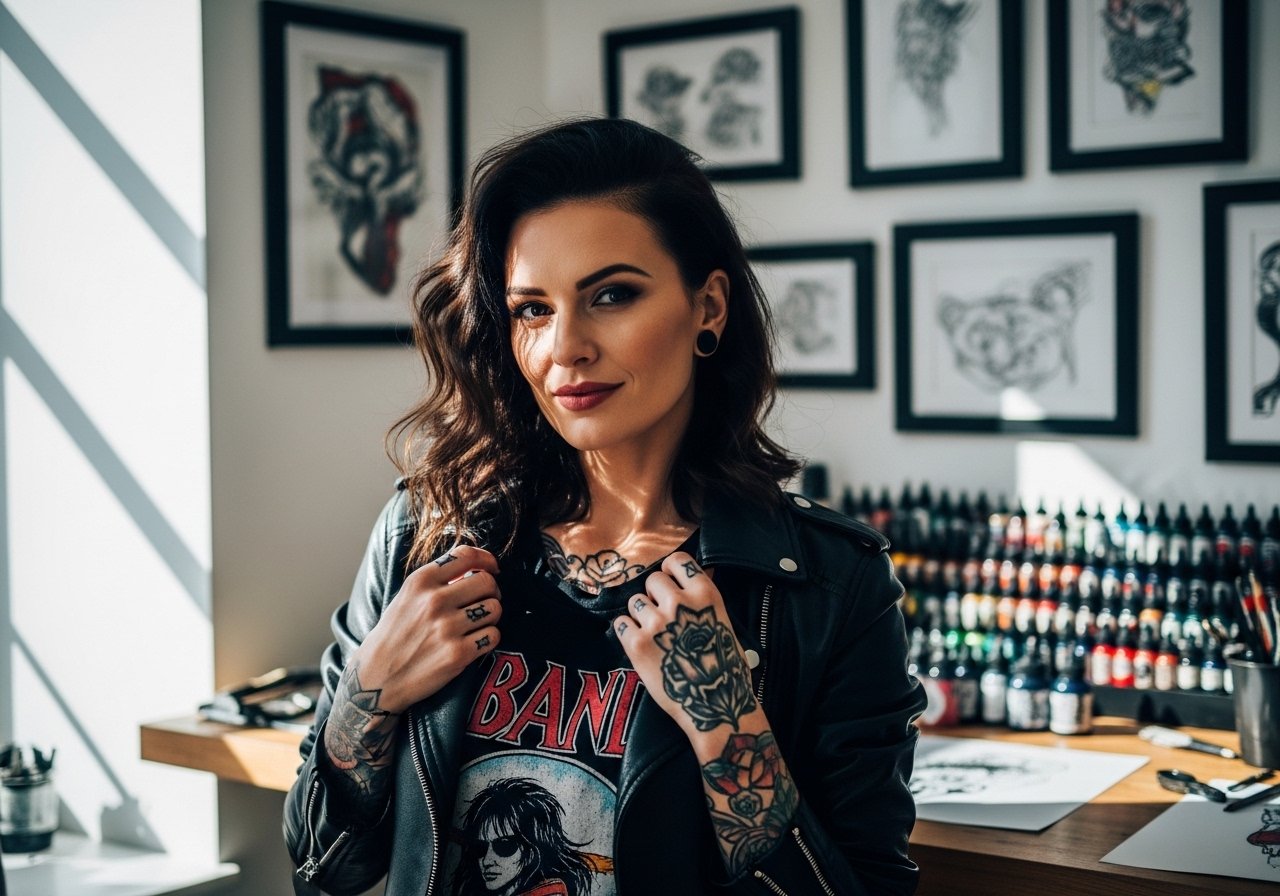
Bold black banners and saturated red hearts often outlast the prettiest micro scripts. I've noticed the mom-dad pieces that still read crisp after five or ten years are usually bold, simple, and placed where skin is steady. That does not mean you must give up detail. It means choosing the right scale and placement for the look you want. Below are 27 vintage mom dad tattoo design ideas and practical notes that help you pick what will still look good later.
1. Classic Heart with Mom Dad Banner on the Forearm
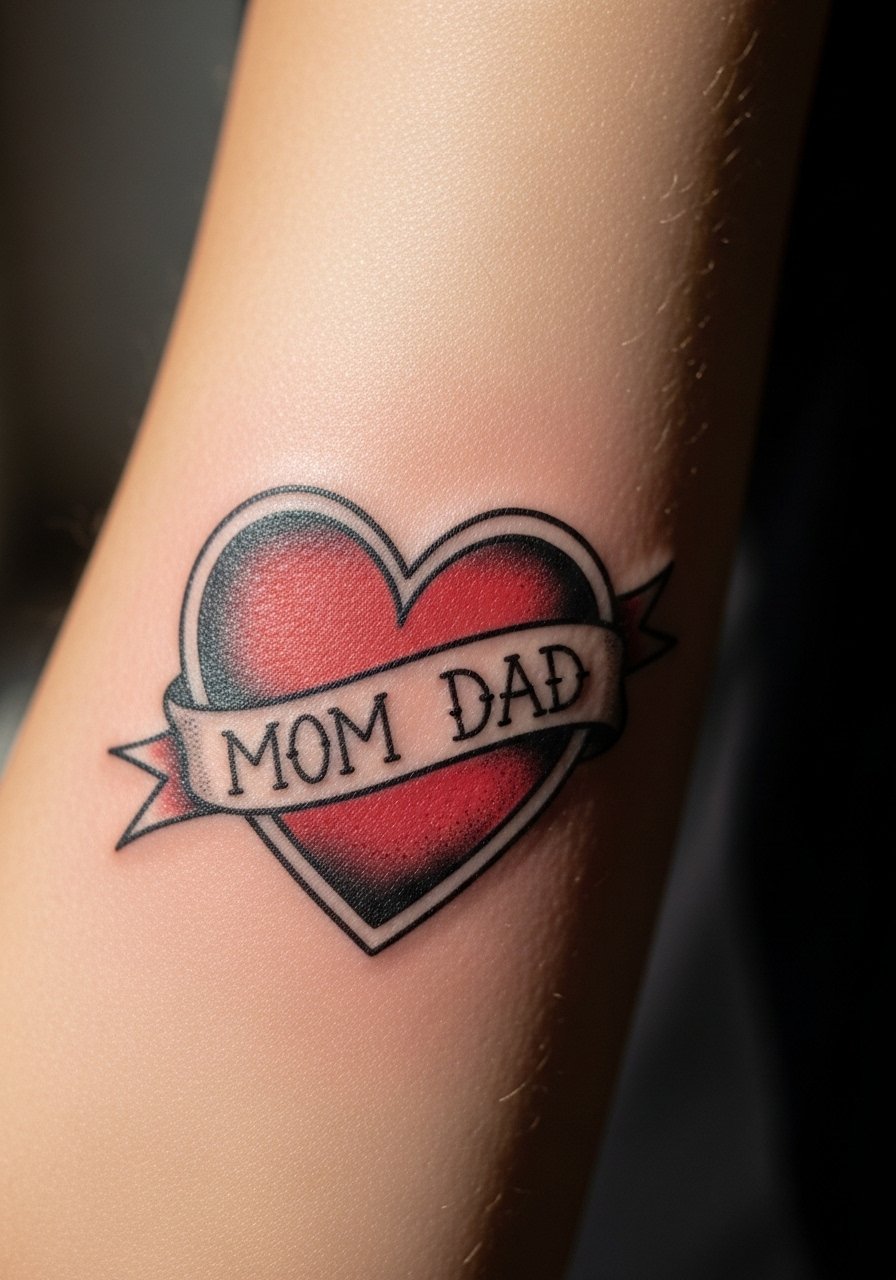
I see this on forearms more than any other placement because it reads from a distance and ages predictably. Expect a moderate pain level and a single session for a 4-6 inch piece. Tell your artist you want bold linework and solid saturation rather than fine filigree so the red stays punchy at year two and beyond. A common mistake is asking for tiny lettering in the banner. Tiny letters tend to blur into a dark smudge after a few years. For showing it off, roll your sleeves up and wear a rolled sleeve chambray shirt that keeps the arm visible without distracting from the linework.
2. Infinity Mom Dad Script on the Wrist

Fine line fans like the infinity motif for a subtle feel but be honest about longevity. Wrists see constant washing and friction, so fine lines need breathing room. Plan for a small touch-up at year two for clarity. In consultation, ask for slightly thicker script than your phone reference so the letters do not close up. The wrist bone area stings more than the flat inner wrist area, so expect a sharper twinge during the session. Avoid having the script run too close to the wrist crease since movement and friction speed fading.
3. Crown and Heart Combo on the Upper Arm

Upper arm pieces are forgiving for size and let bold colors sit well. This combo looks regal without being elaborate. I recommend 4-5 inches so the crown details read after a few years. Tell your artist to use heavy outlines and controlled saturation in the gold areas rather than thin metallic strokes that can wash out. Pain is usually low to moderate and most people get this in one to two sessions. Pair this with a fitted tank top to show off the shape when you want to display it.
4. Dove with Mom Dad Memorial Ribbon on the Shoulder

Shoulder placement is a strong choice for memorial designs because it heals with minimal friction. The shoulder accepts shading well so black and gray dove work sits peacefully. Bring reference photos of ribbon placement during consultation so the tail of the ribbon does not disappear into clothing seams. A common regret is asking for too much tiny detail on the wing feathers. Stipple or whip shading held to a mid-density avoids muddiness at year three. For session day, wear a loose button-down shirt so the artist can access the shoulder without you removing layers.
5. Anchor with Mom Dad Names on the Forearm
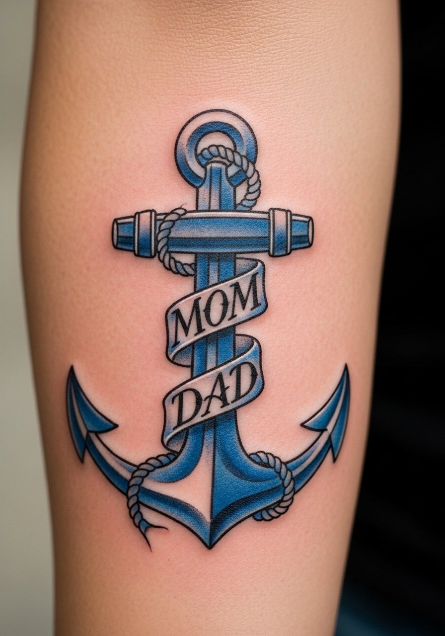
Anchors read as stability and are great when you want something that ages well. Forearm placement keeps the anchor visible and reduces blowout risk compared with hands. Ask your artist to keep the rope and lettering bold and slightly spaced so it does not merge into the anchor body over time. Expect one to two sessions depending on color. A real mistake is squeezing too many names or years into the anchor; that ruins clarity. If you prefer a casual look, cuff a sleeve or add a leather cuff on the opposite arm during show-off moments.
6. Swallow Birds with Mom Dad Banners on the Chest

Chest pieces can be visible in tanks and henleys, which is why birds over a banner work well here. The chest moves with breathing so keep the design centered and not too thin. Discuss symmetry with your artist; uneven placement is a common early regret. Expect moderate pain toward the sternum and lower pain nearer the outer chest. For showing it off, an open V-neck henley frames the birds without revealing too much.
Studio Day Picks
The wrist and forearm pieces above heal differently from larger chest and shoulder work, so a few small items smooth out the session and the first week.
-
Tattoo Goo ointment. Thinner than heavy balms, it helps avoid clogged pores on small banner work on wrists and fingers while keeping saturation even.
-
H2Ocean spray. A dry-spray option that can be useful in humid climates where reds risk fading during early healing, especially on chest and forearm pieces.
-
Uniqva Balm. Lightweight and non-greasy, it helps color retention in warm weeks and reduces the heavy occlusion that can dull fine details.
-
Revivex lotion. Useful post-scab for keeping reds and warm tones lively, which matters for traditional hearts and crowns.
-
Aquaphor Healing Ointment. A thin layer in the first 48 hours helps small scripts and tight banners avoid early dryness that can pull ink from fine lines.
7. Floral Heart Mom Dad Outline on the Inner Bicep

The inner bicep accepts linework and floral framing without too much sun exposure, but it can be touchy during healing from sweat and arm movement. Pain here runs moderate to high for most people. Ask for defined outlines and slightly more spacing between petals so stipple shading does not look muddy at year two. A common mistake is requesting ultra-fine petals. That detail tends to blur under skin stretch. For the session, wear a sleeveless muscle shirt so the artist can position the arm comfortably and keep the stencil steady.
8. Vintage Portrait Mom Dad Silhouette on the Calf

Calf pieces give size and contour without constant sun or friction, so a vintage silhouette reads like an old photograph for years. Expect one to two sessions for a 6-8 inch silhouette and moderate pain only when the artist gets close to bone. A good consultation note is to bring a clear side-profile photo so the pendant lines read like a likeness rather than a sketch. The typical mistake is compressing too much facial detail into a small oval, which can look like smudging after a while. For warmer months, rolled cuff chinos work nicely with calf work and let the silhouette be seen when you want.
9. Rosary Beads with Mom Dad Cross on the Ribcage

Fair warning: ribs are one of the more painful spots on the body. That does not mean you should avoid it, but be ready for a sharper session and for touch-ups in areas where linework sits over flexible skin. The vertical rhythm of beads can travel with breathing, so instruct the artist to anchor the design to a less flexing part of the rib. Artists disagree on fine line here. One group says ribs blur quickly, while another says careful depth and spacing fix that issue. Ask about their rib experience and realistic touch-up timelines before committing.
10. Pinup-Style Mom Dad Heart on the Shoulder Blade

Shoulder blade pieces carry vintage flair and the pinup angle gives it personality. Expect two sessions if you want vibrant color and skin-friendly blending. Tell your artist the era and color palette you prefer so they choose saturation that holds. A frequent misstep is packing too much shading into small pinup faces, which can merge in time. For showing it off, an off-shoulder or wide-neck top highlights the piece. Try an off shoulder blouse when you want the art visible without overexposure.
11. Script Mom Dad with Arrow Through Heart on the Wrist

Wrist scripts read intimate and are quick sessions, but wrist skin takes extra abrasion. Lineweight matters more than ornamentation here. Ask the artist for slightly heavier script and a cleaner serif so the letters do not fade into one another at year three. The main mistake I see is copying a tiny cursive from social media without adapting it for skin. Plan for a one-off touch-up within two to four years for clarity depending on sun exposure and hand use. Avoid placing the arrowhead right on the wrist crease where movement accelerates wear.
12. Old School Dice with Mom Dad Banner on the Forearm

Dice communicate risk and grit while staying firmly in the old-school flash language. Forearm placement is forgiving for saturation, so encourage bold outlines and saturated yellows or reds for contrast. A common session error is over-detailing the pips and shadows. Keep the graphic simple so the dice keep their edges at year five. Pain is low to moderate and most people finish in a single session. For a summer look, cuffed short sleeves let the dice be visible without competing patterns.
13. Micro Finger Mom-Dad Banners

Finger tattoos are a niche and need special planning. The skin on fingers recovers differently and touch-ups are common. If you want legibility, choose a micro bold banner and avoid script that relies on hairline strokes. Expect faster fading and plan for touch-ups within one to three years. A mistake is picking a deeply shaded small image that will patch unevenly as it heals. Be aware of work and hand washing routines because daily friction shortens life span. For the session, remove rings and keep the hand steady to avoid stencil smearing.
14. Geometric Frame Anchor Hybrid on the Chest
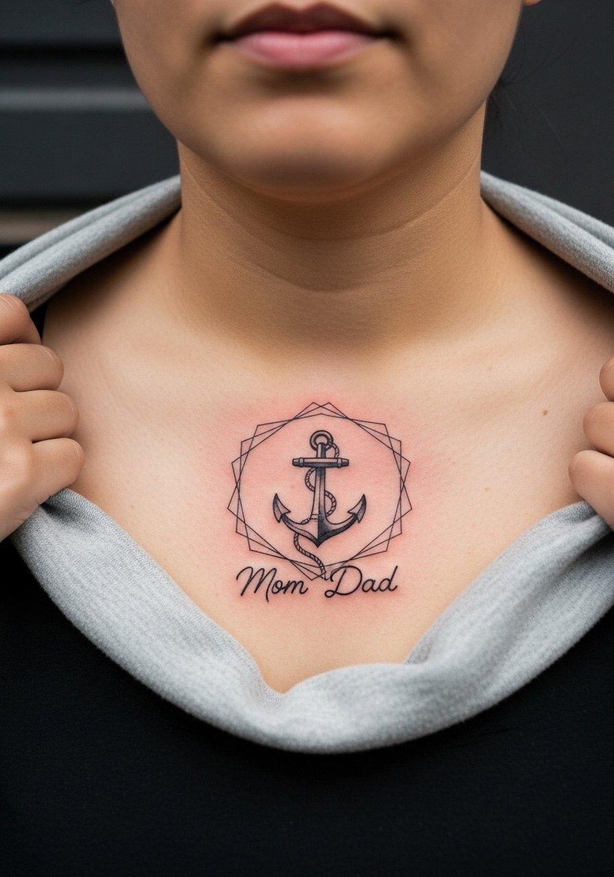
Combining vintage anchor imagery with a modern geometric border gives you a hybrid look that ages differently across elements. The anchor benefits from boldness while the frame needs spacing so lines do not run together at year three. Discuss exact negative space during your consult and ask the artist to map the frame to chest contours. One frequent regret is crowding the frame with small decorative dots that merge. Chest placement shows well with an open collar and reduces friction compared with the neck.
15. Mini Portrait Lockets on the Collarbone

Collarbone designs sit in a visible spot and photograph well. Because the collarbone skin sees sun, pick slightly bolder encircled portraits rather than ultra-fine faces. Ask your artist to keep the portrait silhouettes strong so they do not soften into gray blobs at year four. Pain can spike when the needle crosses bone on the collarbone ridge. For display, a thin chain pendant necklace sits just under the art and complements the locket motif.
16. Patchwork Vintage Sleeve Element: Mom Dad Flash

When building a sleeve, treat mom-dad elements as anchor pieces. They should be spaced to avoid having two small banners blur into one another over time. In consultations for patchwork sleeves, ask the artist to plan negative space and leave breathing room between motifs. The biggest mistake is crowding with too many tiny texts. Expect several sessions and overlapping color topping for consistent saturation. This approach gives you the vintage flash feeling without losing legibility later.
17. Nautical Compass with Mom Dad on the Calf
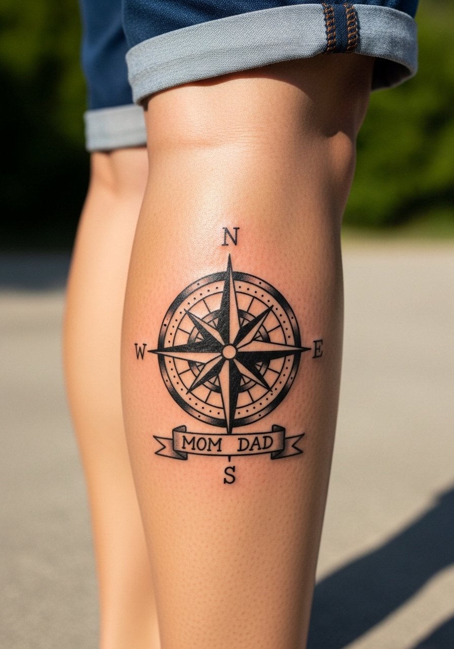
Calf placement accommodates slightly larger compass pieces and keeps directional detail from warping. Tell your artist which cardinal points you want emphasized and keep fine inner details minimal because dense geometry can merge with muscle movement. Pain levels here are usually moderate to low. A typical mistake is asking for micro ticks inside the compass; those need high contrast or they will fade into gray. For summer visibility, rolled shorts or cuffed pants frame the compass nicely.
18. Floral Cameo Heart on the Inner Thigh
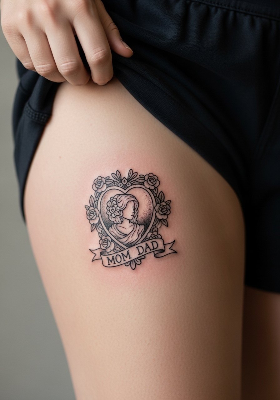
Inner thigh ink can be private and beautifully detailed, but healing needs careful consideration for friction from clothing. The inner thigh favors bold outlines and denser petals to keep detail as the skin moves. Pain ranges from moderate to high depending on personal tolerance. The common error is too many tiny flourishes. For session wear, choose loose shorts and expect to keep the area out of tight clothing during the first two weeks.
19. Cameo Ring Heart on the Collarbone
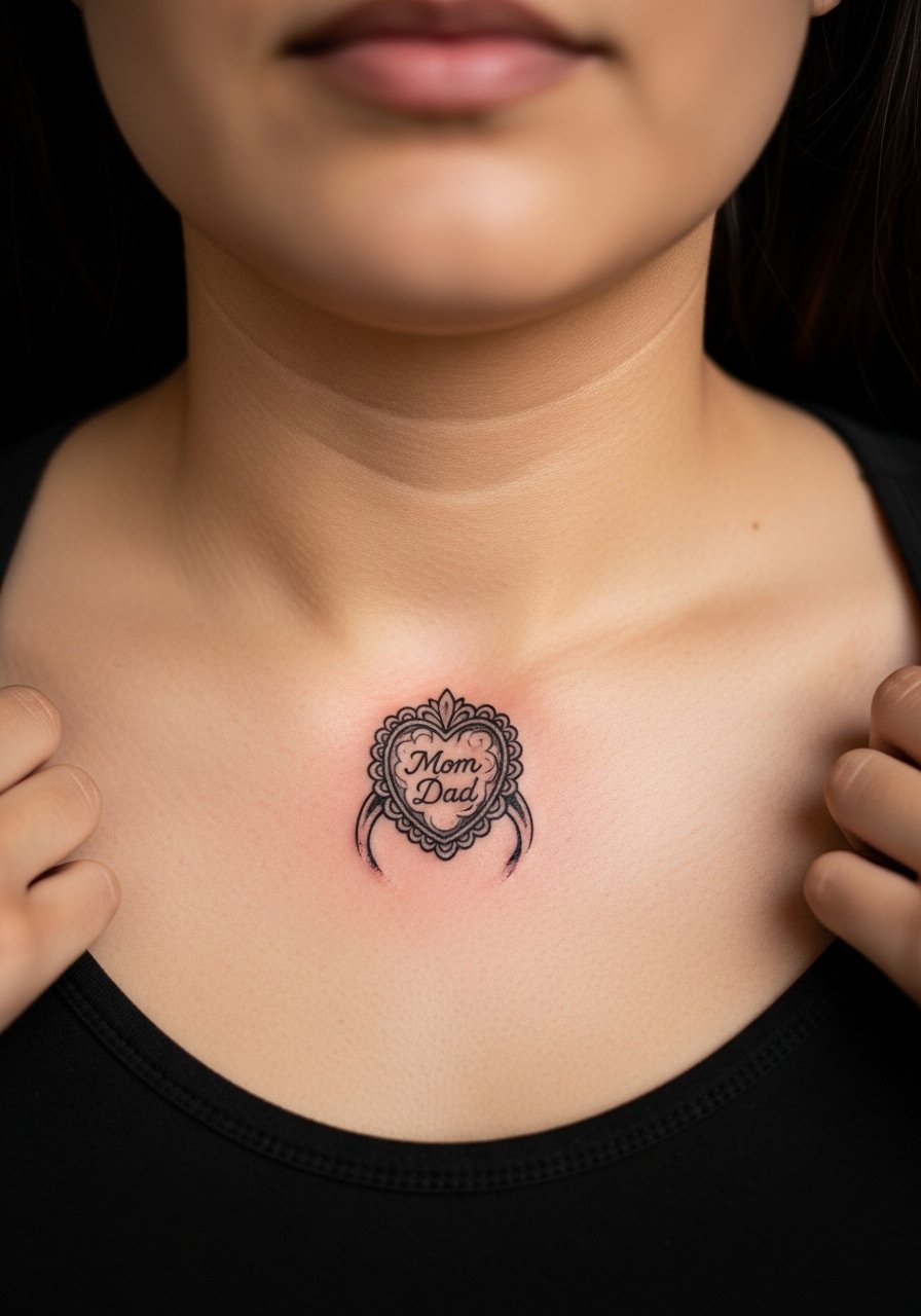
A cameo-style heart on the collarbone reads like heirloom jewelry. Because it sits near bone, ask for slightly thicker shading and a defined outline so the cameo still reads clearly at year three. One mistake is choosing lace-like filigree that loses detail in everyday wear. The collarbone takes touch-ups well and shows nicely with off-shoulder tops. For an elegant look, pair with a thin gold chain necklace that sits below the design.
20. Pinstripe Frame Mom Dad Patch on the Bicep
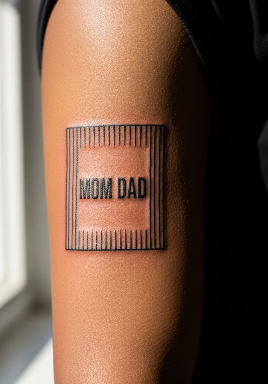
Outer bicep placements are low-friction and great for framed text. Solid outlines and open internal spacing make framed lettering last. Ask the artist to mock up the frame scale on your arm so the stripes do not crowd the text. A frequent mistake is a frame too small for the chosen typeface. Expect low to moderate pain and completion in a single session for a 3-4 inch framed patch.
21. Anchor with Geometric Frame on the Forearm

This hybrid nods to both vintage and modern sensibilities. Forearm placement gives the geometric frame space so lines hold. During consultation, emphasize spacing between the anchor and frame to avoid merging at the corners as skin settles. A mistake is aligning the frame with a muscle crease, which can distort the geometry when you flex. For a casual show-off look, roll a sleeve or wear a v neck henley so the forearm is visible when desired.
22. Memorial Dove and Cloud Band on the Upper Back

Upper back allows for larger memorial compositions that breathe. The skin here is stable and accepts soft grayscale shading well. One oversight I see is making the script too small beneath soft clouds; the letters should be bold enough to remain legible at distance. The session can run longer due to larger surface area, so plan breaks. For display, tank tops or back-exposing styles show the band without uncomfortable exposure.
23. Wrap Script Bracelet: Mom Dad Around the Wrist
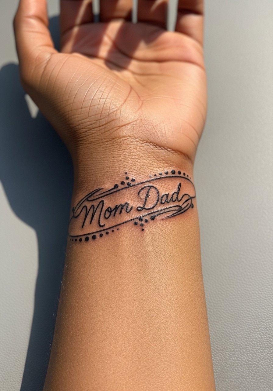
A bracelet-style script reads like jewelry but it needs measured spacing. Because the wrist turns constantly, request larger letter spacing and thicker strokes than your initial reference. Expect touch-ups more often than larger arm pieces. Avoid tiny ligatures and flourishes that the skin will not hold. When you want to accessorize, go for a thin leather bracelet on the opposite wrist to balance the look without crowding the script.
24. Tiny Matching Mom Dad Anklet Tattoos
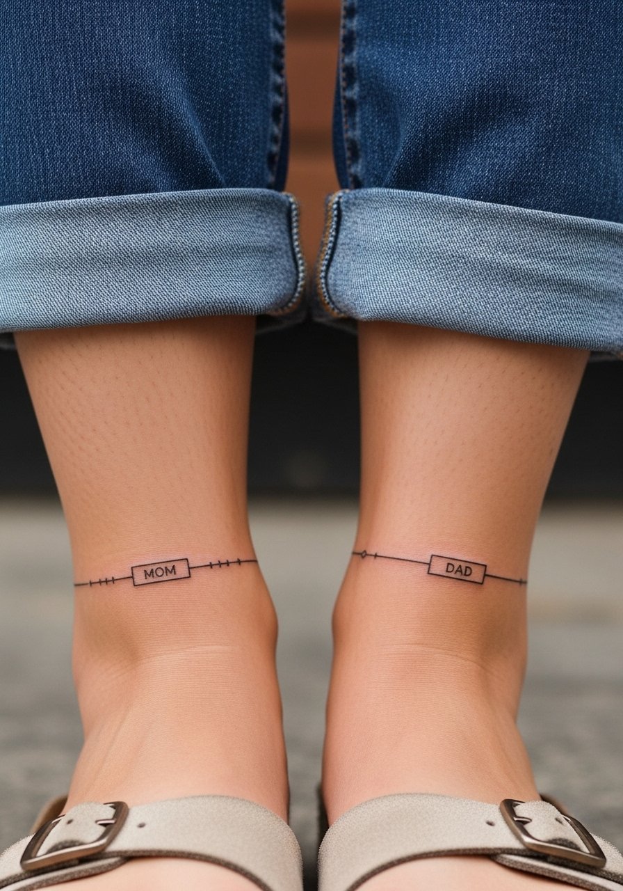
Ankle tattoos are charming and seasonal, but they are exposed to shoes and socks friction. Keep detail minimal and lineweight steady. The mistake people make is packing too much tiny decoration into a small circumference. Expect a touch-up at year two, depending on footwear habits. For session access, wear rolled jeans or shorts. Keep in mind ankle work can fade faster if you wear closed shoes frequently.
25. Floral Wreath Heart Over the Chest
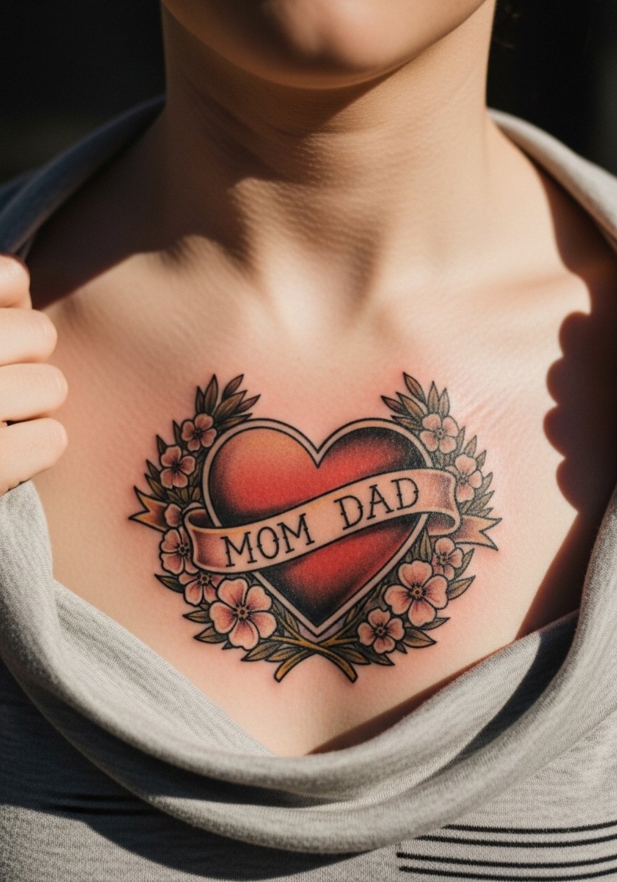
A chest wreath reads classic and feminine while holding up if outlines are confident. The floral elements need room to prevent petal edges from blurring. Ask for heavier stems and fewer tiny leaves in crowded spots. Pain varies across the chest but expect more sensitivity near the sternum. For evenings out, a v neck henley or open button shirt shows the wreath without demanding full exposure.
26. Paired Portrait Silhouettes on the Thigh

Outer thigh gives privacy and size for clearer silhouettes. The skin here tolerates larger shapes so portraits can keep detail without becoming fuzzy. Common mistakes include cramming tiny facial features into too small an oval. For session comfort, wear loose shorts and expect a moderate pain level. Thigh pieces often look great months later when swelling settles and saturation evens out.
27. Old-School Ribbon Band Around the Calf or Knee
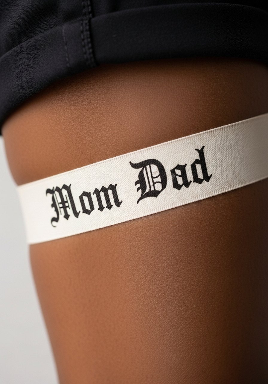
A circumferential ribbon band reads like a classic armband and holds up well when the ribbon width is substantial. Thin bands often fade into thin gray lines, so ask for at least medium width and solid outlines. Expect low to moderate pain on the calf. A frequent mistake is asking for very small script inside a thin ribbon. Keep the banner width and lettering proportional so the message remains legible after a few years. Wear rolled cuff chinos or shorts to show it off.
Frequently Asked Questions
Q: Will a small fine-line Mom Dad script on my wrist blur faster than a bold banner?
A: From what I have seen, fine-line scripts on wrists blur faster because of constant friction and washing. Bold banners with heavier linework and slightly more spacing keep letters readable longer. If you want subtle, ask the artist to scale the lettering up a touch and plan for a touch-up within two to four years.
Q: How do chest and ribcage memorial pieces differ in healing and pain?
A: Ribcage sessions generally hurt more and move with breath, affecting line stability during the first week. Chest pieces on the outer pectoral area tend to be less painful and sit in an easier healing zone. For ribs, expect breaks during the session and ask your artist about their rib experience so you can plan realistic touch-up timelines.
Q: Are finger and ankle mom-dad tattoos a bad idea if I want them to last?
A: They can work if you accept more frequent touch-ups. Fingers and ankles are high-friction areas, so choose bold, simple designs and thicker linework. If you need long-term low-maintenance ink, consider moving the concept to the forearm or calf instead.
Q: I have darker skin. Which vintage mom-dad styles pop best for me?
A: Bold traditional outlines and saturated blocks of color tend to read best on darker skin because of high contrast. Very fine gray shading can lose contrast, so ask for cleaner linework and denser fills. Waiting a month before photographing the healed piece also helps show the design clearly.
Q: What should I wear to my session for a collarbone or chest tattoo?
A: Wear something with an open neckline like a wide-neck shirt or a strapless top you can easily adjust. The goal is to expose the tattoo area without being fully undressed. Comfortable, loose clothing that the artist can move aside is the practical choice.
Q: Artists disagree on Saniderm versus dry healing. Which camp is right for vintage boldwork?
A: There are two camps. One prefers protective film like Saniderm to keep the area clean and reduce scabbing. The other prefers dry healing for boldwork to allow scabs to form and settle. For vintage bold lines, many experienced artists lean toward dry healing, but personal skin response matters. Ask your artist which method they trust with their linework and follow their plan for the best result.