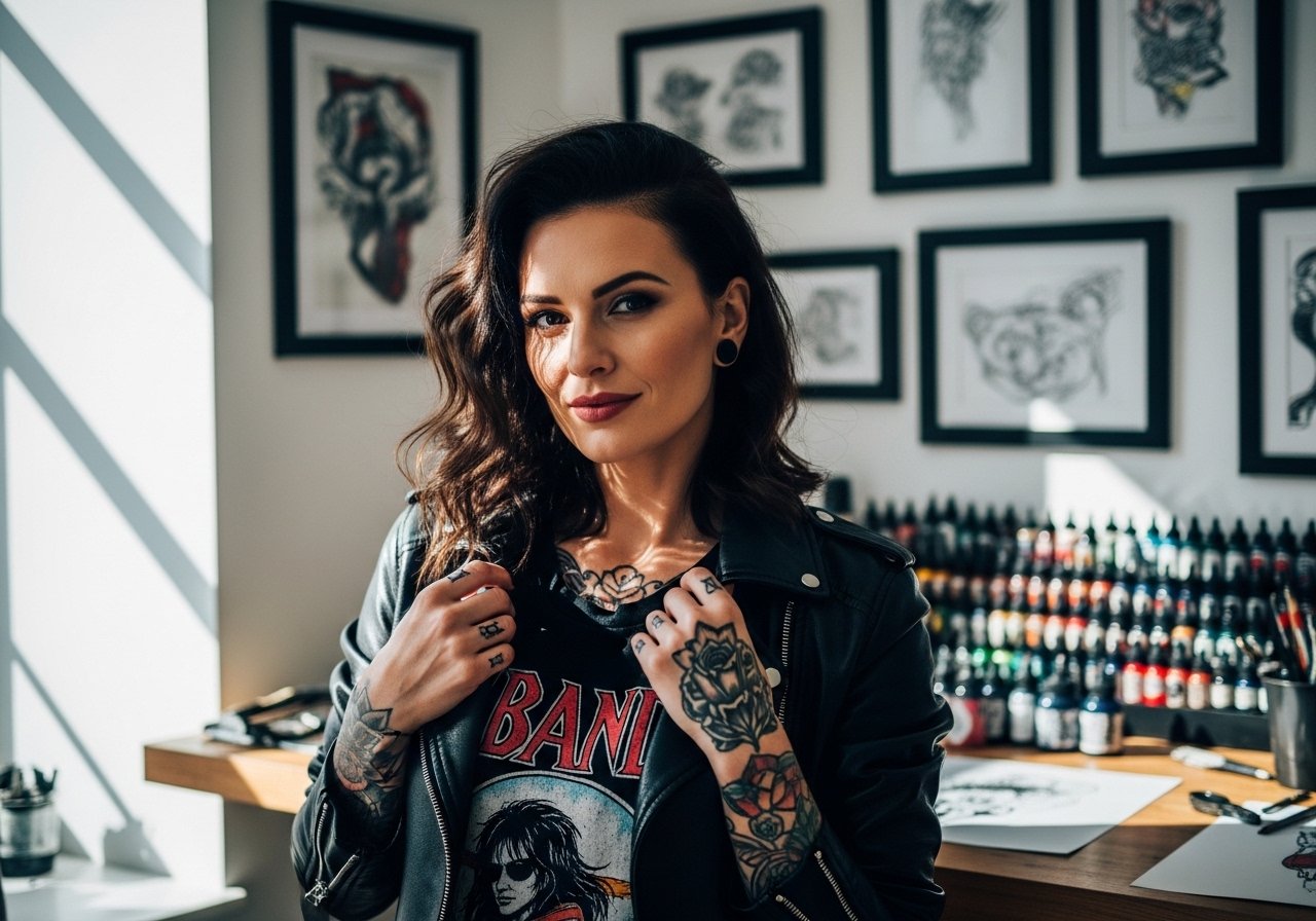
Fine line watercolor is trending, but what holds color on a full back over years is not just the pigment. Placement, saturation, session pacing, and how you move afterward all matter. In this collection I focused on full-back pieces that read as paintings but follow tattoo longevity rules, with notes on consultation talk, session wear, and realistic touch-up timing to help you get a back piece that still looks intentional after five years.
1. Cascading Botanical Watercolor Across the Spine
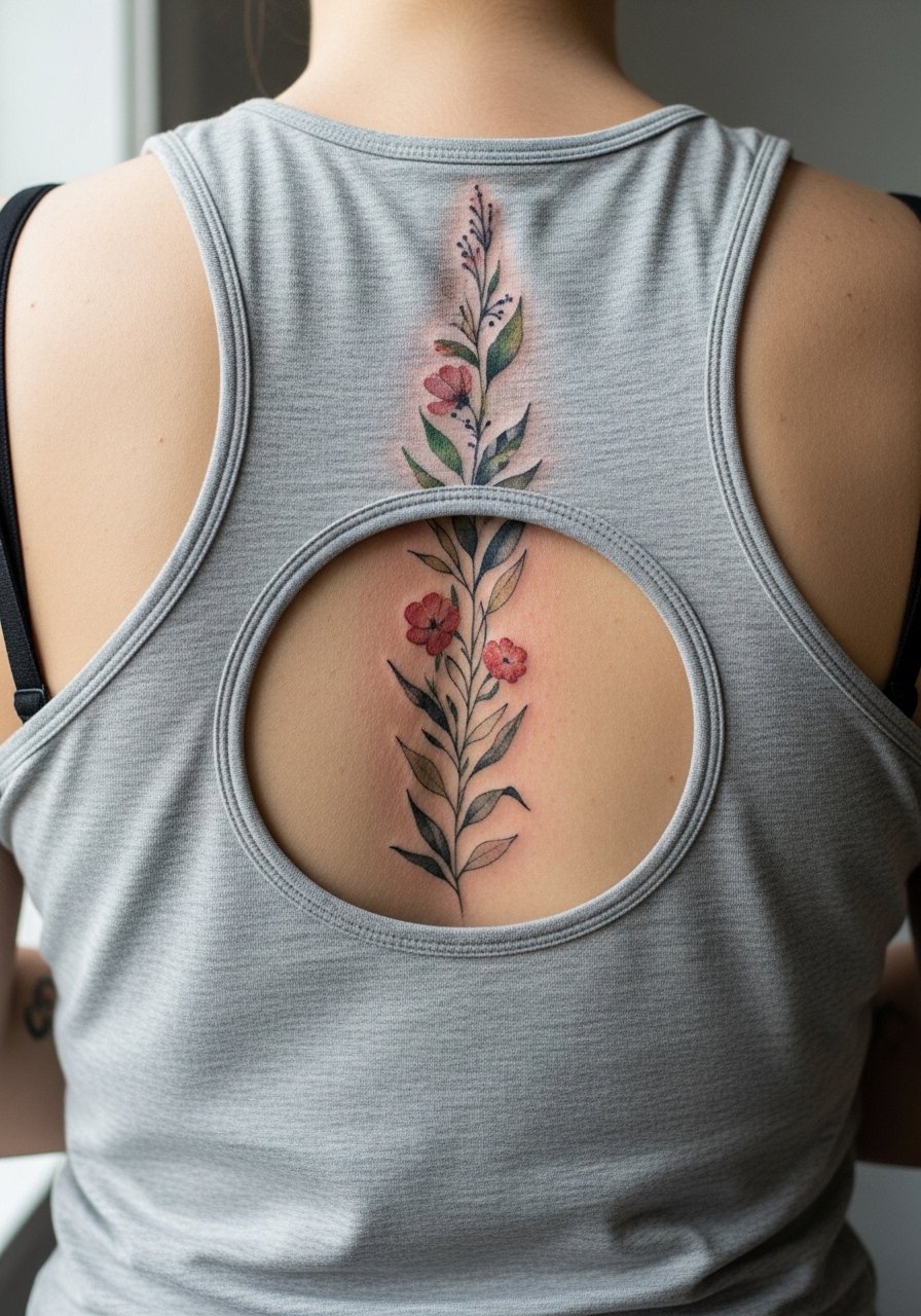
I've seen full-back botanicals hold their presence when artists plan negative space along the spine. For a cascading composition ask your artist to stagger stems and keep heavy saturation away from the vertebrae itself. Fair warning, the spine is a higher pain zone and long sessions here often need breaks, so expect two to three sittings. A common mistake is packing too much tiny detail into one session, which leads to muddy color later. For the session wear a racerback tank you can pull aside easily, and plan for a touch-up around year three if you want the watercolor to read bright.
2. Full-Back Phoenix in Loose Washes
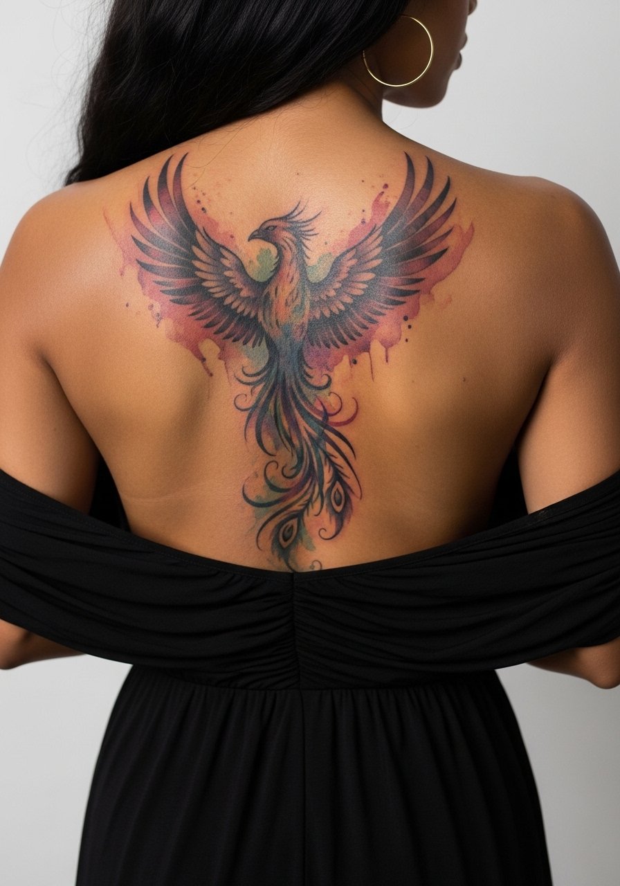
Most phoenix concepts rely on contrast between saturated areas and pale washes. I recommend telling your artist you want bold anchors in the wings with diffused watercolor fills. The main mistake is asking for everything to be feather-fine and expecting longevity; watercolor needs deliberate saturation points to survive. Sessions run long for this scale, so break it into upper and lower back appointments to prevent swelling. When you want to show it off, open-back dresses work well. Try an open-back midi dress for evenings to let the color read without covering the wings.
3. Koi Pond Panorama with Subtle Splashes
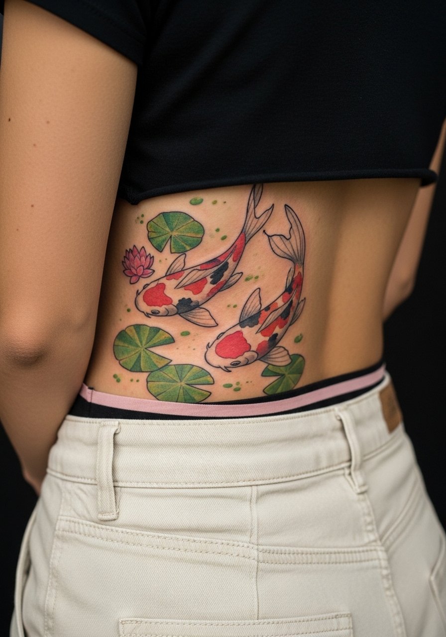
When a design spans the lower back, friction from clothing and waistbands is the main wear issue. For koi scenes, ask for slightly bolder edges around the fish to keep form as washes fade. A common aging pattern is that light washes at the edge disappear first while cores keep some saturation. Session feel: lower back sessions are a 5 to 7 for many, and you may want to stagger work across two visits. Wear high-waisted bottoms and a cropped tee to the appointment so the area is accessible but not irritated by waistbands afterward.
4. Celestial Map with Watercolor Nebulae

There is something about nebulas on the back that reads like a worn tapestry from a distance. For longevity, request defined constellations and slightly denser pigment at focal points so the stars stay crisp as washes soften. A real mistake is letting the artist blend all pigment into one continuous fade without anchors. The session will involve long shading passes that can cause skin to swell, so expect repeat appointments and a likely touch-up at year three to restore midtones. To frame it at night, halter tops or dresses with an open back complement the spread without competing.
5. Mandala-Back with Watercolor Halo
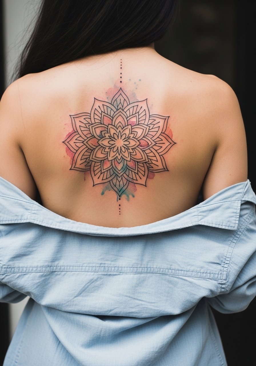
Mandalas on a full back require respect for origin and scale. This pattern traces to Buddhist design, so many choose slight variations rather than exact ritual motifs. Artists split on how tight mandala detail should be for a back piece. One camp insists on dense dot work for texture, the other says larger shapes age better. Name both and ask where your artist stands during consultation. The common aging issue is overcrowding fine dots that merge; ask for slightly enlarged spacing and a watercolor halo to keep the central geometry readable for years. For the session wear a loose button-down shirt you can slide to one side.
6. Portrait-Style Watercolor Portrait with Painterly Strokes

Portraits in watercolor can feel like a painted panel across the back when done with intentional anchors. The biggest mistake is treating portraits like a photograph and pushing for micro-detail in wash zones. Tell your artist to prioritize tonal anchors around the eyes and jaw so recognition remains as washes fade. Sessions are long and usually split into realistic rendering then color sessions. This placement is demanding on session pacing and likely needs a touch-up at year three to five. If the portrait references a cultural figure, discuss respectful adaptation rather than direct replication.
Studio Day Picks
The upper and lower back pieces above ask for different prep than chest or rib work, so a few items make the session smoother and protect the color in the first week.
-
Stencil transfer paper kit. Lets you preview the composition across a large back canvas before finalizing placement, which is vital for full-back layouts.
-
Topical numbing cream. Helpful for longer sessions on the spine and lower back when you need a manageable pain window.
-
Thin protective film roll. Useful for the first 24 hours on lower back pieces where waistbands might rub the area.
-
Fragrance-free body wash. Cleanses healing skin without irritating delicate watercolor washes across large areas.
-
Aquaphor healing ointment. Thin layers in the first days help maintain moisture on large watercolor zones while letting color breathe.
7. Ocean Wave Wash with Line Accents

There is a visual impact when sweeping waves meet crisp linework for boaters or shore motifs. I advise asking for stronger outlines on wave crests to keep motion readable as dilute washes fade. A mistake is expecting all color to sit evenly; areas near the spine and lower back can lose pigment faster. Session feel leans more toward sustained shading, and the lower-back location can ache afterward if you sit for long periods. Pair this design with beachwear that shows the band, like a high-waisted swim bottom for summer reveals.
8. Abstract Color Blocks with Fine Line Overlay
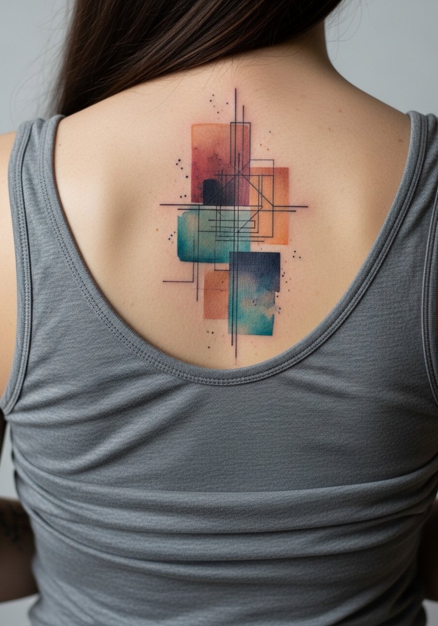
Abstract blocks let color carry the composition while thin linework keeps structure. One common mistake is placing too many thin lines across saturated washes; those lines can blur over time. Ask for slightly thicker key lines and fewer crossing points. The controversy in some circles is whether watercolor without anchors qualifies as a tattoo that will age well. One camp says artist should avoid pure wash. The other camp says careful placement and a few bold anchors are enough. The session will favor layering pigment after initial healing to build depth.
9. Botanical Jungle with Layered Watercolor Depth
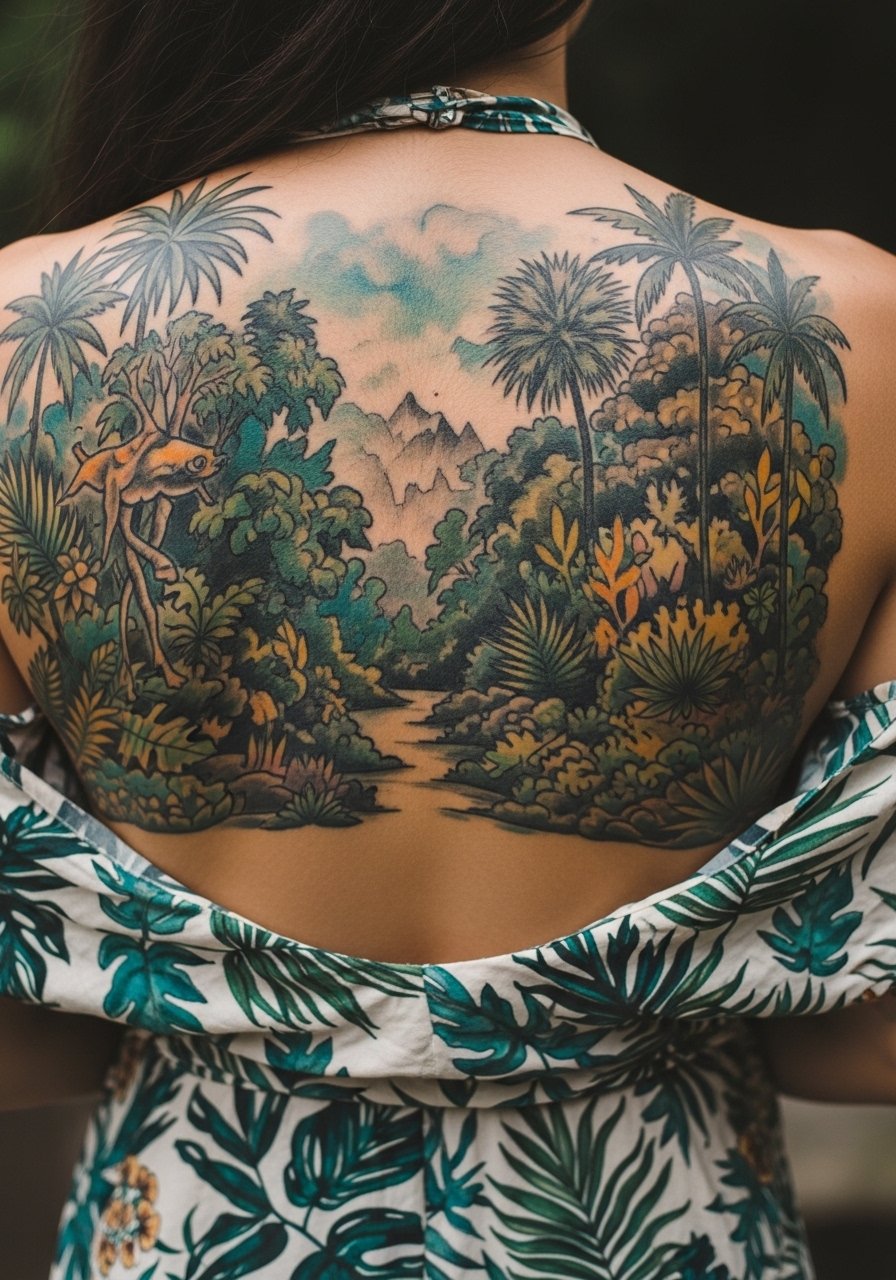
For dense botanical full-back work, spacing is everything. I tell clients to pick a few leaf shapes to repeat rather than endless new motifs, so the eye reads pattern and the piece ages more gracefully. A typical error is crowding too many micro-leaves in shadow zones where washes will merge. The session will likely split between outline/anchor day and color layering days. To show this off, open-back dresses or halter tops work well. Try an open-back halter top for events.
10. Mythic Creature with Saturated Color Anchors
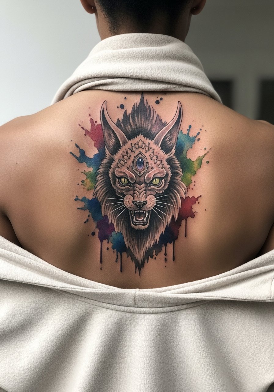
Mythic full-back pieces read best when the artist balances painterly color with saturated anchors at the eyes, claws, or mane. The mistake people make is asking for everything soft, which removes contrast as pigment fades. Session time can be long and often split into a sketch day and multiple color days. Pain is variable depending on proximity to the spine. If your work includes symbolic imagery from a culture, discuss respectful adaptation and alternatives.
11. Full-Back Lace Pattern with Watercolor Wash
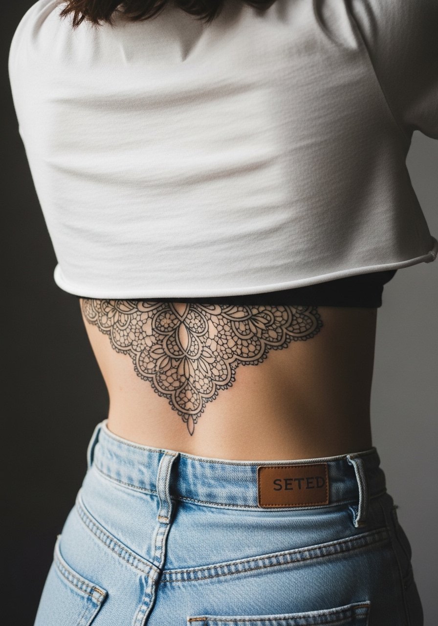
Lace motifs need repeatable rhythm across a large canvas. The common aging error is making tiny connecting threads that blur into one line later. Ask for slightly wider gaps and a watercolor wash behind the lace to preserve contrast. Lower back friction is the practical concern, so wear soft waistbands after the session. For appointments, high-waisted jeans and a cropped tee make access simple without pulling against the fresh ink.
12. Surrealist Butterfly Burst with Color Trails
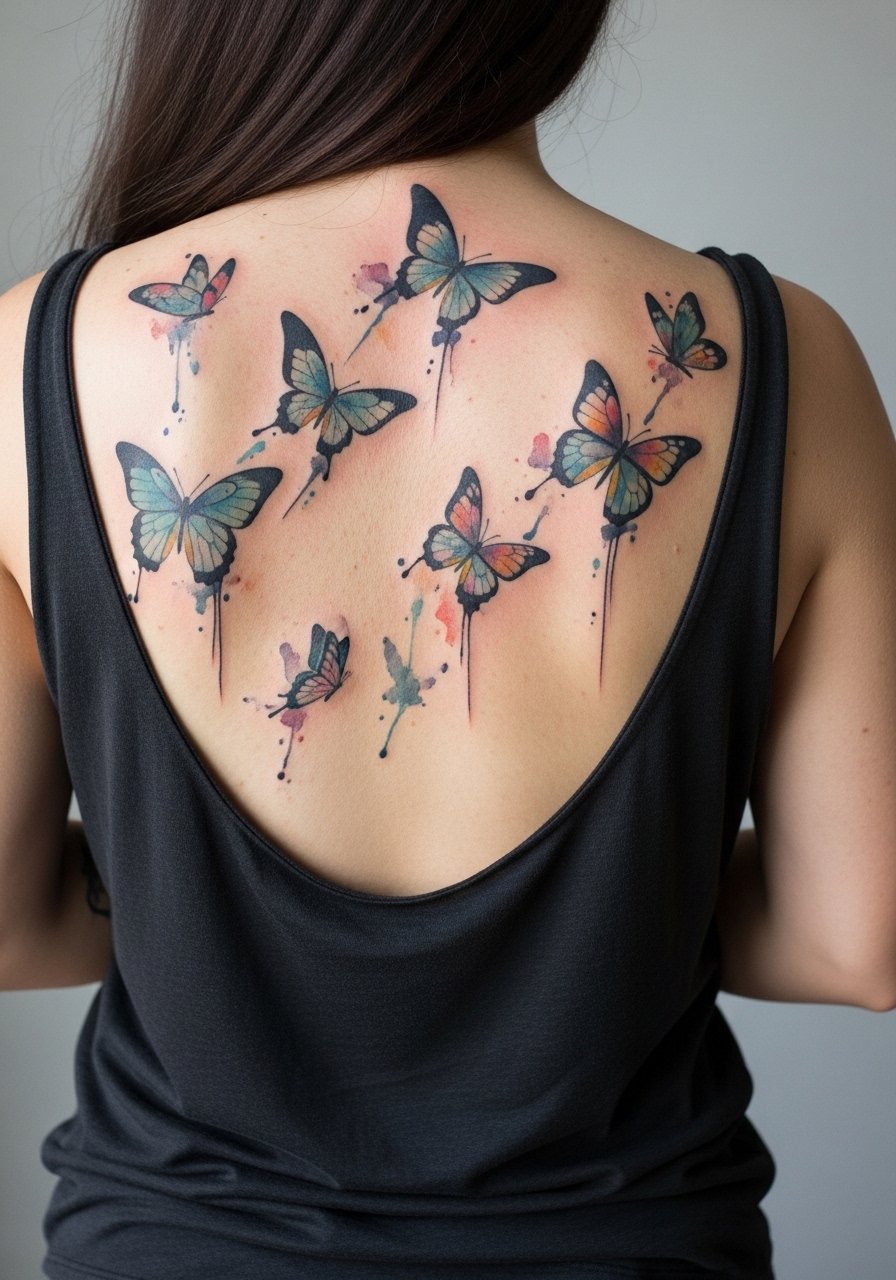
Butterflies work well on full backs when motion is baked into composition. A design that fades into soft trails helps hide aging where washes thin. Artists sometimes make the mistake of packing identical butterflies across the back; variance in size and saturation keeps the piece alive. Sessions for this scale often split by side or by row of motifs. The visual impact is strong with open-back garments and layered hair styles pulled up to show the full field.
13. Scripted Phrase with Watercolor Background

When lettering spans the back, clarity is everything. The biggest mistake is choosing a hairline script over too broad an area; tiny scripts can blur. I recommend a medium-weight calligraphic script with a watercolor wash behind to emphasize words without risking illegibility later. If the text has cultural or personal significance, confirm exact phrasing and capitalization during consultation. Sessions are straightforward but require steady handwork, and a touch-up is common where letters endure the most abrasion.
14. Color-Blocked Silhouette Landscape
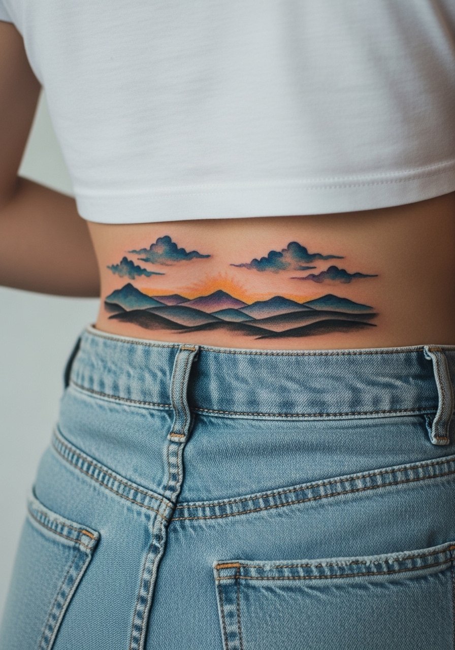
Silhouette landscapes age fairly predictably because solid shapes hold pigment better than soft washes. The error many make is over-detailing the silhouette with tiny strokes that vanish. Tell your artist to keep the silhouette bold and use washes for sky and background. Lower back wear matters, and this placement tolerates a slightly thicker session layering to lock color in. Beach or festival outfits that expose the band are natural show-off pairings.
15. Lotus and Koi Full-Back Composition
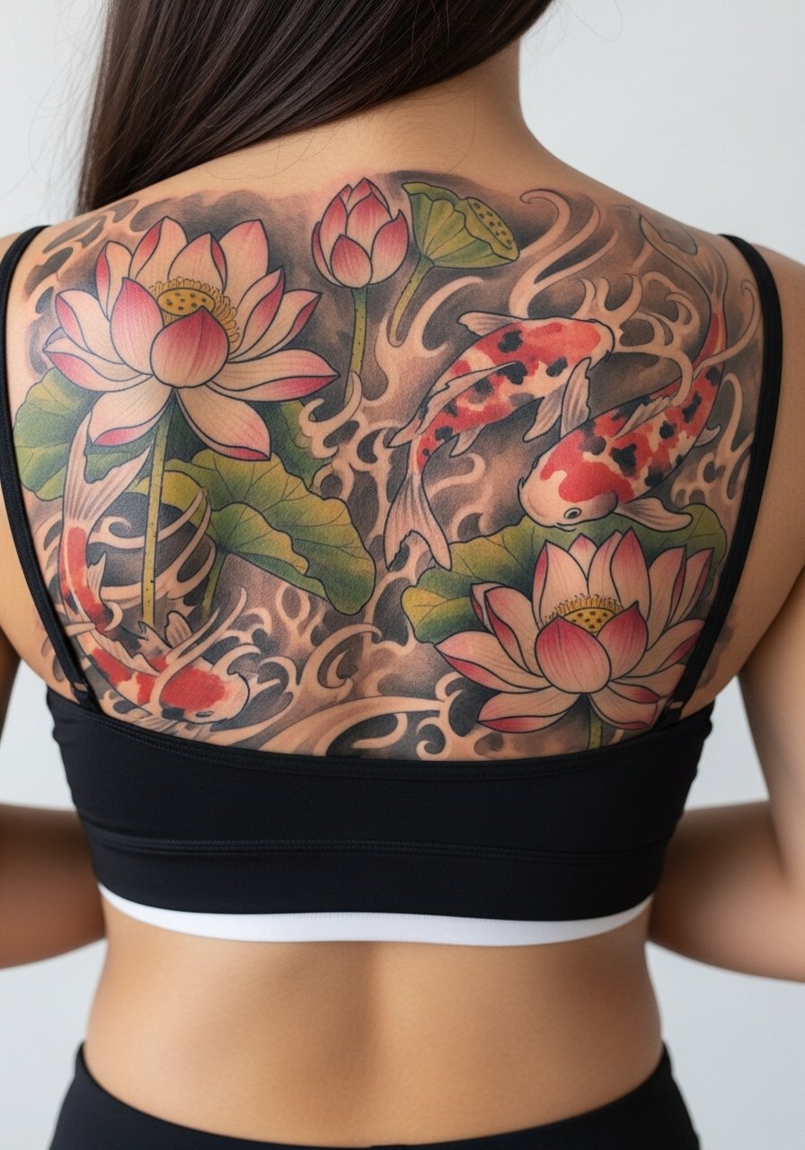
This is a classic combination that reads well across a back canvas when the lotus provides negative space and koi provide movement. Avoid the trap of making every detail feather-fine; instead ask for bolder edges on the koi and softer petals on the lotuses. Sessions can be multiple days and you will want to schedule recovery time to avoid sleeping on the area. To make it event-ready, choose tops with a low band or an open back that frames the central composition.
16. Geometric Watercolor Grid with Soft Bleeds
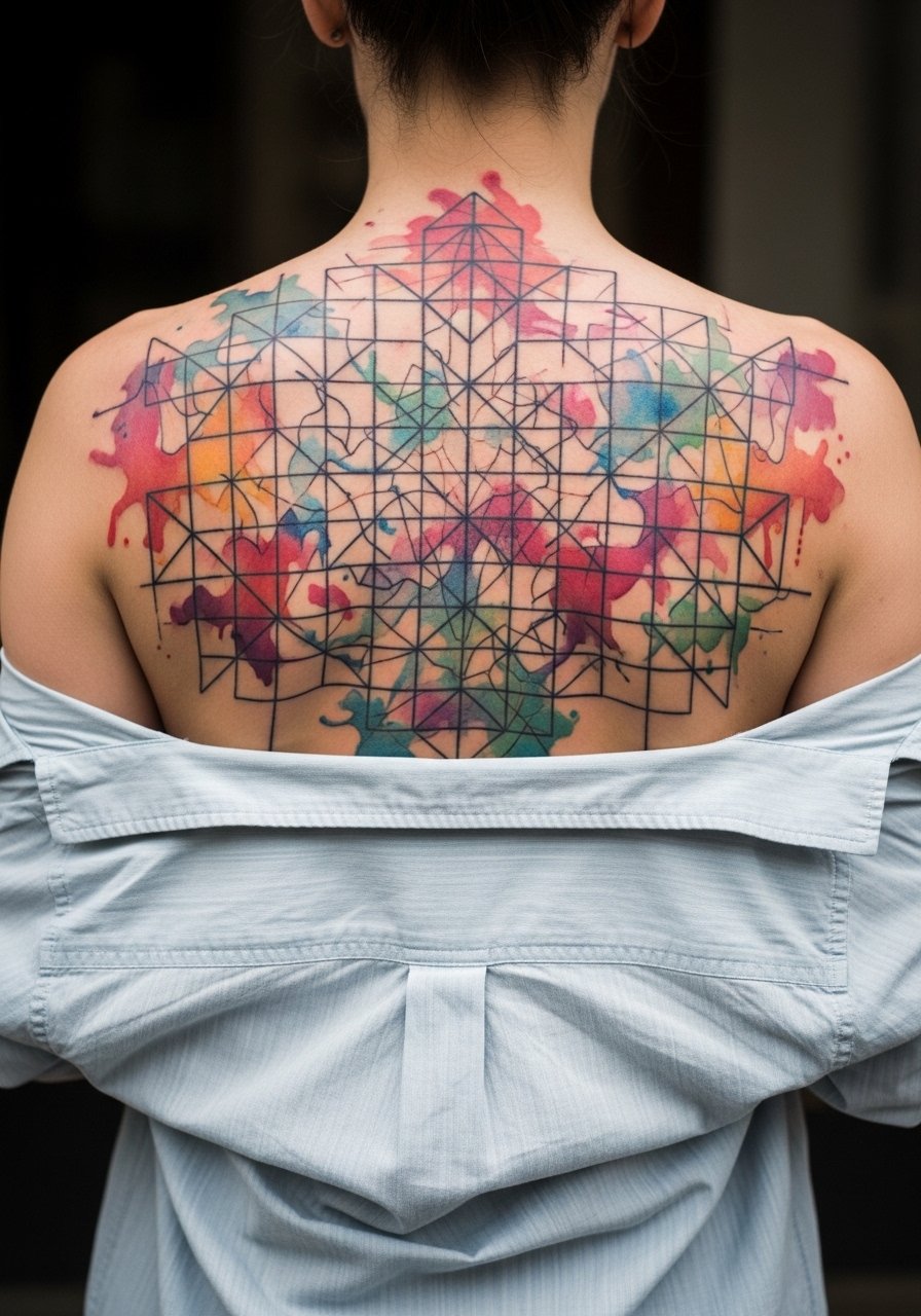
Geometric patterns demand precision and spacing to avoid eventual merging. The most common issue is making grid lines too close. Ask your artist to scale the grid so each cell has breathing room and to add soft watercolor bleeds to distract from small shifts over time. Sessions involve precise linework first and color layering later. This back placement tolerates larger scales, which is one reason geometric grids can hold up better than tiny repeat patterns.
17. Night Sky Panorama with Watercolor Gradient

A night sky across the shoulders reads cinematic and photographs well. The aging challenge is preserving subtle gradients. I advise stronger pigment near the horizon line and diluted washes higher up so the transition survives sun exposure. Expect at least two sessions for smooth gradients and an eventual refresh for the midtones. Pair this with open-back or wide-neck tops to let the shoulders and gradient show on cooler evenings.
18. Seasonal Tree with Watercolor Leaves
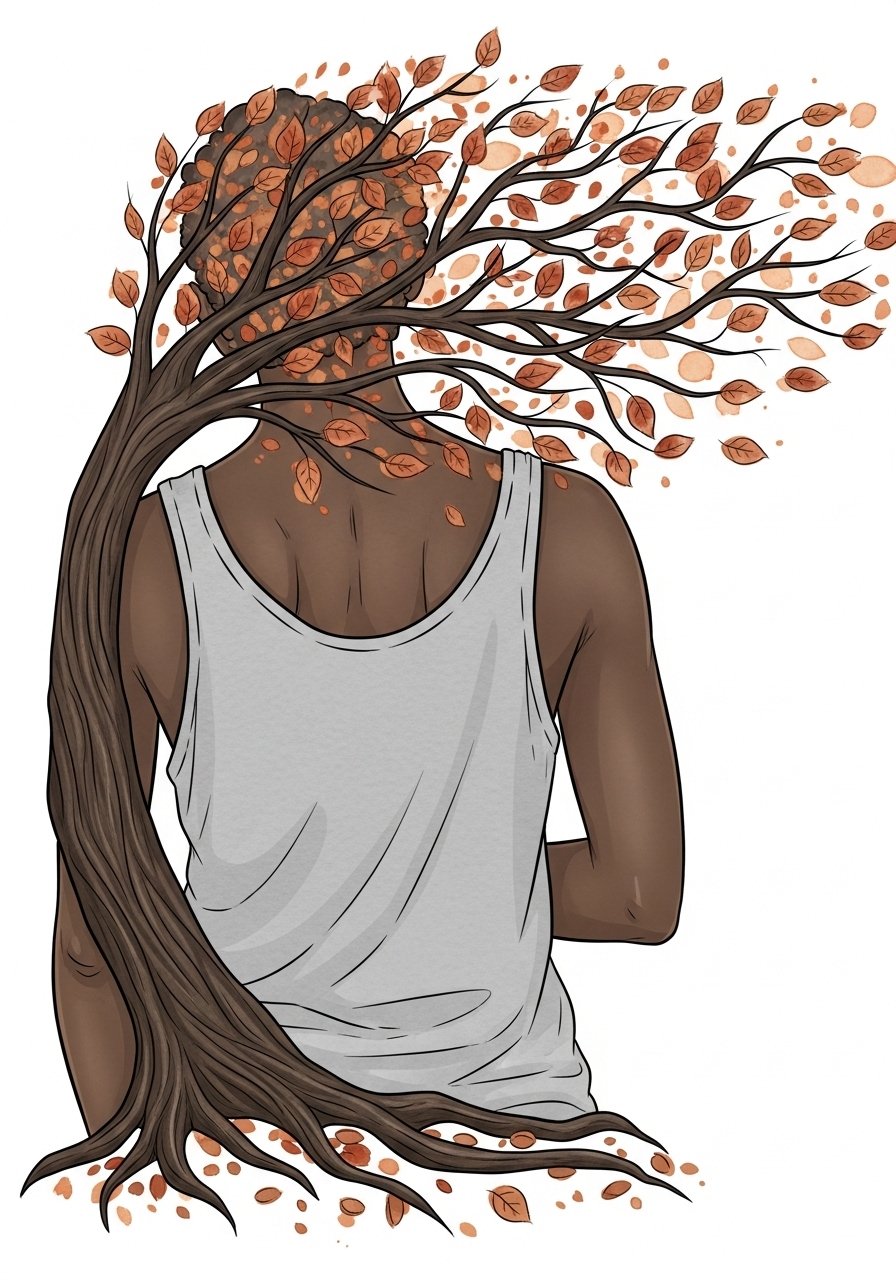
Seasonal color palettes allow you to pick tones that align with wardrobe. The main mistake is too many tiny leaves that compact into a blur. Ask for clusters of leaves and occasional solid shapes to keep seasonality visible as washes soften. Sessions will likely cover trunk and major branches first, then leaf color in subsequent visits. If career considerations matter, discuss reveal options and clothing that keeps the tattoo private when needed.
19. Feathered Wing Spread with Watercolor Tint
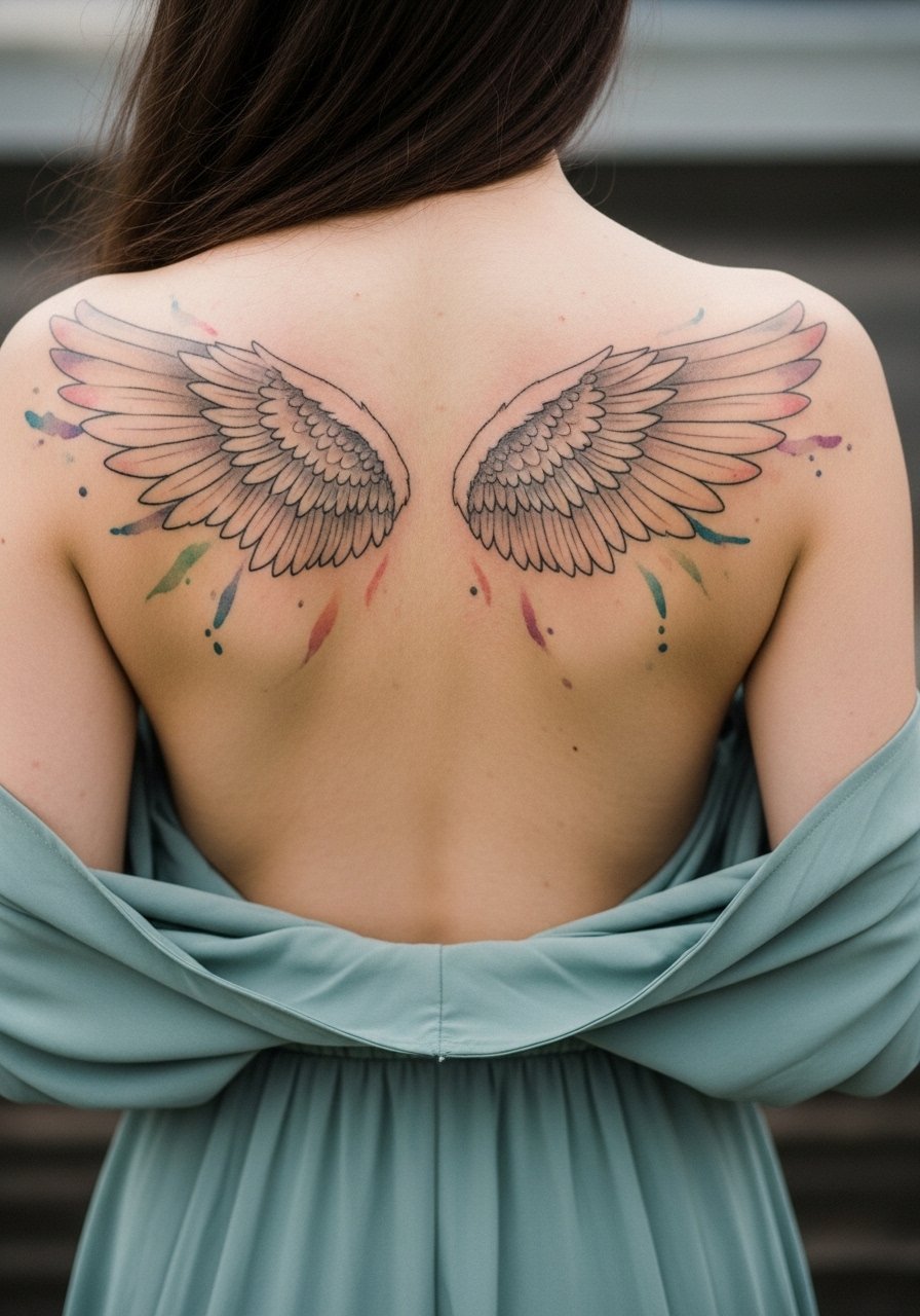
Wings rely on a balance between fine feather linework and tinted washes. A frequent error is making the feather shafts too close together, which can merge. Ask your artist to vary feather sizes and include solid anchors near the base of the wings. Sessions are long and often split into base linework and color passes. For evenings out, open-back dresses showcase the span without crowding the shoulder line.
20. Watercolor Cityscape with Reflective Wash

Cityscapes read as strong blocks when the skyline silhouettes are clear and reflections are intentionally soft. The mistake is overworking building detail where washes will eventually blend. Request crisp silhouette anchors and gentle mirrors below to retain the scene as color fades. Lower back placement requires attention to clothing that might rub. For the session, bring comfortable seating options because this area can be sensitive during long shading passes.
21. Color-Forward Abstract with Negative Space Lines
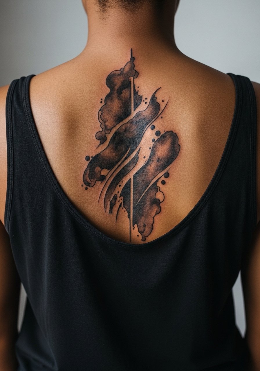
Abstract full-back work that mixes strong color fields with negative space lines often ages well because the lines are intentional and the color fields can be re-saturated in touch-ups. The common mistake is creating too many thin negative lines that disappear. Ask for fewer, purposeful negative lines and bolder color shapes. Sessions are artist-specific but usually involve layering color over a series of shorter visits. For discovery, look for local studios through convention guest lists, directory sites, and community hashtags to find artists who specialize in large color work.
Frequently Asked Questions
Q: How painful is a full-back watercolor tattoo compared with line-only designs?
A: Pain varies by zone. Large washes tend to sting less than constant tight linework near the spine. Expect higher sensitivity along the vertebrae and lower back; plan multiple shorter sessions rather than one marathon to manage discomfort.
Q: Do watercolor full-back tattoos need different touch-up timelines than traditional full-back pieces?
A: In my experience, watercolor pieces usually need a touch-up earlier for midtones because washes fade faster than saturated traditional fills. Plan for a realistic touch-up at year three to maintain vibrancy, with lighter refreshes every few years after.
Q: Are there placement risks specific to full-back watercolor that I should ask about in consultation?
A: Yes. The spine and lower back have different skin tension and healing patterns. Ask your artist about planned anchors near the spine and how they will protect wash areas near waistbands. Also ask about sun exposure plans for the upper back if you often wear backless clothing.
Q: How should I dress for a full-back session to make access and healing easier?
A: Wear clothing that the artist can slide aside without being removed, like a loose tank top or a button-down. Post-session, avoid tight waistbands and choose soft high-waisted bottoms while the lower back heals.
Q: Should I worry about employers seeing a full-back tattoo in professional settings?
A: Full-back tattoos are easy to conceal with standard clothing, so they are generally low risk for workplace visibility. If you anticipate regular close-collar dress requirements, plan designs and reveal choices accordingly.
Q: How do artists differ on watercolor technique and what should I ask before booking?
A: Artists vary on how much saturation they use and how they layer washes. One camp favors more pigment anchors for longevity. The other prefers a painterly thin wash approach. Ask to see healed photos of similar scale work and discuss touch-up expectations before booking.