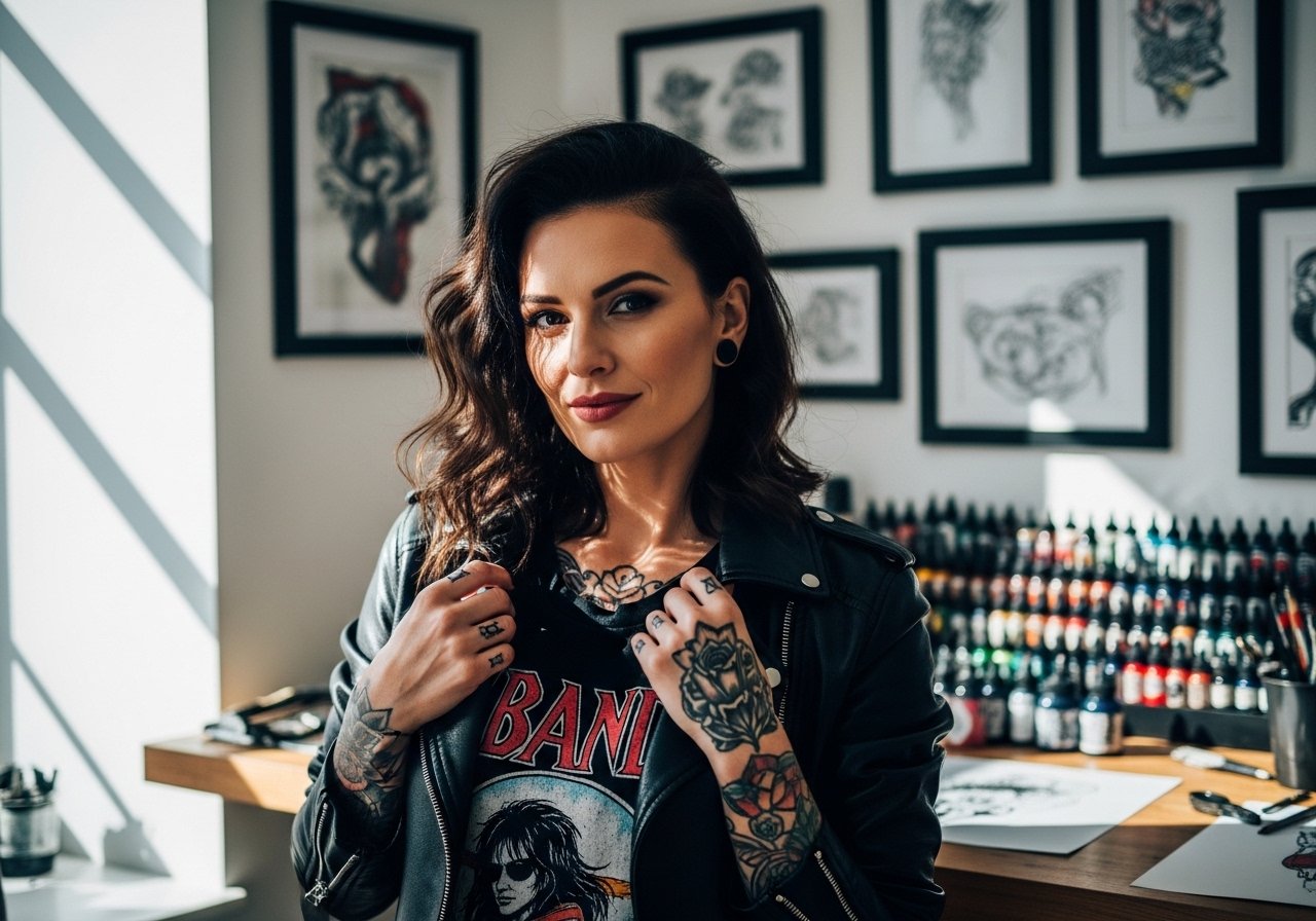
Fine line watercolor on forearms looks effortless online, but what holds up over years is another story. Some pieces that sing the day they are done blur into soft color washes by year three because of placement, needle depth, or sun exposure. Others keep crisp edges when artists balance linework with measured saturation and breathing room. This list focuses on forearm watercolor approaches that read clean after healing and gives what to ask your artist in the chair.
1. Loose Botanical Watercolor on Inner Forearm
I've seen this placement last better than wrist pieces when the color sits with slight negative space around stems. Tell your artist to keep the linework as a fine anchor and let the washes breathe away from dense detail. Fair warning, the inner forearm catches the sun on casual days, so expect some fading by year three if you do not use sun protection. The session feels moderate on most pain scales and usually finishes in a single appointment under two hours. A common mistake is asking for overlaid detail in the watercolor zones. If you want it to age clean, ask for stipple shading near the outlines and light saturation in the washes. For showing it off, a rolled-up linen shirt sleeve frames the piece without covering the flow.
2. Minimal Splash with Fine Line Anchor on Outer Forearm

This approach pairs a crisp single-line motif with a soft color field that sits behind it. When you consult, specify the exact lineweight you want and ask for light saturation in the colored areas. The biggest mistake is asking for deep, painterly saturation across the whole piece. That tends to age into mud on forearms because of daily friction and sun exposure. Expect a one to two hour session for a medium-sized piece and a touch-up at year two if you want it bright long term. For session day, wear a short-sleeve tee you can roll without rubbing the fresh work.
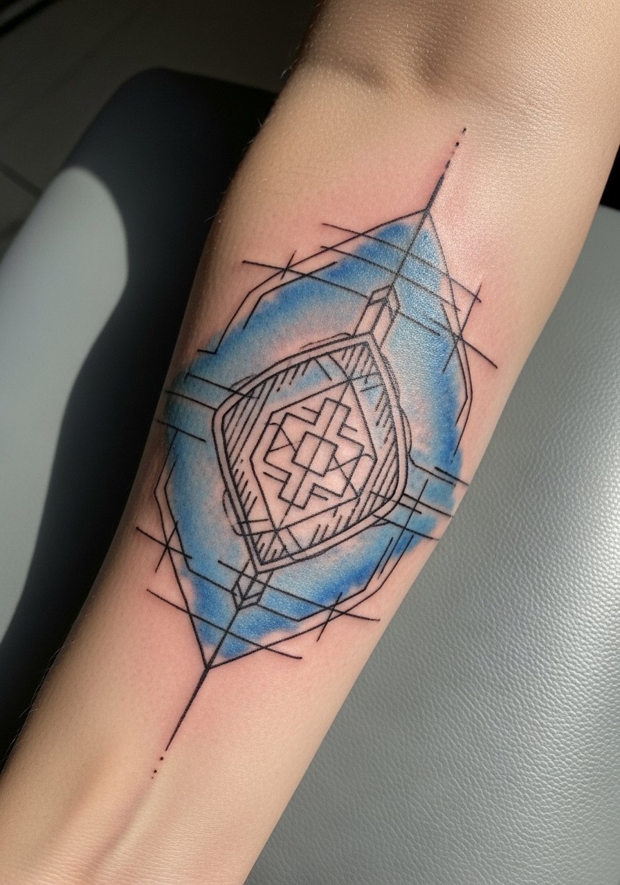
3. Watercolor Geometric Overlay on Mid Forearm
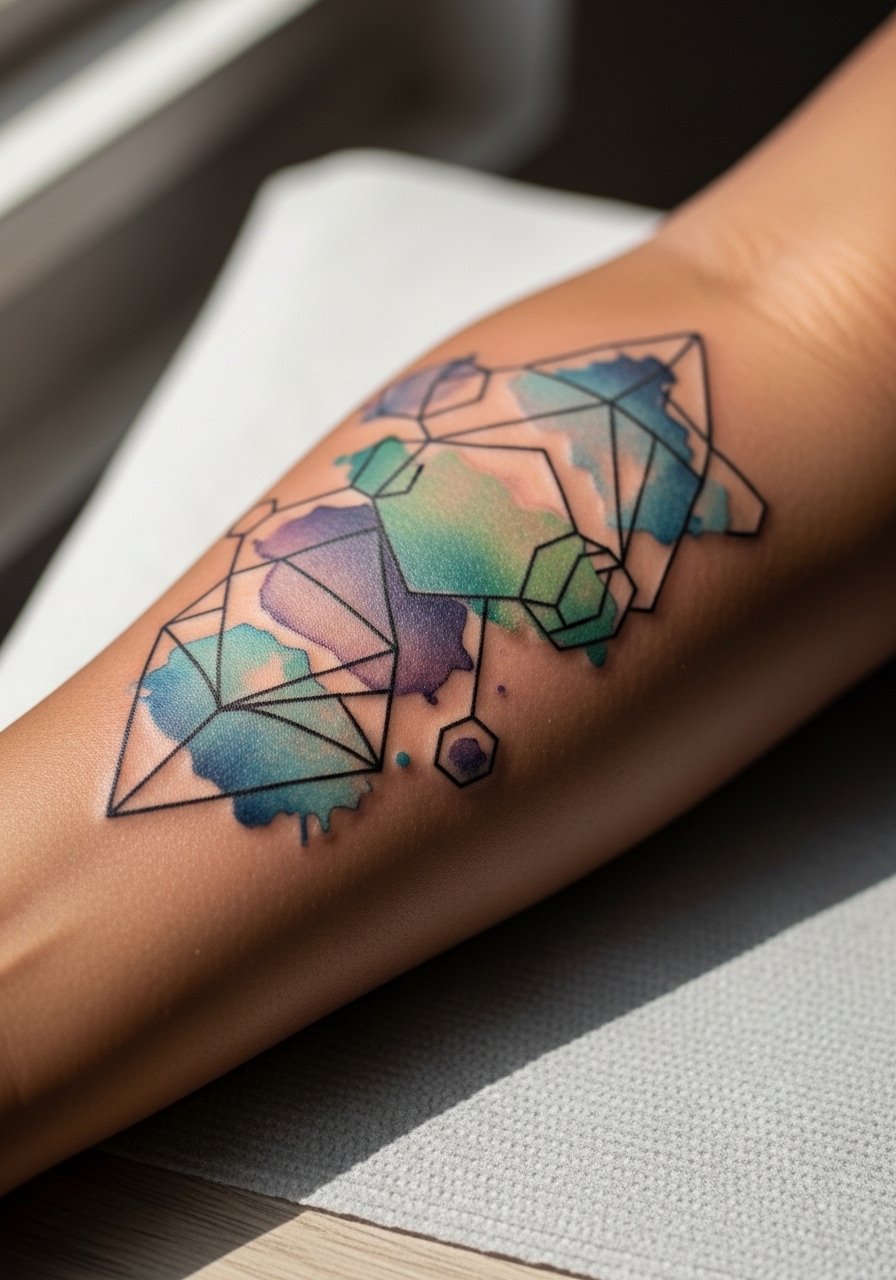
There is real visual punch when rigid geometry meets loose watercolor. In consultation, bring images showing the exact ratio of lineweight to wash. The controversy here is clear. One camp says watercolor should never meet tight geometry because soft washes bleed into fine lines. The other camp argues controlled spacing and proper needle depth prevent that problem. I advise asking where your artist stands before booking. The session is steady work and can feel like long linework mixed with color packing. Expect touch-ups on the color fields by year two if you spend a lot of time outside. Pair this with rolled sleeves and a minimalist bracelet when you want the geometry to pop.
4. Small Pop-Color Motif Near the Wrist

Wrist-adjacent watercolor reads lively but has higher blowout risk because the skin is thin and moves a lot. The mistake I see most is asking for extreme micro-detail inside the wash. Instead, request a slightly larger motif with bold line anchors to preserve contrast. Sessions are quick, often under an hour, but the first week of healing requires gentle movement. Expect more frequent touch-ups than mid-forearm work. For showing it off, stack a thin chain bracelet that sits above the piece without rubbing the tattoo.
5. Full Forearm Wash That Mimics a Sleeve
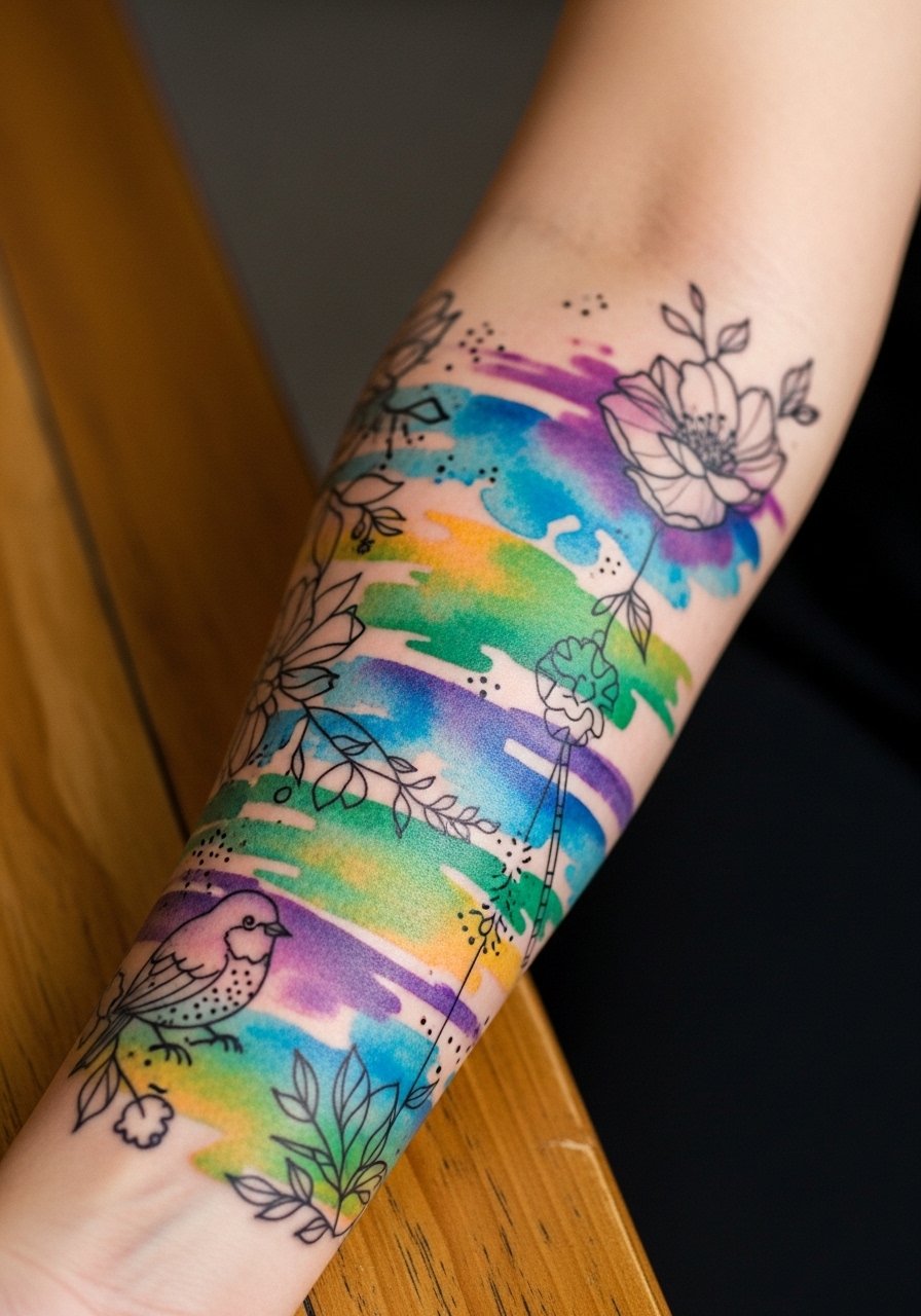
A forearm sleeve built around watercolor needs structure. I tell clients to prioritize big shapes and negative space so the washes read distinct over time. The common error is cramming too many small motifs into the same vertical space. That creates a muddy look as colors settle. These sessions often take multiple appointments, each two to four hours. Expect a touch-up at six to twelve months for saturation and another at year two for color revival. During consults, ask the artist about layered saturation and how they plan to separate colors with linework. For session days, wear a long-sleeve shirt that buttons at the cuff so you can slide it back without pulling on the fresh work.
6. Single-Color Wash with Stipple Border on Inner Forearm
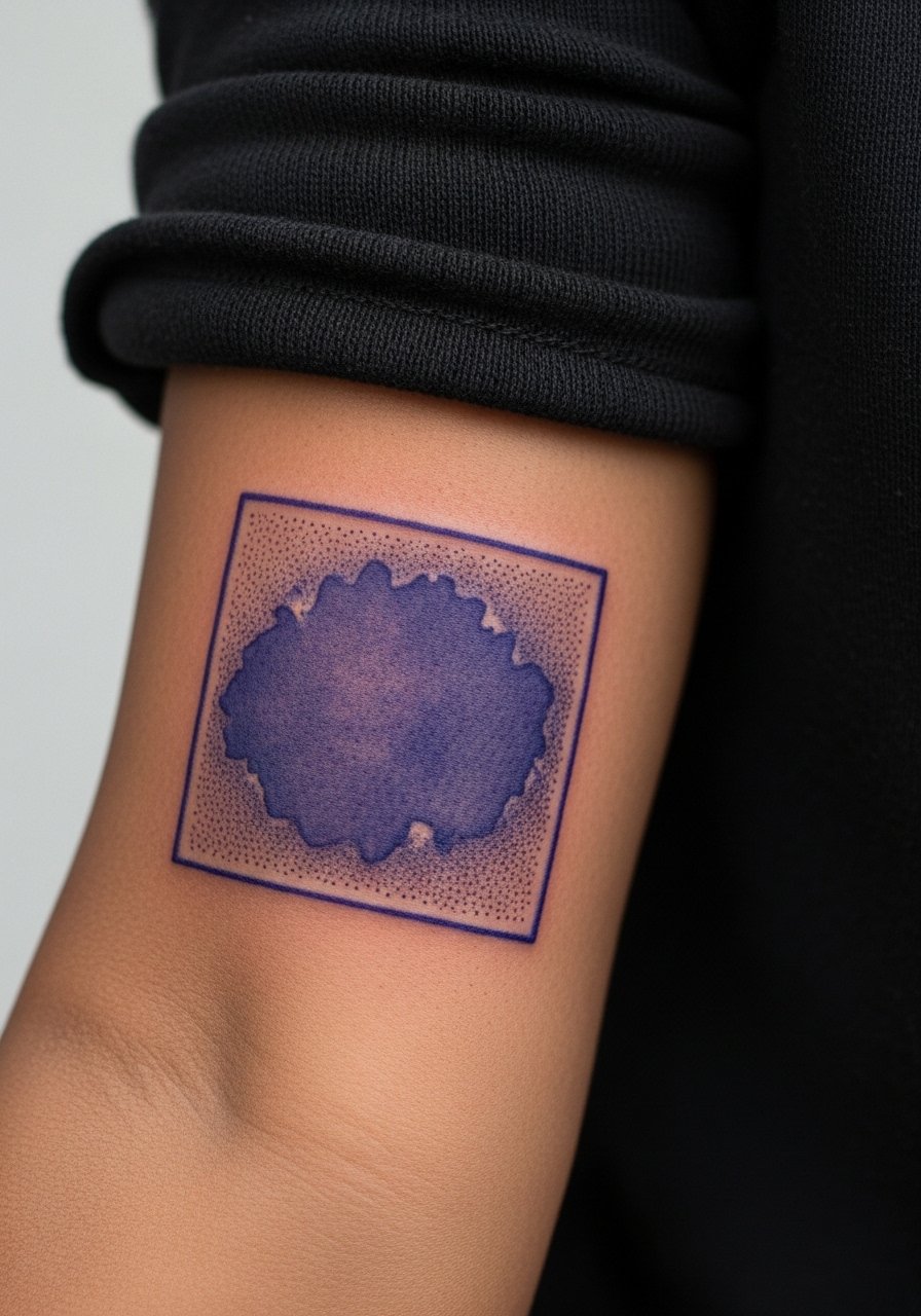
One-color washes age differently than multicolor pieces because the eye reads contrast more easily. Ask for stipple shading near edges to create a crisp transition that holds up after healing. The frequent mistake is asking for a dense saturated block without texture. Dense blocks flatten over time. This piece usually fits into a single two-hour session. Expect a touch-up at year two for saturation depending on sun exposure. For showing it off, cuff a rolled sleeve shirt that keeps attention on the wash without competing patterns.
Studio Day Picks
These forearm approaches above need prep and smart first-week choices so color and linework settle clean.
-
Stencil transfer paper kit. Lets you preview the exact placement and scale on forearms, which is especially useful for sleeve layouts and inner forearm pieces.
-
Topical numbing cream. Applied per instructions before a wrist or inner forearm session eases sensitivity without altering linework when used correctly.
-
Thin protective film roll. Useful for the first day on wrist and full forearm pieces to shield against friction from clothing.
-
Fragrance-free gentle body wash. Cleanses healing forearm tattoos during showers without stripping natural oils that help color retention.
-
Aquaphor healing ointment. A thin layer in the initial days helps retain moisture in delicate watercolor fields without clogging the channel.
7. Micro-Realism Watercolor Portrait Panel

Micro-realism with watercolor needs a restraint that people often skip. Bring reference photos that match the scale you want. Tell your artist which facial features must stay in crisp linework and which can soften into the wash. The common mistake is expecting museum-like portrait detail inside a loose watercolor field. That mismatch speeds the need for touch-ups. Sessions take longer than a simple motif and can span multiple sittings. For longevity, keep sun exposure low and expect touch-ups at year two. Pair this piece with a classic wristwatch when you want to balance portrait detail with everyday wear.
8. Abstract Brushstroke Series Along the Forearm

Abstract strokes rely on composition more than subject matter. When you sit down with your artist, map the negative space first so each stroke has room to read later. The aging story is simple. If strokes overlap too densely they merge into a single tone after a couple of years. Make sure line anchors or tiny negative gaps separate adjacent washes. Sessions can be split into short blocks to maintain color clarity. This placement pairs well with rolled sleeves and a casual canvas belt that keeps the outfit low-key and the arm visible.
9. Color Trail with Dot Work Accents

Dot work creates texture that helps watercolor feel intentional as it ages. Ask for stipple density notes during consultation so the dots do not crowd the wash. The typical mistake is too many dots in the same plane as the wash. That makes the trail read muddy after settling. A small-to-medium trail can be done in one appointment. Expect a touch-up for the dots at year two since dots depend on precise depth. For session comfort, wear a breathable short-sleeve top that gives clear access without rubbing the area.
10. Nautical Watercolor with Bold Linework
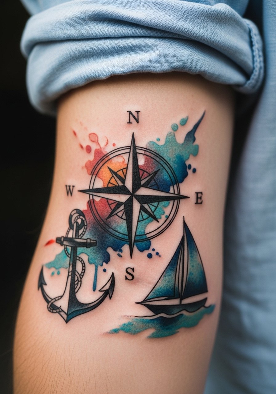
Bold black outlines paired with watercolor make an instant visual anchor. I recommend keeping the outline slightly thicker than you would for a pure fine line piece. That thickness protects against early blurring and preserves contrast against the wash. A common error is requesting ultra-thin black in this hybrid. Ultra-thin black loses presence as color fades. Expect one longer session for the outlines and a shorter one for the color fills. This looks great with rolled cuffs or a simple navy polo that complements nautical tones.
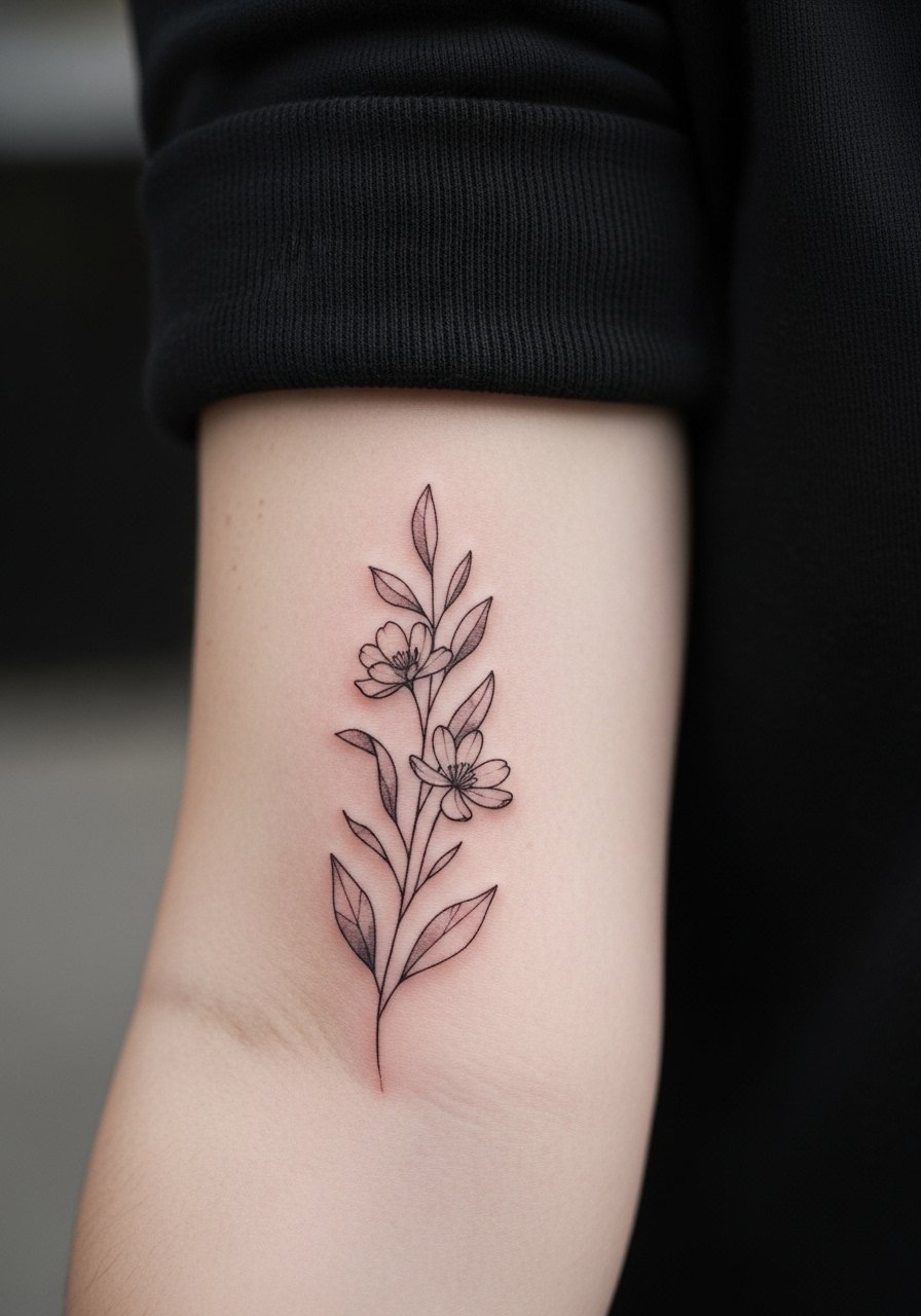
11. Botanical Stem with Watercolor Halo
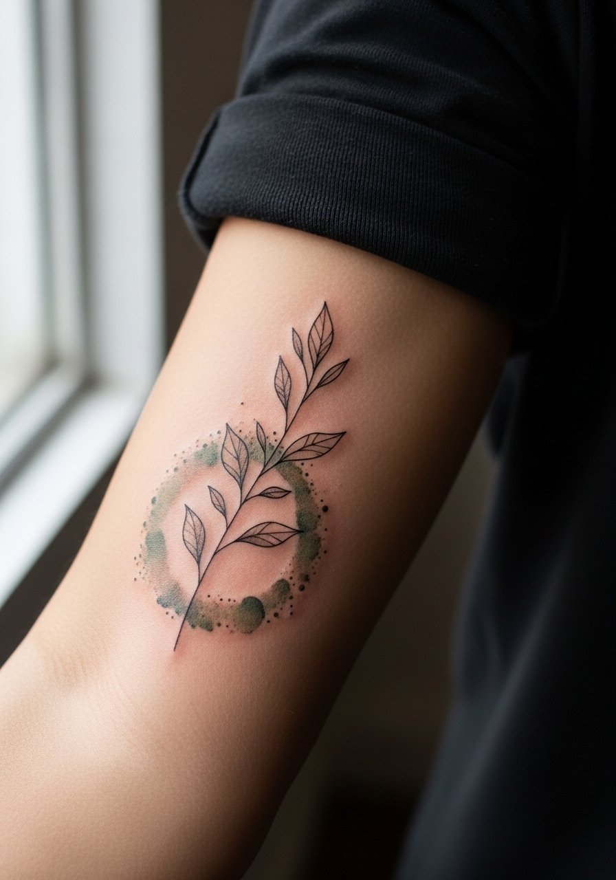
Putting a halo of color behind a fine stem keeps the botanical readable as it ages because the halo preserves contrast. Tell your artist you want the halo to stop a few millimeters from the stem line so the silhouette remains crisp. The error I see is bleeding the halo right up to the stem which causes early softening. Expect a moderate session and a touch-up at year two for the halo saturation. Wear a cotton button-down shirt you can slide without sliding fabric across fresh ink.
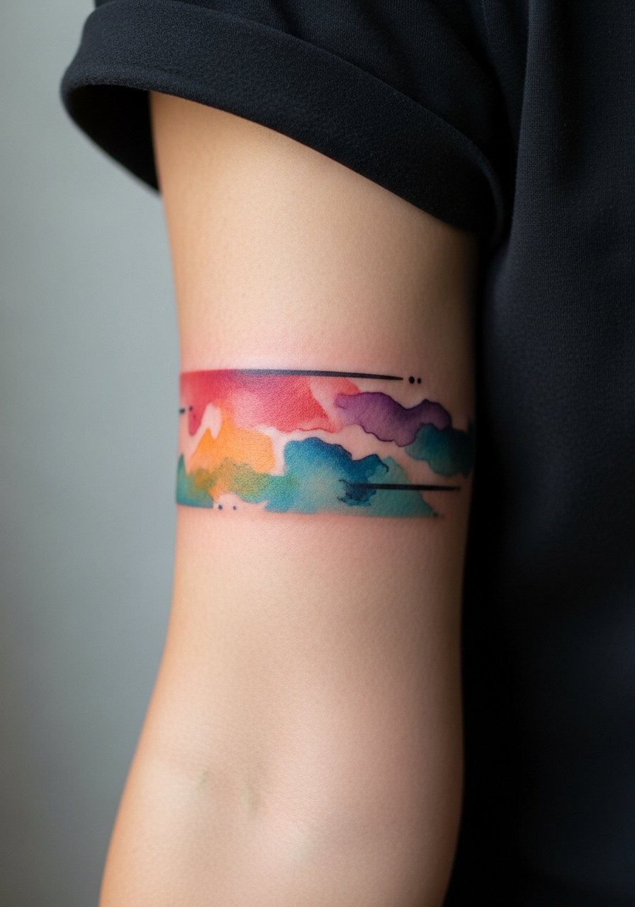
12. Mountain Range with Gradient Wash

Minimal silhouettes are forgiving when paired with gradient washes. The main consultation point is telling the artist how much gradient you want and where the peaks should rest relative to the arm's contours. A mistake is compressing the peaks too tightly vertically. That creates visual blurring as the wash settles. Sessions can be short. Expect a touch-up for the gradient if you spend a lot of time outdoors. For casual wear, a soft crewneck tee keeps attention on the silhouette without competing colors.
13. Script with Watercolor Backdrop

Text needs crisp contrast to stay legible. When you request script over watercolor, state the exact font weight you like and confirm the backdrop stops short of the letters. The controversy is direct. One group says text should never sit over watercolor because legibility declines fast. The other group points out that with clear negative space and proper line depth, text survives. I recommend walking through both approaches with your artist and seeing healed examples. Small script sessions are quick but expect touch-ups sooner than a plain black script. For showing it off, a thin chain pendant can frame the wrist-to-forearm flow without crowding the letters.
14. Marine Life Watercolor Panel

Complex forms like fish need careful layering of color so scales do not merge into a single blot. Ask your artist how they will separate color fields and consider a light outline around key features. The session time varies with detail. The common mistake is asking for saturated gradients across small details which flatten over time. For longevity, plan layering sessions spaced by a few weeks. This design pairs well with rolled sleeves and a simple canvas watch strap that complements ocean tones.
15. Floral Sprig with Watercolor Washes
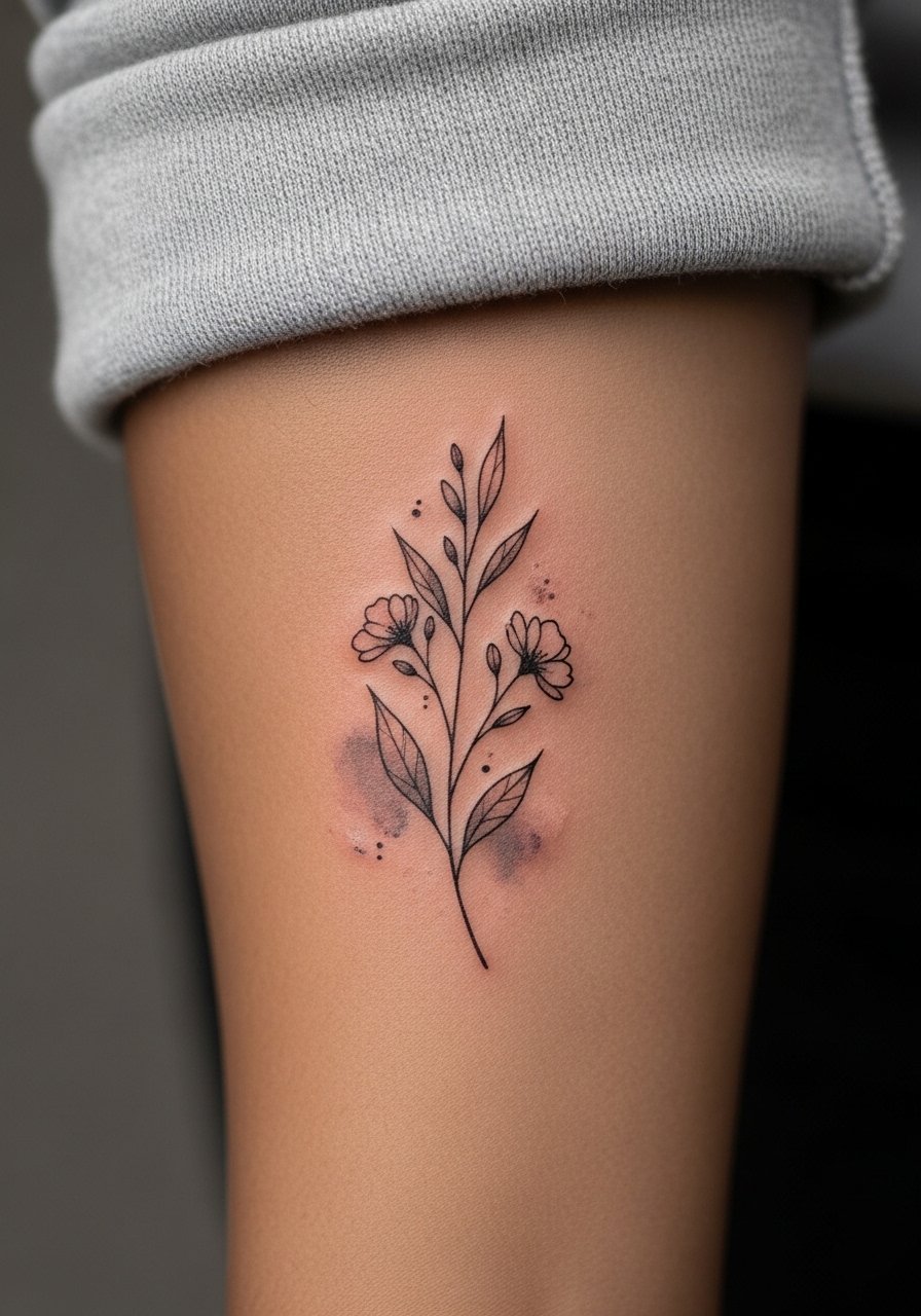
Floral sprigs age well when the stems have defined linework and petals are implied with soft washes. The common error is packing petals with color detail that needs crisp edges. I suggest asking for more negative space inside petals so they read longer. Sessions are usually short. Expect a minor touch-up at year two to refresh petals that get extra sun wear. For session comfort, wear a sleeveless tank so the artist has clear access without tugging fabric.
16. Abstract Color Band Near the Elbow
Near the elbow the skin creases and moves a lot, so color bands can fragment over time. I warn people that this placement needs extra negative space at the crease to avoid early blending. The session can feel jumpy because of the arm movement required during application. A typical mistake is asking for an uninterrupted band across the crease. Instead, request small gaps or line anchors on either side. Touch-ups for this area are common in year one. For the appointment, choose a short-sleeve top that allows maneuvering without pulling the elbow.
17. Monochrome Wash with Line Etching
Monochrome washes can read very clean because the eye sees one tone with crisp line etching. Tell your artist you prefer limited saturation and deeper contrast around etched lines. The mistake I see is oversaturating the wash which reduces the etched detail over time. Sessions are manageable in length. Expect a touch-up at year two if you often get sun. For low-key showing, cuff a neutral long-sleeve shirt that lets the line etching do the talking.
Frequently Asked Questions
Q: Do watercolor tattoo designs on the forearm need different aftercare than regular color pieces?
A: They do in one main way. Watercolor fields often use lighter saturation and more negative space so keeping them moisturized and out of strong sun in the first months helps color settle evenly. The practical routine a studio suggests will be similar to other color work but watch the edges of washes for early flaking and avoid heavy friction during the first week.
Q: How long before a watercolor forearm piece needs a touch-up?
A: From what I've seen, many watercolor forearms benefit from a touch-up around year one to eighteen months for saturation, and another refresh around year three if you want the original vibrancy. Placement, skin type, and sun exposure change that timeline.
Q: Will a watercolor wash blur the linework if I put them together?
A: It depends on spacing and needle depth. If the wash is left a few millimeters from the line and the artist uses slightly bolder anchor lines in key spots, the two can coexist cleanly. Ask to see healed examples that match your scale during consultation.
Q: Are forearm watercolor tattoos more likely to experience blowout?
A: Blowout risk is higher where skin is thin or moves a lot, like near the wrist or elbow. Proper line depth and avoiding overly fine single-pass lines lowers that risk. If you are worried, ask your artist about their approach to depth and line spacing.
Q: What should I wear to the session for a forearm watercolor piece?
A: Wear something easy to slide up without rubbing the fresh tattoo. A short-sleeve or a loose button-down shirt you can pull aside works well. Comfort and access are the priorities so the artist can work without fabric interference.
Q: How should I choose between a bright, saturated watercolor and a muted wash?
A: Bright, saturated washes look great initially but usually need more maintenance. Muted washes age more gently and can still read vivid with good contrast from linework. Think about your sun exposure habits and how often you want to schedule touch-ups.