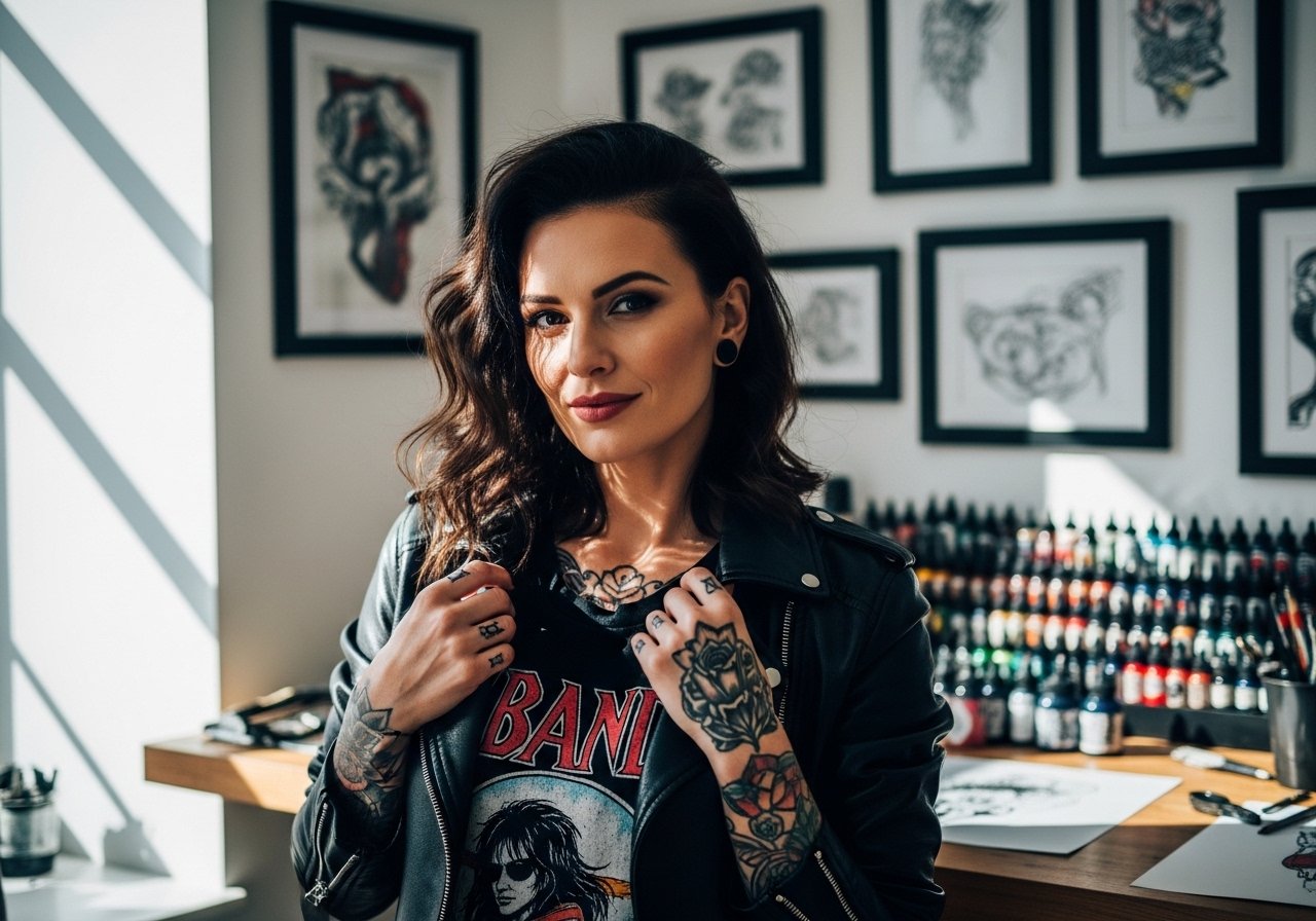
Fine line tattoos dominate boards right now, but the pieces that still read strong in years are often the ones planned around real wear and movement. Fading, blowout, and placement visibility are the three headaches I see most, and they change which design I recommend. Below are 27 arm tattoo ideas for men, each pairing a practical take on longevity with a clear styling note so you know how it will sit when it heals and when it ages.
1. Fine Line Arrow on Inner Forearm
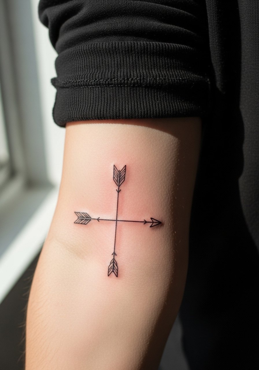
This slim arrow reads clean when it follows the arm's length, so I recommend placing it along the direction of muscle rather than across the crease. Pain on the inner forearm is low to mid, and a single short session usually finishes it. Ask your artist for a slightly heavier line than what looks delicate on screen so the arrow keeps its definition at two and five years. A common mistake is making the arrow too thin or packing detail near the point, which invites blurring. For showing it off, rolled sleeves work best, and a loose button-down shirt frames the forearm without hiding the piece.
2. Micro-Realism Wolf Head on the Bicep
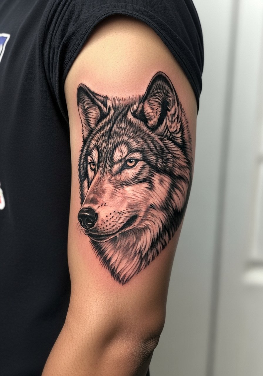
The bicep gives enough real estate for micro-realism without cramming the detail, but expect a longer session and a slow fade in tiny highlights over time. Tell your artist you want contrast between fur texture and shadow areas, not micro stippling everywhere. Most versions that age poorly try to cram too much facial detail into a small area. Pain is moderate and the session often runs two to three hours. Wear a short-sleeve tee on the day so the artist can access the outer bicep easily. For touch-ups, expect to revisit around the three to five year mark for crisp highlights.
3. Bold Blackwork Half Sleeve Wrap
Blackwork ages differently than detailed pieces. When saturation is even the negative space reads well for years. This is a higher pain session if saturation is dense, and you will likely book multiple sittings. Ask the artist to map out negative space from the start so the wrap breathes where needed. A common mistake is trying to cover too many small motifs in a dense sleeve. For daytime wear, a racerback tank or rolled sleeves shows off the bulk without exposing too much. Expect touch-ups at five years if you want the black perfectly even.
4. Geometric Forearm Band with Dot Work
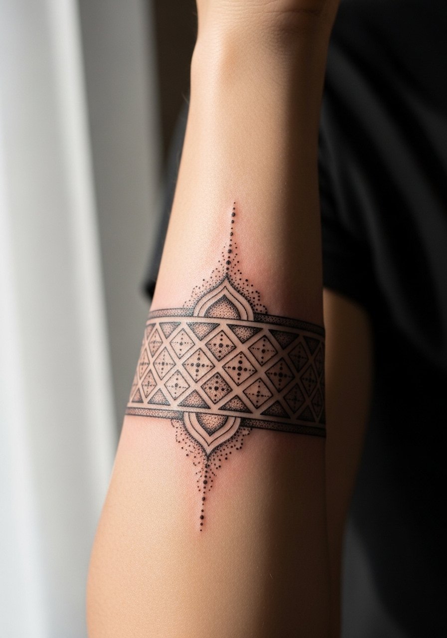
Geometric bands rely on spacing more than line fragility. The mistake I see is scaling the pattern too small. For a band to hold at year three, lines and dots need breathing room. This placement has low to medium pain and is a one to two hour session depending on complexity. During the consult, specify that dot density should decrease toward the edges to avoid early merging. Style it with a minimalist watch so the geometry aligns with accessories and does not get lost under chunky bracelets.
5. Traditional Anchor Near the Wrist
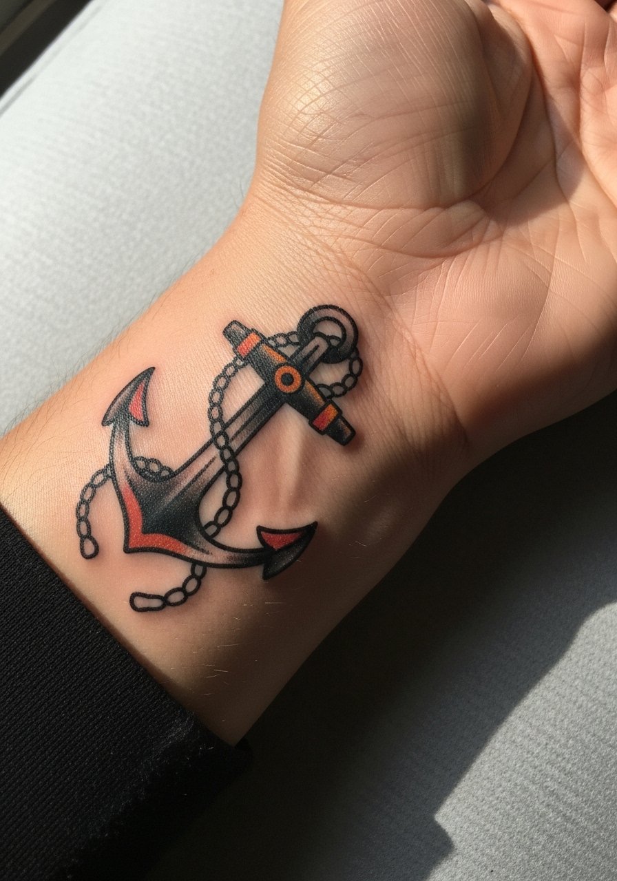
Wrist placements are high friction zones from washing and bracelets, so traditional bold lines and solid saturation work better than fine detail here. Pain is higher than the forearm because the wrist has less cushion, and sessions are short. Tell your artist you want heavier outlines and solid fills to resist early fading. A common mistake is asking for tiny shading inside the anchor; that gets lost under daily abrasion. For showing it off on weekends, stack a few thin bracelets or a leather cuff bracelet that frames the wrist without rubbing the ink.
6. Script Wrap on the Inner Bicep
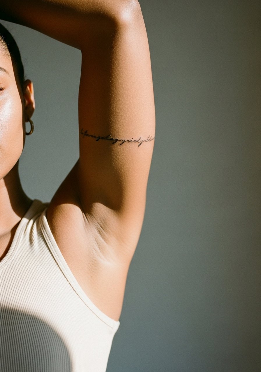
Inner bicep script looks intimate but the skin there moves and stretches, which can blur thin lettering. Artists are split on fine line here. One camp argues the skin stretch causes letters to lose crispness at two years. The other camp says with slightly bolder stroke weight and careful spacing the script settles well. During consultation ask which approach your artist uses and request a slightly increased line weight if they lean conservative. Pain can spike when the arm is lifted and exposed. Wear a tank top you can raise for the session. Expect potential touch-up at year two to maintain edge clarity.
Studio Day Picks
The forearm and wrist pieces above face different friction and exposure challenges than upper-arm work, so these items smooth the session and the first week.
-
Stencil transfer paper kit. Lets you test placement directly on skin before committing, which matters for wrist and inner bicep script.
-
Topical numbing cream. Applied per instructions about 45 minutes before helps with wrist sensitivity without altering surface contrast.
-
Thin protective film roll. Useful for small wrist pieces that face repeated washing and friction in the first week.
-
Fragrance-free body wash. Gentle cleansing prevents irritation around fresh linework on forearms without stripping moisture.
-
Aquaphor healing ointment. A thin layer for the initial days helps lock moisture for fine lines while letting the skin breathe.
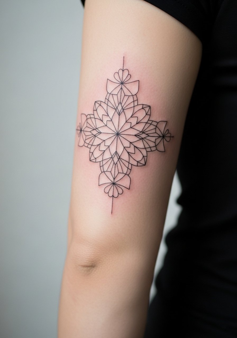
7. Minimalist Compass Near the Elbow
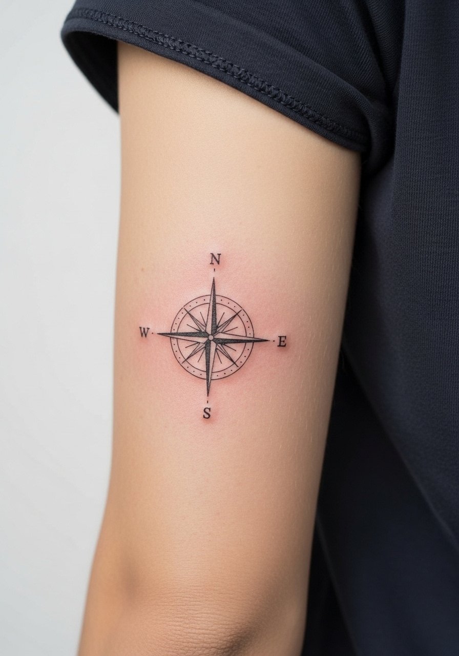
Placement near the elbow crease moves a lot and sits on skin that folds. For a compass to last, keep the motif simple and avoid tight inner details that sit over the joint. Pain at the elbow is variable and the session is usually short. Tell the artist to avoid placing critical points directly on the crease. The common mistake is centering complex detail over a fold, which leads to distortion at six months. Pair the piece with rolled sleeves or an oversized short-sleeve linen shirt to let the compass read clean without catching on cuffs.
8. Neo-Traditional Lion Head on Outer Forearm
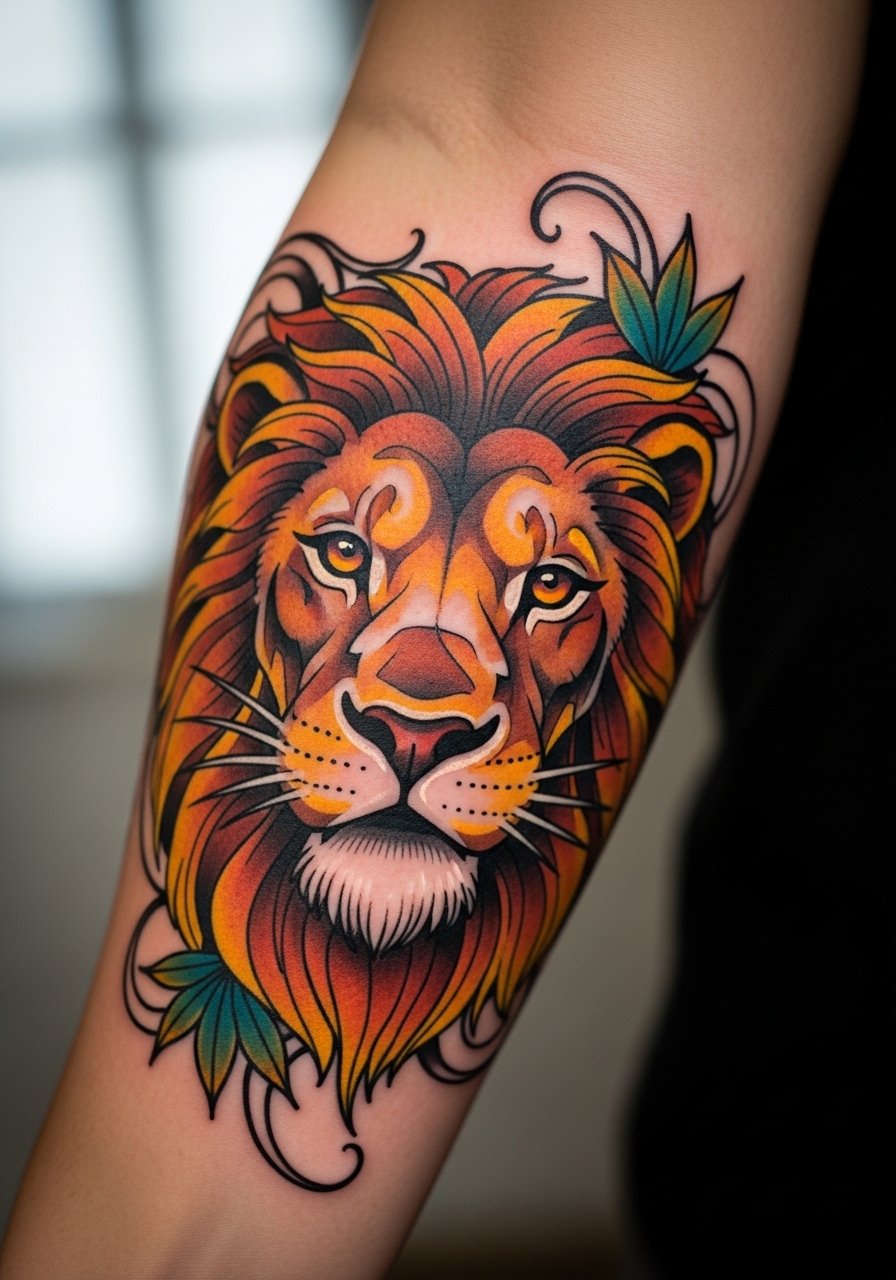
Neo-traditional size on the outer forearm gives impact and resists fading when color is saturated properly. The visual reads from a distance, which is why many men choose it for that spot. Pain is medium and session time depends on color layering. Ask for durable color placement and avoid pastel fills that wash fast. A mistake I see is asking for too many tiny color blends that fade unevenly. For wearing out, a short-sleeve button-up frames the art without hiding it.
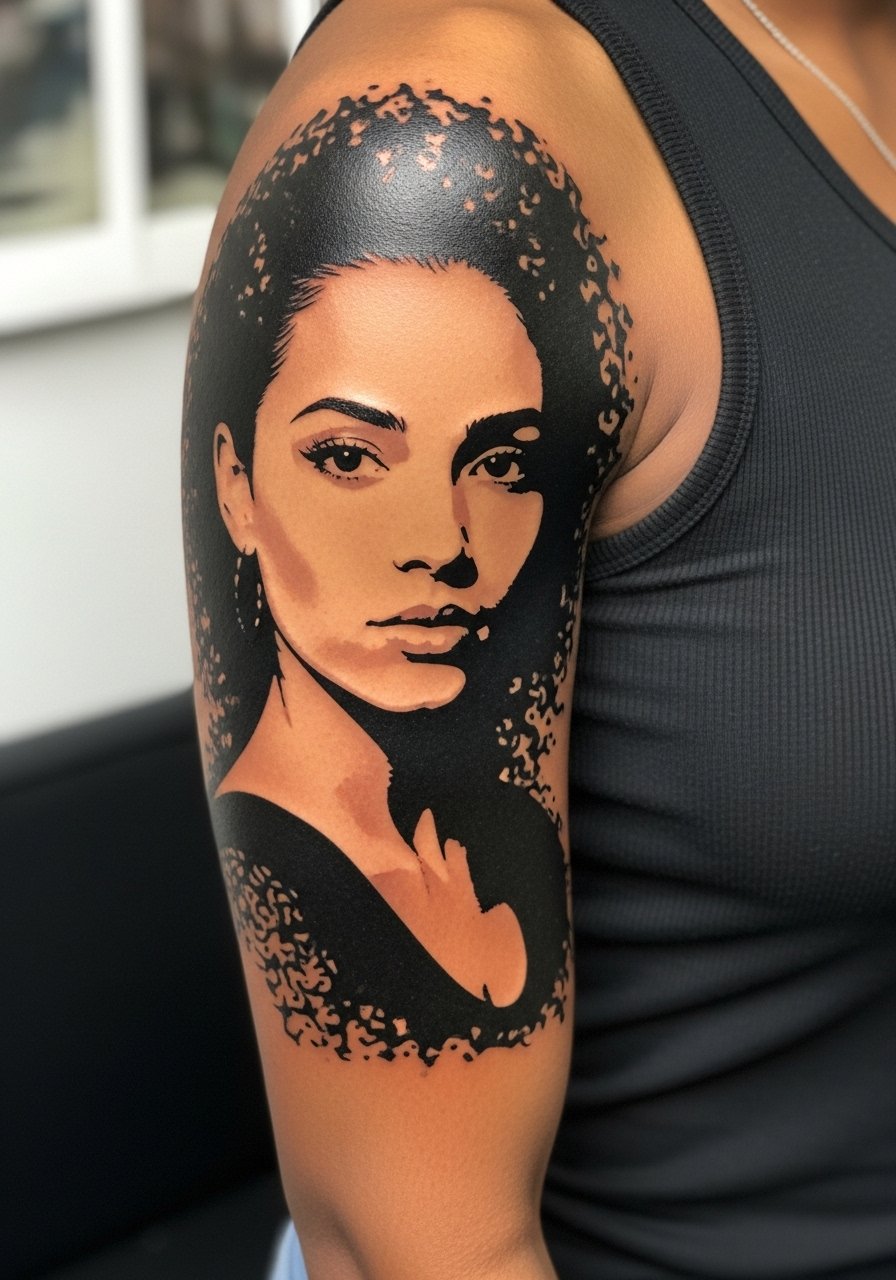
9. Single Needle Portrait Strip on the Outer Arm
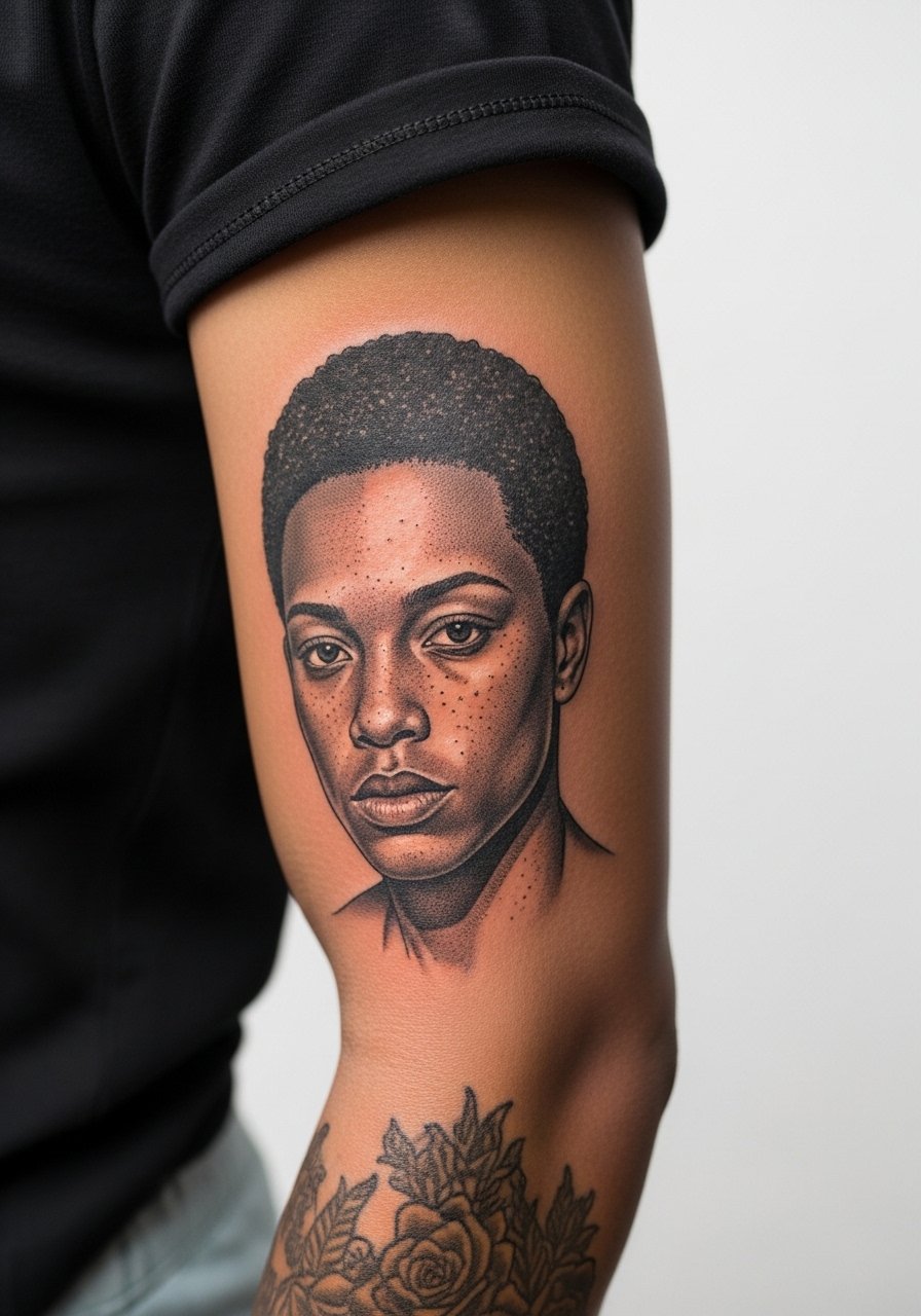
Portrait strips need consistent depth so shading translates across skin tones. Single needle takes patience and can spread if placed too low on softer tissue. Consult on contrast priorities rather than hyper detail. The outer arm is forgiving and a good canvas for portrait strips. Pain is moderate and sessions can be long depending on size. The common error is compressing too many facial features into a narrow strip. Pair this with a crew neck tee with sleeves that can be rolled for showing the artwork along the arm.
10. Tribal Armband with Negative Space
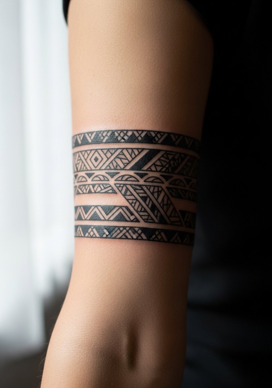
Tribal armbands are about rhythm and spacing. Negative space keeps the band readable as skin tone changes and as lines age. Pain is low to medium and sessions are typically one sitting. During consultation, request clear spacing maps so the band avoids merging after a few years. A mistake is trying to make the band too thin. Show it off with a short-sleeve cotton henley that pulls attention to the forearm silhouette.
11. Script Date Along the Wrist Edge
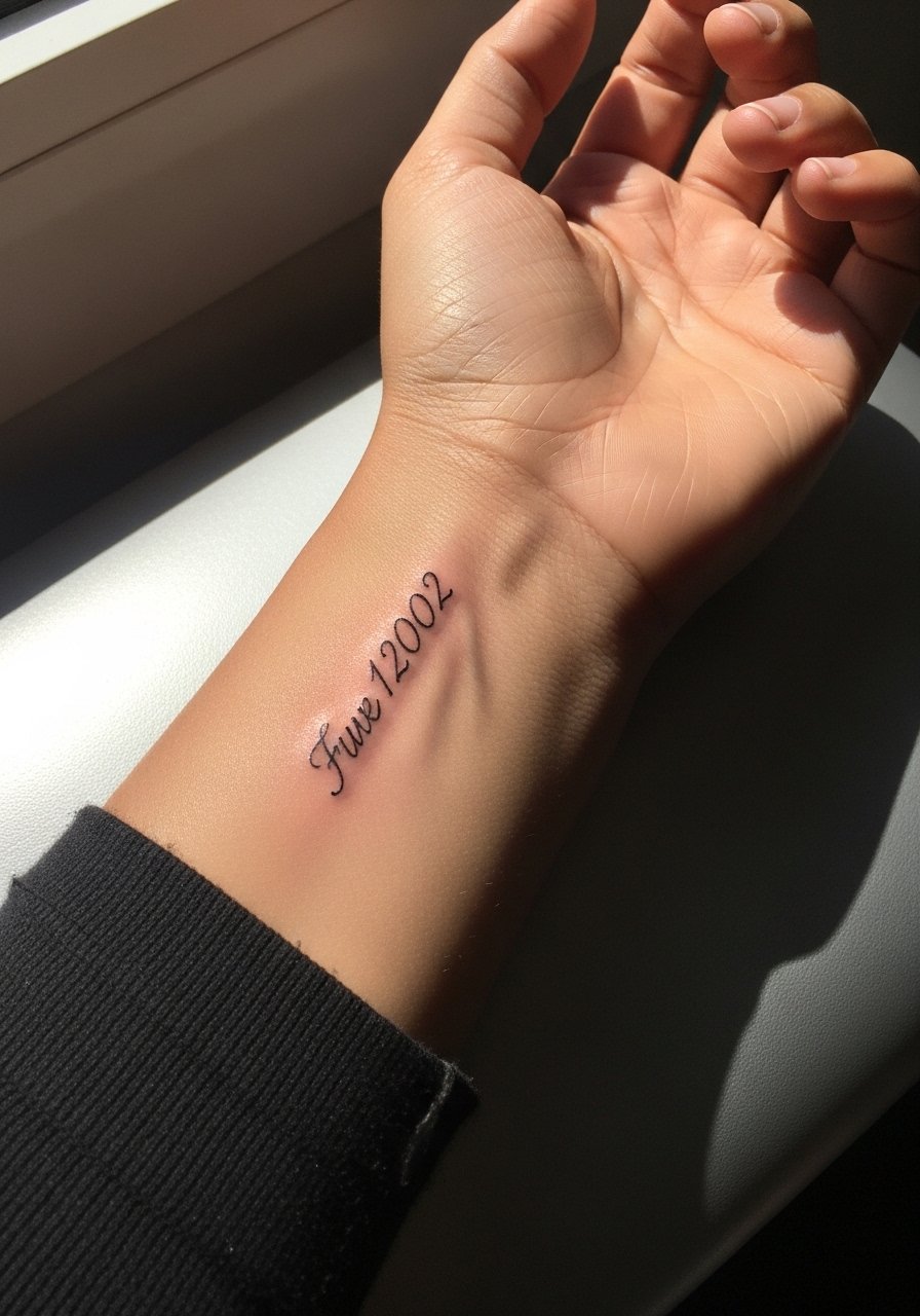
Edge-of-wrist scripts look discreet but face heavy washing and friction. Use a slightly heavier stroke than you think you need. Pain is higher near the wrist bone and the session is brief. The mistake is choosing ultra-fine cursive that becomes unreadable at year two. For the session wear a lightweight long-sleeve shirt with a roll-up sleeve so the artist can access the wrist easily. Expect to schedule a touch-up at two to three years if you want the lettering precise.
12. Sleeve Starter: Botanical Panel on Outer Arm
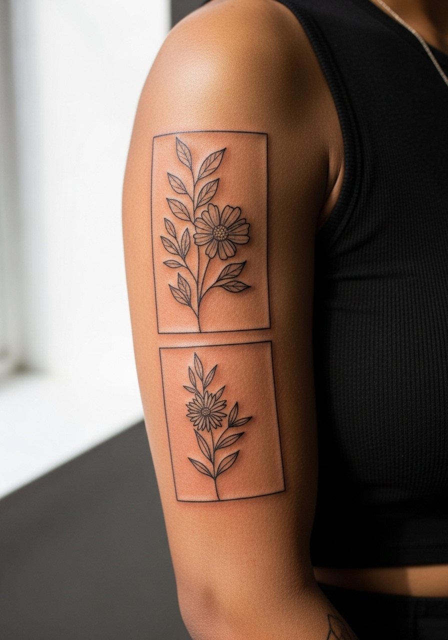
Starting a sleeve with a botanical panel gives a modular plan for future additions. The outer arm takes layering well and the botanical motifs allow negative space between leaves. Sessions are moderate length depending on coverage. Tell your artist you want anchor points for future pieces so composition stays balanced. The rookie mistake is not planning flow toward the shoulder or wrist. For showing off early stages pair with a sleeveless top so the panel reads as intended.
13. Subtle Triangle Cluster on the Forearm
Small geometric clusters work on the forearm if you allow spacing between elements. Pain is low and the session is short. Tell your artist you prefer a slight variation in line weight to prevent early merging. A common mistake is placing identical small triangles too close, which creates a smudge look at year three. Wear a casual chambray shirt with sleeves you can roll so the shapes stay visible and flat.
14. Blackwork Sleeve Accent with Negative Florals
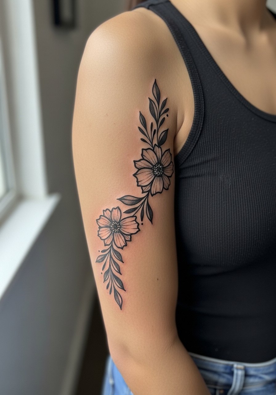
Blackwork accents with negative florals look graphic and age predictably when the black fields are solid. These require longer sessions and stronger aftercare in the first week. Ask the artist to plan negative space deliberately so flowers remain visible as the black settles. Overworking small floral details into black fields invites muddiness later. Style with a cut-off tee or tank that highlights the contrast between ink and skin.
15. Minimalist Line Sleeve Segment
Single-line sleeve segments are elegant but require careful spacing and a confident hand from the artist. These are low to moderate pain and usually done in one session for short segments. The mistake is overcomplicating the path or adding too many curves that cross. In consultation ask for a stencil preview on the arm motion so the line flows with muscles. Pair with a short-sleeve linen shirt so the clean line remains the focus.
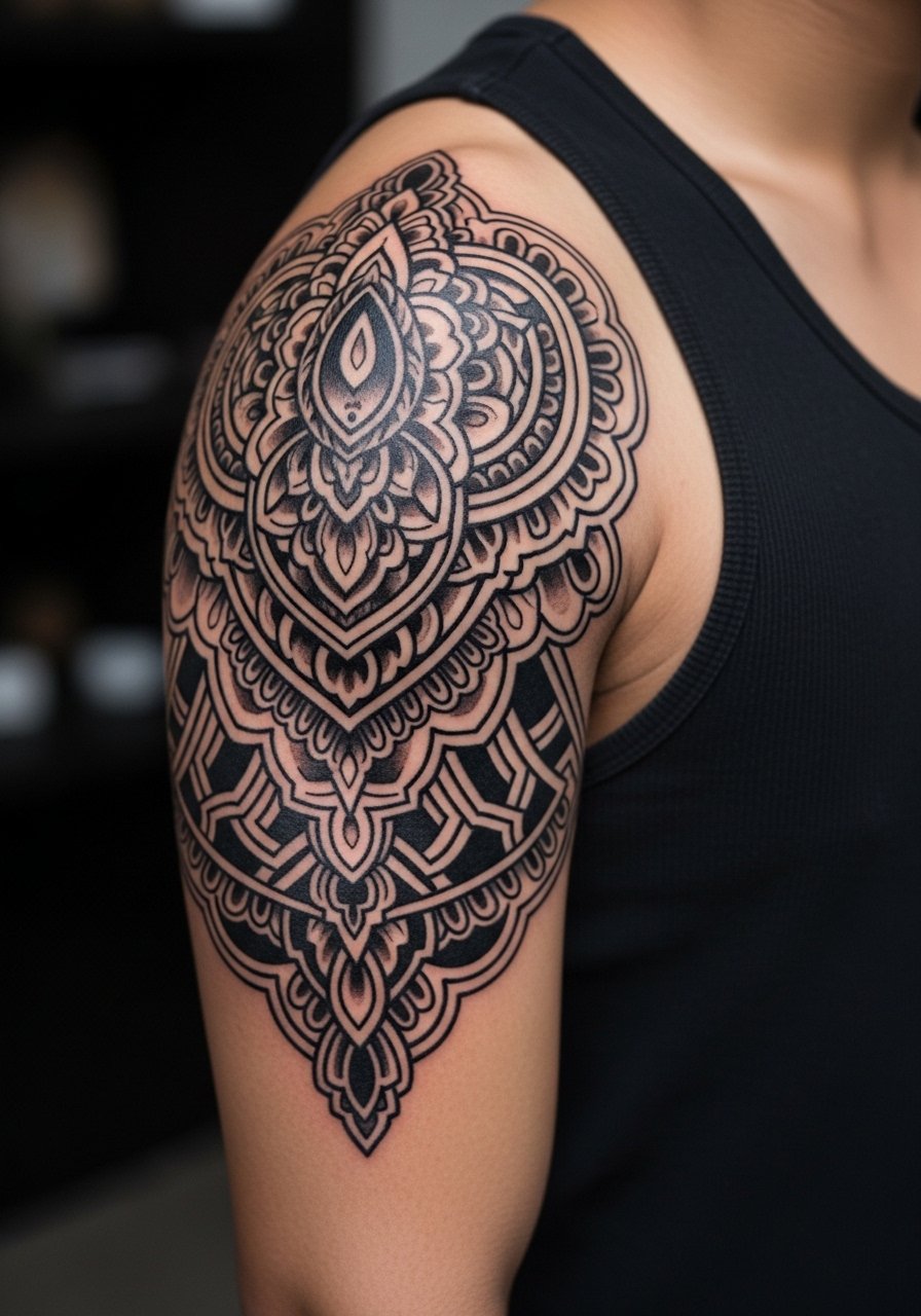
16. Geometric Mandala on the Outer Elbow Area
Mandala pieces need room to breathe. Placing them across joints is tricky, so this outer-elbow placement keeps the dense center off the crease. Pain can spike near the elbow and session time varies. Artists often advise larger scale so the fine geometry does not blur. A common error is shrinking a mandala into a space too small for the radial detail. For weekend wear choose a rolled sleeve tee that showcases the radial composition cleanly.
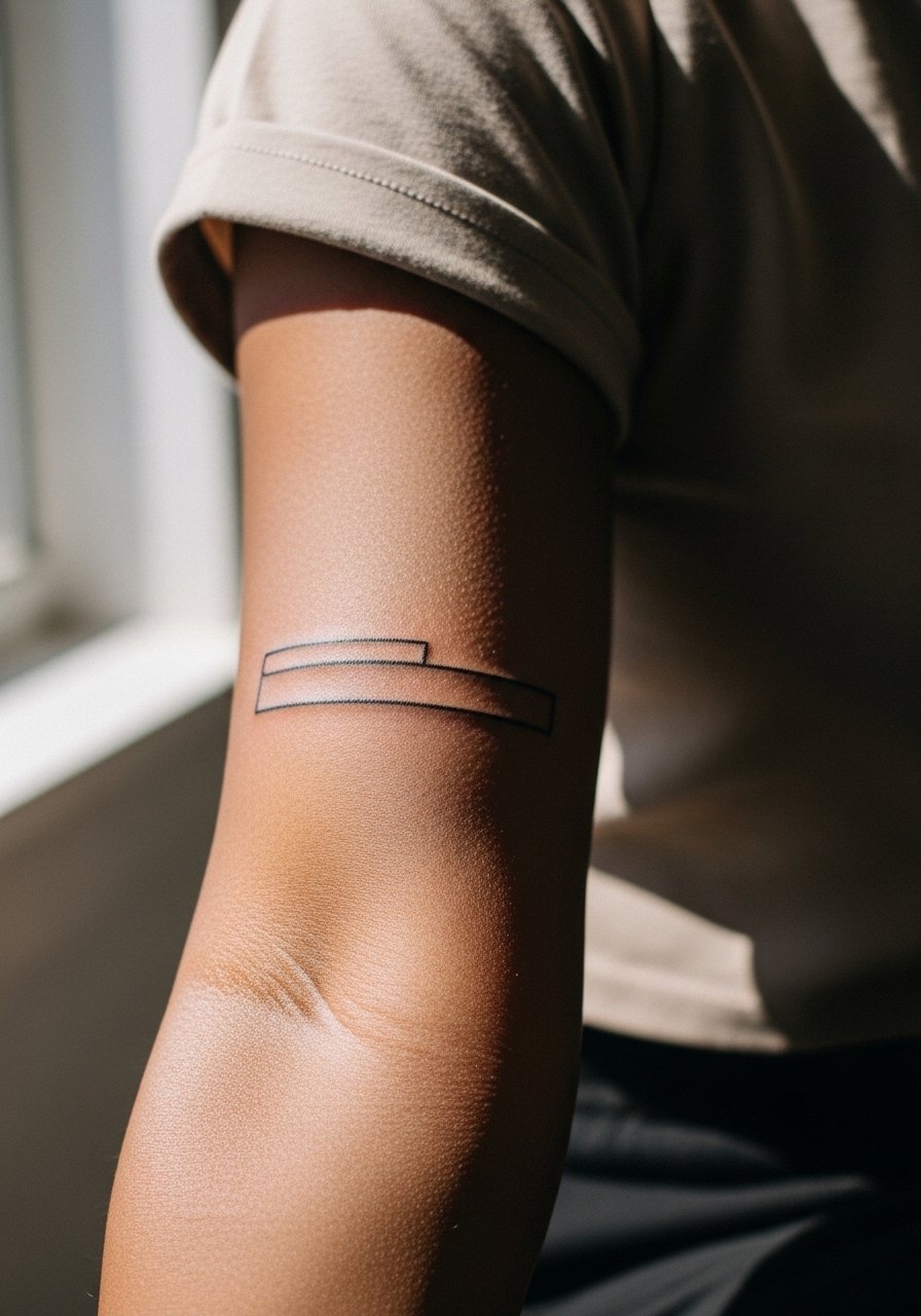
17. Forearm Barcode or Coordinate Band
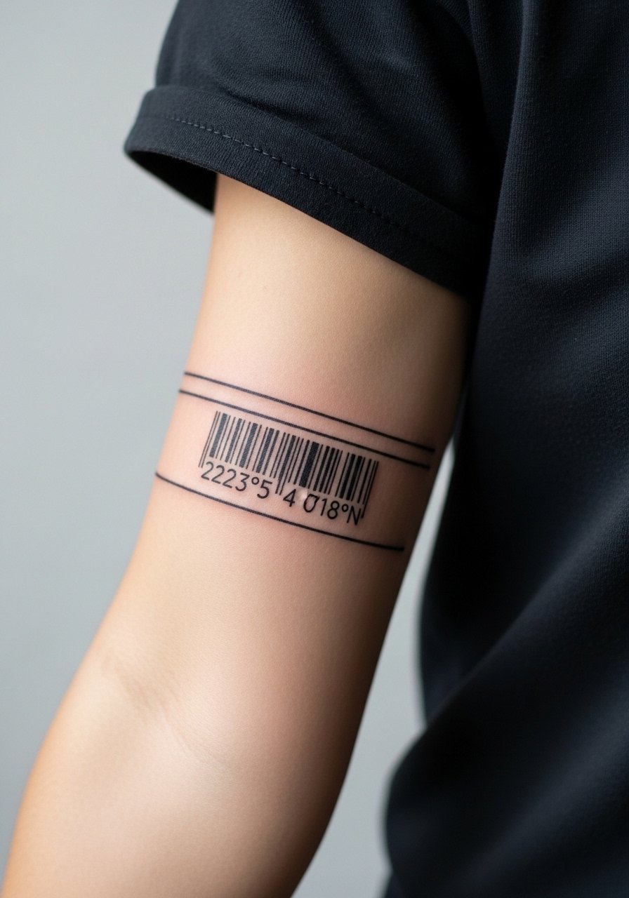
Bands that mimic barcodes or coordinates read modern and spare. Keep line spacing consistent and avoid tiny bars that will fill in. Pain is moderate and the session is quick. Tell your artist you want the bars slightly thicker than the digital reference so they hold at year two. The mistake is matching on-screen pixel widths that are too narrow. For daily style go with a simple leather bracelet that sits adjacent to the band without rubbing the ink.
18. Sleeve Negative Space Portrait
Negative space portraits depend on strong contrast. They hold well when the surrounding black maintains saturation. Sessions are long and require endurance. Ask the artist to prioritize silhouette clarity over tiny facial details. A mistake is compressing features into small negative pockets that become indistinct. Pair with breathable session clothing like a sleeveless training tank so the artist has full access and you stay comfortable.
19. Small Crest on the Outer Wrist
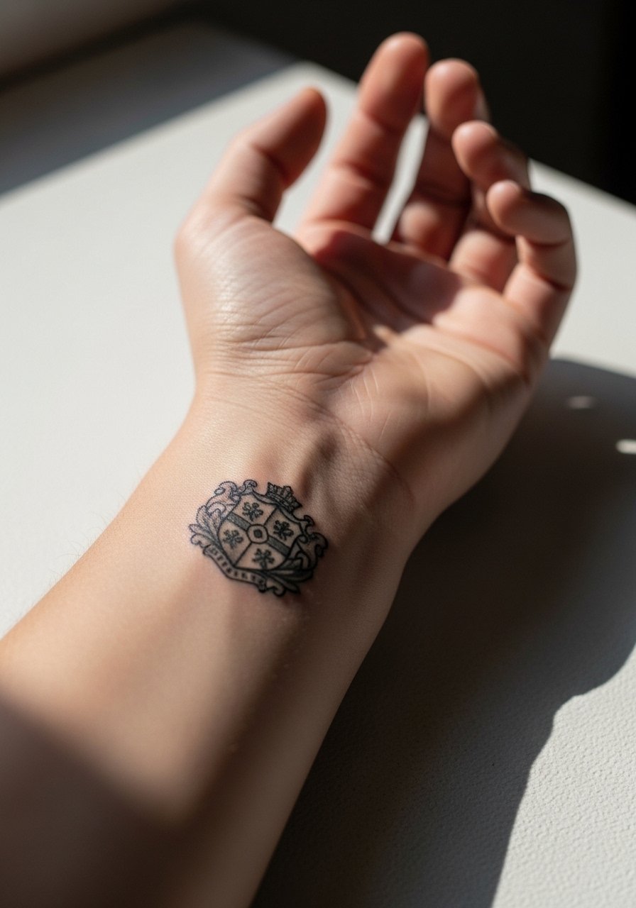
Wrist crests should use bold outlines and avoid tiny interior detailing. Friction from watches and bracelets makes thin elements fade first. Pain is higher than the forearm and the session is short. Tell your artist you prefer simplified fills so the crest retains identity at two and five years. A common mistake is packing lettering or tiny shields into a tiny crest. Style it with a minimal leather strap watch that complements the crest without rubbing directly over new ink.
20. Armour-Style Geometric Shoulder Cap
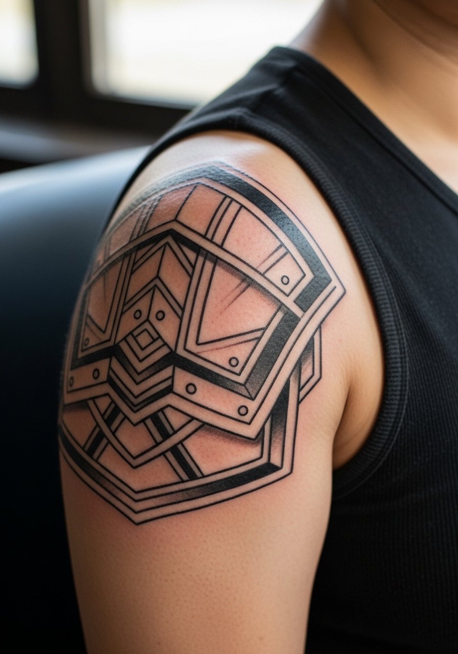
Shoulder caps age well when the pattern respects muscle curvature. They have low to medium pain and often finish in one session. The consultation should focus on how the cap tapers into future sleeve work. The mistake is forcing flat, rigid geometry onto a rounded surface without flow. For display pair with a sleeveless muscle tee that keeps the shoulder silhouette visible.
21. Tiny Anchor Behind the Wrist Bone
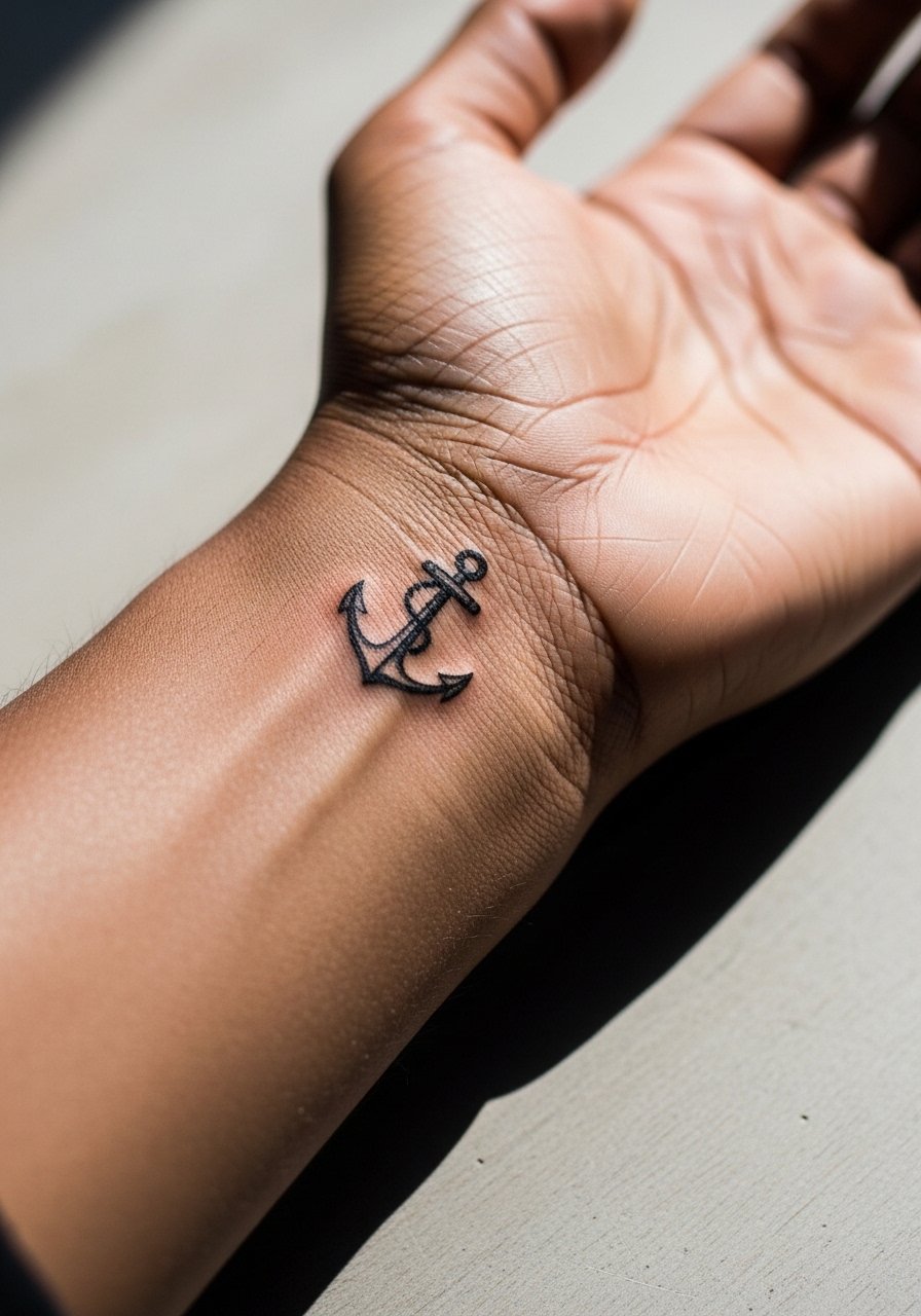
Small motifs behind the wrist bone face constant movement and soap exposure. Ask for bolder outlines and limited interior shading. Pain is higher and the session is brief. The common mistake is choosing ultra-fine detail in a spot that will weather quickly. For showing it off choose thin stackable bracelets that sit above the new ink and avoid constant rubbing. Try a thin metal bracelet that frames the anchor without covering it.
22. Mechanical Gears Along the Forearm
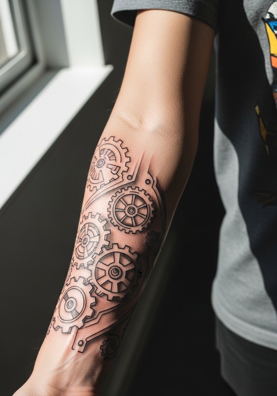
Mechanical motifs work with the forearm's linear anatomy if gears have clear negative space between them. Pain is moderate and session time varies by detail. Tell the artist to separate elements enough to prevent merging at two years. A mistake is letting small teeth sit too close, which blurs in heavier motion areas. Wear a lightwork mechanic-style shirt or rolled sleeves to complement the industrial theme.
23. Script Quote Along the Outer Bicep
Outer bicep script gives more space than the wrist and usually preserves legibility longer. Still, ask for letter spacing that breathes and a slightly heavier main stroke. Pain is moderate and sessions are short to medium. A mistake is copying tiny script from social images without scaling it for an arm. For evenings out a rolled sleeve button-down highlights the quote without hiding it.
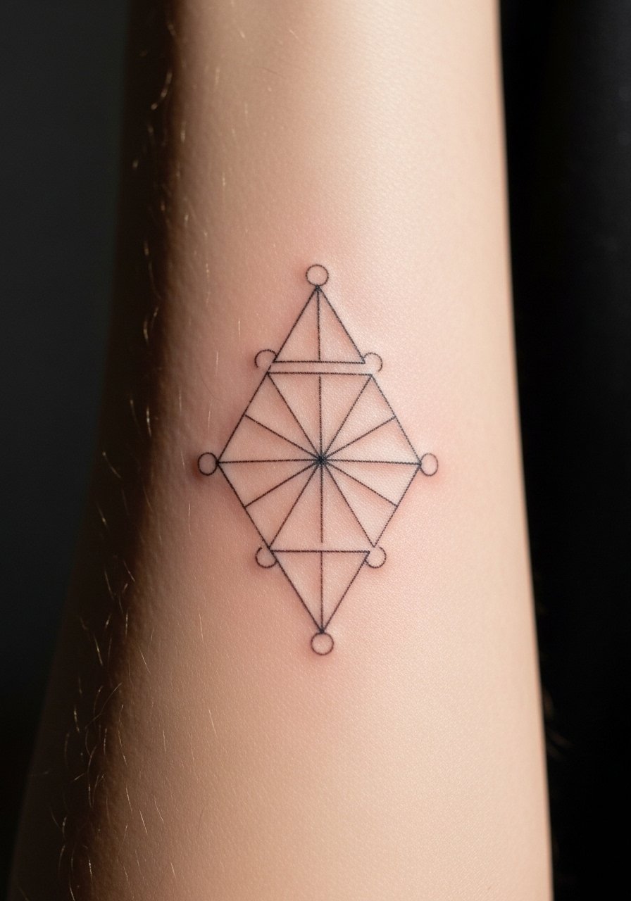
24. Single Needle Constellation Along the Forearm
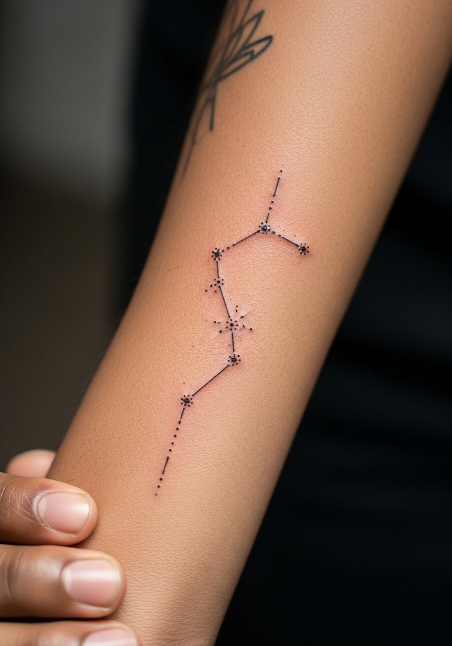
Single needle dot constellations are delicate but face blurred dots if placed too dense. Space stars and let the lines be faint rather than hairline. Pain is low and the session is brief. The mistake is over-plotting tiny stars in a tight map. Pair with a thin canvas bracelet for a casual juxtaposition that does not rub the ink.
25. Wave Band with Thin Negative Lines
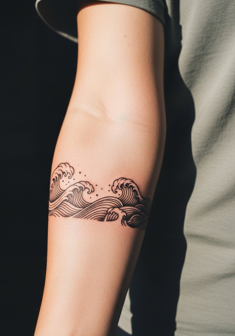
Wave bands look dynamic but must allow negative lines to breathe so the crests stay distinct. Pain is low and sessions are short. During consultation request deliberate spacing and test stencils on the arm motion. The common mistake is lining up too many small negative stripes that vanish with wear. For a beach-ready look pair the band with a rolled linen sleeve shirt.
26. Classic Panther on the Outer Arm
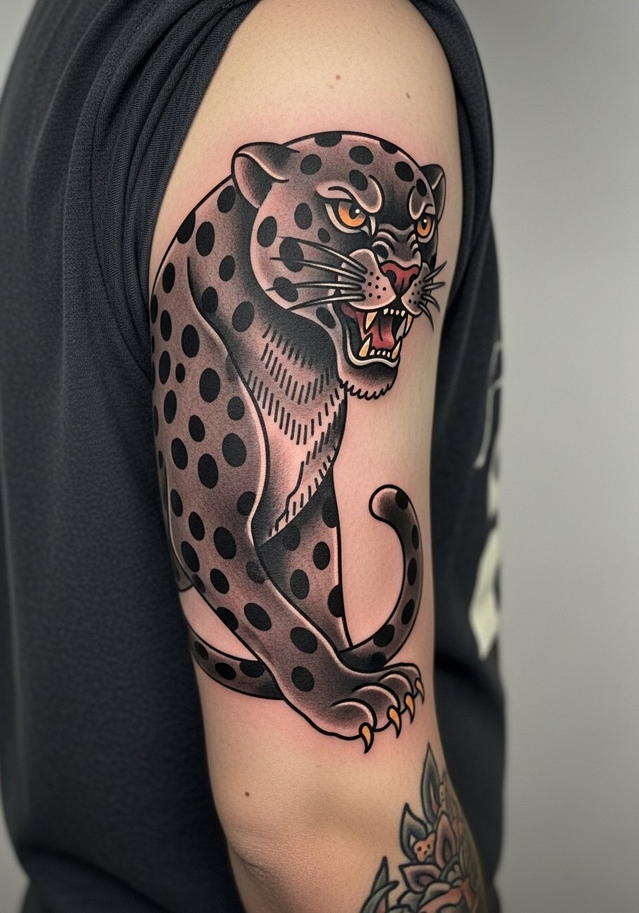
Classic animal pieces in bold traditional style survive wash and wear when outlines are thick and fills solid. The outer arm is a forgiving site. Pain is moderate and sessions vary by size. A mistake is softening outlines for a vintage look without considering future blowout. Show it off with a short-sleeve graphic tee that complements the bold motif.
27. Half Sleeve Collage That Ages with Intent
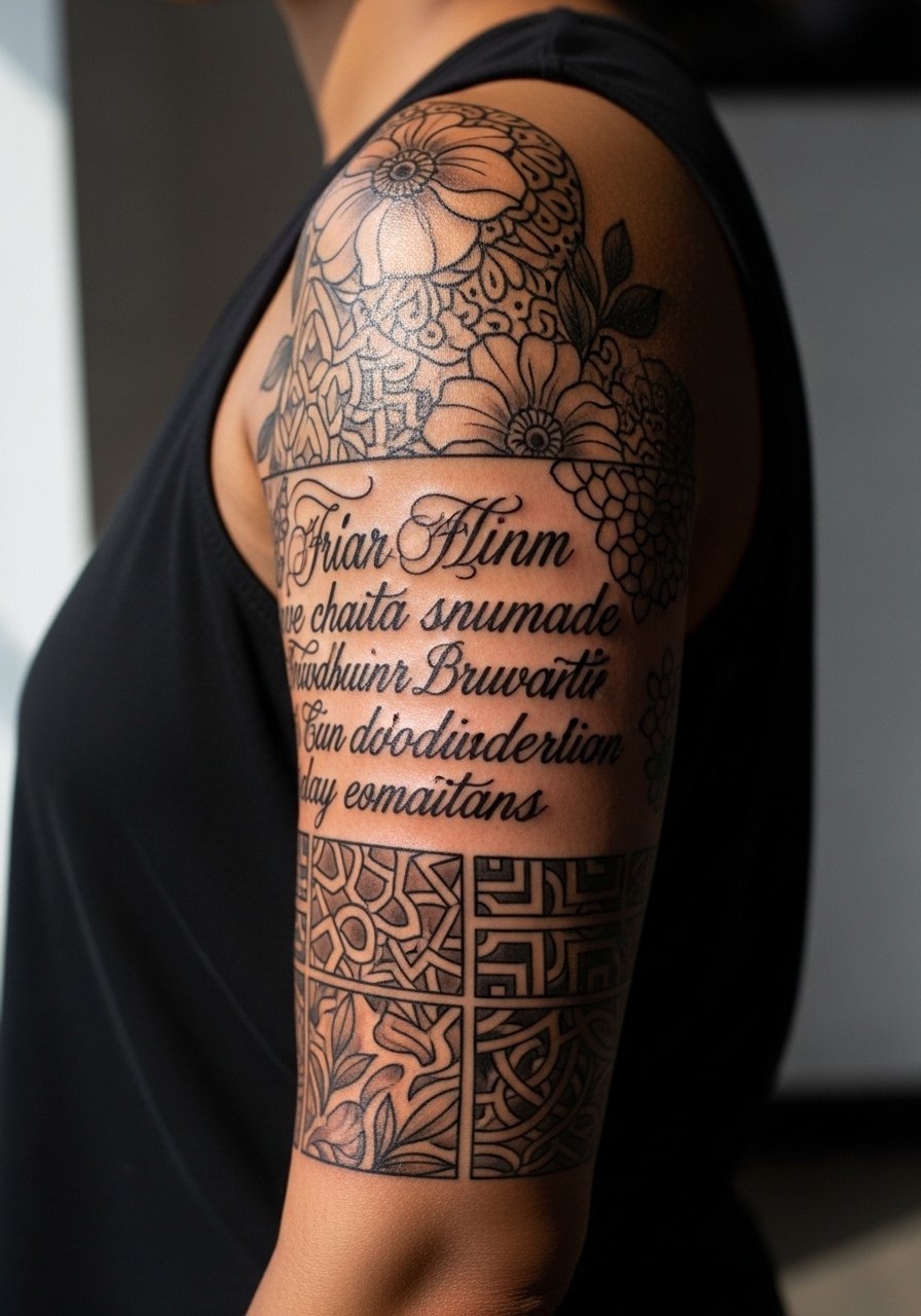
A collage half sleeve works when each element is designed to age into the others. Plan negative spaces and anchor pieces so touch-ups can refresh specific zones rather than the whole arm. Sessions are multiple and fatigue is a factor. One common mistake is collecting unrelated flash pieces without planning flow, which looks disjointed as it heals. For appointments wear breathable layers like a sleeveless gym tank so the artist can work longer comfortably and you can manage swelling.
Frequently Asked Questions
Q: Will fine line forearm tattoos blur faster than bold blackwork?
A: From what I have seen, fine line pieces blur sooner on high-motion and high-friction zones. Bold blackwork trades fine detail for longevity because solid fills and stronger outlines resist early merging. If you want a delicate look in a high-use area, ask the artist to slightly increase stroke weight and leave more negative space.
Q: How should I dress for a session that focuses on wrist and inner bicep work?
A: Wear clothing that gives the artist easy access. A tank top or a short-sleeve shirt you can roll up is best for inner bicep and forearm work. For wrists bring a loose long-sleeve that rolls easily so you can get in and out without irritation. A tank top or a roll-up button shirt makes the day smoother.
Q: Do hand and finger tattoos affect job prospects and do artists disagree on them?
A: Yes, hand and finger tattoos still split opinions on employability and longevity. One camp argues they are worth it for visibility and personal statement. The other camp warns they fade quickly from washing and can limit formal workplace options. Decide based on your industry and be prepared for more frequent touch-ups.
Q: How often will I likely need touch-ups on a forearm sleeve started now?
A: Expect touch-ups on high-contrast or tiny detail areas at three to five years, though bold black fields can go longer. I advise planning touch-ups into your timeline rather than treating them as surprises. Artists can refresh focal points without reworking the whole sleeve.
Q: Are there specific placements men should avoid for fine line work if they want it to last?
A: Avoid thin fine line designs on areas with constant abrasion like the wrist edge, fingers, and the inner elbow crease unless you accept regular touch-ups. Forearms and outer biceps are safer for fine lines when scaled properly. Ask for a scaled stencil preview so you can see how spacing translates to real skin movement.