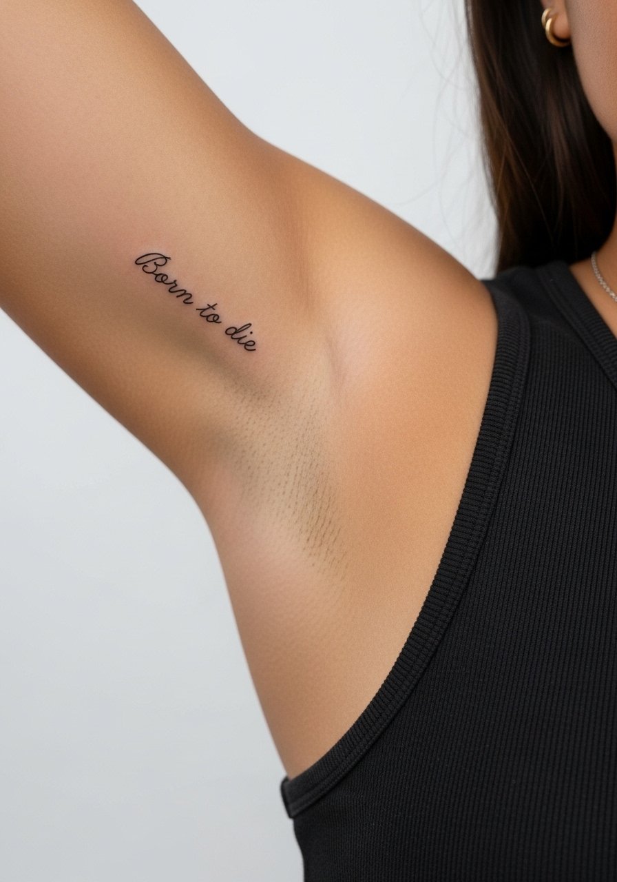
Fine line Lana Del Rey lyric pieces and moody micro-realism have been everywhere, but what holds up looks different than what trends on feeds. The designs that age best give the ink room to breathe and pick placements that see less abrasion. Below are 27 fan-ready drawings, each with what to ask your artist, how it heals, common mistakes, and outfit tips so the piece reads like it belongs to you.
1. Fine Line Script on Inner Forearm
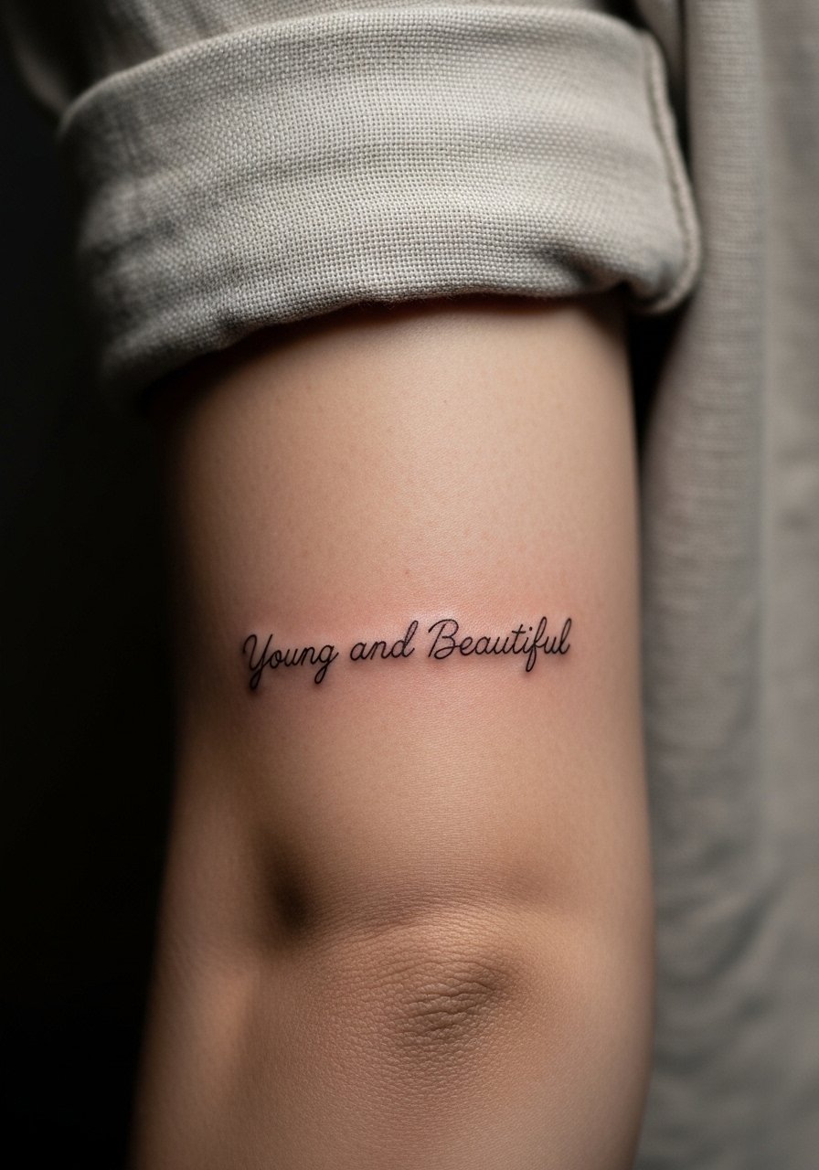
I often steer fans toward inner forearm script when they want a visible lyric without crowding. Fair warning, forearm linework needs slightly bolder spacing than you think so letters do not blur together after a few years. Tell your artist you want single-needle feel with slightly increased spacing between characters. The session feels mild, like a 3 to 4 on most pain scales. For showing it off, pair with a rolled-up linen shirt that frames the line without covering the area. Expect a touch-up at year two to three if you want the letters crisp long term.
2. Mini Polaroid Frame on Outer Wrist
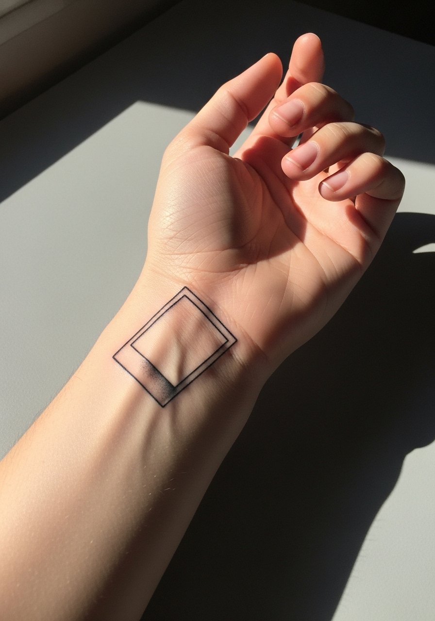
Personal observation tells me wrist pieces read large in person, so a tiny polaroid needs a clean margin around the image. The outer wrist has constant movement and washing, so pick a slightly thicker border to protect the interior detail from early fading. During consultation, ask for moderate lineweight and shallow saturation to avoid blowout. The session is short and fairly tolerable. Pair the piece with a thin chain bracelet when you want the tattoo visible but not crowded. Plan on a touch-up between year one and three depending on sun exposure.
3. Micro-Realism Daisy Behind the Ear
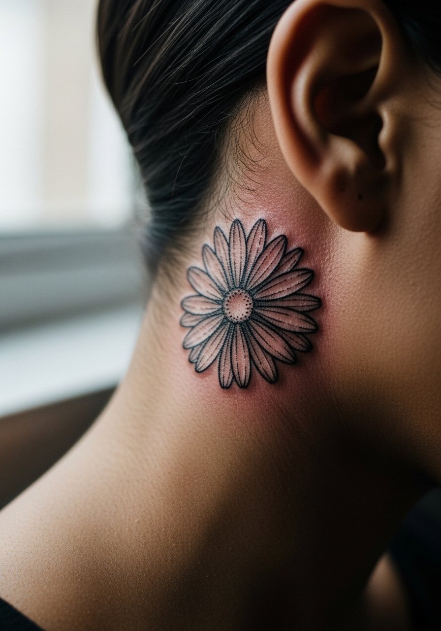
Fair warning, behind-the-ear work is tiny and sits on thin skin, so it can blur if needles go too deep. One camp of artists advises against fine micro-detail back here because the skin moves and fades faster. The other camp says precise depth control keeps it stable. Ask your artist which camp they fall into. For the session wear, tuck hair behind one ear and bring a small clip so the area stays visible. This placement reads delicate with time if kept small. Expect a touch-up window earlier than larger pieces, often around year two.
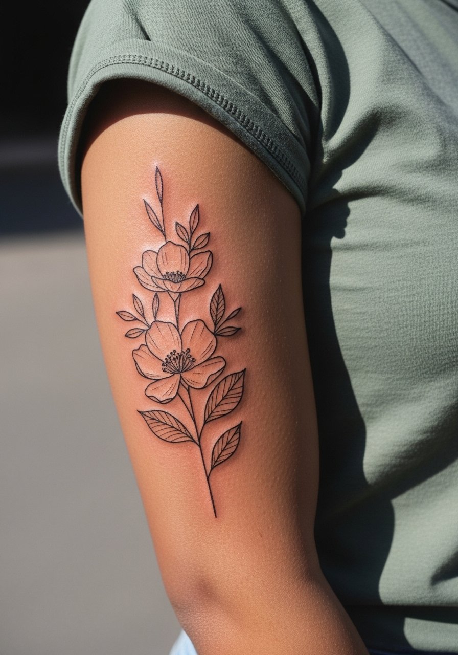
4. Vintage Microphone on Upper Arm
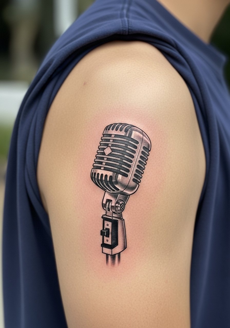
There is something about a tiny vintage microphone that pairs perfectly with an Americana aesthetic. If you want this to age well, request a slightly stronger silhouette and shallow shading rather than full micro shading. A common mistake is asking for extreme microdetail that dissolves into gray speckling after a few years. For the session, the upper arm is forgiving and sits around a 4 on pain scales. Show-off pairing works great with a sleeveless denim vest or a loose tank to keep the artwork visible.
5. Collarbones Script in Typewriter Font
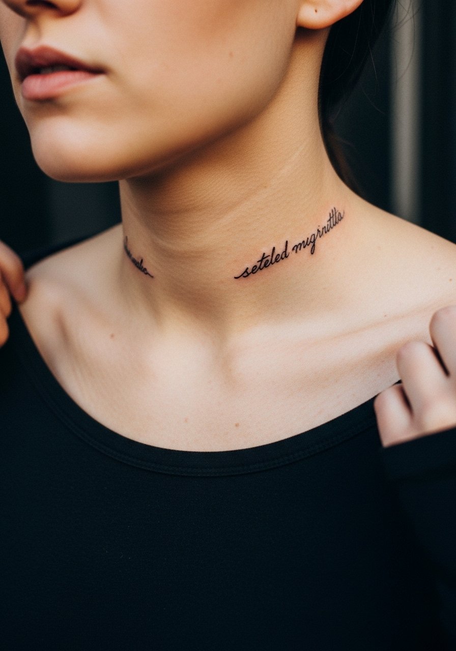
When you sit down with your artist for collarbone text, bring examples showing line spacing across the bone. The collarbone is great for lyrics but the skin contours can warp letters if the stencil sits crooked. The pain here is higher than the arm, often a 5 to 7 for a sensitive person. For session access, wear a wide-neck shirt you can pull aside. This placement pairs well with open-neck dresses for evenings. Expect letters to soften by year three without a light touch-up.
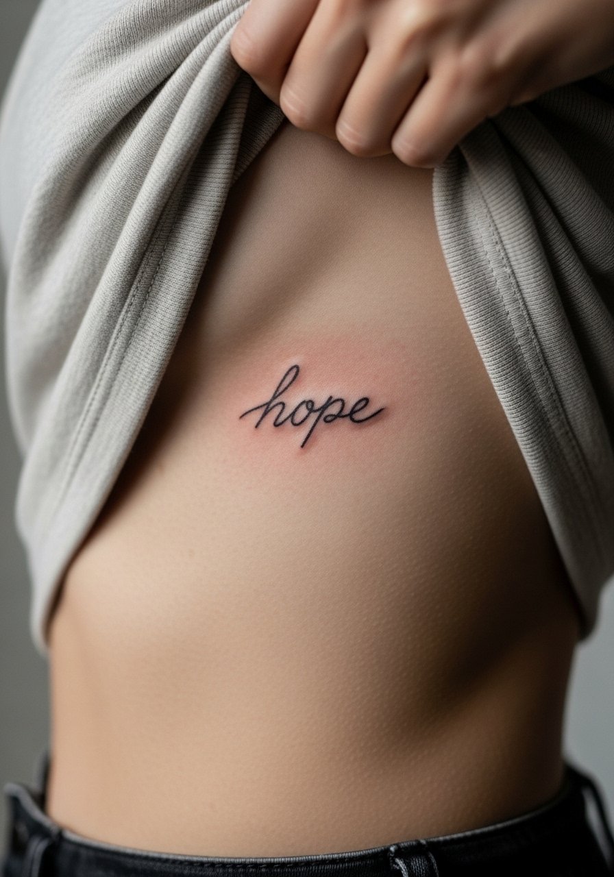
6. Tiny Heart with "LDR" Script on Ribcage
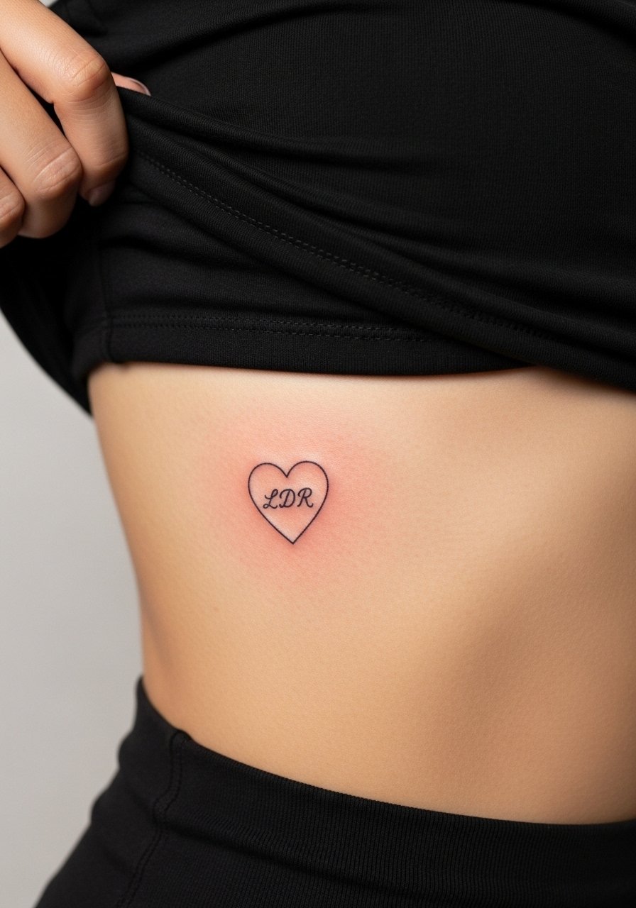
Artists split on fine work on the ribcage. One camp argues the constant stretch and thinner skin blurs fine line quickly. The other camp says meticulous depth and extra spacing keeps it readable for years. I tell fans to err on slightly larger lines for rib work. Warning, the ribs are a high pain area, often an 8, and sessions can feel long. For appointment wear, choose a cropped top you can lift easily. A tiny heart and initials can read intimate and discreet after healing, but expect a possible touch-up at year two if you keep it very fine.
Studio Day Picks
The collarbone, wrist, and ribcage pieces above each demand different prep and first-week care, so these items smooth the session and early healing.
- Stencil transfer paper kit. Lets you preview placement on skin, which is especially useful for collarbone script and inner-forearm text.
- Topical numbing cream. Applied as directed before a ribcage or sternum session it helps manage pain during long single-sitting pieces.
- Thin protective film roll. Keeps wrist and finger tattoos cleaner through frequent handwashing.
- Fragrance-free gentle body wash. A daily cleanser that avoids irritating new linework on exposed placements like forearms and collarbones.
- Hustle Butter Deluxe. A familiar mainstream healing balm that many clients find keeps tight linework moisturized without heavy residues.
7. Watercolor Halo Floral on Shoulder Blade
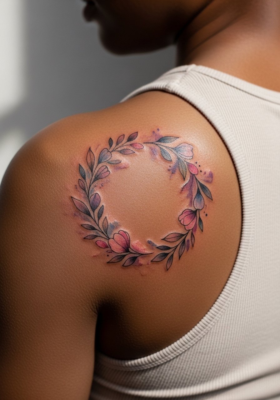
Visual impact is the reason shoulder-blade florals work so well. The skin has enough flat area to allow watercolor washes room to breathe. A common mistake is requesting very dense watercolor where the pigment pools in the first year and then fades into uneven patches. Ask your artist for softer washes with a clean outline so the shape holds as colors shift. Session pain is mild to moderate. For showing it off, reach for an open-back dress that frames the work without exposing too much skin.
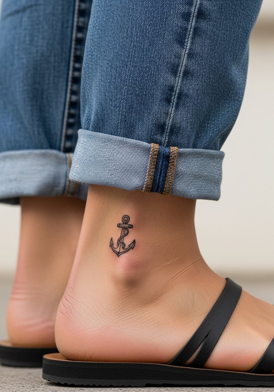
8. Tiny Anchor on the Side of Finger
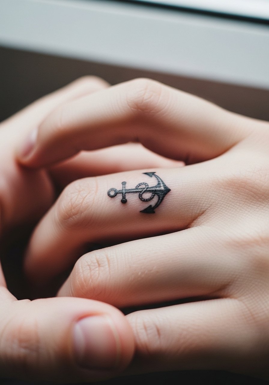
The biggest mistake with finger tattoos is expecting permanence. Fingers are high-friction and often need touch-ups. Most artists warn that side-of-finger ink fades faster than inner-finger scripts. If you want longevity, opt for a slightly bolder motif and accept periodic touch-ups. The session is quick and sharp. Hand tattoos can affect hiring in some fields, so think about career implications before committing. For daily wear, simple rings place well around the anchor but do not use aftercare product links here.
9. Noir Rose with Stipple Shading on Thigh
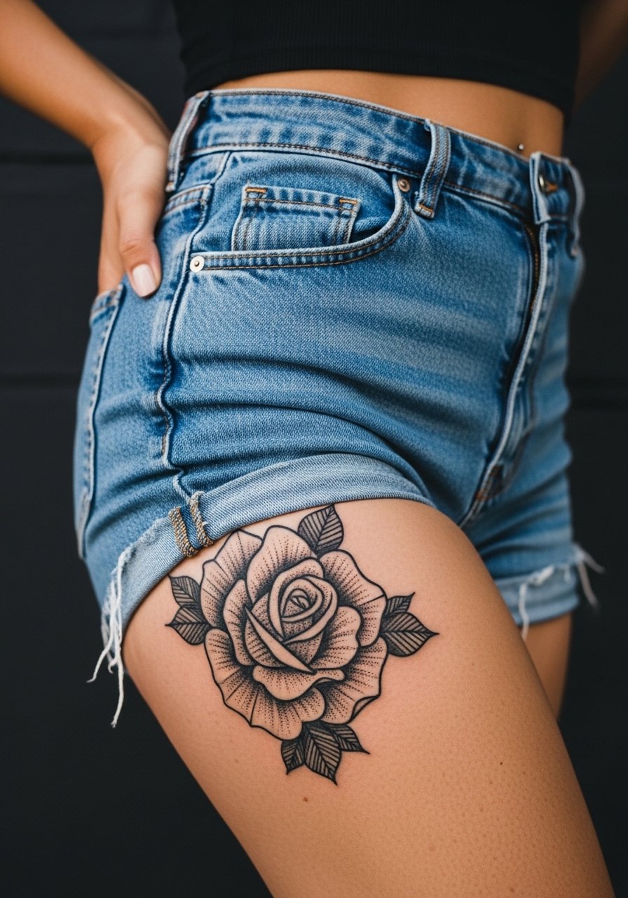
Aging lead works here because thigh flesh keeps blackwork intact longer than thinner skin zones. For a noir rose that lasts, stipple shading and solid black saturation outperform delicate gray washes. A common error is too much tiny detail that turns into a gray field over years. Session comfort is generally good, often a 4. For the appointment, wear high-waisted shorts you can lower slightly so the artist can access the upper thigh. Touch-ups for saturation can be done at year three or later depending on how often you wear tight clothing.
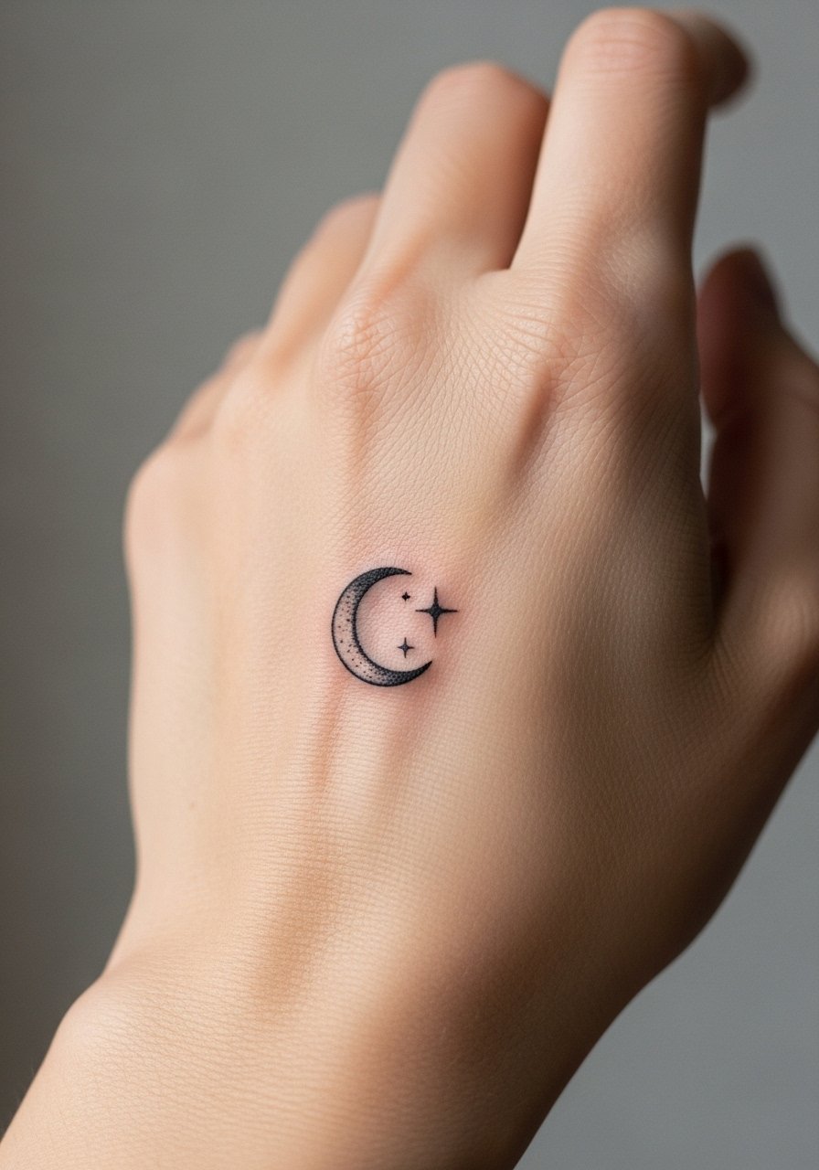
10. Minimal Crescent Moon Behind the Ear
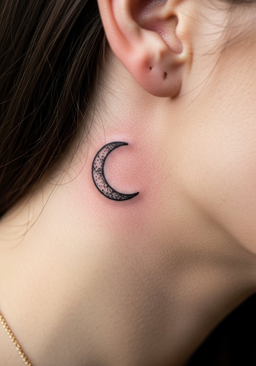
The visual of a crescent behind the ear reads understated in photos and in person. Keep it tiny and avoid dense shading here to reduce blowout risk. The area heals fast but may need a small touch-up because of nightly pillow friction. Request a slightly shallower pass during the session. This placement reads best when you tuck hair up for a night out. Expect minimal pain and quick healing.
11. Song Lyric Line Along the Spine
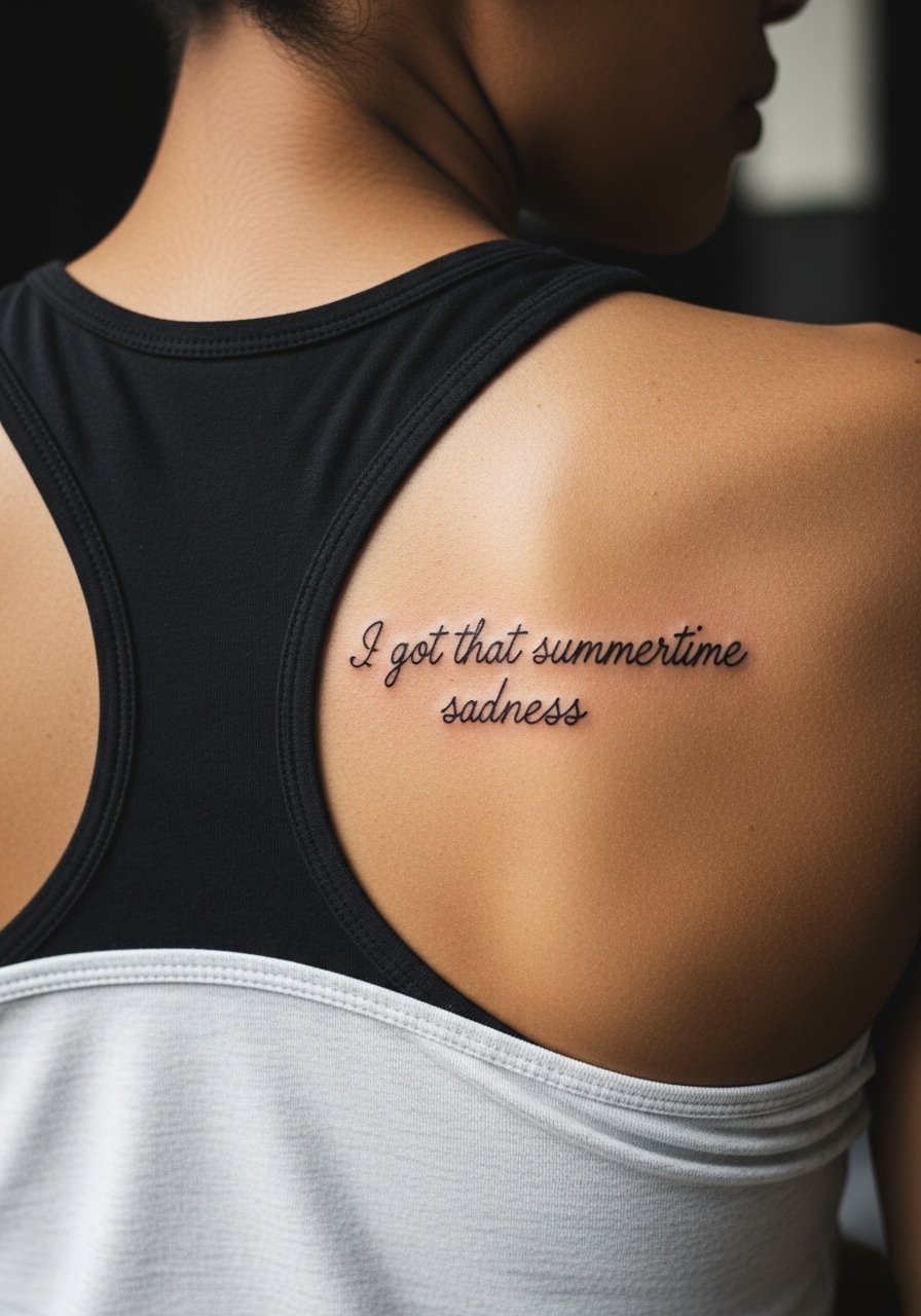
When you place a lyric along the spine, exact wording and line breaks matter. During consultation, show the font size on a photo mockup to avoid letters landing on bone ridges. The spine is a sensitive area with intermittent pain, often a 6 out of 10. For the session wear, a racerback tank gives the artist access while keeping you comfortable. Spinal text holds well when letters have a little breathing room. Expect a touch-up at year two if the text is very fine.
12. Classic Matchstick with Flame on the Wrist
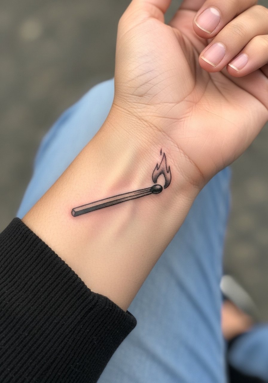
There is a visual honesty to bold black outlines and solid saturation in small wrist pieces. The mistake people make is asking for ultra-thin lines for a traditional piece. That approach sacrifices longevity. Ask for clear outline and a small but saturated fill. The wrist is a higher wear zone, so protective film in the first week helps. Session time is short. Pairing is simple with a lightweight watch that does not press on the tattoo while it heals.
13. Vintage Car Micro-Realism on Calf
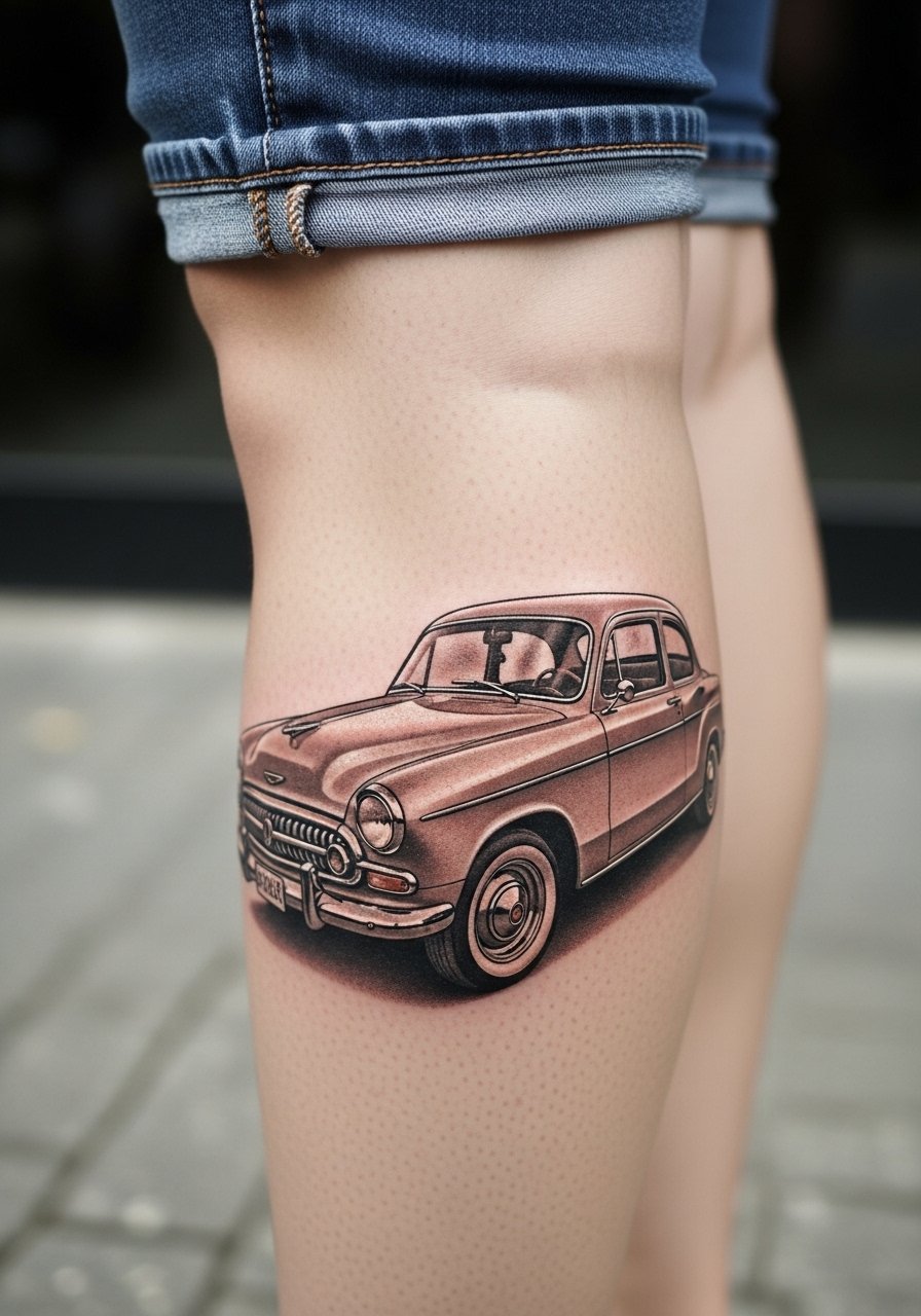
Personal observation says calves are forgiving for micro-realism because of thicker skin and less friction. If you want tiny engine detailing to read after five years, request slightly bolder contour lines around the small details. The session can be 1 to 2 hours depending on scale. For show-off moments, pair the design with denim shorts or cropped pants that reveal the calf. Touch-ups for micro-realism often happen at year three in areas that rub against clothing.
14. Single Line Silhouette of a Palm Tree on Ankle
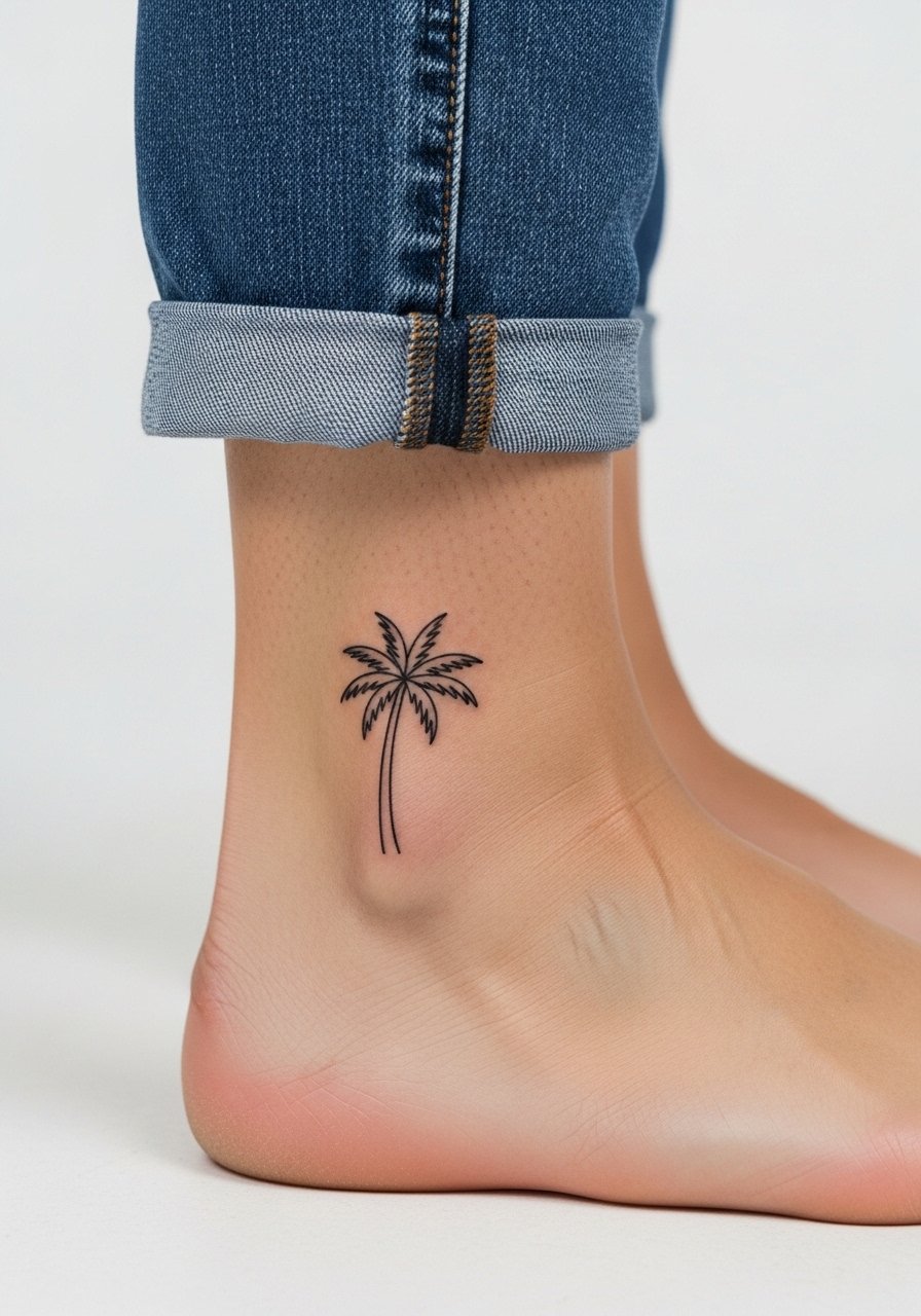
Mistake lead: the biggest error with single-line silhouettes is going too small where the negative space disappears after a year. The ankle has thin skin and sees shoe and sock friction. Ask for a slightly thicker single-line and plan for more touch-ups than a thigh piece. The session is short but sharp. For footwear that shows it off, opt for sandals and a jeans pair you can roll up.
15. Vintage Radio Script on Sternum
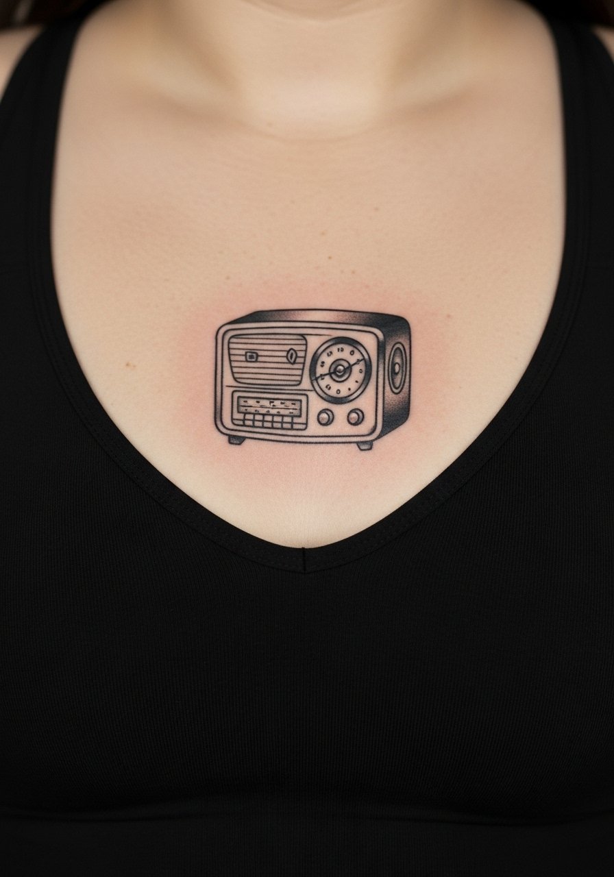
Aging lead matters here because sternum skin shifts with posture and breathing. Some artists favor heavier linework near bone to preserve the shape as the skin stretches. The sternum is a sensitive placement and pain can be high. For the session, wear a fitted sports bra so the artist can access the area cleanly. Show-off pairing works with low-cut tops that reveal just the top of the illustration. Expect a touch-up at year two if the original lines were very fine.
16. Floral Half-Sleeve Outline on Outer Arm
There is a visual impact to outline work that reads well from a distance. If you want a half-sleeve that ages without heavy color shifts, choose outline with selective stipple shading rather than dense color fills. A common mistake is packing too many small elements too close together, which blurs at year five. The outer arm is forgiving pain wise. For showing it off, a short-sleeve linen shirt that you can roll up frames the sleeve without losing continuity.
17. Micro Heartbeat Line at the Sternum
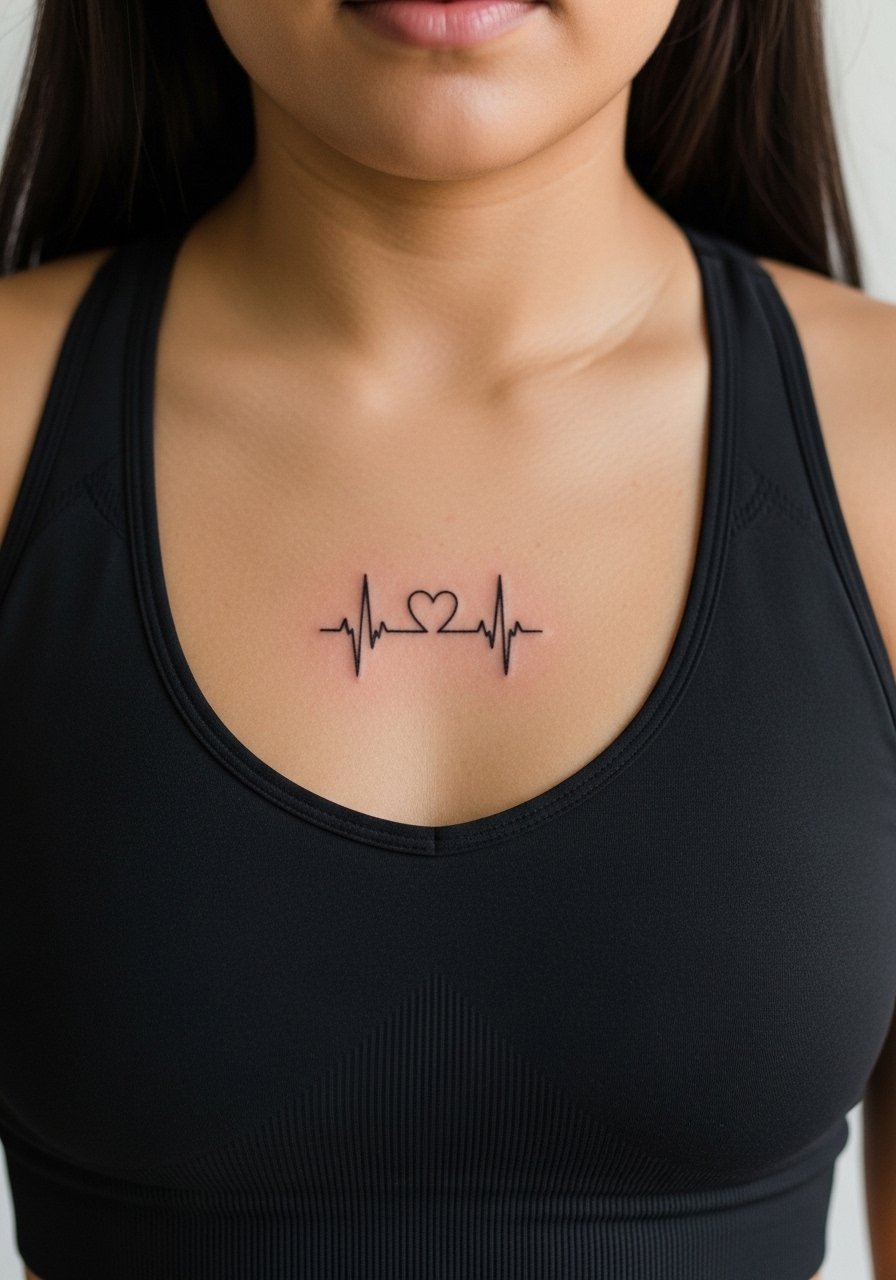
Consultation lead: bring precise placement photos for anything centered on the sternum so the artist can map symmetry with your clavicle line. Tiny heartbeat lines look modern, but sternum movement can shift perceived alignment if not planned. Session pain is above average. For wardrobe on the day, bring a sport bra or zip-up top to allow access. Expect this minimalist element to need touch-ups sooner than larger blackwork pieces.
18. Retro Sunglasses with Reflection on Forearm
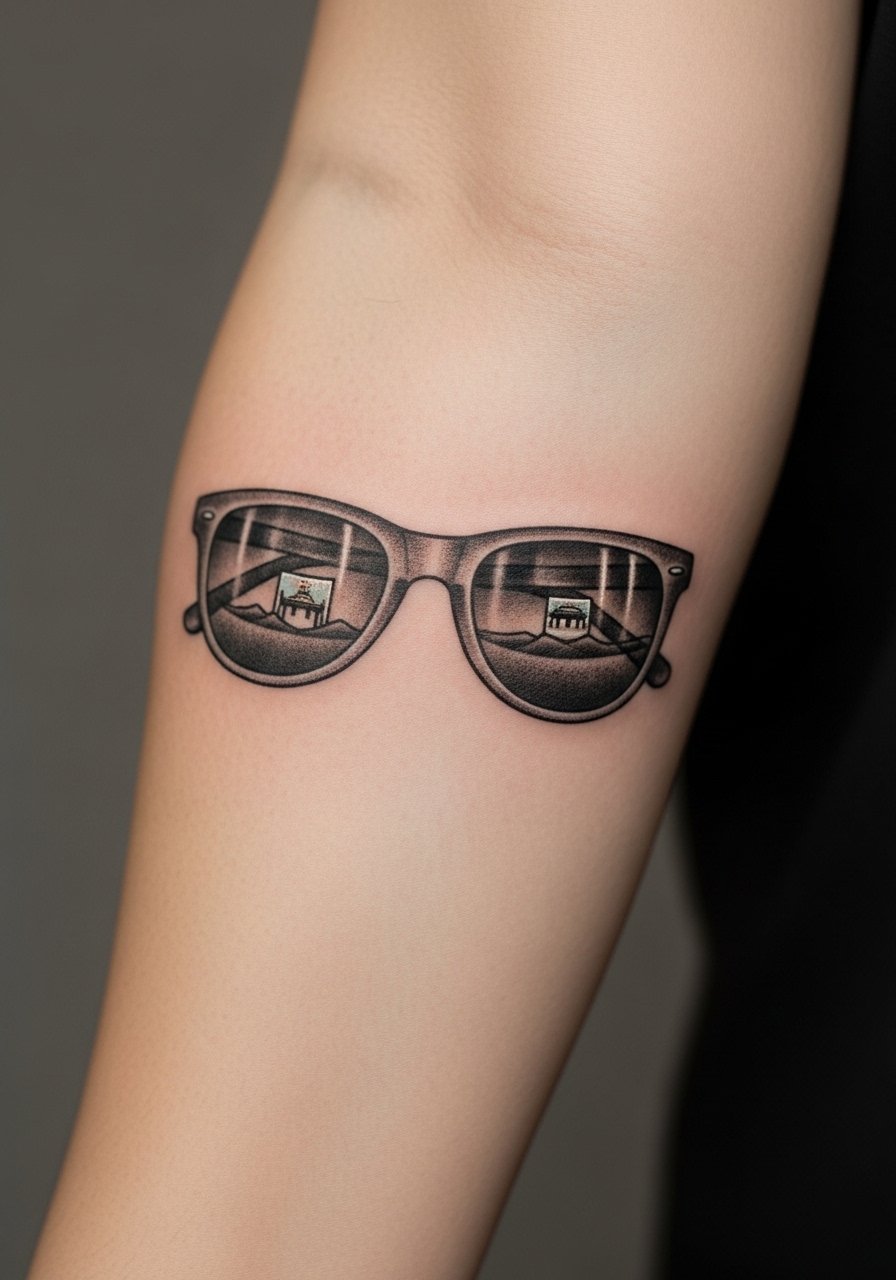
Visual impact lead: thoughtful negative space in the lens helps keep the reflection legible over time. A mistake is overloading the tiny reflective area with micro-detail. Tell your artist to simplify the reflection and strengthen the frame lines. Forearm sessions feel moderate and heal predictably. The piece pairs well with rolled sleeves and a casual button-down for an everyday look.
19. Script Arc Around the Wrist Bone
Mistake lead: people underestimate how curved skin alters letterforms. When text wraps the wrist, have your artist mock up the stencil while your wrist is held in the same relaxed position you will wear it. Wrist skin and motion cause early blurring, so choose slightly larger letterforms and request shallow but clear needle depth. The session is quick. Style pairing with stacked bracelets can look natural without obscuring the text when you choose thin bands like a delicate bangle.
20. Atlas Map Coordinates on Ribs
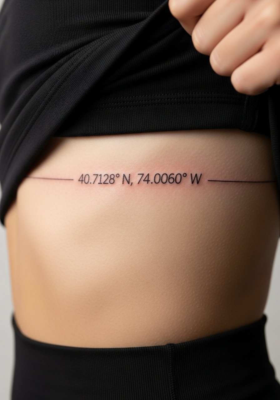
Consultation lead: when tattooing coordinates on the ribs, exact spacing and font weight determine long-term legibility. Ribs are prone to the fine-line controversy. One camp says ribs blur quickly under fine work because of stretching. The other camp says careful depth control preserves lines. Ask the artist where they stand and for a sample stencil. Expect higher pain and possible touch-up at year two for ultra-fine fonts.
21. Tiny Bird Trio Over the Collarbone
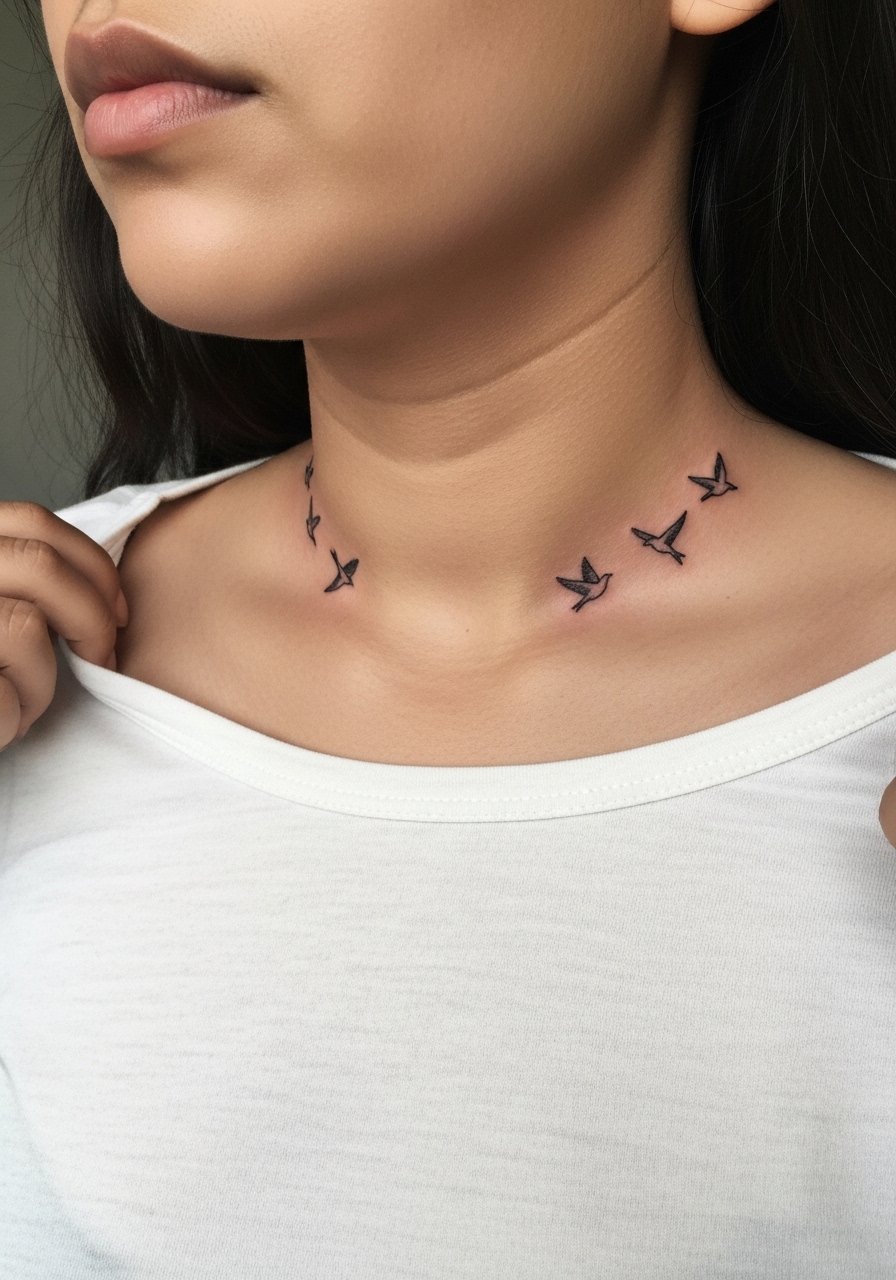
Personal observation: clusters of tiny birds read charming when spaced intentionally. The collarbone needs clean stenciling because the bone interrupts lines. A mistake is clustering birds too tightly, which makes silhouettes indistinct after healing. The session sits in the mid-range for pain. For showing off, a wide-neck knit top frames the flock nicely. Touch-ups may be needed at year three for very small silhouettes.
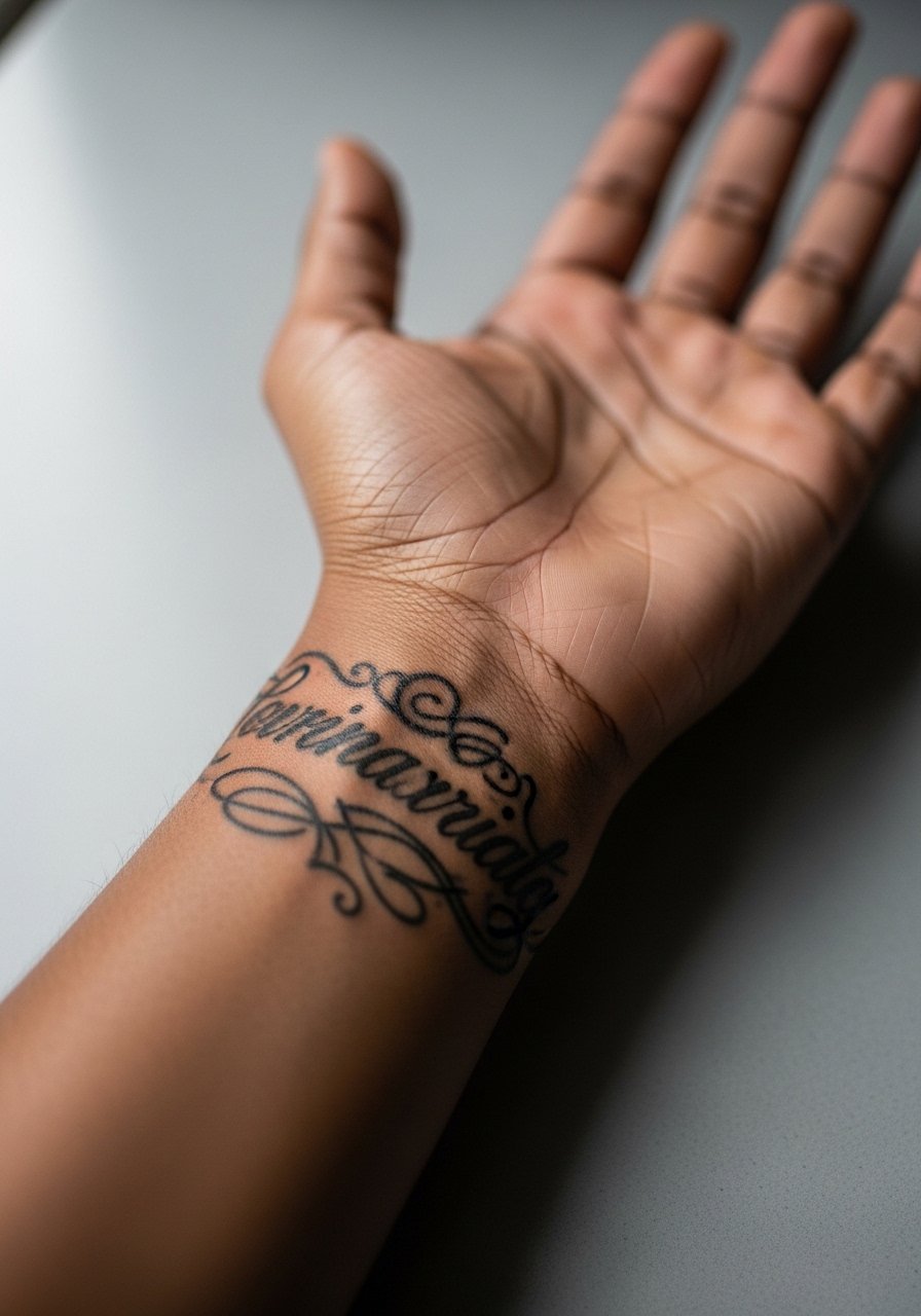
22. Vintage Key with Filigree on Inner Wrist
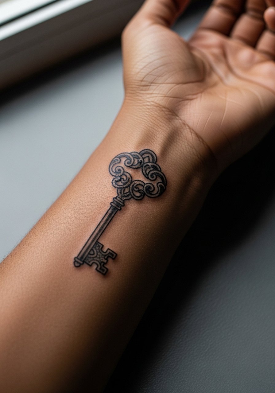
Mistake lead: inner wrist detail can fade into an illegible blur if the filigree is too tight. Request simplified filigree and slightly thicker stem lines so the shape survives regular motion and washing. Session pain is moderate. Because wrists see frequent movement, expect a touch-up sooner than forearm pieces. This placement is great with a minimalist watch that avoids pressure on the fresh ink.
23. Tiny Script on the Side of the Ribcage
Mistake lead: side-rib script is one of those placements where the size and font choice determine longevity. Tiny cursive on ribs can wander as the skin stretches. If you want the word to last, ask for increased letter spacing or choose a cleaner sans-style font. The ribs are painful and require endurance. For the session wear, a strapless top or a cropped athletic top is easiest. Plan for a touch-up at year two for very thin cursive.
24. Tiny Anchor on the Ankle Tendon
Pain warning lead: ankle tendon placements can feel sharp due to proximity to bone. That sensitivity means sessions are quick but intense. Anchors here need slightly stronger outline to withstand scuffs from shoes. A common error is a fragile outline that fades into flecks. For footwear that highlights the tattoo, choose open sandals. Expect touch-ups at year two because of sock and shoe friction.
25. Crescent Moon and Stars on the Back of the Hand
Controversy lead: hand tattoos remain contentious for both longevity and social perceptions. One camp says hands are acceptable creative spaces and will be touched up as needed. The other camp warns of rapid fading and potential professional consequences. If you decide on the back of the hand, go bold with linework and accept touch-ups as part of ownership. The session is painful and healing may be patchy. Consider minimal jewelry that does not rub the area in the first month.
26. Small Anchor Wrapped in Chain on Thigh
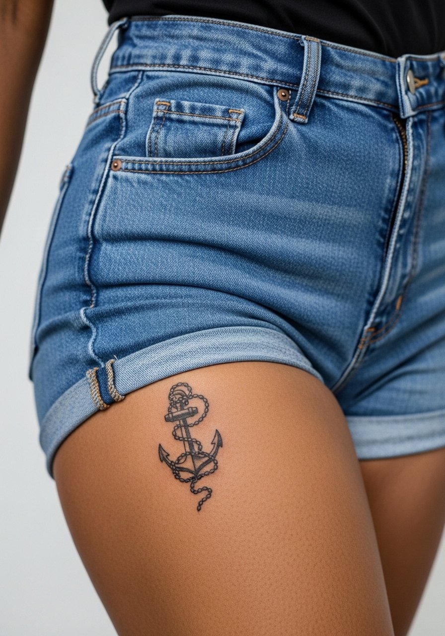
Visual impact lead: the thigh is forgiving for small compositions that include wrap elements like chains. Chains can blur if the links are too tiny, so ask the artist for slightly wider link spacing and clear negative space. The session is comfortable for most. For the appointment, wear high-waisted shorts or a skirt so the artist can access the hip easily. This placement ages well compared to hands or fingers.
27. Tiny Lyric Phrase on the Inner Bicep
Styling lead: the inner bicep gives privacy and surprise when you raise your arm. For text here, ask for moderate letter spacing and gentle lineweight so the phrase remains legible as muscles shift. The session can be awkward but not excessively painful. For the appointment, wear a loose tank top that lets the artist reach the area without strain. Inner bicep text often stays stable longer than hand or finger pieces, with touch-ups typically later down the line.
Frequently Asked Questions
Q: Will fine line scripts fade faster than bolder pieces if placed on the ribs or sternum?
A: It depends on depth and spacing. Fine line on ribs and sternum often softens faster because of skin movement. One group of artists recommends larger spacing and slightly heavier lineweight. Another group says impeccable depth control will preserve fine lines. Ask your artist which approach they prefer and plan for a possible touch-up at year two.
Q: Do micro-realism portraits need special placement to hold detail long term?
A: Yes. I recommend flatter, less mobile areas like the outer thigh or upper chest for fine portrait detail. Areas with frequent friction and thin skin lose micro-detail sooner. During consults, ask to see healed photos of similar placements from an artist's portfolio.
Q: How should I dress for a sternum or ribcage appointment?
A: Wear something that gives the artist access while keeping you comfortable. A fitted sports bra or a cropped tank that you can lift works well. If you want options for after photos, bring a wide-neck shirt you can pull aside easily.
Q: Are hand and finger tattoos a good pick if I want low-maintenance ink?
A: Not usually. Hands and fingers are high-friction zones and often need touch-ups. They can also affect professional perceptions depending on industry. If you want similar symbolism with less upkeep, consider the wrist or inner forearm instead.
Q: How soon should I expect a touch-up for very delicate script pieces?
A: Expect to revisit the studio between year one and three for ultra-fine scripts, depending on placement and sun exposure. Bigger, bolder versions of the same phrase often go longer without work.
Q: Where can I find references and portfolios without contacting specific artists directly?
A: Use discovery pathways like dedicated tattoo subreddits, local shop portfolio pages, and searchable hashtags that reflect the style you want. Many fans also browse shop gallery archives and convention booths to compare healed work and placement examples.